I remember standing in a client’s living room early in my consulting career, staring at a beautifully decorated space that still felt unsettled. The walls were warm taupe, the furniture carefully curated, and yet the room kept pulling the eye in the wrong directions.
It took me longer than I would like to admit to realise the ceiling was working against the room’s proportions. Once we unified it with the walls, the room finally settled.
That experience, and honestly dozens like it across more than a decade inside people’s homes, shaped my thinking on one of the most deceptively simple decisions in interior design.
Here is the short answer, and I want to give it to you upfront.
| Painting your ceiling the same color as your walls works beautifully when your room needs visual cohesion, height, or a sense of enclosure. It works against you when your ceiling carries visible imperfections or when your room already lacks natural light. |
That is the core of it. Everything else, the nuance, the room-by-room judgment calls, the finish decisions, and the practical steps, I will walk you through below.
What Actually Happens When You Paint the Ceiling the Same Color as Your Walls
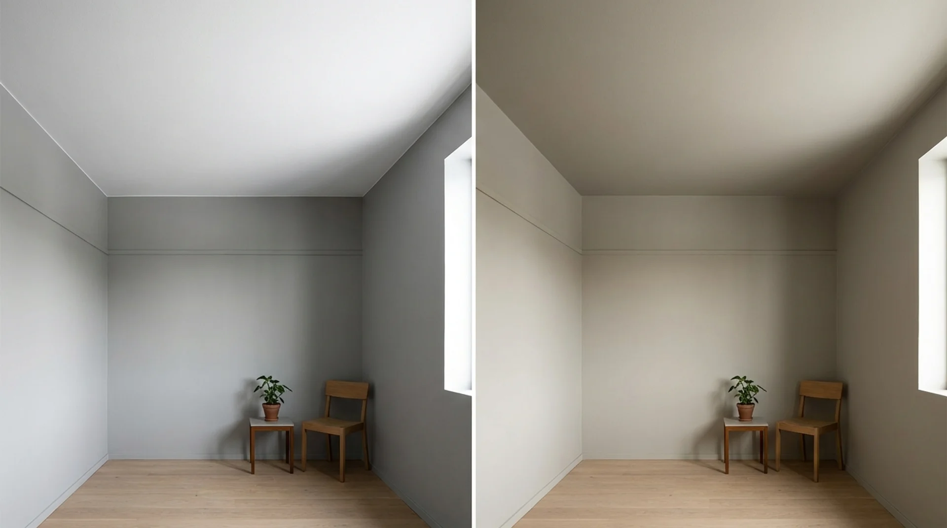
Most people assume an all-over color will look flat or strange. Your eye stops searching for where the wall ends and the ceiling begins, and the room reads as a complete, contained space.
Designers call this the envelope effect, and it works because the brain naturally finds rest in visual continuity.
Here is a quick reference from my own project experience:
| Room Condition | Effect of Matching Ceiling to Walls |
|---|---|
| Small room with low ceiling | Creates the illusion of height and volume |
| Room with limited natural light | Can feel heavier; lighter shades work best |
| Ceiling with cracks or uneven plaster | Amplifies imperfections more than contrast would |
| Long, narrow hallway | Visually widens and elongates the space |
| High-ceilinged room with bold colour | Creates a dramatic, intimate cocoon effect |
| Ceiling with architectural features | Either frames them beautifully or hides them, depending on the intent |
The Real Advantages, Backed by Experience
How a Unified Color Scheme Makes a Room Feel Larger
Your square footage is fixed, but your perception of it is not. When you paint the ceiling the same color as your walls, you remove the visual boundary that tells your brain where the room stops.
A study published in the Journal of Environmental Psychology confirmed that visual boundaries within a space significantly influence perceived size. Removing the contrast between the wall and the ceiling eliminates one of those boundaries.
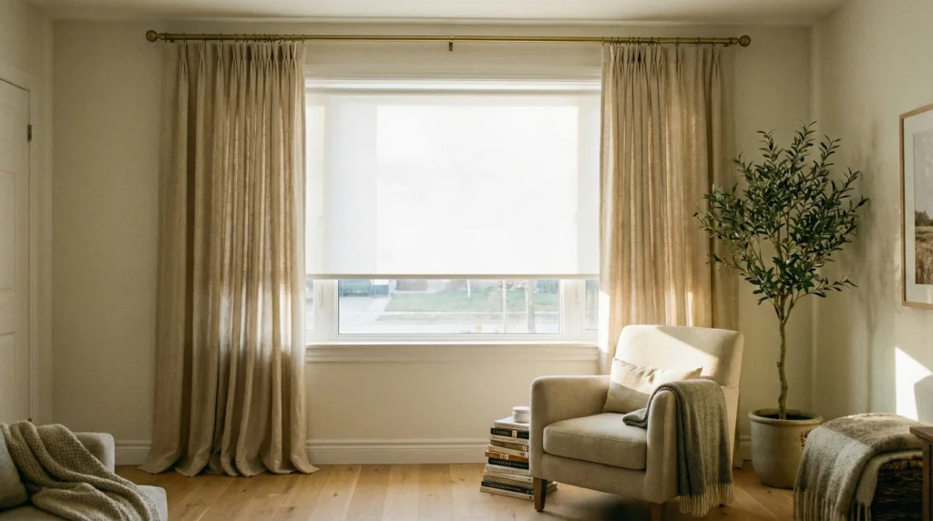
I applied this to a client’s bedroom in a converted Victorian terrace. The ceiling sat at just 2.4 metres, which felt oppressive against dark navy walls.
We painted everything in the same dusty blue. Guests who visited after consistently described it as feeling “so much bigger” than they remembered.
If your room feels pinched or low, matching the ceiling to your walls is one of the most affordable fixes available to you.
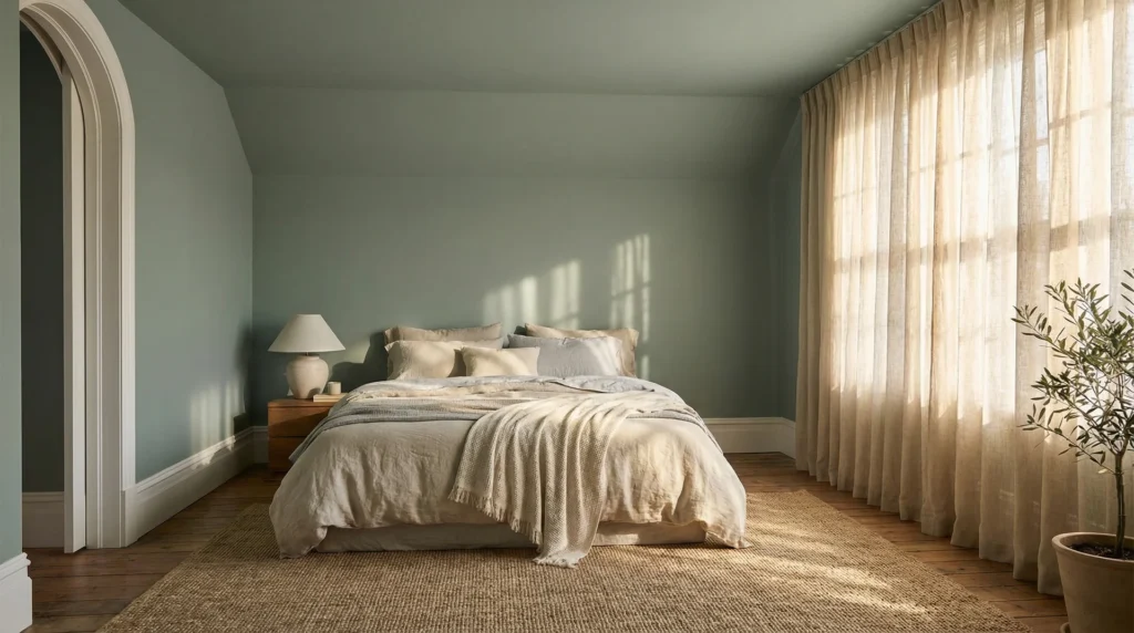
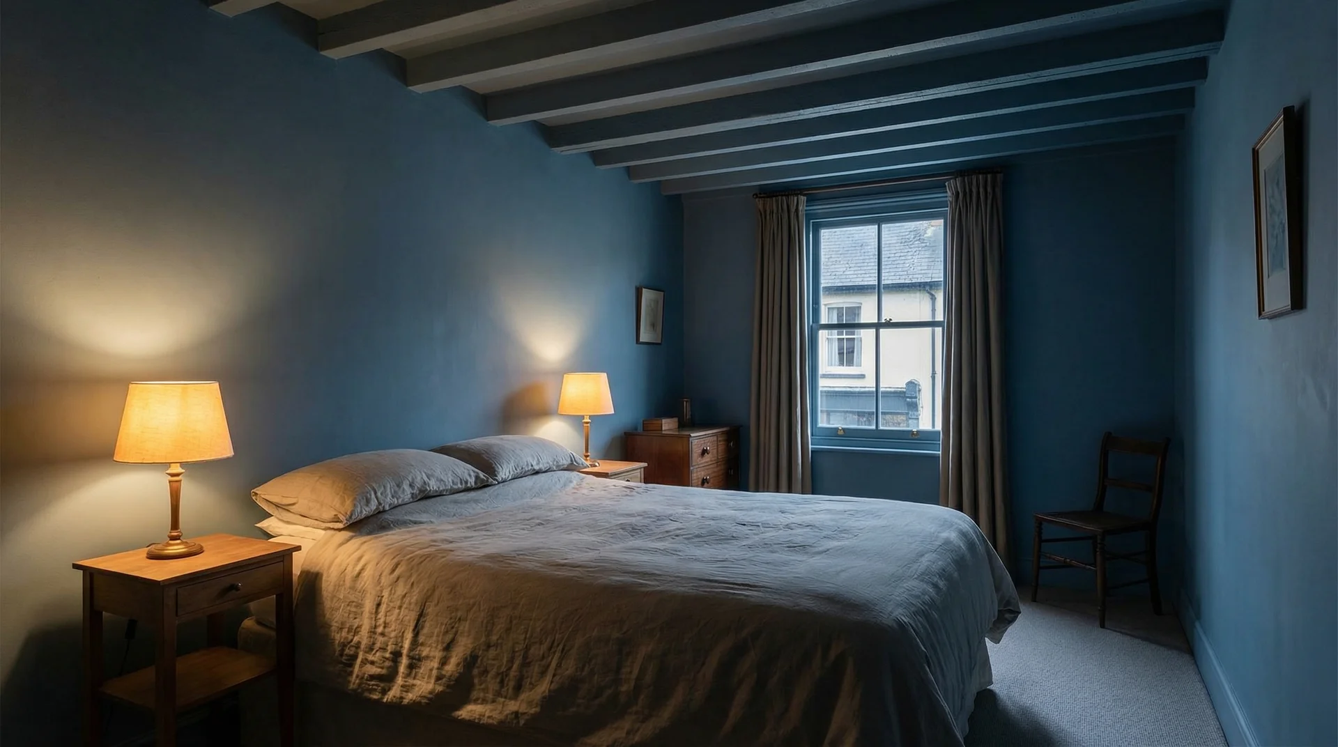
The Intimacy Effect: Why Bedrooms Love This Approach
A room wrapped in a single, considered color feels curated and sheltered.
The psychology behind this connects to what geographer Jay Appleton called the prospect and refuge theory, which suggests humans feel most relaxed in spaces that feel simultaneously sheltered and outward-looking. A unified ceiling and wall color delivers exactly that sense of refuge.
I lean on this principle most often when working on bedrooms painted in warm, mid-depth tones such as terracotta, deep sage, or dusty rose.
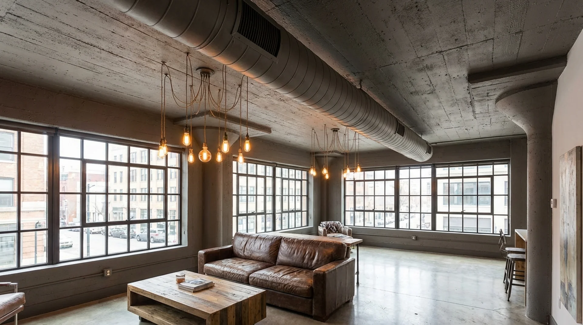
Hiding What You Would Rather Not See
Older homes often carry ceiling conditions that skim-coating cannot fully resolve, including angled transitions where walls meet ceilings awkwardly or exposed pipework overhead.
Painting everything in a unified color, especially a darker shade, pulls those elements into the background rather than spotlighting them.
I worked on a converted loft apartment where an overhead ventilation duct ran the full length of the space. Painting the duct, ceiling, and upper walls in the same warm charcoal made it virtually disappear.
Saving Time and Reducing Painting Costs
Using one color for both walls and ceiling cuts your decision-making in half. You also avoid the painstaking task of cutting a perfectly clean line where the wall meets the ceiling, because there is no color change to expose any brush imprecision.
Tradespeople I have worked with consistently note that single-color rooms paint faster. If you are hiring a painter, that reduction in labor translates directly into a lower quote.
The Honest Downsides You Need to Know Before You Commit
Ceiling Imperfections Will Not Hide Themselves
A white ceiling is forgiving. Small hairline cracks and faint water marks tend to disappear against a bright white background. The moment you introduce color, you change how light interacts with that surface. A warm amber or deep teal casts shadows into any crack or texture variation, making them far more visible than before.
Before you commit, get close and look at your ceiling under different lighting conditions throughout the day. If you find cracks or surface irregularities, fill, sand, and prime before you paint.
Darker Colors Can Compress a Space
The envelope effect works in your favor in small, low rooms. In a large room with generous ceiling height, it can work against you. I learned this during a project where a client wanted a tall dining room painted in dramatic forest green on all surfaces.
The room had 3.2-metre ceilings, and the result was striking but too intense for daily use. We repainted the ceiling in a lighter tint of the same green, which preserved the cohesion while lifting the visual weight considerably.
Color depth on the ceiling needs to correspond with the room volume and light levels.
Your Design Flexibility Narrows
Once you commit to a full-room color envelope, changes feel more consequential.
Swapping out wall art, introducing an accent wall, or adding ceiling-mounted pendant lights in a contrasting finish all read differently against an all-over color.
The room becomes a more complete composition, which is a strength and a constraint at the same time.
Should the Ceiling Be Lighter or Darker Than the Walls?
This is one of the most common follow-up questions I get, and it deserves a direct answer.
The general principle most designers follow: paint the ceiling in a lighter tint of the same wall color, typically around 50% lighter. This preserves the visual connection between the two surfaces while lifting the overhead plane so the room does not feel heavy.
When to use the exact same shade: small rooms, hallways, and intentionally intimate spaces where you specifically want the enclosure effect. Bedrooms and reading nooks respond particularly well to an exact match.
When to go lighter on the ceiling: larger rooms, spaces with moderate natural light, and rooms where you want cohesion without full enclosure. The result still reads as intentional and connected without the risk of visual compression.
When to go slightly darker on the ceiling: this is a deliberate design move for creating drama in a room with high ceilings. It draws the ceiling plane visually downward and creates a more intimate scale in a space that might otherwise feel cavernous. Use this sparingly and only in rooms with strong, controlled lighting.
What Happens to Trim and Molding When Ceiling Matches Walls?
Trim treatment is the part of this decision that most guides miss, and it matters more than people expect.
When you match your ceiling to your walls, your trim becomes the visual anchor. Here is how I typically approach it:
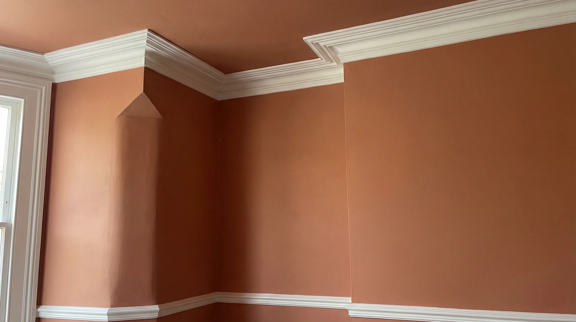
- White or off-white trim creates the strongest contrast and frames the room crisply. This is the most common choice, and it works across almost every wall and ceiling color combination
- Trim painted in the same color as the walls and ceiling gives you a fully immersive, seamless look. It removes all visual boundaries and works beautifully in modern, minimalist interiors. The trade-off is that any imperfection in the trim work becomes very visible.
- Trim painted in a deeper version of the wall color is a more sophisticated approach that adds layering. It works exceptionally well in rooms with good architectural detail.
My personal default is white trim against a same-color wall and ceiling, because it gives you the envelope effect while keeping a clean, grounding boundary at the room’s edges.
Edwina’s Checklist: How to Know If This Works for Your Room
- Is your ceiling in good structural condition? If yes, proceed. If there are cracks, fill them first.
- Does your room receive natural light for most of the day? Naturally bright rooms handle deeper all-over colors far better.
- Is the ceiling height below 2.7 metres? A matching ceiling can help the room breathe visually.
- Do you want the room to feel cosy and contained, or open and airy? A matching ceiling delivers the former.
- Are there architectural elements overhead that you want to feature? A matching ceiling will soften them.
- Are you prepared to repaint the entire room if you change your wall color later? A matching scheme means ceiling and wall changes happen together.
Choosing the Right Color and Finish
Color Guide from My Project Experience
| Color Family | What It Does When Used on All Surfaces |
|---|---|
| Off-whites and soft neutrals | Feels airy and clean; expands the room seamlessly |
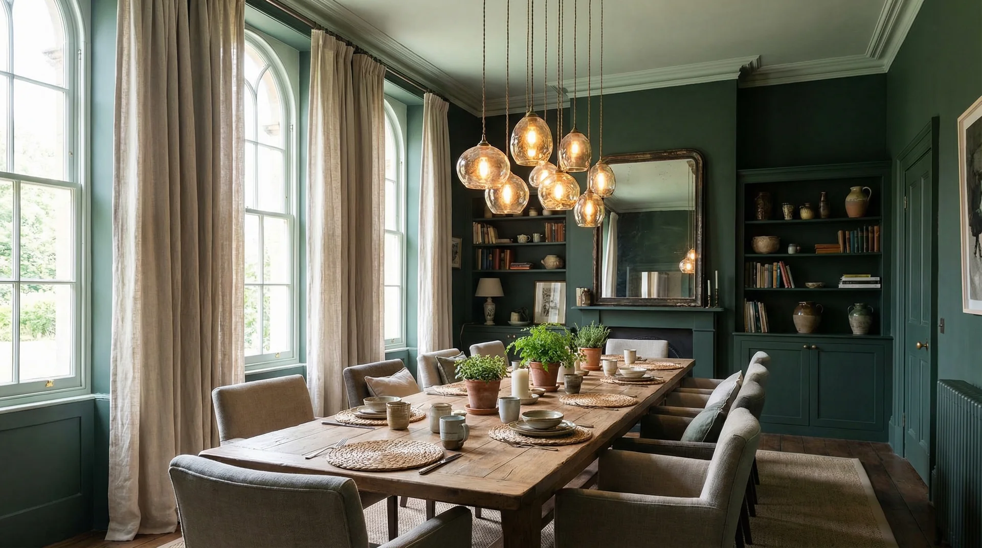
| Warm mid-tones (terracotta, warm taupe, blush) | Creates warmth without heaviness |
| Cool mid-tones (sage, dusty blue, slate) | Feels calming; works beautifully in bedrooms |
| Deep saturated colors (navy, forest green, charcoal) | Delivers drama; best in larger or well-lit rooms |
| Bold brights (mustard, cobalt, burnt orange) | Requires confident styling and generous light |
For first-timers, I always recommend a mid-depth neutral or muted earthy tone. It gives you the cohesive effect without the full commitment of something intensely saturated.
The Finish Decision Most People Overlook
Paint finish is where many well-intentioned projects fall apart. Here is how I approach this on every project:
- Walls: Eggshell or satin finish for durability and a soft sheen
- Ceiling: Flat or matte finish in the same color to reduce visible imperfections and soften the overhead plane
The slight difference in light reflection means your eye registers the ceiling as distinct from the walls without seeing a color contrast. It is a quieter and more sophisticated result than most people expect.
Getting the Execution Right
1. Prepare the ceiling thoroughly. Fill all visible cracks, sand smooth, and apply a quality primer. This step is non-negotiable with any color deeper than a mid-tone.
2. Paint the ceiling first. Always. Ceiling paint drips onto walls, and you want to cut your wall color over a finished ceiling edge.
3. Apply two full coats. One coat rarely achieves the depth or evenness you need, especially when transitioning from white to any mid or deep color.
4. Use a quality angled brush for your edges. Any variation in sheen or slight color drift between batches will still show at the ceiling line.
5. Evaluate under your actual lighting conditions. Walk through the room at night under your regular artificial lighting and confirm that the color reads the way you intended.
When This Approach Works Room by Room
Bedrooms: The most consistently successful application of this approach. Any shade from a soft blush to a deep slate works here, and the sense of enclosure actively supports rest.
Small living rooms: Lighter, warmer neutrals work best because living spaces still need to feel socially comfortable and welcoming rather than cave-like.
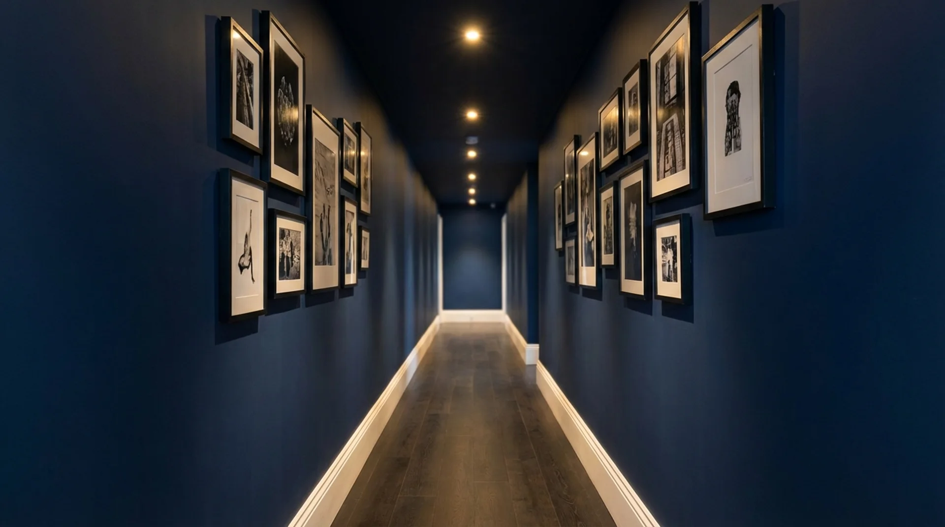
Hallways and staircases: These spaces respond brilliantly to this treatment. Bold, saturated colors work well here because exposure time is brief and the visual impact is significant.
Home offices: Research increasingly supports muted, cooler tones for concentration and reduced visual fatigue. An all-over sage green or soft slate blue creates a focused, settled environment that a white-ceilinged room struggles to replicate.
Rooms to approach carefully:
- Kitchens: Steam and grease affect the ceiling more than the walls. A washable finish is essential, and lighter shades are more forgiving to maintain.
- Bathrooms: Humidity requires mould-resistant paint formulations. Lighter shades are the safer choice in any bathroom without excellent ventilation.
- Large, low-light dining rooms: Careful color selection is essential. A matching dark color in a poorly lit dining room can feel oppressive rather than atmospheric.
Frequently Asked Questions
Does painting the ceiling the same color as the walls make the room look smaller?
It depends on the color and the room. In small rooms, this approach actually makes the space feel larger by removing the visual boundary between wall and ceiling. In larger rooms painted in very deep colors, it can create a more enclosed feeling. The right color depth for your specific room dimensions and light levels is what determines the outcome.
Should the ceiling be the same exact shade or slightly different?
For full enclosure and intimacy, use the exact same shade. For cohesion without heaviness, use a tint that is about 50% lighter than your wall color. Both approaches work, and the choice depends on how enveloped you want the room to feel.
What finish should I use on the ceiling versus the walls?
Use a flat or matte finish on the ceiling and an eggshell or satin finish on the walls. The same color in two different finishes creates a subtle visual distinction between the surfaces without breaking the unified color effect.
Do I need to paint the trim the same color, too?
You do not have to. White or off-white trim against an all-over color creates a clean, grounding boundary. If you want a fully seamless look, painting the trim in the same color works well in modern interiors but requires very precise execution.
Is this approach suitable for rental properties?
With lighter shades, yes. Mid-tone and lighter neutrals on both walls and ceiling photograph well, appeal broadly, and are straightforward to repaint. Deeper, saturated all-over colors can be harder to cover and may deter potential tenants or buyers.
The Final Word
After more than a decade of design consultations and hundreds of rooms, my honest view is that painting your ceiling the same color as your walls is one of the most underused and misunderstood tools in residential design.
When you apply it thoughtfully, with the right color depth for your room’s proportions, the right finish for each surface, and solid preparation underneath it all, it transforms a room in a way that is both subtle and significant.
The rooms that stay with me most are rarely the ones with the most expensive furniture. They are the ones that feel intentional from floor to ceiling, where every surface was considered. An all-over color scheme, done well, delivers that quality of completeness in a way that is genuinely within reach for most homeowners.
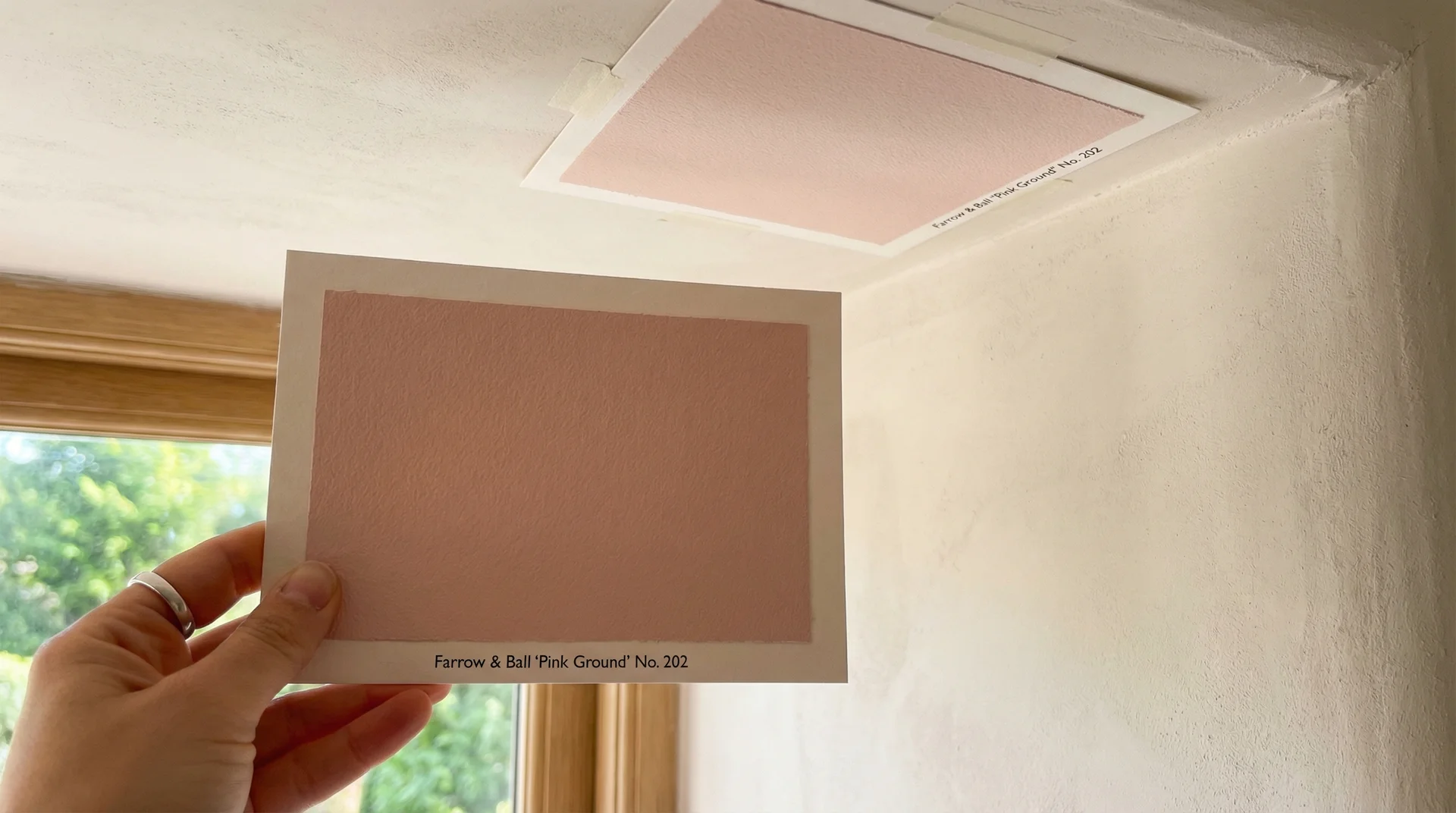
If you take one thing from everything shared here, let it be this: test your chosen color on both the wall and the ceiling before you buy a full tin.
Paint sample cards on both surfaces, live with them for 48 hours under different lighting conditions, and trust what you see. Your room will tell you exactly what it needs.