I remember standing in a client’s kitchen in Portland, paint chip in hand, both of us staring at a swatch called Caliente. She loved it. She also said, “But what if I hate it in six months?” We painted it anyway. Three years later, she told me it was the best decision she made in the whole renovation.
Red kitchens get a reputation they don’t deserve. People picture fast food logos or Valentine’s Day overkill. After more than a decade in residential design, I can tell you the fear is rarely about red itself. It’s about not knowing which red to use, how much of it, and what to put around it.
This guide answers all three: specific shade picks, pairing logic that goes beyond “just add white,” ideas sorted by commitment level, and honest answers to the questions people are too embarrassed to Google.
The paint colours, product names, and resale observations in this article are based on personal design experience and general market trends. Colour perception varies by room, lighting conditions, and individual monitor settings. Always sample paint in your own space before committing.
Why Red Actually Makes Sense in a Kitchen
Almost every homeowner I’ve worked with asks some version of the same thing: “Am I going to regret this?” Here’s the answer before we get to ideas.
What Red Does to a Room (and to You)
Colour psychology research consistently links red to increased appetite, higher energy, and stronger social engagement, which is exactly why you see it in restaurants. The kitchen is already the most active, social space in a home. Red doesn’t fight that energy; it feeds it.
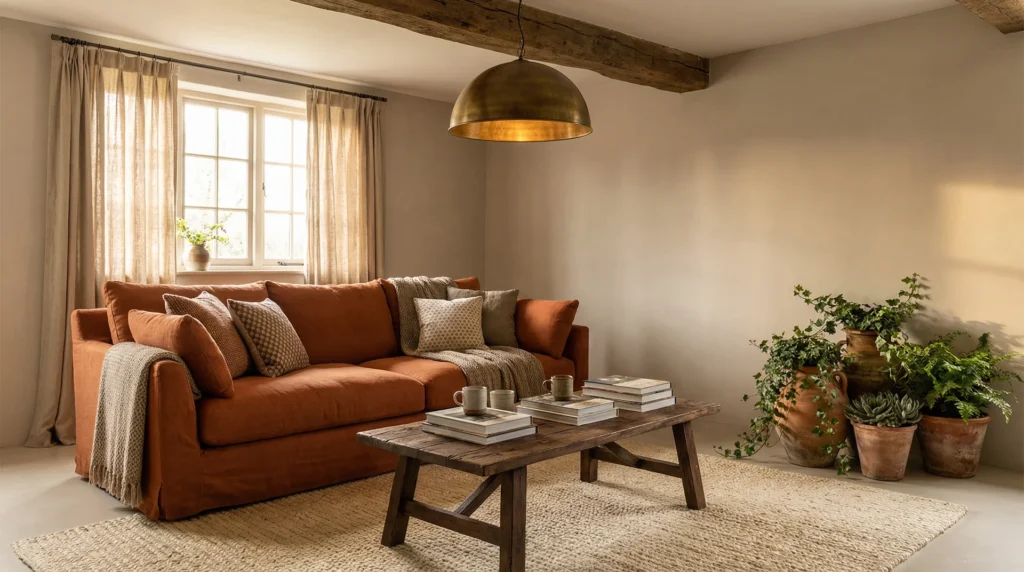
I’ve placed red in everything from tight New York galley kitchens to sprawling open-plan farmhouse spaces. The rooms that worked had one thing in common: the colour had a reason to be there. It anchored something. It made the room feel chosen rather than default.
Pinterest named cherry red its colour of the year for 2025, and the National Kitchen and Bath Association’s 2025 report confirmed burgundy and warm reds moving into mainstream preference as homeowners moved away from grey and all-white.
This is not a micro-trend. Warm, saturated colour in kitchens has real staying power because it solves a problem people are tired of, which is kitchens that feel like showrooms rather than homes.
The Honest Answer to “Will I Regret a Red Kitchen?”
You’ll regret a bad shade. You’ll regret a poor pairing. You almost certainly won’t regret red itself if you go in with a plan.
The most common mistake I see is choosing a red that fights the room’s undertones. A cool-leaning kitchen with grey floors and white marble looks jarring with a warm tomato red. A warm-toned space with oak floors and cream walls can carry almost any red beautifully. The room tells you what kind of red it wants.
On resale: earthy reds and burgundy read as sophisticated in most buyer markets. Bright, saturated reds are riskier, though a high-quality execution in the right kitchen tends to attract buyers rather than put them off. The real liability is poor execution at any colour.
Know Your Red: A Shade-by-Shade Guide for Red Kitchen Ideas
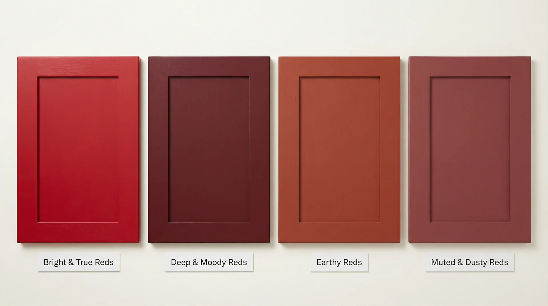
Choosing the wrong shade is where red kitchens go wrong. Everything else, the pairing, the finish, the placement, depends on getting this right first.
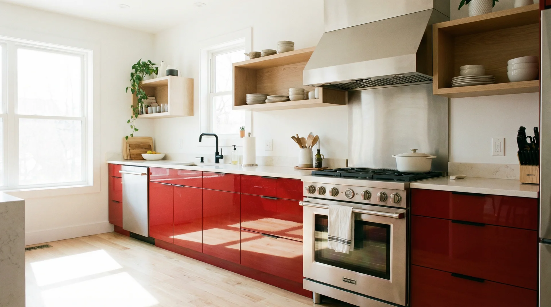
Bright and True Reds for Modern and Contemporary Red Kitchens
These are the reds people picture first, and also the most demanding to use well.
Best for: Modern, contemporary, and mid-century kitchens with generous natural light and clean lines. They look brilliant against white Shaker cabinets, stainless steel appliances, and white quartz countertops.
Harder in: Small kitchens, dark kitchens, and rooms with a lot of warm wood already in play. A bright red in a low-light space can feel relentless by late afternoon.
US paint picks worth sampling:
- Benjamin Moore Caliente AF-290 – a saturated, confident red with balanced warm-cool undertones
- Sherwin-Williams Bolero SW 6870 – slightly deeper, works well on lower cabinets
- Benjamin Moore Vermillion 2002-10 – punchy and modern, best with crisp white surroundings
Pair with: Crisp white walls, warm grey countertops, matte black hardware, or pale natural wood. Keep the surrounding palette genuinely neutral or the red starts competing for attention rather than commanding it.
One 2026 pairing worth noting: red-stained timber cabinetry against a stainless steel range and hood reads as genuinely current and unexpectedly refined. It’s the combination showing up in some of the most interesting kitchen projects right now.
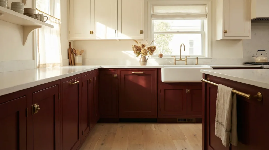
Deep and Moody Reds: Burgundy, Crimson, and Wine Red Kitchen Ideas
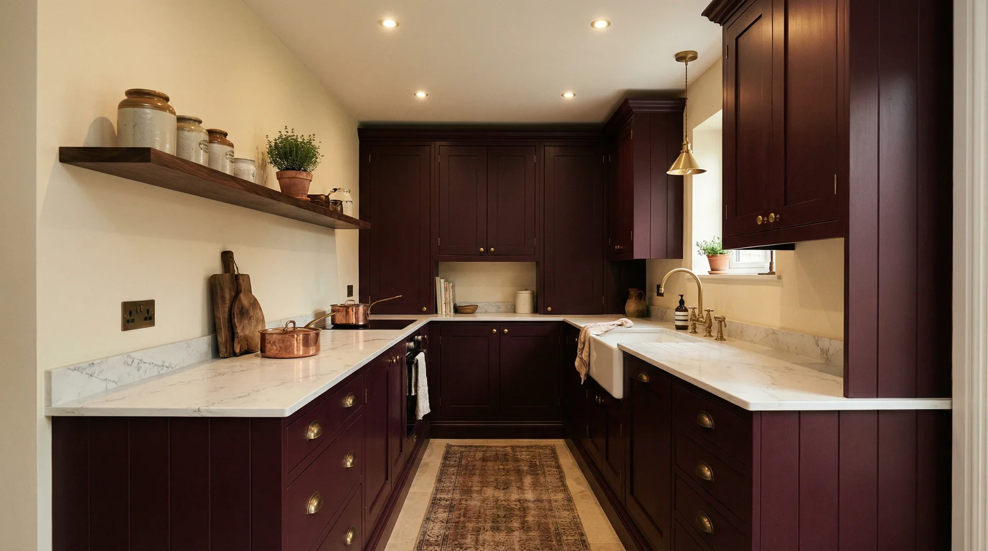
This is the category I recommend most often for homeowners who are drawn to red but nervous about it. Deep reds read as rich and considered rather than bold and risky.
Best for: Traditional, Shaker-style, farmhouse, and transitional kitchens where you want warmth without trend-chasing. These shades perform well in lower light because they absorb rather than reflect, creating a genuinely cosy atmosphere.
The longevity case: Burgundy and deep crimson have appeared in European kitchen design for decades without feeling dated. If trend anxiety is part of your hesitation, this is the shade family to choose.
Pair with: Warm cream walls, unlacquered brass or oil-rubbed bronze hardware, dark walnut shelving, and apron sinks. Avoid cool grey with these reds; the undertone clash is subtle, but it makes the whole room feel slightly off.
US paint picks:
- Benjamin Moore Merlot Red 2006-20
- Sherwin-Williams Antique Red SW 0045
- Farrow & Ball Preference Red No. 297 (widely available at US retailers)
Earthy Red Kitchen Ideas: Terracotta, Rusty Red, and Burnt Sienna
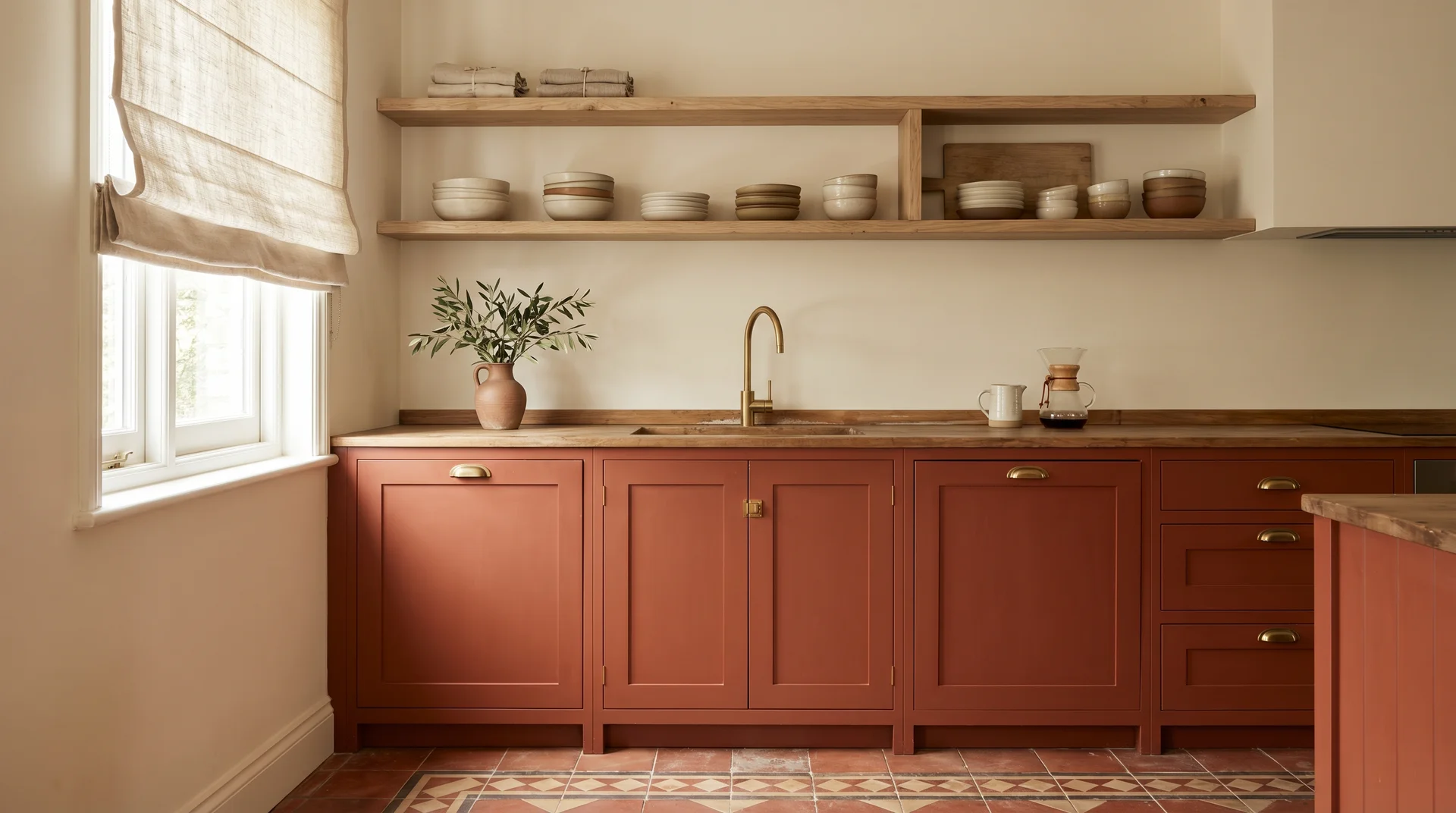
If you want one honest recommendation for 2026 and beyond, it’s this family. Earthy reds sit at the intersection of where interior design is headed, toward warmth, organic texture, and colours that feel grounded rather than performative.
Best for: Almost any kitchen style. Earthy reds work in farmhouse, boho, Mediterranean, transitional, and even certain contemporary kitchens when paired with the right materials.
Why they’re the lowest-risk entry point: They read as a warm neutral to most people at first glance. Guests notice the warmth before they notice the colour.
Pair with: Natural linen textiles, olive green accents, unlacquered brass, raw oak, and terracotta tile floors. These colours share the same warm, slightly dusty undertone, and they make each other look better.
US paint picks:
- Benjamin Moore Tuscan Terra AC-27
- Sherwin-Williams Fired Brick SW 6335
- Clare Paint Desert Dusk — if you want something with more pink warmth
Muted and Dusty Reds: Garnet, Rosewood, and Brick Red Kitchen Ideas
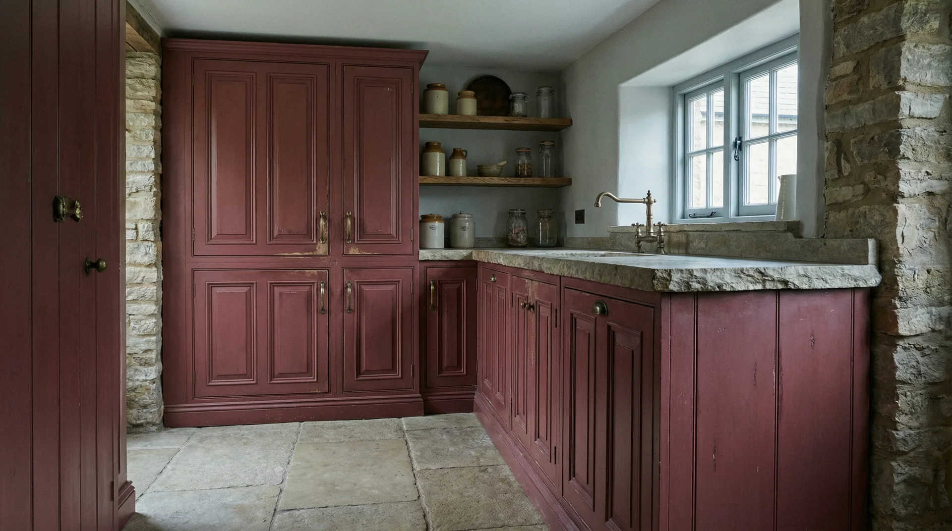
These are for the homeowner who processes design through texture and restraint rather than impact. Muted reds carry grey or brown undertones that soften the colour without dulling it.
Best for: Period homes, cottages, and transitional spaces. They pair beautifully with exposed brick, natural stone, and aged wood. A garnet red cabinet in a stone-floored farmhouse kitchen looks like it was always meant to be there.
How Much Red Do You Actually Want? The Commitment Spectrum!
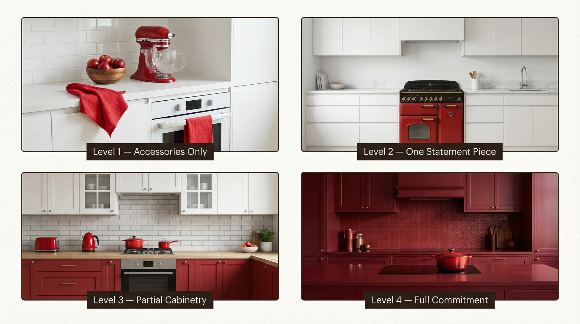
Instead of asking “Do you want a red kitchen?” I ask every client: “Where on this scale do you sit?” It makes the decision immediately clearer.
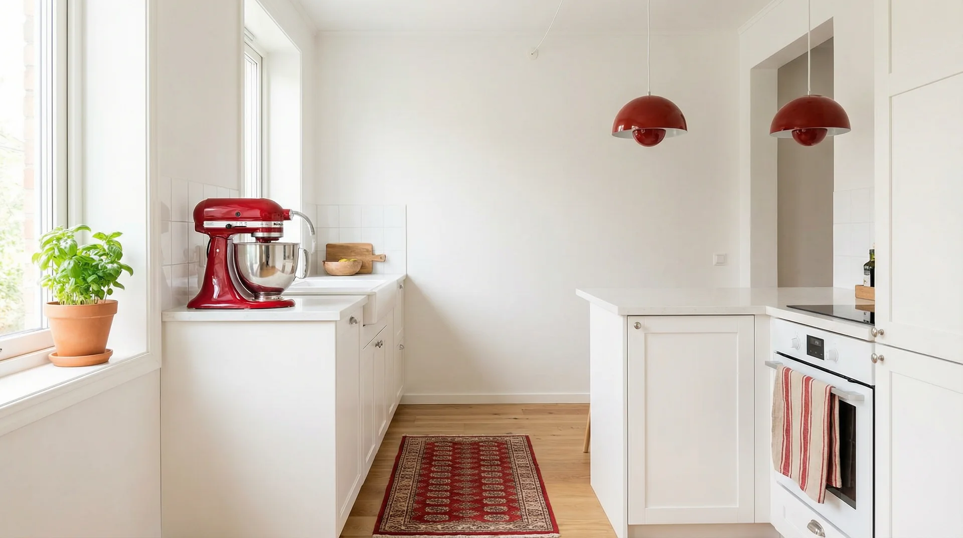
Level 1: Zero Commitment: Red Kitchen Accessories and Textiles
This is the right starting point if you aren’t sure whether you love red in your kitchen or just love the idea of it.
What works at this level:
- A red KitchenAid stand mixer on the counter
- Linen dish towels in terracotta or deep red
- Red bar stools or counter stools, easily reupholstered or sold if you change your mind
- A bowl of red apples as a permanent countertop feature, genuinely effective and genuinely free
- Red pendant lights above an island
- A vintage-style red toaster or kettle
This level gives you warmth and personality. If you try it and want more, that tells you something useful.
Level 2: Low Commitment: One Red Statement Piece in Your Kitchen
This is where the room starts to feel genuinely designed rather than accessorised.
| Statement Piece | Impact Level | Reversibility |
|---|---|---|
| Red range cooker (Smeg, Big Chill, La Cornue) | Very high | Moderate |
| Red retro refrigerator | High | Moderate |
| Red kitchen island only | High | Low |
| Red tile backsplash | Medium-high | Low |
| Red accent wall | Medium | High |
Whatever piece you choose, it becomes the only statement. Neutral cabinets, simple hardware, quiet countertops. The statement piece earns its attention only when the room doesn’t compete with it.
Level 3: Medium Commitment: Partial Red Kitchen Cabinetry
This is the approach I recommend for most homeowners who want a genuinely red kitchen without the full-room commitment.
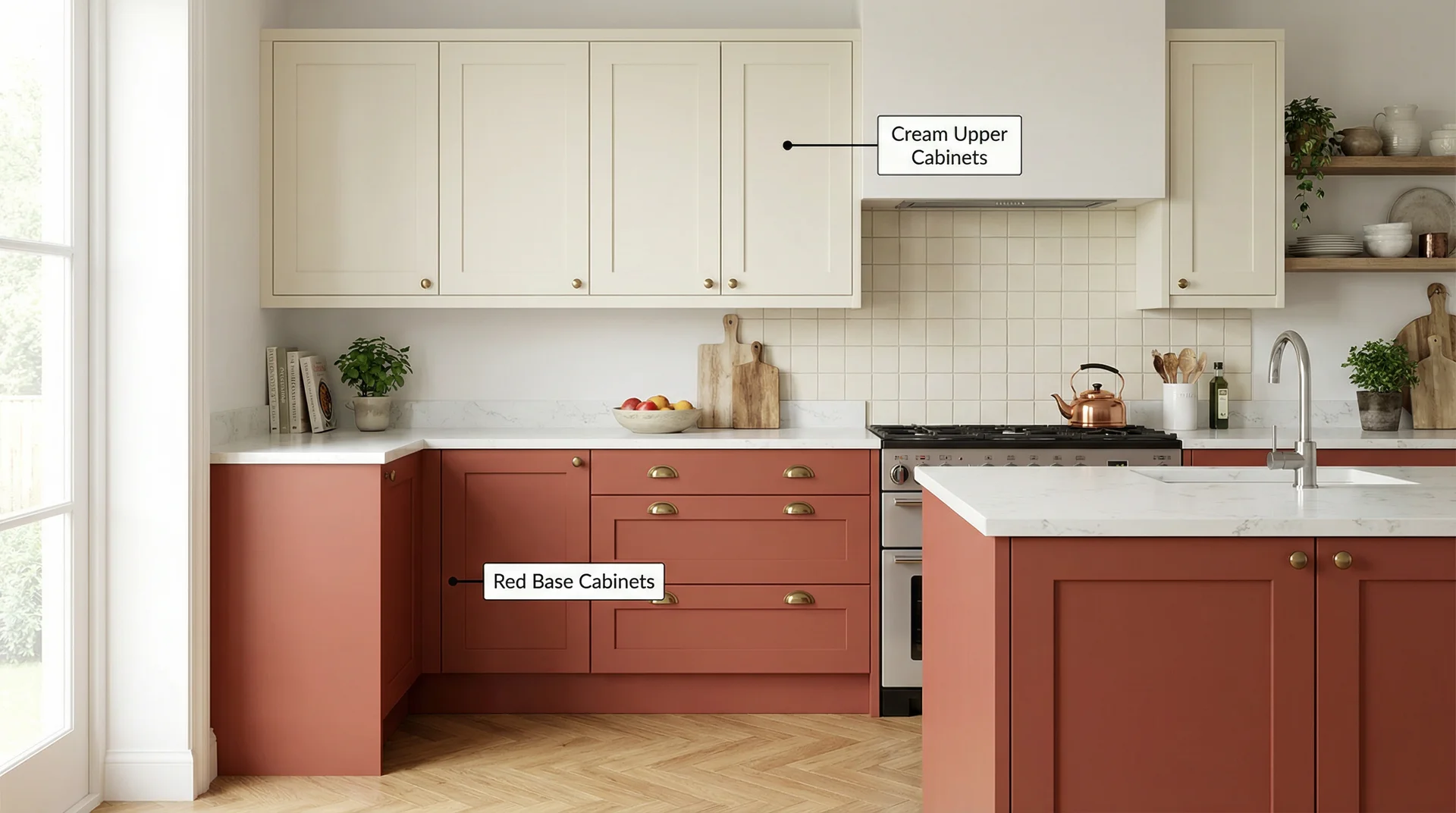
The two-tone strategy: Paint your base cabinets red and keep the uppers white, cream, or a soft neutral. The eye reads the lower cabinets as a grounding colour and the uppers as a lightening element, so the room feels balanced. Painting the island red and leaving the perimeter cabinetry neutral works well as an alternative, particularly in open-plan kitchens.
Finish guidance:
- Gloss lifts dark reds in lower-light kitchens and makes the colour feel intentional rather than heavy
- Matte is more forgiving of imperfect cabinet surfaces and reads as more contemporary
- Satin sits between both and works in most contexts
Level 4: Full Commitment: The All-In Red Kitchen and Colour Drenching
Full red kitchens work. They work less often than partial applications, but when they’re right, they’re extraordinary.
One technique worth knowing at this level is colour drenching: painting cabinets, walls, ceiling, and trim all in the same red or very close tones. It sounds like too much. In the right space, it creates a cocooning atmosphere that you can’t achieve any other way. It works beautifully in deep burgundy or muted terracotta; I’ve never seen it succeed in a bright primary red without becoming overwhelming.
When a fully red kitchen works well:
- Kitchens with good natural light from at least one large window
- Rooms with ceiling heights of 9 feet or above
- Spaces where the red is a deep or earthy tone rather than a bright primary
- Layouts where white ceilings and light floors create top-and-bottom relief
My rule for full-commitment red: keep the ceiling white and the floor light. Those two decisions alone prevent a full red kitchen from feeling like a room you want to leave. Keep countertops in white quartz, cream marble, or pale wood regardless of what you do with the cabinets and walls.
What Colors Go With a Red Kitchen?
Classic Red Kitchen Color Pairings and Why They Work
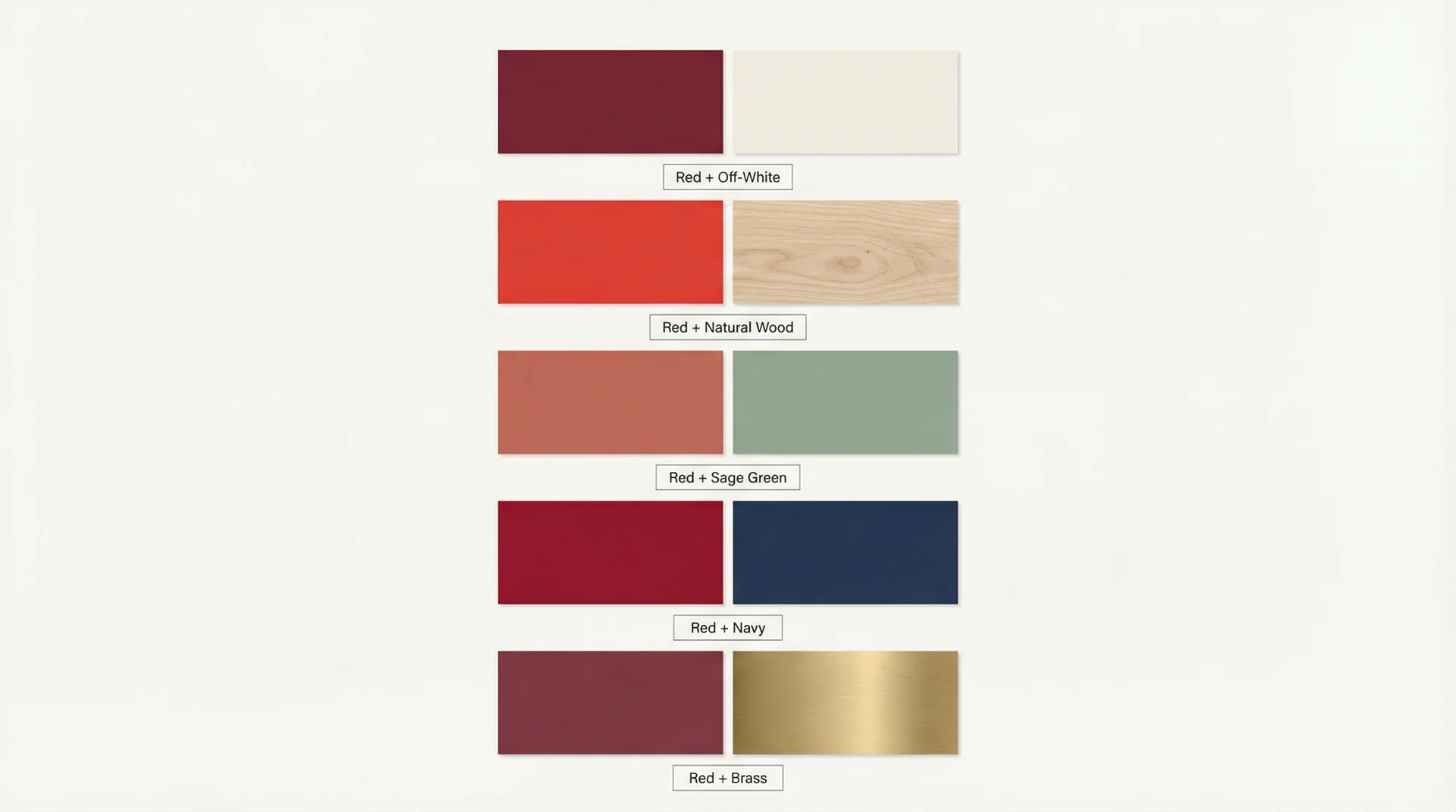
White and off-white work because they do the opposite of what red does. Red advances visually; white recedes. The contrast gives each colour room to exist without competing. Off-white and cream make the red feel richer rather than harsher.
Natural wood grounds red in a way no other material does. It shares the warm spectrum without matching the red exactly. Light oak softens bright reds; darker walnut deepens wine and burgundy tones.
Grey works with red when you match undertones carefully. Warm grey with warm red, cool grey with a red that has blue-purple undertones like wine or cranberry. Mismatching undertones here is one of the most common things I see go subtly wrong in kitchen colour schemes.
Unexpected Red Kitchen Color Pairings Designers Actually Recommend
Sage green and red is the pairing I get the most pushback on from clients and the most compliments on after completion. They sit opposite each other on the colour wheel, which means they create contrast without clashing. Keep the sage muted and dusty rather than bright.
Navy and red is high drama done well. It works best in larger kitchens and needs generous white on the walls, ceiling, and countertops to prevent the room from feeling sealed.
Brass hardware is the finishing element that makes any red kitchen feel intentional. The warm gold of brass against deep red reads as genuinely considered rather than accidental. It’s the detail that separates a red kitchen that looks designed from one that looks like a mistake.
What Not to Pair With Red in Your Kitchen
Avoid cool silver or chrome hardware with warm reds. The undertone clash is subtle but persistent and makes the room feel like two different colour schemes sharing a space. Go brass, copper, or oil-rubbed bronze instead.
Avoid multiple competing bold colours. Red works as the dominant statement. Add cobalt tile, green paint, and yellow accessories together and you’ve built a room that fights itself. Red needs quiet supporting characters.
Avoid high-gloss finishes on walls in a full-red kitchen. The reflections amplify the saturation and make the room feel intense in a way that gets tiring. Gloss on cabinets is fine; gloss on walls in a fully red room is usually too much.
Avoid anything glitzy or sparkly with red. Mirrored splashbacks, glitter grout, and metallic wallpapers behind red cabinetry date very quickly and make the red look cheap rather than confident.
Red Kitchen Ideas by Kitchen Style
Red in a Modern or Contemporary Kitchen
Contemporary kitchens give you the most latitude with bright and saturated reds because the clean lines and minimal decoration provide the neutral frame that bold colour needs.
What works:
- High-gloss, handleless red cabinets against white or concrete walls
- A red island in an otherwise all-white space, where the contrast is the design
- A deep red paired with matte black fixtures and stainless steel for a more editorial feel
The finish matters enormously in contemporary spaces. A satin or semi-gloss red on flat-fronted cabinets looks designed. A matte red on the same profile can look underpowered. Test both before committing.
Red in a Farmhouse or Shaker-Style Kitchen
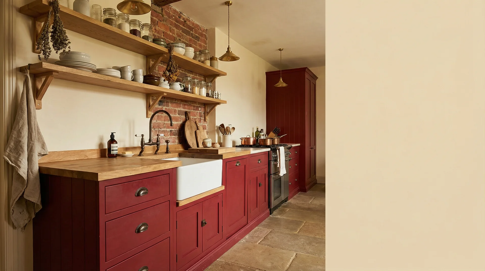
Shaker cabinets and red are a genuinely great combination. The Shaker door profile is simple enough to carry bold colour without the colour overwhelming the cabinetry’s character.
What works:
- Deep crimson or burgundy on Shaker fronts with cream uppers
- Rusty red or terracotta on lower cabinets with a Belfast sink and exposed shelving
- A red range cooker as the room’s anchor against white or sage Shaker cabinets
For farmhouse red, use oil-rubbed bronze or unlacquered brass hardware. Black hardware works with brighter reds in more contemporary farmhouse spaces, but reads as too harsh against the earthy reds that suit traditional farmhouse kitchens.
Red Kitchen Ideas for Small Kitchens
Small kitchens and red can coexist beautifully with specific decisions.
Use earthy or muted reds rather than bright saturated ones. The more orange or blue-leaning a red is, the more it advances visually, which makes small spaces feel smaller. A dusty terracotta or muted garnet sits in the space rather than pushing at its walls.
Apply red in small kitchens strategically:
- A red island or peninsula only, with white or cream perimeter cabinets
- A red backsplash with completely neutral everything else
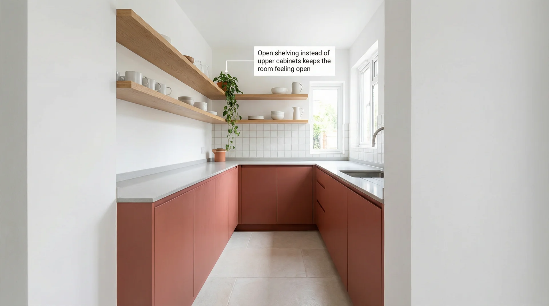
- Red base cabinets with open shelving above instead of upper cabinets, which opens the room dramatically
A gloss or satin finish in a small red kitchen helps, too. The light reflection makes small spaces read as slightly larger and prevents the red from feeling heavy.
Red in a Traditional or Period Home
Period homes are possibly the most forgiving context for red. Cornicing, ceiling roses, original skirting boards, and stone floors all provide the neutral weight that keeps a deep red from taking over.
Use garnet, rosewood, or deep plum-red in a matte or eggshell finish. The easiest application: paint the dresser or freestanding larder unit in a deep red and leave everything else in cream or white. The red anchors the room to its architecture in a way that feels like it was always planned that way.
Practical Red Kitchen Questions
Does a Red Kitchen Affect Resale Value?
It depends on execution rather than the colour. A well-executed red kitchen in earthy or deep tones with quality materials and thoughtful pairing appeals to a wide range of buyers. A poorly executed bright red kitchen with mismatched metals and cheap finishes puts buyers off, though so would the same poor execution in any other colour.
If resale is a real concern, earthy reds and burgundy are the safest choices. They read as warm and considered to most buyers rather than bold and polarising.
Is Red a Good Color for a Kitchen With Low Natural Light?
Deep earthy reds, burgundy, and muted terracotta absorb lower light and create a warm, intimate atmosphere rather than fighting the darkness. Bright, saturated reds need natural light to read correctly; in low light, they look brownish and flat rather than rich.
Compensate with warm-toned under-cabinet lighting and pendant lights with warm-white bulbs in the 2700K to 3000K range. Any red kitchen can glow beautifully at night with the right lighting.
How Do I Stop My Red Kitchen from Looking Like a Fast Food Restaurant?
The fast food association comes from specific combinations: bright primary red plus white, plus yellow or orange, plus cheap materials. Avoid that combination, and you avoid the association. Quality of shade, quality of finish, and quality of the surrounding palette do all the work.
| Sophisticated Red Kitchen | Jarring Red Kitchen |
|---|---|
| Muted or deep red | Bright primary red |
| Matte or satin finish | High-gloss walls |
| Natural stone or wood countertops | Laminate or bright white plastic |
| Brass or oil-rubbed bronze hardware | Bright chrome hardware |
| Warm white walls | Stark cool white walls |
| One consistent shade of red | Multiple competing shades of red |
Can Renters Add Red to a Kitchen?
Yes, with more options than most people realise.
Renter-friendly ideas that need no paint:
- Peel-and-stick backsplash tiles in red or terracotta, removable and genuinely effective
- Red bar stools or counter stools
- A red stand mixer, kettle, or toaster on the counter
- Red open shelving brackets, removable when you leave
- A vintage red rug in front of the sink
- Red linen curtains at a kitchen window
- Red ceramic pendant lampshades, where you swap the shade and keep the fitting
The same styling principle applies at any commitment level: choose one category to anchor in red and let everything else stay neutral. Even in a rented white kitchen, a red KitchenAid and three red textiles create a kitchen with a real personality.
Where to Start With Red Kitchen Ideas If You’re Still Not Sure
Start with one earthy red accessory, something small you can buy today and live with for two weeks. A red Le Creuset on the counter, a terracotta bowl, a set of linen napkins. Pay attention to how you feel every time you walk in. Warmer, or unsettled?
Most people feel warmer. The ones who feel unsettled usually discover they want a different shade of red rather than no red at all.
From there, move up the commitment spectrum only when the previous level feels like it’s not quite enough. That’s the framework that gets most homeowners to a red kitchen they love rather than one they second-guess.