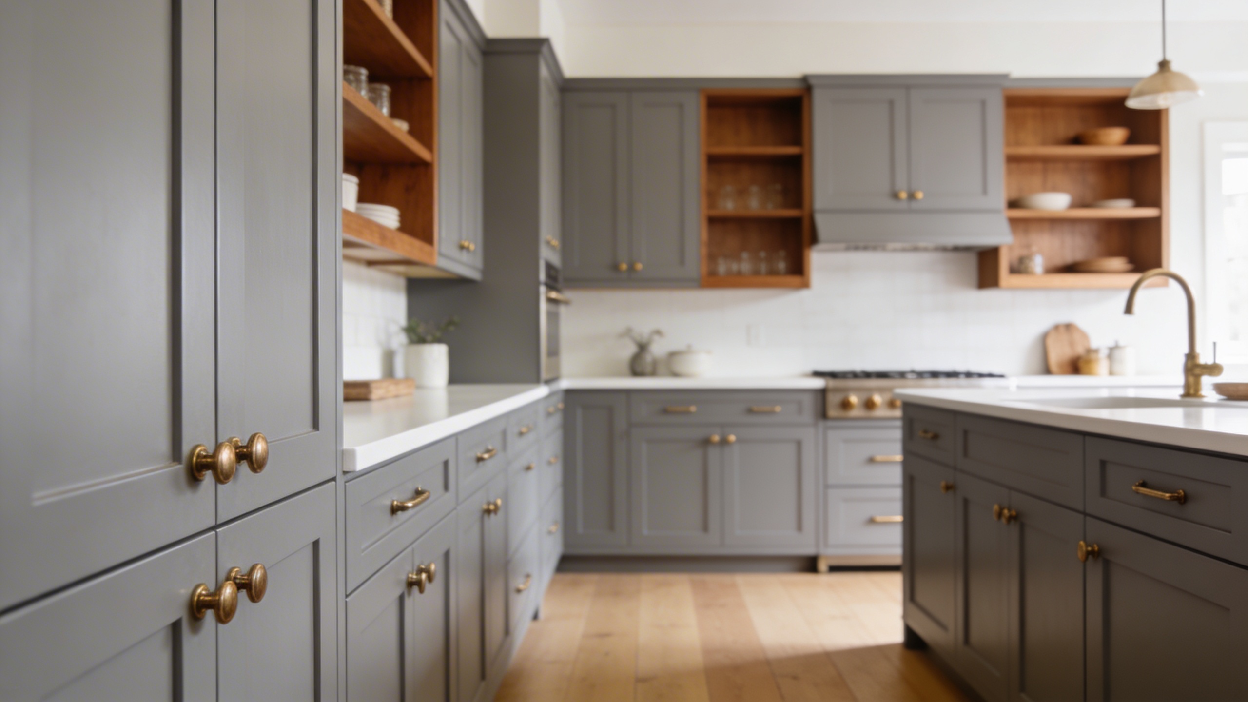

When I first started working as a design consultant, grey cabinets were just beginning to edge out the all-white kitchen as the go-to choice. A decade later, grey has held its ground, and I think it always will.
People fall in love with a grey cabinet, bring it home, and then spend weeks second-guessing every other color decision in the room. The walls feel off, the countertop looks muddy, and the whole kitchen feels heavier than they imagined.
So, to answer the question, the best colors to pair with grey kitchen units include white, navy blue, sage green, warm cream, matte black, brass tones, and terracotta, among others. The right choice depends entirely on the undertone of your specific grey and the mood you want the kitchen to carry.
I have pairings organized by style and mood, a splashback guide, and a style matching reference so you can find the combination that actually works for your space.
Once you’ve landed on your color, the practical side of where to apply it, what to avoid, and how to test it before committing is covered in our guide on how to use colors in a grey kitchen.
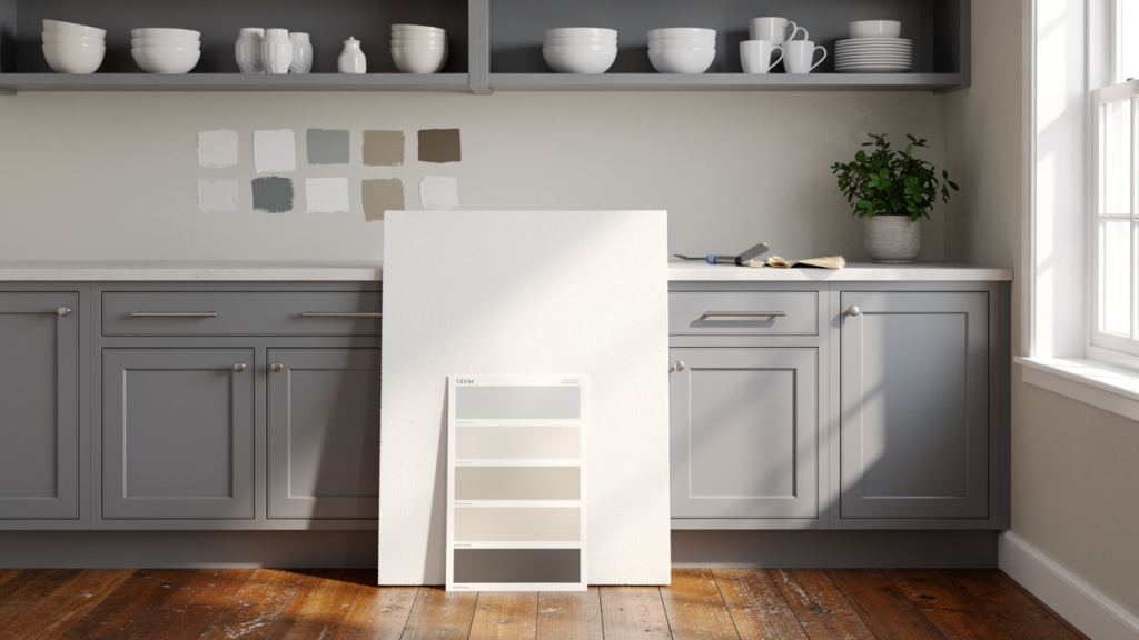
First, Identify Your Grey’s Undertone (This Changes Everything)
Walk up to your grey cabinet door and hold a plain white piece of paper right next to it. Look carefully at what your grey does in comparison to that white.
- If your grey pulls slightly blue or green, you have a cool grey
- If it looks a little tan or brownish next to the white, you have a warm grey, sometimes called greige
- If it just looks grey with no obvious lean, you have a neutral grey, and you have the most flexible starting point of all three
Undertone is the most misunderstood factor in kitchen color pairing. During my years as an independent styling advisor, I worked with a client in Austin who had chosen a beautiful warm greige cabinet for her kitchen remodel.
She then painted her walls a crisp, cool white because it looked fresh on the paint chip. The combination gave her kitchen a slightly dingy, unresolved quality that she couldn’t quite name.
We repainted the walls in a soft warm ivory, and the entire space clicked into place within an afternoon.
The undertone of your grey essentially sets the temperature of your kitchen, and every color you bring in needs to either match that temperature or contrast it intentionally.
| Your Grey Type | What It Feels Like | Colors That Work Best |
|---|---|---|
| Cool Grey (blue/green undertone) | Sleek, modern, crisp | Crisp white, navy, teal, forest green, black |
| Warm Grey/Greige (brown/yellow undertone) | Cozy, soft, inviting | Cream, warm beige, terracotta, brass, caramel wood |
| Neutral Grey (no obvious undertone) | Balanced, versatile | Almost anything, giving you the widest range |
Beyond undertone, the depth of your grey also shapes your choices:
- Light greys like dove or mist tend to feel airy and work beautifully in smaller kitchens where you want to preserve a sense of openness.
- Dark greys like charcoal or slate carry more visual weight and suit larger kitchens where you want drama and presence.
Kitchen orientation – Always factor in which direction your kitchen faces before buying a single pot of paint.
- A north-facing kitchen will make almost any grey pull cooler and heavier than a paint chip suggests.
- A south-facing kitchen with strong natural light can handle darker greys and deeper accent colors that would feel oppressive elsewhere.
17 Colors that Go with Grey Kitchen Units
Classic Choices
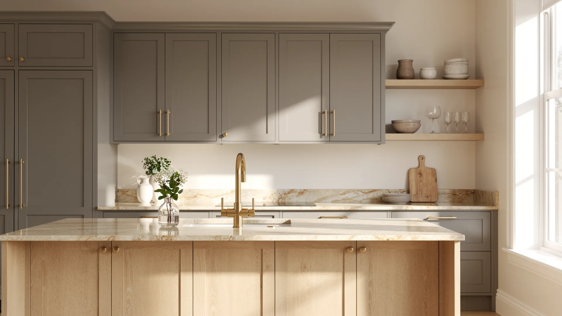
1. Crisp White
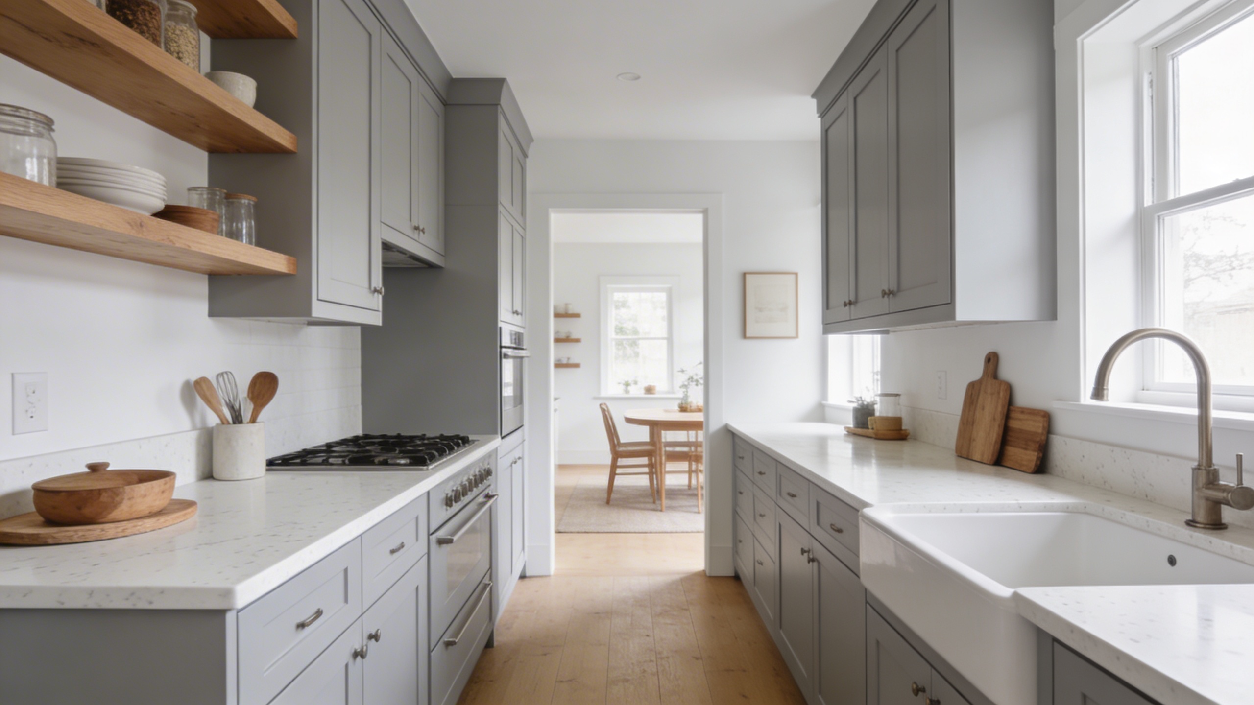
White and grey is the pairing I’ve specified more than any other in my career, and I still reach for it without hesitation when a client wants something clean, bright, and enduring.
It adapts beautifully to the architecture around it rather than competing with it, reading as Scandinavian in a minimal space, traditional in a shaker-style kitchen, and modern in a flat-front one.
The detail most guides skip is that almost every grey carries a hidden purple or violet undertone that a bright cool white will amplify.
I’ve watched clients paint their walls a crisp cool white next to a warm greige cabinet and end up with a kitchen that reads faintly lavender in afternoon light. Matching the temperature of your white to the specific undertone of your grey prevents this entirely.
If you’re having cabinets professionally sprayed and matching the grey to a specific paint brand for your walls, confirm which lacquer system your painter uses.
Benjamin Moore’s colorant system doesn’t replicate exactly in other manufacturers’ lacquers, and a color match can look noticeably different once both surfaces are dry and side by side.
- Best grey match: Cool, warm, and neutral, but the white must be chosen to match the grey’s temperature
- Best for: Walls, countertops, backsplash tiles, open shelving
- Style it suits: Scandinavian, minimalist, traditional, modern farmhouse
- Pair it with: Warm white walls, natural wood open shelving, brushed nickel or brass hardware
- Pro tip: If your grey has a purple undertone, reach for a white with a very slight yellow base like Benjamin Moore White Dove. It neutralizes rather than amplifies.
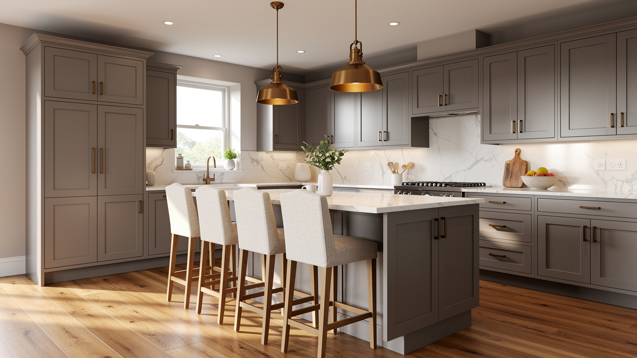
2. Matte Black
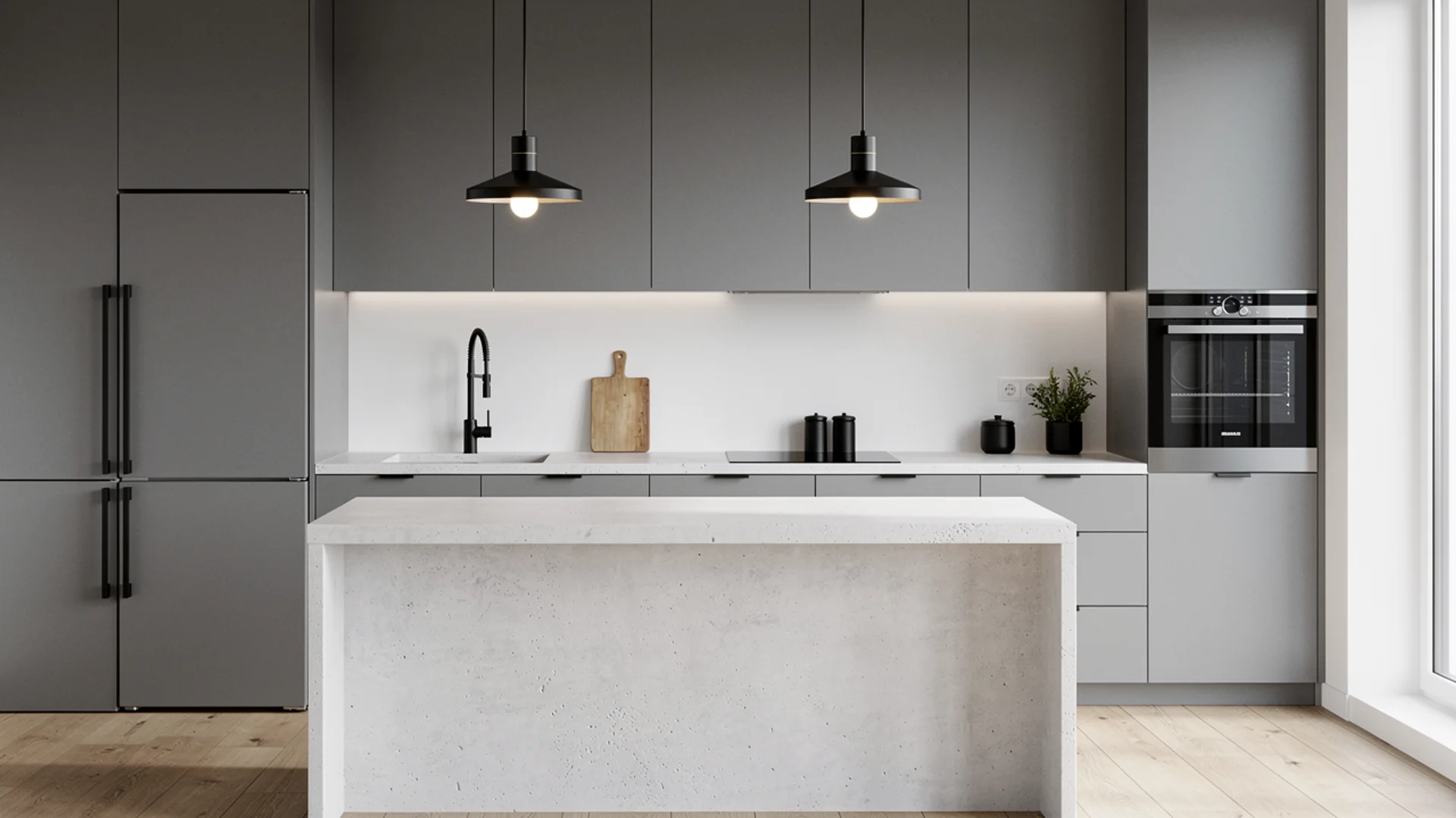
Black in a grey kitchen sounds bold on paper and looks completely considered in person. The reason it works is contrast. Grey is a middle-ground color by nature, and black gives it something definitive to lean against. The result feels intentional and sharp rather than safe.
Matte black performs best in cool grey kitchens where you want to lean into the sleek, modern quality of the space. In a warm greige kitchen, black still works but needs balancing with warmer elements like wood shelving or brass fixtures to keep the combination from reading too stark.
- Best grey match: Cool and neutral grey
- Best for: Cabinet hardware, faucets, pendant lighting, appliances, window frames
- Style it suits: Industrial, contemporary, modern
- Pair it with: Concrete or white quartz countertops, flat-front cabinetry, integrated appliances
- Pro tip: Matte black shows water spots and fingerprints significantly more than brushed finishes. In a high-use kitchen, brushed black or gunmetal gives you the same visual effect with far more practicality.
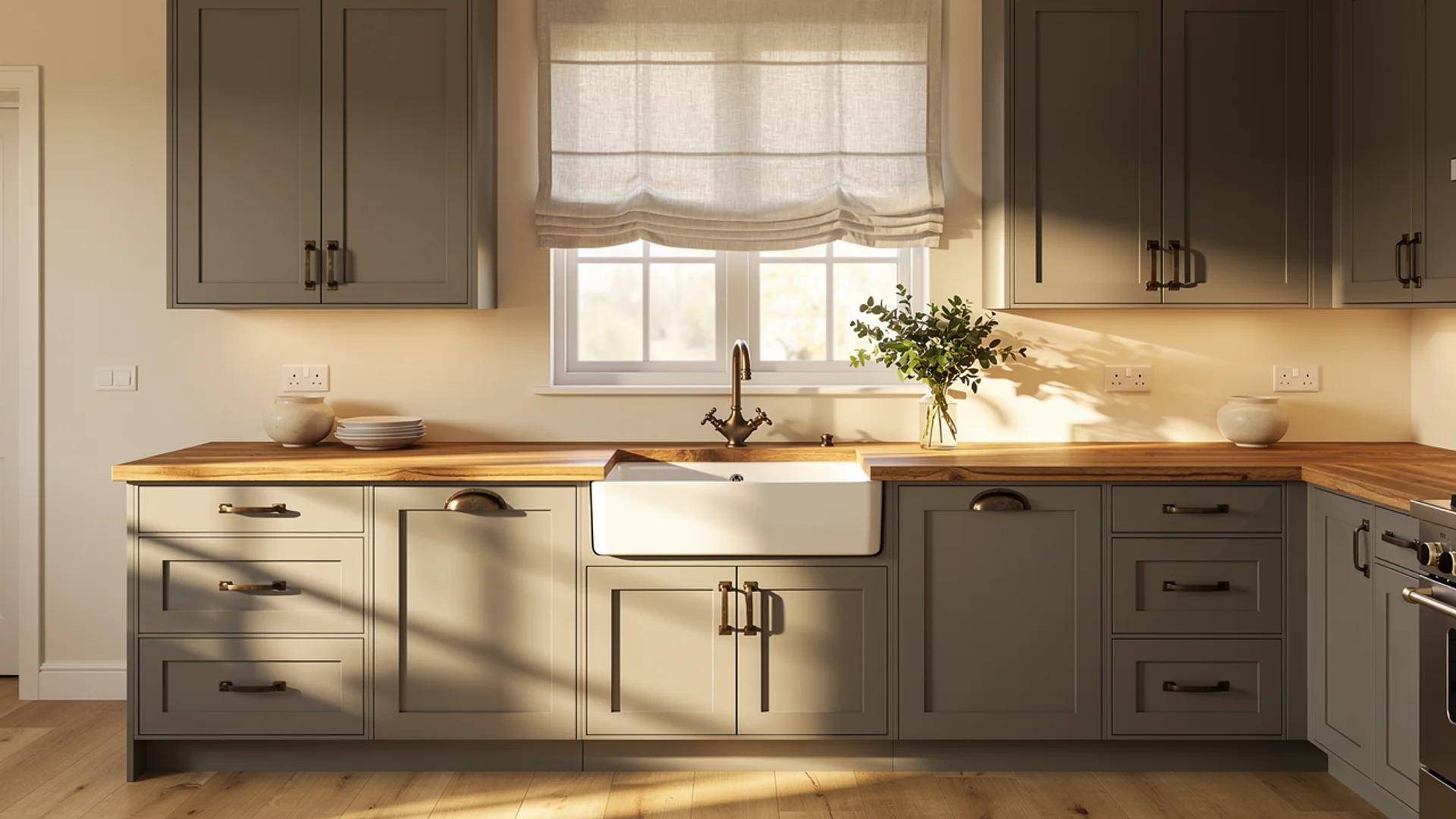
3. Soft Cream/Ivory
Cream is what I reach for when a client says their grey kitchen feels too cold or too clinical. It adds warmth without introducing a color that competes for attention, and it does it in a way that feels organic rather than forced.
I’ve used it most successfully in older homes where the architecture already carries warmth, and in newer builds where the client wants to introduce a sense of lived-in comfort.
Cream also acts as a bridge between grey cabinets and natural wood elements. If you’re planning a butcher block countertop or open wooden shelving, cream ties those warmer materials to the grey cabinetry in a way that white sometimes struggles to.
- Best grey match: Cool and neutral grey
- Best for: Walls, countertops, upper cabinets in a two-tone setup, backsplash tiles
- Style it suits: Transitional, farmhouse, traditional, cottage
- Pair it with: Warm wood accents, linen textiles, aged brass or bronze hardware
- Pro tip: The difference between a cream that looks elegant and one that looks dated is undertone. Stick to creams with a pink or yellow base rather than ones that pull green, which can look yellowed and old under artificial kitchen lighting.
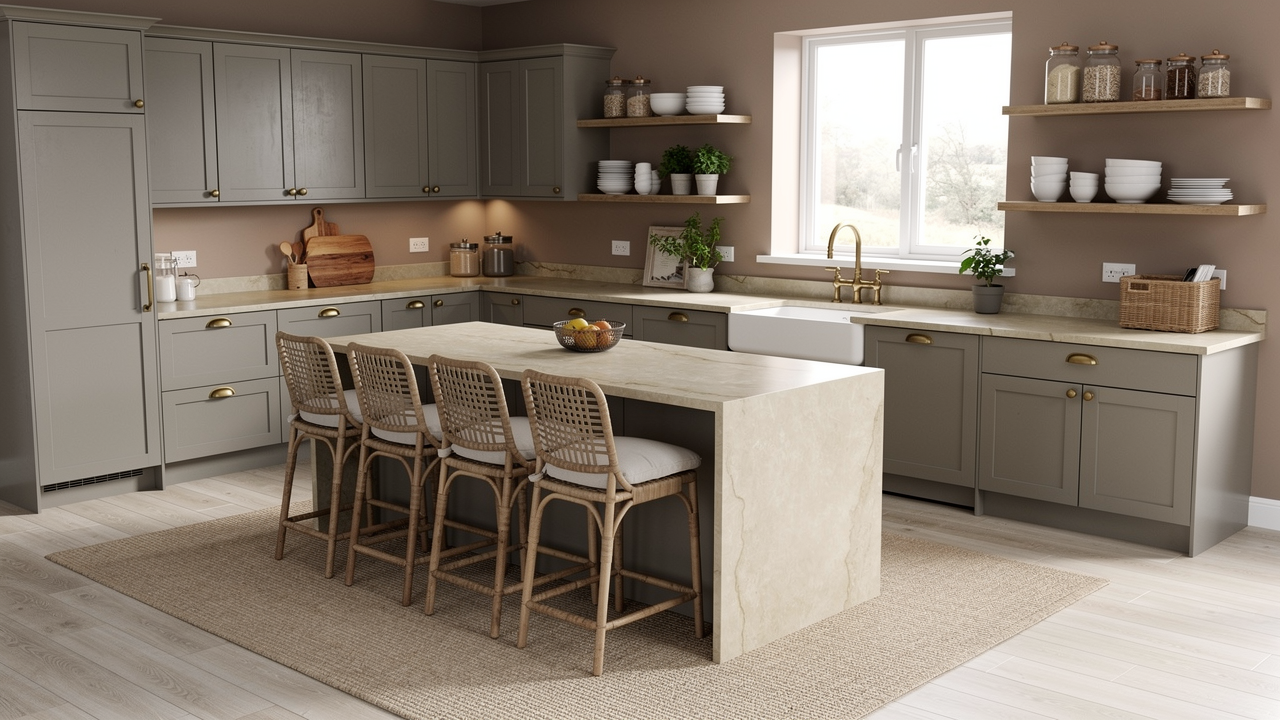
4. Warm Beige/Taupe
Beige gets dismissed as boring, and I’ll admit I thought so too early in my career. Then I started pairing it deliberately with warm grey cabinets and watching how grounded and liveable those kitchens felt compared to spaces chasing trendier combinations.
Taupe sits in interesting territory between grey and beige, and that shared tonal language is exactly what makes them work together so naturally.
The layered, tonal quality this pairing produces needs texture to come alive. Woven bar stools, a linen roman shade, or a jute rug add the tactile dimension that keeps the palette feeling rich rather than flat.
- Best grey match: Warm and neutral grey only. Against cool blue-grey, beige can read muddy.
- Best for: Walls, flooring, textiles, natural material accents
- Style it suits: Farmhouse, transitional, country, traditional
- Pair it with: Natural linen, warm wood flooring, unlacquered brass hardware, stone countertops
- Pro tip: Taupe walls with grey cabinets work best when there’s a clear value difference between the two. If your grey and your taupe are too close in depth, the kitchen loses definition. One should be noticeably lighter than the other.
Cool and Serene Choices
5. Navy Blue
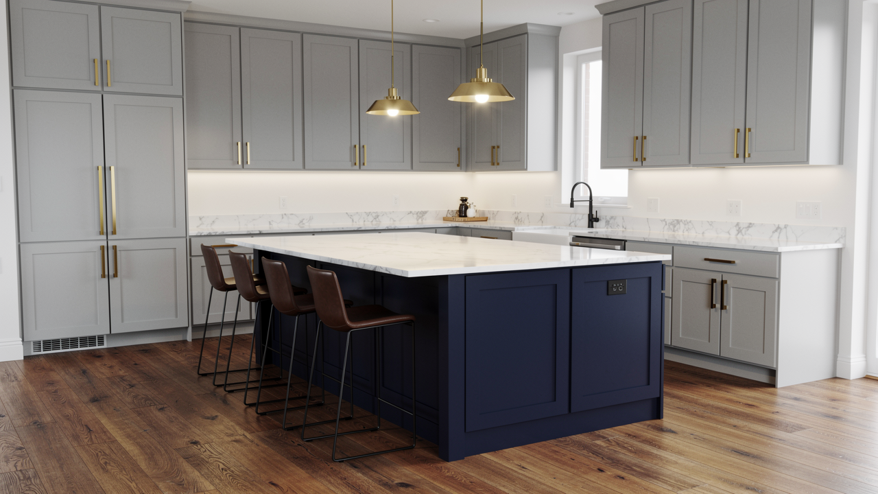
Navy blue looks like a risk and lives like a classic. I’ve specified it as an island base color against light grey perimeter cabinets more times than I can count, and it delivers every time.
What makes the pairing work is that both colors share a cool, composed quality, but navy brings a depth and richness that grey alone cannot achieve.
The trio of light grey, navy, and brass hardware is one of my most-reached-for combinations for clients who want a contemporary kitchen with genuine character.
The brass introduces warmth that keeps the cool palette from feeling cold, and that balance is what makes the whole thing land.
- Best grey match: Light and mid-tone cool or neutral grey
- Best for: Island base, lower cabinets in a two-tone setup, bar stools, feature wall
- Style it suits: Contemporary, nautical, traditional, transitional
- Pair it with: Brass or gold hardware, white or light marble countertops, warm wood flooring
- Pro tip: Navy reads very differently under warm versus cool lighting. Always test your chosen navy under the actual bulb temperature in your kitchen before committing. Under warm 2700K lighting, some navies pull almost purple.
6. Powder Blue
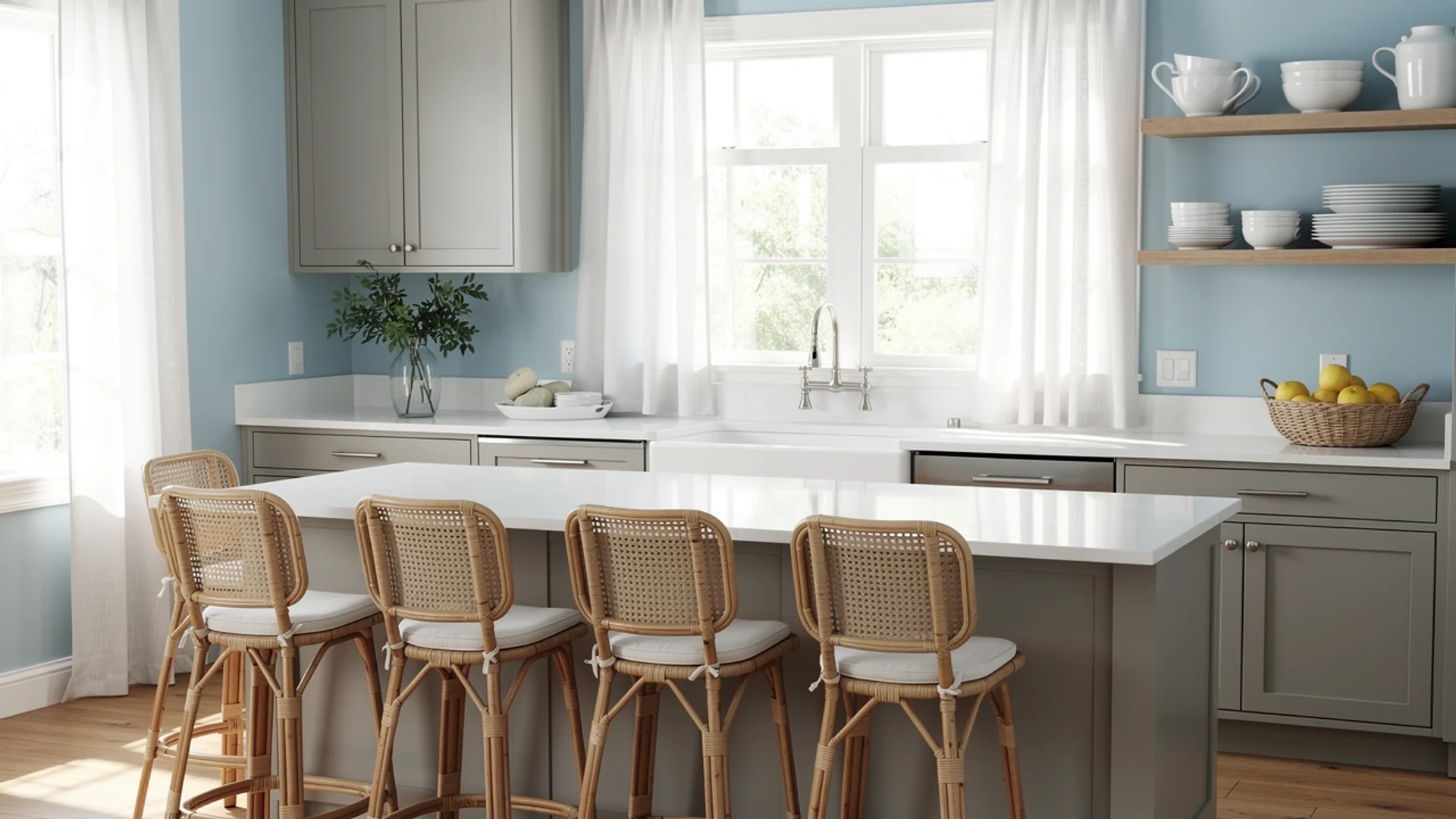
Where navy brings depth and drama, powder blue brings lightness and ease. It works particularly well in kitchens with strong natural light or in homes where that relaxed, airy quality feels right.
Against grey, it reads as calm and considered rather than bold, and it’s the kind of pairing that makes a kitchen feel like a genuinely pleasant place to spend time in. Keep the rest of the palette simple with this one.
Powder blue doesn’t need much help, and overworking the palette around it dilutes the very quality that makes it appealing.
- Best grey match: Light cool or neutral grey
- Best for: Walls, an accent cabinet, textiles, bar stools
- Style it suits: Coastal, cottage, Scandinavian
- Pair it with: White countertops, natural rattan or cane accents, brushed nickel hardware, simple linen window treatments
- Pro tip: Powder blue is highly sensitive to lighting. In a north-facing kitchen with limited natural light, it can read grey-blue and lose its warmth entirely. Test it in the actual space across morning and evening light before deciding.
7. Teal
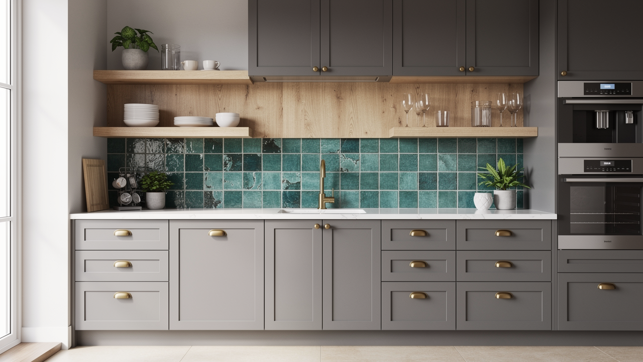
Teal occupies interesting middle ground between blue and green, which gives it a versatility that neither color has on its own. Against grey cabinets it adds energy and personality without tipping into colors that exhaust you after six months.
I’ve used it most successfully as a backsplash color in grey kitchens, particularly in encaustic or handmade-style tiles where the variation in tone gives the color depth and movement.
If you’re nervous about committing to teal on a large surface, introduce it through textiles or a single painted open shelving unit first. It has a way of anchoring a grey kitchen and giving it a focal point that the space often needs.
- Best grey match: Cool and neutral grey. Against warm greige, the contrast can feel disconnected.
- Best for: Backsplash tiles, accent cabinetry, textiles, small appliances
- Style it suits: Contemporary, eclectic, maximalist
- Pair it with: White or light grey countertops, brass hardware, natural wood accents to warm the palette
- Pro tip: Teal tiles with natural grout variation will look entirely different from a flat teal paint. Sample the actual tile material rather than a painted swatch, because texture changes color perception significantly.
8. Sage Green
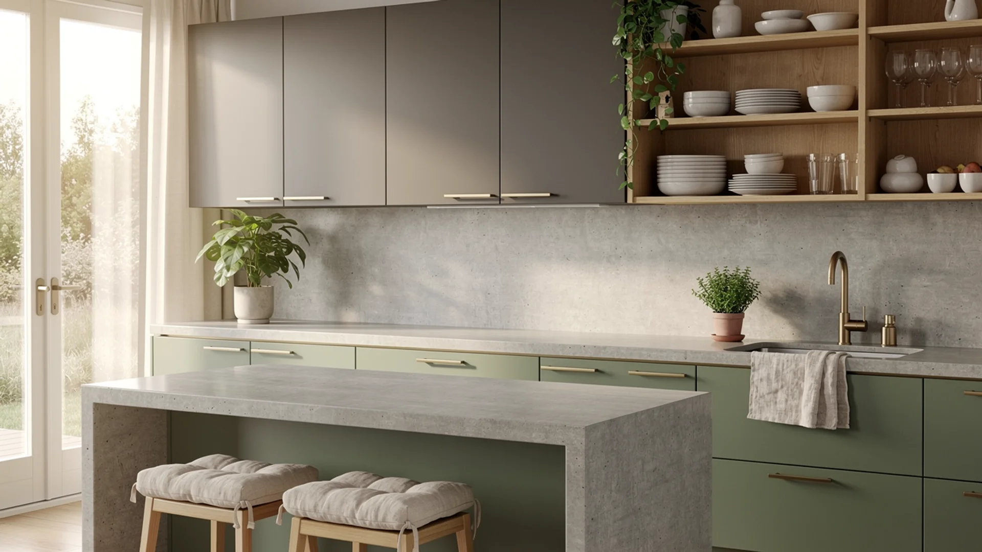
Sage green has had a significant moment over the last few years, and having worked with it across a range of projects I understand why completely. It brings the natural world into a kitchen in a way that feels subtle and sophisticated rather than literal.
Against grey cabinets, the two colors share an earthy, muted quality that makes them sit together comfortably without either one fighting for dominance.
Sage green also performs unusually well in two-tone setups. I’ve specified it on lower cabinets with warm grey uppers, and the combination reads as layered and considered rather than busy.
It’s one of the few accent colors that holds its own against grey at cabinet scale without needing the restraint of a single wall or island.
- Best grey match: Warm and neutral grey
- Best for: Walls, second cabinet color in a two-tone setup, open shelving backs, backsplash tiles
- Style it suits: Organic modern, farmhouse, transitional, country
- Pair it with: Warm wood tones, linen textiles, brushed brass hardware, stone or concrete countertops
- Pro tip: Sage green has a wide tonal range and some shades pull strongly yellow or strongly blue depending on the light. The versions that sit in the true grey-green middle, like Farrow and Ball’s Mizzle or Benjamin Moore’s Saybrook Sage, work most reliably with grey cabinets because they share the grey’s muted, desaturated quality.
9. Forest Green/Emerald
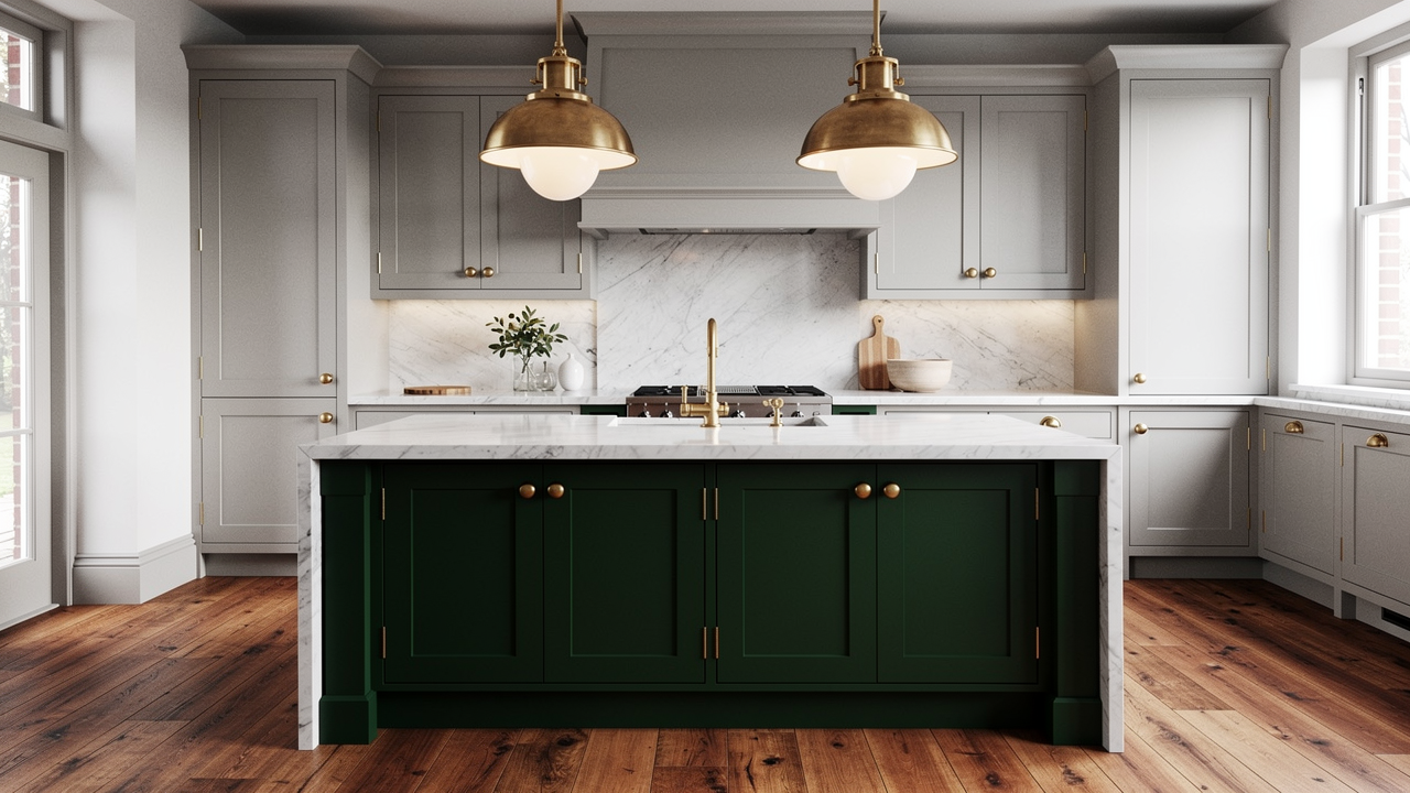
Forest green and emerald are for the client who knows exactly what they want and isn’t looking for permission to want it.
Against light grey cabinets, a deep forest green island or lower cabinet brings a level of drama and sophistication that most other color choices cannot match.
The grey provides the restraint that keeps the green from feeling overwhelming, and the green gives the grey the richness and depth it sometimes lacks on its own.
Hardware selection carries unusual weight with this pairing. Brass or unlacquered gold is the finish I always reach for here because the warmth of the metal softens the contrast between the two colors and prevents the combination from feeling too heavy.
- Best grey match: Light and mid-tone grey. Dark grey with dark green can collapse into each other and lose definition.
- Best for: Island base, lower cabinets, a pantry door, feature wall
- Style it suits: Maximalist, traditional, contemporary, heritage
- Pair it with: Unlacquered brass hardware, white or cream upper cabinets, marble or stone countertops, warm wood flooring
- Pro tip: Aim for at least a 20-point difference in LRV between the two cabinet colors so the two-tone effect reads clearly rather than muddying together in low light.
Warm and Bold Choices
10. Mustard Yellow
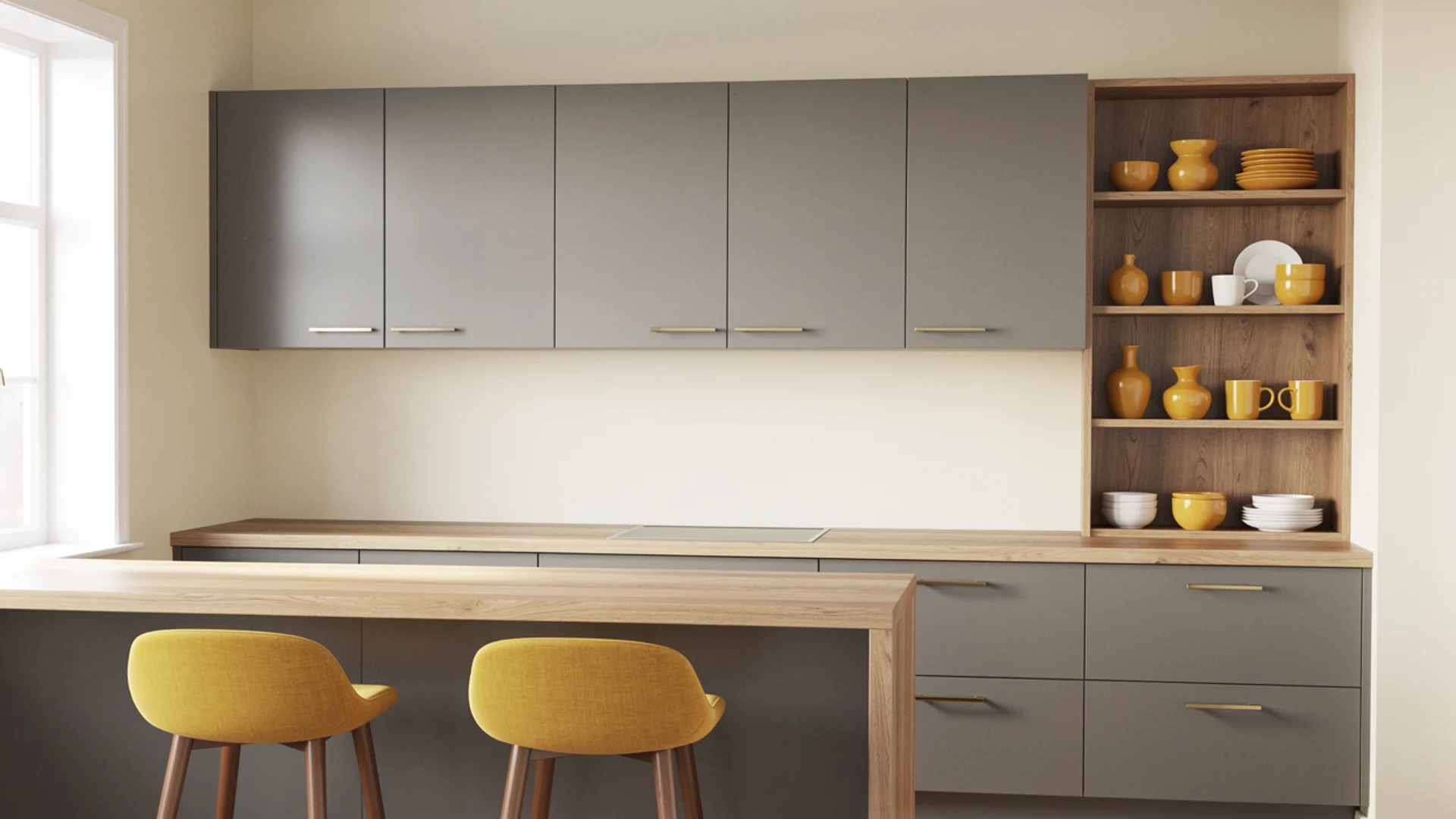
Mustard yellow is a color I approach with both enthusiasm and caution, because the gap between a mustard that elevates a grey kitchen and one that overwhelms it comes down entirely to saturation and placement.
The shades that work best lean toward ochre or amber rather than the brighter, almost neon yellows. These deeper, more complex yellows carry enough warmth to lift a grey kitchen without making the whole space feel like it’s vibrating.
The restraint principle applies firmly here. Grey cabinets, white or cream walls, natural wood, and then mustard as the one deliberate pop of warmth. That discipline is exactly what makes it land rather than overwhelm.
- Best grey match: Warm and neutral grey
- Best for: Bar stools, a single accent wall, textiles, small appliances, pottery
- Style it suits: Retro, eclectic, mid-century modern
- Pair it with: Warm white or cream walls, natural wood countertops or shelving, matte black or antique brass hardware
- Pro tip: Mustard yellow and cool blue-grey is a genuinely difficult combination because the warm-cool contrast is too stark without a bridging neutral. If your cabinets lean cool, introduce a warm wood or cream element first before adding mustard, otherwise the pairing looks unresolved.
11. Blush Pink/Dusty Rose
Blush pink surprises people every time I suggest it for a grey kitchen, and then it surprises them again when they see it work. The combination feels modern and quietly elegant in a way that’s genuinely hard to achieve with more expected color choices.
The key is staying firmly in the dusty, muted end of the pink spectrum because blush and dusty rose already carry enough grey in them to sit comfortably alongside grey cabinets without clashing.
The combination I come back to most often: light grey shaker cabinets, blush walls, white marble countertops, and brushed gold hardware. It has a softness and warmth that feels considered and liveable rather than precious.
- Best grey match: Light and mid-tone cool or neutral grey
- Best for: Walls, soft furnishings, small appliances, decorative ceramics
- Style it suits: Modern, transitional, contemporary
- Pair it with: White marble or quartz countertops, brushed gold hardware, warm white open shelving
- Pro tip: Dusty rose reads very differently in natural versus artificial light. Under warm incandescent or filament bulbs it deepens into a genuine rose. Under cool LED lighting it can pull almost mauve. Check your bulb temperature before finalizing the shade.
12. Terracotta/Burnt Orange
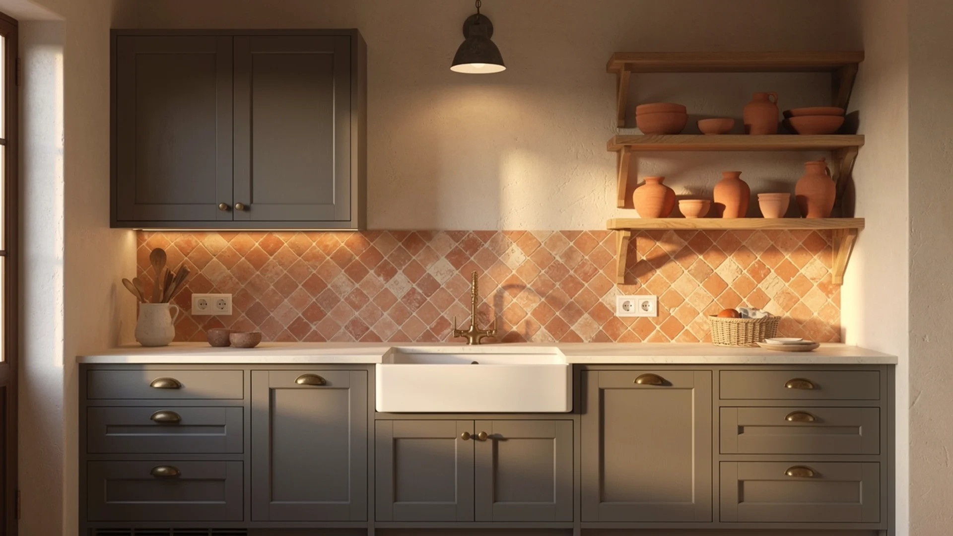
Terracotta is one of my favorite colors to bring into a grey kitchen because it does something most colors cannot: it adds warmth, earthiness, and personality all at once without requiring a full wall of color to make its presence felt.
A terracotta backsplash in handmade zellige or encaustic tiles against grey cabinets creates a rich, layered quality that feels collected and personal rather than designed.
This pairing consistently produces the kind of kitchen that people walk into and immediately want to spend time in, and in my experience that quality is harder to achieve than it sounds.
- Best grey match: Warm and neutral grey
- Best for: Backsplash tiles, pottery, textiles, a single open shelf
- Style it suits: Bohemian, Mediterranean, rustic, eclectic
- Pair it with: Warm wood tones, natural linen, aged brass hardware, cream or warm white walls
- Pro tip: Terracotta tile varies enormously in tone between wet and dry installation. Always ask your tile supplier for a dry sample and view it next to your cabinet door in natural light before ordering, because the fired finish can read significantly more orange or more brown than the showroom display suggests.
13. Burgundy/Deep Red
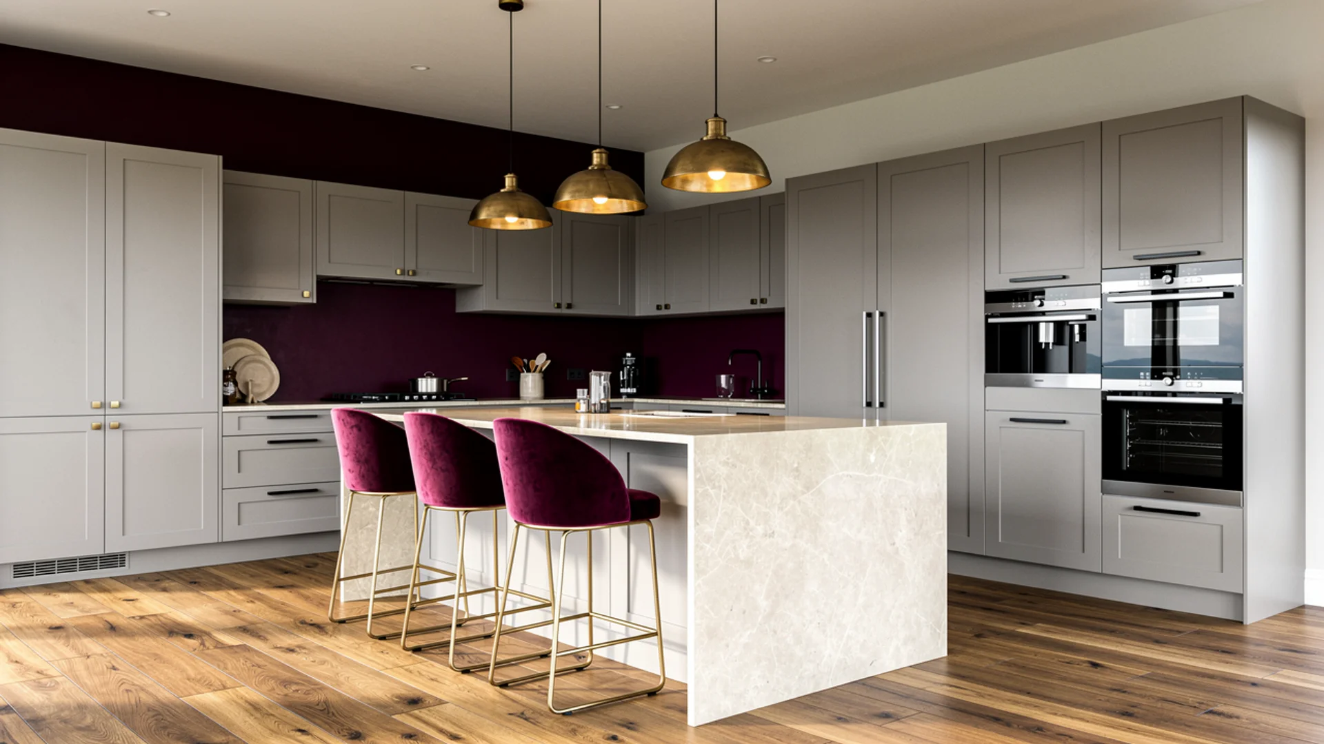
Burgundy requires conviction, and I mean that as a compliment. Clients who choose burgundy for their grey kitchen tend to know their own taste clearly, and the results reflect that confidence.
Against light or mid-tone grey cabinets, burgundy creates a contrast that feels rich and deeply sophisticated, bringing the kind of warmth and drama that anchors a kitchen in an open-plan home particularly well.
Used on a full wall, burgundy can feel heavy in a smaller kitchen. Introduce it first through upholstered bar stools or a statement light fixture to gauge how the depth of color interacts with your specific grey before committing to a larger surface.
- Best grey match: Light and mid-tone grey. Dark grey with burgundy can feel oppressively heavy in smaller spaces.
- Best for: Feature wall, bar stools, textiles, a statement light fixture
- Style it suits: Traditional, maximalist, sophisticated contemporary
- Pair it with: Light grey or white upper walls, natural wood flooring, brass or antique gold accents, stone countertops
- Pro tip: Burgundy with cool blue-grey cabinets can pull slightly purple in certain lighting conditions. If your grey leans cool, choose a burgundy that pulls toward brown rather than blue to keep the combination feeling warm and grounded.
14. Warm Caramel Wood Tones
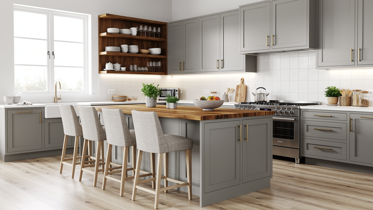
Wood isn’t a paint color, but it’s consistently the single most transformative element you can introduce to a grey kitchen, more so than any paint choice on this list.
Warm caramel wood tones in a butcher block countertop, open floating shelves, bar stool legs, or a contrasting island finish bring an organic warmth that no paint color quite replicates.
Medium-toned woods in caramel, honey, or walnut ranges work best. Very light woods like bleached pine can wash out against lighter greys, and very dark woods like ebony can make the combination feel heavy.
The middle range of warm, golden-toned wood hits a balance that almost always looks right regardless of the grey’s specific undertone.
- Best grey match: Warm, neutral, and even cool grey. Wood is the most forgiving element on this list.
- Best for: Countertops, open shelving, island base or legs, flooring, bar stools
- Style it suits: Organic modern, Scandinavian, transitional, farmhouse
- Pair it with: Matte or satin grey cabinets, brass or brushed gold hardware, linen or cotton textiles
- Pro tip: Wood undertone matters as much as wood tone. Yellow-based woods like pine or light oak can clash with cool grey cabinets. Red-based woods like cherry can feel too warm against greige. Walnut, with its balanced brown undertone, is the most reliable wood choice across the widest range of grey types.
Sophisticated Neutrals
15. Charcoal (Grey-on-Grey)
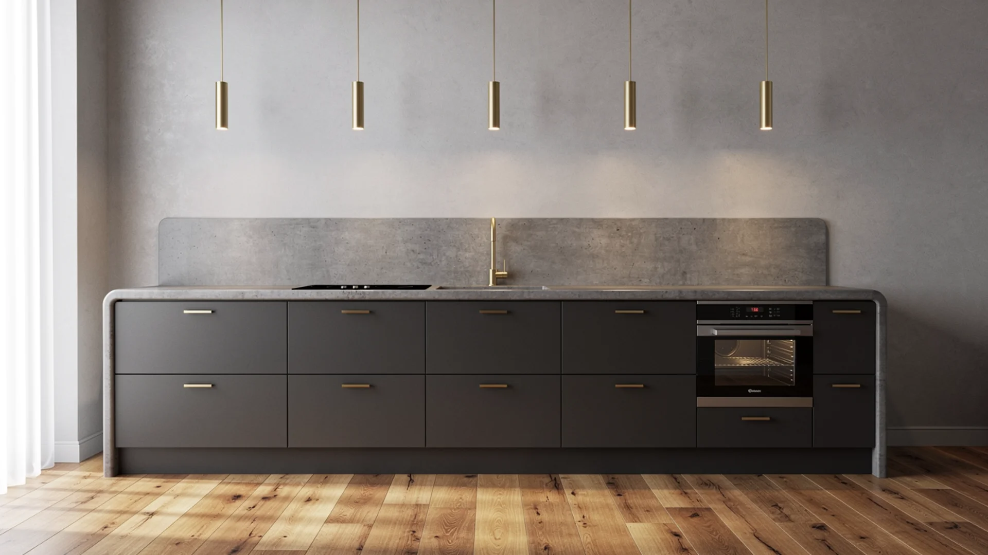
A monochromatic grey kitchen is one of the most sophisticated directions you can take a space, and also one of the most commonly done poorly.
The difference between one that feels layered and intentional and one that feels flat and unresolved comes down almost entirely to variation in tone, texture, and finish.
There’s a specific technique worth knowing here, sometimes called a color wash effect, where you use the same grey on both the cabinets and walls but in different finishes: matte on the walls and satin on the cabinets.
As natural light moves through the kitchen throughout the day, the two surfaces catch and reflect it differently, creating the impression of two distinct but harmonious tones from a single color. The depth you get from finish variation alone consistently surprises clients.
This is also where LRV becomes worth understanding. A charcoal grey with an LRV below 40 will absorb light in a north-facing kitchen in a way that makes the space feel smaller and heavier than intended.
If your kitchen doesn’t receive strong natural light, keep your darkest grey at a mid-tone and use finish variation to create depth instead of going full charcoal.
- Best grey match: Works as the primary color, paired with lighter grey secondaries
- Best for: Layering across cabinets, walls, countertops, and flooring in varying depths and finishes
- Style it suits: Contemporary, minimalist, industrial
- Pair it with: Warm wood flooring or open shelving, brass hardware, warm-toned pendant lighting to anchor the palette
- Pro tip: Test your grey samples on large foam boards painted with two full coats rather than directly on the wall. The existing wall color beneath skews your perception of the undertone. Moving foam boards around the kitchen at different times of day gives you a far more accurate read of how the color will actually behave.
16. Brass/Gold Accents
Brass deserves its own entry because it functions differently from every other color on this list. It doesn’t live on walls or countertops in most kitchens.
It lives in the details, and in a grey kitchen, those details carry an enormous amount of visual weight. Brass hardware on grey cabinets adds warmth, depth, and a sense of quality that even expensive matte black hardware doesn’t quite replicate.
There’s a richness to brass against grey that I’ve come to rely on consistently in projects where the client wants their kitchen to feel elevated without being flashy.
Unlacquered brass, which develops a natural patina over time, is my personal preference in this pairing because it softens with age in a way that feels lived-in and genuine rather than showroom-perfect.
- Best grey match: Warm and neutral grey. Against very cool blue-grey, brass can look slightly disconnected unless a warm secondary element bridges the two.
- Best for: Cabinet pulls and knobs, faucets, pendant light fixtures, shelf brackets, tap fittings
- Style it suits: Contemporary, transitional, maximalist, traditional
- Pair it with: Warm wood accents, cream or greige walls, stone countertops with warm veining
- Pro tip: Mixing brass with one other metal finish, like brushed nickel on appliances, is generally fine. Mixing brass with three or more different metal finishes in the same kitchen starts to feel unresolved. Decide on brass as your primary decorative metal and let everything else follow from that.
17. Greige
Greige is the most quietly reliable color on this entire list and almost never makes a dramatic statement, which is entirely the point.
In a grey kitchen where the goal is warmth and cohesion rather than contrast, greige on the walls creates a seamless tonal environment that feels genuinely comfortable to live in day after day.
It bridges the gap between grey cabinetry and warmer natural materials in the space, like wood flooring or linen bar stools, in a way that feels effortless rather than engineered.
I tend to recommend it most often to clients who are remodeling a kitchen in a home they plan to stay in for a long time, because the best background colors are the ones you stop noticing after a while.
They make everything else in the room look better without drawing attention to themselves.
- Best grey match: Warm and neutral grey. Cool blue-grey with greige can feel slightly unresolved unless the greige pulls strongly toward grey rather than beige.
- Best for: Walls, upper cabinets in a two-tone setup, flooring
- Style it suits: Transitional, traditional, farmhouse, contemporary
- Pair it with: Warm wood tones, stone or quartz countertops, linen or cotton textiles, unlacquered brass or bronze hardware
- Pro tip: The greige shades that work best with grey cabinets are the ones that lean gray-forward rather than beige-forward. A greige that pulls too warm can make a cool grey cabinet look slightly purple by contrast. Benjamin Moore Pale Oak and Accessible Beige by Sherwin-Williams both sit in a reliable middle ground.
What Color Splashback Goes with Grey Kitchen Units?
The splashback is the question I get asked most often after hardware, and it deserves a direct answer rather than being buried in surface-by-surface notes.
Grey kitchen units give you an unusually wide range of options here because the cabinets themselves don’t demand attention. The splashback can afford to do the work.
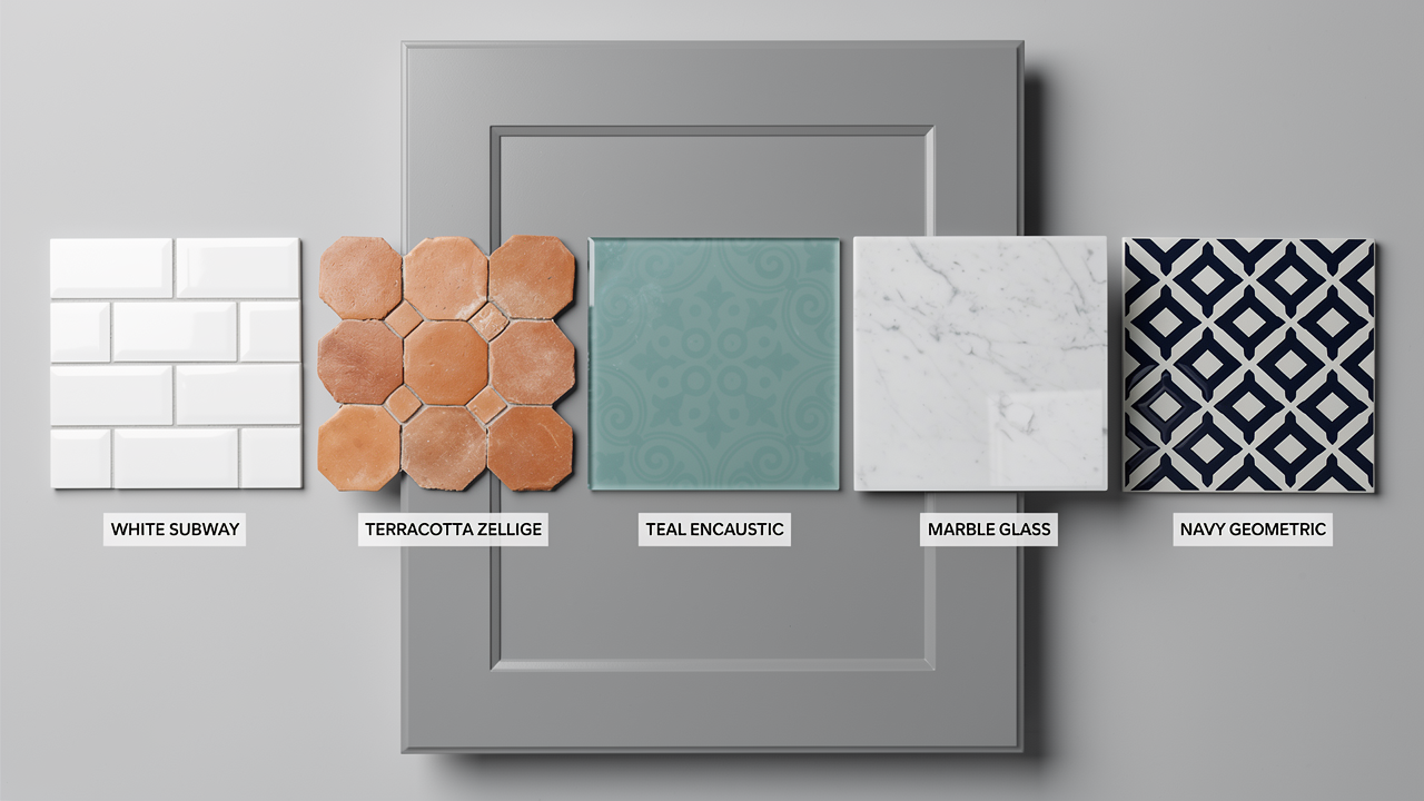
White subway tile is the most popular choice and the safest, producing a clean result in almost any grey kitchen. If you want more personality without full commitment, consider:
- Terracotta or warm-toned zellige against warm grey or greige cabinets for a Mediterranean feel
- Teal or sage green encaustic tile against cool or neutral grey for earthy contrast
- A natural stone slab in marble or quartzite that carries the grey palette into a more luxurious register
- Deep navy or forest green metro tile against light grey cabinets where you want depth on the wall rather than a second cabinet color
- Glossy white or smoked glass tile in contemporary kitchens where the goal is to reflect light and keep the eye moving
One rule which applies across all splashback choices is that grout color matters as much as tile color.
A warm ivory grout reads entirely differently from a cool white grout on the same tile. Always test the grout color alongside the tile and the cabinet door together, not in isolation.
Matching Colors to Your Kitchen’s Style (Quick Reference)
Before you commit to any pairing from the list above, step back and look at the bigger picture of your kitchen’s overall style direction.
The clients who struggle most with color decisions are the ones choosing individual colors in isolation rather than building toward a coherent style story.
| Kitchen Style | Grey Type That Works Best | Primary Color Pairing | Supporting Elements | What Makes or Breaks It |
|---|---|---|---|---|
| Scandinavian | Light cool or neutral grey | Crisp white | Light wood, simple hardware, minimal accessories | Clutter breaks the whole aesthetic. Less is genuinely more here. |
| Industrial | Dark cool grey or charcoal | Matte black | Concrete countertops, steel appliances, exposed shelving | Needs at least one warm element like wood to avoid feeling cold |
| Modern Farmhouse | Warm grey or greige | Soft cream or sage green | Shaker cabinets, farmhouse sink, open shelving | Hardware choice matters enormously. Brass elevates it, chrome cheapens it. |
| Contemporary | Light to mid cool grey | Navy blue or forest green | Marble or quartz, integrated appliances, brass accents | Proportion of the accent color. Too much navy or green overwhelms the grey. |
| Coastal | Light cool or neutral grey | Powder blue or teal | Natural rattan, white countertops, linen textiles | Avoid anything too polished or lacquered. Natural textures carry the style. |
| Bohemian | Warm or neutral grey | Terracotta or mustard yellow | Handmade tiles, mixed metals, layered textiles, plants | Needs grounding. Without a consistent neutral base, it tips into chaos. |
| Traditional | Warm grey | Burgundy, cream, or navy | Wood flooring, stone countertops, classic hardware profiles | Cabinet door profile matters as much as color. Flat fronts undermine the style. |
| Organic Modern | Warm neutral grey | Sage green or caramel wood | Stone surfaces, linen, matte ceramics, indoor plants | Finish matters more than color here. Everything should be matte or natural. |
Your kitchen’s fixed elements matter as much as your style preference. The flooring, the window size, the ceiling height, and the direction your kitchen faces all shape which colors will actually work in your specific space.
A palette that looks stunning in a south-facing open-plan kitchen can feel heavy and cold in a north-facing galley. Always filter style inspiration through the physical reality of your room.
Frequently Asked Questions
What color walls go with grey kitchen units?
Warm white, soft cream, greige, sage green, navy, and powder blue all work well. Match the wall color temperature to your grey’s undertone, and aim for at least a 15 to 20 point LRV difference between the two surfaces.
Do grey and beige go together in a kitchen?
Yes, particularly when your grey has a warm or neutral undertone. Ensure there’s enough value contrast between the two so the kitchen retains structure. Cool grey with beige can read muddy; swap to cream instead.
Does a grey kitchen go with wood floors?
Yes, it’s one of the most successful combinations in kitchen design. Medium-toned woods in honey, caramel, or walnut work best across the widest range of grey types. Warm wood floors ground a grey kitchen in a way no paint color replicates.
How do I make my grey kitchen feel warmer?
Introduce warm wood tones, switch to brass hardware, choose cream or greige for walls, and layer in natural textiles. Warm-toned pendant lighting at 2700K to 3000K makes an immediate difference to how the grey reads in the evening.
What countertop color goes with grey kitchen units?
White quartz or marble works across all grey types. Warm-veined stone suits warm grey or greige cabinets particularly well. Butcher block or warm wood countertops work with any grey and are the fastest way to add warmth if the kitchen feels cold.
Summing Up
Know your grey’s undertone, respect the temperature relationship between your colors, and let the grey do what it does best, which is hold everything together quietly while the colors around it do the talking.
The combinations that work best in real kitchens are rarely the ones that look most impressive on a mood board.
They’re chosen with an understanding of the specific room: its light, its size, its fixed elements, and the way the people living in it actually use the space.
If you’ve tried one of these pairings in your own grey kitchen, share your experience in the comments below.