
You’ve probably saved a few photos of rooms painted in Sherwin-Williams Alabaster (SW 7008). It turns up everywhere, farmhouse kitchens, serene primary bedrooms, the kind of open-concept living area that makes you stop scrolling and screenshot the whole thing.
It looks effortless every time, which is exactly why you’re reading this instead of just buying a gallon and going for it. You’ve been burned before. You picked a white that looked perfectly soft on the chip, and it landed on your walls looking vaguely yellow, or strangely dingy, or simply nothing like what you had in mind.
That fear is worth taking seriously. The wrong white doesn’t just fail to deliver what you pictured. It makes everything around it feel like it’s fighting the room.
In ten years of paint consulting, working across residential projects from single-room refreshes to full home repaints, I’ve watched people agonize over whites more than any other color. The reason is simple: white shows everything it’s placed next to, and a wrong choice becomes impossible to ignore.
This article tells you what Alabaster actually is, how it behaves across different lighting conditions and surfaces, how it compares to the whites already on your shortlist, and, just as importantly, when to skip it.
By the end, you’ll know whether your space is a good match for this color before you’ve opened a single can.
What Color is Alabaster White Paint?
Alabaster is a warm, soft off-white that sits between true white and cream without fully committing to either. It doesn’t read as stark or clinical. It doesn’t pull toward beige. In most rooms, it reads as white, but with a quality of warmth that plain white simply doesn’t carry. That warmth is what makes rooms feel finished and settled rather than freshly painted.
The most searched version is Sherwin-Williams Alabaster SW 7008, and that’s the focus of this review. Alabaster exists as a name across other brands.
Benjamin Moore OC-129 carries a faint pink tilt, and Dunn-Edwards DEW310 pulls more beige, so if you’ve seen the name in different paint stores, you’re looking at different colors. The Sherwin-Williams version is the one driving most design conversations, and the one most people mean when they say “Alabaster.”
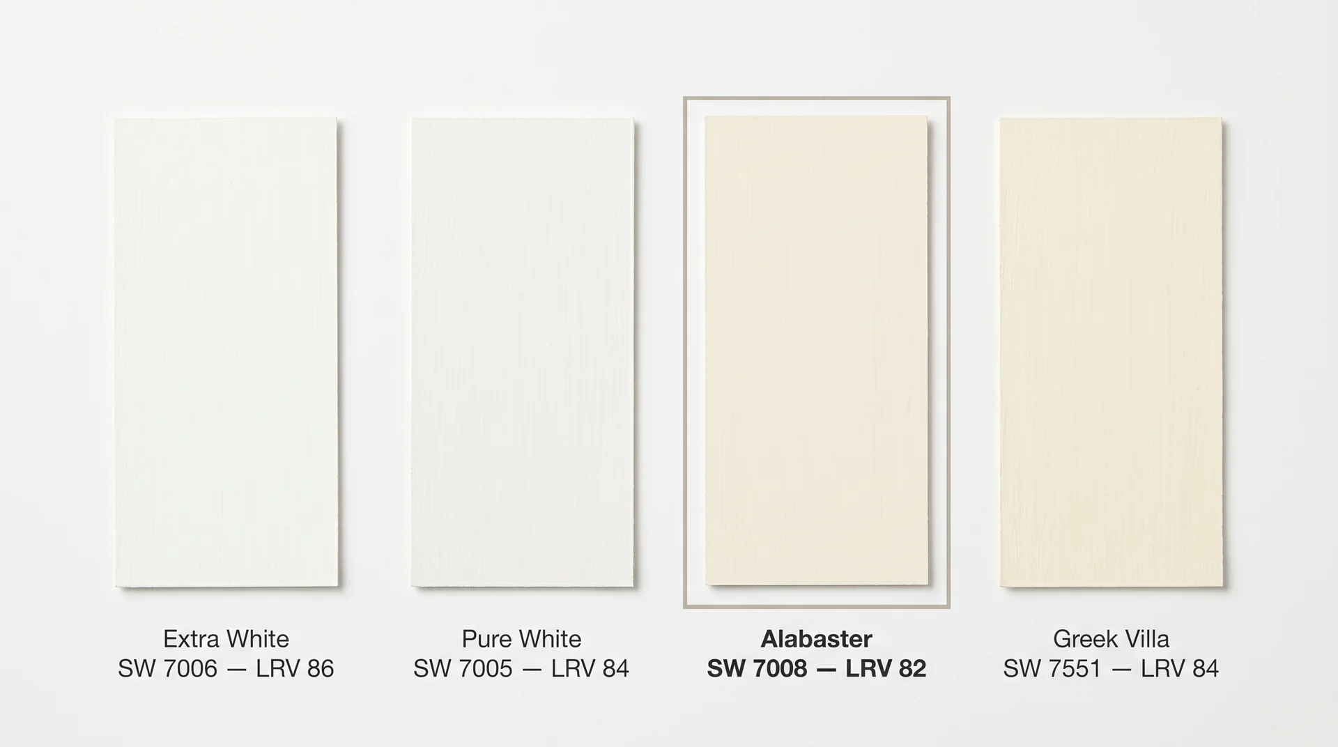
Alabaster Paint Specs: LRV, RGB, and Hex Code
| Specification | Value |
|---|---|
| Paint Code | SW 7008 |
| LRV | 82 |
| RGB | 237 / 234 / 224 |
| Hex Code | #EDEAE0 |
Note: Screen colors are a digital approximation. Always test a physical paint sample in your own space before purchasing.
LRV stands for Light Reflectance Value, and it measures how much light a color bounces back into a room on a scale from 0 to 100. At 82, Alabaster reflects a lot of light, so rooms feel bright and open.
That small gap from 100 is where the warmth lives; it’s what gives the color its personality rather than a clinical blankness. The RGB breakdown confirms this: 237 red, 234 green, 224 blue. The blue value is the lowest of the three, which is why Alabaster reads warm rather than cool or gray.
Is Alabaster Paint Warm or Cool?
Alabaster is warm, but quietly so. Its primary undertones are yellow-beige, with a secondary touch of gray that keeps the warmth from becoming too golden or obvious. That gray component is the quiet reason Alabaster reads as a white rather than a cream.
Think of it as a chaperone for the warmth present enough to keep things from going too far in one direction, invisible enough not to cool the color down.
Pull too far toward yellow without that gray base, and you’d end up in Swiss Coffee territory. Pull too far toward gray, and you’d have something closer to White Dove or Repose Gray. Alabaster sits in a deliberate, well-calibrated middle.
If you’re weighing Alabaster against Swiss Coffee specifically, our Swiss Coffee vs. Alabaster comparison covers exactly how the two undertones behave across different light conditions and room placements.
Will Alabaster White Paint Look Yellow on Your Walls?
On its own, Alabaster does not read as yellow. In a room by itself, it looks like a soft, warm white. The warmth registers as cozy and inviting rather than golden. The gray undertone does enough work behind the scenes to prevent the color from tipping too far toward warm.
Where yellow becomes more visible is in contrast. Place Alabaster next to a cool, bright white like Extra White or Pure White, and the warmth surfaces immediately. Put it alongside stark white appliances or a bright white subway tile backsplash, and the contrast pulls the yellow forward.
That’s the color behaving as any warm white will when measured against a cooler finish; it’s not a flaw, and the solution isn’t to avoid Alabaster. It’s to choose surrounding finishes that work with the color rather than against it.
In my own client work, the only rooms where Alabaster looked genuinely yellow were spaces where it was fighting very cool-toned finishes or very warm, direct artificial lighting. Both times, the pairing was the problem, not the paint.
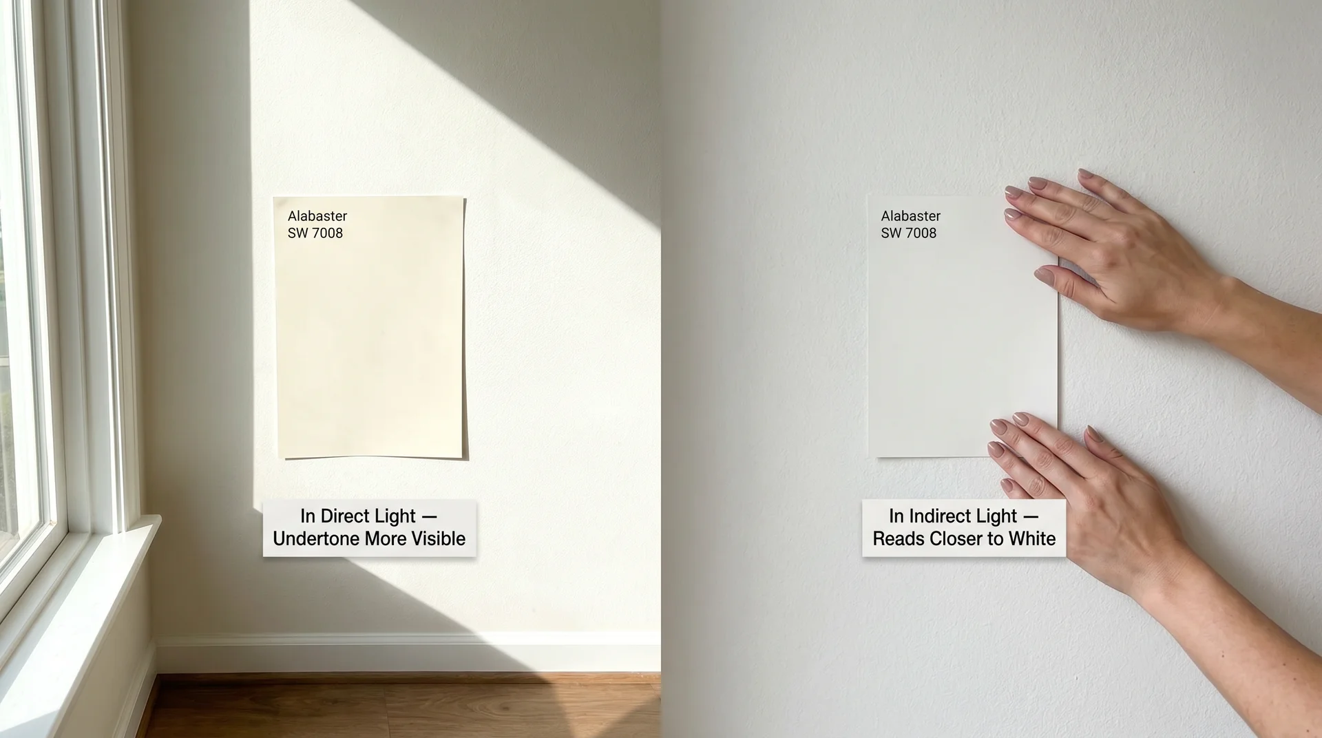
How Light Changes Alabaster: A Room-Direction Guide
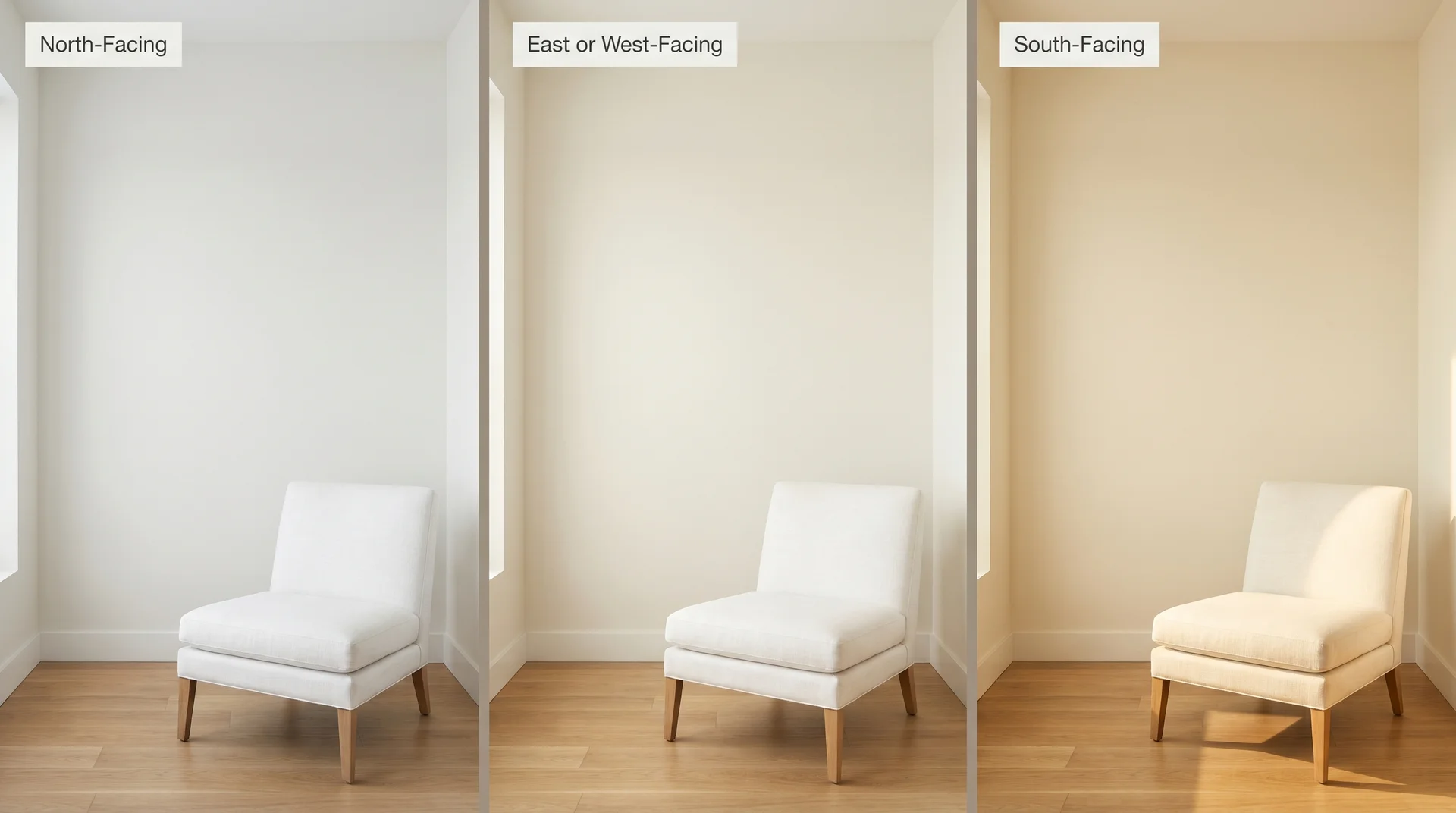
Light is an active ingredient in how paint color behaves, not a neutral backdrop. The same gallon of Alabaster will look different in a bright south-facing living room than it does in a shaded north-facing bedroom, sometimes dramatically so. Know your room’s orientation before you sample.
North-Facing Rooms
North-facing rooms receive cool, diffused, indirect light throughout the day. In these rooms, Alabaster reads closest to a clean, neutral white; it loses some warmth in the cooler light, which actually makes it perform beautifully in spaces that already feel small or dim.
The warmth stays present enough to feel intentional but restrained enough not to dominate. If you’ve been worried that Alabaster might feel too creamy in your home, a north-facing room is where that concern is least likely to materialize.
South-Facing Rooms
South-facing rooms get the most direct sunlight across the widest part of the day, and in these rooms, Alabaster’s yellow-beige undertone becomes more visible as direct sun amplifies the warm tones in the paint. It’s still a strong choice, but this is the scenario where sampling first matters most.
If the room also has warm-toned countertops, honey wood floors, or warm hardware, the accumulation of warmth can feel like too much. The fix is usually introducing a cooler accent somewhere to give the eye a resting point, rather than changing the paint color entirely.
East and West-Facing Rooms
East-facing rooms get warm morning light and cooler afternoon light, so Alabaster shifts gently throughout the day. West-facing rooms flip that: cooler in the morning, warmer as golden-hour light floods in, which tends to look genuinely beautiful.
The wall that catches shadow throughout the morning can look slightly dull until the afternoon light reaches it. In east or west-facing rooms, test Alabaster on at least two walls before making a final decision, not just one patch in the best-lit corner of the room.
Where Alabaster White Paint Works Best
Alabaster on Walls
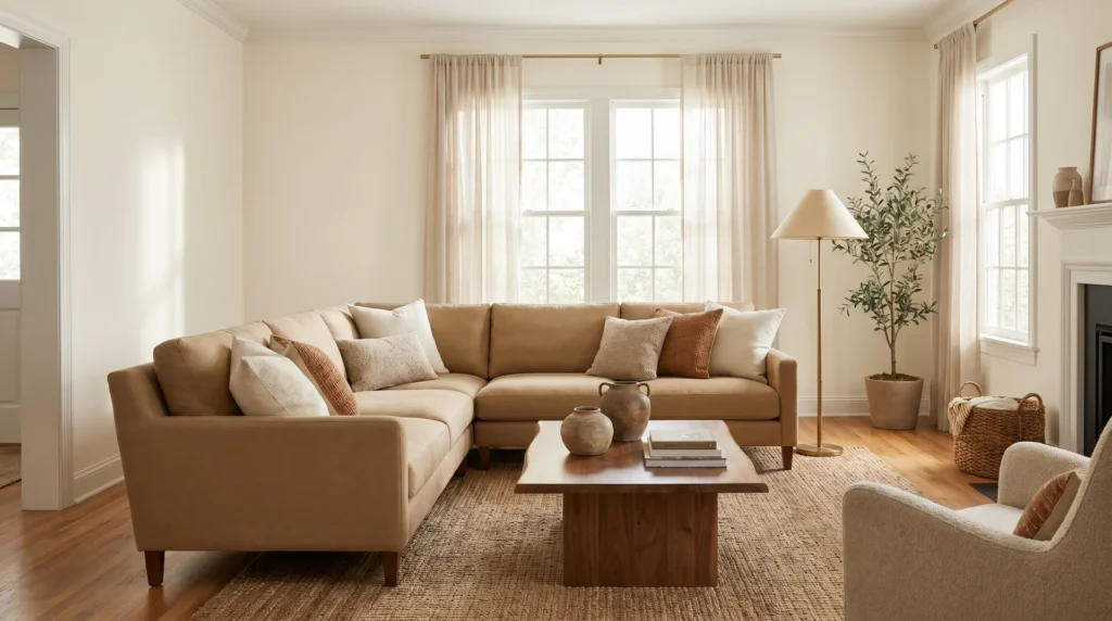
Alabaster works across a wide range of rooms: living rooms, primary bedrooms, nurseries, dining rooms, and open-concept main floors. It creates a warm, neutral backdrop that recedes behind furniture and art without disappearing.
It’s particularly well-suited to spaces where the goal is warmth without color commitment; you get the softness of an off-white without the visual weight of a beige or greige.
One of its most popular applications is on shiplap. The warmth softens what can read as stark or too rustic in a crisper white, and Alabaster keeps the look grounded and considered rather than themed.
It also works well as a whole-house color because its undertone is consistent, and it moves from room to room without visual conflict. You can shift accent colors between rooms, and the backdrop stays cohesive throughout.
Where it’s less effective is in spaces that need sharp, modern crispness. If the design direction is all clean lines, cool-toned stone, and chrome fixtures, Alabaster carries too much warmth to sit comfortably in that palette.
Alabaster on Kitchen and Bathroom Cabinets
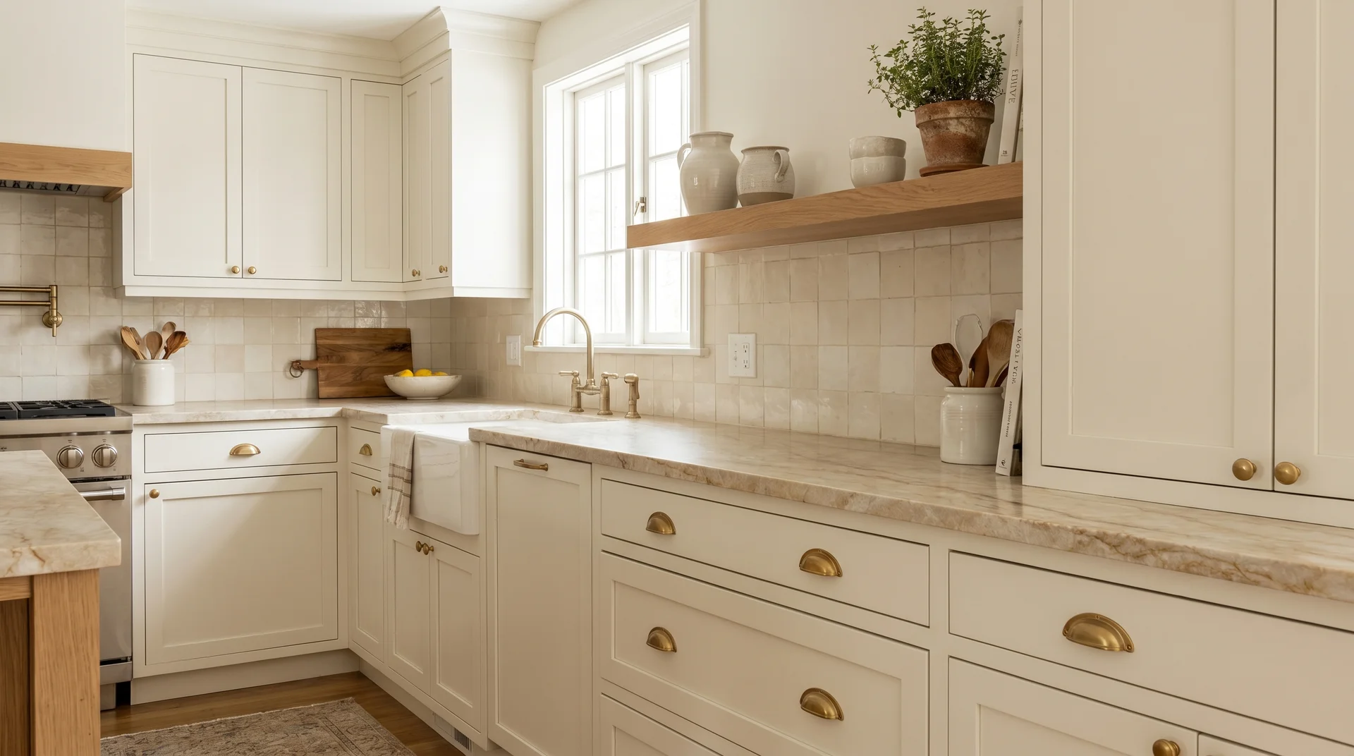
In ten years of client projects, Alabaster on cabinets is the recommendation I’ve made more than almost any other. On cabinetry, it delivers the warmth of a cream without going fully cream; it feels classic without being precious.
It works beautifully with brass and unlacquered bronze hardware, warm-toned wood shelving, and natural stone countertops in beige, warm gray, or cream tones.
If you’re at the countertop stage of an Alabaster kitchen, it’s worth knowing which specific stones share the same undertone logic as the cabinet color. This breakdown of which granite shades complement warm-white kitchen cabinets maps out the pairings that work and the ones that fight.
The caution is the surrounding environment. If the backsplash is a very cool white subway tile, or if the appliances are stark white, that contrast can make Alabaster look muddy or off by comparison.
Sample it on an actual cabinet door, in your actual kitchen, with your actual tile visible beside it, before committing to a full repaint.
Alabaster on Trim and Baseboards
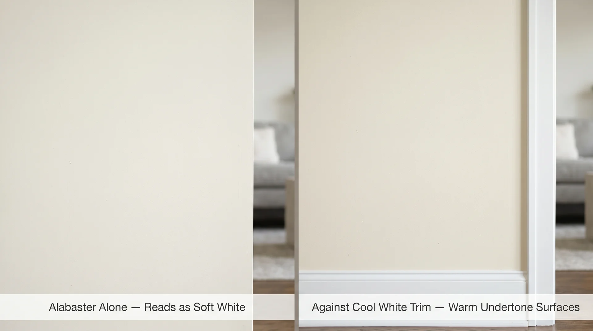
Alabaster works well on trim, and my preference in most cases is to match it to the walls rather than introduce a second white. When you pair Alabaster walls with a brighter, cooler white trim like Extra White, the contrast pulls the warm undertone forward in a way that reads as unintentional.
The wall suddenly looks more yellow than it actually is, because the trim is drawing out the difference.
Use Alabaster on both surfaces and vary only the sheen: eggshell on the walls, satin or semi-gloss on the trim. The sheen difference creates enough visual distinction without any undertone clash.
If you want a slight contrast trim option, Sherwin-Williams Pure White (SW 7005) is the closest cooler companion that doesn’t fight the wall color.
Paired against a warm greige wall color like City Loft SW 7631, Alabaster reads at its most refined as the two share enough warmth that the contrast reads intentional rather than accidental.
Alabaster on Exteriors
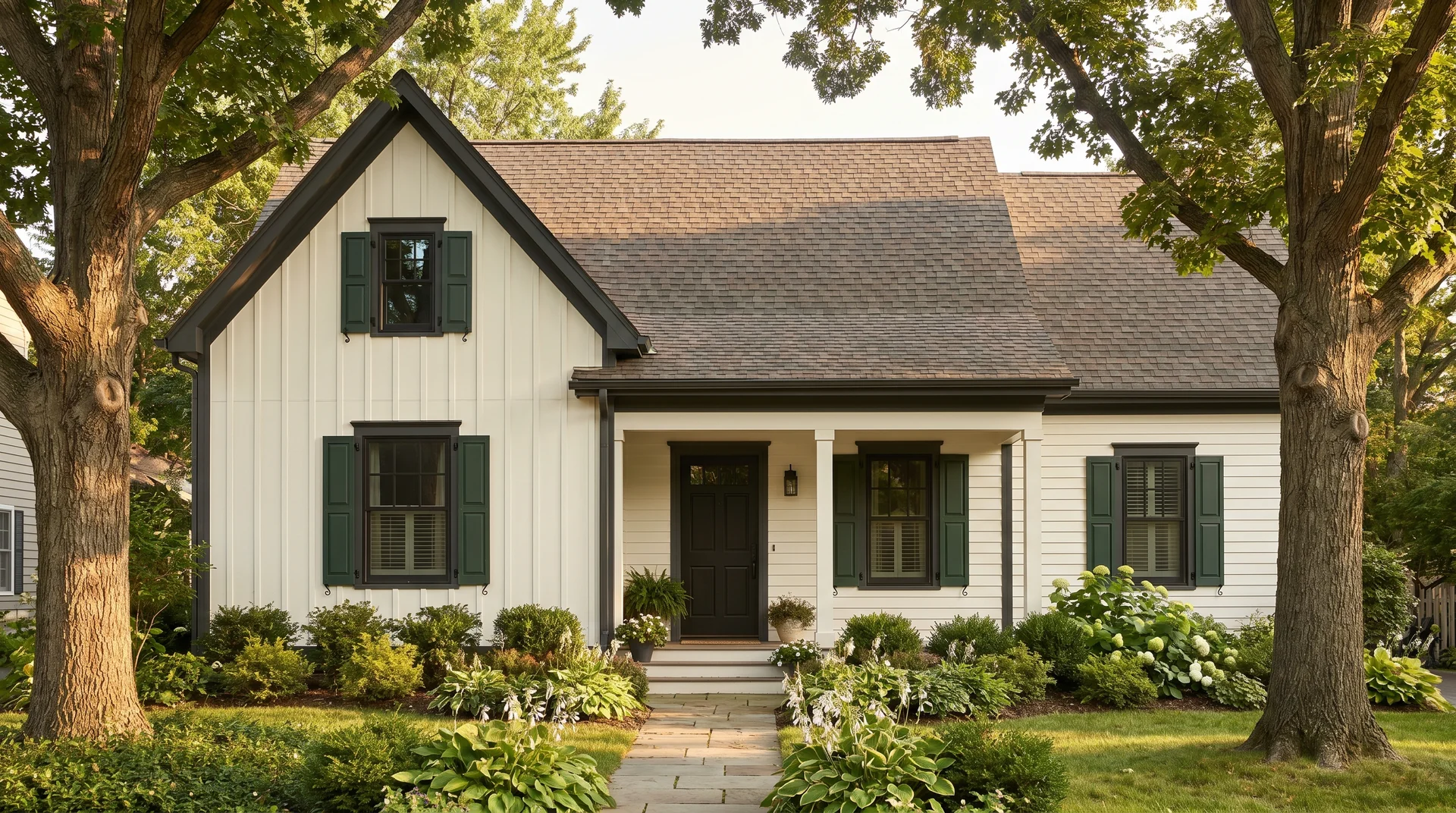
Alabaster works on exteriors, but it behaves differently outdoors than it does inside. In direct midday sun, particularly in bright southern climates, it reads noticeably brighter and more stark than expected. Always test it on the actual exterior surface in strong sunlight before painting a full elevation.
It excels alongside natural materials: warm-toned stone foundations, cedar or wood accents, board-and-batten siding with dark trim, and landscaping-heavy elevations where greenery softens what could otherwise feel too stark.
Alabaster also works consistently well as a trim color on a limewashed brick exterior. When the brick is finished in a warm chalky white at 50% opacity and the trim is in Alabaster rather than a cooler Pure White, the overall palette reads as warm and cohesive without tipping into cream territory. It’s one of the more reliably good exterior combinations.
If your home has brick and you’re considering a full exterior update, the limewashed brick house before and after examples show how different white trim tones, roof colors, and opacity levels interact across real brick types which is useful context before locking in any single finish.
One note on sheen for exteriors: Alabaster should be applied in a flat or satin exterior finish, not eggshell. Eggshell on exterior surfaces retains moisture in ways that cause premature chalking in humid climates
Alabaster on Ceilings
Wrapping both walls and ceiling in the same Alabaster creates a cocooning, envelope-like quality that works well in bedrooms and reading rooms, where the goal is atmosphere rather than brightness.
What doesn’t work is using Alabaster on the ceiling alone when the walls are a different, cooler white. The warm ceiling reads discordantly against a cooler wall, as though the colors came from different batches rather than a deliberate choice.
What Paint Sheen to Use With Alabaster
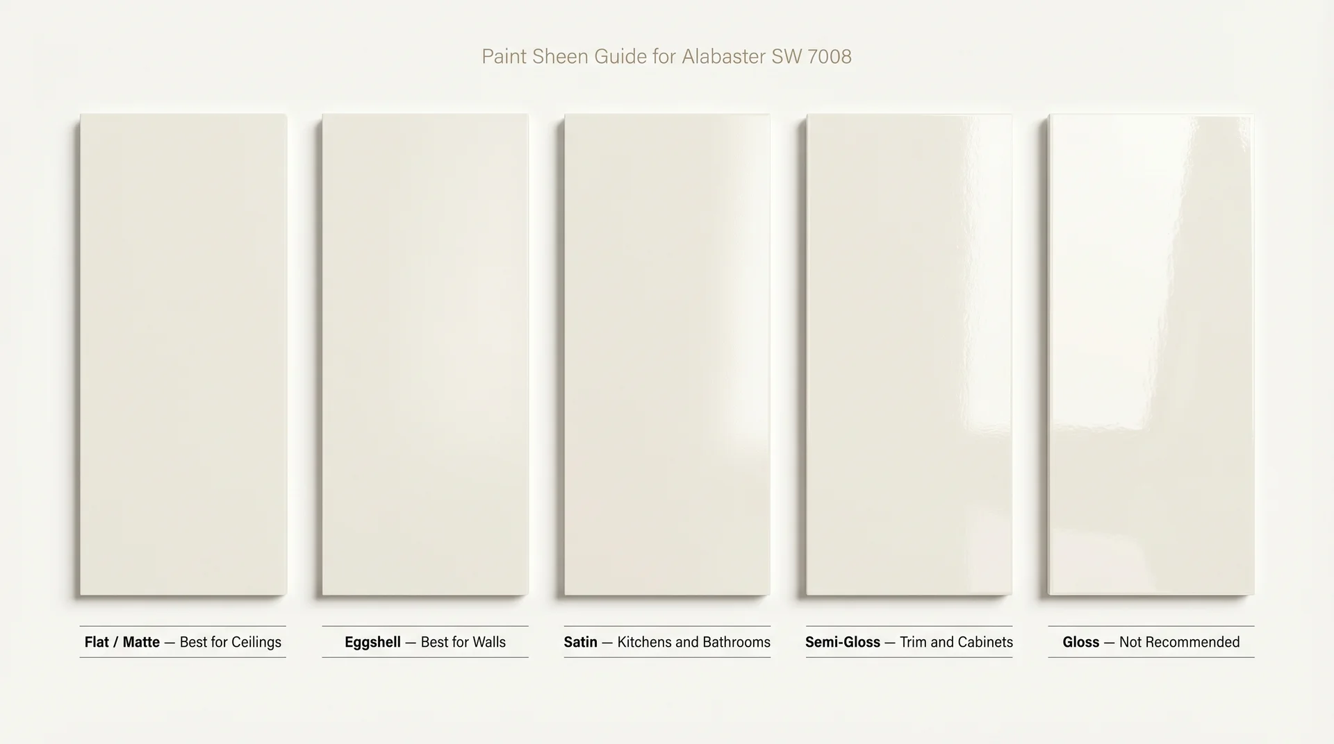
Sheen affects how Alabaster reads almost as much as light direction does. Here’s a surface-by-surface guide:
- Walls in living rooms and bedrooms: Eggshell. It’s easy to clean, holds the color well, and doesn’t create a reflective surface that competes with the warmth of the paint.
- Walls in kitchens and bathrooms: Satin. Better moisture resistance and easier to wipe down.
- Trim and baseboards: Satin or semi-gloss. More durable, wipeable, and the higher sheen creates a natural visual distinction from the walls without needing a different color.
- Cabinets: Semi-gloss. Handles daily wear and moisture well, and holds up to repeated cleaning.
- Ceilings: Flat or matte. Hides surface imperfections and prevents a distracting shiny ceiling overhead.
- Exteriors: Satin or low-luster. Weather-resistant without a glassy or commercial finish.
Alabaster vs. Popular White Paint Colors
Each comparison below is a decision tool, not a full review. If you’re choosing between Alabaster and one of these, here’s what you actually need to know.
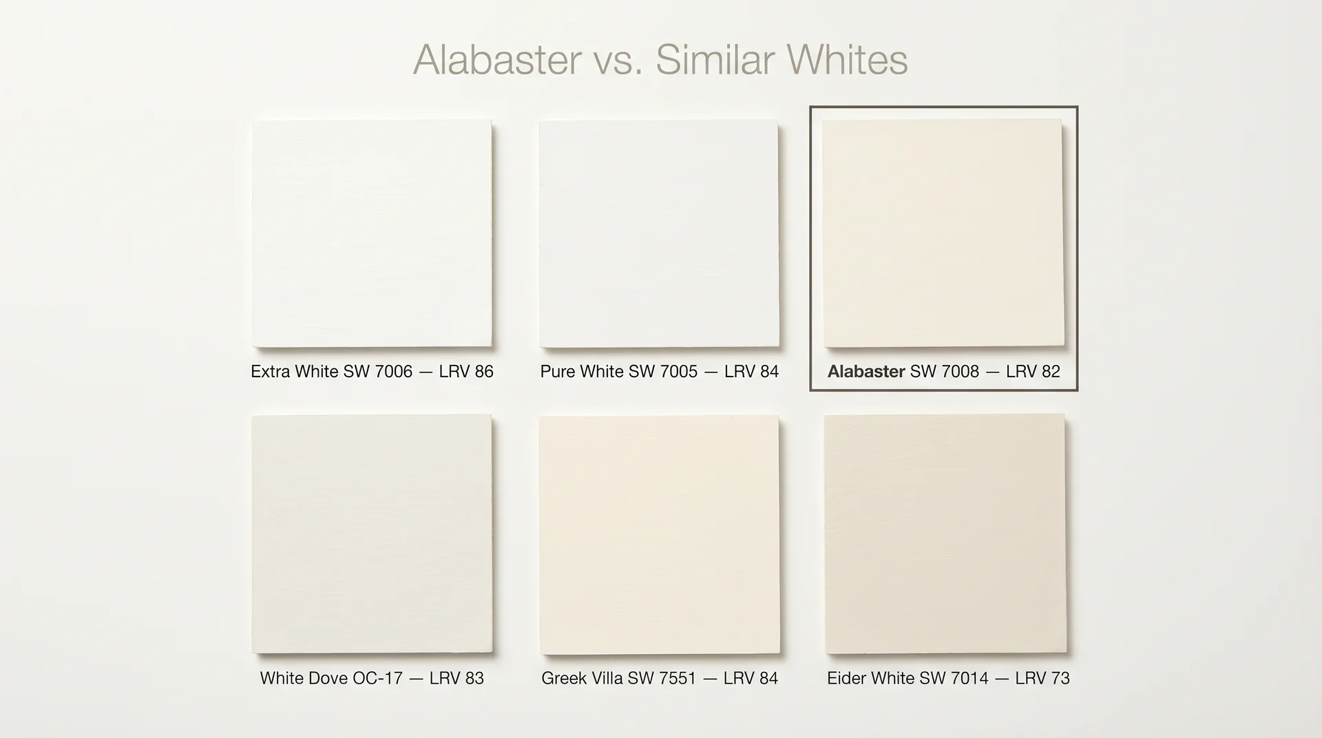
Alabaster vs. Pure White (SW 7005)
Pure White has an LRV of 84 and carries cooler, brighter undertones. If the design goal is clean and modern, Pure White is the better fit. If the goal is soft and livable, Alabaster wins. Pure White also works well as a trim companion for Alabaster walls, where you want a slight but harmonious contrast.
Alabaster vs. Benjamin Moore White Dove (OC-17)
Both are warm off-whites with nearly identical LRVs: White Dove at 83, Alabaster at 82. White Dove’s undertone leans more gray and muted. Alabaster carries more yellow-beige warmth.
In rooms with cool-toned finishes, White Dove is generally the safer choice. In rooms that need warmth, Alabaster delivers more of it. Your flooring and countertop undertones are usually the tie-breaker.
And if you’re not sure how to read those undertones against your specific finishes before you commit, the guide to choosing between off whites walks through the fixed-finish evaluation method that makes that call a lot less of a guess.
Alabaster vs. Greek Villa (SW 7551)
Greek Villa is slightly lighter at LRV 84 and reads fresher, almost like clean linen. It leans warmer than Alabaster but carries less of the stabilizing gray undertone, which means it can pull more creamy in warm light.
Alabaster stays more consistent across changing lighting conditions. Greek Villa works well if the look is airy and light-filled. Choose Alabaster if consistency across the day is the priority.
Alabaster vs. Benjamin Moore Simply White
Simply White pushes further toward yellow than Alabaster does. In rooms with warm wood tones and direct sunlight, it can tip into cream territory in a way Alabaster avoids.
Homeowners and designers who want warmth without visible yellow almost always prefer Alabaster over Simply White. If you’ve looked at Simply White and felt it was too buttery, Alabaster is the more restrained version of the same warmth instinct.
Alabaster vs. Eider White (SW 7014)
Eider White sits at a lower LRV of around 73, making it a noticeably darker off-white. Where Alabaster reads as white with warmth, Eider White reads as warm with white; it’s a more visible off-white, closer to the beige family.
Eider White is the better choice if you want a color that clearly separates from white trim. The two colors should not be used together; their undertones clash rather than complement each other.
Alabaster vs. Snowbound (SW 7004)
Snowbound (SW 7004) is one of the most common whites people search alongside Alabaster, and the two colors are genuinely different in ways that matter.
Alabaster pulls yellow-warm; Snowbound pulls pink-soft. The right choice between them depends almost entirely on your flooring undertone and light direction.
When Not to Use Alabaster White Paint
- Cool, modern, or Scandinavian-minimalist interiors. Alabaster’s warmth will feel out of register against cool concrete, blue-gray stone, chrome fixtures, and clean-lined furniture. A cooler, brighter white is the right fit for those spaces.
- Rooms with existing stark or cool white finishes you’re keeping. Alabaster next to those finishes reads as dingy regardless of how it looks on its own. The contrast is the problem, and paint alone won’t fix it.
- Kitchens with very bright white appliances, cool marble-look backsplashes, and chrome or stainless hardware throughout. The accumulated cool tones fight Alabaster’s undertone, and the cabinets or walls can look off in a way that’s genuinely difficult to diagnose until it’s already done.
- Spaces where the wall color is a cool gray or blue-toned paint. Warm trim and cool walls tend to feel mismatched rather than intentionally contrasted. The undertones work against each other without enough difference to read as a real design choice.
Colors That Pair Well With Alabaster White Paint
Neutrals and Warm Tones
Alabaster’s most natural companions are warm neutrals: camel, warm taupe, soft terracotta, tan, and warm greige. These colors share enough of the same undertone that the palette reads cohesive rather than matched.
A room with Alabaster walls, warm taupe upholstery, and a camel linen rug holds together without effort because everything in it is drawing from the same warmth.
When Alabaster moves to the trim or cabinetry, and you’re choosing a wall color to sit alongside it, Agreeable Gray (SW 7029) is the warm greige that coordinates most naturally with it.
The two colors share the same beige-warm base, which is why they appear together so often in warm-palette homes.
If you want a wall color with more presence and visible color depth, Evergreen Fog SW 9130 is the other Sherwin-Williams pairing that comes up most often with Alabaster trim.
Darker Accents
Deep charcoal, almost-black tones like Urbane Bronze, forest green, and warm navy all work beautifully against an Alabaster backdrop.
The contrast is crisp without being harsh, because the warmth in the white softens the edge between light and dark. Dark-painted built-ins or an accent wall against Alabaster walls read as sophisticated rather than stark.
If you’re deciding which dark color to use in that role, Sherwin-Williams Iron Ore SW 7069 is the near-black that works most consistently alongside Alabaster.
Its LRV of 27 gives it depth without the flatness of a true black, and Alabaster is one of its strongest trim pairings.
Dark-painted built-ins or an accent wall against Alabaster walls read as sophisticated rather than stark.
Wood, Stone, and Natural Finishes
This is where Alabaster’s warmth earns its reputation. Honey oak, walnut, travertine, warm limestone, and unlacquered brass all coordinate with it naturally.
You don’t have to engineer the pairing. The color and the material share enough underlying warmth that they simply belong together, which is why it works so consistently in homes with natural wood floors, stone countertops, and warm hardware.
Brick sits in the same category. If your home has a dated red or orange brick fireplace, a soft whitewash in a warm white sits with Alabaster walls without any undertone conflict.
If that update is on your list, our complete guide to updating brick to work with Alabaster covers product choice, mixing ratios, and how to get consistent coverage in a weekend.
How to Sample Alabaster White Paint the Right Way
The most common paint mistake isn’t choosing the wrong color. It’s sampling incorrectly and then discovering the problem after four gallons are already on the wall.
- Use peel-and-stick samples instead of painted swatches on white paper. Brands like Samplize offer real paint on adhesive backing thatyou can move around the room. Viewing paint against a stark white page distorts the color completely.
- Place samples on at least two walls, one that catches direct light and one that sits in shadow. The same paint reads noticeably differently on each, and you need to be comfortable with both before you commit.
- View samples at three different times: morning, midday, and evening with lamps on. Alabaster shifts subtly across these conditions. A single viewing at one time of day tells you very little.
- Hold the sample near your existing finishes. Place it next to the countertop. Hold it near a cabinet door. Color exists in relationship to everything around it, and an isolated patch in the middle of a bare wall won’t show you that relationship.
- Don’t rely on the paint chip. It’s a printed approximation of the color, useful for eliminating options, not for making a final decision.
Frequently Asked Questions
What Color Is Alabaster Paint?
Alabaster is a warm, soft off-white with yellow-beige undertones balanced by a quiet gray secondary undertone. It reads as white in most settings, with enough warmth to separate it from cooler, brighter whites. Sherwin-Williams SW 7008 is the most commonly referenced version.
Does Sherwin-Williams Alabaster Look Yellow?
On its own, Alabaster does not read as yellow. The yellow undertone becomes visible when the color sits next to a cooler white or in rooms with very strong direct sunlight. The gray in the undertone keeps it from reading as golden or cream under standard conditions.
What Is the LRV of Sherwin-Williams Alabaster?
The LRV of Alabaster SW 7008 is 82. On the scale from 0 (absolute black) to 100 (pure reflective white), 82 means it reflects a significant amount of light while retaining enough depth to carry warmth rather than appearing blank or cold.
Can You Use Alabaster on Exterior Siding?
Yes, but it behaves differently outdoors. In bright midday sun, it reads a little brighter and more stark than it appears indoors. It works best on exteriors alongside warm, natural materials, dark trim, and heavy landscaping. It’s less effective on homes with cool gray roofing, blue-gray stone, or predominantly chrome architectural details.
What Trim Color Goes With Alabaster Walls?
The most cohesive option is Alabaster on both walls and trim, with a higher sheen on the trim. This avoids undertone clashes and creates a seamless, soft finish. For a slight contrast, Sherwin-Williams Pure White (SW 7005) is the closest cooler option that doesn’t fight the wall color.
Is Alabaster White Paint Still in Style?
Yes. It became Sherwin-Williams’ Color of the Year in 2016, but it has stayed in consistent demand since then and continues to appear in current design projects across all styles. The broad shift toward warm off-whites keeps it relevant, and it’s better understood as a perennial than a trend.
Is Alabaster a Good Whole-House Paint Color?
Yes, Alabaster works well as a whole-house color, particularly in homes with warm-toned finishes, natural wood, and mixed natural light. Because the undertone is consistent, it moves from room to room without visual conflict. Shift the accent colors between rooms and use Alabaster as the constant backdrop throughout.
What Is the Difference Between Alabaster and White Dove?
Both are warm off-whites with similar LRVs: Alabaster at 82, White Dove at 83. White Dove’s undertone pulls more gray and muted. Alabaster carries more yellow-beige warmth. White Dove tends to work better in rooms with cool-toned finishes. Alabaster suits rooms that need more warmth in the palette.
Final Thoughts
Alabaster is a genuinely reliable white. It suits a lot of homes, handles a lot of surfaces, and stays consistent enough across lighting conditions that it rarely surprises you. What it isn’t is foolproof.
Put it in a room built around cool, clean finishes, and it’ll look like a mismatch no one can quite explain. Put it in the right room, alongside warm wood and natural materials, and it simply disappears into the space the way the best whites always do, quietly making everything else look like it belongs there.
Sample it properly. View it at multiple times of day. Place it next to your actual countertops and floors. Those fifteen minutes of work will tell you more than any paint review online, including this one.
