
Choosing the right color for a grey kitchen is one decision. Knowing what to do with it once you’ve chosen it is an entirely different one, and in my experience, it’s where most homeowners lose confidence.
I’ve worked with clients who spent weeks arriving at the perfect color pairing, only to apply it in a way that didn’t do the choice justice. The problem wasn’t the color. It was the placement, the proportion, or a testing process that didn’t reflect how the color would actually behave in the room.
This guide covers the practical side of working with color in a grey kitchen: where to put it, which combinations to avoid, and how to test your choices in a way that prevents repainting regret.
If you’re still deciding which color to pair with your grey units, our guide on colors that go with grey kitchen units covers that in full before you come back here.
Applying Color: Where to Put It in a Grey Kitchen
Choosing the right color is only half the decision. Where you place it determines whether the kitchen feels considered and balanced or busy and unresolved.
I’ve seen beautiful color choices land badly simply because they were applied to the wrong surface, and I’ve seen modest, careful choices transform a space entirely because the placement was right.
The 60-30-10 Rule
- 60% of the kitchen’s visual space: your grey cabinets and dominant neutral (walls, flooring)
- 30% of the visual space: your primary pairing color (countertops, a second cabinet color, backsplash)
- 10% of the visual space: your accent (hardware, lighting, textiles, decorative objects)
Most color mistakes in grey kitchens come from pushing a pairing color past 30% or scattering accent colors across too many surfaces at once. The grey needs room to function as the anchor it was chosen to be.
Walls
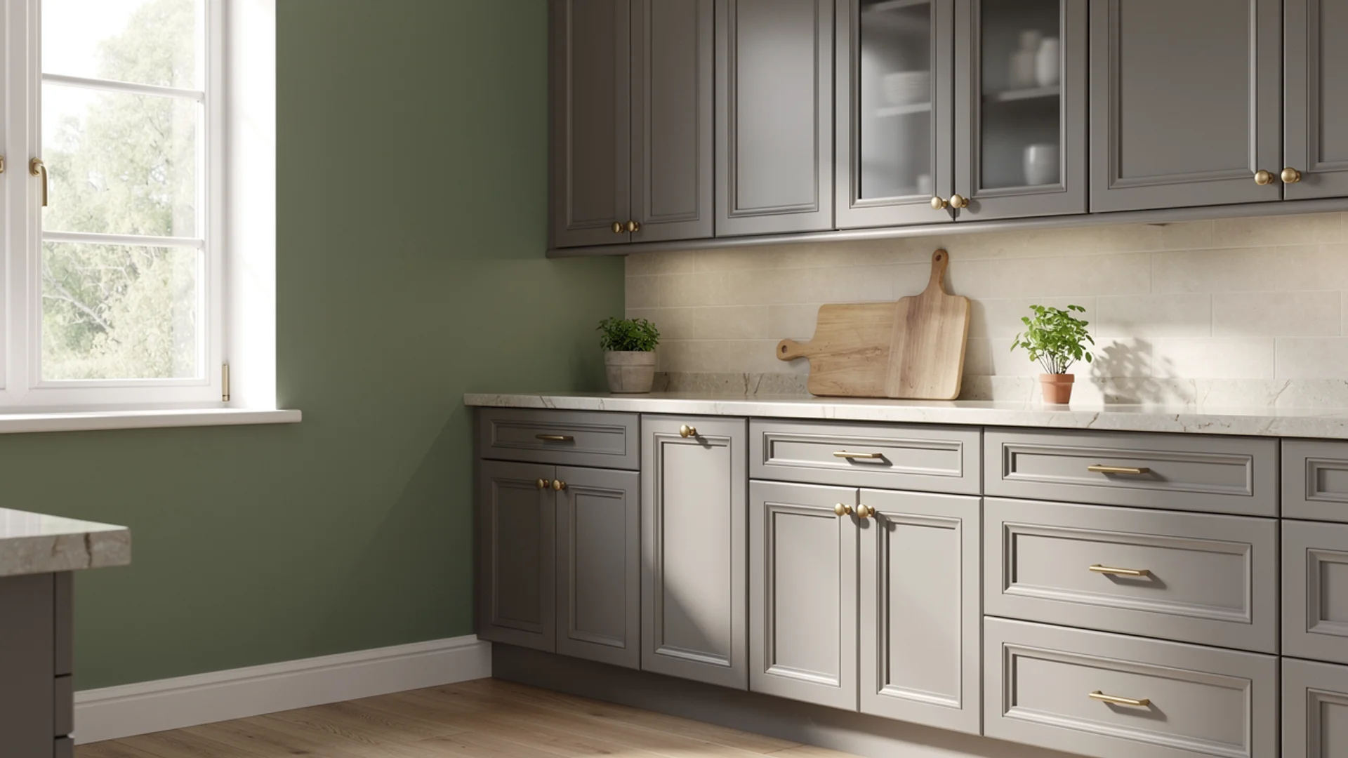
Walls give you the biggest color impact for the least financial commitment, which makes them the right place to experiment first. In a grey kitchen, the wall color sets the emotional temperature of the entire space.
A few things worth knowing about wall color in kitchens specifically:
- Kitchen walls receive grease, steam, and moisture, so always use a washable eggshell or satin finish rather than flat or matte
- The wall area visible above and between cabinets is often smaller than you expect, which means a bold wall color in a galley kitchen reads as a series of small colored rectangles rather than a full backdrop
- In open-plan kitchens where the wall color flows into a living or dining area, choose a color that works in both contexts rather than optimizing purely for the kitchen
Island Base
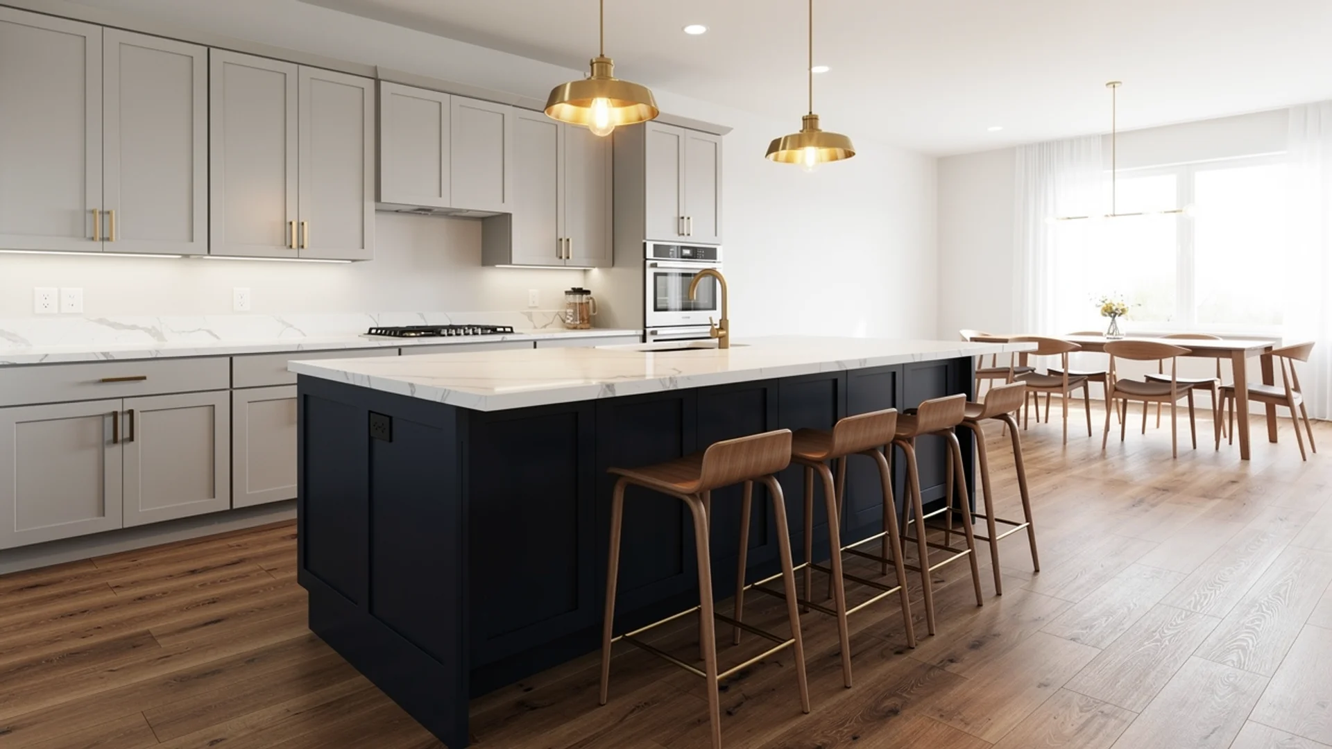
The island is the single best place in a grey kitchen to introduce a second, bolder color without overwhelming the space. Because it’s a freestanding element surrounded by negative space, it carries color differently from a full run of cabinetry. Navy, forest green, and burgundy all work on an island at a scale they couldn’t sustain across an entire kitchen.
The proportion rule here: keep the island color as your 30% pairing color and let the perimeter cabinets remain your dominant grey. Reversing that ratio, bold color on the perimeter and grey on the island, tends to feel unbalanced.
Backsplash
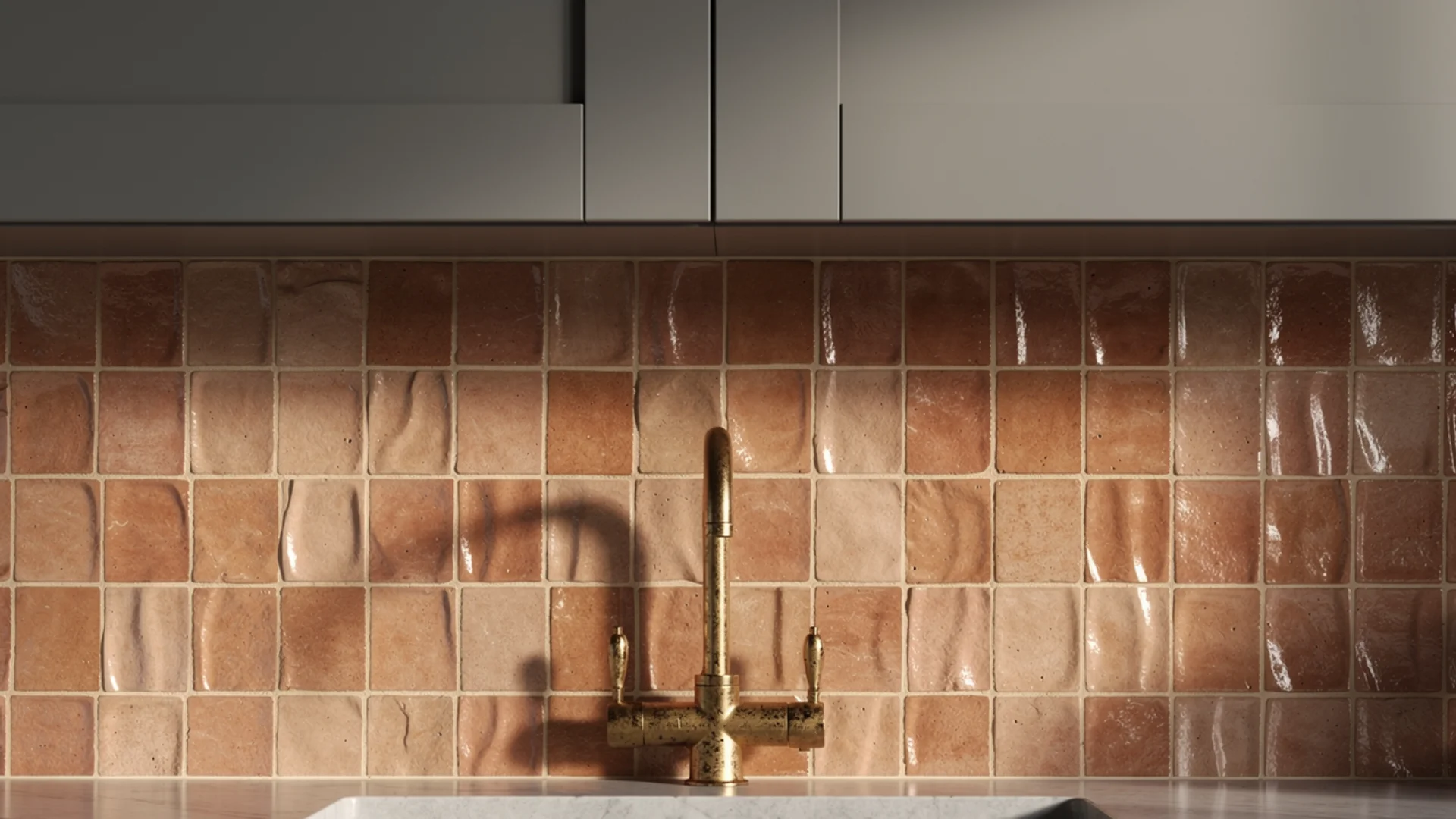
The backsplash is where I encourage clients to take their biggest color risk, precisely because it’s the most reversible surface in the kitchen.
Retiling is a weekend project compared to repainting cabinets or replacing countertops, which makes it the right place to be bold if you’re going to be bold anywhere.
In terms of proportion, the backsplash sits firmly in your 30% pairing color territory. It’s visible enough to carry a color statement but contained enough that it doesn’t overwhelm the grey.
The mistake most people make is treating it as a neutral surface by default, choosing white subway tile because it feels safe, when it’s actually the surface in a grey kitchen that can afford the most personality.
Hardware and Fixtures
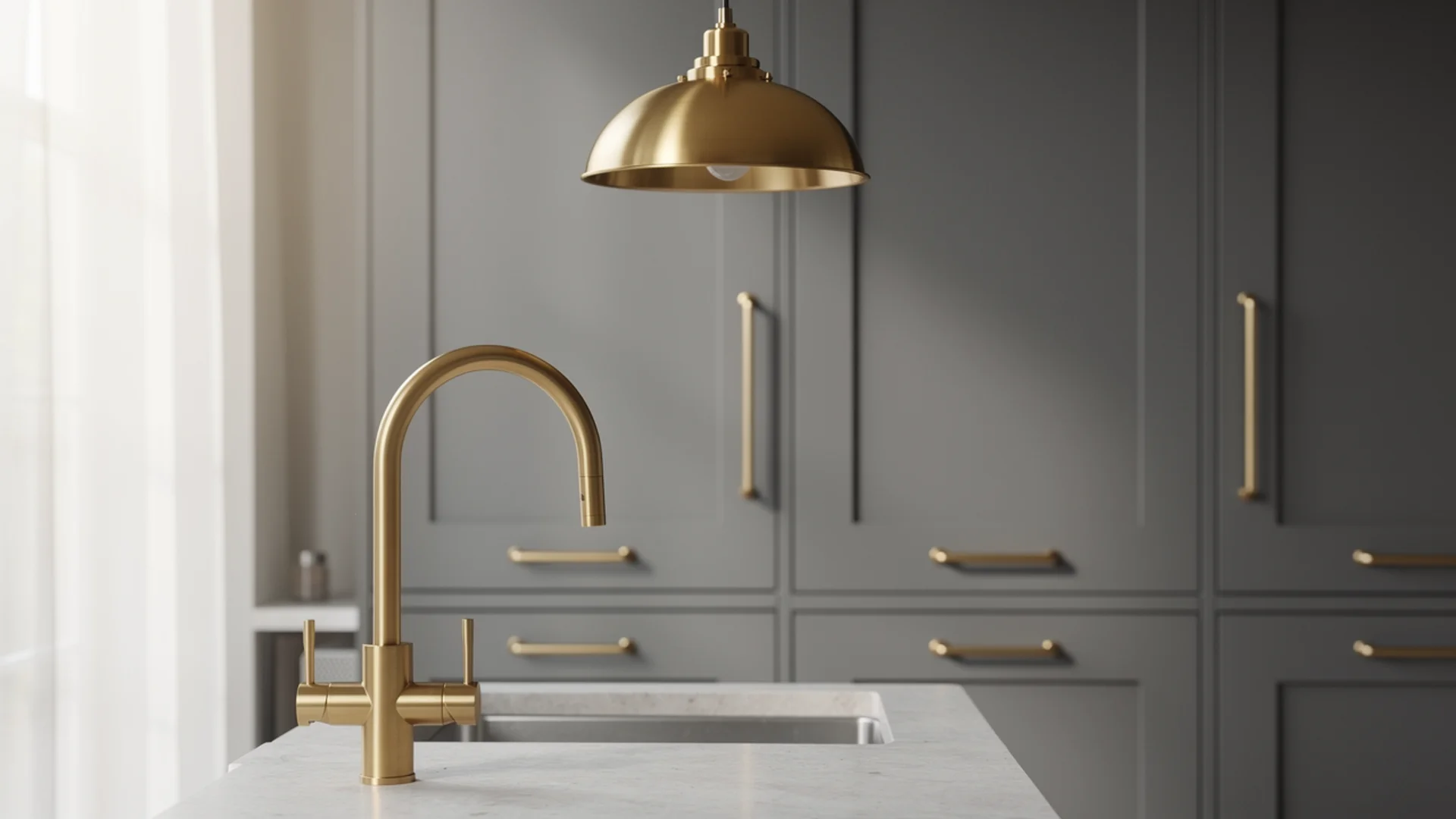
Hardware is the 10% accent that either unifies or fragments a grey kitchen’s palette, and it’s consistently the element that gets chosen last and deserves to be chosen first.
The finish you select for your cabinet pulls, faucet, and light fixtures creates a through-line that ties the entire color palette together or works against it quietly in the background.
The one rule I hold firmly across every grey kitchen I’ve worked on: choose one primary hardware finish and apply it consistently across pulls, faucet, and light fixtures.
A second metal as a deliberate accent is acceptable, a brass faucet paired with brushed nickel appliance handles for example.
Three or more different metal finishes in the same kitchen almost always reads as unresolved, regardless of how considered each individual choice seemed in isolation.
Soft Furnishings and Accessories
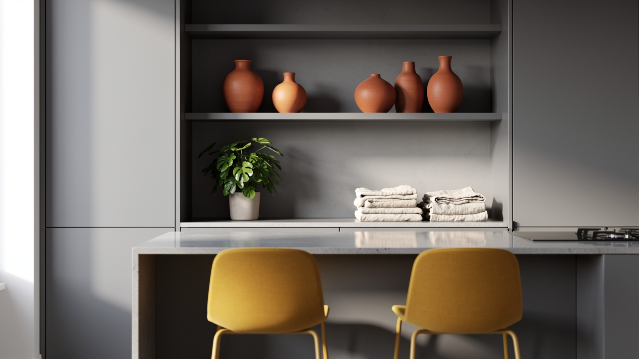
Bar stools, rugs, curtains, plants, and ceramics live in the 10% accent territory and carry more visual weight than most people expect.
In a grey kitchen with a restrained palette, a set of mustard bar stools or a terracotta ceramic collection on open shelving can anchor the entire color story of the space.
- Repeat accent colors at least twice in the space so they read as intentional rather than accidental. One mustard stool looks like a mistake. Two mustard stools look like a decision.
- Plants are the most underused color element in grey kitchens. The green of living plants adds life and warmth in a way that no paint color replicates, and they work with every pairing on this list.
- Rugs in a kitchen need to be practical first. Flatweave cotton or washable wool in your accent color gives you the visual benefit without the maintenance cost.
What Flooring Goes with Grey Kitchen Units?
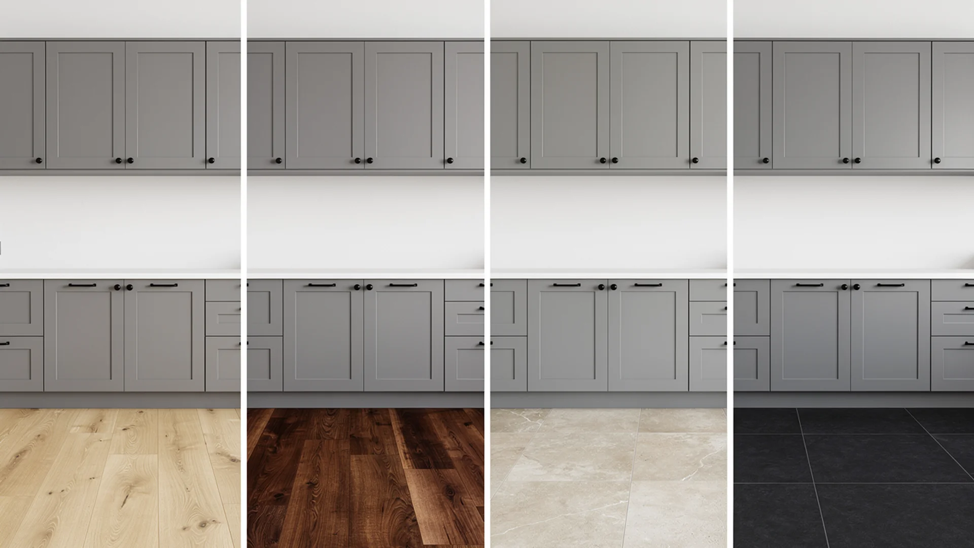
Flooring is a fixed element that most homeowners either already have or are choosing alongside the cabinets, so it shapes every other color decision in the room.
Grey kitchen units are forgiving across most flooring types, but a few principles are worth following.
- Light wood or light oak laminate creates warmth underfoot and prevents a cool grey kitchen from feeling clinical. It works well in both contemporary and Scandinavian-style kitchens and is the most popular choice for good reason.
- Medium-toned wood flooring in honey or walnut tones bridges the gap between cool grey cabinets and warm accessories without the flooring competing with either.
- Dark wood or charcoal-toned flooring works in larger kitchens with good natural light. In smaller or north-facing kitchens it can make the whole space feel compressed.
- Stone or porcelain tile in warm greige tones is particularly successful with warm grey or greige cabinets, creating a cohesive tonal palette from floor to ceiling that feels considered rather than matched.
One thing most people overlook is that floor tone affects how grey cabinet color reads. A warm honey wood floor draws out any warm undertones in your grey, making it feel softer and more inviting.
A cool stone floor amplifies any cool undertones, making it sharper and more modern. If your grey sits right in the middle, the floor is one of the most powerful tools you have for nudging it in either direction.
Colors to Avoid With Grey Kitchen Units
Most color guides tell you what works. Knowing what doesn’t is equally useful, because some of these are genuinely common mistakes that are easy to avoid once you know what to look for.
The Wrong White
The most frequent mistake in grey kitchens, and the most counterintuitive. A white that doesn’t match your grey’s temperature makes both colors look wrong simultaneously.
- Cool blue-white next to warm greige reads as dirty or unresolved
- Warm creamy white next to cool blue-grey looks yellowed under artificial light
- White with a green undertone next to almost any grey feels clinical in a way that’s hard to name but easy to feel
The fix is temperature matching, not finding a better white.
Purple and Lavender as a Primary Color
Grey hides purple undertones and reveals them aggressively when provoked. Bringing an actual purple or lavender in on walls or large surfaces risks triggering the hidden purple in your grey cabinets, making the entire palette feel unintentionally monochromatic.
- Deeply saturated aubergine used sparingly as a single accent can work with the right grey
- Purple as a primary pairing color almost never resolves cleanly
- If your grey already pulls slightly purple in certain lights, avoid any purple-adjacent colors entirely
Highly Saturated Colors on Large Surfaces
Grey is a recessive, composed color by nature. Highly saturated colors on large surfaces shout over it and the kitchen ends up feeling neither composed nor energetic, just unresolved.
| Color | Why It Fails With Grey | Where It Can Work |
|---|---|---|
| Bright red | Too stark, visually exhausting at scale | A single appliance or small ceramic grouping |
| Neon or lime green | Overwhelms grey’s subtlety entirely | Nowhere in a grey kitchen |
| Hot pink or fuchsia | Fights the grey rather than complementing it | Very small accent pieces only |
| Bright cobalt blue | Dominates at scale despite looking fine in samples | A single row of backsplash tiles at most |
Orange-Red Without a Grounding Neutral
Terracotta and burnt orange work beautifully with grey. Their brighter, more saturated cousins in the orange-red family do not. A true orange-red against grey, especially cool grey, creates a jarring contrast with nothing to resolve it.
Stay in the muted, earthy end of the terracotta spectrum. Keep a generous proportion of neutral ground around it. The warmth lands. The brightness doesn’t.
Colors Too Close in Depth to Your Grey
When your wall color and grey cabinets share a very similar LRV, the kitchen loses visual definition and the whole space flattens.
Before you commit: Photograph your paint samples in black and white. If your wall color and cabinet grey look like roughly the same shade in the photo, they are too close in value and the combination will feel flat and structureless.
Aim for at least a 15 to 20 point LRV difference between your cabinet grey and your wall color. That gap is what gives the kitchen its sense of dimension.
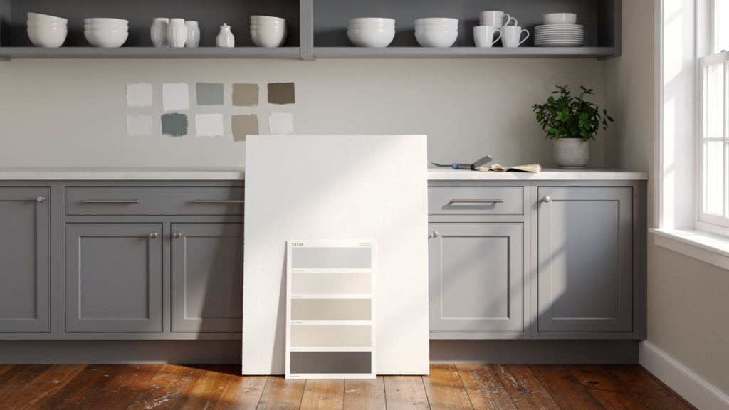
How to Test Your Color Pairing Before Committing
This is the step most homeowners skip, and it’s the one that prevents the most regret. Choosing a color in a paint store or from a screen and applying it directly to your kitchen is one of the most reliable ways to end up repainting within a year.
Use Foam Boards, Not Wall Patches
The standard advice is to paint a sample patch directly on your wall and observe it. The existing wall color underneath skews your perception of the new color’s undertone in ways that are subtle but meaningful, particularly with grey, which is already undertone-sensitive.
The better approach:
- Buy large foam boards from any craft store
- Apply two full coats of your sample color, letting each coat dry completely
- Move the boards around the kitchen and prop them against cabinets, countertops, and walls at different points throughout the day
- View them in the morning with natural light, midday, and in the evening under your actual artificial lighting
This gives you a genuinely accurate read of how the color behaves in your specific kitchen rather than how it looks in isolation on a wall that’s already a different color.
Test Under Your Actual Bulb Temperature
Artificial lighting changes color perception more dramatically in kitchens than in almost any other room because kitchens use multiple light sources at different heights and intensities.
| Bulb Temperature | What It Does to Color | Worth Knowing |
|---|---|---|
| 2700K (warm white) | Deepens warm tones, makes cool greys pull slightly purple | Most flattering for wood and warm materials |
| 3000K (soft white) | Balanced, the most reliable for grey kitchens | Good middle ground for mixed palettes |
| 4000K (cool white) | Sharpens cool greys, can make warm tones look washed out | Works well in industrial or contemporary kitchens |
| 5000K (daylight) | Reveals undertones most accurately | Useful for testing but rarely flattering as a permanent kitchen bulb |
If your kitchen uses 2700K bulbs and you’re pairing a cool grey with a crisp white, test that combination specifically under those bulbs before committing. The purple undertone issue is most likely to appear under warm artificial light, not in natural daylight.
Understand LRV Before You Finalize
Every paint color has a Light Reflectance Value, a number between 0 and 100 that measures how much light the color reflects. For grey kitchens specifically, LRV matters in two ways.
First, it tells you how a color will behave in your kitchen’s light conditions:
- LRV above 60: Reflects significant light, feels airy and open, good for smaller or north-facing kitchens
- LRV 40 to 60: Mid-range, versatile, works in most kitchen sizes and orientations
- LRV below 40: Absorbs more light than it reflects, adds drama but can make a space feel smaller and heavier
Second, it helps you check whether your color pairing has enough contrast to read clearly. Most paint brands list LRV values on their website or in their color tools. It takes about two minutes to check and removes a significant amount of guesswork from the process.
Watch Out for the Paint Brand Mismatch
If you’re selecting a wall color from one paint brand and having your cabinets sprayed in a color match by a different manufacturer, the two will rarely look identical once dry.
This is particularly relevant with grey because the difference in colorant systems between brands is most visible in complex, multi-pigment colors.
- Benjamin Moore uses a proprietary 13-pigment colorant system that other brands don’t replicate exactly
- A color match in another brand’s lacquer system will often read slightly warmer, cooler, or more saturated than the original
- The difference may be subtle on a paint chip and obvious on a full cabinet door in natural light
Ask your cabinet painter which brand and system they use, then select your wall color from the same brand where possible. If that’s not possible, request a sprayed sample panel in the matched color before the cabinets go in.
A Few Final Checks Before You Commit
- Order peel-and-stick paint samples for wall colors where available. They’re larger than standard chips and removable, so you can test multiple colors simultaneously without painting over each other
- Check your color in both an empty kitchen and a furnished one. Countertops, flooring, and appliances all affect how a wall color reads, and an empty room during renovation looks nothing like a finished, furnished kitchen
- Give yourself at least 48 hours of observing the sample before deciding. First impressions of paint colors are unreliable. The color you’re uncertain about on day one often looks right by day two.
- Use the Houzz Visualizer or Benjamin Moore’s Color Preview app to get a rough directional sense before you even order samples. These tools aren’t precise enough to replace physical testing but they’re useful for eliminating obvious mismatches early in the process.
Summing Up
The practical side of color in a grey kitchen comes down to three things:
- Knowing where to put your chosen color so it works at the right proportion
- Knowing which combinations to avoid before you commit
- Testing in a way that reflects how the color will actually live in the room rather than how it looks on a chip
Most renovation regret I’ve seen in grey kitchens doesn’t come from a bad color choice. It comes from a good color choice applied without enough thought to placement, proportion, or the specific light conditions of that particular room. Those are the variables that this guide is designed to help you control.
Found this helpful? Share it with someone who might need it next.
