
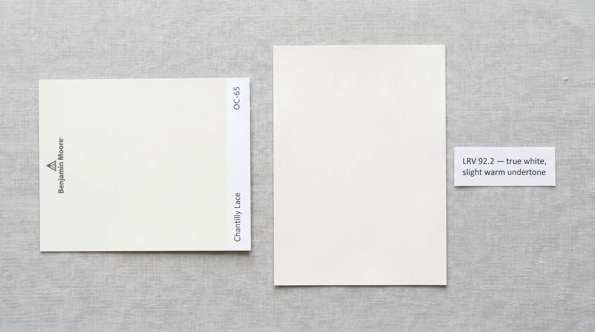
Chantilly Lace is a true white. Not an off-white, not a warm white, not a greige with ambitions. It’s Benjamin Moore’s OC-65; it has a light reflectance value of 92.2.
It earns its reputation as one of the most recommended whites in American interior design for a reason that’s both simple and easy to misread: it has almost no undertone, which means it doesn’t impose a mood on a room the way creamy or cool whites do.
If you’re here with a sample patch already drying on your wall, watching it shift hour by hour, you’re asking the right question. What you need is an honest account of how this color actually performs across different rooms, light sources, and surfaces, including the situations where it doesn’t behave the way the photos suggested it would.
I’ve placed Chantilly Lace in client homes and in my own projects. A few of those confirmed exactly why it gets recommended so widely. A couple taught me when to point a client toward something else.
Both kinds of experience are worth knowing before you commit to a full room.
What Color Is Chantilly Lace, Actually?
Chantilly Lace is a clean, bright white with a very slight warm undertone that reads as neutral in most conditions. It doesn’t pull grey, it doesn’t pull blue, and it doesn’t tip into cream the way some off-whites do.
In good light, it looks like the ideal “white room” from a home design magazine. The trick is understanding what “good light” means specifically for this color, because the answer matters more here than it does for whites with a stronger undertone to anchor them.
The Specs That Matter
| Detail | Value |
|---|---|
| Brand | Benjamin Moore |
| Color Code | OC-65 (also listed as 2121-70 in the historical fan deck) |
| Collection | Off-White Collection |
| LRV | 92.2 |
| Undertone | Very slight warm; reads neutral across most light sources |
| Finish Options | Flat, Matte, Eggshell, Pearl, Satin, Semi-Gloss, Hi-Gloss |
What LRV 92.2 Actually Means in Practice
LRV stands for light reflectance value, and it runs from 0 (pure black) to 100 (theoretical pure white). At 92.2, Chantilly Lace reflects a very high percentage of the light that hits it. That’s what lets it read as a true white rather than an off-white; it’s near the top of the scale, well above the range where most warm or creamy whites sit.
High LRV comes with one practical implication worth knowing now rather than after painting: the higher the reflectance, the more sensitive a color is to your light source.
A color that reflects almost everything is going to show you exactly what kind of light you have. That’s not a flaw. It’s the physics of highly reflective surfaces, and it explains nearly every “why does it look different here” question you’ll find in paint forums about this color.
How Chantilly Lace Behaves in Different Lighting
Chantilly Lace reads differently depending on your room’s orientation, window size, and light fixtures, and understanding those differences is the one thing most paint guides skip over.
Saying it “looks beautiful in any light” is technically true in the same way that saying most roads are fine for driving is technically true. It’s not wrong, but it doesn’t tell you what happens on the specific road you’re on.
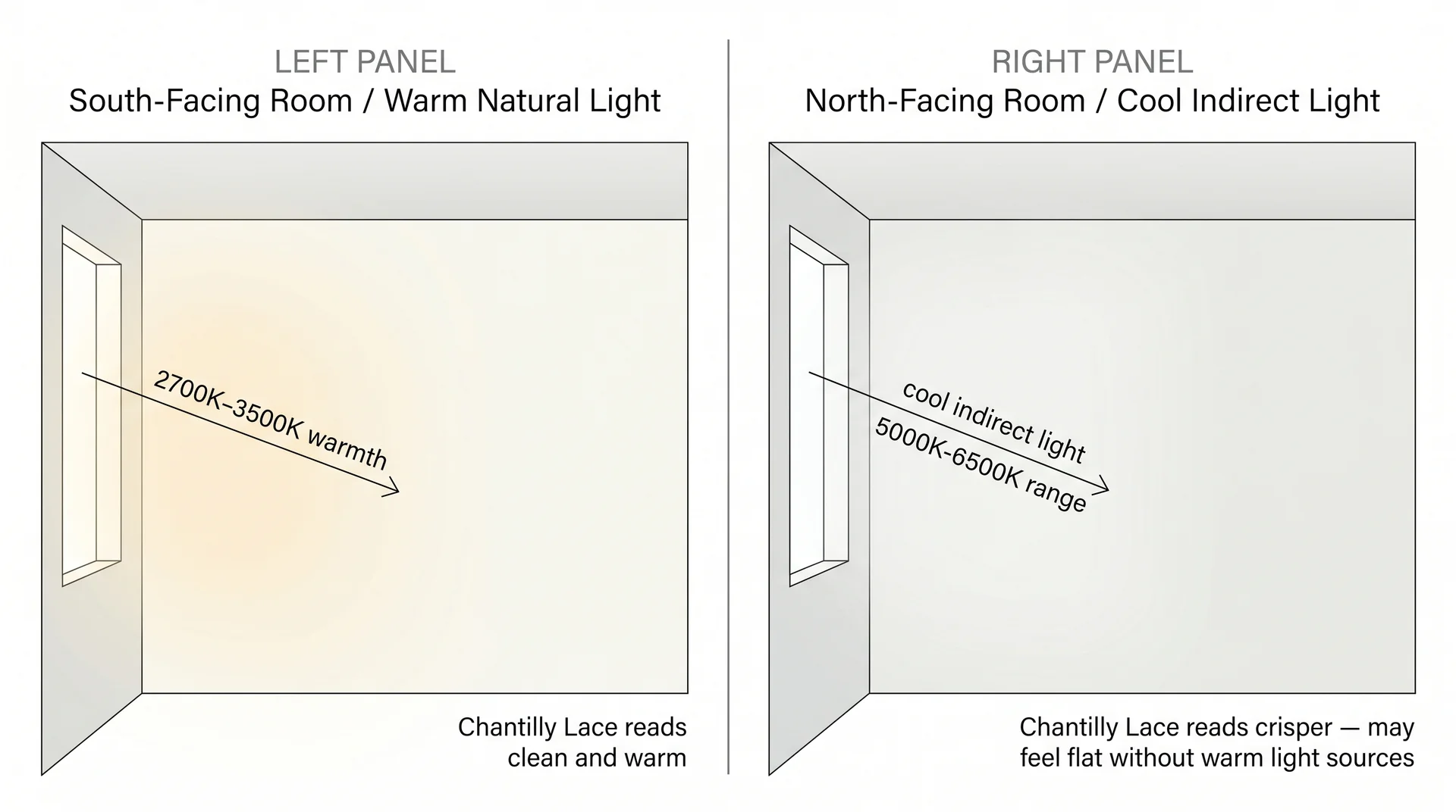
South- and West-Facing Rooms
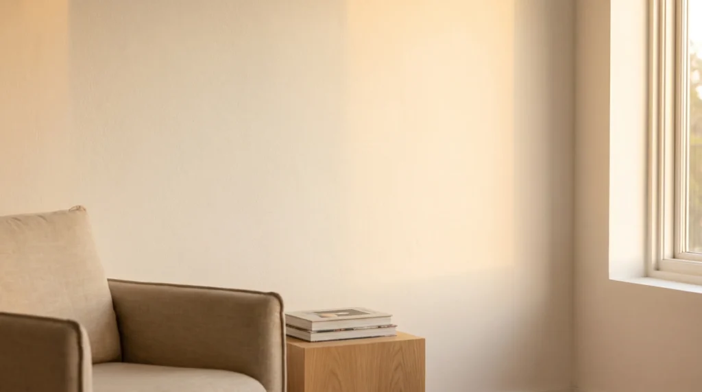
This is where Chantilly Lace earns every recommendation it gets. Warm afternoon and southern light bring out the color’s slight warmth without pushing it into cream territory. Walls look bright, clean, and fresh.
The undertone balances nicely against warm wood floors or natural stone without competing. If you have a south- or west-facing space and you’ve been going back and forth on this color, it will look the way the photos you’ve been saving look.
North- and East-Facing Rooms
This is the conversation most polished articles avoid. In a north-facing room, or any space that gets predominantly cool indirect light, Chantilly Lace can read slightly flat.
It won’t shift visibly grey or blue; it carries no grey undertone, so that kind of shift isn’t in its range. But the slight warmth that reads so well under southern light gets suppressed in cool ambient conditions, and what you’re left with is a very clean, crisp white that some people find sharp and others find clinical.
I worked on a north-facing living room where the client had chosen Chantilly Lace specifically because they’d loved it in a bright dining room at a friend’s house. On the painted walls, the color read correctly but was noticeably cooler than they expected.
The paint wasn’t wrong. The light was doing exactly what a north-facing light does. The fix wasn’t repainting; it was shifting the lamp sources toward warmer bulbs around 2700K. That’s the thing to know before you stand in a hardware store choosing between this and Simply White.
Artificial Lighting: The Renovated Kitchen Problem
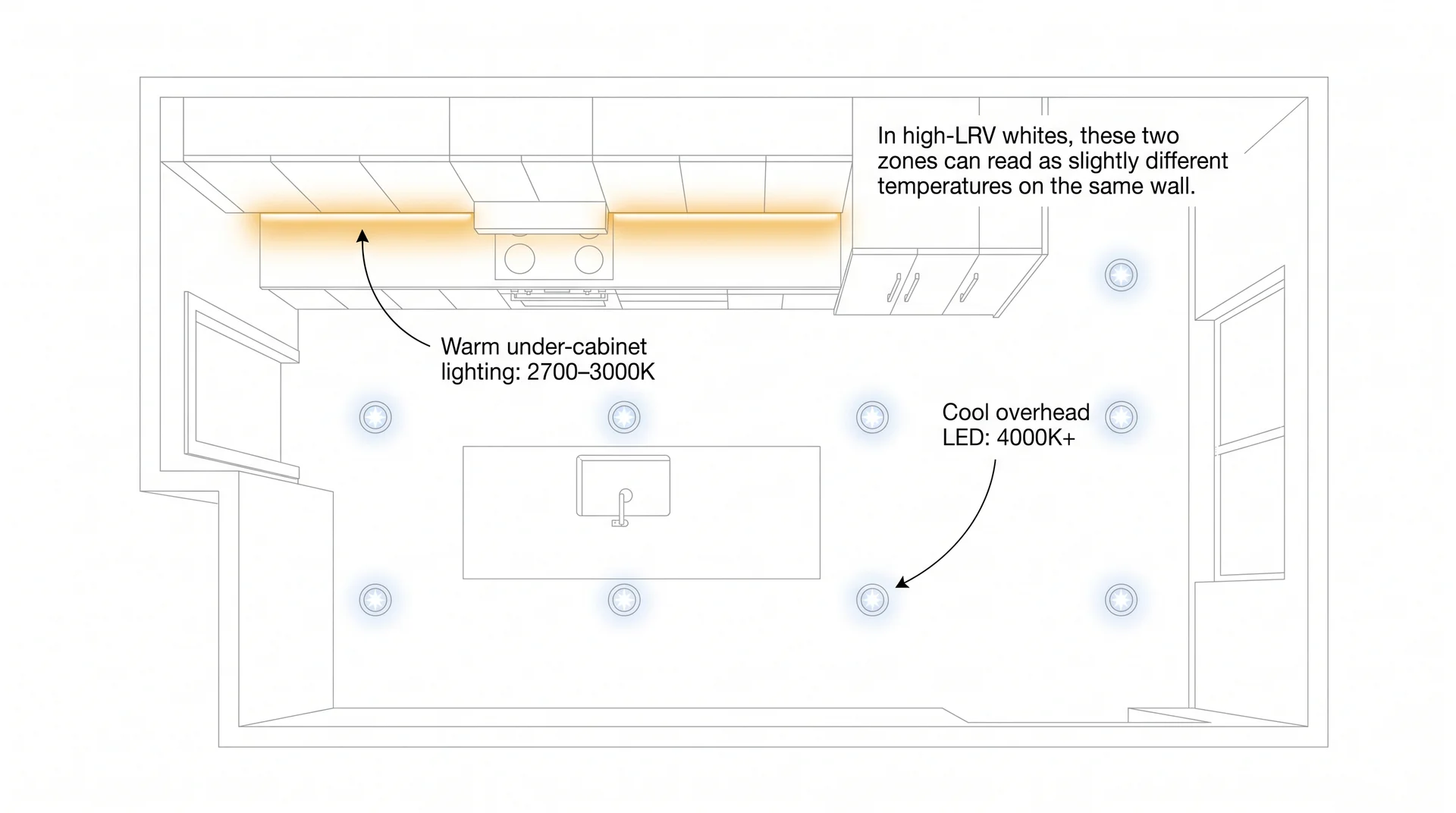
Here’s a situation that comes up constantly on client projects and almost never makes it into paint articles.
Modern renovated kitchens and bathrooms typically run two competing light sources: cool-white LED overhead fixtures, usually around 4000K or higher, and warm under-cabinet or vanity lighting in the 2700 to 3000K range.
These aren’t the same color temperature, and in a high-LRV white like Chantilly Lace, the result is that different surfaces in the same room can read slightly differently depending on which fixture is the dominant light source in that zone.
Under-cabinet faces lit from below by warm lights read warmer. Walls under cool overhead LEDs read crisper and slightly cooler. In the same kitchen, with both sources running simultaneously, you may see a visible temperature shift across the space.
It’s subtle. Most people stop registering it after a few weeks of living with it. But it surprises people on reveal day, and it’s worth knowing before you sign off on your kitchen lighting plan alongside your paint selection.
If you want to avoid it, standardize your kitchen light sources to 2700 to 3000K throughout. If that ship has sailed because the overhead fixtures are already installed, accept the variance as part of how the room works. It reads as depth more than error once you stop looking for it.
Understanding how the color sits on different surfaces in that light is a separate question entirely, and it’s worth thinking through before you commit to an all-Chantilly-Lace approach.
Chantilly Lace on Walls, Cabinets, and Trim
Chantilly Lace works on all three surfaces, but it doesn’t behave identically on all three, and that distinction matters if you’re planning a cohesive whole-room approach.
On Walls
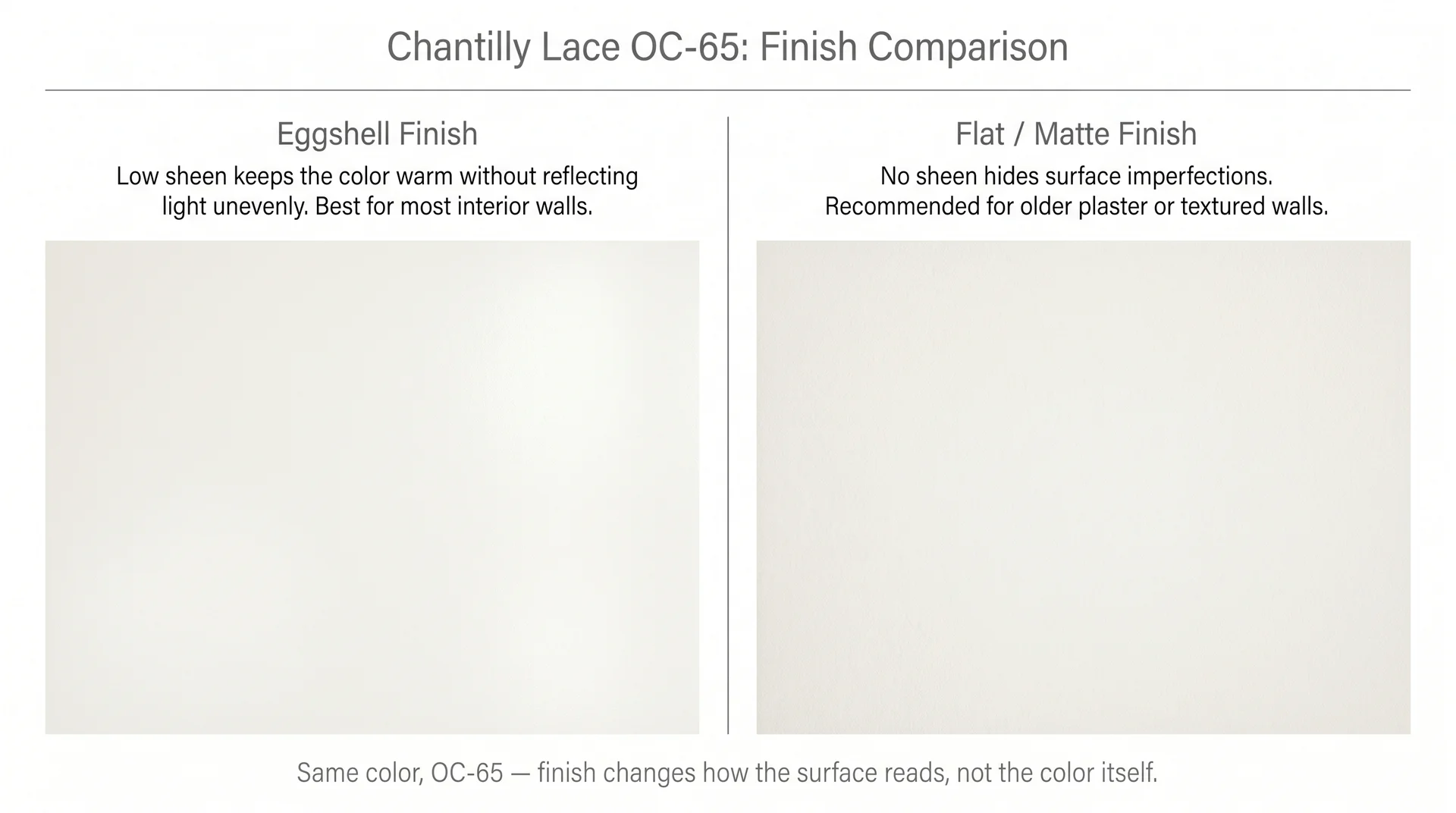
Eggshell is the standard finish for most interior walls, and it works well with Chantilly Lace. The low sheen keeps the color soft without making the room feel matte flat, which can sometimes dull a very bright white and make it read slightly chalky.
Flat or matte is worth considering in older homes with textured plaster walls, where you want the color without the sheen drawing attention to surface variation. If you’re painting ceilings in the same room, see our guide to choosing the right ceiling paint.
Ceiling white and wall white are typically different products with different formulations, even when you want them to match.
On Cabinets
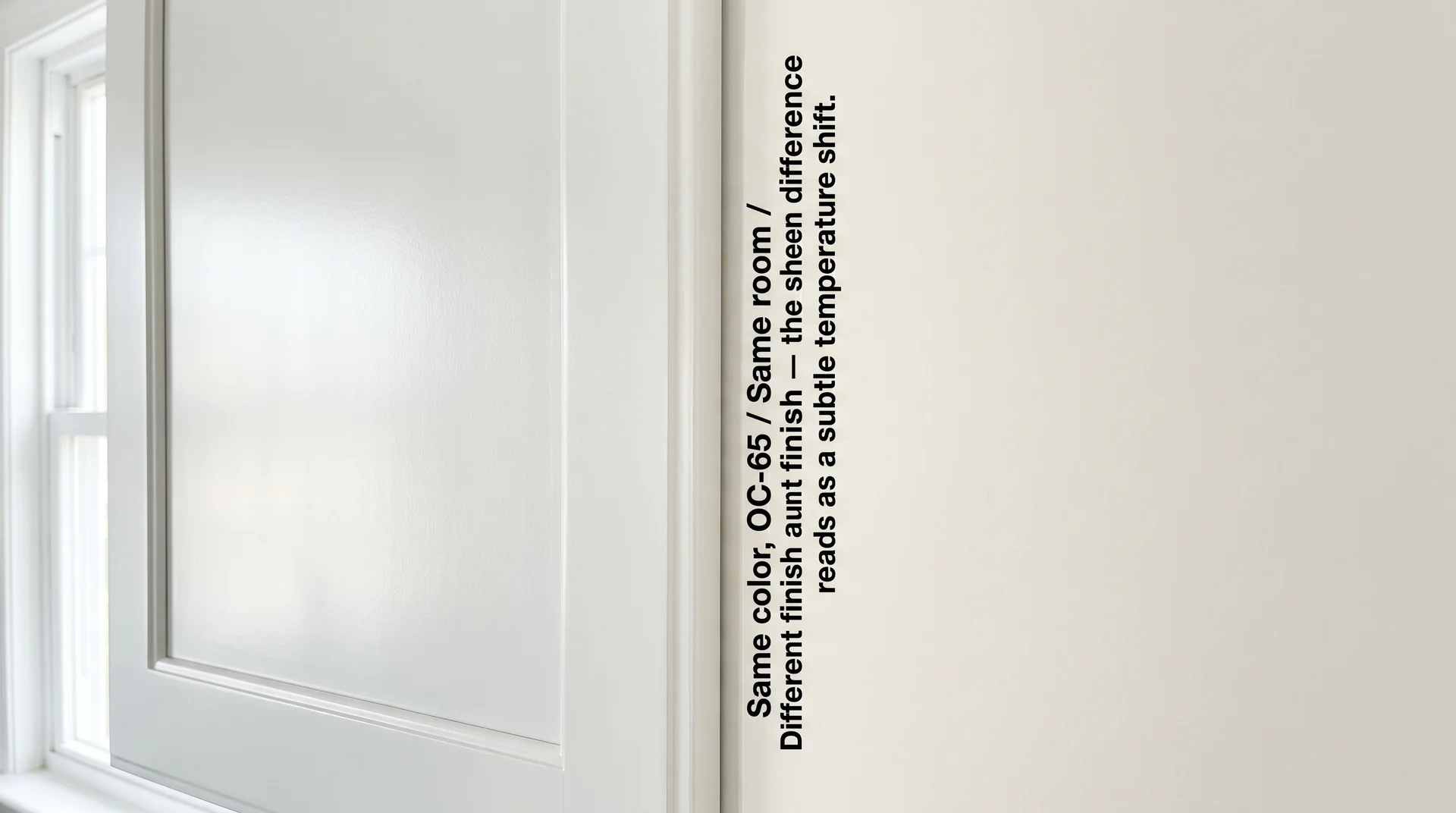
The question of whether Chantilly Lace works on cabinets comes up constantly in autocomplete suggestions and rarely gets a direct answer. It works. With this specific consideration, cabinet painting calls for a semi-gloss or satin finish for cleanability and durability.
At those higher sheens, Chantilly Lace reads slightly crisper and cooler than it does in eggshell on walls. The color is the same. The sheen is amplifying the reflectance and reducing the perceived warmth.
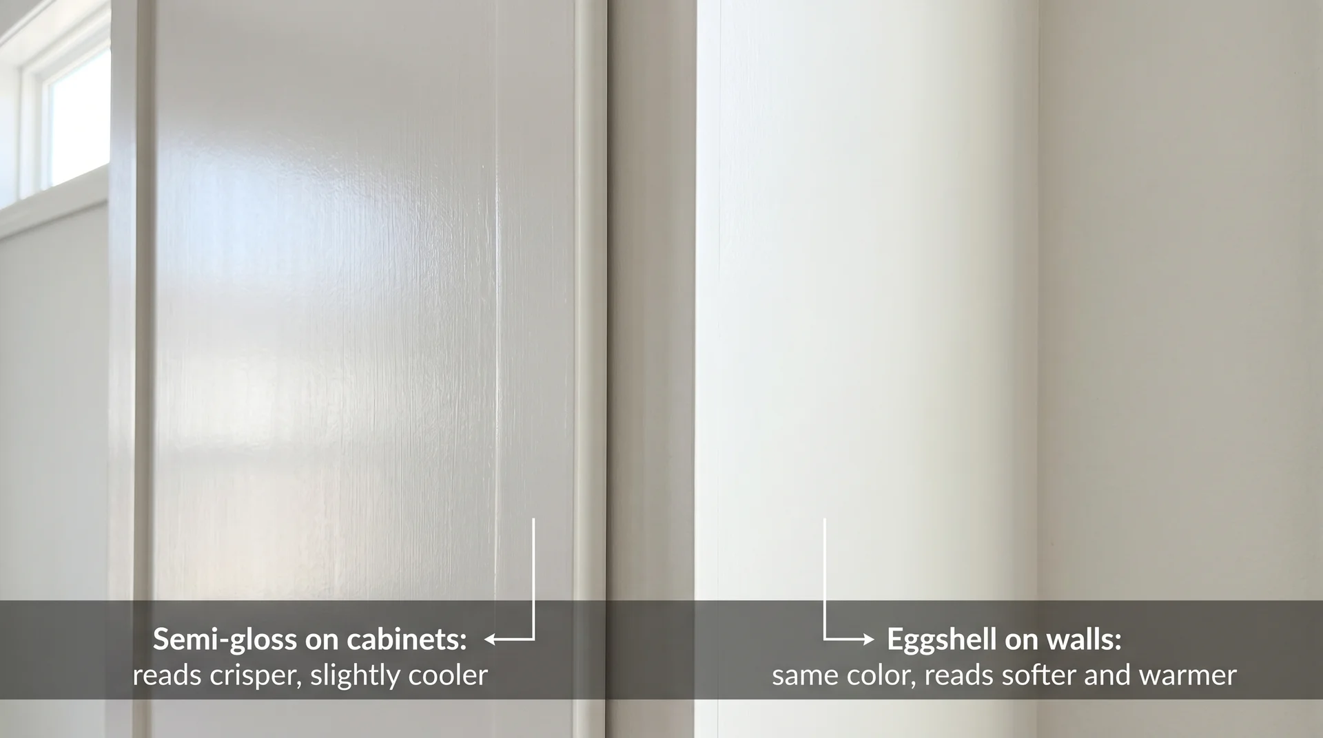
In a room where cabinets and walls are both Chantilly Lace but in different finishes, they’ll look like slightly different whites when you stand back and compare them across the room.
This usually reads as intentional contrast rather than a mistake. The cabinets look clean and precise, and the walls look soft. But if your goal is a seamless visual match, test both finishes side by side on an actual cabinet door and an adjacent wall section in your specific light before you commit to the full project.
On Trim and Millwork
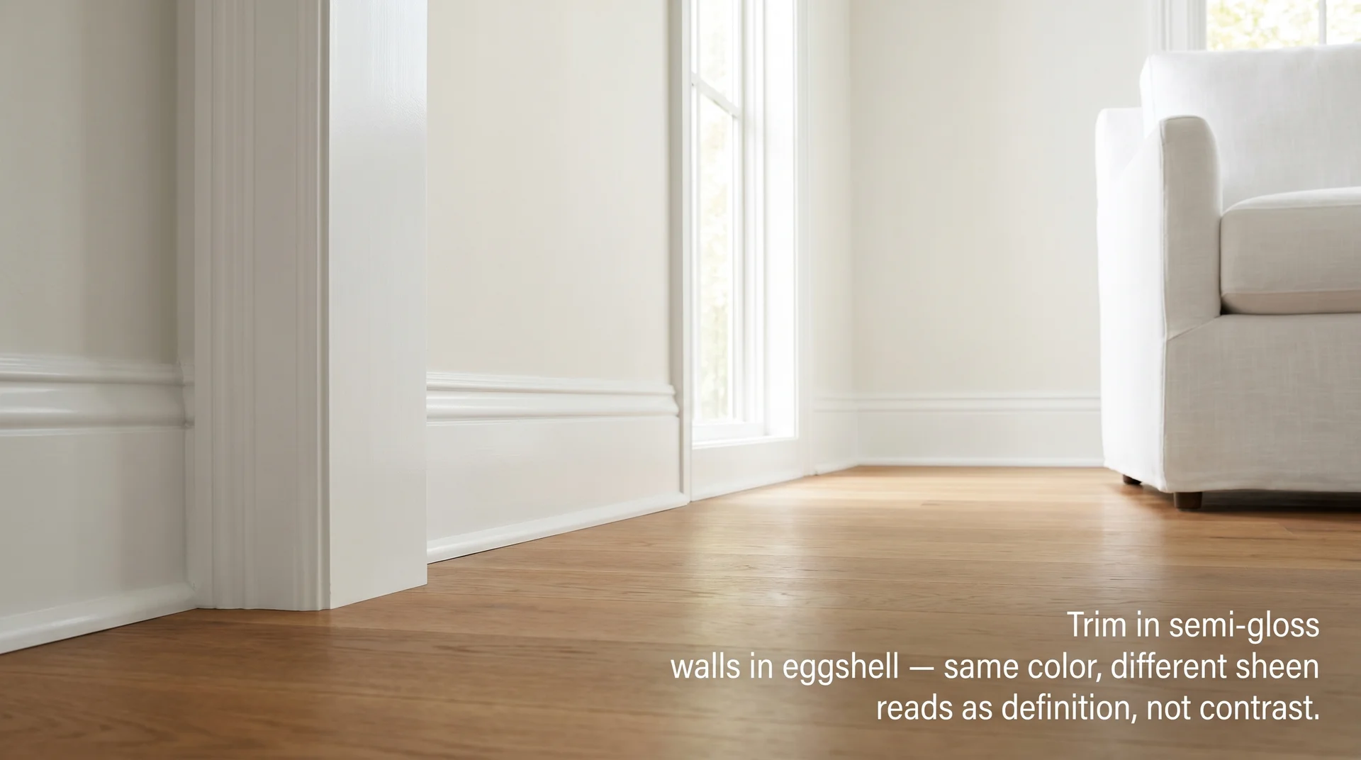
Chantilly Lace in semi-gloss on trim, paired with itself on walls, produces a quiet, tailored result that holds up across design styles from traditional to contemporary.
When the wall colour is a warmer, lower-LRV neutral from the Off-White family rather than Chantilly Lace itself, the contrast reads more deliberate without creating a colour temperature conflict.
Benjamin Moore Pale Oak (OC-20) is one of the most consistently cited pairings in this configuration since the warm base is compatible with Chantilly Lace’s slight warmth, and the approximately 23-point LRV gap between the two creates a clean visual distinction at the wall-to-trim line that the tonal approach deliberately avoids.
The slight sheen difference between the trim and the wall reads as definition rather than contrast. It also coordinates naturally with most other whites on existing trim because its near-neutral undertone rarely clashes the way a strongly yellow or grey-leaning white would.
If you’re working with baseboards, shoe molding, or other trim profiles, this guide on choosing the right trim profile covers the installation side of the decision.
Chantilly Lace vs. Simply White vs. White Dove vs. Pure White
| Color | Brand & Code | LRV | Undertone Character | When It’s the Right Call |
|---|---|---|---|---|
| Chantilly Lace | Benjamin Moore OC-65 | 92.2 | Very slight warm; reads neutral in most conditions | Bright, south- or west-facing rooms; cabinets; trim; mixed-material spaces where you want the walls to stay clean |
| Simply White | Benjamin Moore OC-17 | Slightly lower than Chantilly Lace | Noticeably warm with a soft yellow-cream lean | North-facing or cool-light rooms; spaces with a lot of grey or cool-toned materials; anywhere you’ve tested Chantilly Lace and it reads too crisp |
| White Dove | Benjamin Moore OC-17 | 83.16 | Soft, warm white; slightly creamy, more muted than Simply White | Traditional rooms; shaded exterior elevations; anywhere a softer, less bright white suits the architecture better than a high-LRV true white |
| Pure White | Sherwin-Williams SW 7005 | 84 | Slight warm lean; reads as a soft off-white at this LRV | Sherwin-Williams projects where a clean white with slight warmth is wanted; not a direct swap for Chantilly Lace, the LRV gap is visible |
A few things that cut through the usual hedging:
- Chantilly Lace vs. Simply White is the most common comparison, and there’s a real answer for most rooms. Chantilly Lace stays cleaner; Simply White pulls warmer. The gap between them is subtle on a chip and more visible on a full wall. If your room runs cool and you’ve tested Chantilly Lace and it felt stark, Simply White is the right move. If your room runs warm and you want the walls to read clean rather than add more warmth to the pile, Chantilly Lace holds its neutrality better.
- Chantilly Lace vs. White Dove is less about choosing between two similar whites and more about choosing between two different intentions. Chantilly Lace at LRV 92.2 is a bright, crisp white. White Dove sits lower on the scale, reads softer and less assertive, and holds up better in shaded conditions both inside and out. If you want your white to recede slightly rather than announce itself, White Dove is the choice.
Chantilly Lace Color Palette: What Works With It
Because Chantilly Lace has almost no dominant undertone, it coordinates across a wider range of palettes than most whites, but that flexibility isn’t unlimited, and a few material combinations work against it in ways that don’t always show up in styled room photos.
Warm-Toned Rooms
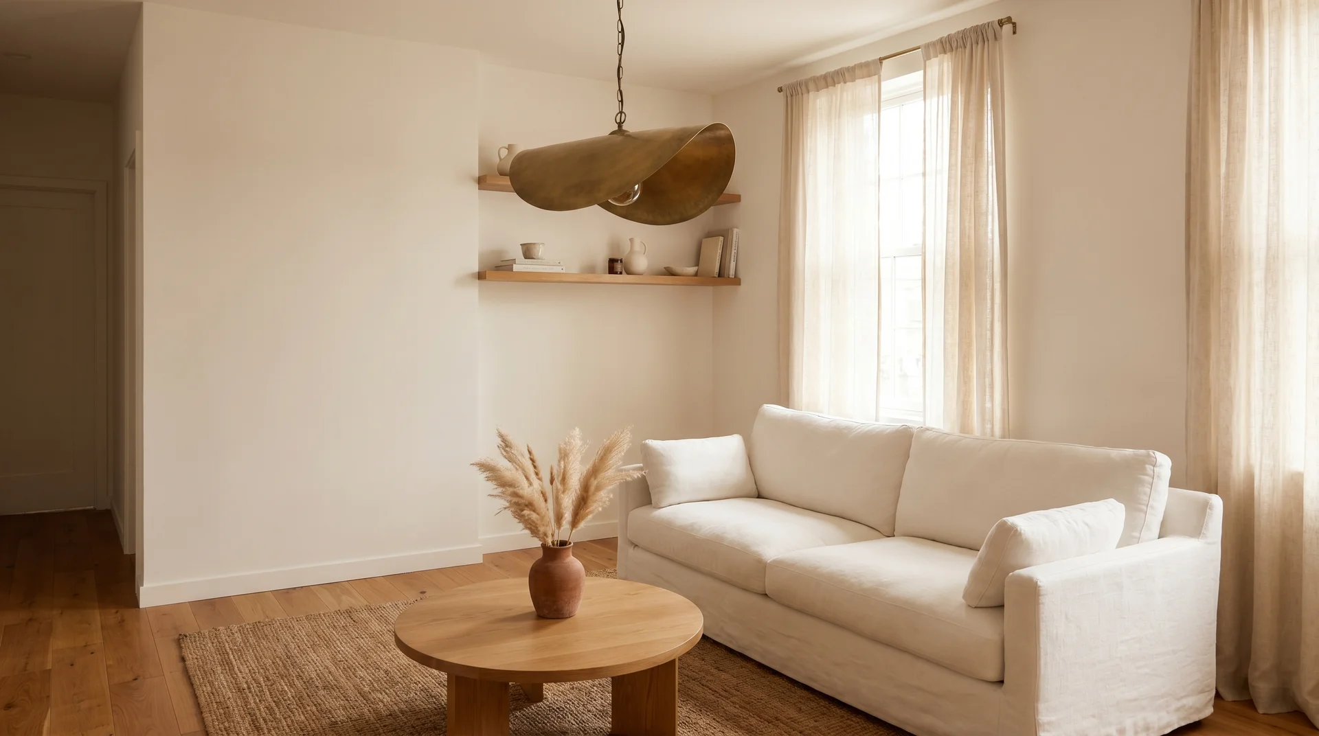
Chantilly Lace is genuinely excellent alongside warm materials. Honey-toned and medium oak hardwood floors, natural linen and jute textiles, aged or unlacquered brass hardware, terracotta accents, warm sage, the walls don’t compete with any of those.
They hold steady as a clean backdrop while the warmth in your materials does what you want it to do. I’ve used it in a few rooms with warm walnut floors and soft brass fixtures, where the white made everything else read more intentional rather than busy.
What doesn’t work as well in warm rooms: deep, saturated warm accent colors on adjacent wall planes. A rich terra cotta or warm rust next to Chantilly Lace can make the white read slightly cold by contrast, even though it isn’t.
If you’re working with strong, warm accents, put them on furniture, textiles, and soft furnishings rather than on walls that share a corner with the white. For kitchen spaces specifically, if your countertop material is part of this decision, this guide to popular granite colors covers how stone tones interact with paint choices in more detail.
Cool and Neutral Rooms
With cool-toned materials, blue-grey concrete, cool-tinted marble, blue-green tile, brushed nickel or chrome fixtures, Chantilly Lace reads clean and very slightly warm by comparison, which prevents the room from going cold or clinical.
Navy, slate blue, and soft sage coordinate particularly well. Charcoal, used in small doses on cabinetry hardware or furniture, adds definition without pulling the color cool.
One specific constraint to flag: in a room where every material is pulling cool grey marble, grey tile, cool lighting, grey furniture, Chantilly Lace’s near-neutral undertone can read as slightly warmer than it actually is, because your eye is calibrated to the cool environment.
It may look like it has more yellow in it than it does. This isn’t the paint behaving badly. It’s simultaneous contrast doing its job. Test the sample directly against your specific materials, not against the chip alone, before committing.
Navy and deep blue-green accents hold up particularly well against it, which is partly why Chantilly Lace became so associated with the shiplap-and-navy aesthetic that peaked several years ago and has since matured into something quieter and more restrained.
Chantilly Lace for Exterior Use
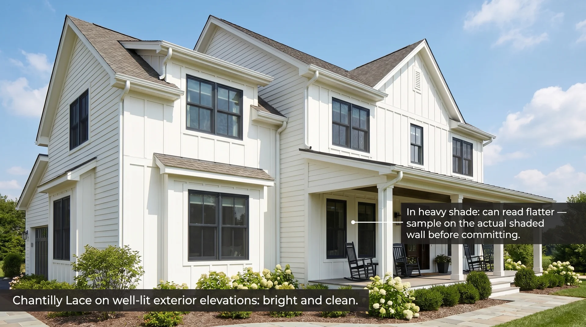
Chantilly Lace works on the exterior, and on well-lit elevations, it reads exactly like the crisp, magazine-cover white most people are picturing when they search for a white house color.
Its high LRV in direct sunlight produces a clean brightness without the slight blue or violet shift that affects some near-white exterior colors under certain sky conditions.
Two things to know before you commit it to an exterior project.
First, exterior paint is formulated differently from interior paint.
Benjamin Moore’s Aura Exterior and Regal Select Exterior lines both carry Chantilly Lace, but you need exterior-specific samples, not interior chips, because sheen and durability formulations affect how a color reads at scale on siding, wood trim, and masonry differently than on flat drywall.
Second: on heavily shaded or north-facing elevations, or under deep porch ceilings, Chantilly Lace can read more flat-grey-white than clean crisp white. The same dynamic that affects north-facing interior rooms is more pronounced at the exterior scale in shade.
If your home has a significant shaded elevation and you want it to read as warm white rather than slightly dull, sample White Dove alongside Chantilly Lace on that specific wall. The softer, slightly warmer character in White Dove holds better in cool shadow at exterior scale, even though the two colors look nearly identical in a bright showroom or on a chip.
How to Sample Chantilly Lace Before You Commit
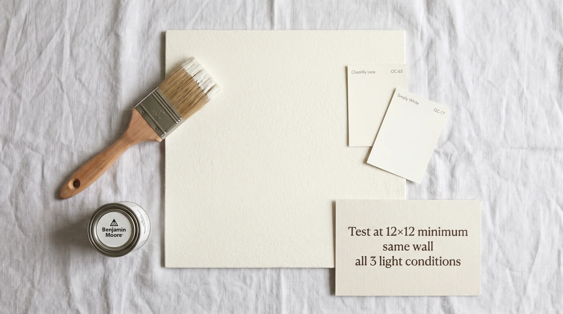
One well-done sample test is worth more than ten chip comparisons, and the way most people test paint samples is set up to mislead them. A few specifics that make the difference:
- Paint directly on the wall, not on paper or cardstock. Your existing wall color shows through the cardboard and affects everything you see. Sample patches painted on actual primed drywall tell you what a freshly painted wall will look like. Patches painted on paper tell you what the chip company’s lighting looked like.
- Go large: at least 12 by 12 inches, ideally bigger. Small patches get dominated by the surrounding wall color and the surrounding light. The larger the sample area, the more accurately it represents full-room coverage.
- Look at it in the morning, in the afternoon, and in the evening with your actual light fixtures on. Chantilly Lace shifts more than most of its competitors across those three conditions. All three observations matter, not just the one that happens to look right when you’re standing there with a chip.
- If you’re painting cabinets, sample the correct finish. Semi-gloss on a cabinet door next to eggshell on the wall tells you what you’ll actually be living with. The sheen difference reads in the room even when both surfaces are the same color.
- If you’re comparing it to Simply White or White Dove, put them next to each other on the same wall on the same day. Comparing them from separate tests done on different days in different light is how people make the wrong decision and end up repainting.
Samplize makes peel-and-stick samples painted with actual Benjamin Moore paint that work reasonably well for wall color decisions. They’re not a substitute for a freshly painted door sample in a cabinet project, but they let you test multiple wall locations without buying a separate sample pot for each one.
The Bottom Line on Chantilly Lace
Chantilly Lace is the most widely recommended white in residential design right now, and the recommendation holds up.
It’s bright without being stark, it coordinates across a wide range of material palettes, and its near-neutral undertone means it rarely creates the kind of unexpected color shift that turns a beautiful chip into a regrettable wall. Those qualities are real.
It’s not the right choice in every situation. North-facing rooms with no warm artificial light, kitchens with competing light temperatures, and shaded exterior elevations in each of those conditions, it can read differently than the photos and chips suggested, and the gap between expectation and reality is worth planning for rather than discovering after the fact.
If your space fits one of those descriptions and you’ve tested the sample and it looked slightly flat or cool, trust what you saw. Simply White for a warmer read, White Dove for a softer one; both are legitimate alternatives, not consolation prizes.
If your sample looked right, it almost certainly is. The color is consistent and well-formulated. What varies is the light it’s sitting in.
