
Agreeable Gray works in most homes. Whether it works in yours depends almost entirely on your room’s light source and the undertones already present in your floors and trim, and that’s what most color reviews skip.
SW 7029 is one of the most frequently recommended neutrals I’ve encountered across a decade of residential design work, and I’ve also watched it go wrong in ways that genuinely surprised homeowners who had followed every standard piece of advice. Both things are true. What follows is the complete picture.
What Is Agreeable Gray? (SW 7029 at a Glance)
Agreeable Gray is a warm greige, a color classification that sits between pure gray and pure beige with a lean toward the warmer side. It belongs to Sherwin-Williams’ neutral family, carries the product designation SW 7029, and has been one of the most-used interior neutrals in American residential design for well over a decade.
The reason it lands differently in different rooms and the reason it became as popular as it did both trace back to the same quality: it’s complex enough to read as sophisticated without being so specific that it fights the other finishes in a space.
The Key Color Specs
LRV 60. That’s the number that matters most when you’re deciding whether this color will work in your space.
An LRV, or light reflectance value, measures how much light a paint color reflects into the room on a scale from 0 (pure black) to 100 (pure white).
At 60, Agreeable Gray lands solidly in the medium-light range, bright enough to keep a room from feeling heavy, but not so light that it reads as near-white or disappears into the background. Most pure whites sit at 85 and above.
| Spec | Value |
|---|---|
| Sherwin-Williams Code | SW 7029 |
| LRV | 60 |
| Color Family | Neutral / Greige |
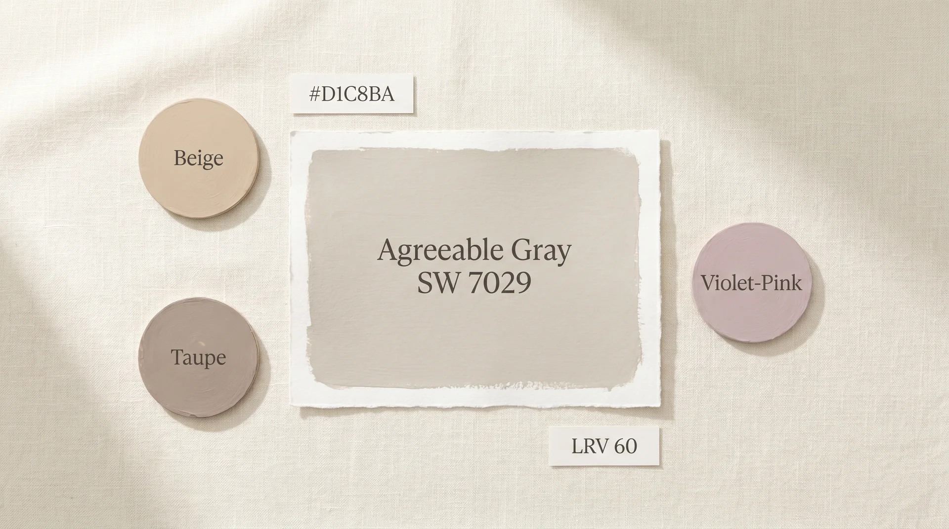
| Hex Code | #D1C8BA |
| RGB | R: 209, G: 200, B: 186 |
| Primary Undertones | Beige, taupe, violet-pink |
| Available At | Sherwin-Williams stores; HGTV Home by Sherwin-Williams at Lowe’s |
The RGB breakdown tells you something useful. Red at 209 and green at 200 sit close together in the warm spectrum, which explains the beige-leaning quality. Blue at 186 isn’t negligible, and that’s where the complexity lives.
Under warm light, the blue component recedes. Under cool light, it surfaces, and when it does, it brings the violet-pink undertone with it. That phenomenon is what the undertones section covers in full.
Does Agreeable Gray Look Gray or Beige?
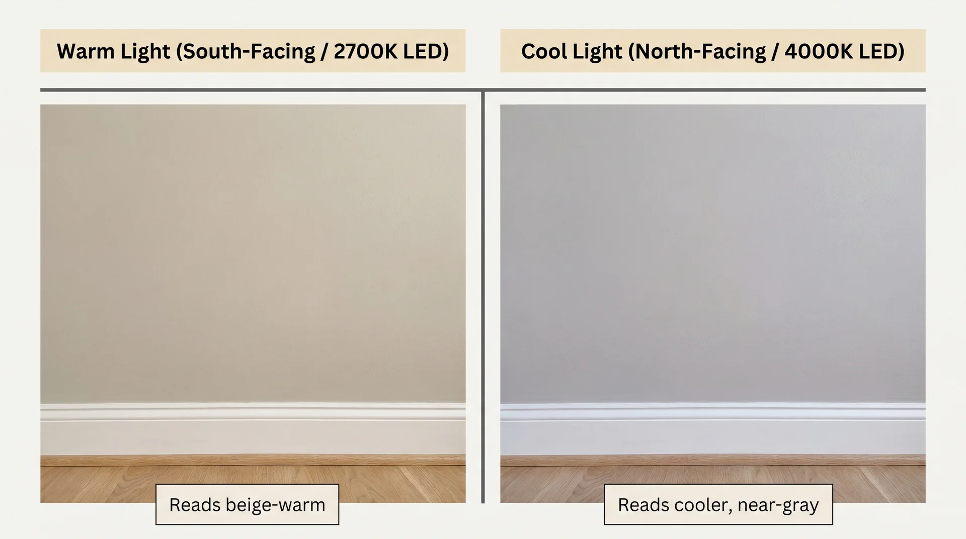
Agreeable Gray reads as a warm greige in most conditions: more beige than gray in warm-lit rooms, but capable of reading closer to gray in cool or north-facing spaces where the warmer frequencies in the pigment aren’t activated by the light source.
On a south or west wall with good natural light, most people would describe this color as a soft, warm gray or warm beige; the greige classification holds. In a north-facing room under cool artificial lighting, the same color can read much grayer, and occasionally almost taupe-purple. The answer to “Is it gray or beige?” is genuinely both, depending on where it lives in your home.
Why Agreeable Gray Became the Most Popular Neutral in America
Home stagers and production builders adopted Agreeable Gray aggressively through the 2010s because it photographs cleanly, reads as calm without reading as cold, and pairs with a wide range of flooring and trim finishes without requiring careful coordination.
It was the neutral of choice in the Fixer Upper era of interior design, appearing frequently in spaces influenced by Joanna Gaines and widely adopted as the go-to choice for American home renovations through that decade. That association cemented its status as the reliable answer when someone didn’t want to make a mistake.
Its ubiquity is also the thing many homeowners are now most uncertain about. Whether that should factor into your decision is addressed in the final section. The relevant point for now: a color doesn’t get adopted this widely unless it reliably delivers, and Agreeable Gray reliably delivers in the right conditions. Understanding what those conditions are is the whole point of this guide.
Agreeable Gray Undertones: What You Need to Know Before You Commit
Agreeable Gray’s undertones are beige and taupe with a subtle violet-pink frequency that becomes visible under specific lighting conditions, particularly in north-facing rooms or under cool-toned LED bulbs at 4000K and above. The sections below explain what that means for your specific space and, more importantly, how to know before you paint whether your room is one of the situations where it matters.
The color that shows up pink in your living room isn’t a different formula. It’s the same one under different light.
Is Agreeable Gray Warm or Cool?
Agreeable Gray is a warm color overall, classified as a greige with a dominant beige-taupe base that reads as inviting rather than cool or sterile in most lighting conditions.
That warm quality is a key part of its appeal over something like Repose Gray, which sits in a cooler, more purely gray position and can feel clinical in certain spaces. Agreeable Gray tends to feel settled and grounded. In south- and west-facing rooms with good natural light, or under warm-white artificial lighting, it performs exactly as the product chip suggests. The greige classification holds.
The caveat is that warm overall doesn’t mean it reads warm in every room under every light source. The warmth is real. It’s also conditional, and the conditions matter more with this color than with most straightforward neutrals.
Why Agreeable Gray Sometimes Reads Pink or Purple
This is the complaint that surfaces constantly in home design forums, Facebook paint groups, and every subreddit where people are navigating color decisions: someone paints a living room Agreeable Gray, steps back, and sees pink. Or lavender. Something they definitely didn’t expect and didn’t choose.
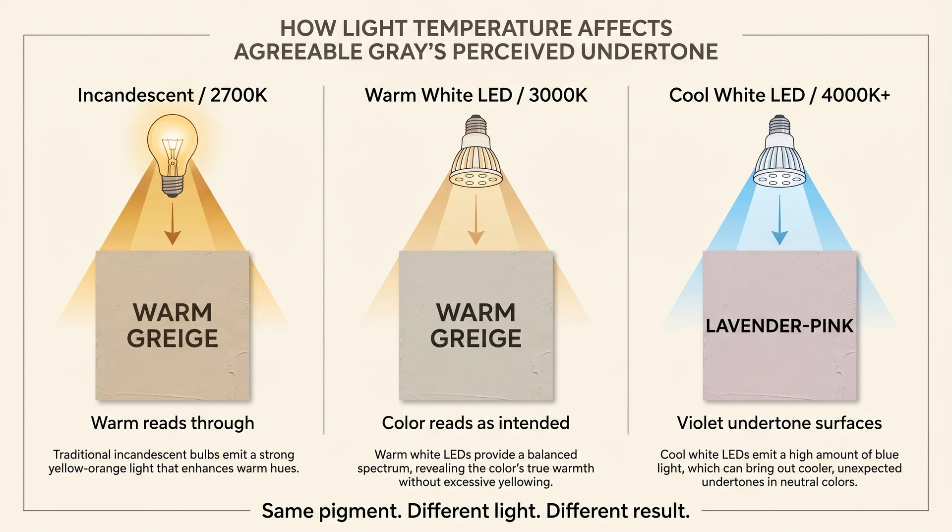
Here’s what’s actually happening: the violet-pink frequency in the pigment is always present. Under warm light, it’s suppressed. Under cool light, it isn’t.
Warm incandescent bulbs and warm-white LEDs in the 2700K to 3000K range emit amber-toned light that fills in the warm channels of the pigment and keeps the violet frequencies from reading at full strength.
Switch to a cool-white LED at 4000K or higher, or let north-facing daylight be your primary light source, and that amber suppression disappears. The violet-pink component reads at full strength against a cooler ambient light, and the color shifts toward lavender.
This shift is caused by metamerism, a well-established principle in color science that describes how the same pigment can look like two different colors depending on what’s illuminating it. It isn’t a defect in the paint.
It’s a property of how pigment and light interact, and it affects Agreeable Gray more noticeably than most of its competitors because of the specific mix of frequencies in SW 7029’s pigment formula.
The situations where I’ve personally seen this go wrong: north-facing living rooms with large windows, spaces lit entirely with recessed cool-white LEDs, and rooms with cool-gray LVP flooring that reflects cool light up onto the walls.
In all of those environments, Agreeable Gray can read as genuinely lavender by late afternoon. It’s a jarring result when you weren’t expecting it, and the sampling process outlined later in this guide is the only reliable way to know before the second coat goes on.
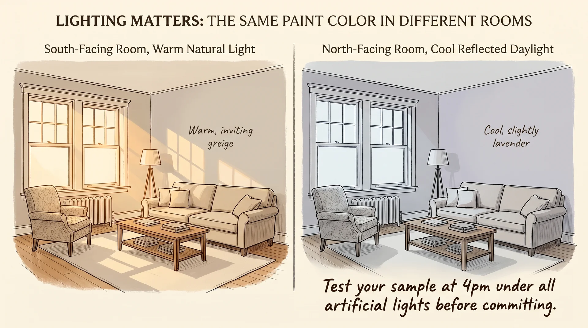
How Your Room’s Light Source Changes Everything
Room orientation and light source temperature each affect perceived color independently. Agreeable Gray’s behavior across those variables follows a consistent pattern once you know what to look for.
| Room Condition | How Agreeable Gray Reads | Risk Level |
|---|---|---|
| South-facing, warm natural light | Warm, true greige | Low |
| West-facing, afternoon sun | Warm and golden, especially at dusk | Low |
| East-facing, morning light only | Warm in the morning, can cool by midday | Medium |
| North-facing, no direct sun | Can shift toward green-gray or lavender | High, sample carefully |
| Warm LED (2700K–3000K) | Warm, reads as intended | Low |
| Cool-white LED (4000K+) | Can pull noticeably pink or lavender | High, check bulb temperature first |
| Incandescent | Warm, sometimes warmer than expected | Low |
One thing color guides consistently skip: if you have a mix of light sources in one room, recessed cool whites combined with warm floor lamps, for example, the color will read differently in different zones of the same space throughout the day.
I’ve seen this create a beautiful layered effect in a living room where warm lamps anchored the seating area. I’ve also seen it make two walls in the same room look like they’d been painted different colors. The deciding factor was which lights were on.
What Colors Pair Well With Agreeable Gray?
Agreeable Gray pairs best with whites and off-whites that share its warm beige direction, with warm wood tones that echo its greige base, and with muted, earthy accent colors that don’t compete with its undertone complexity.
Pairings that tend to go wrong introduce cool-toned elements without accounting for how they’ll interact with the violet-pink frequency in the paint.
The Best Trim Colors for Agreeable Gray Walls
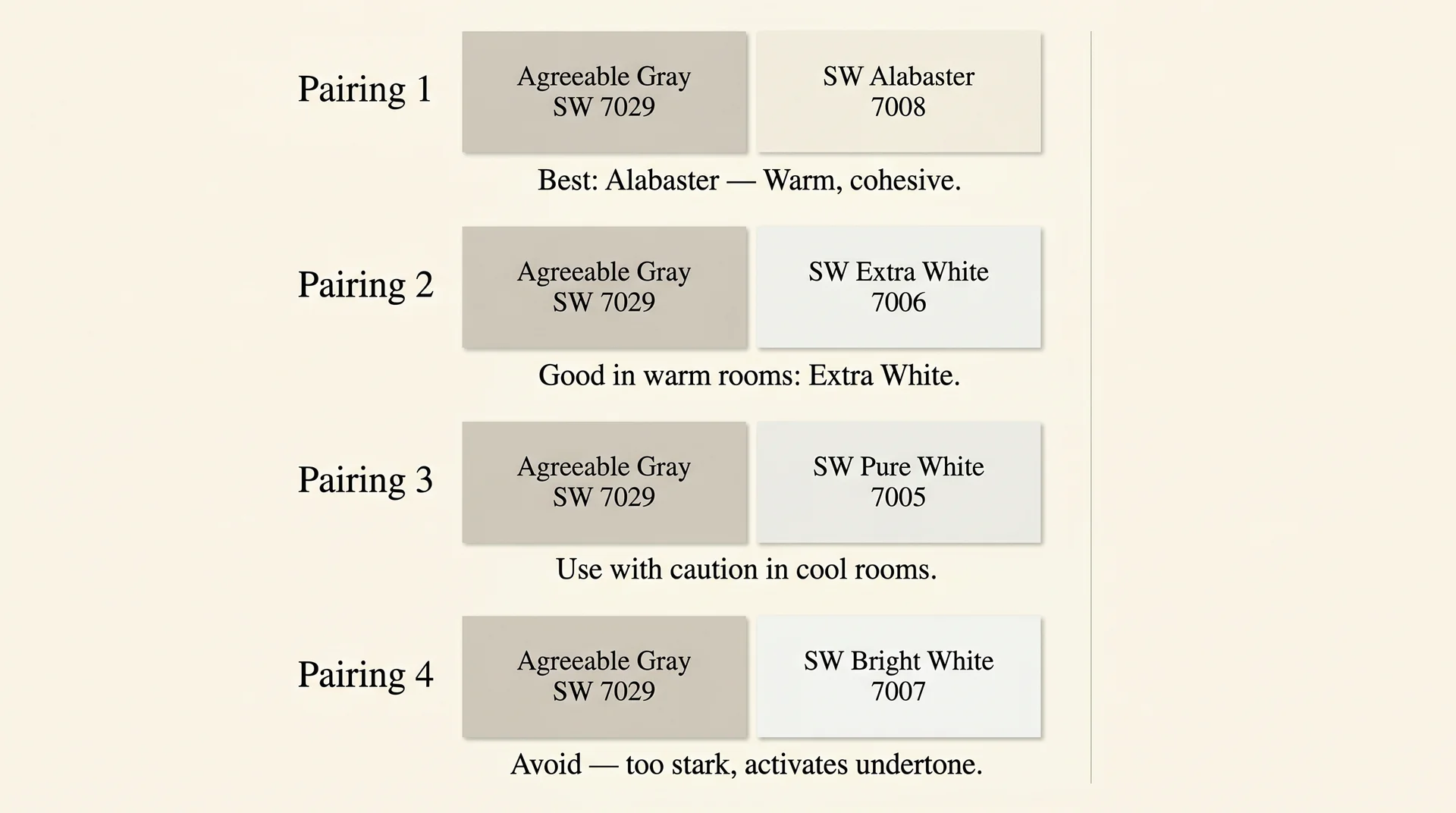
Trim selection is where most Agreeable Gray rooms either pull together or quietly fall apart. The color needs white trim that shares its warmth, not trim that fights it.
- SW Alabaster (SW 7008): The strongest pairing in most situations. Alabaster’s warm, creamy white complements Agreeable Gray’s beige base without creating a jarring contrast. The two share enough of the same warm frequency that the room feels cohesive rather than striped, and Alabaster doesn’t introduce any of the cool frequencies that can activate AG’s violet undertone. If you want to understand how Alabaster behaves across different lighting conditions before committing to this pairing, this in-depth guide to SW Alabaster paint color covers its undertone behavior in the same detail as this article.
- SW Extra White (SW 7006): A solid choice in south- or west-facing rooms where the warmth is well established. In cooler rooms, Extra White can read slightly cool against Agreeable Gray and create a tension that most homeowners sense without being able to identify.
- SW Pure White (SW 7005): Workable in warm, well-lit spaces but risky in cool or north-facing rooms. Pure White leans slightly cool, and against Agreeable Gray’s violet-pink undertone in dim light, the contrast can feel unresolved rather than crisp.
- SW Bright White (SW 7007): Generally worth avoiding with Agreeable Gray. It reads too stark and highlights the undertone mismatch rather than creating a clean contrast.
Agreeable Gray With Oak Trim: Answering the Current Question
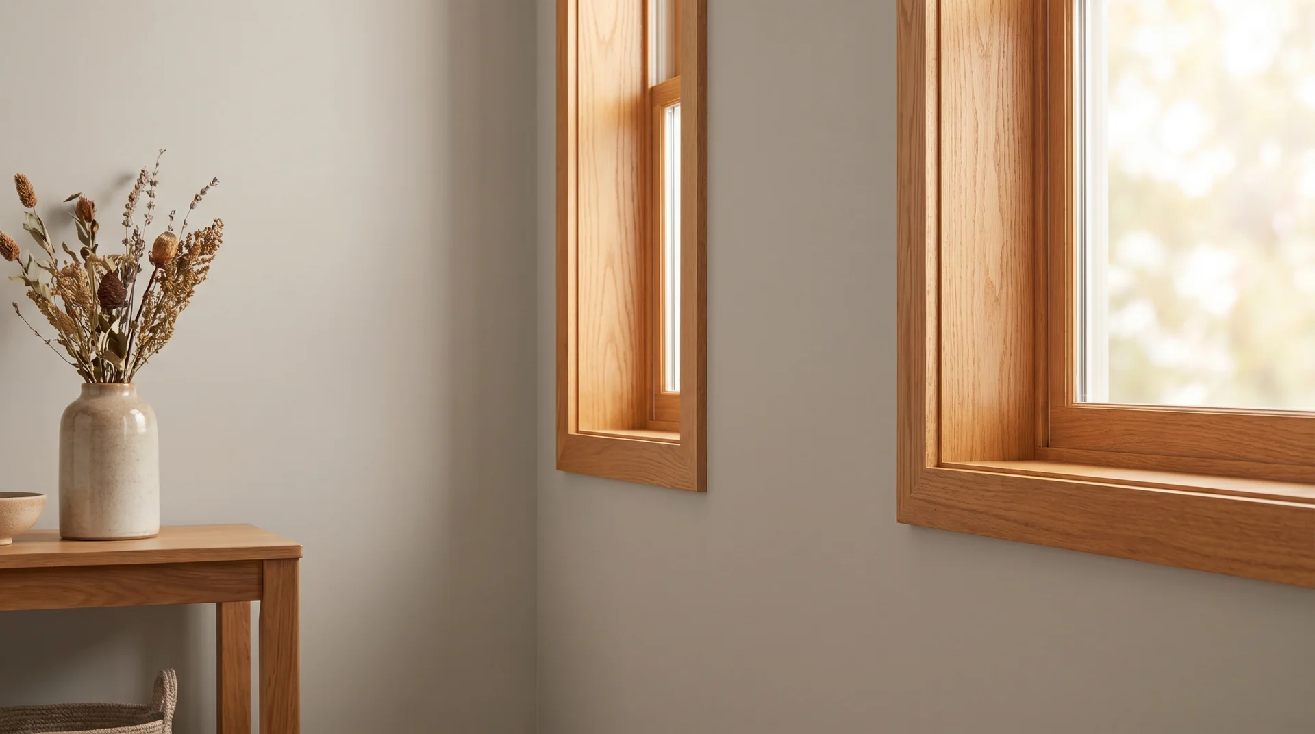
This is the pairing question that most existing Agreeable Gray articles don’t address, because the reviews that rank well were written when cool white trim and gray walls were the dominant combination. The warm-wood revival has changed what people are actually working with, and the oak trim question is genuinely underserved.
Natural oak and medium-tone oak pair well with Agreeable Gray because both sit in the warm, beige-adjacent family and share enough of the amber spectrum to feel harmonious rather than competing.
The result is a relaxed, layered look where the wood and the wall occupy the same broad warm territory.
For homes moving in the warm-natural direction, this is one of the better greige-and-wood combinations available right now. The two finishes reinforce each other’s warmth rather than creating temperature conflict.
Honey oak with strong orange undertones behaves differently. When the trim reads heavily orange, and the room has any cool-light influence, the contrast between warm-orange wood and a potentially lavender-shifted wall can look like an unintentional mismatch.
If your trim is honey oak with pronounced orange tones, test your sample under every light source before committing, particularly under your overhead fixtures at night, when the two elements will actually be seen together most often.
Agreeable Gray With Dark Walnut and Ebony Floors
High-contrast pairings work well with Agreeable Gray. Deep walnut floors ground the color and give a room an anchor that lighter wood tones don’t always provide.
The warmth in both walnut and Agreeable Gray sits in compatible registers, so the contrast reads as a value difference rather than a temperature conflict between warm and cool.
Very dark, cool-toned gray LVP is the one case worth watching carefully: those floors can reflect cool light upward and affect the perceived wall color, particularly in rooms where the floor covers a large surface area.
Accent Colors That Work and One Combination to Avoid
Agreeable Gray’s warm, greige base gives you a generous range of accent options, and most muted, earthy tones sit comfortably alongside it. If you’re planning an accent wall, settle on the accent color before you commit to the AG on the main walls; the two need to be evaluated together, not in sequence.
- Muted sage green: The warm yellow-green in sage sits in a complementary zone to AG’s beige-taupe. At low saturation, the two read as grounded and natural together. Sherwin-Williams Evergreen Fog SW 9130 is the most frequently paired sage green in this combination, and
- Dusty blue: Works when it’s soft and thoroughly greyed down. A desaturated blue introduces a hint of coolness without amplifying the violet undertone enough to cause a problem.
- Warm terracotta: A natural pairing. The red-orange of terracotta anchors the warmth of the palette and makes the room feel grounded and layered.
- Muted mustard or ochre: Brings personality and warmth without going loud or saturated enough to compete with the wall color.
The combination to avoid: cool charcoal or blue-gray accent walls in the same room as Agreeable Gray walls.
If a dark accent wall is the direction you’re considering rather than a saturated accent color, the undertone of whichever dark you choose matters significantly.
Warm-toned darks integrate more naturally than cool ones.
If you’re looking at Sherwin-Williams’ lineup specifically, it’s worth understanding what Peppercorn SW 7674
does in that context before you commit, because its violet undertone behaves very differently from the blue-gray quality that creates tension alongside Agreeable Gray’s warm base.
The cool blue frequency in charcoal activates the violet undertone in Agreeable Gray, and the room can start reading as lavender-forward rather than greige-forward. It’s a combination that looks cohesive in renderings and wrong in person.
I’ve seen it in finished spaces where the homeowner was convinced something was off with the paint itself, when the actual issue was the temperature conflict between the accent and the main wall color.
Agreeable Gray in Every Room: A Practical Room-by-Room Guide
Agreeable Gray performs differently across room types because room size, ceiling height, and primary light source each affect how the color reads. This section covers the specific scenarios where it excels and the one room type that requires serious evaluation before you commit.
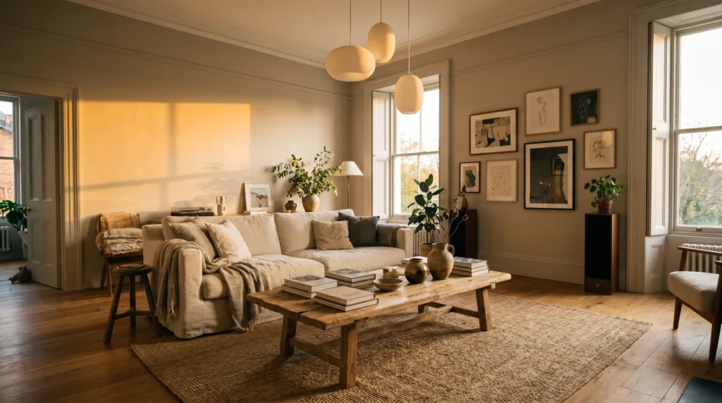
Living Rooms and Open-Plan Spaces
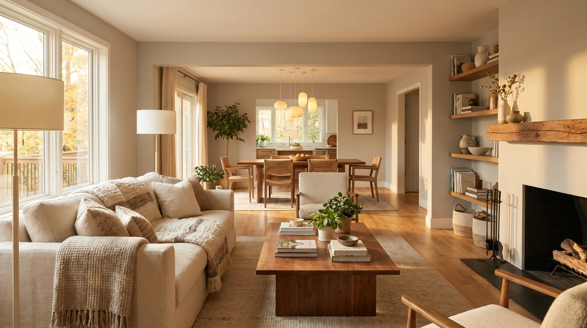
This is where Agreeable Gray performs at its strongest. Open-plan spaces typically have multiple light sources, good volume, and a mix of warm and neutral elements that let SW 7029 settle into its best version of itself. The LRV of 60 is well-suited to large, connected spaces: enough reflectance to keep a room feeling alive, not so high that the color washes out into something nondescript.
For whole-home color schemes where one neutral runs through connected spaces, Agreeable Gray is one of the more forgiving choices available.
Applied consistently from the entry through the main living area, it tends to make homes feel larger and more cohesive, and the slight complexity in its undertone reads differently in each room depending on what’s in it, which creates a sense of visual flow rather than monotony.
One friction point in open-plan spaces worth knowing before you paint: if one section of the floor plan faces north and another gets direct south or west sun, the color will read visibly different in each zone. That’s manageable with the right lighting and furnishing choices, but it’s something to account for before you’ve committed the full quantity.
Agreeable Gray in the Bedroom
Bedrooms are generally a reliable setting for this color because the dominant light source during the hours the room is most used, evening and night, tends to be warm artificial light.
Warm-white lamps and sconces suppress the violet frequency, and the color reads as warm, calm, and cocooning. It’s a genuinely good bedroom choice for anyone who wants something that doesn’t feel stark but also doesn’t make a statement that needs to be decorated around.
Before you test your sample: if your bedroom has cool-toned overhead fixtures, switch the bulbs to warm-white 2700K first. You’re assessing the color as it will actually live in that room, not under the conditions that happen to make every paint color look its best.
Agreeable Gray in Kitchens and Dining Rooms
In kitchens, Agreeable Gray’s beige warmth complements wood cabinetry well, especially natural wood finishes, white-painted cabinetry with warm undertones, and cream-toned cabinets that share its greige direction.
It creates a grounded backdrop that lets the cabinetry carry the visual center without fighting it. Paired with warm-toned hardware in brass, bronze, or oil-rubbed gold, the palette reads as intentional and layered.
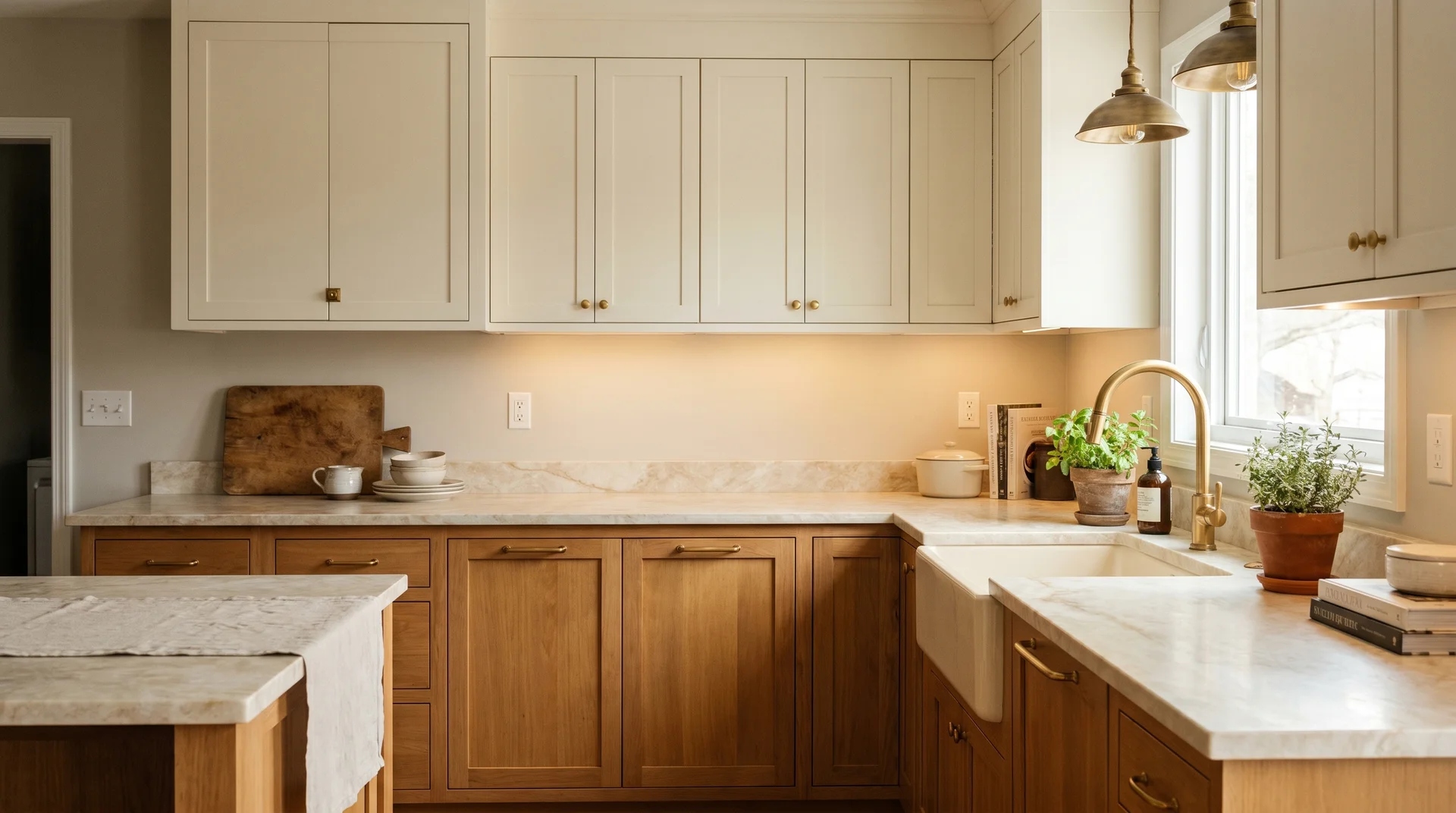
The specific friction point in kitchens: cool-toned stone countertops. If your counters are a cool-veined white and gray quartz or a charcoal granite, the cool frequencies in the stone can interact with the violet undertone in the wall color and read as flat or slightly muddy, particularly under kitchen lighting that runs at 4000K or above.
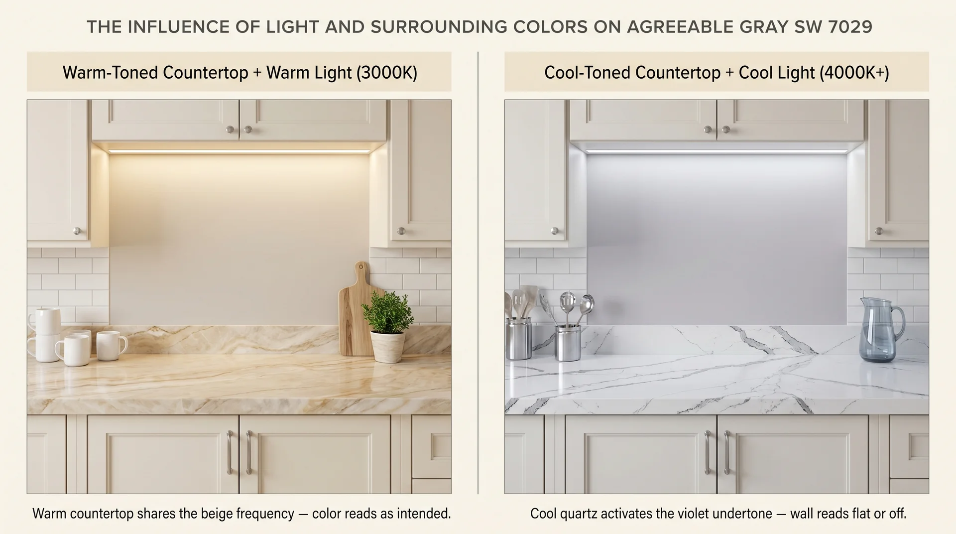
Check your wall sample against a counter swatch under your actual kitchen lighting before you order the full quantity. For guidance on choosing a countertop that works in warm-palette kitchens, this guide to the most popular granite colors covers undertone compatibility in the same depth as this article does for paint.
North-Facing Rooms & The Honest Assessment
North-facing rooms receive no direct sunlight. The light in them is reflected from the sky, which runs blue-cool, and from surrounding surfaces that may or may not add any warmth. This is the room type where Agreeable Gray requires the most careful evaluation, and where the overwhelming majority of “it looked pink on my walls” complaints originate.
In a north-facing room, Agreeable Gray can shift noticeably toward green-gray or lavender, particularly under natural light and with cool overhead fixtures.
That doesn’t mean it can never work in a north-facing space. It means the decision requires real testing in that room, under that light, at multiple times of day. If your sample looks warm and right at 10 am but reads lavender by 4 pm, that information matters.
If your artificial lighting throughout the room is warm-white, that warm source may compensate enough to keep the color in the right range after dark. There’s no universal answer, only what the sample tells you in your specific conditions.
If you’ve tested properly and the color still pulls cool, consider moving toward Accessible Beige (SW 7036) instead. It carries a stronger yellow-beige base that resists the lavender shift more reliably in cool-light environments.
It’s a warmer, more straightforward color without Agreeable Gray’s undertone complexity, but in a north-facing room where that complexity is working against you, reliability matters more than sophistication.
If you’re drawn toward going lighter rather than sideways, a soft white is the other realistic alternative for a room where Agreeable Gray isn’t working.
Snowbound SW 7004 is the most-searched soft white in this category, and our full review covers how it handles north-facing light specifically, including when it solves the problem and when it doesn’t.
Agreeable Gray as an Exterior Paint Color
Agreeable Gray translates well to exterior use, where its greige warmth reads as classic, approachable, and broadly compatible with a wide range of architectural styles.
The exterior context also changes the lighting dynamics that make it complicated indoors, and in many ways, the color performs more predictably outside than in.
Using Agreeable Gray on Your Home Exterior
On exterior facades, Agreeable Gray occupies a comfortable position between the warmth of a full beige and the cool modernity of a true gray.
It reads as sophisticated without reading as stark, and it pairs naturally with crisp white trim, black shutters, and warm-metal hardware finishes in bronze or oil-rubbed brass. For rooflines, it sits well against charcoal shingles, weathered wood tones, and warm brown or taupe roofing.
The pink-lavender concern that affects north-facing interior rooms is substantially less likely to surface on an exterior facade. Full-spectrum natural sunlight contains the warm frequencies that suppress the violet undertone, and most exterior surfaces receive enough reflected warm light to keep the color reading in its intended greige range. This is one reason Agreeable Gray performs more predictably outside than in some interior situations.
For exterior paint selection, the EPA’s Safer Choice program provides guidance on low-VOC exterior formulations that balance environmental performance with coating durability.
Sherwin-Williams offers SW 7029 in the Emerald Exterior line, a formulation rated for durability across temperature fluctuation and UV exposure, which matters for a color at this LRV, where any chalking or color shift over time will be visible.
Agreeable Gray With Brick
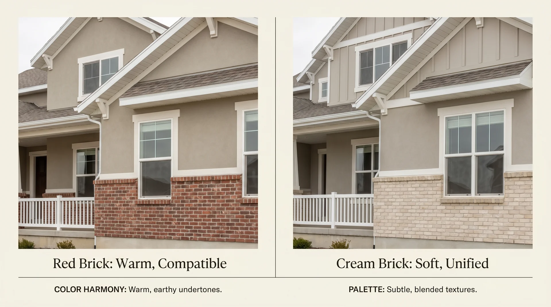
Red brick and Agreeable Gray is a better pairing than many homeowners expect. Red brick carries warm orange-red undertones, and Agreeable Gray’s beige base sits in a warm, compatible zone that doesn’t fight it.
The two read as belonging to the same warm family, which creates a natural, grounded exterior palette. Add white trim, and the combination lands as classic without being expected.
Buff or cream brick is even more compatible. It shares enough of the warm beige spectrum with Agreeable Gray to create a soft, unified look where the wall and brick feel like a coordinated decision rather than a default. The result is quieter than red brick, which suits traditional or cottage-adjacent homes where you want warmth without strong visual contrast.
The pairing to evaluate carefully on exteriors: cool-gray fiber cement siding used in combination with Agreeable Gray as an accent color, or vice versa.
Cool gray and Agreeable Gray can read slightly mismatched when adjacent, because the cool frequencies in the gray siding can bring out the violet undertone in the AG sections. Moving toward a warmer gray for the siding, or toward a warm white for the accent areas, tends to resolve the tension.
Agreeable Gray vs. Similar Colors: How to Choose?
Agreeable Gray sits in a specific position in the greige spectrum: warmer and more beige-forward than Repose Gray, lighter and less saturated than Accessible Beige, and distinct from its closest lookalikes despite the frequency with which they’re grouped together.
This section maps the practical differences in terms you can use when standing in front of chips.
Agreeable Gray vs. Repose Gray
| Attribute | Agreeable Gray (SW 7029) | Repose Gray (SW 7015) |
|---|---|---|
| LRV | 60 | 58 |
| Temperature | Warm (greige) | Cool-neutral (true gray) |
| Primary Undertones | Beige, taupe, violet-pink | Purple, blue-gray |
| Best For | Warm-wood interiors, cozy, layered spaces | Contemporary spaces with cool-toned finishes |
| Cool-Light Risk | Can shift toward pink or lavender | Can shift toward purple |
The practical decision between these two usually comes down to whether your home leans warm or cool. Warm wood floors, oak trim, and warm-white lighting generally point toward Agreeable Gray.
Contemporary spaces with white oak or light gray LVP and cooler lighting are a more comfortable ground for Repose Gray. Both colors carry a lavender risk in cool light; it’s not unique to Agreeable Gray, but Repose Gray’s stronger gray base can make the shift toward purple more pronounced when conditions aren’t right.
Agreeable Gray vs. Accessible Beige
| Attribute | Agreeable Gray (SW 7029) | Accessible Beige (SW 7036) |
|---|---|---|
| LRV | 60 | 58 |
| Temperature | Warm greige | Warm beige with yellow-gold base |
| Primary Undertones | Beige, taupe, violet-pink | Yellow, gold, faint green |
| Best For | Versatile neutrals, varied lighting | Traditional interiors, reliably warm spaces |
| Cool-Light Risk | Can shift toward lavender | Can shift toward olive-green |
Accessible Beige is warmer, more straightforwardly yellow-beige, and more resistant to the lavender shift that Agreeable Gray can produce in cool-light environments. If you’ve tested SW 7029 in your space and found it pulling toward lavender, Accessible Beige is frequently the better alternative.
It’s less nuanced, but in a north-facing room where Agreeable Gray’s complexity is working against you, a color that simply stays warm is more useful than one that requires the right conditions to perform.
If you’re drawn to something slightly lighter and airier than Agreeable Gray with more undertone complexity, Sherwin-Williams City Loft SW 7631 is the closest comparison worth making, and it behaves quite differently in real rooms.
The Closest Benjamin Moore Color to Agreeable Gray
Revere Pewter (HC-172) is the Benjamin Moore color most often cited in this comparison, and it’s an imprecise one.
Revere Pewter is darker (LRV approximately 55.5), reads more greenish-gray in most conditions, and has a stronger green undertone than Agreeable Gray. The two colors serve similar purposes but read differently in person.
The closest Benjamin Moore equivalent to Agreeable Gray in terms of warmth, LRV, and greige character is Pale Oak (OC-20), which carries similar warm beige-gray tones at a comparable LRV according to Benjamin Moore’s product data.
Collingwood (OC-28) and Pashmina (AF-100) both occupy a similar greige territory and come up regularly in this comparison. If you need to match across brands for any reason, get a physical sample in your actual room. Cross-brand color matching is never exact, and the undertone behavior varies between formulations even when chips look close in the store.
The Closest Behr Alternative
For homeowners purchasing at Lowe’s or working within a Behr budget, the closest alternatives to Agreeable Gray are Sculptor Clay and Wheat Bread, both warm greiges that occupy a similar position in the neutral spectrum.
Behr’s Silver Feather is occasionally cited as a match but leans cooler than SW 7029. As with any cross-brand comparison, sample in your specific room before committing.
How to Sample Agreeable Gray Correctly Before You Paint
For a color like Agreeable Gray, where the undertone shifts significantly under different light sources, proper sampling isn’t optional. It’s the decision. Most homeowners lose time and money at this step, not because they skipped it, but because they did a version of it that didn’t give them real information.
Choosing the right sheen matters as much as choosing the right color. For guidance on how flat and matte finishes behave differently on interior walls before you settle on a sheen for Agreeable Gray, this guide to flat vs. matte paint finishes covers the practical differences in depth.
Which Sheen Should You Choose for Agreeable Gray?
- Eggshell: The right choice for most interior walls in living rooms, dining rooms, and bedrooms. The slight sheen adds depth, makes the warm greige quality more present, and holds up to cleaning better than matte.
- Matte or flat: For ceilings, or for rooms where you want a more absorbed, intimate effect. Matte makes the color read slightly deeper and quieter, which works well in bedrooms where you want the space to feel settled.
- Satin: For trim, doors, and high-traffic areas like hallways or children’s rooms. The higher sheen holds up to scrubbing and creates a subtle contrast between wall and trim that reads as intentional.
- Semi-gloss: Reserved for kitchens, bathrooms, and trim where durability is the priority over surface depth.
One thing worth knowing: eggshell and satin will read slightly different from a flat sample pot. The finished eggshell surface reflects light at a low angle and reads as marginally warmer and more luminous than the flat sample. When evaluating your test boards, account for that shift.
The Correct Way to Test a Paint Sample in Your Home
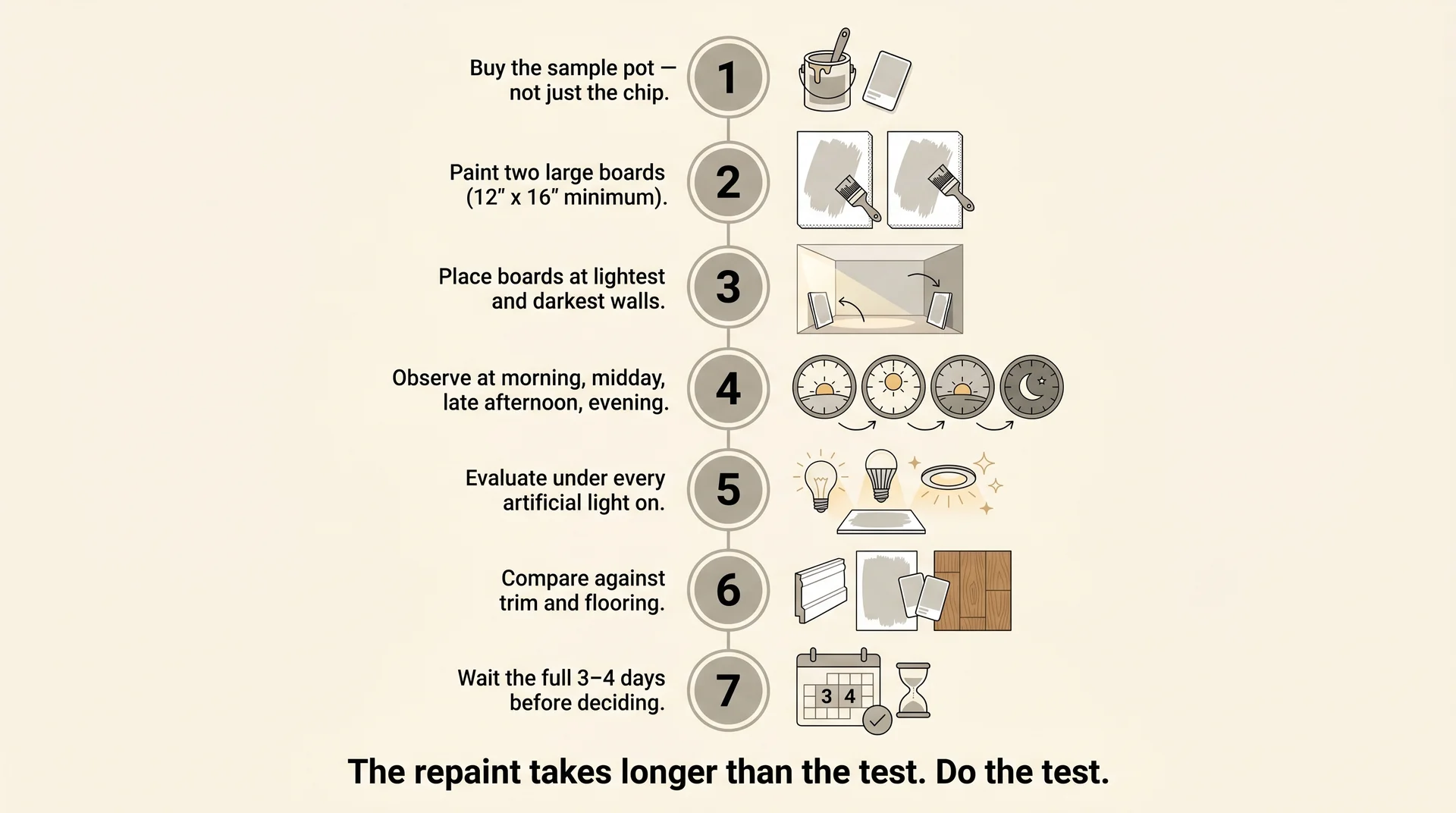
- Buy the actual sample pot from Sherwin-Williams. A paint chip gives you too little surface area to evaluate the color accurately in your room. The pot gives you enough product to paint large boards and assess the color in context.
- Paint two large boards, at least 12″ x 16″. Foam core board or primed cardboard both work. Two boards let you test in different zones of the room without applying paint to your finished wall.
- Place one board on the wall that receives the most natural light. Place the second on the wall that receives the least. You’re assessing the color at both ends of your room’s light range, not just at its best.
- Observe at four distinct times: morning, midday, late afternoon, and evening. Pay specific attention to what happens after 4 pm, when natural light shifts toward a cooler angle, and to what happens at night under your artificial lighting alone.
- Evaluate with every artificial light in the room on. Turn on overhead fixtures, lamps, and under-cabinet lighting if applicable. This is the step most people skip. If the color shifts toward pink or lavender under your evening artificial light, that’s the room’s actual daily reality.
- Compare against your existing fixed finishes. Hold the board against the trim. Hold it near the floor. A harmonious pairing feels settled. A competing one feels like something in the room is slightly off, even if you can’t name it immediately.
- Wait the full three to four days before deciding. You need to observe the color across different weather conditions. An overcast day and a bright day render the same paint color differently, sometimes dramatically.
The shortcut that goes wrong most often: testing a small patch on the actual wall, stepping back for thirty seconds, deciding it looks right, and ordering the full quantity that weekend.
Two weeks later, there’s a finished room that looks different every evening. The board-and-time process takes three to four days. The repaint takes considerably longer.
Is Agreeable Gray Still Worth Choosing in 2026?
Agreeable Gray is a reliable neutral that outlasted the gray wave of the 2010s precisely because its warmth prevented it from aging into starkness the way cooler grays did.
The version of this color that reads as builder-grade is the version applied without thought: the same color on every surface, paired with cool-white trim, lit with 4000K recessed fixtures, laid over gray LVP flooring.
That specific combination was the standard new-construction package for years, and it’s why so many people associate this color with flipped houses and spec homes.
Agreeable Gray applied with warm lighting, the right trim, and intentional pairing decisions looks nothing like the version you’ve walked through in every open house.
The color earned its ubiquity through genuine performance. What reads as generic is the set of application decisions that surrounded it in production interiors, not the color itself.
Applied with warm lighting, compatible flooring, and trim that shares its warmth, it reads as considered and settled in a way that more adventurous choices often don’t.
Final Thoughts
The honest limits: if your home is predominantly north-facing and cool-toned, this color will require more care and more testing than most reviews suggest, and it may not be the right choice regardless of how much you like it on the chip.
If your existing finishes run cool and gray-toned, a color with warm beige undertones may sit uncomfortably alongside them. And if you’re choosing Agreeable Gray because it feels safe, it’s worth asking whether the safety is actually working for your space or substituting for a decision you haven’t fully made yet.
The goal is a room that feels like the one you wanted, and this color can get you there, provided you give it the conditions it needs.
