
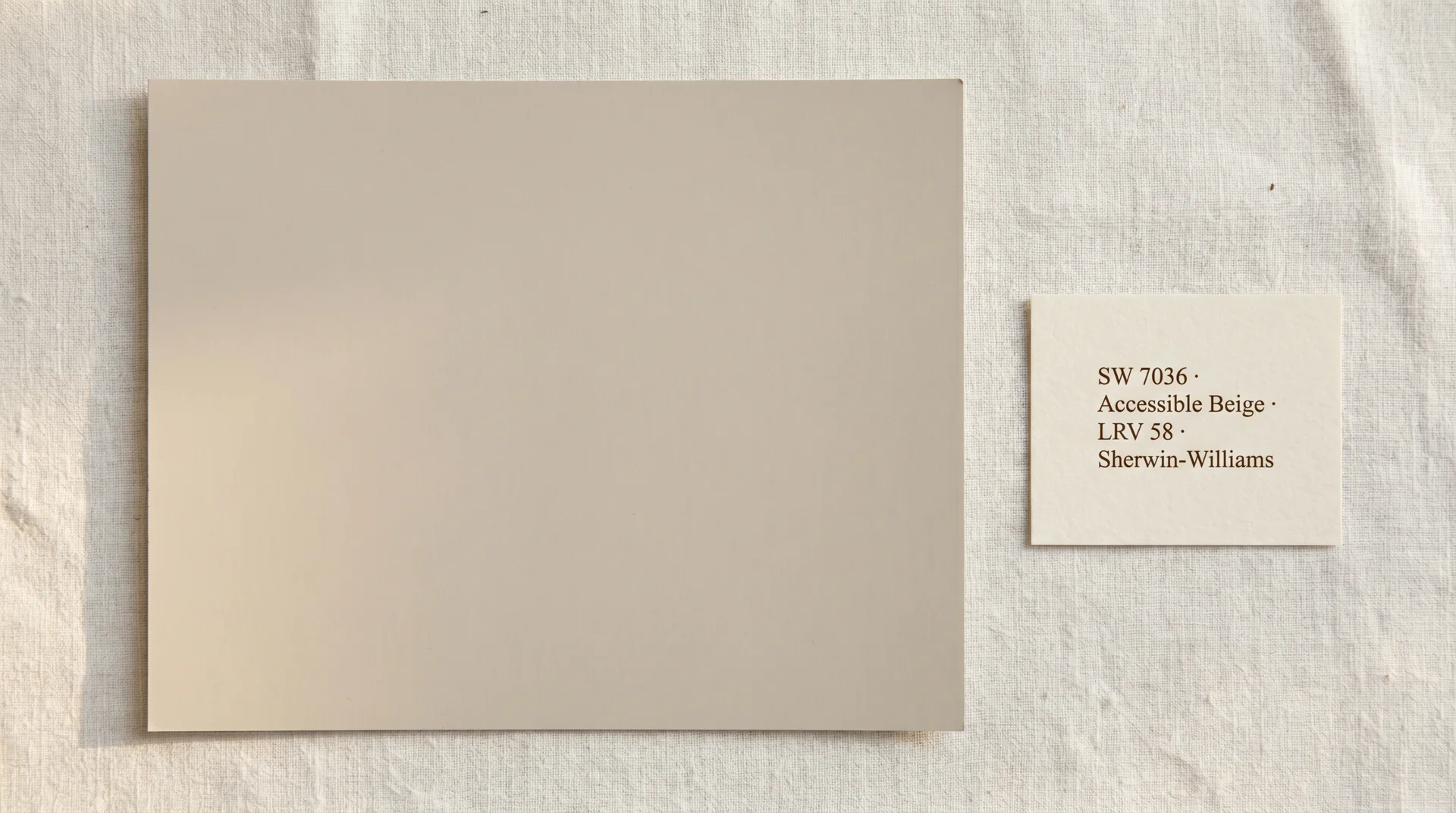
Accessible Beige is Sherwin-Williams SW 7036, a warm greige with a Light Reflectance Value of 58 that sits somewhere between a classic beige and a soft gray, depending entirely on your light source.
It’s one of the most requested neutral paint colors in residential design, and it earns that reputation in the right room. It also misfires quietly in the wrong one, which is what most of the color reviews you’ll find online won’t tell you.
I’ve specced this color on client projects across living rooms, bedrooms, and exteriors. I’ve watched it look beautiful in one home and look confusing in another with nearly identical furniture. The difference was always the light.
This piece covers what you need to decide whether Accessible Beige works for your specific space, including when to walk away from it entirely.
What Is Accessible Beige Paint Color?
Accessible Beige is a warm-toned neutral paint color made by Sherwin-Williams, sold under code SW 7036 and available in every standard interior and exterior finish.
It’s a greige, sitting closer to the beige end of the spectrum than the gray end, with enough warmth to feel inviting and enough gray influence to work alongside cooler accents without fighting them. Sherwin-Williams has produced it for years, and it’s consistently among their top sellers for residential use.
The name gets shortened in common usage. You’ll see it referenced as “accessible beige Sherwin-Williams,” SW 7036, or simply “7036” on paint fan decks and contractor quotes. If you’re matching it from another brand, the alternatives are covered in the comparisons section later.
The Specs: LRV, Hex Code, and Finish Options
| Spec | Detail |
|---|---|
| Color Code | SW 7036 |
| Collection | Sherwin-Williams Classics |
| Light Reflectance Value (LRV) | 58 |
| Approximate Hex | #CEC0A8 |
| RGB | R: 206, G: 192, B: 168 |
| Available Finishes | Flat, Matte, Eggshell, Satin, Semi-Gloss, High-Gloss |
| Interior / Exterior | Both |
The LRV of 58 is worth understanding before you buy. Light Reflectance Value measures how much visible light a paint color reflects on a scale of 0 (pure black) to 100 (pure white).
The Munsell Color Science Laboratory at RIT, which has researched LRV and spatial perception extensively, places mid-range values like 58 in a zone that reflects enough light to keep a room feeling open without creating the brightness contrast of a true white.
For Accessible Beige, this means it won’t make a small room feel cavernous, and it won’t make a large room feel dim. It’s a middle-range reflector, and that flexibility across room sizes is a large part of why so many designers reach for it.
The 58 is measured under standardized lighting conditions. Your room is not a standardized lighting condition, and that caveat matters more for this color than for most. The undertone behavior is what drives real-world performance, not the number alone.
Is Accessible Beige a Beige or a Greige?
Accessible Beige is a greige, a color in the territory between beige and gray, with the balance tipped toward the warmer beige end. It’s not a gray that happens to look beige in warm light. It’s a beige that carries enough gray and green influence to avoid reading as a traditional cream or honey beige.
Coming from classic warm beiges like Navajo White or Ancient Ivory, Accessible Beige will read noticeably cooler and more current. Coming from a true gray like Mindful Gray, it’ll read noticeably warmer.
That positioning is what makes it so popular for transitional interiors, where people want warmth without committing to a yellowy traditional look.
Understanding the Undertones in Accessible Beige
Accessible Beige carries two undertones: a soft pink and a subtle green. Which one shows up depends almost entirely on your light source. This is not a quirk. It’s how this color is built, and understanding it is the difference between a decision you’re happy with six months later and one that has you wondering why it looked so different on the chip.
The Illuminating Engineering Society has documented how different light sources shift the perceived hue of painted surfaces. With Accessible Beige, those shifts are more pronounced than with colors that sit firmly on one end of the warm-cool spectrum. Because it lives in greige territory, it responds meaningfully to whatever light you put it under.
How Accessible Beige Reads in Warm and Incandescent Light
Warm light sources, specifically incandescent bulbs and warm-white LEDs in the 2,700K to 3,000K range, pull the pink undertone forward. Under these conditions, the color reads as a true, creamy, inviting beige.
This is the version most people see in showrooms, model homes, and the staged photography that makes them fall in love with it in the first place. In strong afternoon sun coming through south-facing windows, it can look almost honey-tinged, which is genuinely good-looking against warm wood floors or cream upholstery.
If you find Accessible Beige slightly too warm or too grounded, choose City Loft SW 7631 as the lighter, more complex alternative, though it comes with more light-sensitivity to manage.
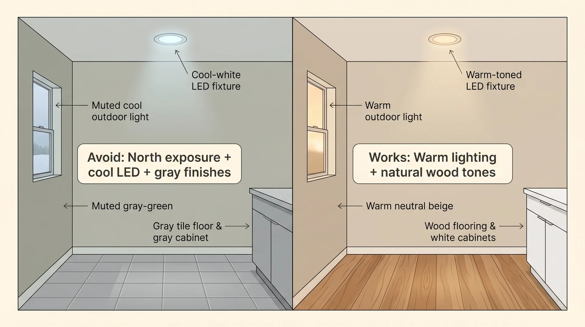
How Accessible Beige Reads in Cool and LED Light
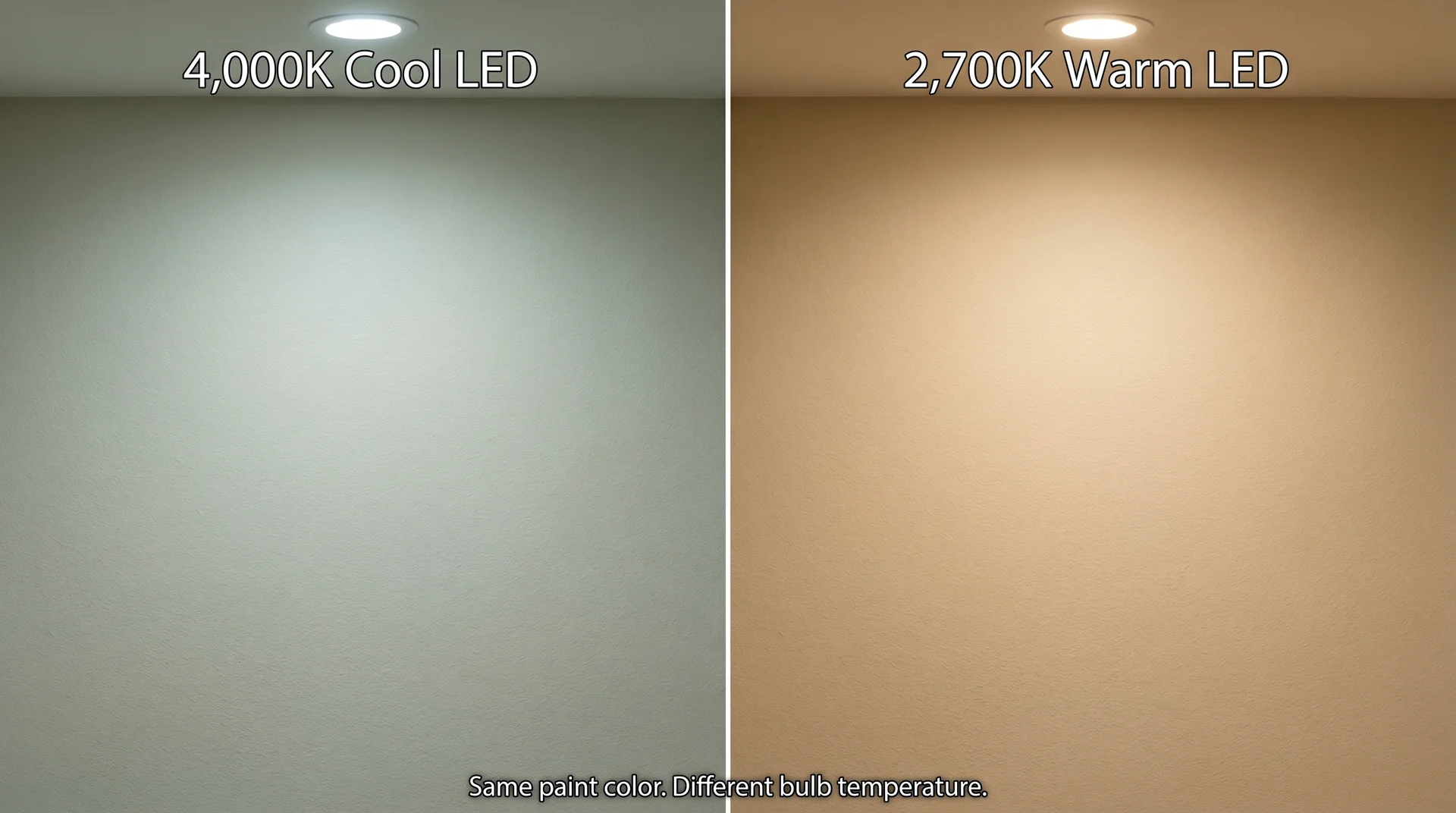
Under cool-white LEDs and daylight-balanced bulbs in the 4,000K to 5,000K range, the green undertone activates, and the color can shift noticeably toward a gray-green. This is the single most underreported behavior of Accessible Beige in the color reviews currently published online, and it’s the thing I tell every client before they commit to it.
I’ve been in a north-facing living room where the owners had painted with Accessible Beige six months prior and were ready to repaint. Their overhead fixtures were 4,000K LEDs. The color on the walls had gone flat and slightly green, nothing like the warm neutral they’d sampled.
When I held a 2,700K bulb next to the wall as a test, the color shifted back toward warm beige immediately. They didn’t need new paint. They needed different bulbs. But that’s the kind of friction this color creates when the lighting isn’t considered before the purchase.
Accessible Beige in a 4,000K room and Accessible Beige in a 2,700K room are not the same color. Evaluate your bulbs before you buy your paint.
North-Facing vs. South-Facing Rooms: What Changes
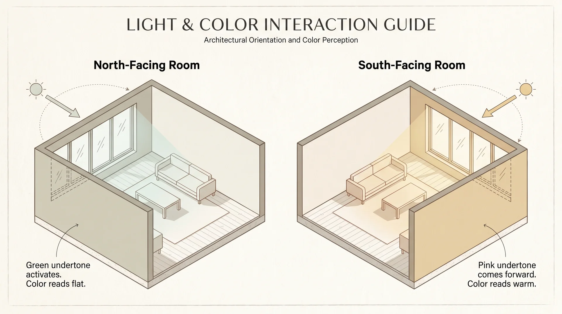
North-facing rooms receive cool, indirect natural light all day. There’s no direct sun to warm the color, so whatever the ambient light does to Accessible Beige tends to persist from morning through evening.
In these rooms, the green undertone has the most opportunity to dominate, especially in the afternoon when the light goes flat. South-facing rooms are the opposite. They get warm indirect light through most of the day, which consistently pulls the pink undertone forward and keeps the color reading as a warm neutral.
East and west-facing rooms are more variable: warm in the morning or evening depending on orientation, then shifting to cooler light the rest of the day. Accessible Beige tends to read well in these rooms overall, with some light-shifting during the cooler middle hours that most people don’t notice unless they’re actively looking for it.
The rule before you commit: sample on at least two walls, leave it for 48 hours, and check at 9 am, noon, and 8 pm with your actual lights on. What you see after dark under your fixtures is the version you’ll live with most often. If those three check-ins all look warm and beige, you’ve got your answer.
The Accessible Beige Color Palette: What Actually Works With It
Accessible Beige pairs best with warm whites for trim, soft blue-gray or sage for accent colors, and natural wood tones for flooring and furniture.
The accessible beige color palette that performs consistently well is built around the color’s warm core, with accents that complement rather than compete with the greige undertone. Reaching for cool gray accents or stark white trim tends to activate the green undertone and make the walls look unintentionally muddy.
Best Trim Colors for Accessible Beige
Trim color is the decision that either makes Accessible Beige look intentional or exposes its undertones in ways you didn’t plan for.
| Trim Color | SW Code | Why It Works | Best For |
|---|---|---|---|
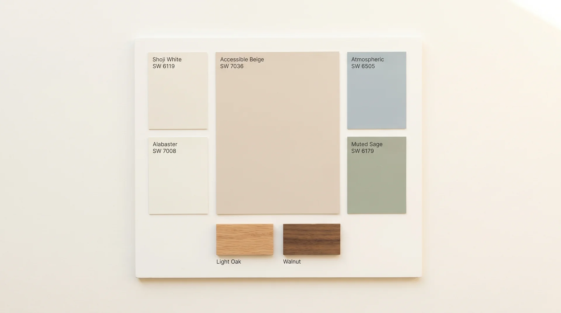
| Shoji White | SW 6119 | Warm undertone flows from the wall color without jarring contrast | Traditional, transitional, and farmhouse interiors |
| Alabaster | SW 7008 | Creamy warm-to-warm transition; no cool interference | Rooms with warm wood tones and good natural light |
| Pure White | SW 7005 | Crisper contrast; works when you want definition between the wall and the trim | Contemporary spaces with clean lines |
Extra White (SW 7006) is a popular trim color and a good one in the right context, but its cool undertone sits uncomfortably against Accessible Beige in rooms with mixed or cool lighting.
The contrast reads stark rather than clean, and it pulls the green out of the wall color. Shoji White is the safer starting point in almost every situation.
Accent and Coordinating Wall Colors
Soft blue-grays, dusty blues, and muted sage greens are the most reliable accent colors alongside Accessible Beige. They complement the warm neutral base without competing with it.
Navy and deep teal read well for accent furniture and cabinetry, providing enough contrast to keep the palette from feeling monotone without introducing the cool-gray interference that works against this color.
Cool medium grays as accent walls are the combination to avoid. In a room painted Accessible Beige, a cool gray accent wall tends to activate the green undertone in the beige rather than creating the sophisticated contrast you’re after.
Pale blue or a blue-gray like Atmospheric (SW 6505) reads much better because it has enough warmth in it to work with the beige base rather than pulling against it.
Flooring and Cabinet Pairings
Light oak, white oak, and medium-toned walnut all pair well with Accessible Beige. The color reads cleanly against natural wood finishes without competing with the wood’s own warm undertone. Dark espresso floors can work in larger rooms with good light, but in smaller spaces, they tend to make the color read heavier than its LRV suggests it should.
The flooring situation that causes the most trouble is cool gray tile throughout the main floor. When gray tile runs under Accessible Beige walls, the combination looks like an argument between warm and cool elements rather than a considered palette.
If you already have cool gray tile throughout your home, this color is probably not your best neutral. The comparison section will point you toward alternatives that read better alongside cool-toned finishes.
For kitchen cabinets, white painted cabinets in Alabaster or Shoji White are a reliable pairing.
Natural wood lowers with white uppers also work well. If you’re unsure how your existing stone or granite countertops will interact with the wall color, see our guide to the most popular granite colors for a closer look at how different stone undertones behave alongside warm-neutral walls.
Door Colors With Accessible Beige
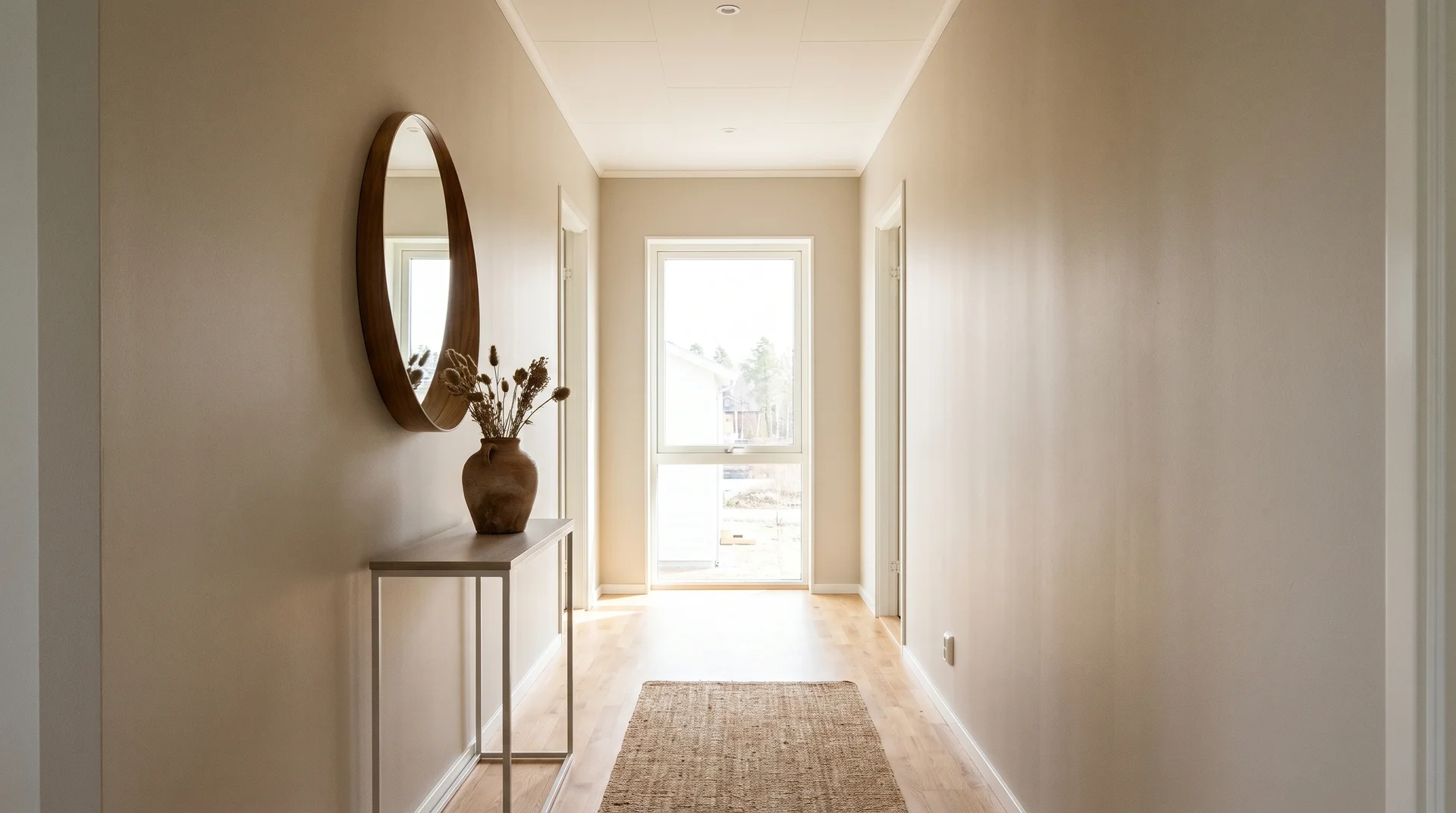
Interior doors painted in Shoji White or Accessible Beige themselves, as a tone-on-tone approach, both read well and keep the space feeling cohesive. The tone-on-tone version works particularly well in hallways and stairwells where you want flow rather than definition between spaces.
For front doors, the color is far more forgiving. A deep navy, soft black, or muted forest green against an Accessible Beige exterior body creates the kind of contrast that reads considered rather than accidental.
Sage green front doors have become popular against beige and greige exteriors, and the combination works because both colors share a similar warmth level while offering enough distinction to give the entry point its own visual weight.
Understanding the full palette options well is what makes room-specific decisions easier, so the sections below address each application on its own terms.
Accessible Beige SW 7036 in Every Room
Accessible Beige (SW 7036) performs differently across room types, and finish selection matters as much as color placement. Each section below works as a standalone reference, so read only what’s relevant to your project.
Accessible Beige in the Living Room
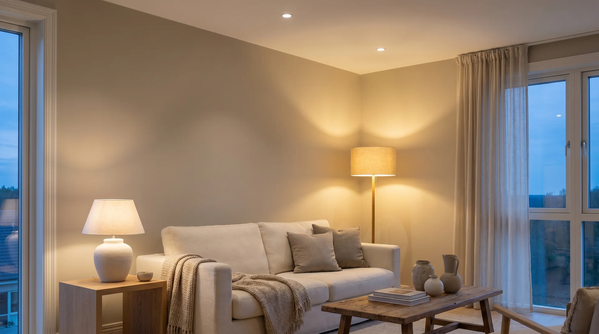
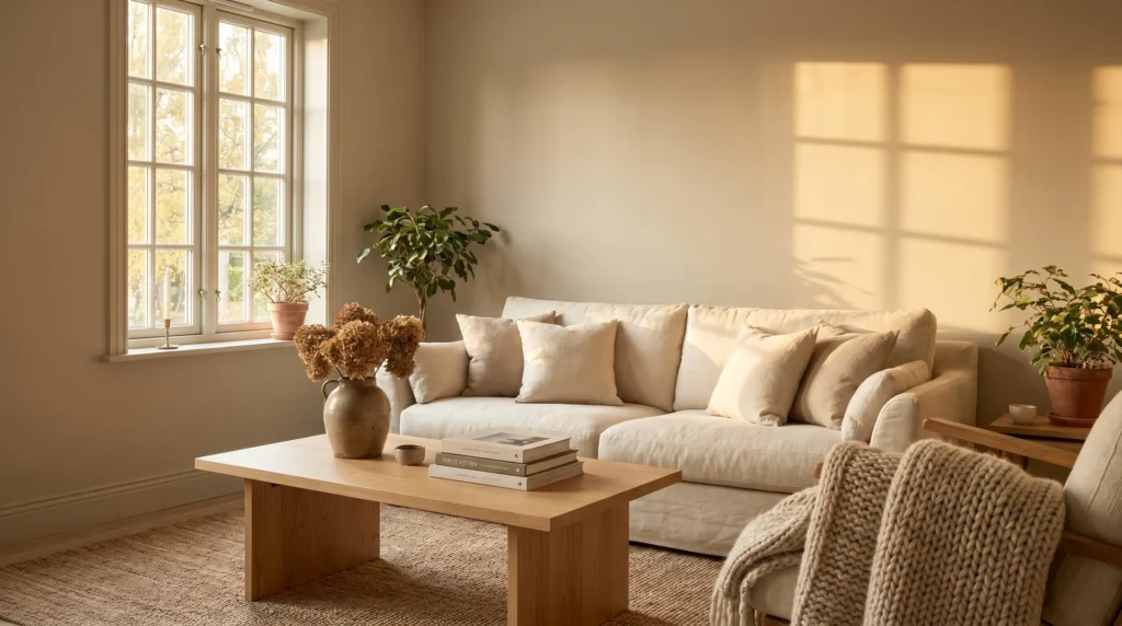
The living room is where this color genuinely excels. Rooms where people spend social time benefit from the color’s warmth, and living rooms typically have more layered lighting than other spaces: table lamps, floor lamps, overhead fixtures, and natural light from multiple windows.
That layered lighting keeps the warm undertone active and makes the color read reliably as a soft beige rather than a gray-green.
Eggshell is the standard finish for living rooms, giving enough sheen to clean smudges and marks without reflecting light the way satin does. In living rooms with textured walls, matte is the better choice because it minimizes the appearance of wall imperfections. Satin is worth considering in high-traffic living rooms where scuff marks and handprints are a regular occurrence.
The living room situation where this color underperforms: very large rooms with minimal furniture and predominantly cool overhead lighting. In these spaces, Accessible Beige can feel flat and slightly cool rather than warm and inviting. It needs layered light sources and furniture with warm tones to do its best work.
Accessible Beige in the Bedroom
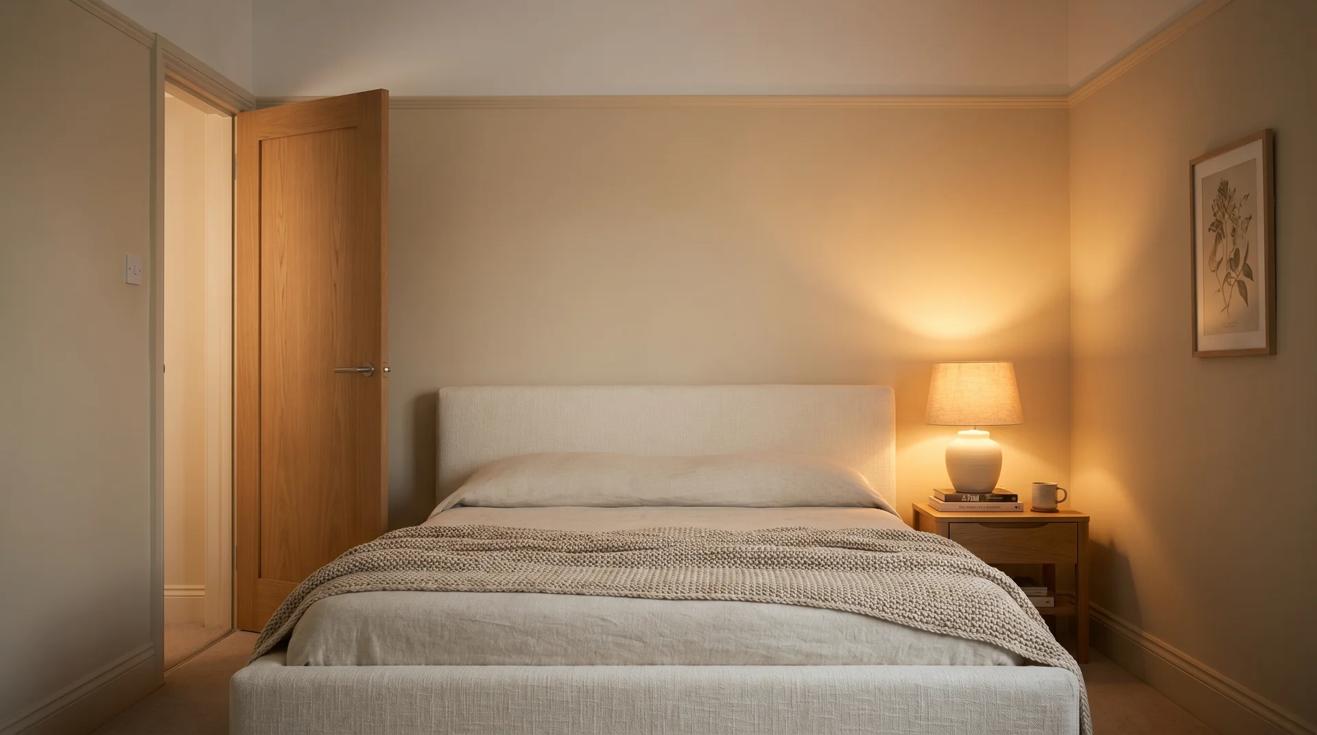
Accessible Beige reads well in bedrooms. The warm neutral creates a restful backdrop without the stark brightness of a white or the visual weight of a saturated color.
The undertone behavior is also less of a concern in bedrooms than in other rooms, because bedrooms typically run warmer artificial lighting than the rest of the house, and people spend significant time in them after dark when warm artificial light pulls the color toward its best version.
For sleeping spaces, matte or flat finish is worth considering, even if you default to eggshell everywhere else. Matte absorbs light rather than reflecting it, which gives the room a quieter, more settled feeling.
The EPA’s Indoor Environments Division advises prioritizing low-VOC paint formulations in enclosed sleeping spaces, particularly bedrooms used by children.
Sherwin-Williams offers Accessible Beige in low-VOC formulations; confirm the specific product line when ordering rather than assuming the standard formula qualifies. (As with any paint selection for enclosed living spaces, consult the manufacturer’s Safety Data Sheet for product-specific VOC information.)
Accessible Beige in the Kitchen and Bath
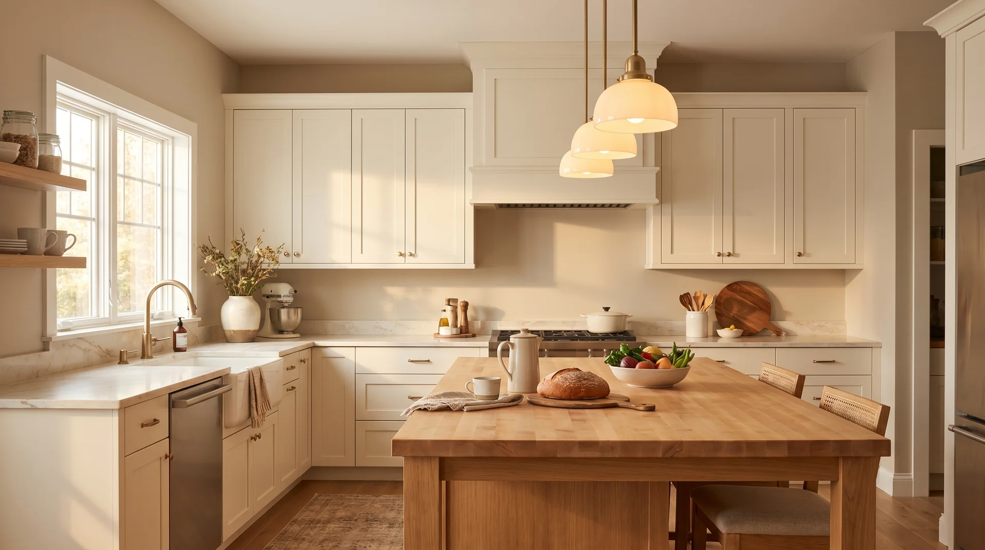
Kitchens are where Accessible Beige produces the most variable results, and the determining factor is almost always the cabinet color. With white or warm wood cabinets, the wall color works beautifully.
I had a client in a transitional kitchen with Shaker-style uppers in Alabaster and a butcher block island, and Accessible Beige on the walls pulled everything together in a way that no cooler neutral would have. With cool gray cabinets, though, it tends to look like two neutral choices made by two different people at two different times. The warm wall and the cool cabinetry sit in an uncomfortable middle ground that reads neither intentional nor resolved.
If you already have cool gray cabinetry, sample Accessible Beige and compare it side by side with Anew Gray before committing. The comparison section covers that decision specifically.
For kitchens and bathrooms, finish selection has functional stakes. Eggshell is the minimum for any space with humidity or regular cleaning. Satin performs better in bathrooms and around ranges and sinks because it handles moisture and wipe-downs without losing its finish.
Flat or matte paint in a bathroom is almost always a decision that needs to be corrected within a year.
Accessible Beige on Exteriors
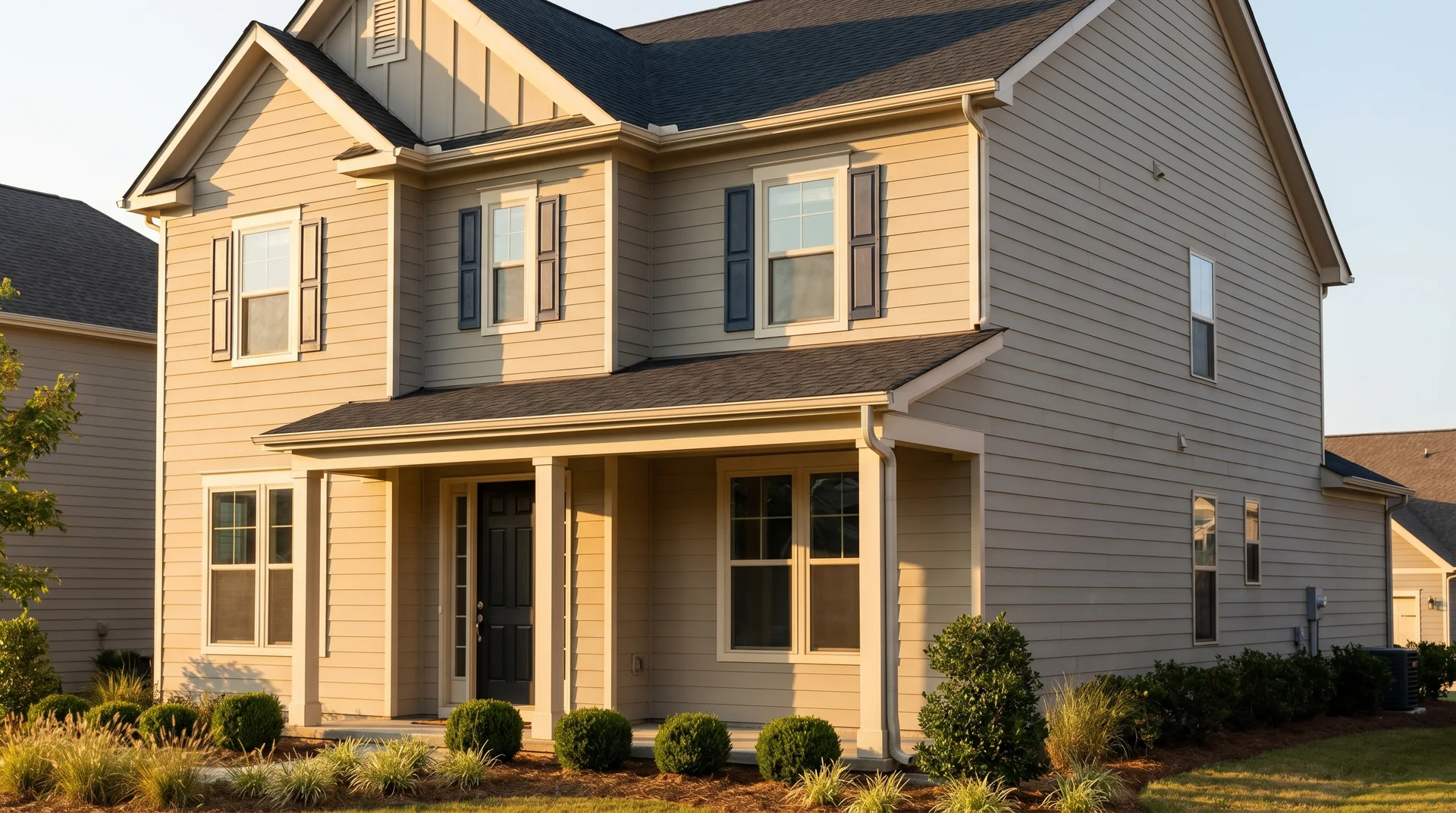
Accessible Beige works on exterior applications, but it reads warmer and slightly more yellow-beige under direct sun than it does indoors. The full-strength formula on a south-facing exterior in full afternoon sun can lean toward a warm honey-beige that’s noticeably different from the subtle greige you sampled under interior lighting. Anticipate this before you schedule the paint crew, not after.
The siding types where Accessible Beige performs best are warm-toned fiber cement, natural wood, and engineered wood. On a brick with warm reddish undertones, the color can compete uncomfortably with the brick rather than sit alongside it. On cool gray stone or contemporary smooth stucco, the warmth of Accessible Beige reads as a contrast rather than a complement.
For exterior trim, Shoji White or Alabaster are the same reliable choices as they are indoors. A dark charcoal or soft black trim reads well against the beige body and gives the exterior a finished, defined look.
For shutters, deeper versions of the accent colors that work indoors, navy, deep green, and soft black, all translate well to exterior shutter applications and hold their contrast through UV exposure better than lighter alternatives.
Accessible Beige vs. Similar Colors: How to Choose
Accessible Beige (SW 7036, LRV 58) is a warm greige, and the comparisons below address the specific situations where a nearby color would serve you better. Each alternative exists on the market because Accessible Beige doesn’t work for everyone, and knowing exactly where it falls short is the fastest way to make the right call.
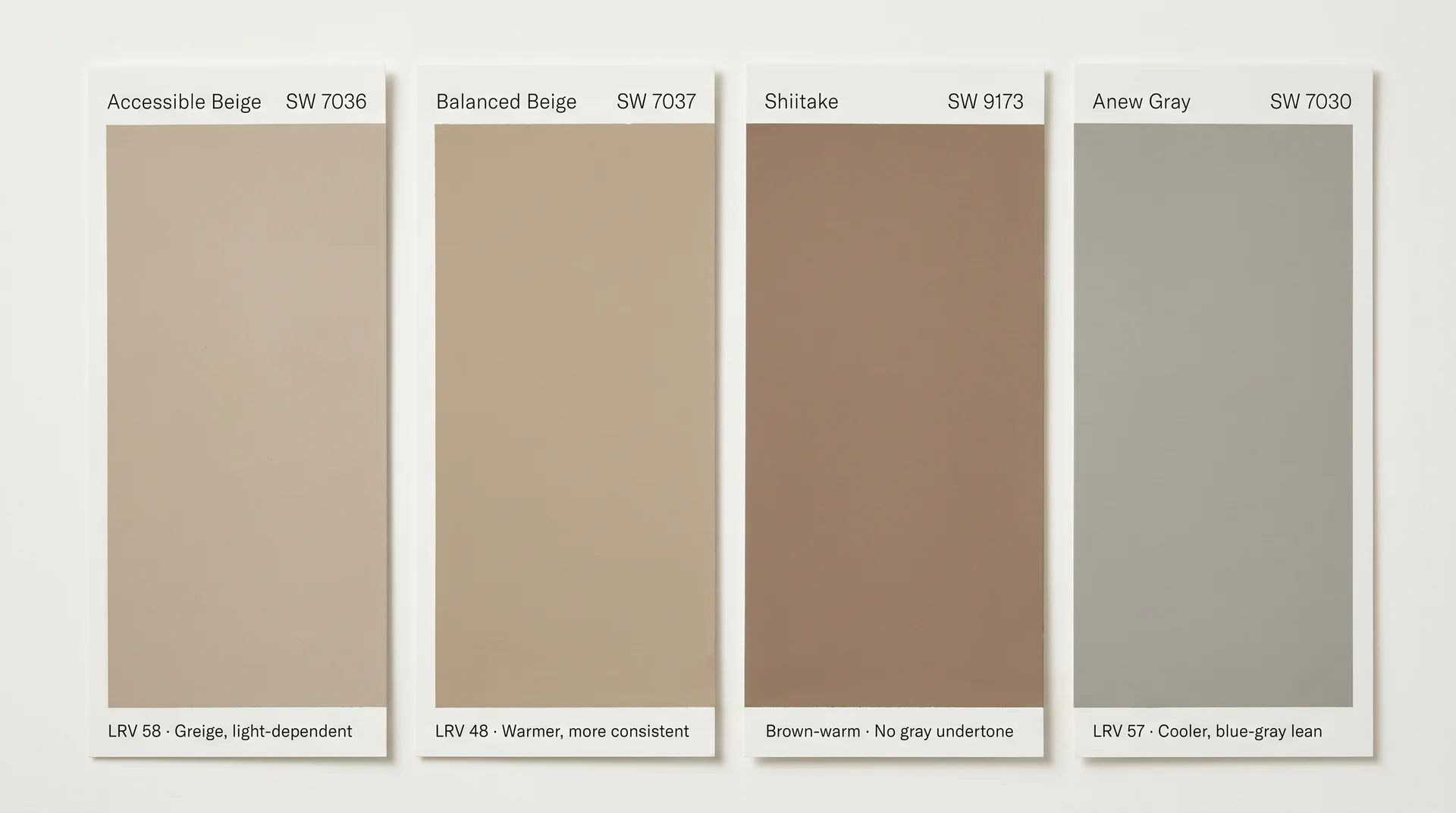
Accessible Beige vs. Balanced Beige
Balanced Beige (SW 7037) is the color directly adjacent to Accessible Beige on the Sherwin-Williams fan deck, and the comparison gets searched hundreds of times a month because the names sound similar and the colors look close on a chip. They’re meaningfully different in use, per Sherwin-Williams product data.
| Attribute | Accessible Beige SW 7036 | Balanced Beige SW 7037 |
|---|---|---|
| LRV (per SW) | 58 | 48 |
| Warmth | Warm-neutral | Warmer, more brown-beige |
| Undertones | Pink and green (light-dependent) | More consistently warm brown |
| Best Situation | Well-lit rooms with layered warm lighting | Darker rooms where consistent warmth matters |
| Risk | Green activation in cool or north-facing rooms | Can read heavy or dark in small spaces |
The 10-point LRV difference is more significant than it looks on paper. Balanced Beige is noticeably darker on the wall, and its undertone profile reads more consistently warm regardless of the light source.
If you’re painting a north-facing room, or you’ve been burned by the green undertone before, Balanced Beige is the more reliable choice. You give up some lightness, but you get a color that doesn’t require perfectly warm lighting to perform.
Accessible Beige vs. Shiitake
Shiitake (SW 9173) is warmer and browner than Accessible Beige, with fewer gray undertones and a more unambiguously warm read across most lighting conditions. If you want a neutral that commits to warmth and doesn’t live in greige territory, Shiitake is the more decisive choice. It pairs particularly well with natural wood tones and warm metal finishes like brushed brass or antique bronze.
Where Accessible Beige has the edge is flexibility with cooler accents. Because it sits in greige territory, it accepts soft blue-grays and dusty blues without the same conflict that Shiitake can create when paired with cool-toned furniture or flooring.
Shiitake in a room with gray stone tile can look stubbornly warm to the point of feeling dated. Accessible Beige handles that mix more gracefully.
Accessible Beige vs. Anew Gray
Anew Gray (SW 7030) sits at a very similar LRV to Accessible Beige (57, per Sherwin-Williams product data) but reads perceptibly cooler, with a more overt gray presence and undertones that lean toward blue-gray rather than greige.
In homes with cool-toned finishes throughout, Anew Gray often reads as the more comfortable choice because it aligns with rather than fights against cool flooring, cabinetry, or furnishings.
The choice comes down to your existing finishes and the feeling you want. If the space runs warm and you want to preserve that, Accessible Beige. If the space runs cool and you want a neutral that acknowledges that rather than fighting it, Anew Gray.
Benjamin Moore and Behr Equivalents
Benjamin Moore’s closest match is Pale Oak (OC-20), a warm greige with a similar LRV and a comparable soft read in most lighting conditions. Pale Oak tends to read slightly lighter and a touch more pink-beige than Accessible Beige, so it’s the right comparison rather than a precise duplicate.
If you’re committed to Benjamin Moore paint for coverage or finish reasons, Pale Oak is the starting point for your sample.
If your shortlist also includes Revere Pewter HC-172, note that it sits darker at LRV 55.51 and carries a green-brown undertone that activates noticeably in north-facing or cool-light conditions, making it behave quite differently from Accessible Beige in lower-light rooms.
For Behr, the closest options are in the Swiss Coffee and Stucco range, but the match is loose. Behr’s color-matching system can replicate the Accessible Beige formula in their paint base at the counter, which is a more reliable approach than trying to find an equivalent by eye from the Behr fan deck.
If none of these alternatives land for your specific situation, the following section clarifies the conditions where walking away from Accessible Beige entirely is the right call.
When Not to Use Accessible Beige Paint Color
There are specific room and home conditions where Accessible Beige consistently underperforms, and knowing them before you buy is worth more than any color review that only tells you when it works.
- Rooms with no natural light. Interior bathrooms, windowless offices, and hallways that rely entirely on artificial lighting. Without any natural light to warm the color, you’re fully dependent on bulb temperature, and Accessible Beige under cool-white LEDs in a windowless space will almost certainly activate the green undertone with no counterbalance. A warmer, lower-LRV color performs more predictably here.
- North-facing rooms with cool-white LED lighting. This is the specific combination that creates the most client disappointment. Cool north light plus cool-white bulbs gives the green undertone nowhere to go. If you’re set on Accessible Beige for a north-facing room, switch your bulbs to 2,700K warm-white first. If the color still doesn’t read the way you want, Balanced Beige is the better fit for that exposure.
- Homes with cool gray finishes throughout. If your tile, countertops, and cabinetry all run cool-gray, Accessible Beige will look like it’s trying to warm up a space that has already made different decisions. Anew Gray or a true cool beige will read more comfortably in those conditions.
- Very contemporary or minimalist interiors. Accessible Beige carries enough warmth and complexity to feel slightly traditional in a context of concrete finishes, very clean lines, and cool-toned materials. It won’t look wrong exactly, but it won’t feel native to the space. Repose Gray (SW 7015) or Agreeable Gray (SW 7029) tend to sit more naturally in contemporary residential design.
- Exteriors with heavy mature tree canopy on the north side. When green-reflected light from dense tree cover hits the north face of a house painted in Accessible Beige, it activates the green undertone the same way a north-facing interior room does, but more intensely and in the most public-facing context your home has. Sample in that specific location, in that specific light, before ordering.
The 75% Trick and Pro Tips for Getting Accessible Beige Right
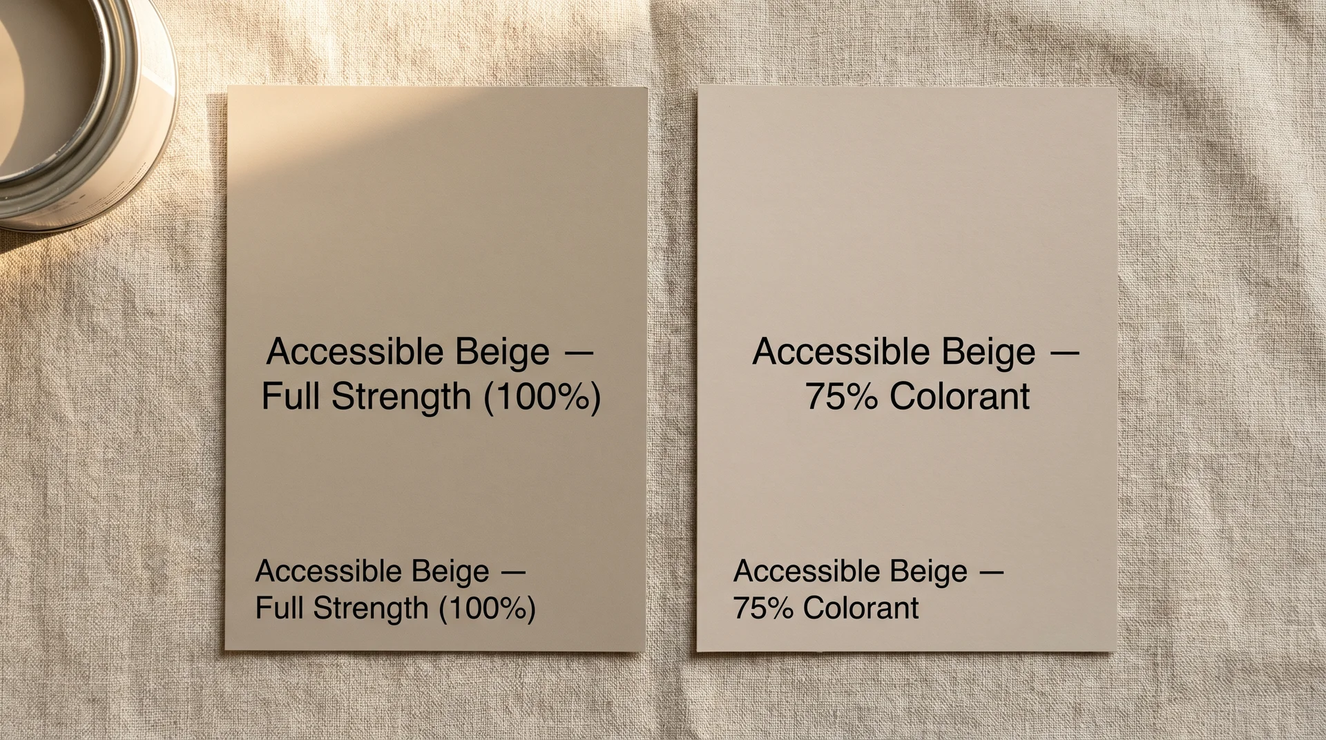
You can order Accessible Beige mixed at 75% of the full colorant formula, which produces a lighter, softer version of the color with the same undertone character but less visual weight on the wall.
This gets searched regularly and explained almost nowhere in the color reviews that currently rank. Here’s what you need to know about it.
The 75% formula works particularly well in small bedrooms, narrow hallways, and powder rooms where the full-strength color carries more presence than the space calls for. You get the warmth and the greige quality without the density that can make a tight room feel smaller than its LRV predicts.
A few things to know before you ask for it at the counter:
- Ask specifically for “75% strength” or “75% colorant.” Some store associates will offer to add white instead, which is not the same thing. Adding white changes the undertone behavior. Reducing the colorant preserves it.
- Write “75% colorant” on the can label. The resulting color won’t have an official SW name or code, so note it on the can if you think you’ll need to rematch later.
- Sample the 75% version first if you’re uncertain. Going from 75% to full strength is a decision you can still make. Going the other direction after you’ve painted four walls is not.
Beyond the formula, these are the practical steps that prevent the most common Accessible Beige mistakes:
- Sample on at least two walls, including the wall opposite the window. The wall that receives reflected rather than direct light is where undertones behave least like you expect from the chip.
- Leave the sample up for a minimum of 48 hours. For more on how paint behaves between application and final evaluation, see our guide to how long to wait between coats of paint, which covers why timing decisions matter more than most people expect.
- Check it at three points in the day: morning, midday, and after dark. The after-dark version under your actual artificial lights is the version you’ll see most often in rooms where you spend evenings.
- Confirm your bulb temperature before ordering gallons. Switching from 4,000K to 2,700K costs almost nothing and can fundamentally change whether this color works in your space.
Is Accessible Beige Paint Color Worth It: The Verdict
Accessible Beige is genuinely good at what it does, which is provide a warm, versatile neutral that reads livable rather than stark in homes with warm lighting and a mix of traditional and transitional finishes. It’s popular because it works in those conditions, not because of marketing.
It also has a strong case as a resale color. Accessible Beige appears consistently on lists of interior paint choices that real estate professionals recommend for staged or move-in-ready homes, specifically because it reads warmer and more inviting than true gray neutrals while still being broadly palatable. If you’re painting before selling, that’s a real consideration in its favor alongside everything else.
The conditions where it falls short are specific and predictable: cool-white lighting, north-facing exposure with no warm light counterbalance, cool gray finishes that compete with the greige rather than complementing it. These aren’t rare edge cases. They describe a meaningful portion of American homes, particularly those built or renovated in the last fifteen years, with modern cool-toned LED retrofits and gray-trending interior finishes.
Sample it. Live with it for two days. Check it after dark under your actual fixtures. If it reads beige and warm across those three check-ins, you’ve found your neutral. If it goes slightly green or flat in one of them, the comparisons section gives you your next color to try, and none of them require starting the whole research process over again.
