
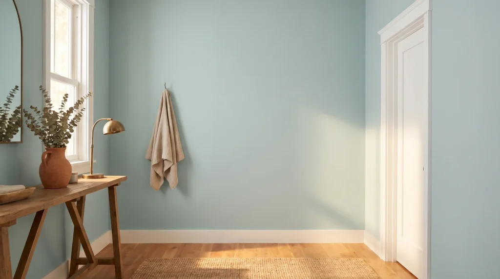
Sea Salt is a soft, muted blue-green with gray undertones, and if you’ve already sampled it and found yourself watching the walls shift from sage to aqua to something almost lavender over the course of an afternoon, you’re not imagining things. That’s exactly what Sea Salt does.
It’s one of the most light-reactive colors in the Sherwin-Williams lineup, and what it shows you depends on which direction your windows face, the temperature of your bulbs, and what time of day you happen to be standing there and understanding why is the difference between a confident decision and an expensive repaint.
Sea Salt is most strongly associated with coastal farmhouse and spa-inspired interiors, and it earns that association, as it reads airy, quiet, and slightly watery in the right conditions. The challenge is that the right conditions change by the hour.
This piece covers what the color technically is, how it behaves, how the Sherwin-Williams version differs from Benjamin Moore’s, what coordinates with it, how it performs room by room, and how to sample it in a way that actually tells you something.
What Sea Salt Paint Color Actually Is
Sherwin-Williams Sea Salt (SW6204) is a light-to-mid-tone blue-green with an LRV of 63, a roughly balanced mix of blue, green, and gray undertones, and no single dominant hue. That last part is what drives everything else about this color’s behavior.
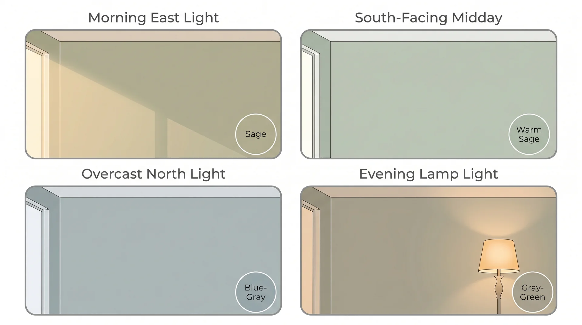
To answer the question that comes up constantly: Sea Salt is neither clearly blue nor clearly green. In cool light, it leans blue-green. In warm natural light, it pulls far enough toward sage that the green becomes the leading quality.
Under warm artificial light at night, it can read as a quiet gray-green. Sherwin-Williams classifies it in the green family. Most people who live with it would say blue-green. Both are right, depending on the hour.
LRV, or Light Reflectance Value, measures how much light a color bounces back into a room on a scale of 0 to 100. At 63, Sea Salt sits on the lighter side of mid-tone, airy rather than saturated.
Colors at this LRV have less pigment depth to anchor any single hue, so when light conditions shift, Sea Salt moves so visibly from room to room and hour to hour.
| Spec | Detail |
|---|---|
| SW Code | SW6204 |
| LRV | 63 |
| Color Family (SW Classification) | Green |
| Undertones | Blue, green, gray (roughly balanced) |
| Perceived Hue | Blue-green to blue-gray, depending on light |
| Available Finishes | Flat, matte, eggshell, satin, semi-gloss |
The finish matters more than people usually account for. Eggshell and satin have a slight sheen that bounces light and pushes Sea Salt toward its cooler, bluer range.
Flat and matte absorb light and read closer to the chip. In bathrooms and kitchens where a washable finish is necessary, semi-gloss is practical, but it will make the color read cooler and more clinical than the same formula in a matte or eggshell finish. Factor that in before you decide on sheen.
Why Sea Salt Looks Different in Every Photo and Every Room
Sea Salt shifts because it has no dominant undertone to hold onto when lighting conditions change. A traditional sage green has enough yellow-green strength to stay recognizable across most situations. Sea Salt doesn’t have that kind of anchor. Warm light pulls the gray and green forward.
Cool light strengthens the blue until the green nearly disappears. What that means in practice: the walls in your room and the walls in someone else’s Pinterest photo can be the exact same paint and look like two different colors.
The forums and comment sections on this color are full of people asking whether they made a mistake after their Sea Salt room looked completely different once the furniture was in or the season changed. Almost always, no. What changed was the light.
North-Facing Rooms
North-facing rooms receive indirect, cool light all day with no direct sun at any point. Sea Salt in these spaces reads firmly on the blue-gray side of its range, sometimes quite strongly.
If you want the coastal spa blue-green from the Pinterest inspiration photos, a north-facing room can get you there, but it leans colder than most people expect. Cool-toned LED recessed lighting amplifies this further.
Warm-toned bulbs, warm wood furnishings, and natural fiber rugs do the counterbalancing work when you want the space to feel grounded rather than cold.
South-Facing Rooms
South-facing rooms get warm, direct light for most of the day, and this changes Sea Salt substantially. The green-gray side of the color comes forward, and it reads closer to a muted sage or soft eucalyptus than the aqua-influenced color the chip suggests.
People who chose it specifically because it looked coastal blue sometimes feel caught off guard. Both expressions are valid versions of the same paint — knowing which one you’ll get requires knowing your room first.
East, West, and the Unexpected
East-facing rooms get warm morning light and cooler afternoon light, so Sea Salt moves through both sides of its range in a single day, greener in the morning, bluer as afternoon comes in.
West-facing rooms do the reverse, and this is where something genuinely surprising can happen. In the transitional light of late afternoon, where fading daylight mixes with warm lamps coming on for the evening, Sea Salt can briefly read with a lavender or mauve quality that has nothing to do with the paint and everything to do with light temperatures mixing.
I’ve watched it happen in client bedrooms more than once. The first time, the homeowner called me, convinced that the paint batch was wrong.
Once I explained the light physics, she found it charming. It helps to know this is a possibility before you’re standing in the room at 5:30 pm, wondering what happened to your blue-green walls.
The time of day you sample matters almost as much as room orientation. A swatch checked at noon in a south-facing room tells you one version of Sea Salt. The same swatch at 7 pm under a warm lamp tells you something completely different. You’ll live in the room for both hours, so you need to see the color at both hours before deciding.
Sherwin-Williams Sea Salt vs. Benjamin Moore Sea Salt
These are two different colors that share a name, and pulling images from both brands into the same mood board is one of the most common reasons Sea Salt research turns confusing.
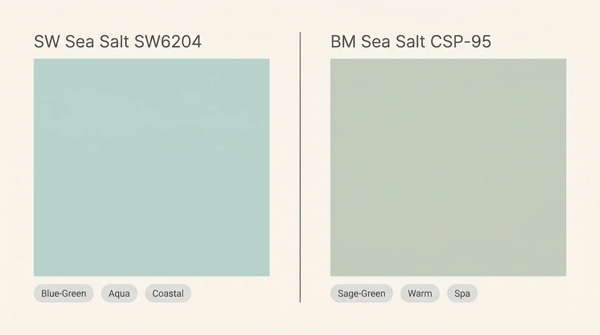
Sherwin-Williams Sea Salt (SW6204) is the cooler, more distinctly blue-green of the two. It carries more obvious aqua influence, has higher light reactivity, and reads lighter overall. This is the version most people are picturing when they search the term.
Benjamin Moore Sea Salt (CSP-95) is warmer and softer, closer to a muted spa sage or very pale eucalyptus. It’s less chameleon-like than the SW version and holds its character more consistently across different lighting conditions, which is an advantage in rooms with variable or unpredictable light.
The trade-off is that it doesn’t have the same coastal aqua quality that makes the SW version so popular.
| Feature | SW Sea Salt (SW6204) | BM Sea Salt (CSP-95) |
|---|---|---|
| Undertone character | Blue-green-gray, cooler | Green-gray, warmer |
| Light reactivity | High | Moderate |
| Best room orientation | South or east facing | Forgiving across most orientations |
| Dominant feel | Coastal, aqua, spa | Spa, sage, soft botanical |
| Trim pairing ease | More sensitive to trim undertone | Works with warm and cool whites |
Behr also has a Sea Salt (780C-1) that reads as a grayer blue-green with less aqua influence than either of the above. It’s a reasonable option if you’re working with a contractor who uses Behr, just know it’s a distinct color and won’t match the SW or BM versions.
Knowing which version you’re actually drawn to makes the coordination decisions that follow considerably simpler.
What Colors Go with Sea Salt Paint?
Sea Salt is a background color that supports a wide range of pairings, but it needs more thought than the one-size formula most articles hand you.
The recommendation you’ll find everywhere is Sea Salt walls with Alabaster trim, done. That pairing works in some lighting conditions and fights itself in others.
The reason it fails is almost always the same: Alabaster is a warm white, and in a room where Sea Salt is already being pushed toward its warm side by south-facing light or warm bulbs, the trim reads cream or slightly peachy against the wall.
The issue isn’t either color individually; it’s how they react together under your specific light conditions, which a chip comparison in the store is not designed to reveal.
Trim Colors for Sea Salt
The trim color that works best depends on what Sea Salt is doing in your light, not on what looks right on a paint card in the store.
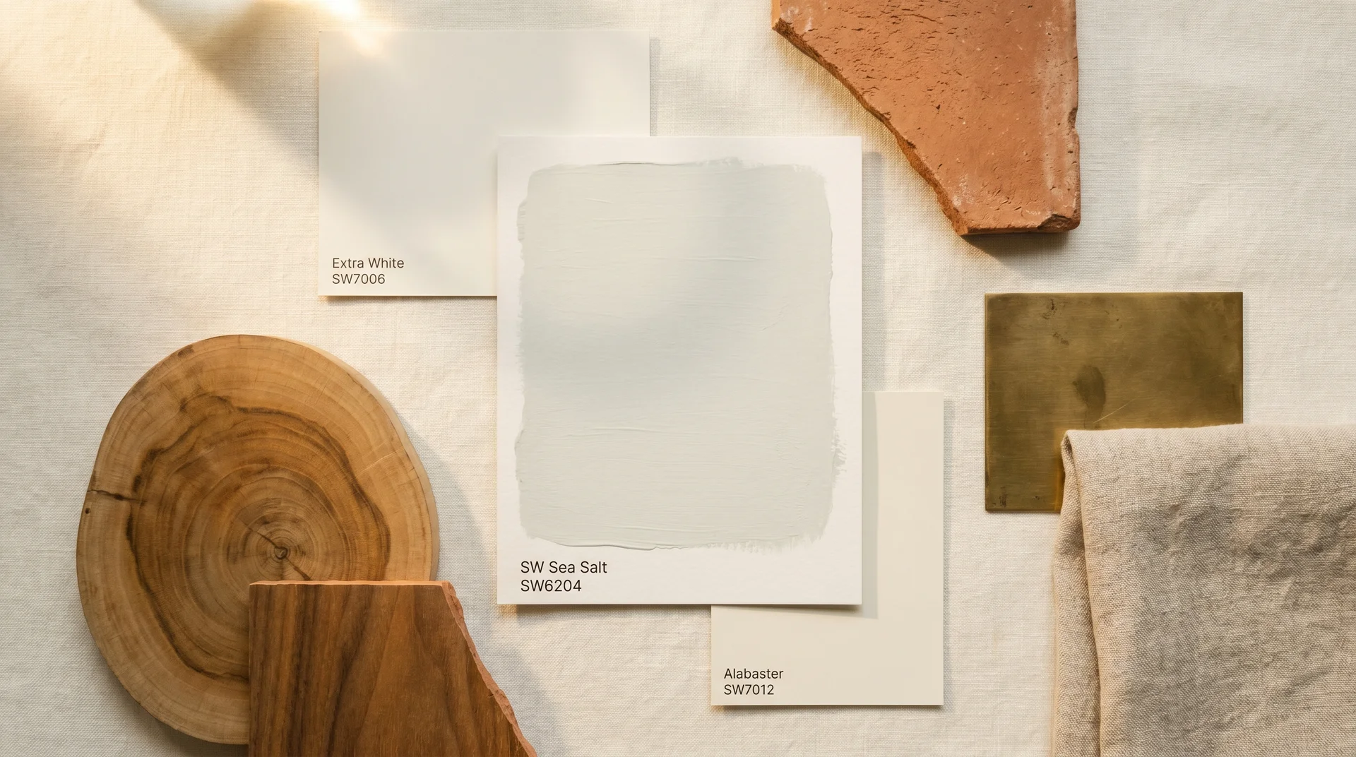
- Cool rooms (north or east facing, cool LED lighting): Sea Salt leans blue in these conditions, and Alabaster reads distinctly yellow against it. SW Extra White (SW7006) or Benjamin Moore Chantilly Lace (OC-65) holds a clean, balanced white without the warmth that fights a cool blue-green wall.
- For the practical side of choosing trim profiles that complement a painted wall, this breakdown of shoe molding versus quarter round covers the decisions that happen after the color is settled.
- Warm rooms (south-facing, incandescent or warm LED bulbs): Sea Salt pulls toward sage in warm light, which makes Alabaster (SW7012) a more compatible match. The warmth of the trim complements what the color is expressing rather than fighting it.
- Variable or mixed light rooms: A balanced white that holds its neutrality across Sea Salt’s shifts tends to work best. SW Shoji White (SW7042) and SW White Duck (SW7010) are two I’ve used in this situation, warm enough not to look stark, neutral enough not to compete with the color in either state.
Sample the trim on the actual wall, next to the actual Sea Salt sample, under the lighting you’ll live with. The chip-to-chip comparison in the store tells you almost nothing useful about how they’ll read together in your specific room.
Accent Colors
- Warm wood tones (walnut, teak, honey oak) ground the space and prevent it from reading too cold or flat.
- Navy and deep teal layer well for a coastal or spa-inspired scheme without competing with the wall color.
- Terracotta and rust bring warmth that counterbalances the blue when Sea Salt leans cool.
- Soft gold and aged brass hardware add warmth without disrupting the color’s quietness.
- Blush and dusty rose are less counterintuitive than they sound, particularly in west-facing rooms where Sea Salt occasionally reads with a lavender quality at dusk.
Flooring
Cool-toned flooring, light gray LVP, pale tile, and cool white oak push Sea Salt further into blue-gray territory. Whether that reads beautifully or cold and flat depends on how much natural light the room gets and how warm the furnishings are.
Warm-toned flooring, honey oak, natural pine, and terracotta tile anchor the space with warmth while the walls stay airy.
Using Sea Salt as a Whole-House Color
Sea Salt works surprisingly well as an anchor color across multiple rooms because its quietness rarely clashes with adjacent spaces. Rooms that sit alongside it well tend to be slightly warmer or a touch deeper in tone.
A warm greige or soft tan in hallways and transitional spaces keeps the flow readable without making Sea Salt feel like it’s repeating itself room to room. In connecting bedrooms or bathrooms, a slightly deeper tone in the same blue-green family, a dusty teal or muted aqua, layers naturally.
Where whole-house Sea Salt schemes tend to fall apart is when every adjacent room is also cool and light-toned. When the entire home reads blue-green at a similar value, the house starts to feel undifferentiated and slightly cold. One or two rooms in a warmer, earthier palette give the eye somewhere to land.
Sea Salt Paint Color by Room
Sea Salt performs differently in different spaces, and the room you’re painting largely determines which version of the color you’ll actually live with.
Bathroom
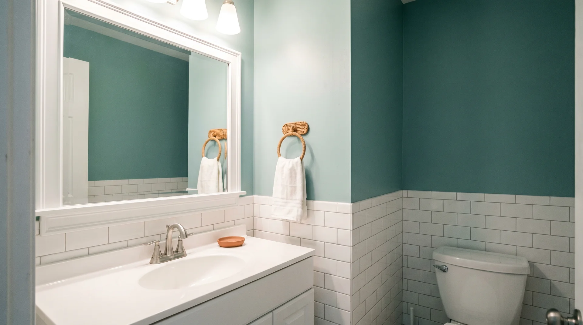
The bathroom is where Sea Salt is most reliable. Controlled lighting, smaller wall areas, and white or neutral tile all work in its favor. The clean blue-green quality reads naturally as spa-like in these conditions, and the combination with white fixtures is almost always uncomplicated.
The harder situations: bathrooms with warm-toned tile (cream, beige, or wood-look porcelain), where Sea Salt can look disconnected from the surrounding surfaces, and windowless bathrooms that run entirely on artificial lighting, where the color can read flat or gray. In either case, the vanity bulb does more work than most people factor in. A warm 2700K bulb shifts Sea Salt toward gray-green and can make it look murkier than the chip suggests.
A neutral 4000K bulb holds it in the clean blue-green range. Check the swatch under the actual installed bulbs, not just by the window — what the window shows you and what the vanity light shows you are often remarkably different colors.
Bedroom
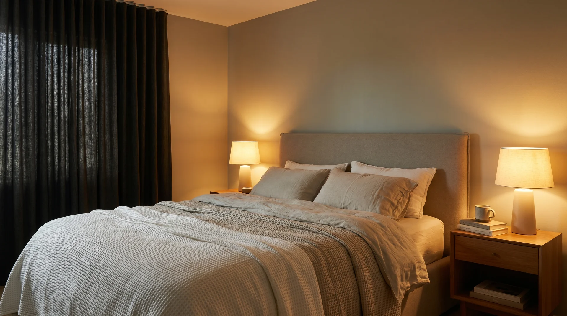
Sea Salt is a genuinely calming bedroom color. In most bedrooms with standard lighting, it reads in the soft blue-gray range that’s restful without feeling cold. The thing worth flagging is blackout curtains.
A bedroom fully closed off from daylight and running on artificial light alone shows a Sea Salt that’s quite different from the airy, naturally lit version most people picture. Warm bedside lamps pull the color toward green-gray; cooler overhead lighting holds it bluer.
Test the color under your actual bedroom lighting, not just in daylight conditions, before committing to it for a full room.
Living Room
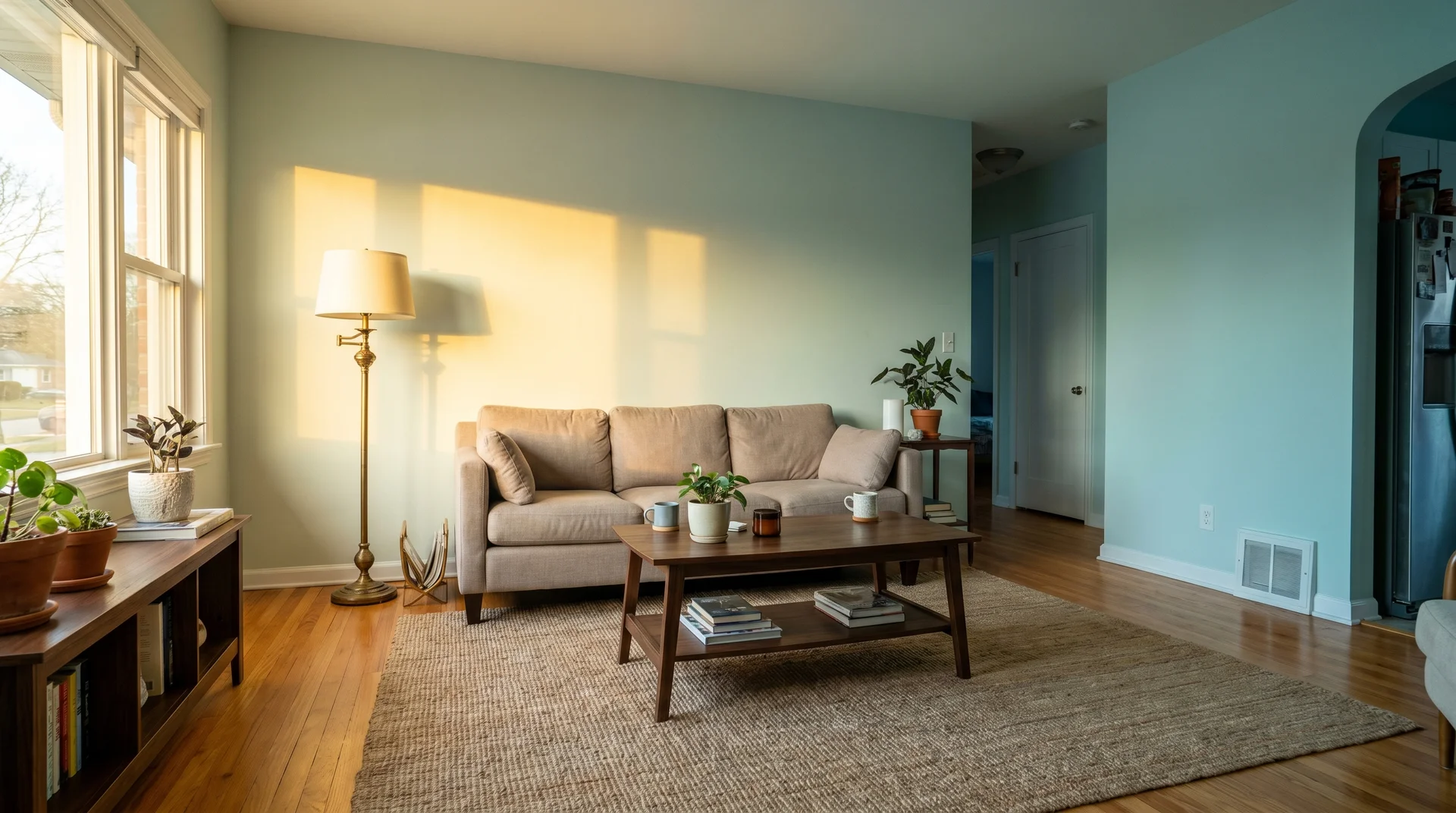
Living rooms are where Sea Salt is hardest to manage, and I think it’s worth being direct about that. They run on the full range of daily lighting, morning light, afternoon sun, evening lamps, overhead fixtures after dark, and the color does something noticeably different at each moment.
The people who love Sea Salt in their living rooms almost always went in knowing this, sampled it across multiple light conditions, and decided they liked what they saw in all of them.
The people who end up dissatisfied are usually the ones who checked the chip on a bright afternoon and never looked again until the room was painted. Large spaces with warm wood floors and natural materials tend to hold the color together well as it shifts.
Rooms that are all cool-toned white floors, gray furniture, cool overhead lighting can push Sea Salt into a flat, cold blue even in decent natural light, and that’s a harder room to make work.
Kitchen
Sea Salt on kitchen walls is genuinely difficult, and I’d rather say that plainly than suggest it depends on how you use it.
Kitchens involve overhead recessed lighting, under-cabinet task lighting, and natural window light all at once, and that combination creates exactly the variable, inconsistent conditions that make Sea Salt’s shifts read as unsteady rather than atmospheric.
On lower cabinets paired with white uppers, it reads as deliberate and coastal; that application works. On all four kitchen walls, it needs significant warm material contrast and a lot of natural light to hold together, and it still tends to feel uncertain after dark.
Sample it extensively in a kitchen before committing, and be honest with yourself about whether you want a wall color that requires that much management.
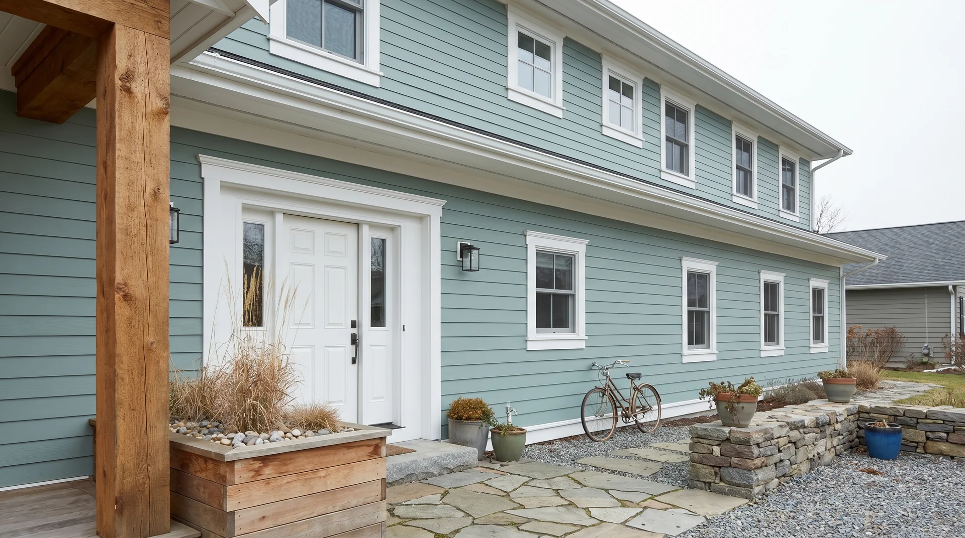
Sea Salt Paint Color on the Exterior
Sea Salt on an exterior surface reads lighter, greener, and considerably less blue than its chip — and the difference between north-facing and south-facing siding can make it look like two different colors on the same house.
Interior paint lives under a mix of natural and artificial light. Exterior paint exists entirely under natural light, and direct sun bleaches pigment in ways interior lighting doesn’t. On a fully sun-exposed south or west-facing surface at midday, Sea Salt loses most of its blue quality.
The green-gray side dominates, and the color reads as a soft, washed-out sage. On north-facing or shaded surfaces, it holds its blue-green character much more reliably and can look genuinely lovely against white trim and natural wood elements.
The Landscape Factor
Here’s a consideration that rarely appears in exterior paint guides: the color of the environment around your home matters.
A lot of green, like mature trees, dense shrubs, and green lawn against the foundation, can cause a green-undertoned paint like Sea Salt to visually recede into the landscape in a way that reads washed-out rather than intentional.
The eye has nowhere to anchor the wall color when the tones are close. Homes with more hardscape around them, stone, gravel, brick, and concrete tend to read Sea Salt on the exterior better because the contrast makes the color register as its own thing.
I’ve seen Sea Salt on west-facing siding in a neighborhood with a lot of red brick nearby, and the surrounding brick made the paint read noticeably more green than it would have in a neutral setting. Exterior color doesn’t exist in isolation, the way an interior wall does.
The context is always part of what you’re seeing.
Exterior Application Notes
Use Sherwin-Williams’ exterior-grade formula for any outdoor application.
The color is the same; the formula is UV-stabilized and moisture-resistant in ways the interior paint isn’t. Sea Salt works best on covered porch walls, north-facing siding, and shaded outbuildings.
For fully sun-exposed siding, sample the color in direct sun, under overcast conditions, and at multiple times of day before deciding.
Overcast light is the most useful evaluation condition, as it shows you the truest version of the color without the bleaching effect of full midday sun, and it’s closer to the baseline the color will read from on most days of the year.
How to Sample Sea Salt Correctly
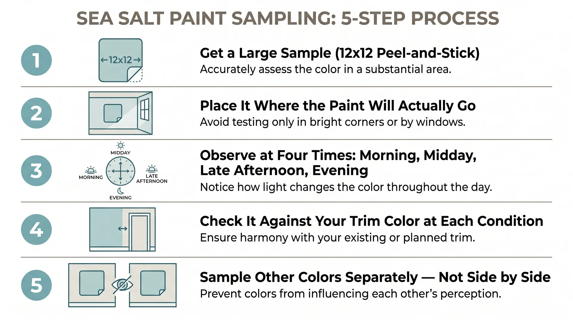
Sea Salt’s light-reactive undertone profile makes the standard sampling approach, small chip, brightest wall, one afternoon, decide — less reliable here than it is for almost any other color.
Here’s the process I walk clients through before they commit to a full room.
- Get a large sample. Samplize offers peel-and-stick painted samples in SW Sea Salt (SW6204) in a 12×12-inch format, using the actual Sherwin-Williams formula rather than printed ink on cardstock. A larger surface reveals undertone behavior that a small chip masks almost entirely.
- Place it in the right location. Not beside a window, not on the brightest wall. Put the sample where the finished paint will actually be, at the same height and on the same surface type. A sample on an adjacent accent wall is showing you a different color than the one on the primary wall across from the window.
- Observe at four distinct times. Morning, midday, late afternoon, and evening with your artificial lights on. Note what you see at each moment and, just as importantly, whether you like it. All four moments matter because you’ll be in the room at all four of them.
- Check it against your trim. Hold a piece of your actual trim color next to the Sea Salt sample at each lighting condition. The pairing that looks right at noon can look wrong at 8 pm, and the trim will be there at 8 pm too.
- Evaluate colors separately. If you’re comparing multiple wall colors for the same space, don’t place the samples side by side. Colors in direct comparison influence each other’s perceived hue. Sample each one independently, on its own wall or in its own room, and evaluate on its own terms.
The most revealing test: how does Sea Salt look in your room after dark?
Nighttime is when artificial lighting has complete control, and it’s when the gap between the mood board version and the reality tends to be widest.
If you can commit to how it looks with the lamps on and the daylight gone, everything you see in natural light will feel like the better version.
Sea Salt is not a color that holds still, and that’s not a criticism. The rooms where it looks effortless are rooms where someone did the work first, sampled it properly, understood their light, chose their materials accordingly, and decided they wanted a color that breathes.
In my experience, when that preparation happens, Sea Salt delivers something that static colors can’t.
