
Iron Ore is not quite black and not quite gray.
It sits in that particular zone where a color carries enough depth to read as dramatic but enough complexity to stay livable, and it’s one of the few dark paints that works reliably across interior walls, kitchen cabinets, and exterior siding without demanding a complete redesign around it.
If you’re here because your sample looks confusing in your actual room, that’s normal, and this guide explains exactly why.
What Is Iron Ore Paint Color?
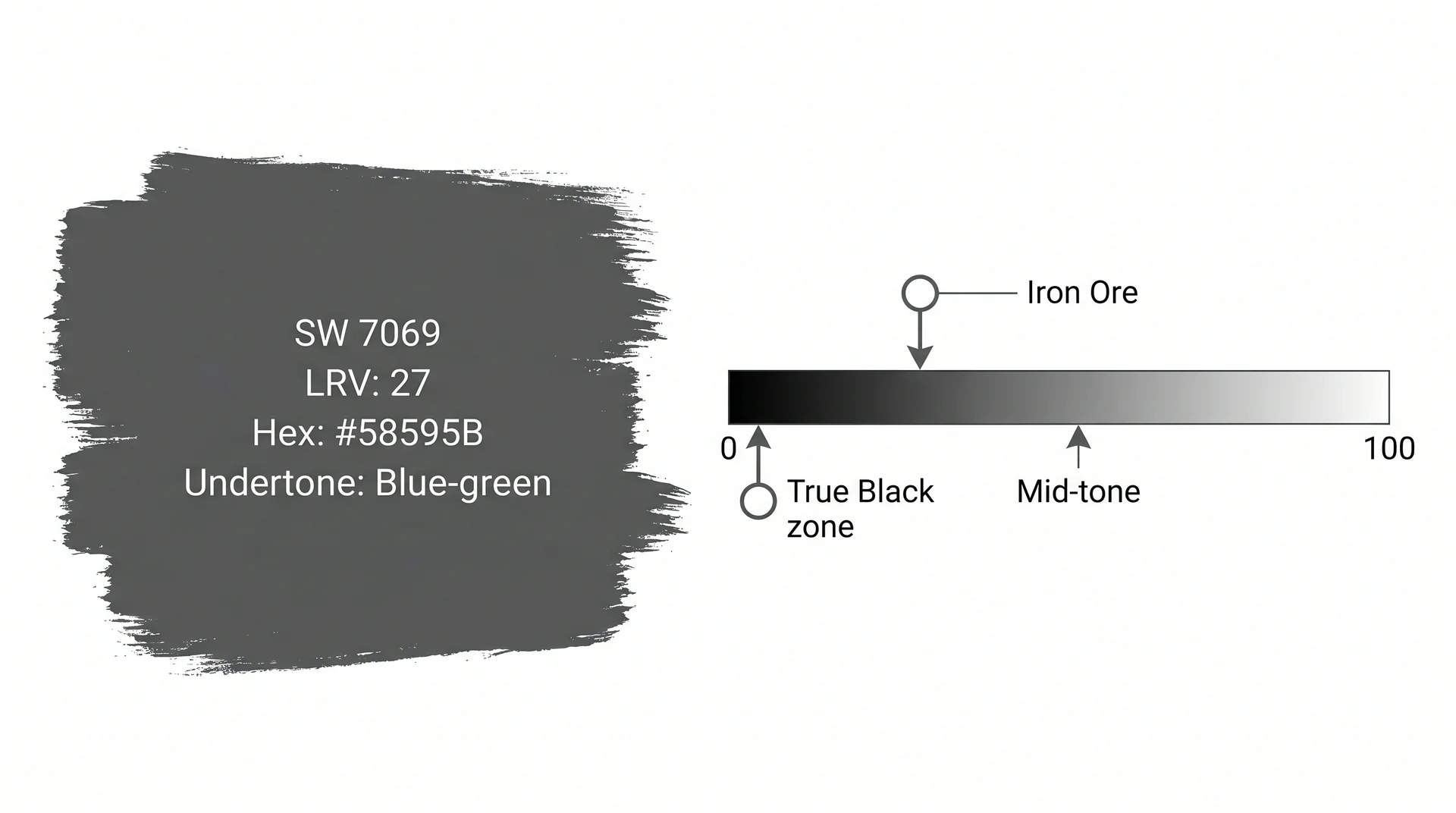
Iron Ore (SW 7069) is a very dark charcoal-gray from Sherwin-Williams with a Light Reflectance Value of 27, a hex code of #58595B, and a subtle blue-green undertone that becomes more visible in cool or diffuse light.
It sits in Sherwin-Williams’ Neutral color family, positioned at the deep end of the gray spectrum rather than among the true blacks, which gives it a dimensionality that pure blacks don’t carry.
LRV, Color Code, and Where Iron Ore Sits in Sherwin-Williams’ Lineup
The Sherwin-Williams SW 7069 technical data sheet lists Iron Ore at LRV 27. That number matters more than most paint color guides acknowledge.
LRV, or Light Reflectance Value, measures how much light a color returns to a room on a scale from 0 (pure black, absorbing everything) to 100 (pure white, reflecting everything).
At 27, Iron Ore absorbs a significant amount of light but doesn’t close down a room the way a true black at LRV 3 does. That difference is exactly why it reads as dramatic rather than oppressive in most residential spaces.
| Spec | Value |
|---|---|
| Paint Code | SW 7069 |
| Hex Code | #58595B |
| LRV | 27 |
| Color Family | Neutral |
| Undertone | Blue-green |
| RGB | R: 88, G: 89, B: 91 |
In Sherwin-Williams’ lineup, Iron Ore sits between the deep grays (Peppercorn SW 7674, Graphite) and the true blacks (Tricorn Black, Caviar). It’s close enough to black to photograph dramatically in a well-lit space, and warm enough in the right conditions to pair with wood and soft textiles without fighting them.
Is Iron Ore a Black or a Gray?
Iron Ore is a very dark gray, and that distinction has real practical consequences. True blacks like Tricorn Black at LRV 3 absorb almost all available light and read as flat, solid, and graphic.
Iron Ore at LRV 27 has enough variation in its pigment to pick up undertones from adjacent surfaces, shift visibly across lighting conditions, and feel dimensional rather than flat on a wall.
That’s why it works so well in layered interiors with varied textures, natural wood, and warm metals. A true black would compete with those elements. Iron Ore works alongside them.
Iron Ore’s Undertones & Why the Color Looks Different in Every Room
Iron Ore’s undertone is blue-green. You’ll see it or you won’t depending almost entirely on one thing: the color temperature of the light hitting that wall.
This single variable is responsible for nearly every confused reaction homeowners have when a sample goes up and looks nothing like the inspiration photos they’ve been saving for months.
The Blue-Green Undertone: What It Is & When It Shows
Iron Ore’s RGB values (R: 88, G: 89, B: 91) are nearly equal across channels, which puts it right on the edge of a perfect neutral gray. Close enough to gray to read as one in most lighting, but with just enough blue-green component to shift perceptibly when conditions change.
Under certain light it pulls toward a cool gray-green that reads almost like a dark sage. Under other conditions it sits as a neutral charcoal with no visible cast.
The undertone doesn’t disappear depending on the room, but how strongly it shows depends almost entirely on what kind of light hits the surface.
How Light Temperature Controls What You See
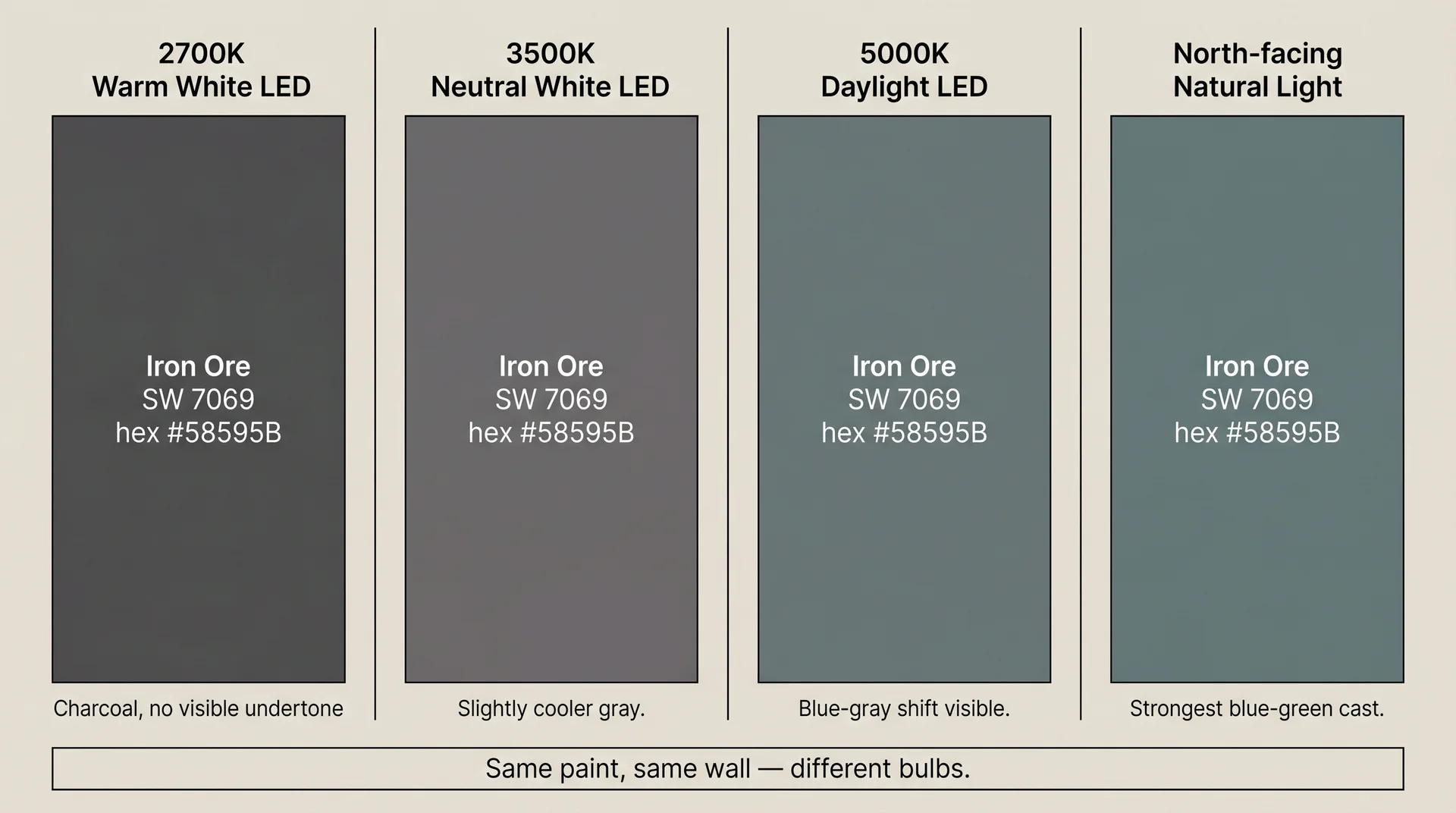
The Illuminating Engineering Society’s published guidance on light source characteristics confirms that color temperature significantly affects how surface colors appear to the eye. For Iron Ore, this plays out in very predictable ways:
- Warm-white LED (2700K–3000K): suppresses the blue-green shift and pushes Iron Ore toward a clean, neutral charcoal. This is the most flattering light for this color and the simplest way to manage the undertone without changing the paint.
- Neutral-white LED (3500K–4000K): brings the blue-green undertone out partially. Iron Ore reads cooler and slightly grayer, which works in modern or minimal spaces where that quality is intentional.
- Daylight bulbs (5000K–6500K): amplify the cool undertone noticeably. Iron Ore reads gray-green or blue-gray under these conditions.
- Incandescent or warm halogen: behave similarly to warm LED, pushing the color toward charcoal and suppressing any visible undertone shift.
If you’ve swatched Iron Ore and it looks nothing like the photos you saved, check the bulbs before you blame the paint. In most cases, swapping a 5000K LED for a 2700K LED is a four-dollar fix that resolves the problem entirely.
I’ve watched this fix a homeowner’s panic more than once, and it’s a considerably cheaper experiment than a repaint.
North-Facing vs. South-Facing Rooms — A Practical Test
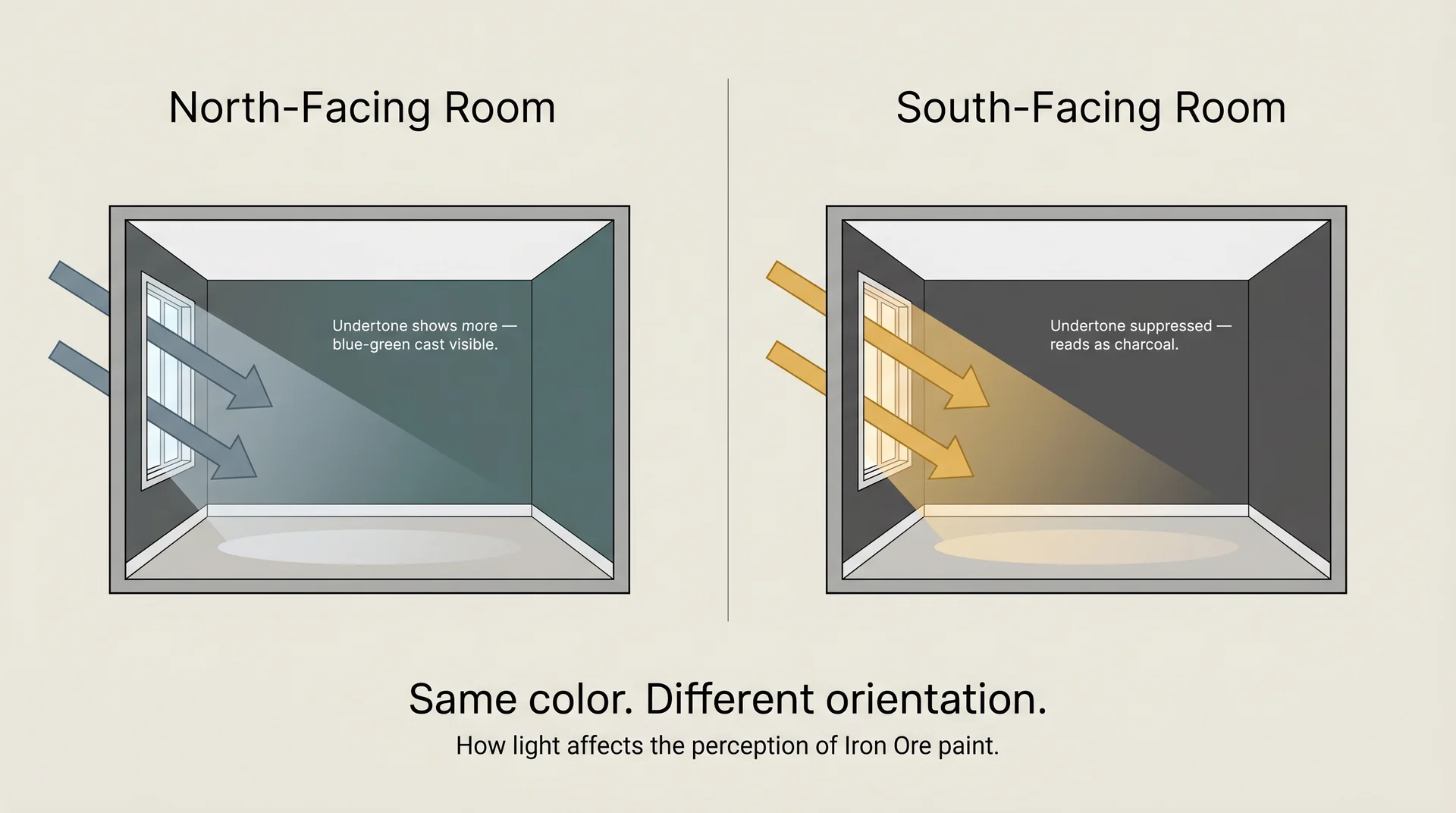
Natural light behaves the same way artificial light does, just on a longer cycle. North-facing rooms get cool, diffuse, indirect light consistently, and that’s the condition where Iron Ore’s blue-green undertone shows most.
South-facing rooms get warm direct sun for significant portions of the day, which suppresses the undertone and lets the color read as clean charcoal most of the time.
Worth knowing before you commit: Iron Ore in a genuinely dark north-facing room benefits significantly from warm, high-CRI (95+) artificial lighting. Without it, a dark color and poor-quality light can make a space feel heavy rather than dramatic, and that’s a harder problem to fix than changing a bulb.
If your room is north-facing and genuinely short on natural light, invest in the lighting plan before you buy the paint, because the two decisions are not as separate as they look on a paint store receipt.
What Colors Go With Iron Ore Paint Color?
Iron Ore pairs best with warm whites, natural wood tones, warm-toned metals, and muted organics.
It’s flexible enough to support both warm and cool color schemes, but it performs differently in each direction, and knowing which way you’re working changes everything about the palette.
Trim and Ceiling Pairings
Trim color is where most people make their first wrong turn with Iron Ore.
Pure whites like Extra White (SW 7006) create very high contrast at the edge, which reads as graphic and modern in the right space. In rooms with traditional millwork, exposed wood beams, or warm floors, that contrast can feel harsh rather than crisp.
These trim colors work more comfortably alongside Iron Ore:
- Alabaster (SW 7008): warm, slightly creamy white that softens the contrast without going yellow. The most universally safe pairing for Iron Ore trim across a range of architectural styles and lighting conditions.
- High Reflective White (SW 7757): crisp and clean without being stark. Works well in spaces with modern finishes and cool light, where some contrast is deliberate.
- Shoji White (SW 7042): a light warm gray with enough pigment to create contrast with Iron Ore without the hard edge of a bright white. Particularly good alongside exposed wood or warm textiles.
For ceiling treatment, three approaches each have a specific use case. Painting the ceiling Iron Ore is a deliberate commitment that works in rooms with high ceilings and generous light. In low-ceiling spaces it adds visual weight that compresses the room.
Matching the ceiling to the trim color is the most common and most forgiving approach. Painting the ceiling the same Iron Ore in flat finish is a subtler move that keeps the room cohesive without adding overhead presence.
Iron Ore Color Palette: Warm Schemes
Warm schemes work with Iron Ore’s gray base by layering in materials that bring out the charcoal quality rather than activating the cool undertone. The goal is to suppress the blue-green and let the depth of the color carry the room.
| Element | What Works |
|---|---|
| Trim / Companion Walls | Alabaster, Antique White, Navajo White |
| Metals | Brass, unlacquered bronze, warm copper |
| Wood Tones | Medium walnut, warm oak, natural maple |
| Textiles | Warm linen, cognac leather, rust, terracotta |
| Accent Colors | Dusty terracotta, camel, deep burgundy |
Iron Ore Color Palette: Cool Schemes
Cool schemes lean into the blue-green undertone rather than working against it. This direction suits modern and Scandinavian-influenced spaces, rooms with concrete or polished stone surfaces, and interiors where the lighting is deliberately cool.
The undertone quality that reads as confusion in warm-scheme rooms becomes the point in this direction.
| Element | What Works |
|---|---|
| Trim / Companion Walls | High Reflective White, Eider White, Snowbound |
| Metals | Matte black, brushed nickel, satin chrome |
| Wood Tones | Light ash, bleached oak, white oak |
| Textiles | Cool gray linen, slate blue, stone, charcoal wool |
| Accent Colors | Slate blue, dusty sage, soft near-black |
Accent Colors That Work Alongside Iron Ore
Iron Ore is a strong base, and it doesn’t need an equally strong accent to read well in a room. Muted, complex colors that carry a little gray in them sit most comfortably alongside it.
Pure saturated colors can feel jarring unless the design intent is specifically high-contrast maximalism, which is a deliberate choice rather than a default. These accent directions integrate well:
- Dusty rose or blush at low saturation
- Warm terracotta (works in both warm and transitional schemes)
- Warm camel or tan
- Deep navy (in cool schemes only)
- Deep forest green or muted sage: Evergreen Fog SW 9130 is the muted sage-gray-green that sits most comfortably alongside Iron Ore, particularly when Iron Ore is on cabinetry or doors, and the walls need a color with depth that doesn’t compete.
Ratio matters here. Iron Ore reads best when it has room to be the dominant statement.
An accent color covering more than 20–25% of the visual field starts to feel competitive rather than composed. Restraint with the accent is usually the better call.
Iron Ore Paint Color by Room: Where It Works Best
Iron Ore works across kitchens, bedrooms, living rooms, and accent walls, but each application has its own conditions that make it succeed or stall. Knowing what you’re working with before you commit saves paint, time, and second-guessing.
Iron Ore on Kitchen Cabinets
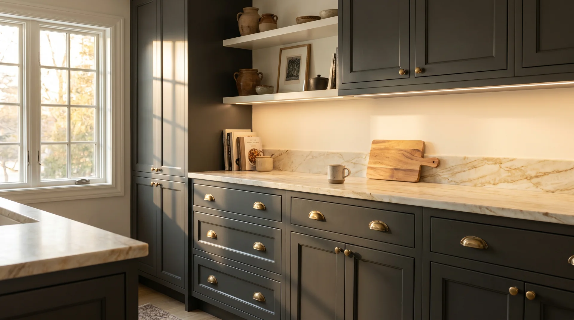
At LRV 27, Iron Ore is dark enough to read as bold on cabinetry but light enough that it doesn’t make a kitchen feel lightless. True blacks at LRV 3–5 can close down a kitchen when cabinet coverage is high or the room is mid-size. Iron Ore avoids that problem while still delivering the dark, graphic look that drives the dark cabinet trend.
If you’re two-toning it with a blue in a two-tone setup, Stardew SW 9138 is one combination that works particularly well.
The blue and gray two tone kitchen cabinet guide walks through the pairing logic and countertop
coordination for that combination in detail.
Countertop pairing is where the decision gets specific. White quartz in warmer formulations (Calacatta, Statuario) works reliably against Iron Ore cabinets. Warm quartzite with movement and beige tones is an excellent pairing.
Cool gray marble with prominent blue or purple veining can fight the undertone depending on your light source. If you’re still narrowing down countertop options alongside Iron Ore, the granite color guide covers how specific stone colors behave with dark cabinetry. Always evaluate the countertop and cabinet color together under your kitchen’s actual artificial light, not a showroom’s.
One practical constraint worth planning around: Iron Ore in semi-gloss on kitchen cabinets will show fingerprints. They’re not dramatic, but they show. In high-traffic kitchens, satin is slightly more forgiving and still reads polished.
Iron Ore as an Accent or Feature Wall
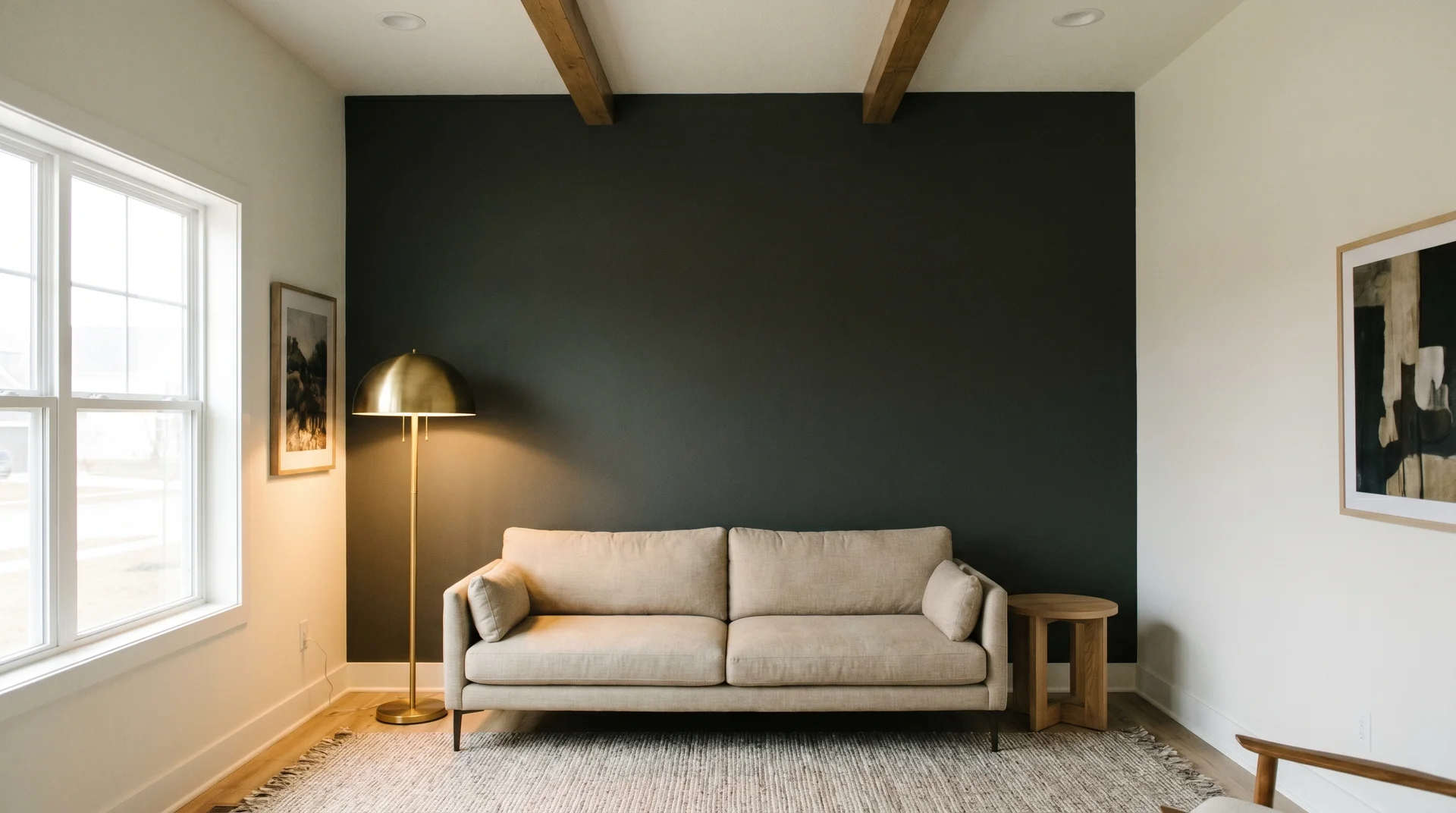
Iron Ore works well as an accent wall color because its LRV gives it more visual texture than a true black, which can read as a flat void rather than a dimensional surface.
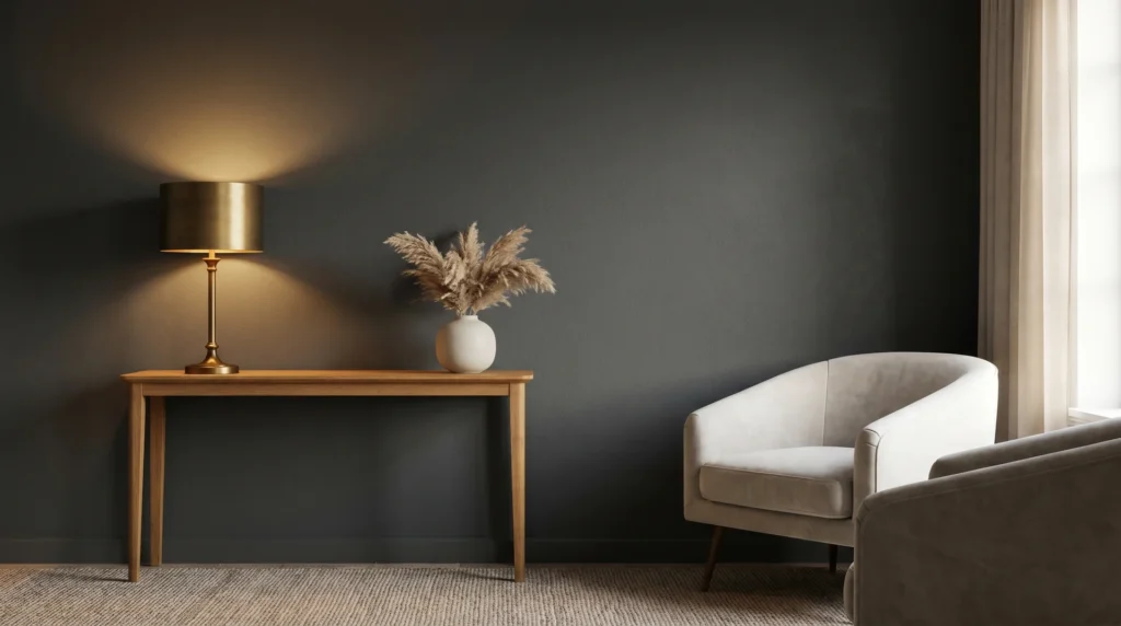
The walls that work: the fireplace wall, the wall a bed headboard sits against, the entry wall you see first walking in, and any architectural feature wall with built-ins or millwork that benefits from a dark backdrop.
Ceiling height makes a significant difference that most accent wall advice skips entirely. I’ve styled Iron Ore accent walls in rooms with 9-foot and 10-foot ceilings, and the result is consistently strong. The same treatment in a room with 8-foot ceilings can make the ceiling feel lower than it is.
If height is limited, consider taking the Iron Ore to chair rail or picture rail height rather than floor to ceiling. You get the visual weight of the color without the compression overhead.
For entryways where you’re also considering dark-painted stairs, an Iron Ore accent wall in the same space reads as very intentional rather than coincidental, especially with warm wood floors or brass fixtures connecting the two.
Iron Ore in Bedrooms and Living Rooms
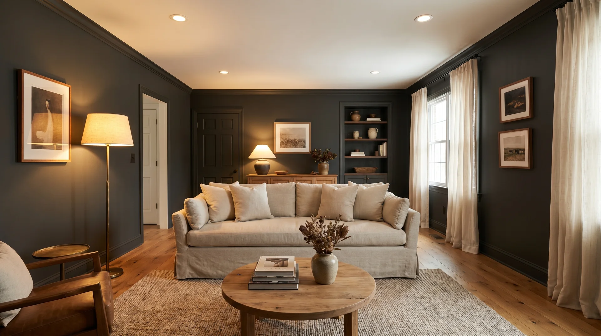
Full-room Iron Ore in a bedroom works when the room has adequate natural light during the day and warm artificial light in the evening. Rooms over 200 square feet with at least two windows handle it well.
Smaller bedrooms with one window are riskier, and a single Iron Ore accent wall behind the bed often delivers the same visual effect without the weight of full coverage.
In living rooms, Iron Ore works best as part of a layered design. Iron Ore walls alongside light-colored upholstery, warm wood floors, and brass or bronze lighting reads as sophisticated.
Iron Ore walls with dark furniture and limited light can tip toward heavy, particularly in the evening. The artificial lighting and the paint color are the same decision, and they need to be planned together. Choosing a paint color and then figuring out the lighting afterward is how rooms end up feeling almost right but not quite.
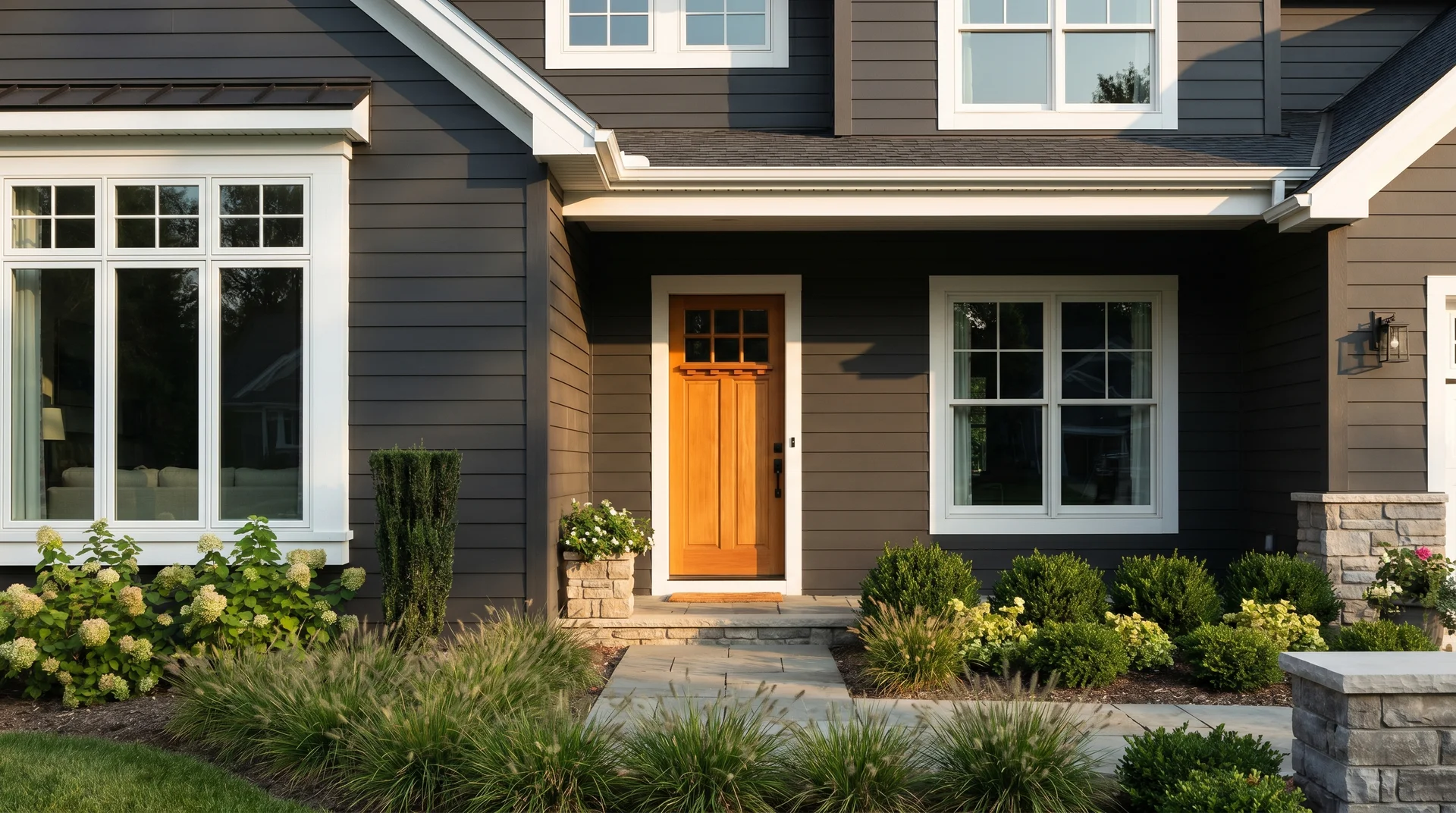
Iron Ore as an Exterior Paint Color
Iron Ore works well as an exterior color and behaves differently outdoors than it does inside.
The blue-green undertone that can be pronounced in a north-facing interior room is less of a factor outdoors, where natural light shifts constantly across the day and the color reads more consistently as dark charcoal.
Iron Ore on Siding: What to Expect
Part of Iron Ore’s appeal on exterior siding is the visual quality it adds to a facade.
A dark charcoal exterior against crisp trim reads as considered and deliberate in a way that medium-value siding colors rarely achieve, which is part of why dark charcoals consistently appear on homes people describe as looking expensive or high-end.
The effect is real, and Iron Ore delivers it without the flatness of a true black on a large exterior surface.
Per Master Painters Institute exterior application standards, dark paint colors on siding require specific product selection and preparation to perform over time. These are the practical specifications for Iron Ore on exterior siding:
- Finish: Satin for most siding types. Flat finishes on exterior dark colors show surface irregularities and collect more environmental debris. Gloss is too reflective for large siding surfaces and amplifies substrate imperfections.
- Product: Sherwin-Williams Duration Exterior or Emerald Exterior carries sufficient pigment load and UV inhibitors for a dark color in continuous sun exposure. Standard exterior paint in a dark color will fade faster.
- Primer: A gray-tinted primer matched closely to Iron Ore is important here. White primer under a dark exterior color requires an additional topcoat to prevent bleed-through in thin spots.
Iron Ore reads differently across siding materials. On fiber cement, it’s crisp and graphic.
Iron Ore reads cleanly on fiber cement siding with white trim and a natural wood front door, and it performs equally well on cedar board and batten siding, where the grain texture adds depth to a dark color that paint alone can’t replicate.
On wood lap siding, the natural grain variation gives Iron Ore a dimensional quality that reads as organic and textured.
On stucco siding, it goes bold and solid. Each material shifts the visual weight of the color on the facade in a way that’s worth accounting for when you’re sampling.
Exterior Trim and Door Pairings for Iron Ore
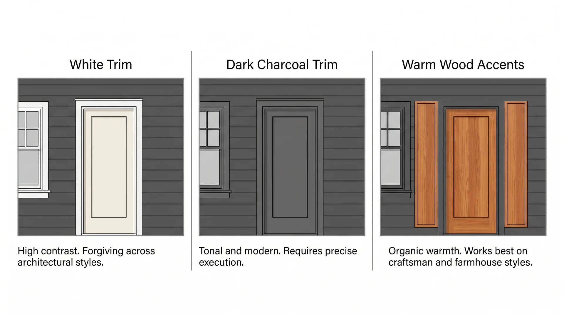
Exterior color combinations with Iron Ore siding generally fall into three directions, each with a distinct character:
- White trim: High contrast, classic, and forgiving across architectural styles. Bright white trim (Sherwin Williams Extra White is reliable for exterior trim) against Iron Ore siding is graphic and clean. This is the lowest-risk combination and the easiest to execute correctly.
- Soft black or dark charcoal trim: Tonal and modern. A slightly lighter or darker charcoal on the trim against Iron Ore siding creates a sophisticated, low-contrast exterior. It requires more precision because the tonal difference between field and trim has to read as clearly intentional rather than accidental.
- Warm natural wood accents: Cedar or ipe doors, wood garage doors, or wood accent panels alongside Iron Ore siding add organic warmth that counteracts the austerity that can come with a very dark exterior. This works particularly well on homes with craftsman or modern farmhouse detailing.
Front door colors that work against Iron Ore siding: warm white (Antique White, Creamy), deep red (Burgundy, Rustic Red), natural wood, and warm brass-finished metal doors. Colors that tend to disappear or compete: medium gray (reads too similar to the siding), orange (fights for attention), and pastels (feel out of scale against a very dark field color).
Regional Fade Behavior: Sun Exposure and Climate
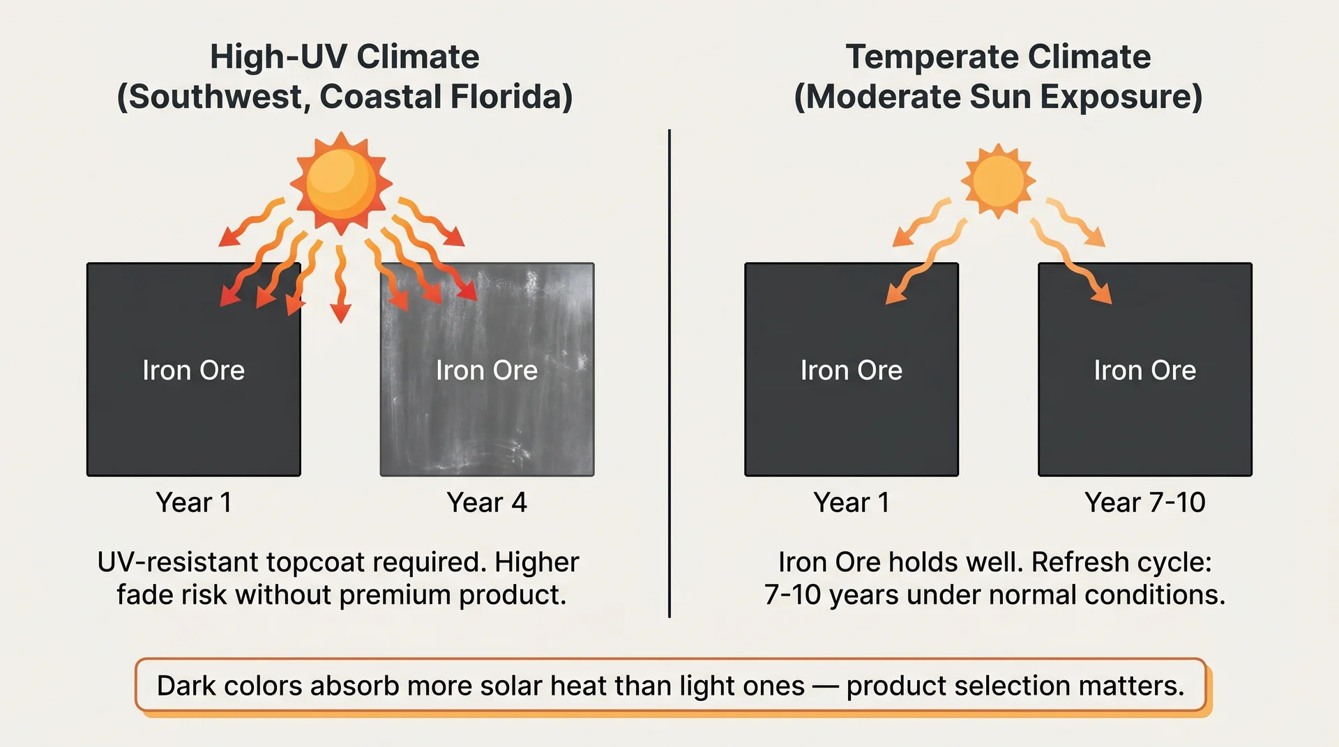
Dark exterior colors absorb more solar heat than light ones. In high-UV climates like the Southwest or coastal Florida, Iron Ore on exterior siding needs a high-quality UV-resistant topcoat to hold its color over time. In temperate climates with moderate sun exposure, Iron Ore exterior holds up well and typically needs refreshing on a 7–10 year cycle under normal conditions.
One trade-off worth knowing on wood siding in high-humidity climates: the heat absorption that dark colors produce accelerates the drying cycle at the surface, which can increase moisture-related peeling risk over time.
It’s manageable with proper substrate preparation and a quality topcoat, and it’s a maintenance variable worth factoring in before committing to a dark exterior on wood siding specifically.
Iron Ore vs. Other Dark Paint Colors
Iron Ore is a very dark charcoal-gray with a blue-green undertone and an LRV of 27, which places it in a specific zone between deep charcoals and true blacks. Understanding where it sits relative to its closest competitors resolves the decision faster than any amount of additional sampling.
Iron Ore vs. Tricorn Black (SW 6258)
| Factor | Iron Ore SW 7069 | Tricorn Black SW 6258 |
|---|---|---|
| LRV | 27 | ~3 |
| Undertone | Blue-green | Nearly neutral |
| How it reads | Very dark charcoal gray | True black |
| Dimensional quality | High, shifts with light | Low, reads flat and absolute |
| Best application | Full walls, cabinets, siding | Doors, trim, accent details |
Choose Iron Ore when you want depth and visual complexity. Choose Tricorn Black when you want an unambiguous true black with no undertone variation and no surprises across lighting conditions.
Tricorn Black doesn’t shift the way Iron Ore does, which makes it more predictable and simultaneously less interesting in layered, textured interiors. The two work together very well: Tricorn Black as the door or trim color against Iron Ore siding or walls reads as a deliberate tonal layering rather than two competing darks.
Iron Ore vs. Benjamin Moore Wrought Iron (2124-10)
This is the most common cross-brand comparison, and it persists because both colors are dark charcoal-gray with blue undertones, both sit in the near-black range, and both are popular for cabinets and exterior applications.
They’re closer than they first appear, and the choice between them often comes down to your specific room conditions.
- LRV: Wrought Iron carries an LRV of approximately 6, significantly lower than Iron Ore’s 27. Wrought Iron reads darker and absorbs more light. That gap matters more at high coverage (full kitchen cabinetry, full-room walls) than it does on a single accent element.
- Undertone: Wrought Iron pulls more blue than blue-green and reads cooler overall. In some lighting conditions it carries a slight navy quality. Iron Ore stays closer to gray even when the undertone shows.
- Scale of application: For heavy cabinet coverage or full-room walls, Iron Ore’s higher LRV makes it more forgiving in smaller spaces. Wrought Iron is better suited to situations where near-black depth is the explicit goal and the space can carry it.
For kitchen cabinets, Iron Ore tends to be more livable when coverage is high and the kitchen still needs to function as a bright, practical space.
If the objective is a dark, dramatic exterior or a single high-impact element where absolute depth matters most, sample both colors against your countertops under your actual kitchen lighting before deciding. The difference is subtle at small scale and significant at large scale.
Iron Ore vs. Black Magic (SW 6991)
Black Magic gets less attention than Tricorn Black and Wrought Iron, but it belongs in this conversation when your room already skews warm.
Where Iron Ore pulls cool, Black Magic pulls warm. Its undertone is brown rather than blue-green, which means in incandescent or warm LED light it reads as a warm charcoal-brown rather than a cool gray.
Choose Black Magic when your room already has strong warm wood tones, terracotta tile, brick, or warm amber lighting. In those rooms, Black Magic integrates naturally because it shares the warm frequency of the surrounding materials.
Iron Ore in a room full of warm wood and amber light can feel slightly off, like the one cool element in an otherwise warm interior. It’s a subtle thing, and it’s exactly the kind of thing that makes a room feel almost right rather than right.
Finish and Application: Getting the Best Result From Iron Ore
Iron Ore requires more precision at the application stage than lighter colors do, and the first-coat coverage behavior is the thing most people aren’t prepared for.
Which Paint Finish Works Best for Iron Ore
- Walls: Eggshell or satin. Eggshell hides surface imperfections slightly better and is the right call for older walls with texture variation. Satin is more washable and holds up better in high-traffic areas.
- Kitchen cabinets and trim: Semi-gloss. Durable, wipeable, and the sheen level reads correctly against wall paint without competing.
- Ceilings: Flat. A flat finish on a dark ceiling doesn’t reflect light back down into the room, which is the intended effect in a dramatic ceiling treatment. It also hides touch-up marks better than any other finish option.
- Exterior siding: Satin. Semi-gloss for exterior trim and doors.
One trade-off with eggshell or flat finishes on Iron Ore walls: touch-up marks show more visibly on dark matte paint than on any lighter finish.
A scuff that needs touching up will likely remain visible until the area has time to oxidize and blend. In a house with young children or active pets, eggshell is worth it over flat.
Primer and Prep for a Dark Color
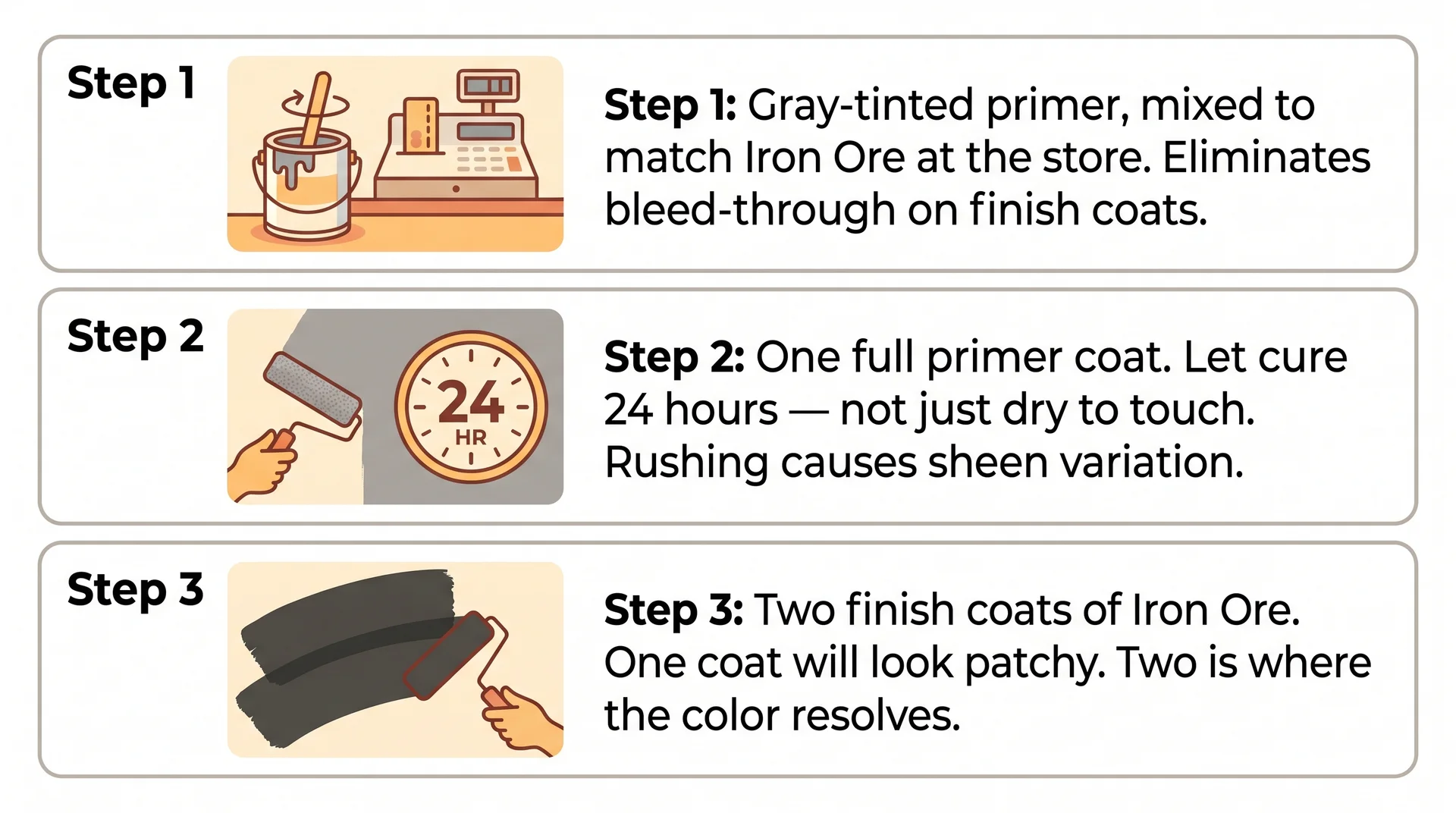
Priming matters more with dark colors than light ones, and a white primer underneath Iron Ore is a setup for extra coats and inconsistent coverage. The approach that works consistently in residential application:
- Use a gray-tinted primer, mixed to match Iron Ore at your Sherwin Williams store. This reduces the number of finish coats needed and prevents white primer from showing through in thin spots.
- Apply one full primer coat and let it cure completely. Full cure is typically 24 hours for most primers. Rushing to the topcoat over an uncured primer causes adhesion issues that show up as uneven sheen months after you’ve moved furniture back in.
- Apply two finish coats of Iron Ore. In most situations, two coats over a tinted primer gives complete, even coverage. Three coats may be needed when going over a very light previous color on cabinets or over raw drywall.
Common Application Mistakes and How to Avoid Them
Iron Ore at one coat looks patchy, streaky, and wrong. That is completely normal. Dark pigment at partial coverage shows every stroke direction and every thickness variation. Two coats is where the color resolves.
If you’re evaluating coverage mid-application and it looks uneven, finish the coat, let it dry completely, and apply the second before making any judgment. The number of homeowners who’ve called a painter back unnecessarily because the first coat of a dark color looked bad is significant.
- Lap marks are more visible on dark colors. Work in manageable sections and keep a wet edge throughout each coat.
- Varying dry times from drafts, vents, or inconsistent application speed create sheen variation that reads as streaking. Close vents and interior doors during application if you can.
- Roller texture shows more on dark paint under raking light. Use a 3/8-inch nap roller for smooth walls. A thicker nap creates texture that’s visible on dark finishes in a way it simply isn’t on lighter colors.
Is Iron Ore the Right Dark Paint for Your Space?
Three specific variables in your room determine whether Iron Ore works or struggles: lighting conditions, room scale, and existing finishes. You need honest answers to all three before you buy a gallon.
Lighting is the most important of the three. Warm natural light or warm-white bulbs in the 2700K–3000K range are where Iron Ore performs the way the inspiration photos look.
North-facing rooms with cool diffuse light and daylight-spectrum bulbs will show more of the blue-green undertone. That’s manageable with a bulb change, which costs four dollars and is worth testing before you rule the color out or commit to a repaint you didn’t need.
Room scale matters because Iron Ore at LRV 27 gives you more flexibility than a true black, but it still absorbs light. Rooms under 150 square feet with one window and low ceilings are on the edge for full coverage.
A single accent wall in those spaces is usually more successful than painting every surface, and it delivers most of the visual impact you’re after.
Existing finishes are the third variable and the one most people evaluate last. Iron Ore works with warm wood, brass, bronze, natural stone, and warm whites. It integrates less naturally alongside cool gray laminate, chrome hardware, and pure cool-white finishes unless the design intent is specifically modern and minimal.
Match the finish direction to what’s already in the room before you evaluate the color on its own. A color that looks right on a sample chip can feel wrong in a room where everything around it is pulling in a different direction.
Order the Samplize peel-and-stick sample before buying a gallon. Test it at three points through the day: morning, midday, and evening under your artificial light.
That’s the only reliable way to know how Iron Ore behaves in your specific space, and a sample costs considerably less than a gallon of paint and a weekend of second-guessing.
