
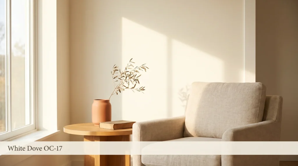
White Dove is a warm, off-white paint with a soft cream undertone, an LRV of 85.35, and a color number of OC-17 in the Benjamin Moore lineup.
It reads as a clean, barely-warm white in rooms with strong natural light, and it shifts toward cream or soft yellow under artificial lighting, in north-facing rooms, or anywhere warm-toned materials amplify what’s already in the paint.
That’s the essential thing to understand before you buy it. White Dove isn’t too white for most walls, and it isn’t going to look dingy on its own. What it will do is respond to its environment more than a cooler, higher-LRV white would. If you understand that going in, you can plan around it. If you don’t, you’ll be making a second call to the paint store.
I’ve specified White Dove on walls, trim, and cabinetry across many client projects over the years. What I know from that work, the part no spec sheet tells you, is that the same can of OC-17 can look like two different colors on two different surfaces in the same room, depending on the finish.
That’s the piece most reviews skip. It’s also the piece that tends to generate the most calls from clients on the finish day.
Why is White Dove So Popular?
Because it occupies the most useful middle position in the white spectrum: warm enough to feel comfortable and soft, light enough to work as a true neutral background in almost any room.
It doesn’t have the stark, slightly cold quality that bright whites carry, and it doesn’t push into obvious cream territory.
That in-between quality is precisely why designers keep reaching for it, and why it remains Benjamin Moore’s most recommended white across residential projects.
White Dove Color Code and Specs at a Glance
| Spec | Value |
|---|---|
| Benjamin Moore Color Number | OC-17 |
| Collection | Off-White Collection / Historical Collection |
| LRV (Light Reflectance Value) | 85.35 |
| Undertone | Warm cream, soft yellow-neutral |
| Approximate Hex Code | #F4F0E7 |
| Finish Availability | Flat, Matte, Eggshell, Satin, Semi-Gloss |
(Specs per Benjamin Moore OC-17 technical documentation. LRV measurement follows the ASTM E1164 standard methodology for spectrophotometric evaluation of object color.)
Is White Dove Warm or Cool?
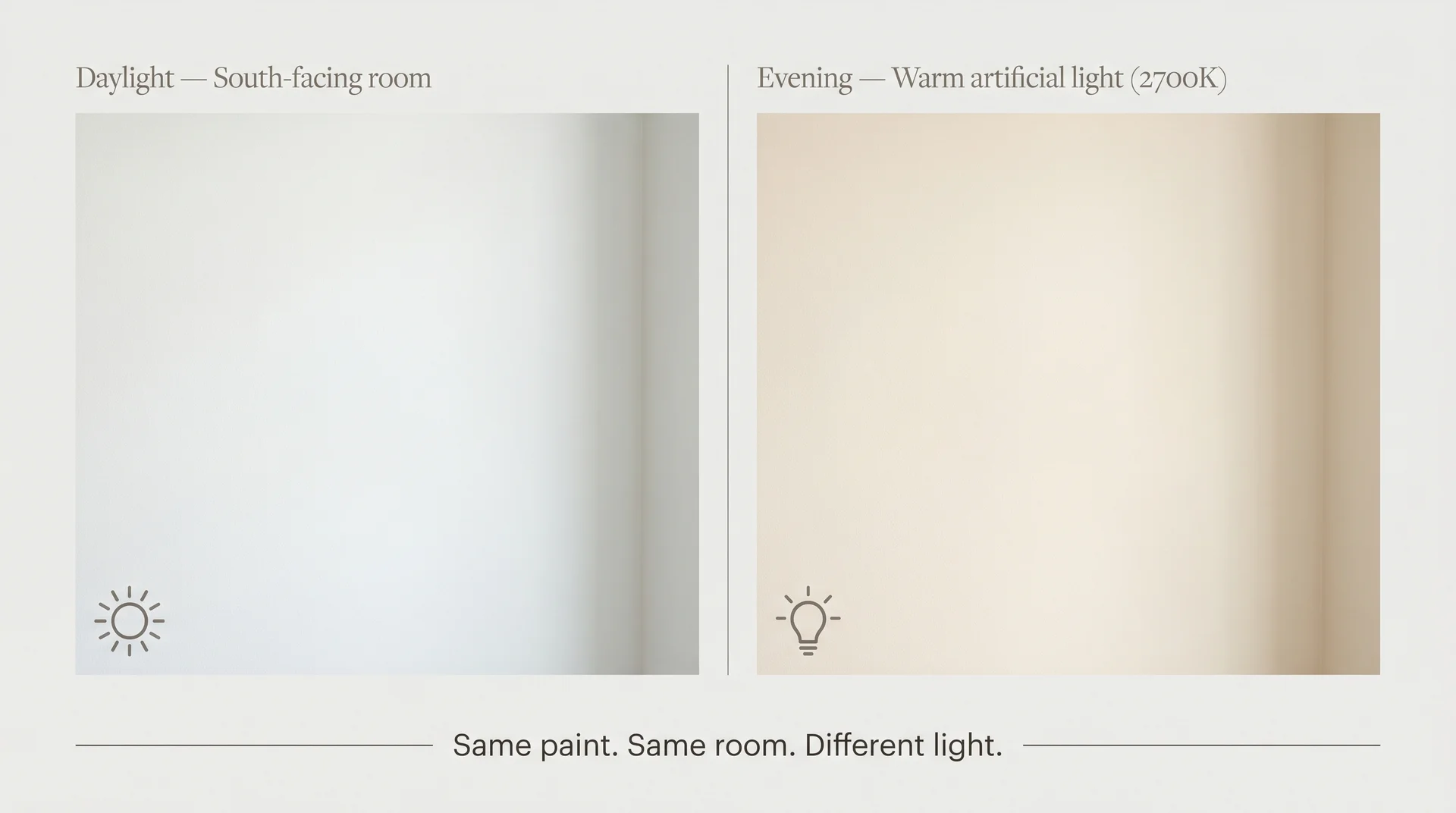
White Dove is a warm white. Its undertones are soft yellow-cream, with no blue, green, or pink cast. Under direct natural daylight, that warmth is subtle enough that most people would call it a clean white.
Under warm artificial light, the cream undertone becomes more visible. In rooms surrounded by warm-toned flooring, cabinetry, or furnishings, the warmth compounds.
This is not a flaw. White Dove became the go-to recommendation for residential projects precisely because it avoids the slightly cold, almost bluish quality that true whites carry in most room conditions.
The warmth is what makes it work so consistently across different styles and materials. The only time that warmth becomes a problem is when the room amplifies it past what the homeowner expected, and that’s almost always a predictable outcome if you know what to look for.
Why White Dove Can Look Yellow (And What to Do About It)
White Dove can read yellow or cream in rooms with warm artificial lighting, warm-toned flooring, or limited natural light. This isn’t a defect, and it isn’t a bad batch. It’s a predictable response to room conditions, and it’s entirely avoidable if you understand what drives it before you pick up a brush.
According to ASTM E1164 measurement standards, an LRV of 85.35 means White Dove reflects roughly 85% of the light that hits it. The remaining 15% it absorbs skews warm.
In a room flooded with cool daylight, that absorbed fraction is barely perceptible. In a room lit by warm LED or incandescent bulbs, those light sources are already pushing amber into the space, and the paint’s undertone compounds that. The wall starts to read more cream than it did at the sample stage, sometimes noticeably so.
Warm-toned flooring does the same thing through reflected light. Golden oak hardwood, honey pine, warm beige tile, and similar floors bounce warm light upward into the room. That reflected warmth hits your White Dove walls and intensifies the cream from below. I’ve seen this shift the apparent color enough that clients genuinely believed they’d received the wrong paint.
This relationship between flooring and wall color is part of a pattern that applies across the entire off-white category.
Understanding how fixed finishes affect paint color before you sample is the step most people skip, and the one that closes the gap between what you expected and what ends up on the wall.
The fix isn’t complicated, but it does require doing the sampling work before committing. Sample the color under your actual evening lighting, not just in daylight.
Hold the sample next to your largest fixed warm surface, whether that’s your floor, your countertop, or your cabinetry. The interaction between those two things is what your finished room will actually look like.
What Is the LRV of White Dove, and What Does It Mean for Your Room?
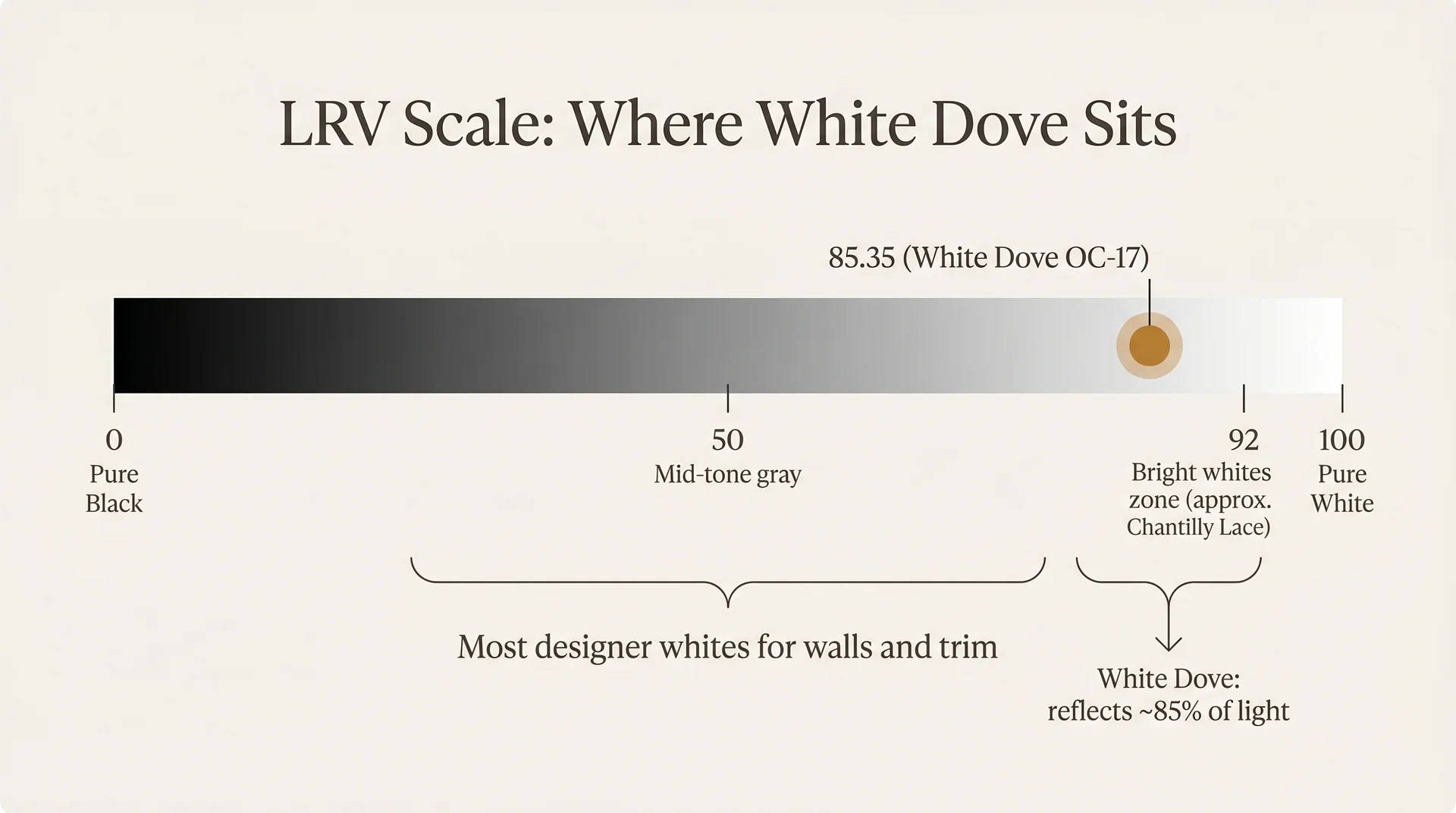
White Dove has an LRV of 85.35, which places it in the light range but not at the very bright end of the white spectrum. Pure white measures near 100; pure black near 0. Most of the bright whites used for trim and ceilings sit between 85 and 94.
White Dove is toward the lower end of that window, which is part of why it can feel soft and warm rather than stark.
In practical terms, that number means White Dove works well in rooms with at least one good light source. Strong natural light is its best context. In rooms with very limited ambient light, the 15% absorbed warmth has more effect on the overall room read.
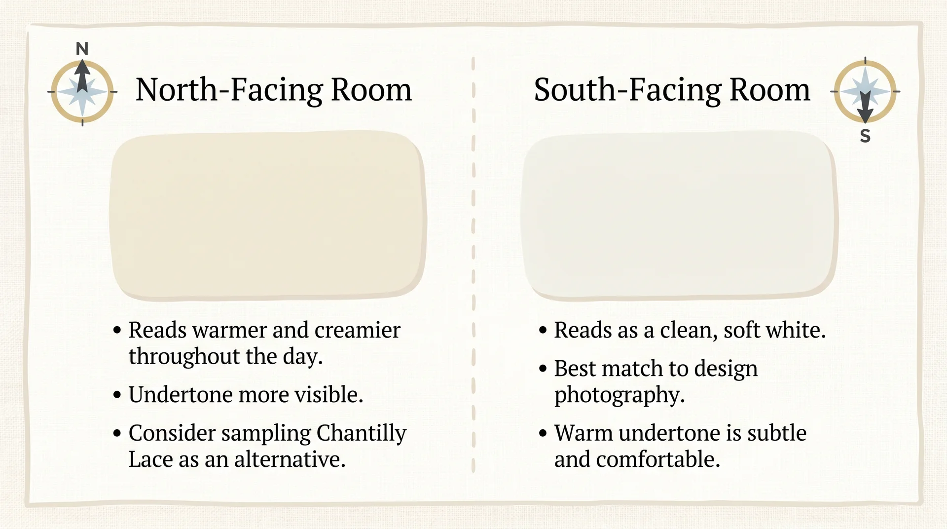
- South or west-facing rooms: White Dove reads as a clean, barely-warm white. This is the version you see in most design photography.
- East-facing rooms: Reads slightly creamier in the afternoon but performs well through the morning hours.
- North-facing rooms: The cream undertone becomes more prominent throughout the day. Worth sampling carefully before committing.
- Rooms with warm artificial lighting only: Bulb temperature matters significantly. Warm 2700K bulbs amplify the undertone visibly. Bulbs in the 3500K to 4000K range keep the color closer to its daylight appearance.
How White Dove Performs by Room and Light Direction
White Dove paint color behaves differently depending on which direction the room faces, what light sources are in use, and what materials surround the walls.
The same can of OC-17 can look like two meaningfully different colors in a south-facing kitchen versus a north-facing study. Knowing what to expect from your specific room makes the sampling process faster and the final decision more confident.
White Dove in North-Facing Rooms
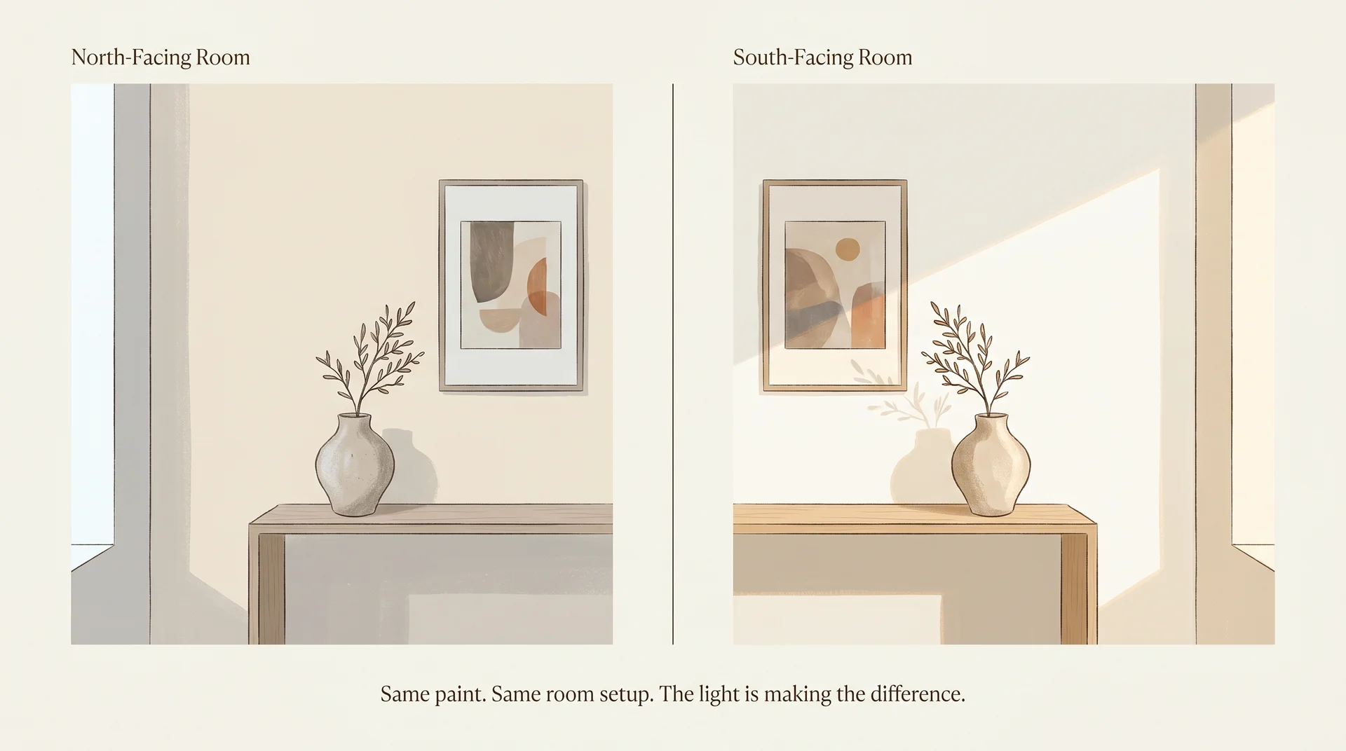
North-facing rooms receive cool, indirect light throughout the day. That light quality makes warm-toned colors read more noticeably cream or off-white rather than clean white. In a north-facing room, White Dove will likely look warmer and more obviously creamy than the photos that drew you to it in the first place.
That’s not automatically a problem. A cream-leaning white in a north-facing bedroom can feel restful and warm rather than clinical. But if you want a crisper, cleaner white in a north-facing space, Chantilly Lace or Simply White will perform more consistently. Both hold their brightness better under indirect cool light.
The constraint I’ve run into more than once: clients fall in love with White Dove in a showroom or a friend’s bright south-facing living room, then paint their north-facing dining room and call two weeks later, wondering why it looks different. It’s the same paint.
The room is doing that. If your space gets no direct light for most of the day, approach the sampling process with that already factored in, and be ready to either accept the warmer read or switch to a cooler white.
White Dove in South-Facing and Well-Lit Rooms
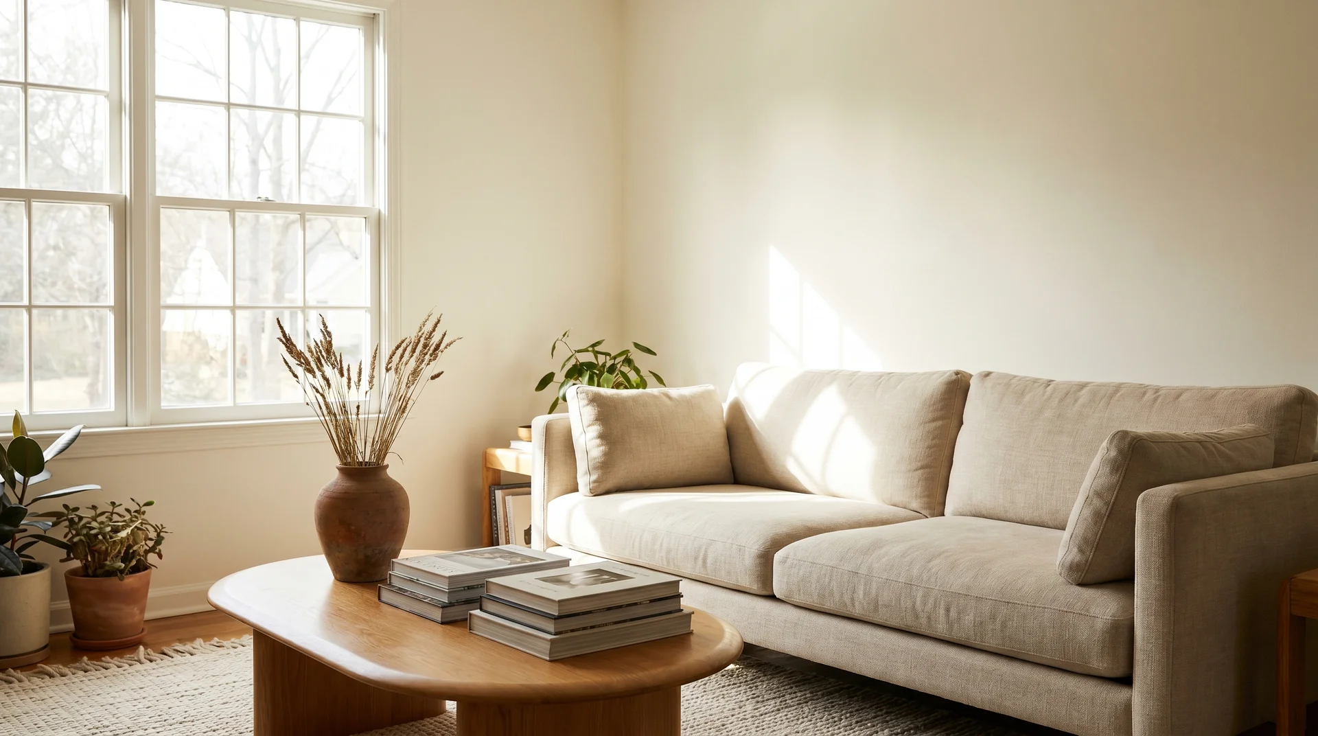
South-facing rooms are where White Dove delivers exactly what the design photos suggest. Strong natural light comes in for most of the day, and the color reads as a clean, barely-warm white that makes rooms feel bright without going cold. This is the context in which it performs at its most reliable.
West-facing rooms get similar performance in the afternoon. East-facing rooms get it through the morning. If you’re working with strong natural light for a meaningful portion of the day, White Dove is one of the most dependable warm whites available.
White Dove in Bedrooms
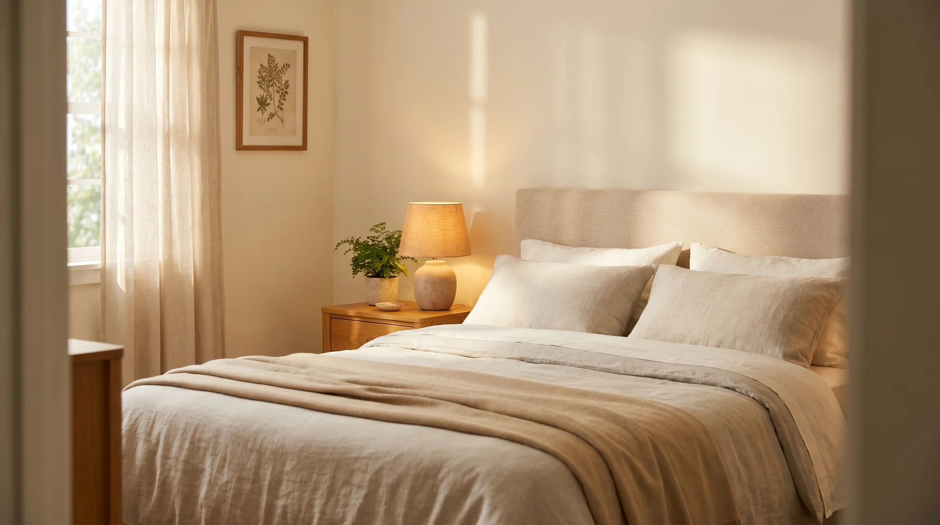
White Dove works particularly well in bedrooms where the design direction runs warm and layered. Its soft cream undertone pairs naturally with linen textiles, warm wood furniture, and neutral bedding stacked in different tones. The color doesn’t pull against those materials the way a cool or stark white would.
For bedroom walls, a flat or matte finish is the right call in most situations. It absorbs light softly, which enhances the restful quality of the color and hides minor wall imperfections. If washability matters, eggshell is a reasonable step up, but it reads slightly warmer and shinier in the same room. Worth knowing when you’re evaluating your sample.
White Dove on Exteriors
White Dove works well on home exteriors and, for most homeowners, looks noticeably crisper outside than it does indoors. Daylight is much stronger and more neutral than interior lighting, which means the warm undertone has less ambient warmth to compound with. The color reads cleaner and more sophisticated on a facade than the interior swatch might suggest.
It’s a natural fit for traditional, transitional, farmhouse, and colonial architecture. On Craftsman homes, it sits well alongside natural wood accents and earthy stone. On more contemporary homes, it needs a clear contrast from trim or accent colors to prevent the palette from flattening into undifferentiated beige.
The exterior trim decision catches more homeowners off guard than any other detail in this category. Pairing White Dove in semi-gloss on trim alongside White Dove in satin or low-lustre on the body creates a tonal, polished look that reads intentional.
Putting a very bright, stark white on the trim next to White Dove on the body does the opposite: the contrast drags the warm undertone into sharp relief, and the body starts to look cream or slightly dingy by comparison.
If the trim color you want reads noticeably cooler or brighter than OC-17, sample them side by side on an actual exterior surface before deciding.
Sheen Selection for White Dove by Surface
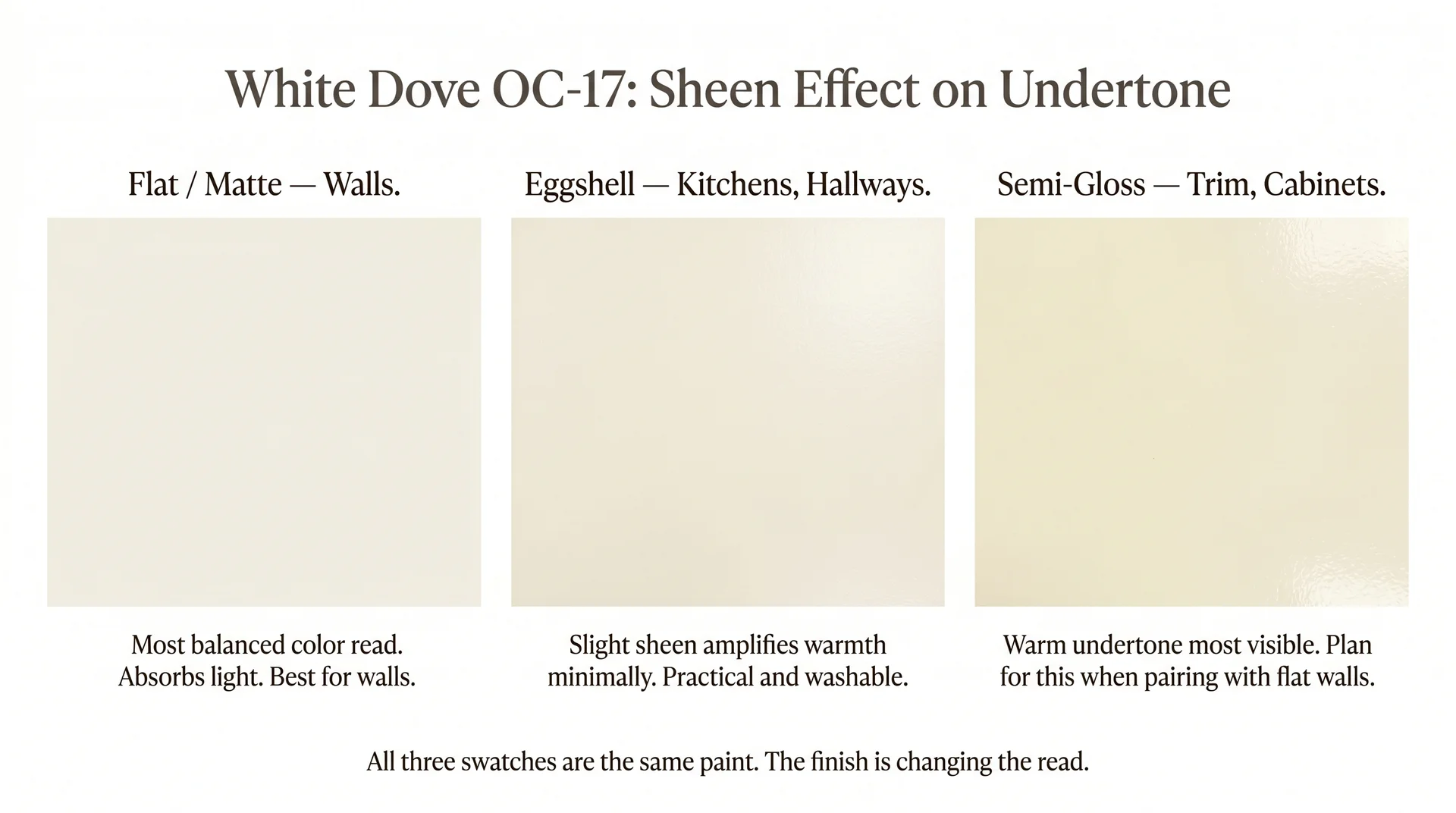
The finish you choose for White Dove changes how the color reads in your room just as much as the color itself, and this is the detail that catches even prepared homeowners off guard.
Here’s what actually happens: semi-gloss surfaces reflect more light back into the room than flat surfaces do. More reflected light means more of the warm undertone gets amplified and bounced back at you. The same OC-17 reads warmer and pulls more noticeably yellow-cream in semi-gloss on trim than it does in flat on the adjacent walls.
I’ve had this conversation more times than I can count. Clients paint the walls in White Dove flat, love the result, then apply White Dove semi-gloss to the trim on the finish day and call to say the trim looks like a different, yellower color.
It isn’t a mistake in the painting. It’s the finish doing exactly what finishes do. Planning for this in advance is the difference between a result that feels cohesive and one that feels slightly wrong in a way that’s hard to pin down.
| Surface | Recommended Finish | Key Consideration |
|---|---|---|
| Living room/bedroom walls | Flat or Matte | Softest color read; hides wall imperfections |
| Kitchen and hallway walls | Eggshell | Washable; reads slightly warmer than flat on the same wall |
| Bathroom walls | Eggshell or Satin | Moisture resistance required |
| Trim and doors | Semi-Gloss | Will read noticeably warmer than adjacent flat walls in the same color |
| Cabinetry | Semi-Gloss or Satin | Task lighting amplifies the warm undertone significantly; sample in the actual finish |
| Ceilings | Flat (ceiling formula) | Benjamin Moore ceiling flat recommended for best coverage and leveling |
| Exterior walls | Satin or Low-Lustre exterior | Reads crisper outdoors; prioritize durability and UV resistance |
On cabinetry specifically, kitchen cabinets sit under task lighting that typically runs warm, and semi-gloss interacts with that light actively.
White Dove cabinets in semi-gloss under 2700K undercabinet LEDs with warm-toned countertops can read quite cream. That may be the look you’re going for. Just don’t make that decision based on a sample chip viewed under fluorescent store lighting.
If you’re considering White Dove on stair risers or interior millwork where a harder finish matters, the same logic from our guide to painted stairs applies: product choice and sheen interact with undertone in ways that flat walls don’t prepare you for.
What Colors Go With White Dove
Building a palette around White Dove means working with the warmth, not against it. Warm backgrounds want warm companions. Almost every place where this color looks wrong is a case where something cooler or starker is fighting the undertone instead of complementing it.
Trim and Accent Color Pairings
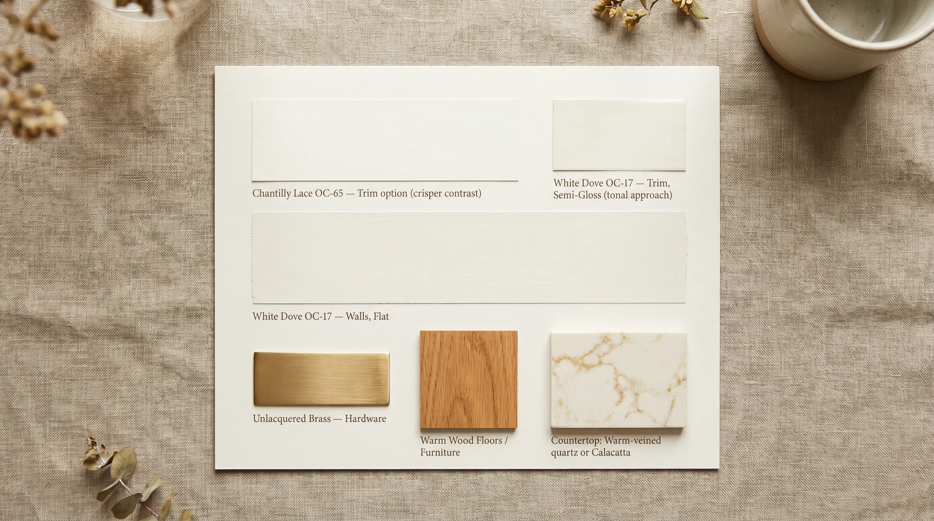
- White Dove on walls and trim (tonal approach): Using the same color at different sheens is a clean, traditional choice. The sheen difference creates enough visual separation between wall and trim that they register as distinct surfaces without any color conflict. This is usually my first recommendation for rooms where you want a unified look. For a deeper look at trim profile options that complement this approach, the shoe molding vs. quarter round guide covers the profile decisions that go alongside your paint selection.
- Chantilly Lace on trim: If you want a crisper edge around windows and doors, Chantilly Lace (OC-65) provides real contrast against White Dove walls without creating a color conflict. It’s cooler and brighter, and it works best in rooms with strong natural light where the contrast reads as deliberate.
- Avoid very bright, cool-white trim: Pairing White Dove walls with a stark cool-white trim puts the warm undertone under a microscope. The walls start to look cream rather than warm-white, and the trim makes it look dingy by comparison. If the trim color you’re considering reads noticeably cooler or brighter than OC-17, sample both side by side on your actual wall before deciding.
- White Dove on trim with a warmer wall color: When White Dove serves as the trim rather than the wall color, it pairs most naturally with warmer, lower-LRV neutrals from the same Off-White family. Pale Oak (OC-20) is the pairing that comes up most consistently in this configuration; both colors share a warm base, the LRV gap between them reads clearly at the wall-to-trim line, and neither undertone conflicts with the other.
Cabinet and Countertop Pairings
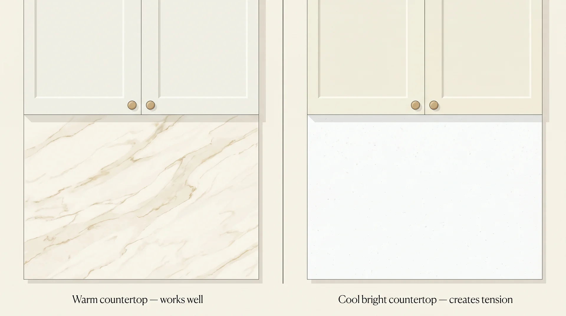
Countertop selection alongside White Dove cabinets is where kitchen projects hit unexpected friction, because countertop materials carry their own undertones, and the interaction with the paint can pull in directions that small tile samples don’t reveal.
White Dove cabinets pair well with countertops that carry warmth: Calacatta marble with warm gold veining, warm-toned quartz, honed granite with beige or tan movement, and butcher block. All work naturally with the cream undertone in the paint.
These materials speak the same tonal language. For a broader look at countertop options and how to evaluate their undertones, the most popular granite colors guide covers the warm-to-cool spectrum across stone options.
Very white countertops are the friction point. Bright quartz or porcelain with cool undertones does to White Dove cabinets exactly what bright trim does to White Dove walls: it drags the warm undertone into sharp relief, and the cabinets start to read cream or dingy by comparison.
If your heart is set on a very white countertop, consider a cooler white for the cabinets, like Chantilly Lace, to sidestep that conflict.
- Hardware that works: Unlacquered brass, matte gold, antique nickel, and oil-rubbed bronze all complement White Dove’s warmth. Chrome and polished nickel can work but lean cool, and in rooms where the warmth is the dominant note, they can sit slightly at odds with the rest of the palette.
Furniture and Decor Direction
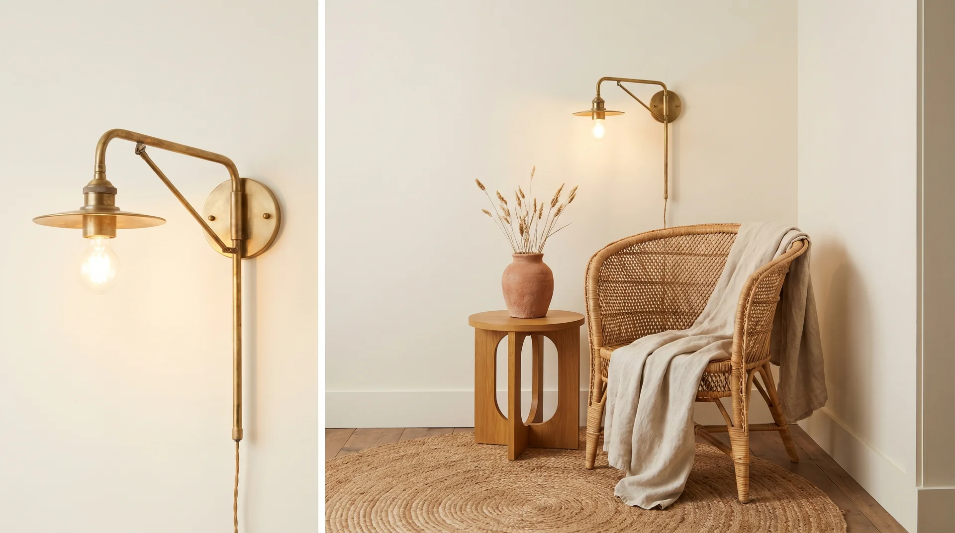
White Dove’s cream undertone makes it comfortable with warm-toned materials: natural linen and cotton, jute and rattan, honey-toned oak and walnut, raw brass, terracotta, and muted earth tones. These materials reinforce the warmth in the walls without competing with it.
Cool-toned furniture, particularly crisp white slipcovers, gray upholstery with blue or violet undertones, or chrome and silver accents, can sit uneasily with White Dove walls in a way that’s hard to name.
The room doesn’t look wrong exactly, but the walls and furnishings seem like they arrived from different design directions. Most noticeable in smaller rooms where the color relationship between walls and furniture is harder to escape.
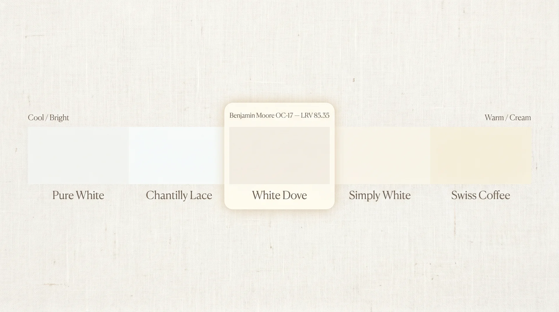
White Dove vs. Similar White Paint Colors
These comparisons exist to help you decide which colors are worth ordering as samples, not to replace the sampling step. No written description fully substitutes for a 12-by-12-inch board on your actual wall under your actual light. What the comparisons below give you is a clearer picture of which differences matter enough to affect your decision.
White Dove vs. Chantilly Lace (Benjamin Moore OC-65)
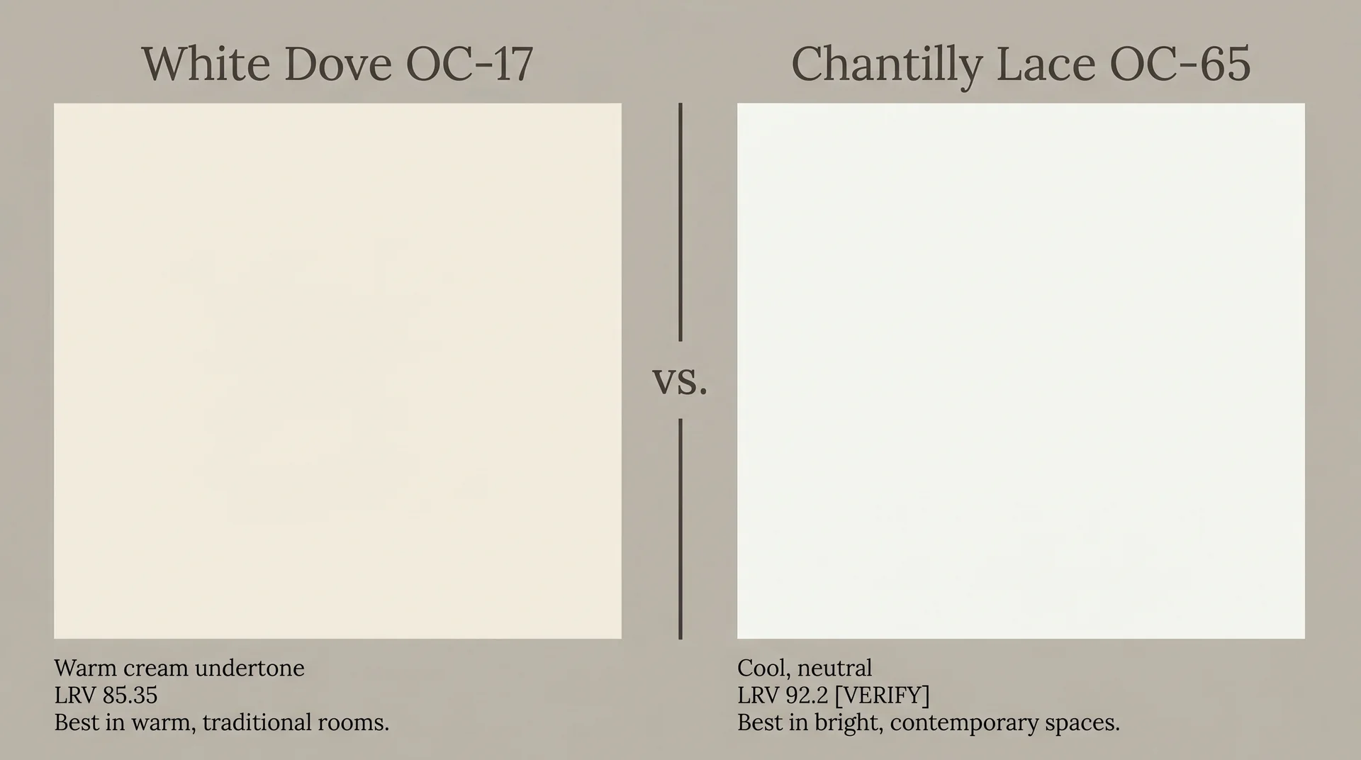
Chantilly Lace is cooler, crisper, and noticeably brighter than White Dove, with no warm undertone. It reads as a clean, true white in most conditions and holds that quality even under warm artificial lighting, because there’s no cream undertone to amplify. It’s the color that does what people sometimes expect White Dove to do in lower-light or north-facing rooms.
| Feature | White Dove OC-17 | Chantilly Lace OC-65 |
|---|---|---|
| Undertone | Warm cream, soft yellow-neutral | Neutral to cool, no warm cast |
| LRV | 85.35 | 92.2 [VERIFY] |
| Under warm artificial light | Reads warmer; can pull cream | Stays clean and bright |
| North-facing rooms | Can feel creamy throughout the day | Performs more consistently |
| Best design context | Traditional, transitional, warm-toned rooms | Contemporary, coastal, bright modern spaces |
| With warm wood tones | Excellent | Good; creates more visual contrast |
Choose White Dove when the room runs warm, and you want the walls to belong to that warmth. Choose Chantilly Lace when you want a white that stays clean regardless of what’s in the room.
White Dove vs. Simply White (Benjamin Moore)
Simply White is brighter and less warm than White Dove. It carries some warmth but holds its brightness better in lower-light rooms, and the cream quality that defines White Dove is less present. In a well-lit room with warm-toned finishes, the two can look similar enough to make the choice feel like splitting hairs.
In a darker or north-facing room, the difference becomes more obvious. Simply White is the better pick if you want a white that stays reliably bright across conditions; White Dove is the better pick if you want that particular softness and are working in a room where light is not a constraint.
Does White Dove Look Dingy?
White Dove doesn’t look dingy on its own, but it can read that way in one specific situation: when it’s placed next to a brighter, cooler white. That’s a contrast problem, not a color problem.
The warm undertone of OC-17, seen alongside a stark cool-white trim or countertop, appears dull by comparison. Isolated, in a room where everything runs warm, it reads as clean and soft. The fix is almost always in what you pair it with, not in the paint itself.
Benjamin Moore White Dove vs. Sherwin-Williams Equivalent
There’s no direct SW equivalent that performs identically to White Dove. Paint formulas and base systems differ between brands, and a color that looks nearly identical on a chip can read differently on a wall because the underlying chemistry behaves differently at scale.
The closest SW whites in the warm off-white range fall in the Creamy and Antique White family. If you’re working with a contractor who specifies SW products, ask for a spectrophotometric match from the OC-17 chip, then sample the result on your actual walls under your actual lighting before committing. Cross-brand matching is a starting point, not a finish line.
White Dove vs. Steam (Benjamin Moore)
Steam is slightly cooler and less creamy than White Dove, reading as a more neutral off-white in most conditions. It carries the off-white quality without the distinct cream character of OC-17.
If you’ve sampled White Dove and it reads too yellow or warm in your room, Steam is often the natural next step before you move to a fully cool white. It’s worth adding to your sample order before ruling out warm whites entirely.
Where to Buy White Dove and How to Sample It Correctly
Getting the sampling process right matters more for White Dove than for most whites, because the color’s behavior is so dependent on your specific room conditions. A chip on a paint store wall under fluorescent lighting tells you almost nothing useful about how OC-17 will perform on your walls under your light.
Is White Dove Available at Home Depot?
White Dove is a Benjamin Moore color and isn’t available at Home Depot. Benjamin Moore products are sold through independently owned Benjamin Moore retailers and many Ace Hardware locations.
Home Depot carries Behr and several other brands, but not Benjamin Moore. Use the store locator on the official Benjamin Moore website to find a local retailer.
Most independent BM dealers can also order any color in any formula, including specialty finishes that larger chains don’t carry, which matters when you’re specifying OC-17 across multiple finishes for walls, trim, and cabinetry.
How to Sample White Dove Before You Commit
- Get a large sample. Buy a sample pot and paint two coats on foam board or heavy paper, at least 12 by 12 inches. Or order a peel-and-stick sample from a service like Samplize. The larger the area, the more accurately you’ll read how the color behaves in your room.
- Place the sample against your actual surfaces. Hold it near your flooring, your trim, and your largest fixed surfaces. Those are the materials most likely to amplify or suppress the warm undertone, and they’re the ones you can’t easily change after painting.
- View it at three points in the day. Morning light, midday light, and evening artificial light. White Dove can read like three slightly different colors across those conditions. You need to be comfortable with all three versions before committing.
- Evaluate under your actual bulbs. Turn on the overhead and task lighting you use in the evening. That warm-bulb version is the one you’ll live with most.
- Sample the finish you’ll actually use. If you’re painting eggshell on kitchen walls, sample in eggshell. If you’re doing semi-gloss on trim, get a separate sample in semi-gloss. Evaluating the wrong finish leads to exactly the kind of finish-day surprise that’s avoidable.
Even a thorough sampling process has limits. Paint looks different at full-wall scale than it does on any board, and rooms have corners, shadows, and reflected surfaces that samples can’t replicate. But working through this process closes the gap between what you expected and what you got, and that gap is almost always where the regret lives.
| A practical note: if you’re pregnant, have respiratory sensitivities, or share your space with young children or pets, check the VOC rating on your chosen formula and ensure adequate ventilation during application and drying. Benjamin Moore’s Natura and Aura lines offer zero-VOC formulations of White Dove for those situations. |
