
If you’ve been staring at a Revere Pewter chip for two weeks and still can’t decide, you don’t need more photos of other people’s rooms. You need to understand what this color actually does in different light conditions, because that’s the question the photos can’t answer for you.
Revere Pewter is one of the most popular paint colors Benjamin Moore has ever produced. It’s also one of the most repainted rooms, bought by homeowners who loved the chip and didn’t recognize the wall.
This guide explains why that happens and how to figure out before you open a can whether this color will work in your specific space.
What Is Revere Pewter Paint Color?
Revere Pewter is a warm greige from Benjamin Moore’s Historical Colors collection, designated HC-172.
Greige is the design shorthand for colors that sit between gray and beige, reading as neutral while carrying warmth. Revere Pewter is one of the most recognized entries in that category, but it behaves more unpredictably than most greiges because of where it sits on the light reflectance scale.
HC-172 Color Specifications: LRV, Hex Code, and Color Family
| Specification | Value |
|---|---|
| Color Number | HC-172 |
| Color Family | Historical Colors / Greige |
| LRV (Light Reflectance Value) | 55.51 |
| Hex Code | #C2B9A7 |
| RGB | R: 194 / G: 185 / B: 167 |
| Primary Undertone | Green-brown (shifts with ambient light) |
| Finish Options | Flat, Matte, Eggshell, Satin, Semi-Gloss |
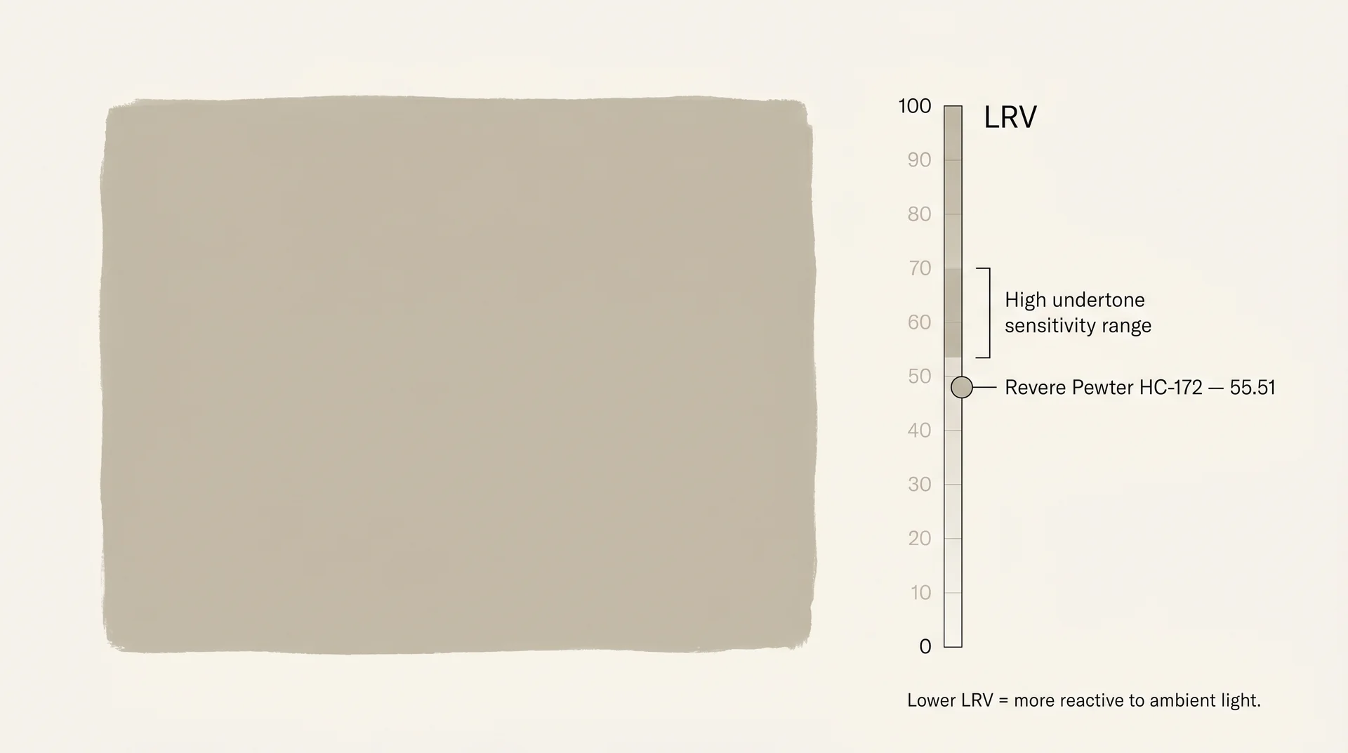
LRV is a standardized measure, on a scale from 0 (pure black) to 100 (pure white), of how much light a painted surface reflects into a room.
Colors in the low-to-mid 50s have less reflective headroom than lighter paints, which means the room’s ambient light has more influence over how the color reads. That’s the property that makes Revere Pewter’s undertone so reactive.
Revere Pewter at 55.51 sits in a range where warm light and cool light pull the color in noticeably different directions. That number explains almost everything about how this color behaves on a wall.
Revere Pewter Undertones: What This Color Actually Does in Your Home
Revere Pewter’s undertone is green-brown, and it activates differently depending on the quality and direction of light in your room.
This distinction between describing the undertone and understanding its mechanics is the difference between a helpful answer and a useless one. The undertone doesn’t stay fixed. It shifts based on what the room is already doing.
Why Revere Pewter Looks Different in Every Room
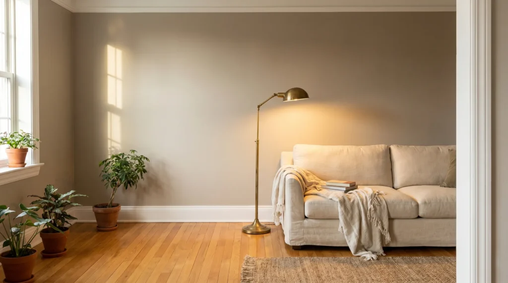
Revere Pewter reads as warm taupe in rooms with abundant warm light and as gray-green in rooms with cool or indirect natural light.
A color with an LRV in the high 70s or 80s has enough reflective power that the room’s ambient light can’t shift it much. Revere Pewter at 55.51 doesn’t have that buffer. Whatever wavelength is dominant in the room gets amplified.
I’ve seen clients repaint an entire open-plan floor because nobody warned them about this before they bought twelve gallons. The chip looked perfect in the store under fluorescent display lighting.
On the walls of a north-facing room with slate tile floors, it looked like a different color entirely. That’s not a painting error. That’s the color doing exactly what mid-LRV greiges do when the conditions aren’t favorable.
Your existing room elements either help or hurt. Here’s what matters most:
- Warm wood floors (honey oak, walnut, warm-stained maple): Pull the color toward its taupe side. Generally, a positive result.
- Cool gray tile, slate, or pale concrete: Amplify the green-brown undertone. Often produces the result that people are frustrated by.
- Warm brass, bronze, or aged gold fixtures: Anchor the warmth and balance the undertone consistently.
- Cool chrome or polished nickel fixtures: Push the color toward its cooler, less flattering register.
North-Facing vs. South-Facing Rooms
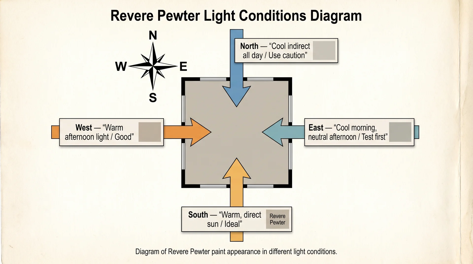
The direction your room faces is the single most predictive variable for how Revere Pewter will look on your walls.
| Room Orientation | Light Quality | How Revere Pewter Reads | Verdict |
|---|---|---|---|
| South-facing | Warm, direct sun through most of the day | Warm taupe, creamy gray | Ideal conditions |
| West-facing | Warm afternoon and evening light | Rich taupe in the evening, cooler in the morning | Good – check early morning light |
| East-facing | Cool morning light, neutral afternoon | Slightly cool at dawn, warms through the day | Acceptable – test before committing |
| North-facing | Cool, indirect daylight all day | Gray-green, can read muddy or clinical | Proceed with caution |
North-facing rooms aren’t automatic dealbreakers. Warm wood floors, warm-toned furniture, and good overhead incandescent or warm-LED lighting can mitigate the green shift. Without those anchors in place, this is the room where Revere Pewter ends up on a forum with the caption “Why do my walls look green?”
What Colors Go With Revere Pewter?
Revere Pewter pairs most reliably with warm whites for trim, deep organic tones for accents, and natural wood finishes for flooring and furniture.
Once you understand the logic behind these pairings, you can evaluate any color against Revere Pewter yourself. That matters when you’re standing in a store trying to choose between two whites that look nearly identical on a chip.
Trim Colors That Work & Why
For trim with Revere Pewter, warm whites outperform cool whites in almost every room condition.
| Trim Color | LRV | Undertone | Works Best When | Avoid When |
|---|---|---|---|---|
| White Dove OC-17 (BM) | 83.16 | Soft warm yellow | Warm wood floors, south or west exposure | Cool gray tile floors or north-facing rooms |
| Simply White OC -117 (BM) | 89.52 | Warm cream | Most rooms, especially with warm wood elements | Very cool rooms where added warmth reads yellow |
| Chantilly Lace OC-65 (BM) | 92.19 | Crisp, cool white | High-contrast look in south-facing rooms | North-facing rooms, cool floors, limited light |
| Oxford White CC-30 (BM) | 85.40 | Neutral cream | Mixed undertone rooms, flexible pairing | Rooms where you want a strong contrast |
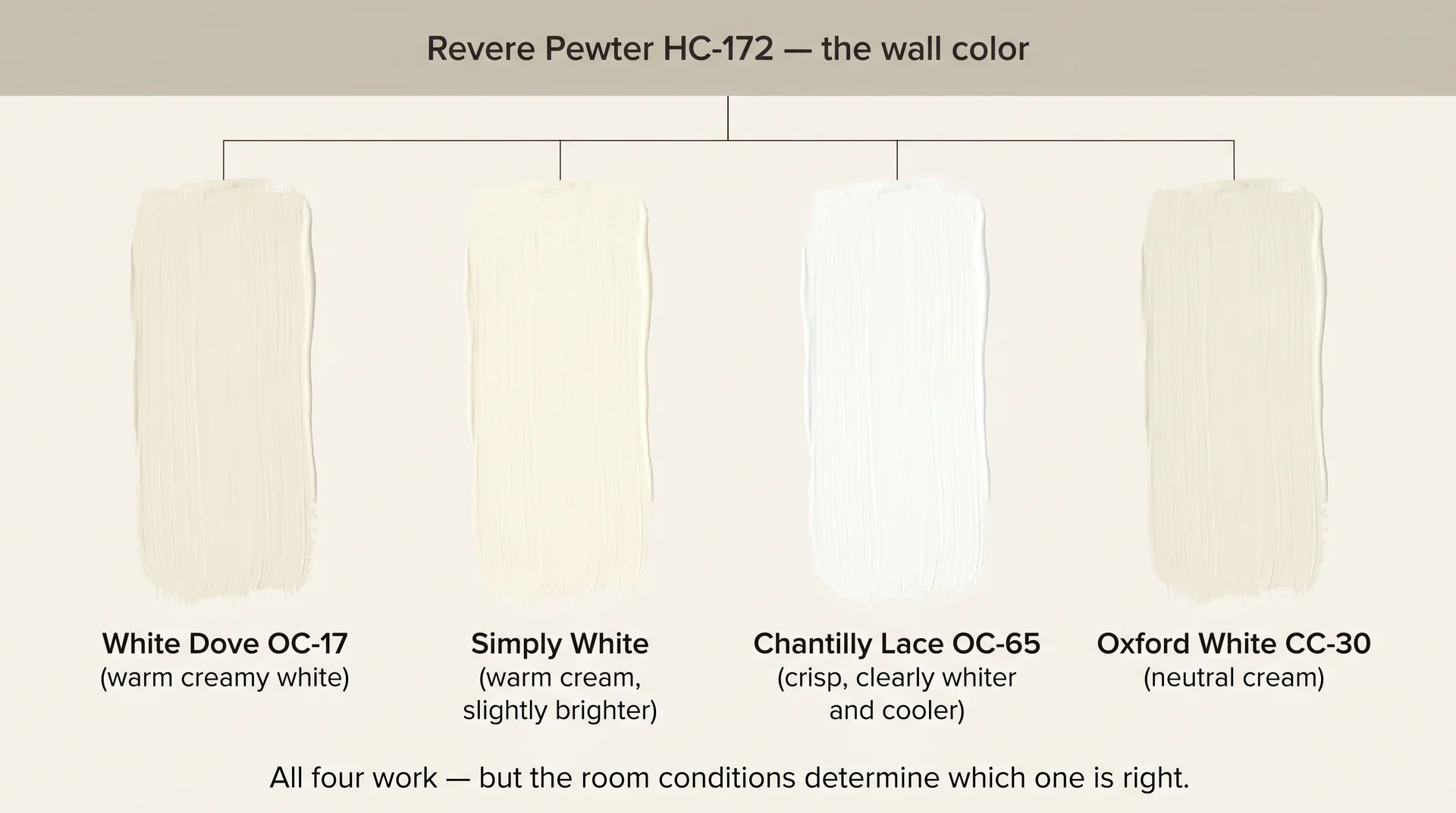
Chantilly Lace is a beautiful white, but it’s crisp and cool. In a north-facing room where Revere Pewter is already pulling gray-green, a cool high-LRV trim creates a jarring contrast rather than a clean one. White Dove is warmer and slightly lower in LRV, which produces a softer, more coherent result in most conditions.
The trim question isn’t about which white looks prettiest in isolation. It’s about which white keeps Revere Pewter reading as the warm greige it’s supposed to be.
Accent and Complementary Colors
Deep, warm, or organic accent colors work well with Revere Pewter because they don’t compete with its undertone.
- Deep navy (Hale Navy HC-154, Naval SW 6244): The most reliable pairing. Clean contrast without amplifying the gray-green quality.
- Olive and forest green (Salamander 2050-10, October Mist 1495): Works by leaning into the green undertone deliberately rather than fighting it.
- Warm rust and terracotta (Pueblo Adobe 2091-30): Pulls the taupe register forward and anchors the warmth of the room.
- Deep charcoal and near-black (Wrought Iron HC-157, Onyx 2133-10): Strong contrast option that works best in well-lit warm rooms.
What to avoid: cool lavender, icy blue, and anything with a blue-gray or blue-green base. These activate the least flattering undertone register and make a challenging room significantly harder to manage.
Cabinet and Flooring Pairings
Warm-toned floors improve Revere Pewter’s performance; cool-toned floors make it harder to control.
Honey oak, walnut, and warm-stained hardwood pull the taupe forward. This is a major reason the color became a renovation default during the 2010s renovation boom, because most homes in that cycle still had warm wood floors, and the pairing was genuinely flattering. The current shift toward gray-washed, white oak, and cool-toned engineered flooring is one reason Revere Pewter now requires more caveats than it used to.
For kitchen cabinets, warm or neutral-base whites and creams pair consistently well. Cabinet colors with a gray-blue undertone, including many popular “greige” cabinet shades, read in direct conflict with the wall color and produce a muddy result in most kitchens.
Where Revere Pewter Works Best (and Where It Struggles)
Revere Pewter performs very well in the right conditions and noticeably poorly in others. It’s not a universally safe choice, and treating it as one is where most failed applications begin.
Living Rooms and Open-Plan Spaces
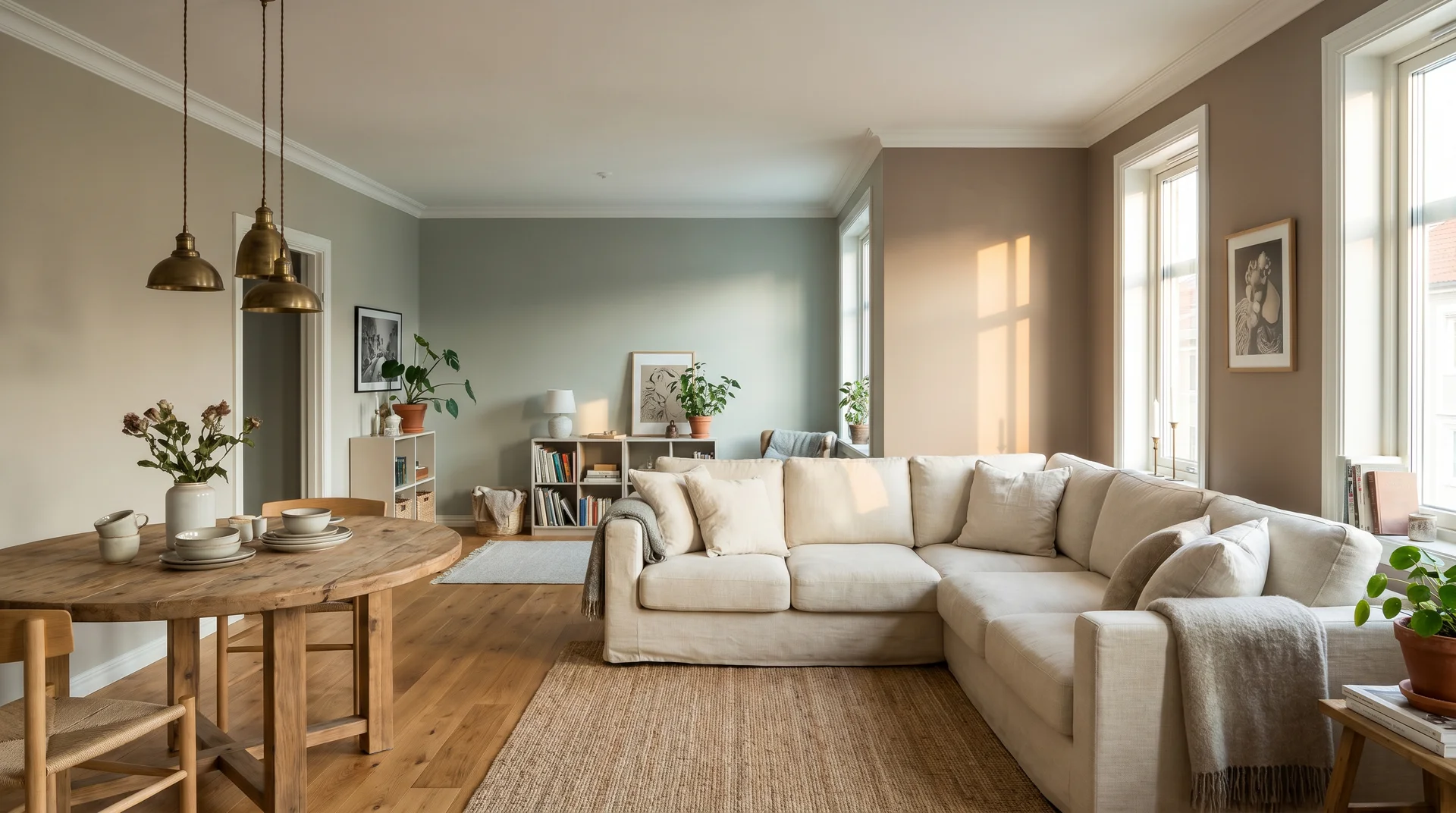
Open-plan spaces are the highest-risk application for Revere Pewter because a single color spans multiple orientations and light conditions at the same time.
If your living and dining areas are connected and face different directions, the walls will read differently depending on which part of the room you’re standing in. That’s not unusual construction; it’s a reality that affects mid-LRV greiges more than lighter or more neutral paints.
The most honest thing I can tell you about open-plan spaces: put large painted sample boards on multiple walls and leave them for 48 hours. A small chip held in the center of the room tells you nothing useful about the walls specifically.
Bedrooms
Bedrooms are generally more forgiving of this color than open-plan spaces.
They’re smaller, typically have a single orientation, and aren’t subject to competing light from adjacent rooms. In a south- or west-facing bedroom with warm wood furniture, Revere Pewter is genuinely lovely.
In a north-facing bedroom with limited light and no warm anchoring elements, the better options are Pale Oak OC-20 at LRV 68.37, which is warmer and substantially lighter, or Edgecomb Gray HC-173 at LRV 63.15, which stays in the same tonal family but handles low light more gracefully.
Kitchens and Kitchen Cabinets
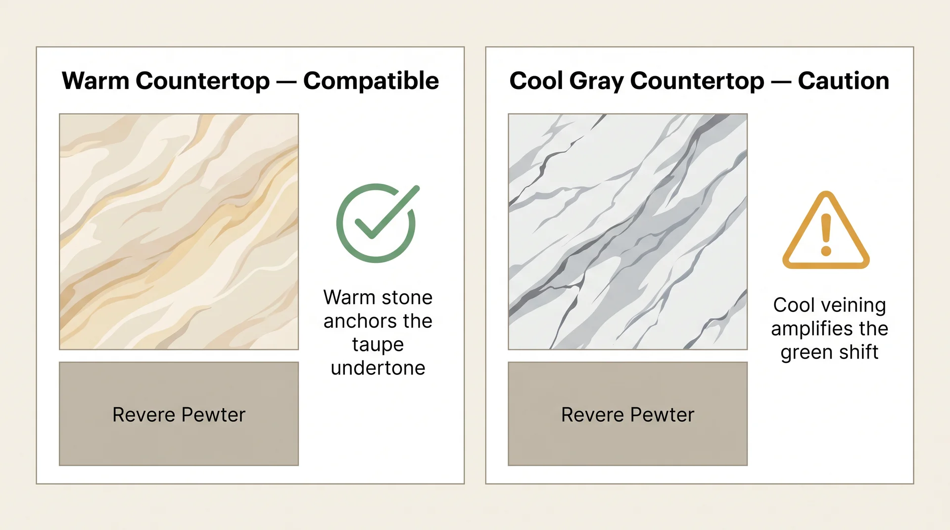
Kitchens introduce a variable that living room applications don’t have to contend with: the countertop.
Countertops with cool veining, including gray marble, blue-gray granite, and white quartz with gray movement, amplify Revere Pewter’s green shift.
This combination consistently produces the “something feels wrong, but I can’t identify it” reaction. Warm countertops, such as cream marble, butcher block, beige quartz, and warm-toned granite, anchor the color’s warmer register and make the pairing stable. If you’re unsure about your countertop’s undertone, the granite color guide here walks through how to read stone undertones before committing to a wall color.
Using Revere Pewter on kitchen cabinets is a different decision from using it on walls. At cabinet scale, the color reads darker, more saturated, and more definitively green-gray than taupe. Clients who want that look are usually better served by Benjamin Moore Kendall Charcoal HC-166 for more definition, or Chelsea Gray HC-168 for something in between.
Exterior Use
Revere Pewter can work as an exterior color, but it performs significantly differently on an outside surface than it does on interior walls.
Natural light is more variable and more intense than interior ambient light. On a north-facing or shaded exterior surface, Revere Pewter reads as a cool gray-green. On a south-facing facade with direct light exposure through most of the day, it reads as the warm greige most people are picturing. A large painted test on the actual exterior surface is essential before painting the full house.
For exterior trim, White Dove is warmer and more forgiving in shadier conditions; Chantilly Lace gives sharper contrast in full sun. Shutter and door colors that work well against Revere Pewter on an exterior:
- Black and near-black (Wrought Iron HC-157, Onyx 2133-10)
- Deep navy (Hale Navy HC-154)
- Deep forest green (Salamander 2050-10, Black Forest Green 2047-10)
- Warm charcoal (Kendall Charcoal HC-166, Ironstone OC-67)
Once you know which conditions Revere Pewter thrives in, the next question is whether a nearby alternative would serve those same conditions better. That depends on the specifics of your room and which brand you’re working with.
Revere Pewter vs. Similar Colors
Several colors in the greige family perform similarly to Revere Pewter, with meaningful differences in LRV and undertone that make one or the other the better fit depending on your room.
Revere Pewter is Benjamin Moore HC-172, a warm greige with an LRV of 55.51 and a green-brown undertone, and that’s the baseline for every comparison here.
Edgecomb Gray HC-173 vs. Revere Pewter HC-172
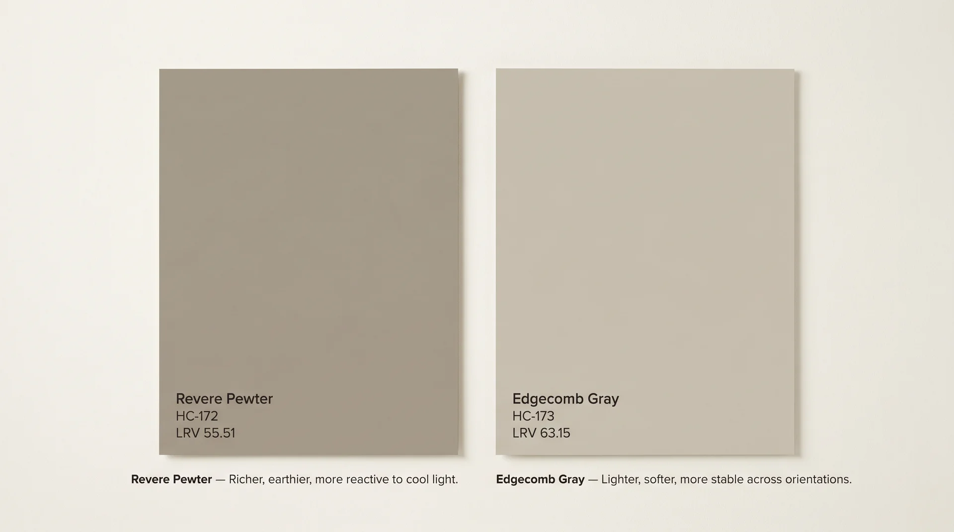
Edgecomb Gray is the lighter, more stable sibling of Revere Pewter in the same color family, and the better choice for rooms with limited natural light or cool-toned floors.
| Attribute | Revere Pewter HC-172 | Edgecomb Gray HC-173 |
|---|---|---|
| LRV | 55.51 | 63.15 |
| Primary Undertone | Green-brown | Beige-pink |
| Behavior in Low Light | Pulls gray-green, can read muddy | Stays warm and soft |
| Overall Feel on the Wall | Richer, deeper, earthier | Lighter, airier, more forgiving |
| Best Room Conditions | South- or west-facing, warm wood floors | North or east exposure, smaller rooms, cool floors |
Edgecomb Gray’s higher LRV gives it more headroom to stay warm even when the light conditions aren’t ideal. Its beige-pink undertone is less reactive to cool light than Revere Pewter’s green-brown. If you love the idea of Revere Pewter but your room is working against you, Edgecomb Gray is the first alternative to test before changing direction entirely.
The Sherwin-Williams Equivalent – Agreeable Gray SW 7029
Agreeable Gray SW 7029 is the closest Sherwin-Williams match to Revere Pewter in overall feel, though the two are not interchangeable.
| Attribute | Revere Pewter HC-172 | Agreeable Gray SW 7029 |
|---|---|---|
| LRV | 55.51 | 60 |
| Primary Undertone | Green-brown | Beige-violet |
| Behavior in Low Light | Pulls gray-green | Can pull slightly mauve or violet |
| Overall Feel on the Wall | Slightly deeper, earthier | Slightly lighter, more balanced |
| Best For | Warm, earthy interiors, well-lit rooms | Cooler interiors, or Sherwin-Williams product users |
Agreeable Gray is a touch lighter at LRV 60 and its undertone trends beige-violet rather than green-brown. In low light, you’ll notice a faint pink-mauve quality rather than green. In rooms where Revere Pewter works reliably, Agreeable Gray works equally well. Either is a solid choice; the practical reason to pick one over the other is usually which brand your contractor stocks.
Colors Lighter Than Revere Pewter
If you want the warmth of Revere Pewter but your room needs more light reflectance, these three are worth testing:
- Pale Oak OC-20 (LRV 68.37): Warm beige with a soft pink undertone. Substantially lighter, much easier to manage across light conditions. One of the most adaptable neutrals in the Benjamin Moore line.
- Edgecomb Gray HC-173 (LRV 63.15): The most direct step up in lightness while staying in the same tonal family as Revere Pewter.
- Accessible Beige SW 7036 (LRV 58): Slightly lighter than Revere Pewter, warmer undertone, more stable across north and east exposures.
After weighing the alternatives, the question that usually remains isn’t which version of greige to choose. It’s whether Revere Pewter itself still feels like the right choice in 2025, or whether something has shifted.
Is Revere Pewter Outdated?
Revere Pewter is overexposed. That’s different from being outdated, and the distinction matters for how you make this decision.
A genuinely dated color is one that’s hard to make look good regardless of how it’s used. Think that particular mauve-gray that defined late-1980s bathrooms, or the specific avocado green that dates a kitchen to 1973. Revere Pewter doesn’t have that problem. It’s still a well-balanced, warm greige with good bones.
If you’re choosing Revere Pewter because your room, your light, and your existing elements genuinely point toward it, it’ll look like a good choice. If you’re choosing it because it’s safe and familiar, you’re probably already a little tired of looking at it before the paint dries.
The issue is that it became a default rather than a decision. When a color shows up in every “safe neutral” roundup and on every Pinterest board for a decade, it starts to read as the absence of a choice rather than the result of one. That’s where Revere Pewter is right now.
What’s moved forward in the neutral category: warmer clay and limewash finishes, greener earthy tones like October Mist 1495 and Rosemary from Benjamin Moore, and textural approaches that render the flat-paint conversation somewhat irrelevant. These feel more specific and more current. Revere Pewter feels like a product of its era, not because the color has aged badly, but because it’s been everywhere for so long that it no longer announces anything distinctive about a space.
If you’re renovating to sell, it’s broadly acceptable. If you’re choosing a color for a room you’ll live in for the next ten years, apply the same evaluation you’d bring to any color. Test it in your light, against your floors, with your trim, and decide based on what you actually see on the wall.
How to Sample Revere Pewter Before You Commit
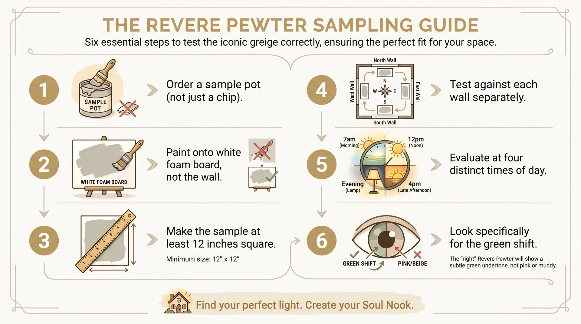
A painted sample board evaluated at multiple times of day is the only reliable method for predicting how Revere Pewter will perform in your specific room.
Paint chips, online photos, and color preview apps are useful for eliminating obvious mismatches. They cannot tell you how a mid-LRV greige will behave in your light at 7 am versus 4 pm. That information only comes from putting actual paint on an actual surface in your actual room.
- Order a peel-and-stick sample or a Benjamin Moore sample pot. Test at least two or three alternatives alongside Revere Pewter. Without a comparison, it’s nearly impossible to evaluate a color accurately in isolation.
- Paint onto white foam board or cardstock, not directly on the wall. Painting on the wall introduces the existing wall color as a variable. A separate board gives you just the new color against your room’s light.
- Make each sample at least 12 inches square, ideally larger. Color perception changes significantly with surface area. A 2-inch chip is almost useless for mid-LRV colors.
- Place the board flat against each wall in the room, one at a time. Different walls in the same room receive different light. A color that reads warm on one wall can look gray on the opposite wall on the same afternoon.
- Evaluate at four distinct times. Early morning with only natural light, midday, late afternoon, and evening with your typical artificial lighting. Note how the color reads at each point on each wall.
- Look specifically for the green shift. This is what you’re testing for. If the color reads gray-green at any point during the day, that’s a consistent condition in your room, not a temporary lighting quirk.
The friction point here is that most people skip this process because they’re ready to commit. A two-day test costs a sample pot. A repaint costs time, labor, and paint. Those aren’t comparable stakes.
One more practical note: buy a quart before a gallon. The upcharge is around $12 to $15. The cost of quart-level confidence versus gallon-level regret is not close.
