
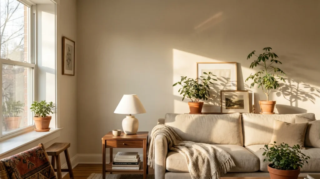
Pale Oak is one of those colors that works better than it should, warm without going orange, soft without disappearing, complex without going muddy.
It’s been one of Benjamin Moore’s most searched neutrals for close to a decade, and most of that attention is deserved.
But “it photographs well” and “it’ll work in your room” are two different claims, and the gap between them is exactly what this review is about.
What follows covers the official specs, how the color actually behaves in real lighting conditions, which pairings bring out its best, and one floor-color combination that consistently goes quietly wrong.
What Is Pale Oak Paint Color?
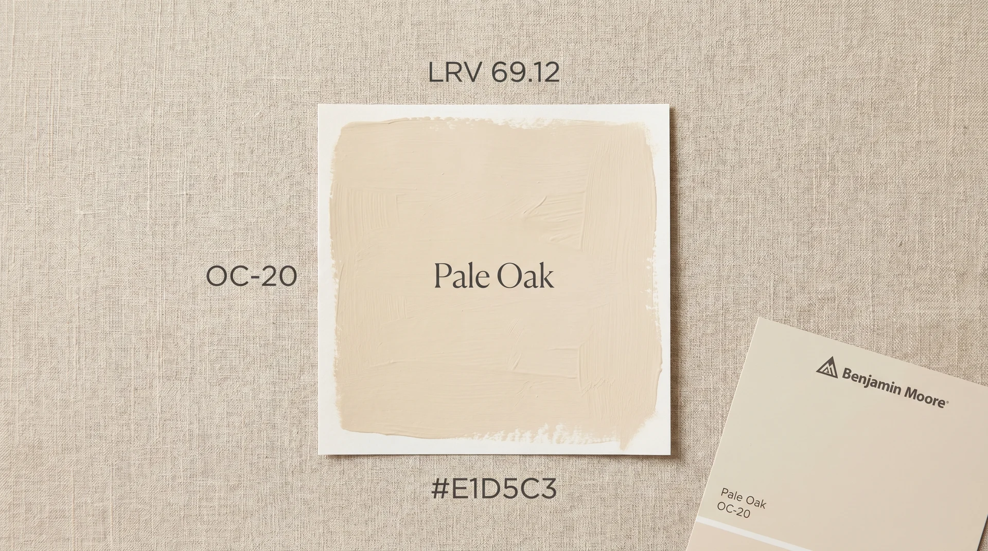
Pale Oak (OC-20) is a warm, light greige from Benjamin Moore’s Off-White collection, with a Light Reflectance Value of 69.12.
It’s not a white that leans beige, and it’s not a beige that leans white. It occupies a precise middle zone: light enough to keep a room feeling open, but with enough pigment depth to read as a deliberate color choice rather than an undecided one.
That balance is exactly what makes it hard to evaluate from a small chip.
The Official Specs (OC-20)
- Color code: OC-20
- Collection: Off-White (Benjamin Moore)
- LRV: 69.12 (source: Benjamin Moore official product data)
- Hex: #E1D5C3
- RGB: 225, 213, 195
- Recommended finish: Eggshell for most interior walls; satin for kitchens and bathrooms; semi-gloss for trim. See flat vs. matte paint finishes if you’re choosing between those two for lower-traffic rooms.
How Benjamin Moore Categorizes It
Benjamin Moore places Pale Oak in its Off-White collection alongside White Dove and Swiss Coffee. The Off-White family occupies a specific part of the color spectrum: these aren’t whites with a hint of warmth added.
They’re warm neutrals with enough white content to stay livable and light. Pale Oak sits at the beigeward end of that family, which means it carries more visual weight and more color depth than its stablemates.
That extra depth is what gives it complexity under changing light, and it’s what makes the undertone question worth understanding before you buy.
Pale Oak Undertones: Warm, Cool, or Something In Between?
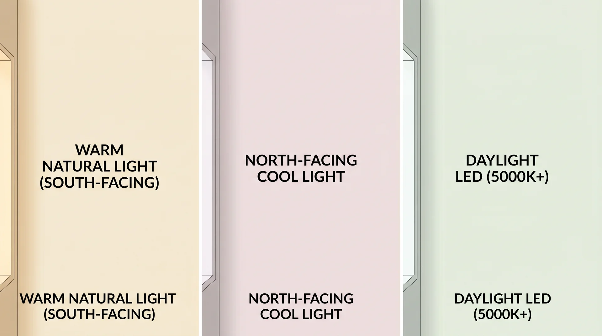
Pale Oak is a warm color with a primary beige undertone, a secondary pink undertone, and a faint green shift that can emerge under certain artificial lighting conditions.
The short answer to “Is pale oak warm or cool?” is warm. But it’s warm in ways that respond to what surrounds it, and that responsiveness is both its appeal and the thing that catches people off guard when they paint a room and see something different from the chip.
The Beige-Pink-Green Trifecta
Most warm neutrals carry one dominant undertone. Pale Oak carries three in loose rotation, and which one shows up depends on the light source and what’s around it.
- In warm natural light, south or west exposure, the beige reads cleanly and the color looks like a soft, settled neutral.
- In cooler natural light, particularly north-facing rooms, the pink undertone becomes more present, and the color can feel faintly blush.
- Under LED or fluorescent bulbs set to daylight white (5000K to 6500K), a faint green can emerge. This is the shift that surprises people most, and the one that polished paint reviews consistently forget to mention.
How the Undertone Shifts with Light Conditions
Under ideal conditions, the color on the Benjamin Moore website swatch is Pale Oak. A south-facing living room with afternoon sun will show you the color at its most appealing: warm, creamy, and grounded. A north-facing bedroom with overhead recessed LEDs set to daylight white will show you something genuinely different.
That’s not a reason to avoid it. It is a reason to test it properly, which the sampling section at the end of this review covers in detail.
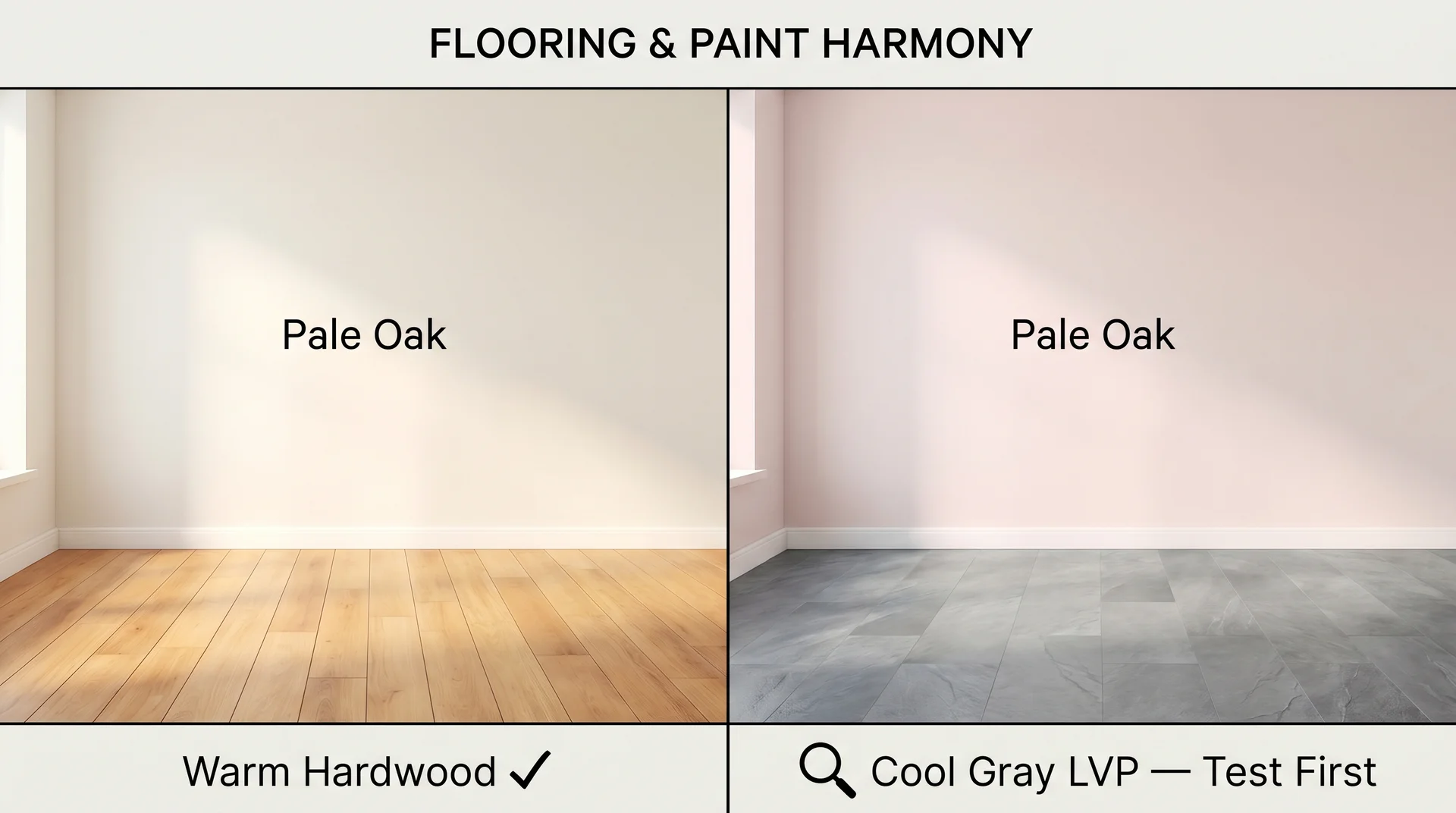
Why Your Floor Color Changes Everything
This is the variable that most paint reviews don’t address, and it’s one I’ve seen play out in client homes more times than I can count. In rooms with warm-toned hardwood floors, honey oak, pecan, or walnut, Pale Oak sits in natural harmony.
The warmth in the floor activates the beige, and the color reads exactly as expected: soft, sophisticated, calm.
In rooms with cool-toned gray LVP or pale cool tile, the pink undertone in Pale Oak has nothing warm to anchor to. The result can feel slightly murky rather than sophisticated. The color itself isn’t the problem, but it needs warmth somewhere in the room to perform at its best, and the floor is the largest warm or cool signal in any space.
How Pale Oak Behaves in Different Light
Light is not a backdrop for paint; it’s an active ingredient, and Pale Oak’s behavior shifts meaningfully depending on the direction, quality, and temperature of the light in your room.
At LRV 69.12, Pale Oak reflects approximately 69% of the light that hits it.
According to the Illuminating Engineering Society’s established LRV standards, colors in this reflectance range are more sensitive to light quality than deeper colors are.
A room with good natural light will read Pale Oak accurately. A room that relies primarily on artificial overhead lighting needs careful bulb selection to get there.
Natural Light: North, South, East, West Exposures
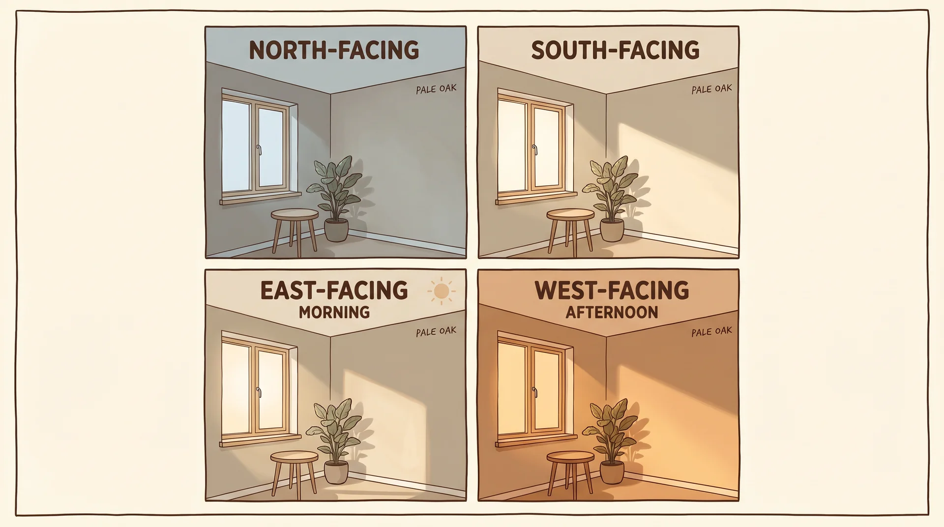
Room orientation has a more pronounced effect on Pale Oak than on most darker neutrals, precisely because it’s light-dependent in a way that a saturated color isn’t.
- North-facing: Pale Oak reads cooler and more greige. The pink undertone is more present, and the color sits quieter and softer than the swatch suggests.
- South-facing: This is where Pale Oak performs best. Warm, steady natural light brings out the creamy beige and suppresses the pink. It reads polished and calm throughout the day.
- East-facing: Beautiful in the morning, more muted by midday. Works well in bedrooms where evening artificial light plays a bigger role than daytime sun.
- West-facing: The color glows warmly in late afternoon and early evening. In rooms you use heavily after dark, pair this with warm-toned bulbs to maintain that quality when the sun goes down.
Artificial Light: Where It Surprises You
Warm incandescent or soft-white LED bulbs (2700K to 3000K) are Pale Oak’s best companions under artificial light. They reinforce the beige and suppress the potential green shift. Daylight-spectrum bulbs (5000K to 6500K) are where the color goes slightly off, pulling toward a faint green or making the pink more apparent than you wanted.
If you’ve painted Pale Oak and you’re seeing a shade you didn’t plan for, change the bulb temperature before assuming the paint is the problem. It’s the most common and most easily fixed issue with this color.
What LRV 69.12 Actually Means for Your Room
LRV, or Light Reflectance Value, measures how much light a paint color bounces back into a room. A score of 69.12 means Pale Oak reflects roughly 69% of the light that hits it. For practical purposes, it won’t brighten a genuinely dark room, and it won’t make a bright room feel smaller. It performs most accurately, and most closely to the swatch in rooms with real natural light coming in.
If you’re weighing Pale Oak against other light-shifting colors, it’s worth knowing that the same light-responsiveness shows up in neutrals like Sea Salt — though in very different directions. Understanding how your specific lighting affects mid-LRV colors is the foundation of making a confident paint decision.
The Best Trim Colors to Pair With Pale Oak
Trim color is one of the most consequential decisions in any paint project, and with Pale Oak specifically, the choice matters more than it does with most neutrals.
Pale Oak’s warm undertones mean a stark, cool white on the trim creates a disconnect rather than a clean contrast. The trim doesn’t look crisp. It looks like two different paint projects that happened in the same room. The goal is a trim color that reads as white or near-white while sharing Pale Oak’s warm base.
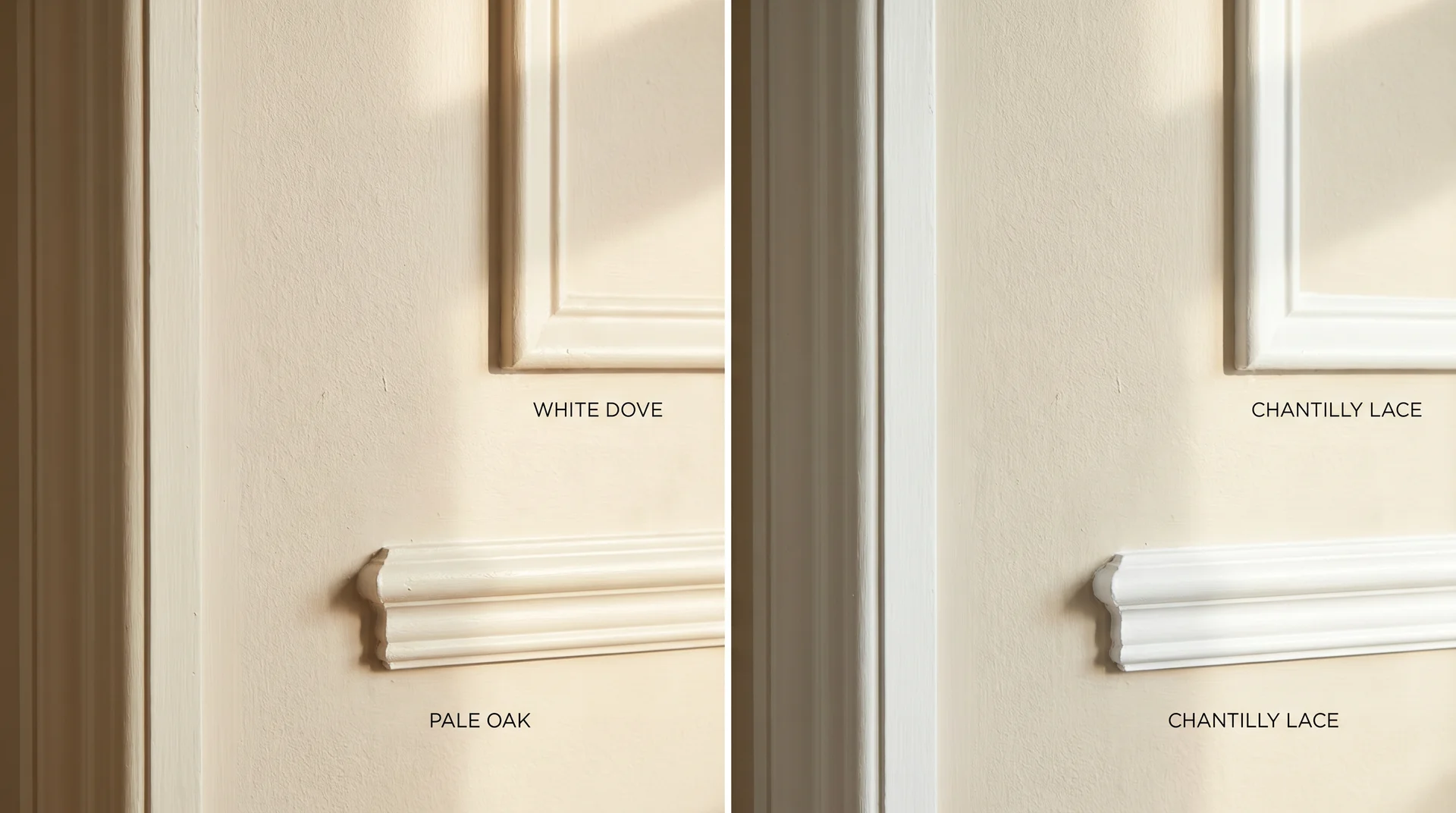
White Dove OC-17: The Safest Pairing and Why
White Dove (OC-17) is the most recommended trim pairing for Pale Oak, and it earns that status. Both colors live in Benjamin Moore’s Off-White collection, share a warm base, and sit close enough on the LRV scale that the wall-to-trim transition feels coordinated. White Dove at LRV 85.35 is light enough to read as a proper trim white while staying warm enough to complement rather than clash with Pale Oak’s undertones.
This combination works across virtually every room type and every light condition, where Pale Oak itself works well. It’s the default recommendation for good reason, and it’s also the right starting point if you’re uncertain.
Chantilly Lace OC-65: When to Use It Instead
Chantilly Lace (OC-65) is a crisper, cooler near-white with an LRV of 92.2. It creates a stronger wall-to-trim contrast than White Dove does. In rooms with abundant natural light and a more contemporary or transitional design, that contrast can feel intentional and sharp in a way that reads modern.
In rooms that already lean cool, or in north-facing spaces where Pale Oak is showing more of its pink undertone, Chantilly Lace can amplify that pink against the brighter trim. Use Chantilly Lace when you want a defined, more formal contrast. Use White Dove when you want the room to feel cohesive and warm.
Using Pale Oak on Trim Itself
A monochromatic approach, Pale Oak on both walls and trim, is a quieter, more enveloping choice. It works well in rooms where you want the architecture to recede and the furniture and textiles to do the visual work. The risk is flatness if there aren’t strong textural or tonal contrasts in the furnishings to compensate. In rooms that already have that contrast built in, it reads as a considered design decision rather than an evasion of the trim question.
Pale Oak in Every Room
Pale Oak is genuinely versatile, but versatile doesn’t mean universal. Some rooms show it at its best, and others surface its real limitations.
Living Rooms and Open-Plan Spaces
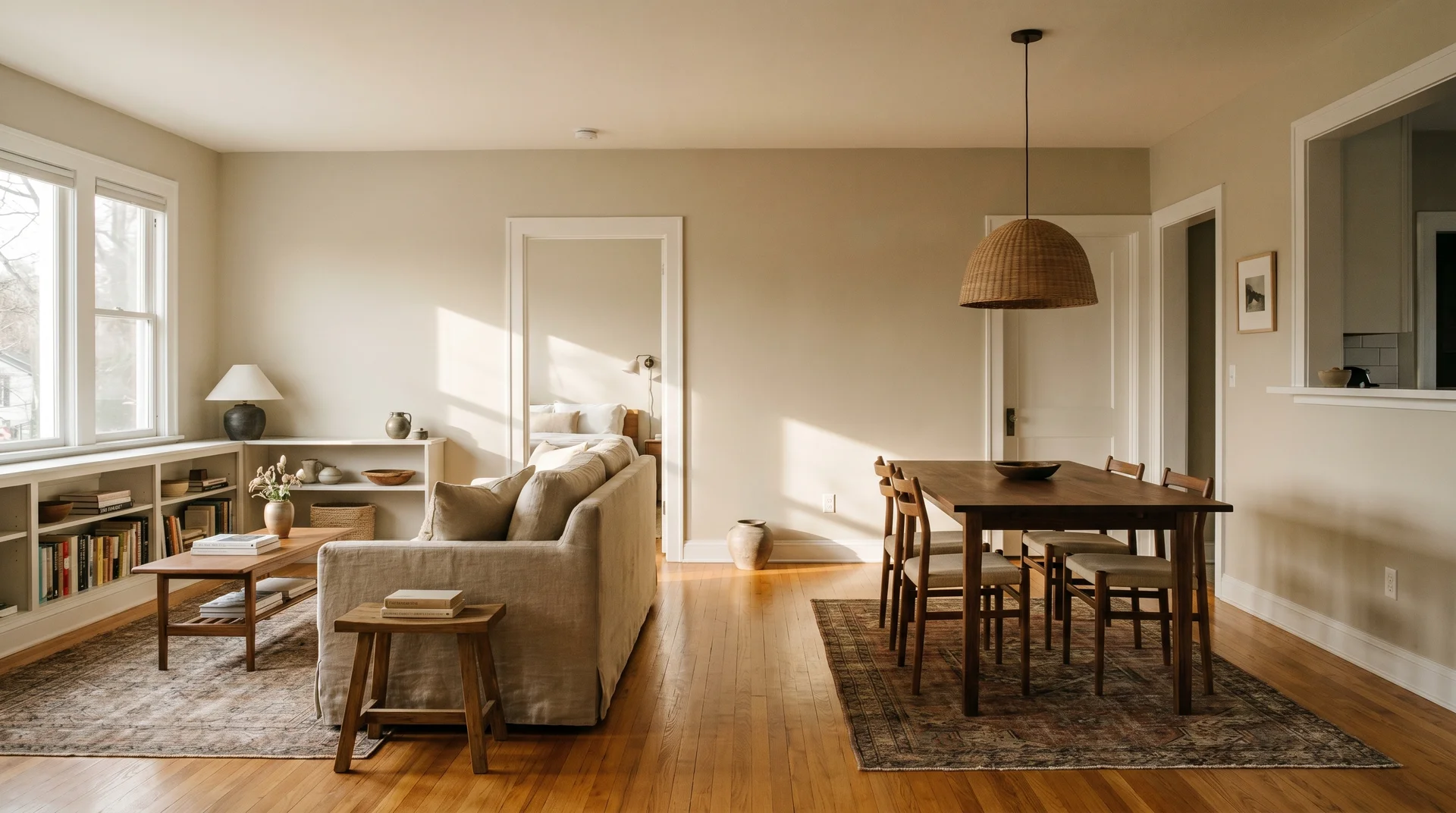
Open-plan spaces benefit from Pale Oak because it functions as a true neutral: it doesn’t pull attention to itself, and it doesn’t fight with furnishings. In large rooms with good natural light and a mix of warm and cool materials, it acts as a ground tone that lets different elements coexist without competing.
One real constraint: in very large rooms with high ceilings and sparse furniture, Pale Oak can feel slightly empty. The color needs visual layers to anchor against. Build warmth through textiles, rugs, and furniture before concluding that the paint is the problem.
Bedrooms
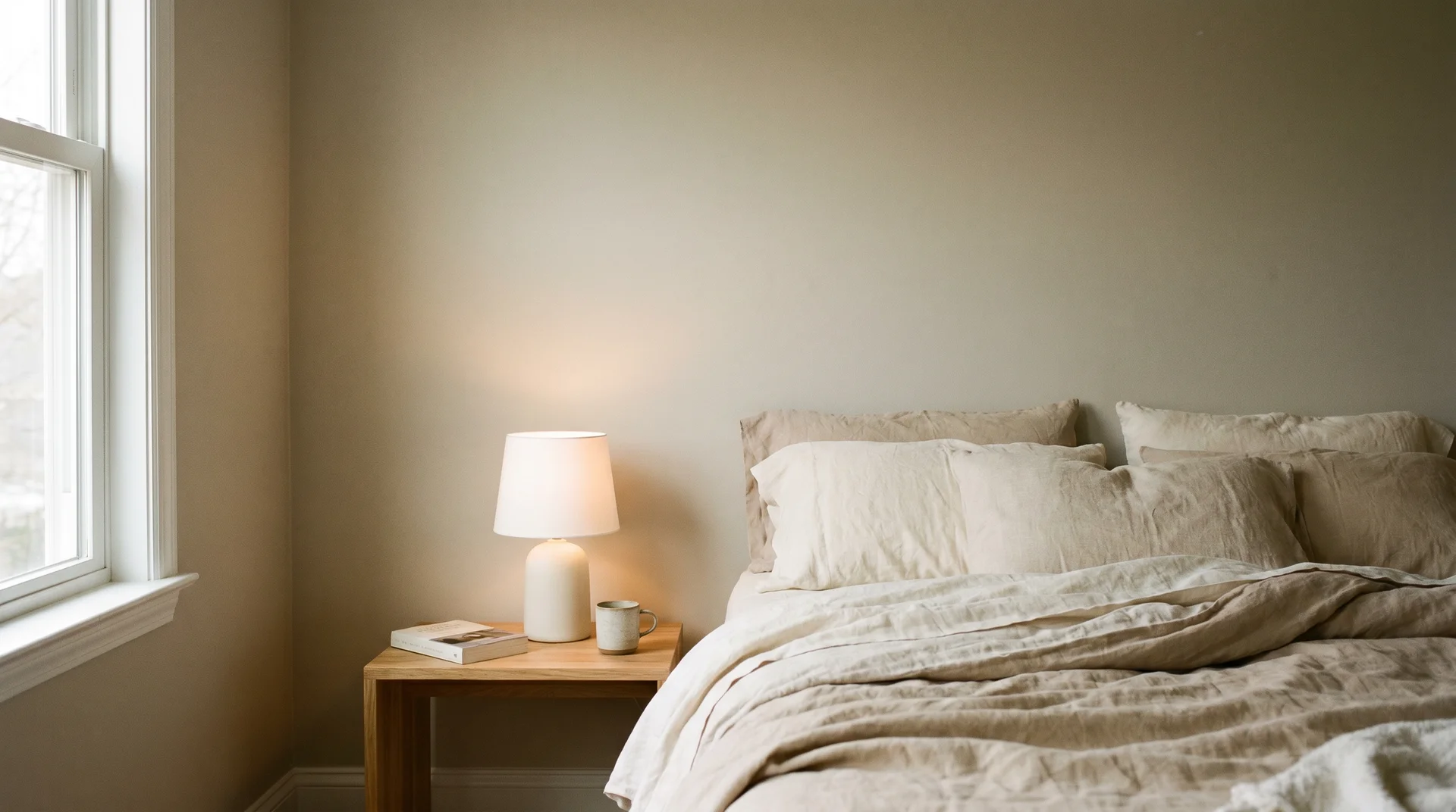
Pale Oak works well in bedrooms because its warmth reads as restful rather than stimulating. It’s not so light that it feels clinical, not so warm that it feels heavy. In rooms with warm-toned bedding, natural wood furniture, and soft-white bulbs, it can feel genuinely settled and intentional.
For east-facing bedrooms, the light is strongest in the morning and diminishes through the day. Confirm the color still reads warmly in the evening under your actual artificial lighting before committing to the full room.
Kitchens and Bathrooms
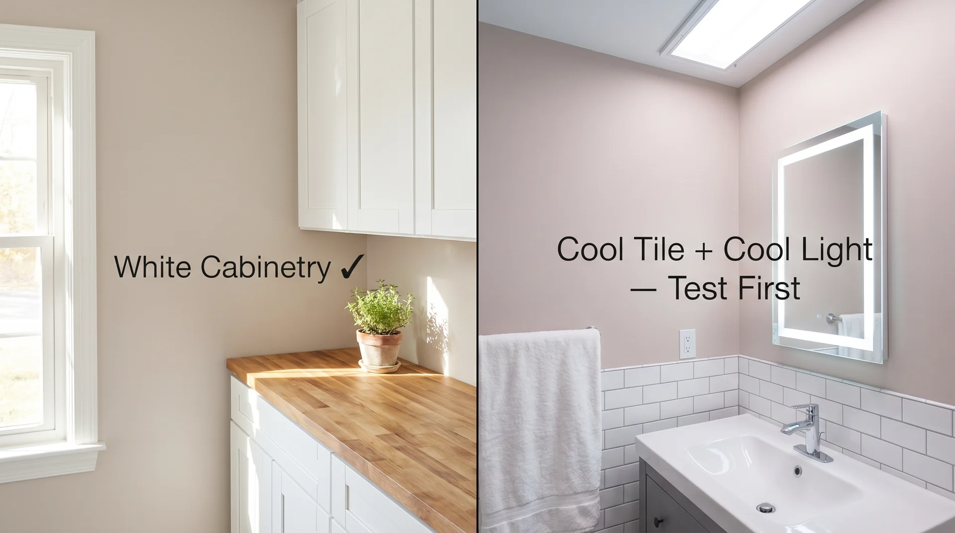
Kitchens work well with Pale Oak on the walls when the cabinetry is white or off-white. If the cabinetry is warm wood-toned, check that the undertones are compatible.
Warm honey-toned cabinets and Pale Oak can look very deliberate together, but cooler or grayer wood tones can create an undertone conflict at the wall-to-cabinet line that reads off without being easy to diagnose.
Bathrooms present a specific challenge because many have cool-toned tile, overhead lighting with no warm supplement, and limited natural light. In that environment, Pale Oak’s pink undertone can appear more strongly than expected. Test with a large sample and observe it under the bathroom’s actual lighting before committing.
Exterior Use: What to Know Before You Commit

Pale Oak reads noticeably warmer on exteriors in direct sunlight than it does indoors, and the shift is significant enough to change how you experience the color entirely.
What feels like a soft, balanced light greige inside your living room can read as a warm medium beige or light tan on the exterior in the afternoon sun.
It’s not necessarily unflattering, but it is a different color from what the interior swatch suggested.
Order a large paint sample and test it on the actual exterior wall at different times of day before purchasing multiple gallons.
Pale Oak vs. Similar Colors
Pale Oak sits in a well-populated category of warm-to-neutral light beiges, and the differences between these colors are real but easy to miss on a small chip.
| Color | Brand | Undertone | LRV | Best For | Key Difference from Pale Oak |
|---|---|---|---|---|---|
| Pale Oak OC-20 | Benjamin Moore | Warm beige, pink, faint green | 69.12 | Mid-tone neutral walls in warm-light rooms | Reference point |
| Swiss Coffee OC-45 | Benjamin Moore | Creamy warm white | 81.08 | Bright rooms that need warmth without visual weight | Much lighter; reads as near-white, not beige |
| White Dove OC-17 | Benjamin Moore | Warm soft white | 85.35 | Trim, ceilings, very light walls | Far lighter; primarily a trim and ceiling color |
| Accessible Beige SW-7036 | Sherwin Williams | Warm greige | 58 | Rooms that need more visual weight than Pale Oak | Darker and more distinctly greige |
Pale Oak vs. Swiss Coffee
Swiss Coffee is lighter and creamier. If Pale Oak reads as a soft beige with complexity, Swiss Coffee reads as a warm white with a hint of richness. In rooms where you want warmth without the visual weight of a mid-tone beige, Swiss Coffee is the better call. In rooms where you want the wall color to register as a color rather than a near-miss at white, Pale Oak is the one.
Pale Oak vs. Accessible Beige (Sherwin-Williams)
Sherwin-Williams doesn’t have a direct equivalent to Pale Oak, which is why “what color is pale oak in Sherwin-Williams?” comes up so often.
Accessible Beige (SW-7036) is the most frequently cited comparison, but it’s noticeably darker and more distinctly greige. The two colors share a warm-neutral family, but they don’t read as the same color once they’re on a wall. Read the full Accessible Beige guide if you’re comparing the two seriously.
If you’re committed to Sherwin-Williams for availability or pricing reasons, ask your local store for a custom color match using Pale Oak’s hex value (#E1D5C3) as the target. Most stores with computerized mixing systems can produce a reliable result.
What to Pair With Pale Oak
Pale Oak is a supporting color; its job is to make other things look good, and it needs those other things to look its own best.
That’s worth stating clearly for anyone landing on this section directly: Pale Oak doesn’t carry a room on its own. It works in the service of the furniture, flooring, and textiles around it. What you pair it with determines how it reads.
Flooring Combinations That Work (and One to Test First)
The flooring pairings that consistently perform:
- Warm honey or pecan hardwood: Pale Oak’s strongest pairing. The shared warmth creates a cohesive, layered feel without either element dominating.
- Natural white oak or light ash hardwood: Works well because the muted, natural warmth in lighter wood tones complements rather than competes with Pale Oak’s undertones.
- Warm off-white tile: Keeps kitchens and bathrooms feeling clean and connected without introducing a competing undertone.
The pairing to test before committing: cool gray LVP. The cool tone in gray luxury vinyl flooring can amplify Pale Oak’s pink undertone in a way that reads muddier than either color deserves on its own. It’s not a universal failure, but it’s the combination I’ve seen go quietly wrong most often in client homes. Order a large paint sample, position it on the wall above your actual flooring, and live with it for a full week before purchasing multiple gallons.
Furniture Tones: What Works and Why
Pale Oak doesn’t compete. That’s its job. The furniture does the work; the color holds the space.
Warm wood furniture, walnut, oak, and teak, read harmoniously against Pale Oak. White and off-white furniture creates a clean, airy contrast that feels deliberate. Dark charcoal or black provides strong visual anchoring without pulling the room toward cold.
The pairing to approach carefully is cool gray furniture against Pale Oak. For the same reason as the flooring consideration, gray pulls out the pink undertone, and the combination can feel unsettled rather than intentionally contrasted. A warm charcoal reads very differently from a cool blue-gray, and that difference matters against this particular wall color.
Accent Colors That Complement Without Competing
- Warm terracotta or clay: Deepens the room’s warmth against Pale Oak without reading as busy or heavy.
- Navy or deep indigo: Provides a rich, grounding contrast that anchors the lightness of the wall color effectively.
- Sage or muted olive green: Reads as natural and relaxed next to Pale Oak’s beige, particularly in rooms with natural wood and linen materials.
- Warm charcoal: Works as a grounding accent without pushing the room cool. Confirm it leans warm rather than blue-gray before purchasing.
How to Sample and Test Pale Oak Before Committing
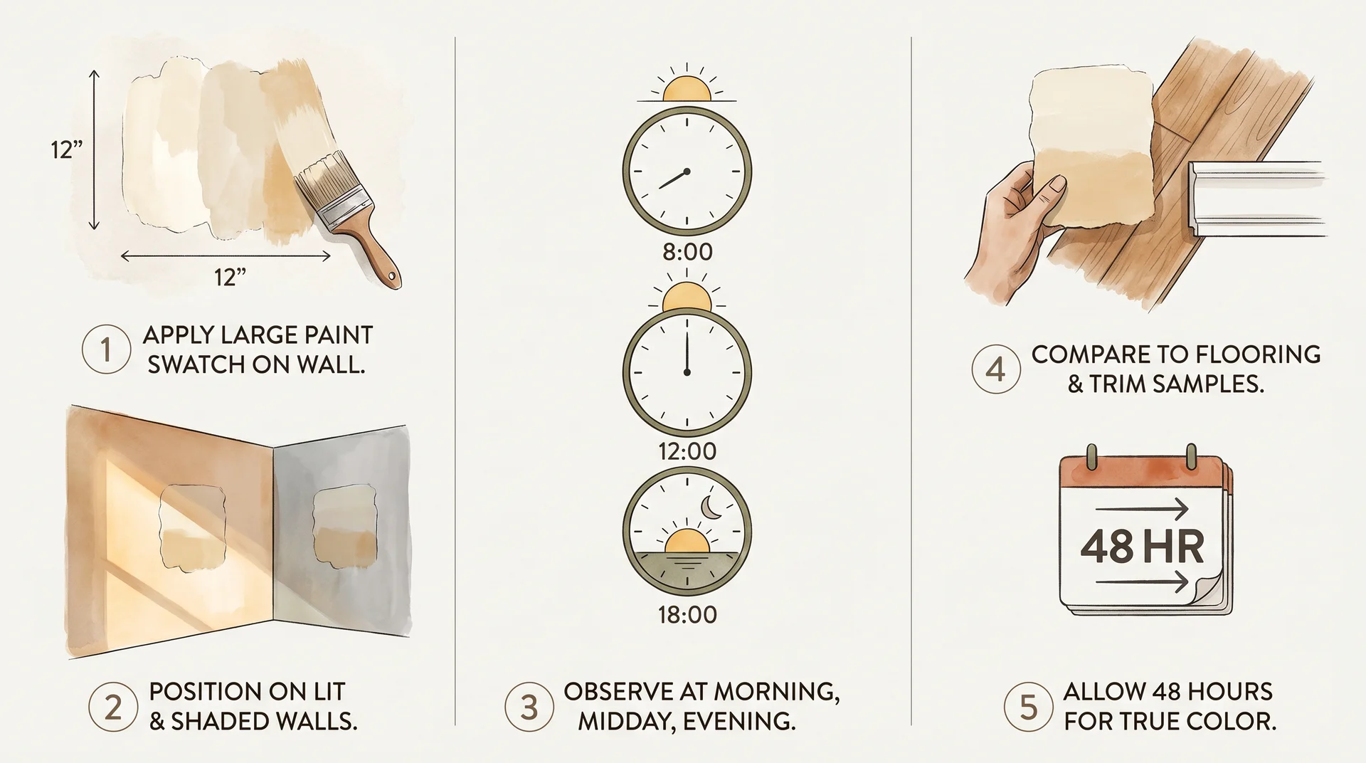
The most consistent source of paint regret isn’t choosing the wrong color; it’s choosing the right color using the wrong method.
A 2×2-inch chip viewed under fluorescent store lighting tells you almost nothing about what Pale Oak will look like on your walls. The chip is too small for your eye to accurately process the undertones, and the lighting in a paint store is virtually never the same as that in your home.
Why Paint Store Swatches Mislead You
Swatches are useful for understanding a color’s general family and approximate position on the light-to-dark scale. They’re not useful for predicting actual in-room behavior.
The undertone shifts described in this review, the pink in cool light, and the faint green under daylight LEDs don’t appear on a small chip. They appear only when the color is applied at scale in your actual environment, surrounded by your actual flooring and furniture.
The Right Sampling Process
- Order a Samplize peel-and-stick sample or purchase a quart of paint and apply it directly to the wall. The sample needs to be at least 12 inches square. Larger is better.
- Test on multiple surfaces: one wall that receives direct natural light and one that stays in shadow for most of the day.
- Observe the sample at three distinct times: morning natural light, midday, and evening with your normal artificial lighting switched on.
- Hold the sample near your trim, flooring, and key furniture pieces. You’re looking for harmony, not a match.
- Wait at least 48 hours before deciding. First impressions and settled impressions are often genuinely different with this color.
What to Look for at Each Check
In morning light, check the undertone: is there a pink or green shift that wasn’t visible on the swatch?
At midday, you’re seeing the color as balanced and accurate as it gets. In the evening, under your artificial lights, assess whether the shift that appears is something you can address by changing bulb temperature, or something that changes the color beyond what you wanted.
Is Pale Oak Still Worth Choosing?
Pale Oak peaked in design-media visibility roughly between 2016 and 2021, and that saturation is what drives the “is it dated?” question.
Here is the direct answer: Pale Oak is a genuinely good color that became very popular. Those are two separate facts, and they don’t cancel each other out.
The neutrals that have aged badly are the ones that were always trend-driven first and livable second. A particular cold gray that looked sharp in 2015 and clinical by 2022 fell into that category because it was never comfortable to live in; it was just fashionable at a moment.
Pale Oak doesn’t fall into that group. It’s a warm, mid-tone greige with real undertone complexity, the kind of color that tends to outlast trend cycles because it’s genuinely comfortable to be around.
If you like it and it suits your space, it’s worth choosing. If you’re renovating to sell in the near term, there are earthier clay and warm brown tones with more current momentum in the design conversation. If you’re painting a home you’ll live in for years, the relevant question isn’t whether it’s having a moment.
A color this livable and this well-behaved in warm, well-lit rooms doesn’t need to be trending to earn a place on your walls. It needs to work in the room you actually have.
