
I want to be upfront before we get to the inspiration. When clients used to ask me about burnt orange for a bedroom, my first instinct was to redirect them toward something safer. Something that would photograph well in every season and wouldn’t have them repainting eighteen months later.
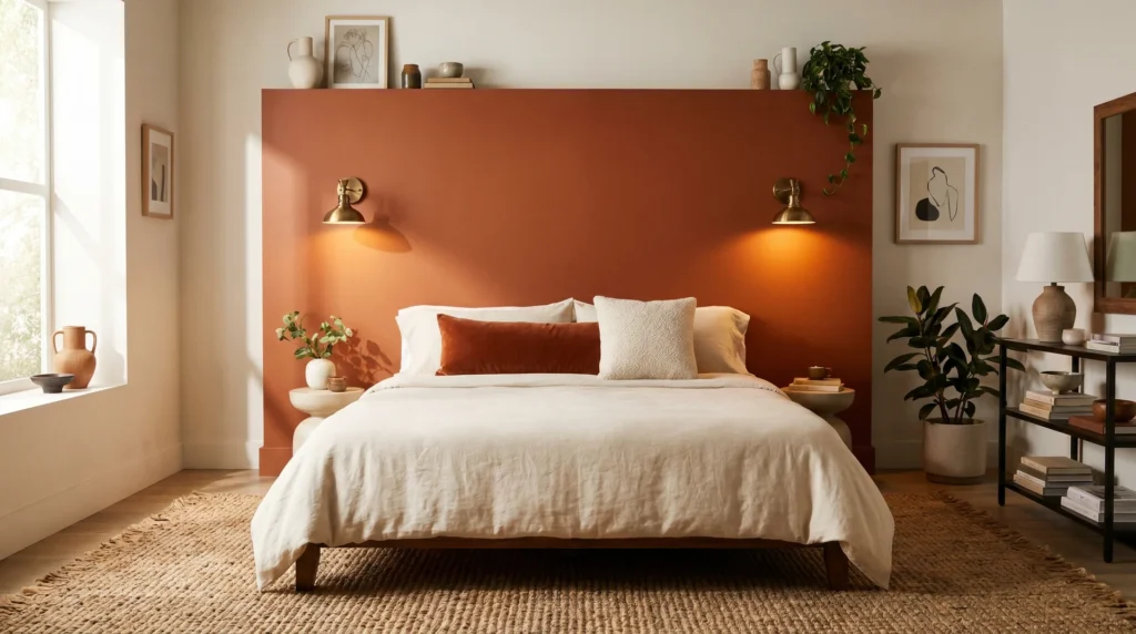
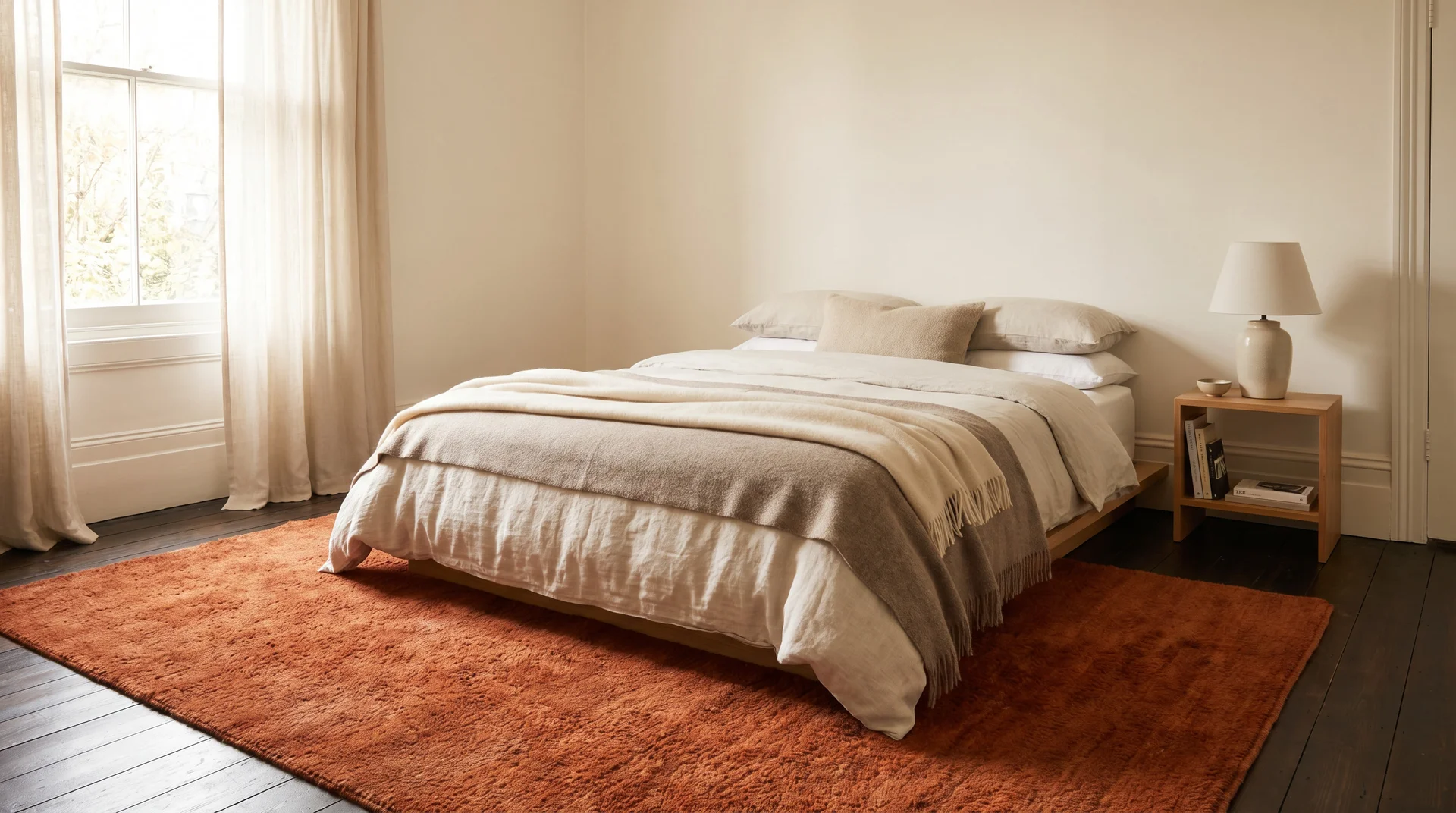
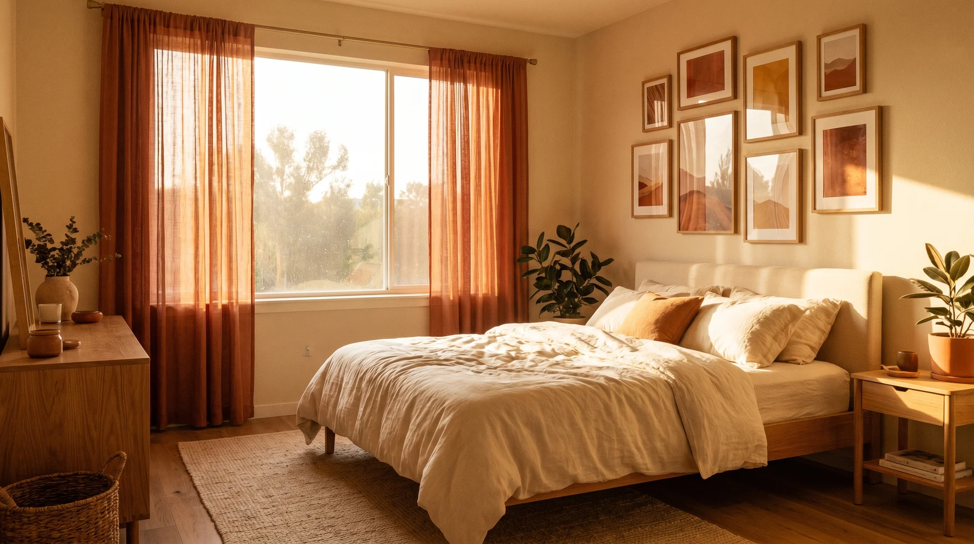
Then I styled a bedroom in a warm cinnamon-burnt orange for a client who had spent a decade in a grey-and-white room she described as “fine.” We laid a matte burnt orange on the headboard wall, brought in cream linen bedding, a woven jute rug, brass sconces, and a cluster of terracotta pots on the windowsill. She walked in during the reveal and stood there for nearly a full minute without saying anything.
That room changed how I think about this colour.
Burnt orange belongs in a bedroom when you use it with intention. You can commit to a full wall, stay entirely in the bedding, or land somewhere in between with a velvet headboard or a vintage rug. All of it works. The version that works for you depends on your room’s light, your existing furniture, and how much warmth you genuinely want to live inside every day.
This guide covers specific room ideas by style, colour pairings that hold up past the first month, paint shade recommendations with brand names, furniture and lighting guidance, and a direct answer to the question nobody else seems to tackle: will burnt orange actually let you sleep?
What Makes Burnt Orange Bedroom Decor Work (And Why It Sometimes Doesn’t)
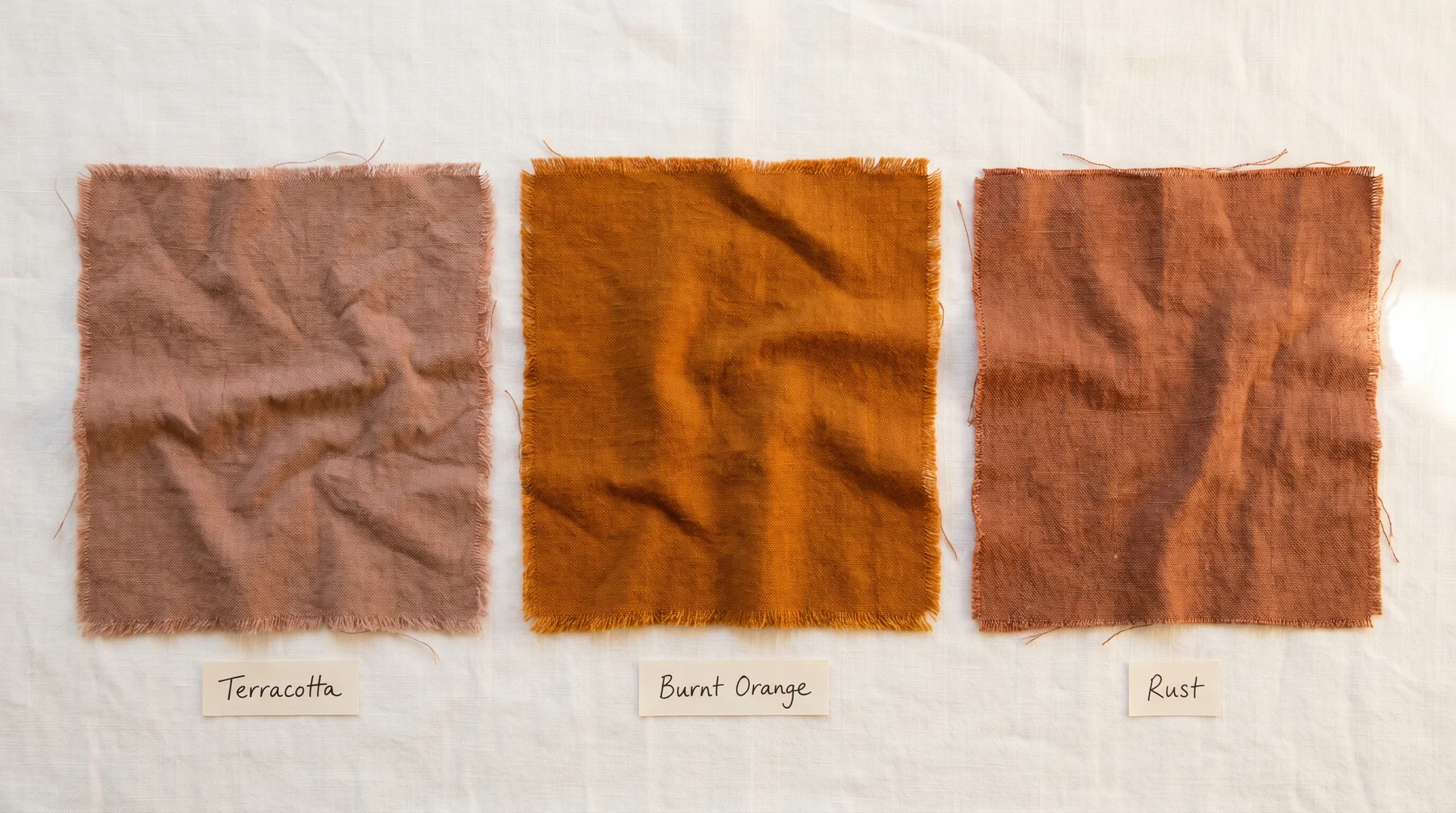
The Real Difference Between Burnt Orange, Rust, and Terracotta
These three words appear interchangeably in home content, and they behave very differently in practice. Getting clear on which one you’re actually drawn to will save you from the wrong paint tin.
Terracotta leans dusty and earthy. It carries brown and grey undertones, reads closer to clay than orange, and sits very calmly in a bedroom. If the rooms you save on Pinterest feel grounded and Mediterranean, terracotta is probably what you’re responding to.
Rust pulls slightly cooler and more industrial. It has a faded, oxidised quality that suits dark wood and matte black hardware well. The rooms that give you a moody, almost vintage feeling are usually rust rather than true burnt orange.
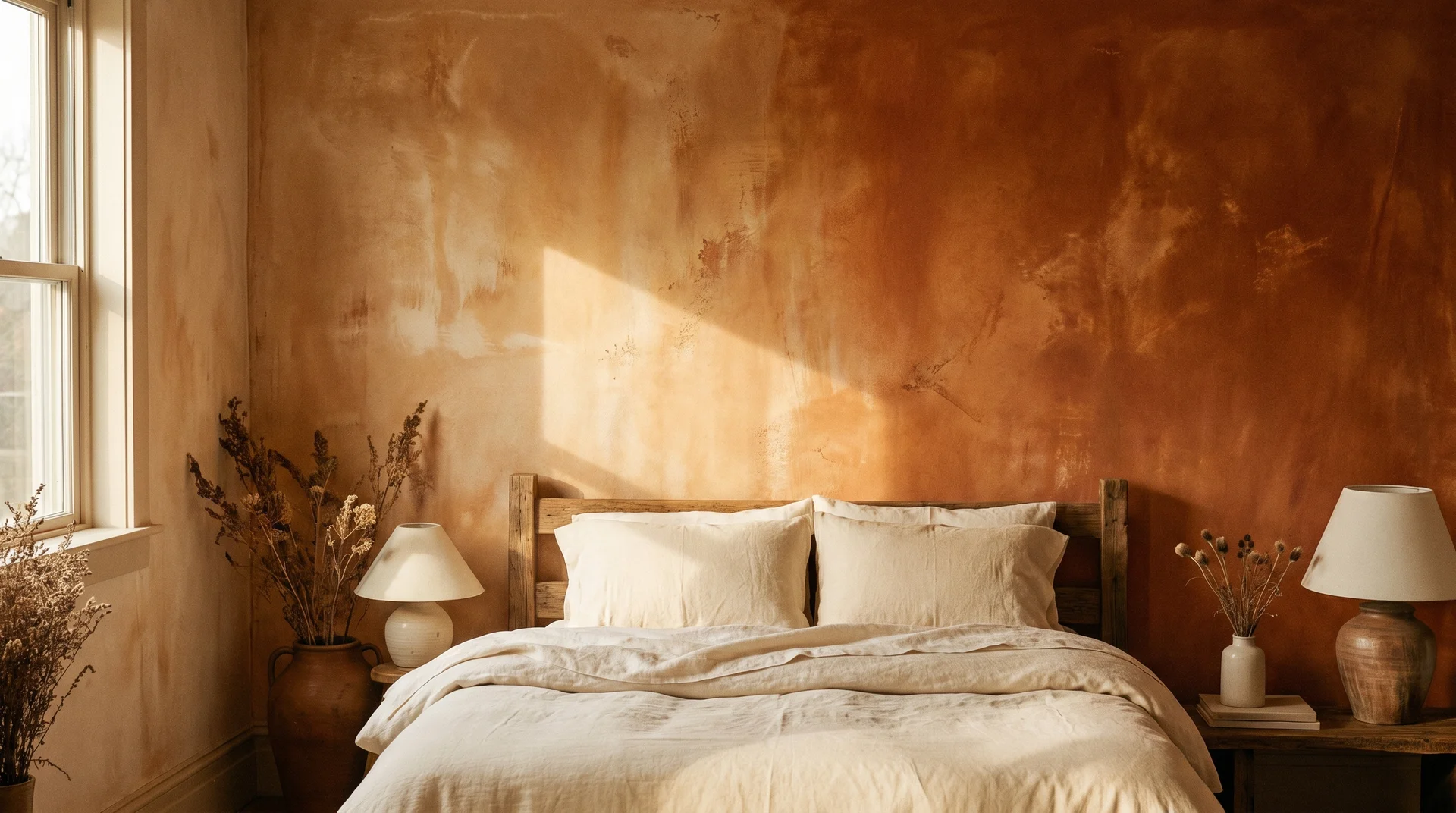
Burnt orange sits between both. Warmer and more saturated than terracotta, with an amber depth that catches warm light beautifully. This is also why it can feel bolder than you expected once it’s on a wall rather than a mood board.
Knowing which end of this spectrum you’re actually drawn to will determine your paint shade, your textiles, and every colour you pair alongside it.
How Much Burnt Orange Is Too Much
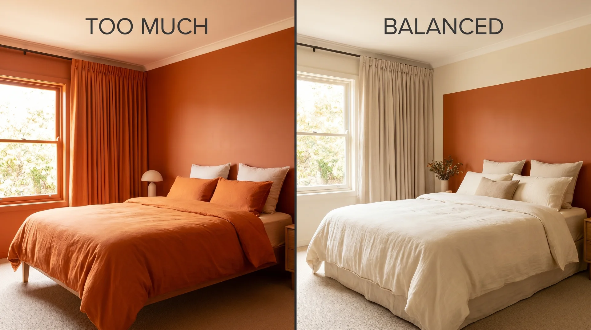
The colour isn’t the variable. Quantity and placement are.
I’ve seen burnt orange used in ways that made a bedroom feel like a warm, considered retreat, and I’ve seen it turn a living room into something that felt airless by the second week. The orange was the same. The handling was different.
Here’s the framework I use with clients:
| Placement | Effect | Best For |
|---|---|---|
| Headboard wall only (matte finish) | Warm anchor, contained drama | Most bedrooms, any orientation |
| Bedding as the hero piece | Warmth without commitment | Renters, small rooms, colour testing |
| Statement rug | Warmth from the floor up | Light walls with neutral furniture |
| Cushion cluster only | Subtle warmth, seasonal refresh | Neutral bedrooms need personality |
| All four walls | Cocooning, immersive | Large rooms with high ceilings and strong daylight |
The practical rule: let burnt orange own one zone and let everything else breathe. A burnt orange headboard wall with cream linen bedding and natural wood furniture feels collected and calm. That same orange on the walls, the duvet, and the curtains simultaneously feels like a very committed decision that will exhaust your eyes within a few months.
Is Burnt Orange Too Stimulating for a Bedroom?
Colour psychology research does show that warm, saturated colours can increase alertness and slightly raise body temperature. Bright, high-chroma orange has been associated with elevated heart rate in some studies. That version of the concern is legitimate.
What the research doesn’t account for is this: a muted, earthy burnt orange at low-to-mid saturation behaves very differently from a neon or traffic-cone orange. A room in Sherwin-Williams Cavern Clay doesn’t function the same way physiologically or visually as a room painted in a fully saturated warm orange. The dustier, more terracotta-adjacent shades carry significantly lower visual energy.
What actually controls how stimulating the room feels:
- Saturation. Muted shades read calm. Saturated shades read energetic.
- Finish. Matte finishes absorb light. Satin and gloss amplify colour, especially under evening artificial light.
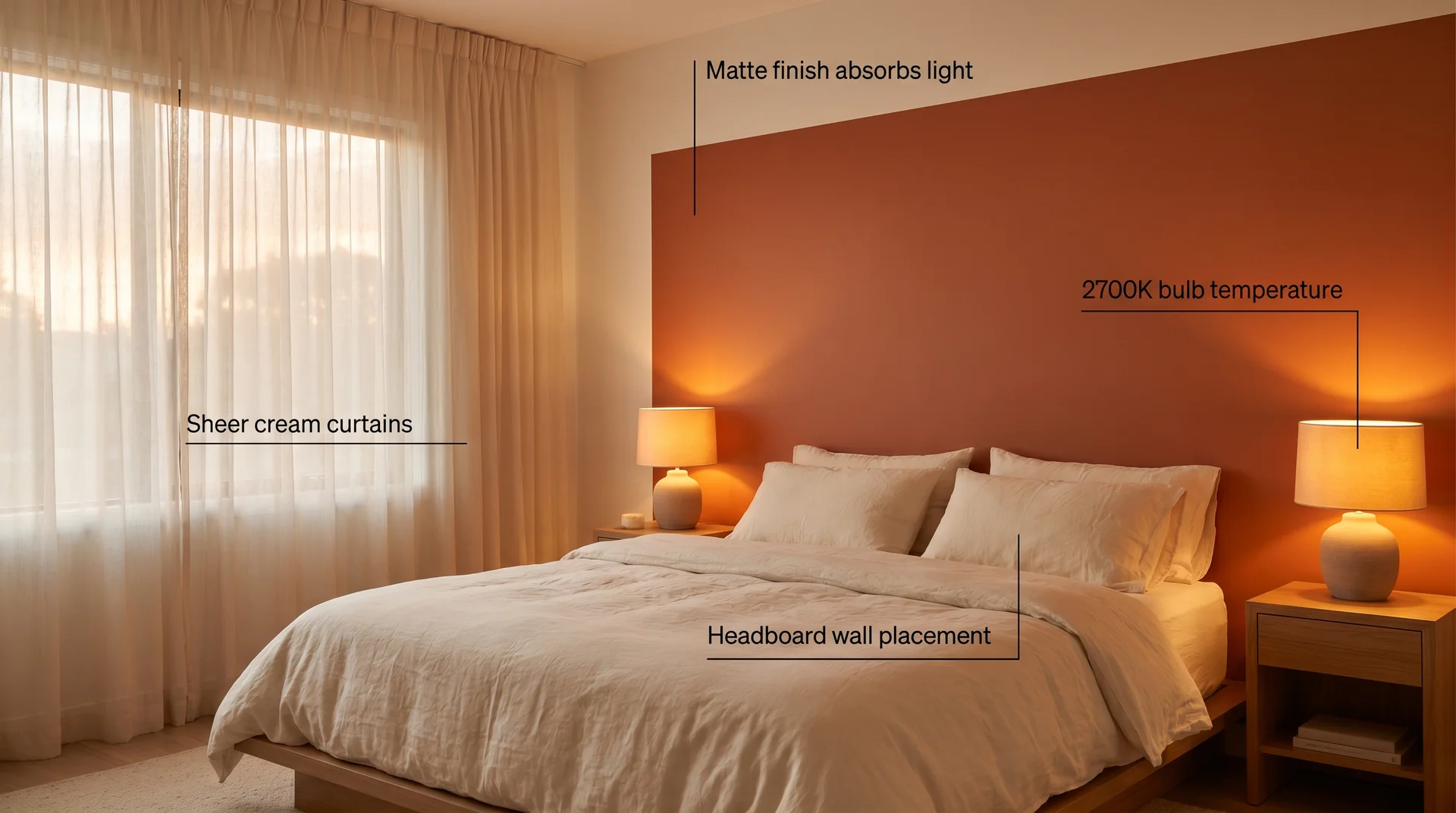
- Bulb temperature. Warm bulbs at 2700K–3000K work with burnt orange. Cool bulbs fight it and make the colour look harsher than it actually is.
- Placement. A burnt orange headboard wall is behind you when you sleep. It’s the first thing you see in the morning, not the last thing before your eyes close.
My honest take: a muted burnt orange in a flat finish on the headboard wall, paired with warm-toned lighting and soft natural textiles, will not disrupt your sleep. A fully saturated all-four-walls treatment in satin finish might.
Burnt Orange Bedroom with Natural Textures
This is the version most people are actually drawn to when they say they love burnt orange. Rattan, jute, linen, raw wood, and terracotta pottery. Grounded, organic, and deeply livable.
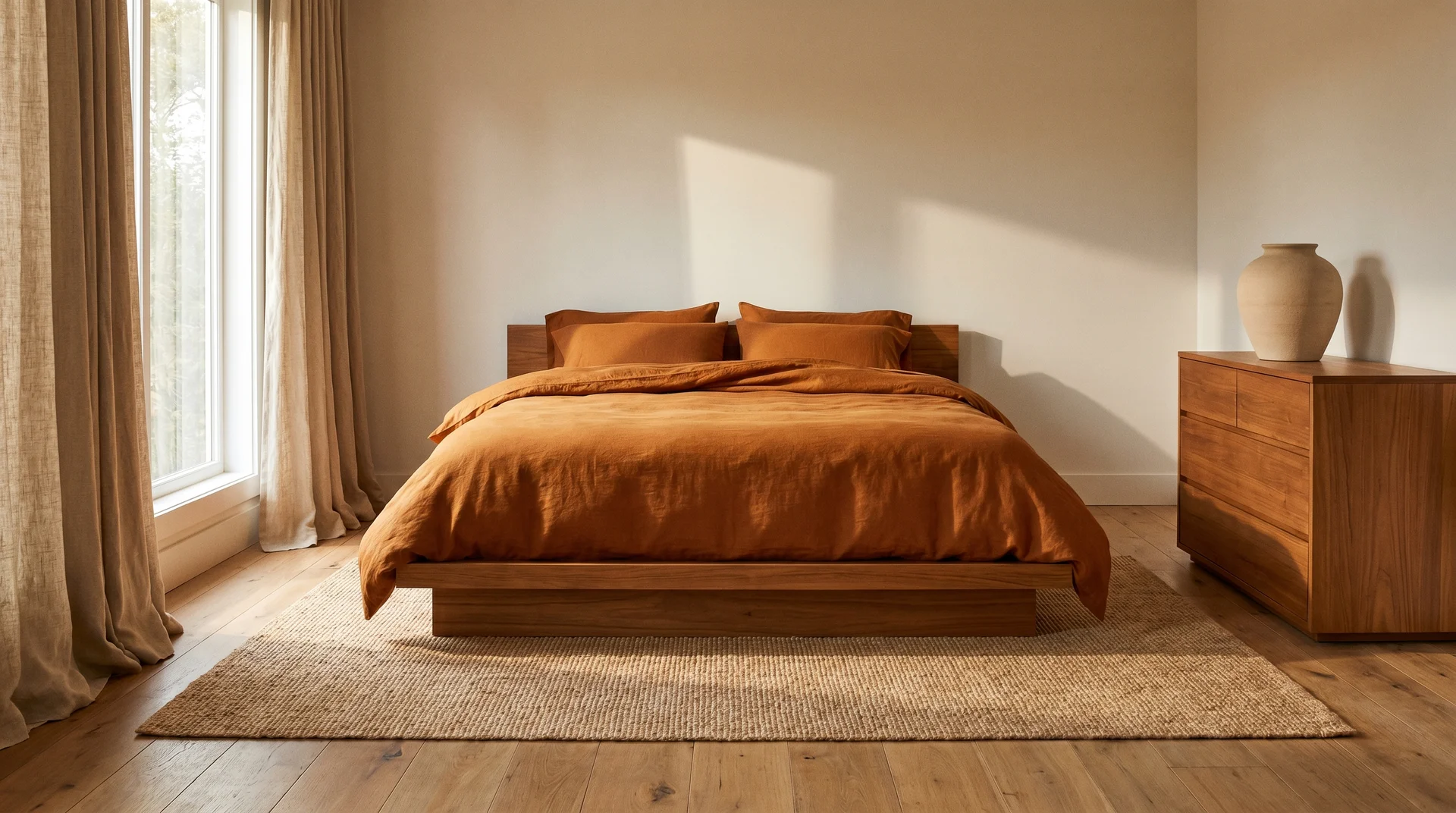
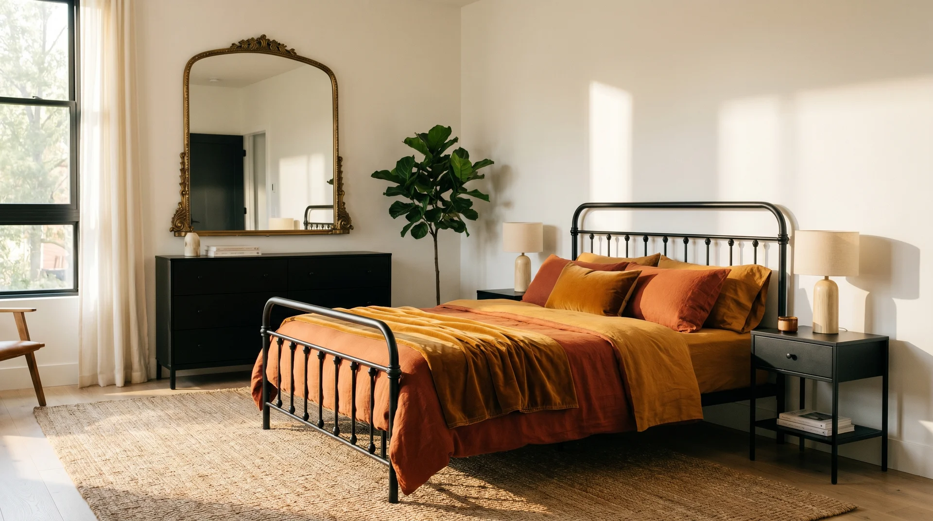
1. The Linen Platform Bed
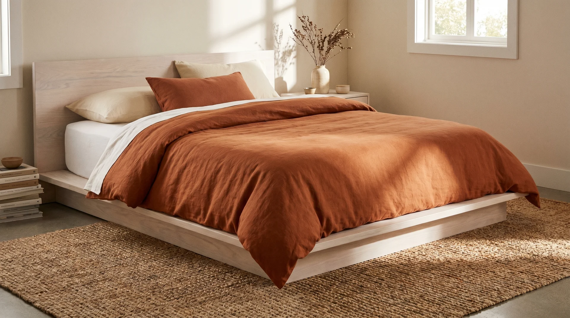
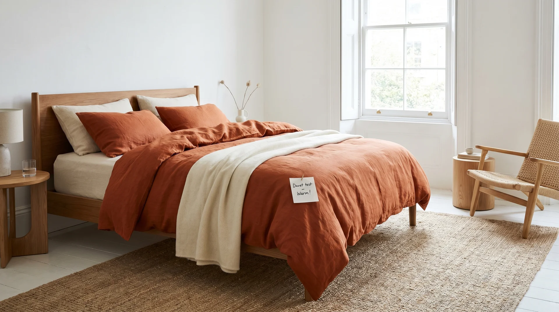
A low-profile platform bed in pale or bleached wood, dressed with a burnt orange linen duvet as the hero piece. Start with a white or cream fitted sheet. Let the duvet carry all the orange.
One cream cushion and one terracotta lumbar, then stop. A chunky jute rug extending about sixty centimetres past each side of the bed. This look reads warm and considered and is almost entirely textile-driven.
2. The Arched Rattan Headboard
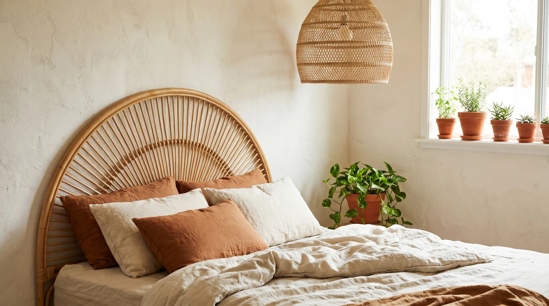
An arched rattan headboard against a whitewashed or warm off-white wall. A single trailing plant, cream and rust cushions, a woven pendant lamp overhead rather than a ceiling fixture. Small terracotta pots along the windowsill. This room doesn’t need orange on the walls because the rattan already reads warm.
3. The Layered Bedding Stack
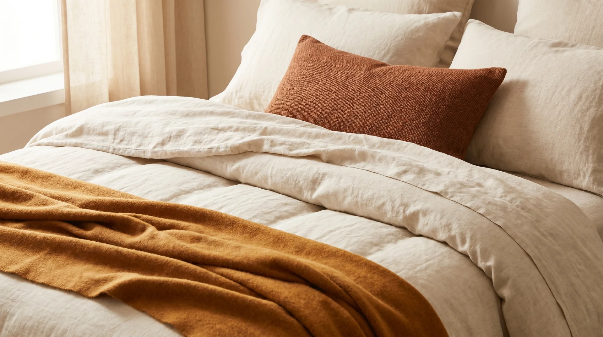
An amber throw folded at the foot, a rust lumbar placed centre, a cream duvet as the base. Nothing else. Orange arrives through accumulation rather than announcement, which is often the more sophisticated approach.
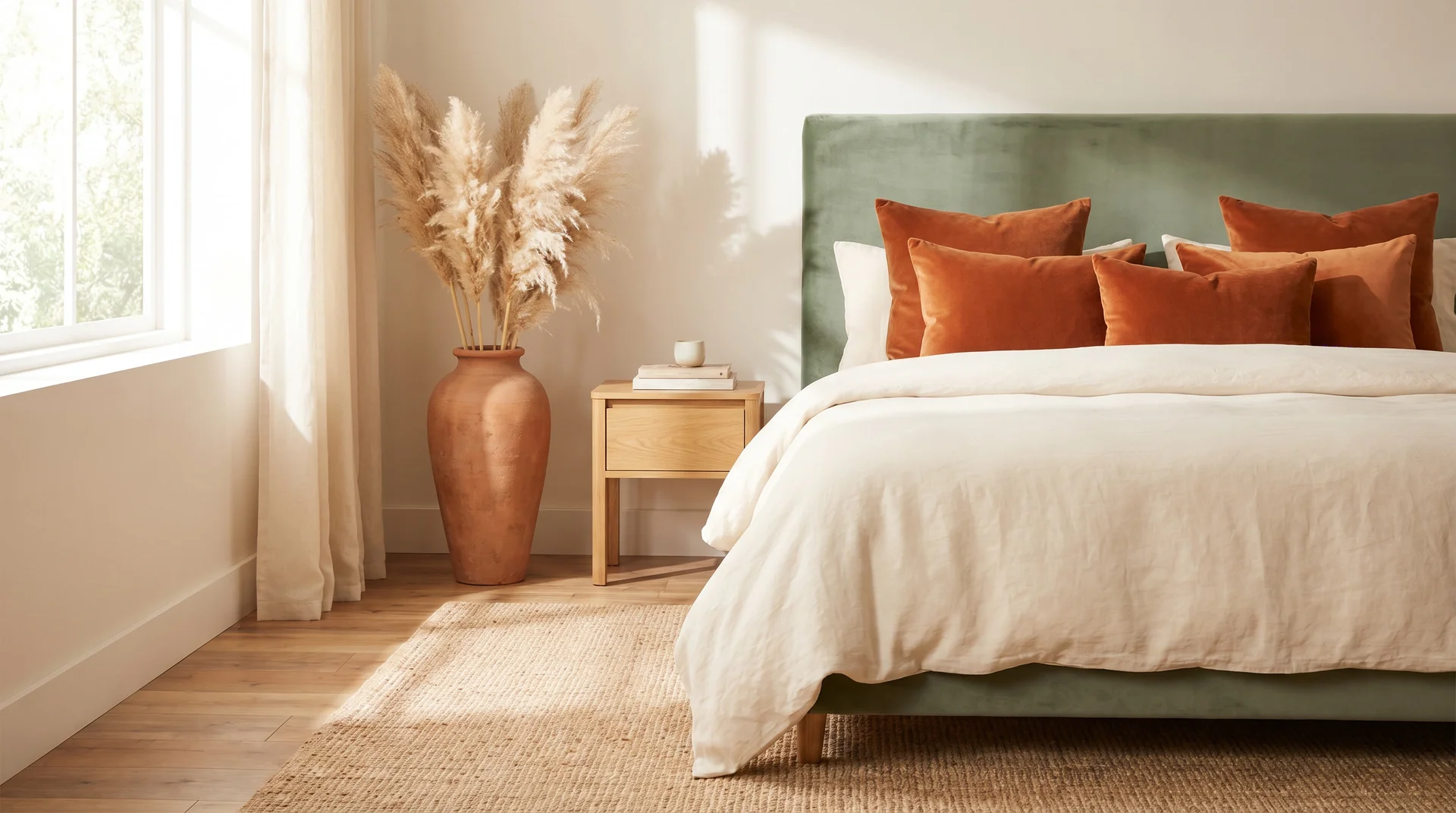
4. The Velvet Cushion Edit
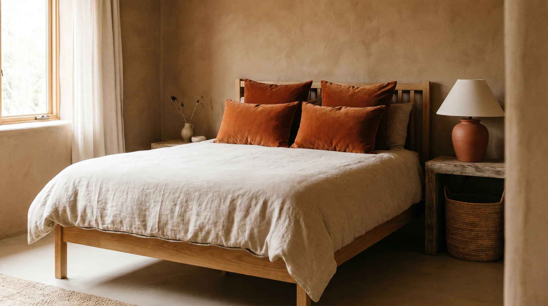
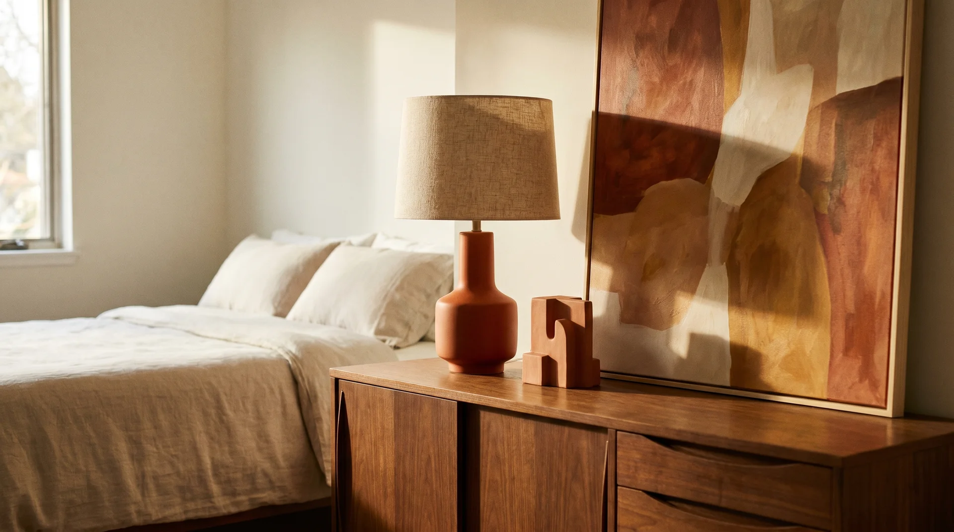
Four burnt orange velvet cushions against a natural linen duvet on a simple wooden bed frame. A woven basket under the bedside table. A terracotta-based ceramic lamp. Earthy and grounded without leaning maximalist.
5. The Full Warm-Earth Room
A deep cinnamon-orange linen duvet set, natural linen curtains that pool slightly on the floor, a sisal rug in its natural straw tone, and walnut or teak furniture. One large ceramic vase on the dresser. No art, no extra objects. This room feels like a boutique hotel and requires almost no ongoing curation to maintain.
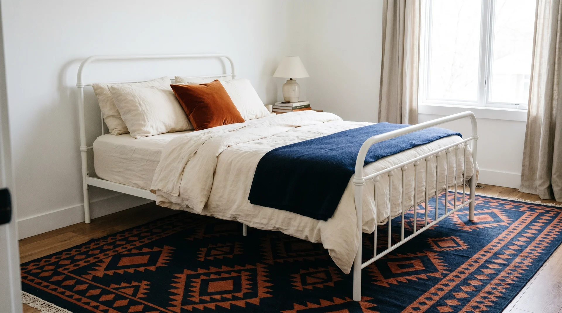
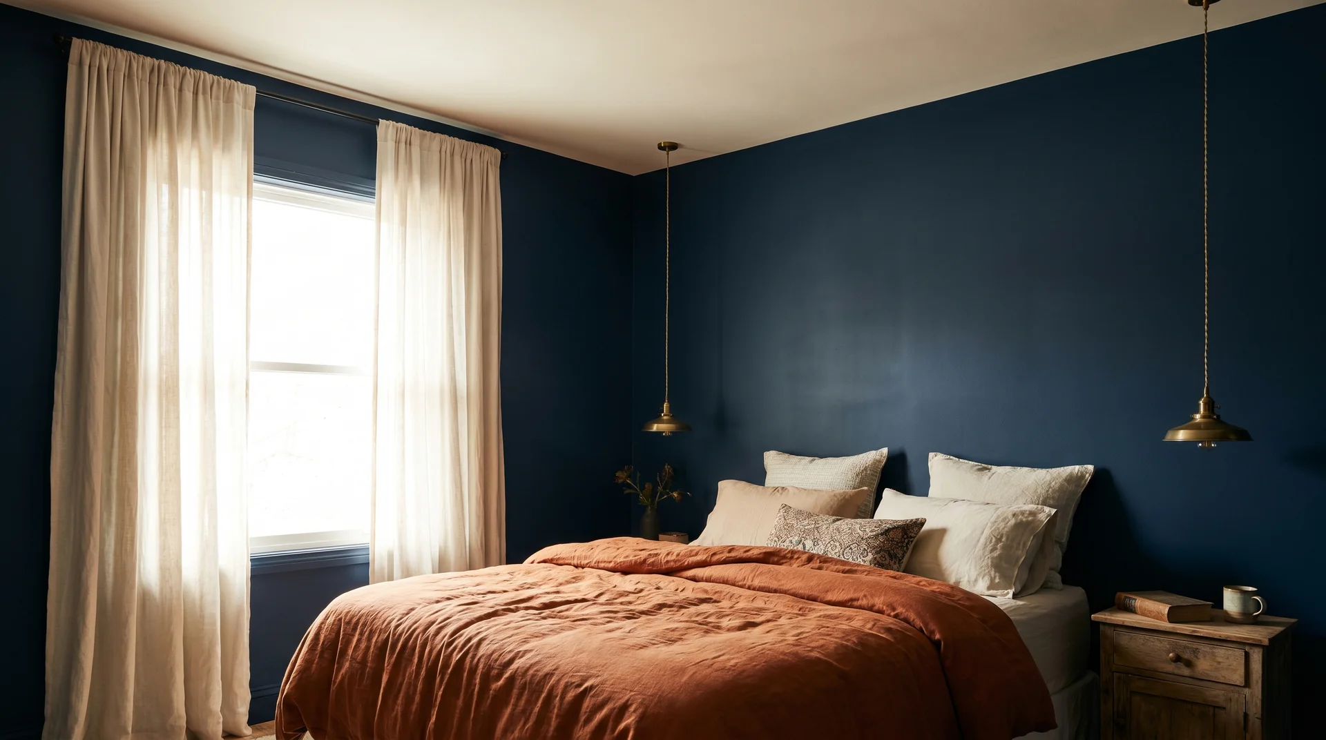
The Classic Bedroom Burnt Orange & Navy Pairing
Blue and orange sit opposite each other on the colour wheel, which means they sharpen each other visually. Navy works in a bedroom specifically because it’s deep enough to absorb rather than compete. It provides the cool grounding that keeps burnt orange from reading as aggressive.
6. Navy Accent Wall with Burnt Orange Bedding
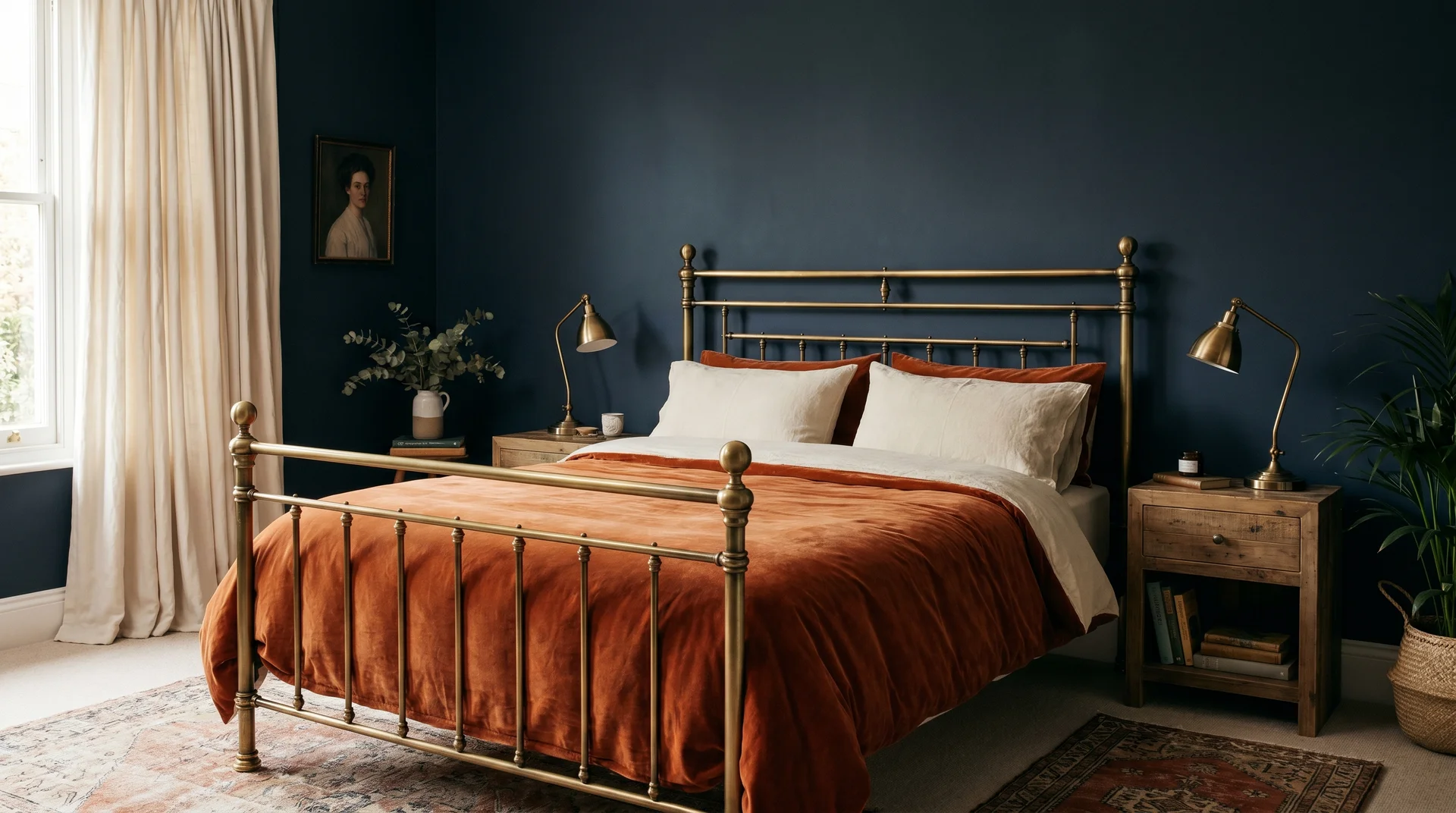
A deep navy headboard wall with a burnt orange velvet duvet and cream linen pillowcases. Antique brass bedside lamps, wooden nightstands. The navy carries the depth; the burnt orange delivers the warmth.
7. The Striped Wallpaper Room
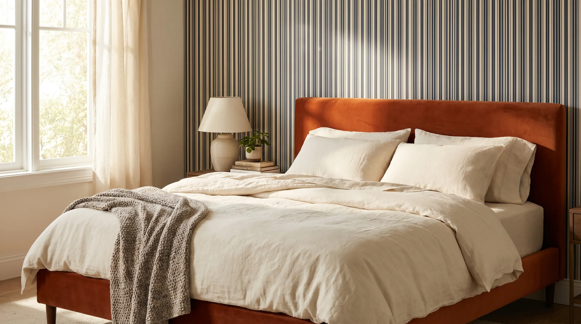
A navy and cream narrow-striped wallpaper on the headboard wall, paired with a burnt orange velvet bed frame. Keep all bedding in cream or warm white. The pattern contains the navy, and the orange frame pulls focus without loudness.
8. The Restrained Navy and Orange Pairing
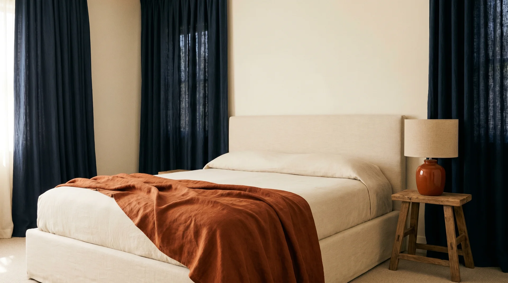
Floor-length navy curtains, cream walls, one burnt orange throw over the corner of the bed, and one burnt orange ceramic lamp on a single bedside table. Nothing else. Restraint is the whole point, and this is one of the most elegant versions of this combination.
9. The Textile-Led Approach for Renters
A deep navy and burnt orange geometric area rug as the palette anchor under a white or cream bed. One burnt orange cushion and one navy throw. No paint involved.
10. The Moody All-Navy Room
Navy on all four walls, warm white ceiling, a burnt orange bedding set, antique brass pendant light overhead, and cream or oat curtains. For rooms with adequate natural light, this genuinely works as well in person as it does in a photograph.
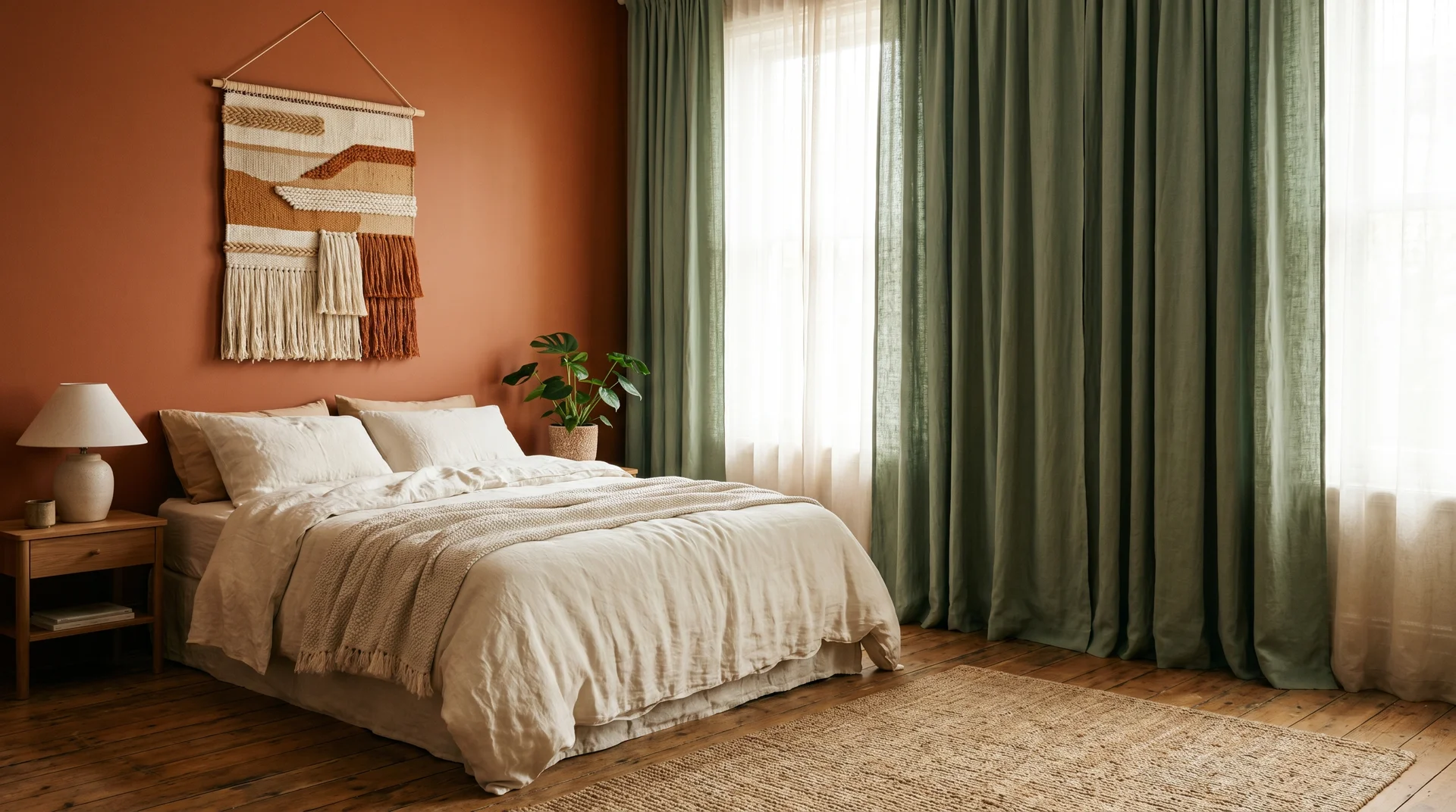
Burnt Orange and Sage Green Bedroom Ideas
Sage and burnt orange come from the same muted, botanical colour family. Both carry grey or brown undertones. Both feel organic in a way that avoids trendiness. The pairing reads like a desert sunset or an autumn forest because those are exactly the environments where these tones appear together.
11. Sage Walls with Orange Linen Textiles

Matte sage green walls, burnt orange linen curtains, a natural jute rug, and cream linen bedding with a single burnt orange throw. Warm wood furniture. A few terracotta pots. This palette coordinates itself.
12. Burnt Orange Feature Wall with Sage Curtains
A burnt orange headboard wall with sage green linen curtains, cream bedding, and a woven wall hanging in warm neutrals above the bed. The warm-cool balance between the wall and curtains holds the room steady without needing additional colour.
13. The Sage Velvet Headboard with Orange Accents
A sage green velvet headboard against warm white walls, burnt orange cushions, and a tall terracotta vase with dried pampas grass beside the bed. A light oak floor or rug underneath. This room looks as good in real life as it does saved on a phone screen.
14. The Earthy Gallery Wall Bridge
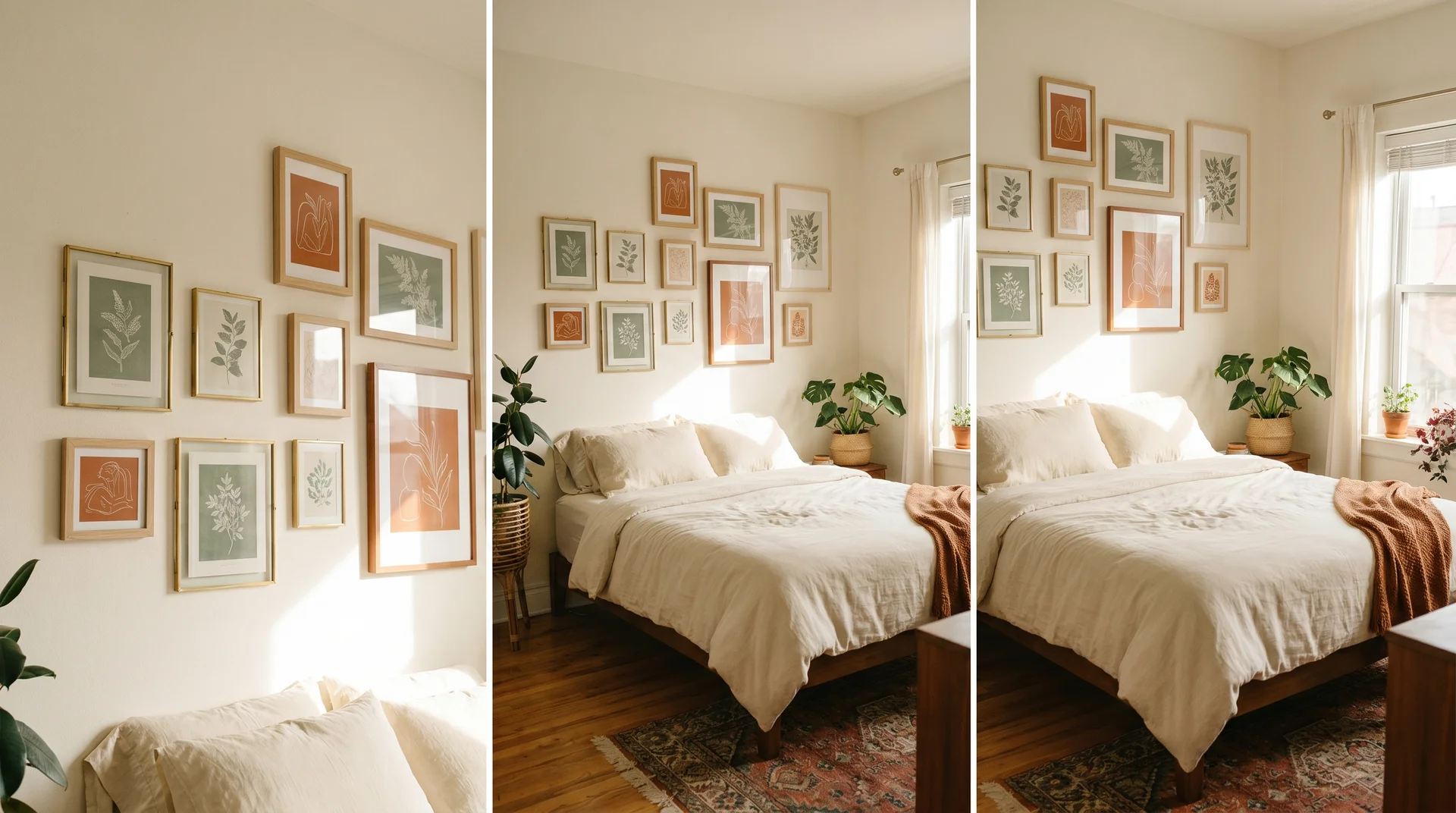
Sage green botanical prints mixed with burnt orange abstract illustrations, framed in thin brass or natural wood. Hung above a cream linen bed. The wall becomes the colour pairing without touching any paint.
15. The Muted Sage and Rust Cushion Edit
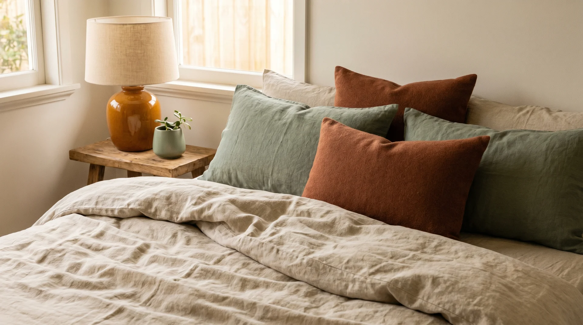
Muted sage and rust colour-blocked cushions on an oat linen bed, a sage-toned plant, a warm amber table lamp. A one-afternoon styling refresh for a flat neutral bedroom.
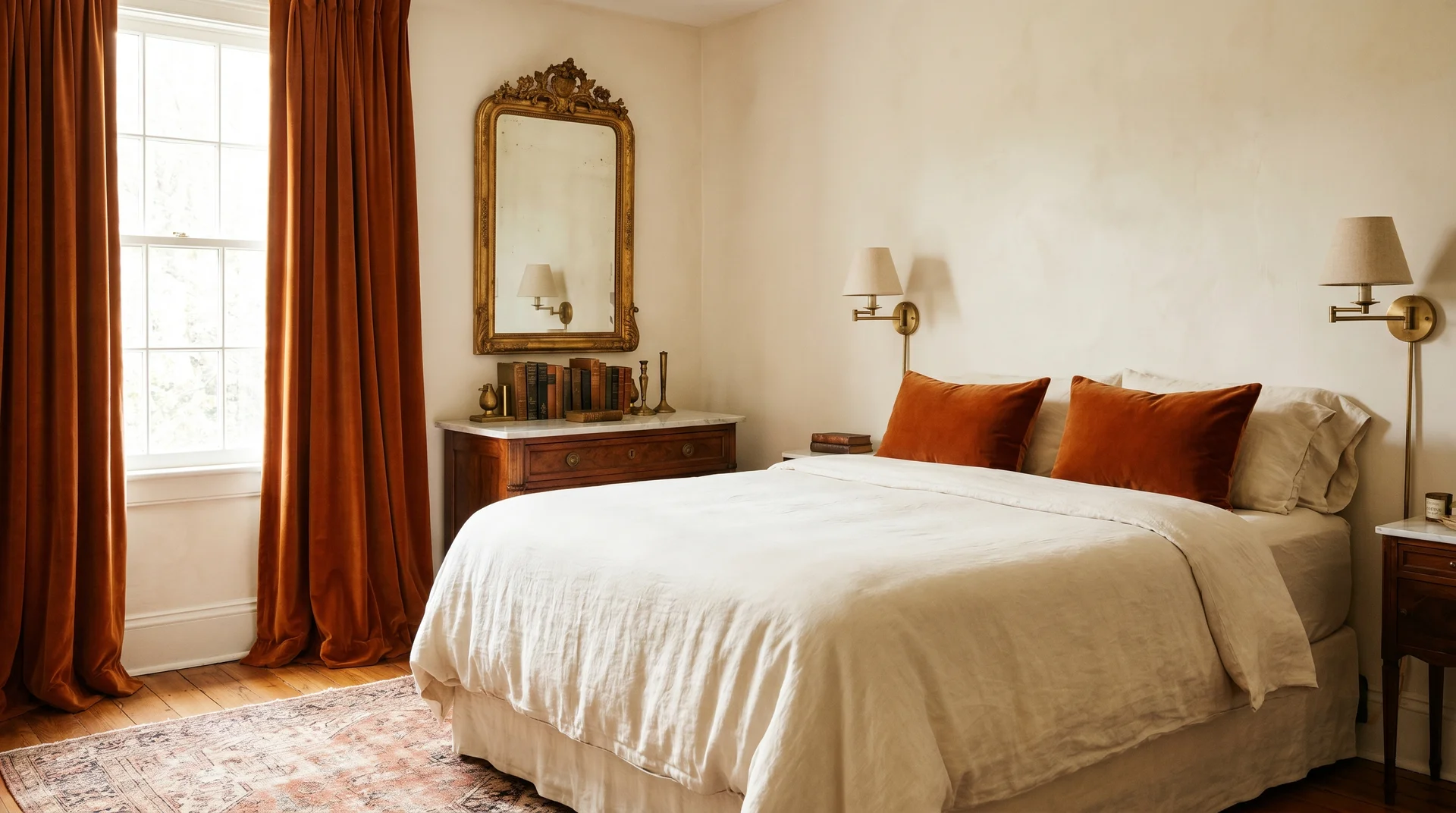
Burnt Orange and Cream Bedroom: The Safe Starting Point
Cream’s warm undertones sit naturally alongside orange. Pure white with burnt orange can feel harsh, particularly under cool overhead lighting. Cream diffuses it.
16. The Single-Throw Test
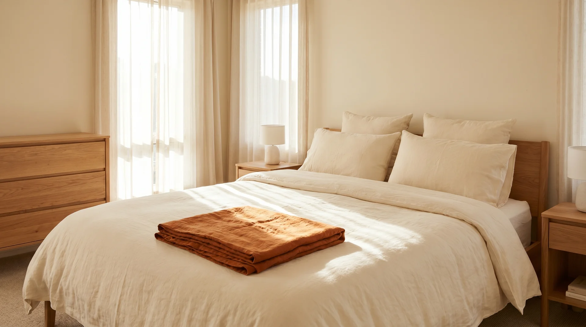
One burnt orange linen throw on an otherwise cream bedroom. This is how you test the colour in your actual room and actual light before spending on paint or a new duvet.
17. The Boucle Headboard with Warm Cushions
A cream boucle headboard with a burnt orange and terracotta cushion cluster. Walls in Benjamin Moore White Dove or Sherwin-Williams Alabaster. The boucle texture reads luxurious, and the orange sits against it clearly.
18. White Shiplap Walls with a Burnt Orange Quilt
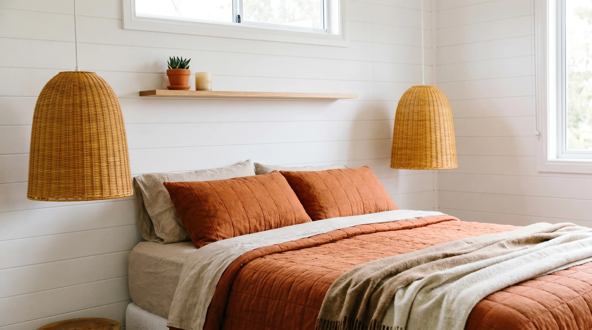
White shiplap walls, a burnt orange quilt, and wicker pendant lamps in a warm honey tone. A thin natural wood floating shelf above the bed with a small terracotta plant and a cream candle. Immediately warmer than most white bedrooms manage.
19. The Quiet Layered Neutral Room
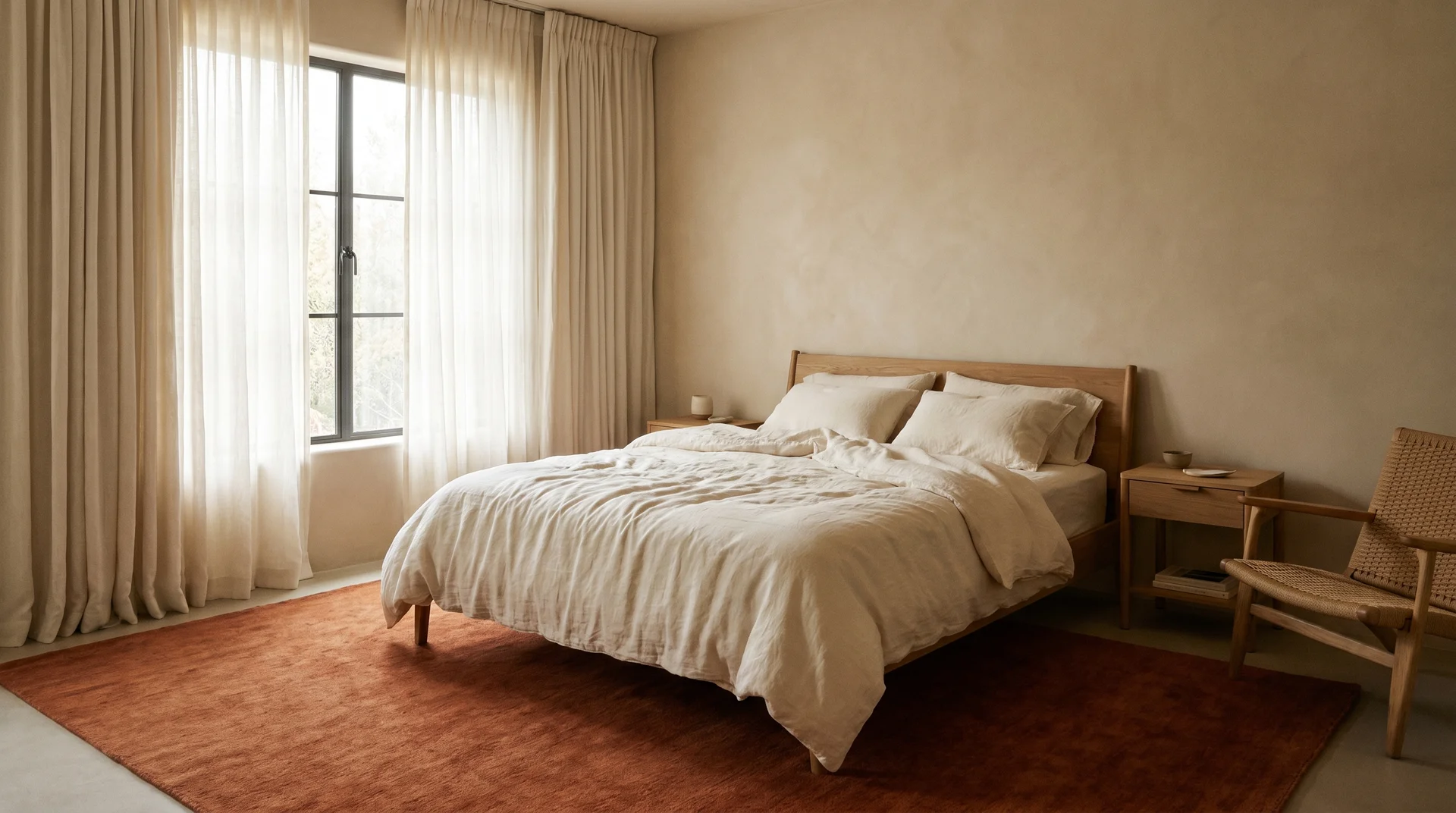
Ivory curtains, a burnt orange area rug, and cream bedding. No orange on the walls or furniture. The rug does all the work. This room reads as a warm neutral until someone actually looks at it.
20. The Botanical Print Duvet on Cream Furniture
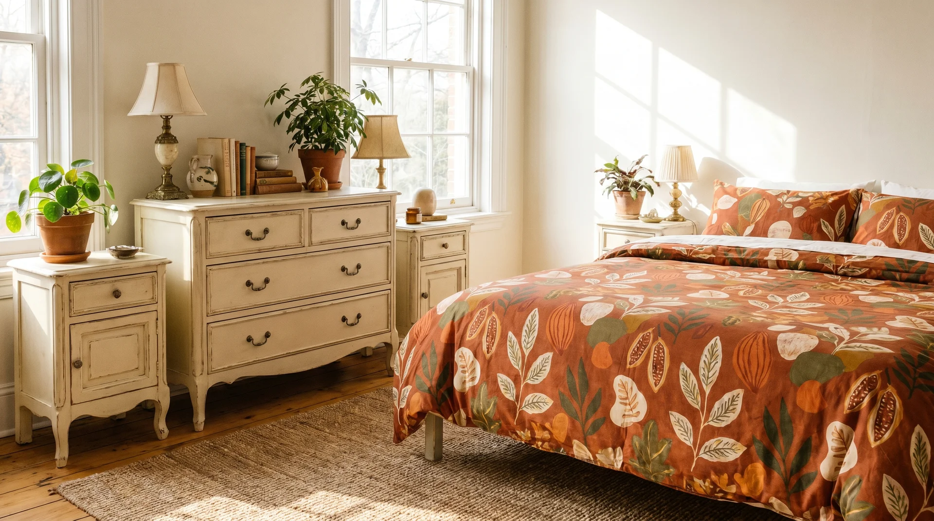
Cream-painted furniture with a burnt orange botanical print duvet. Botanical prints in earthy tones contain multiple complementary tones in one piece, which makes them very easy to build a bedroom palette around.
Burnt Orange and Charcoal or Black Bedroom Ideas
This pairing takes a confident hand. When it works, it looks editorial in person, not just in photographs.
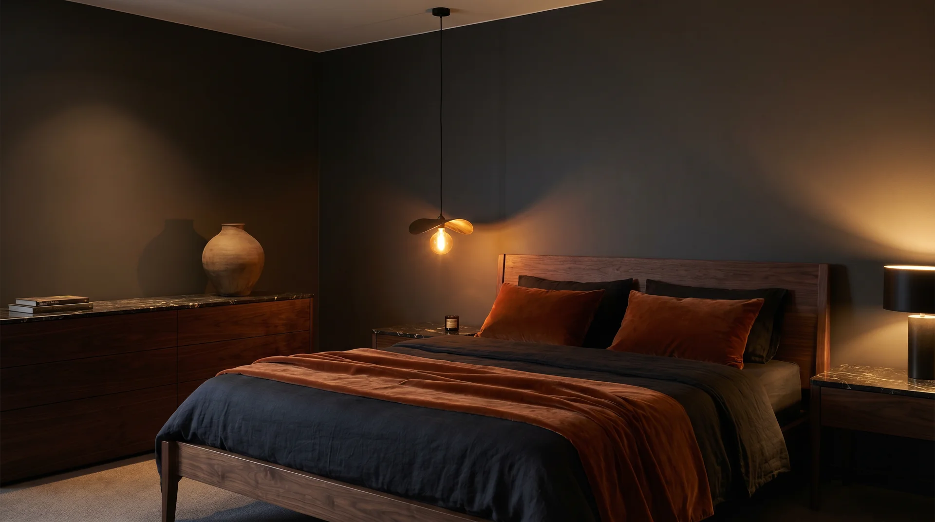
21. Charcoal Accent Wall with a Burnt Orange Velvet Bed Frame
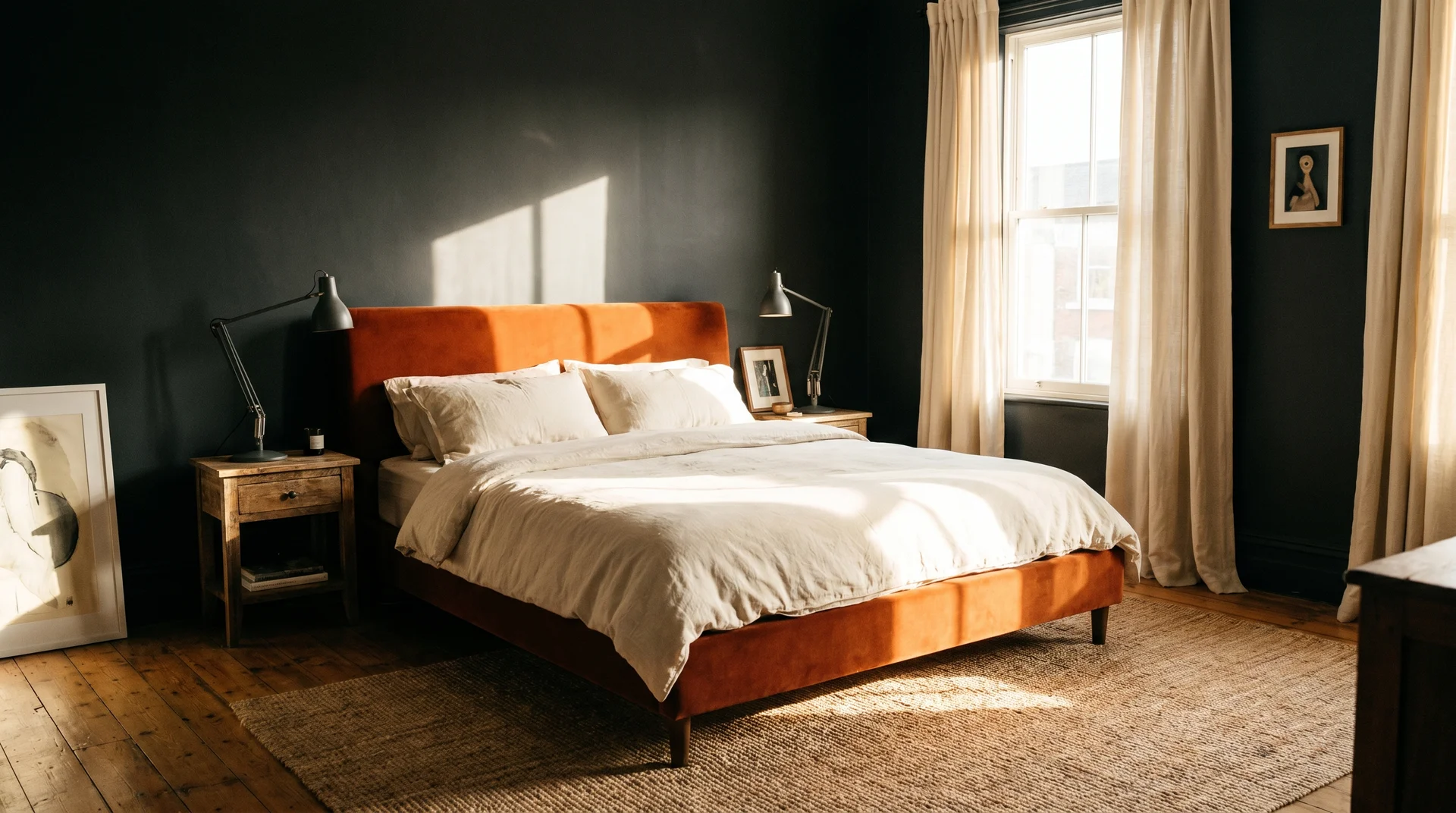
A deep charcoal matte wall behind a burnt orange velvet bed frame. Cream or warm white bedding. Matte dark metal lamps, wooden nightstands. The charcoal absorbs the warmth of the orange rather than competing with it.
22. Matte Black Furniture with Warm Orange Bedding
Matte black bed frame and nightstands with a burnt orange and ochre bedding set. One brass or antique gold mirror above the dresser. The black provides the cool structure; the bedding provides all the warmth.
23. The Minimal Drama Bedroom
Charcoal linen curtains, one burnt orange knit throw, brass bedside lamps on each side. Cream walls, warm wood floor. Minimal pieces, significant mood.
24. The Architectural Black Bed with Orange Headboard Insert
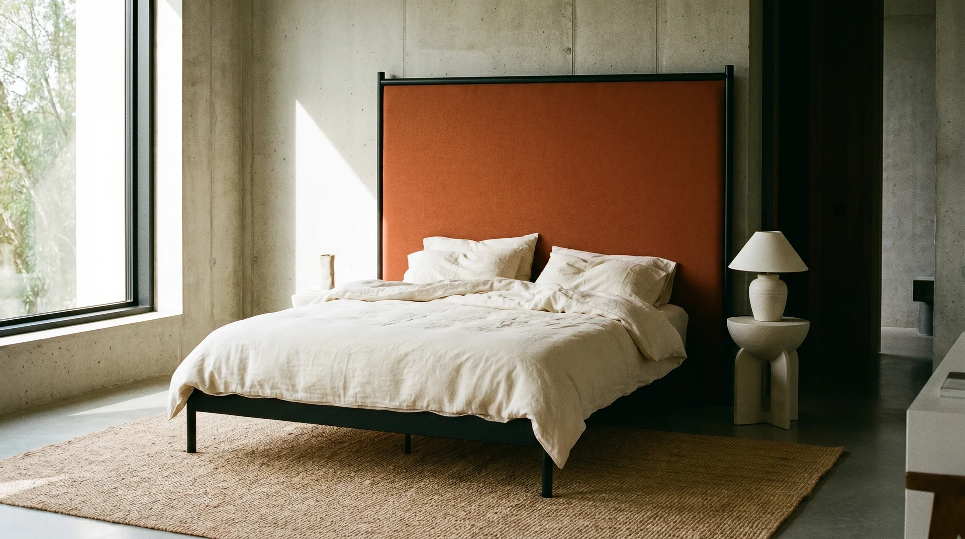
A black-framed bed with a burnt orange upholstered headboard panel. Drama without a paint commitment.
25. The Editorial Dark Bedroom
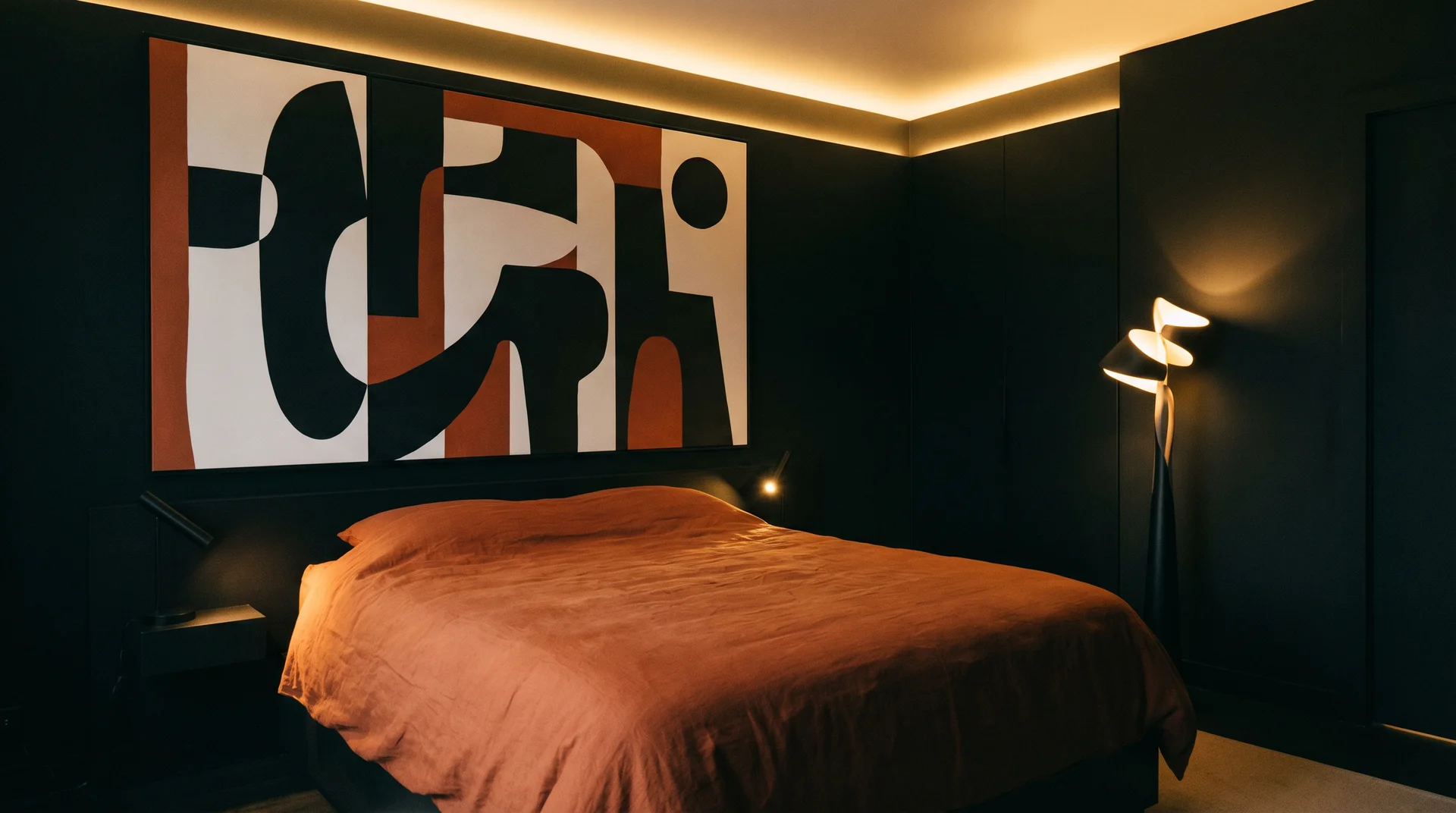
Dark near-black walls, a burnt orange duvet, and one large graphic artwork in black, white, and orange above the bed. No plants, no decorative objects competing with the palette.
Burnt Orange and Mustard or Ochre: Tonal Warmth Done Right
This combination tips into “too much” territory when both colours compete. It works when you treat them as a single tonal family rather than two separate bold statements.
26. The Colour-Blocked Burnt Orange and Mustard Headboard Wall
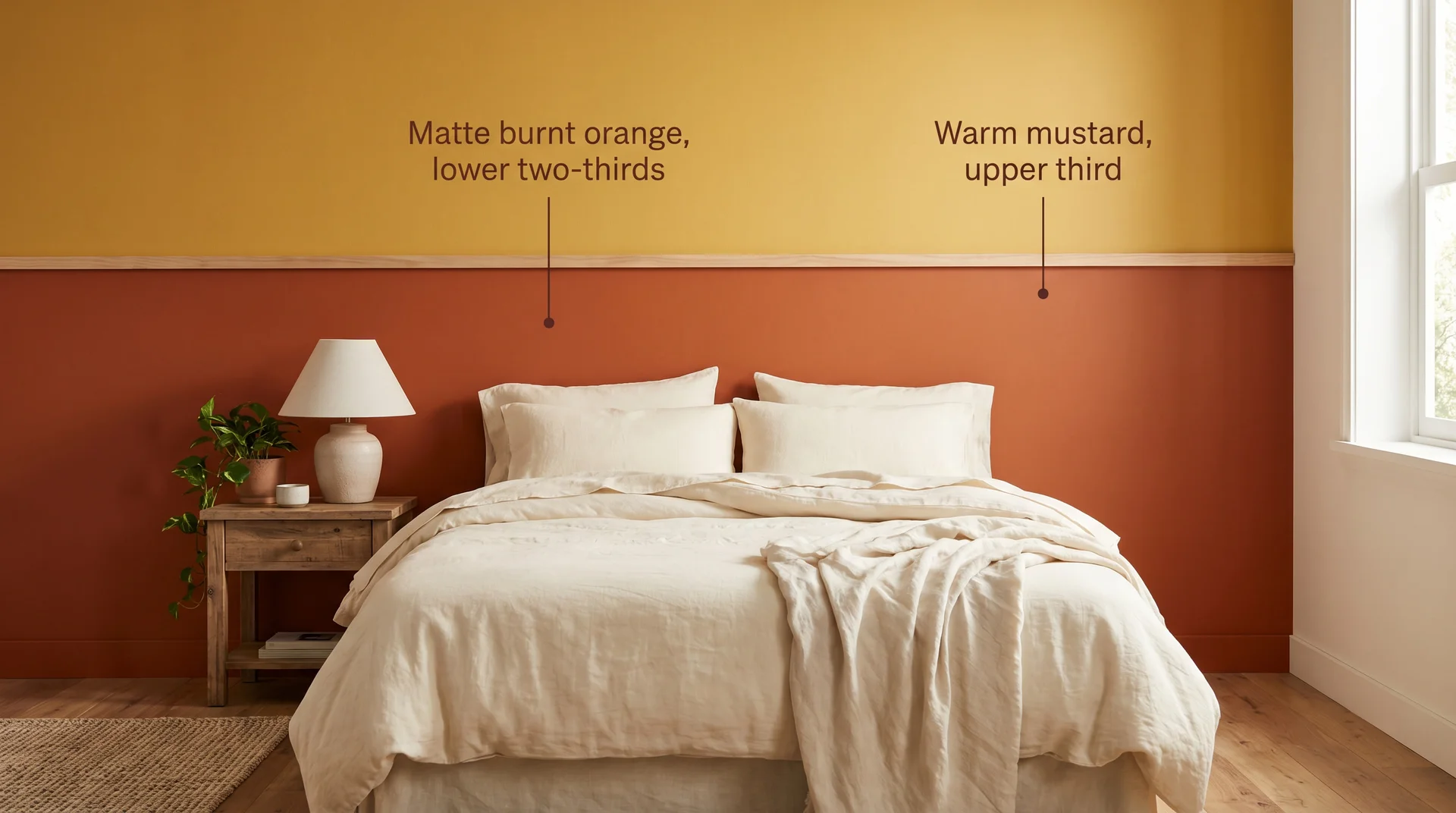
The lower two-thirds of the headboard wall is matte burnt orange, the upper third is warm mustard, with a thin wooden rail as the divider. Cream bedding. Nothing else on the wall. This looks intentional because it is.
27. The Mid-Century Mustard and Ochre Mix
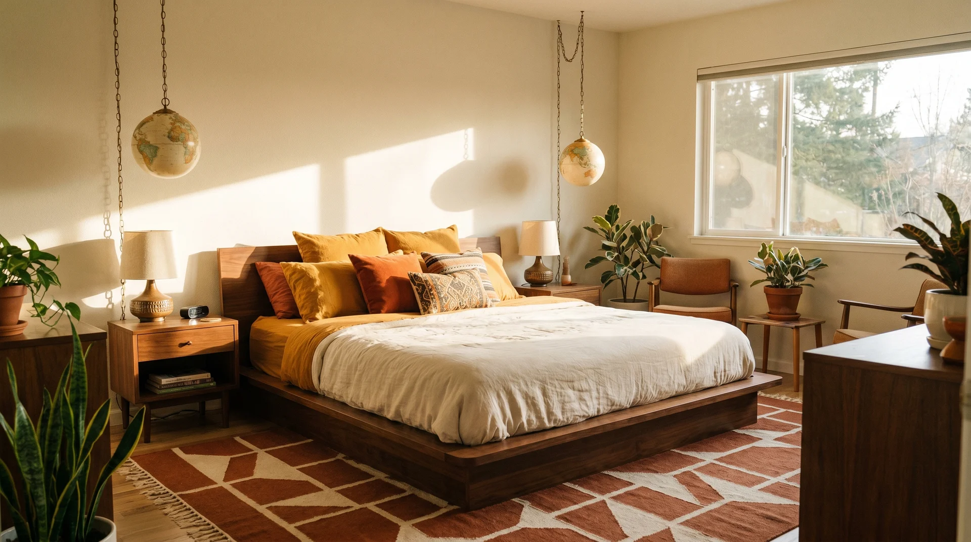
Ochre and burnt orange cushions on a warm walnut bed, cream duvet, walnut nightstands, and a geometric rug in rust and cream underfoot. Vintage-style globe pendant lights overhead. Walnut wood bridges the two tones naturally.
28. The Quiet Tonal Mustard and Orange Bedding Stack
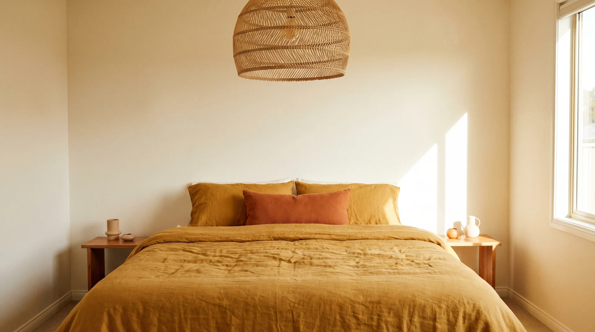
A mustard linen duvet, one burnt orange lumbar, warm wood side tables, and a woven pendant lamp. Cream walls. Warm without any sense of effort.
Burnt Orange Feature Wall Ideas: Which Walls and Which Finishes
Most content tells you to “do an accent wall” without addressing where or how to make it feel considered rather than accidental.
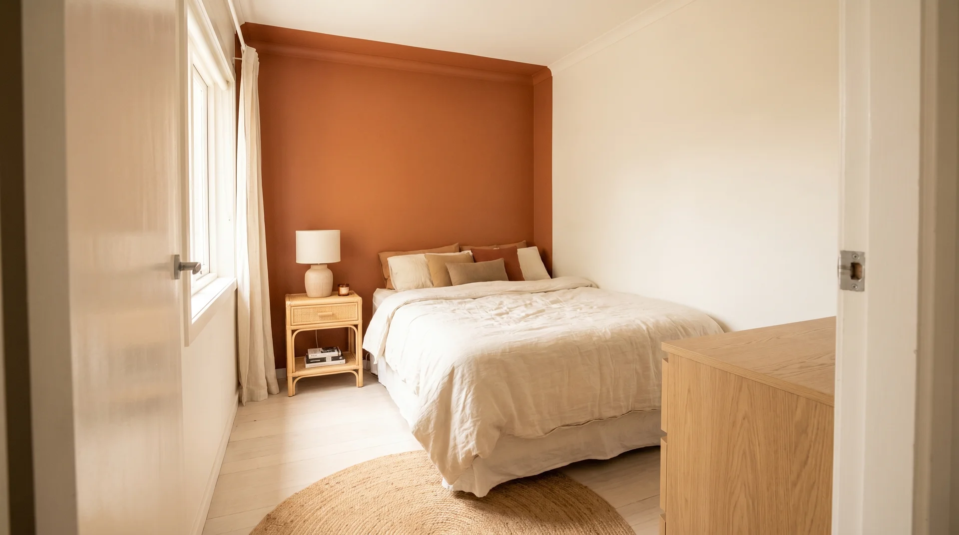
The headboard wall is almost always the right choice. It creates an immediate visual anchor when you walk into the room and frames the bed. It’s also behind you when you sleep, which addresses the stimulation concern from earlier.
Here’s how finishing changes the experience:
| Finish | Effect in Burnt Orange | Best Used For |
|---|---|---|
| Flat / matte | Soft, absorbed, earthy | Bedrooms in any orientation; most forgiving |
| Eggshell | Slight sheen, slightly more saturated | Rooms with strong natural light |
| Limewash | Textural, depth-varied, less uniform | Feature walls where texture is part of the design |
| Satin | More saturated, more reflective | Better in living areas; proceed carefully in bedrooms |
| Gloss | Highly reflective, amplified colour | Avoid bedrooms with this palette |
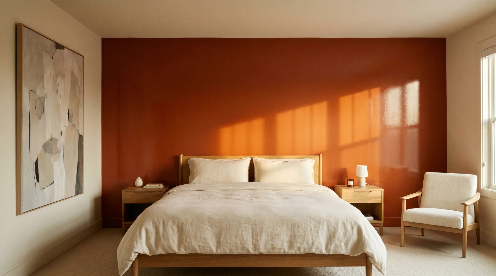
29. The Flat Matte Burnt Orange Headboard Wall
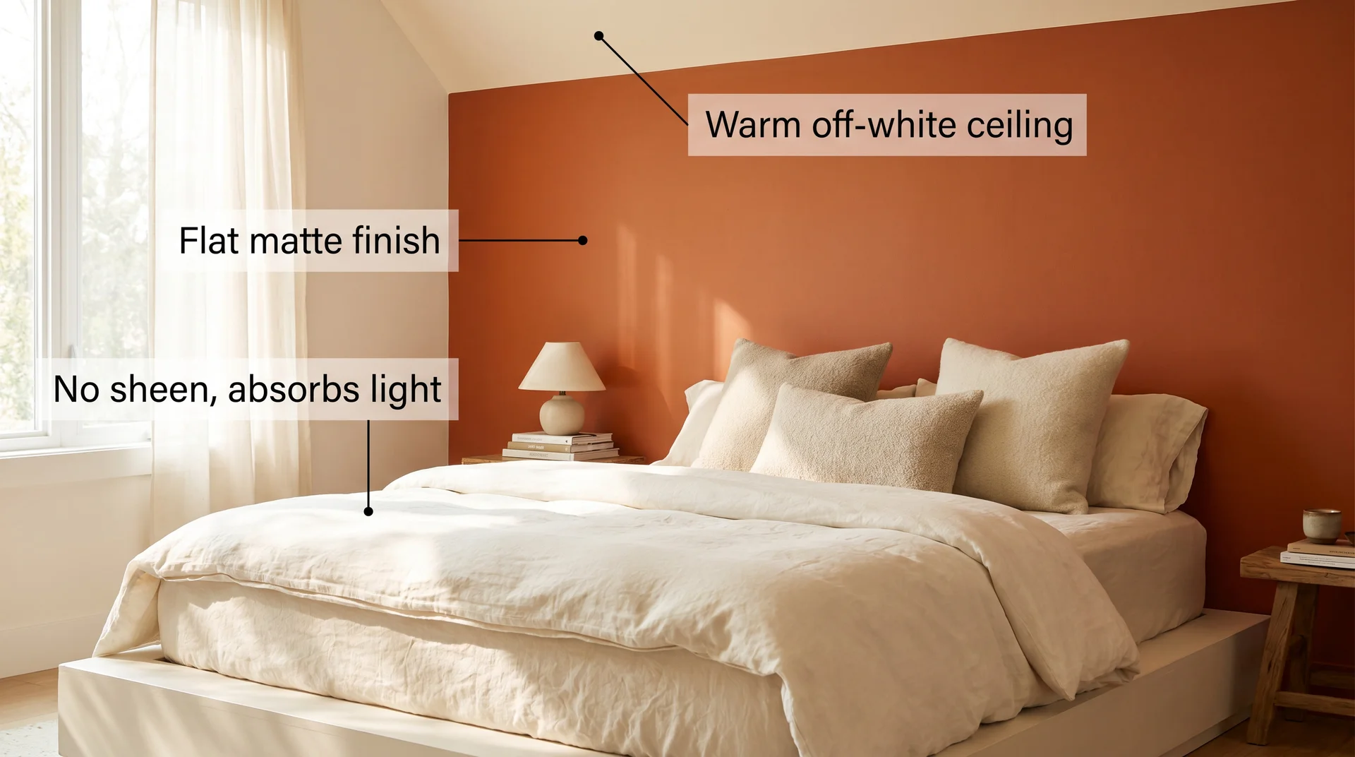
The most contained and impactful choice. Matte paint absorbs light rather than reflecting it back, which keeps the colour reading warm rather than alert-inducing. This is what I specify most often.
30. The Limewash Burnt Orange Wall
A limewash finish in burnt orange or rust creates a naturally varied surface that looks aged and considered. The variation in tone across the wall means the colour never reads as flat or overworked.
31. The Fluted Panel Feature Wall in Burnt Orange
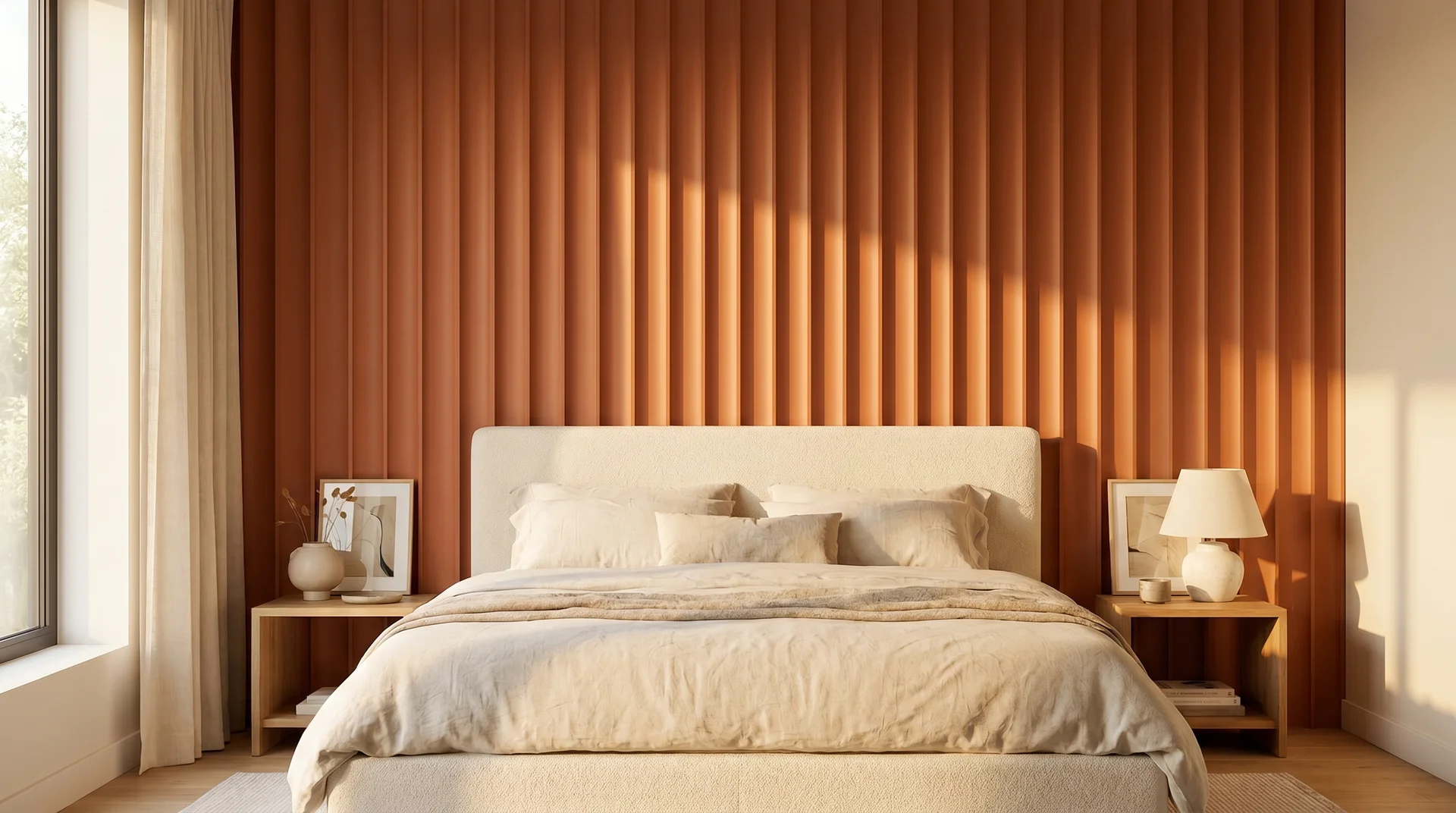
Fluted or grooved MDF panels painted in burnt orange create a sculptural wall that uses shadow to soften colour intensity. The vertical lines draw the eye upward and make the room feel taller.
32. The Burnt Orange Botanical Wallpaper Wall
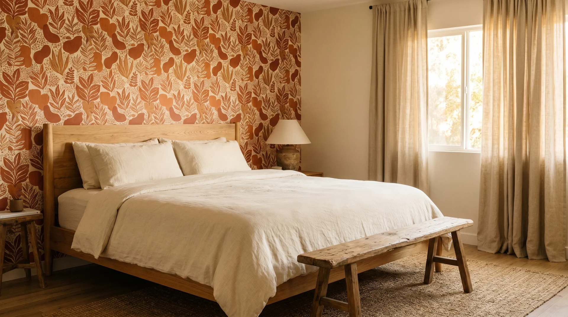
A botanical or geometric wallpaper in a burnt orange, terracotta, and cream palette functions as both the wall treatment and the primary decor element. Keep the bedding in cream, the curtains plain oat or warm white, and let the wallpaper carry the room.
33. The Half-Wall Burnt Orange Treatment with a Dado Rail
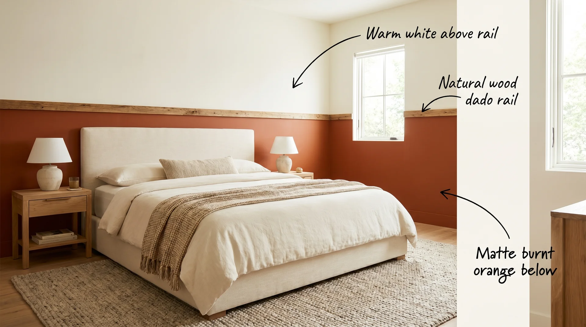
Burnt orange on the lower half of the wall, warm white on the upper half, divided by a natural wood dado rail or a clean painted line. This grounds the room with colour while keeping the upper half open. Particularly good in rooms with lower ceilings where a full painted wall would feel heavy.
Burnt Orange Bedroom Ideas for Small Bedrooms
Burnt orange works in a small bedroom. The application needs to be more deliberate.
34. Single Headboard Wall, Everything Else Neutral
Paint only the headboard wall. Keep the remaining three walls in a warm off-white. Pair with light-toned furniture, pale oak or rattan rather than dark upholstered pieces.
35. Textiles First, Paint Later
Introduce the colour through bedding before you commit to paint. A burnt orange duvet in your actual room’s light will tell you whether it reads the way you hoped.
36. The Burnt Orange Lamp Shade Test
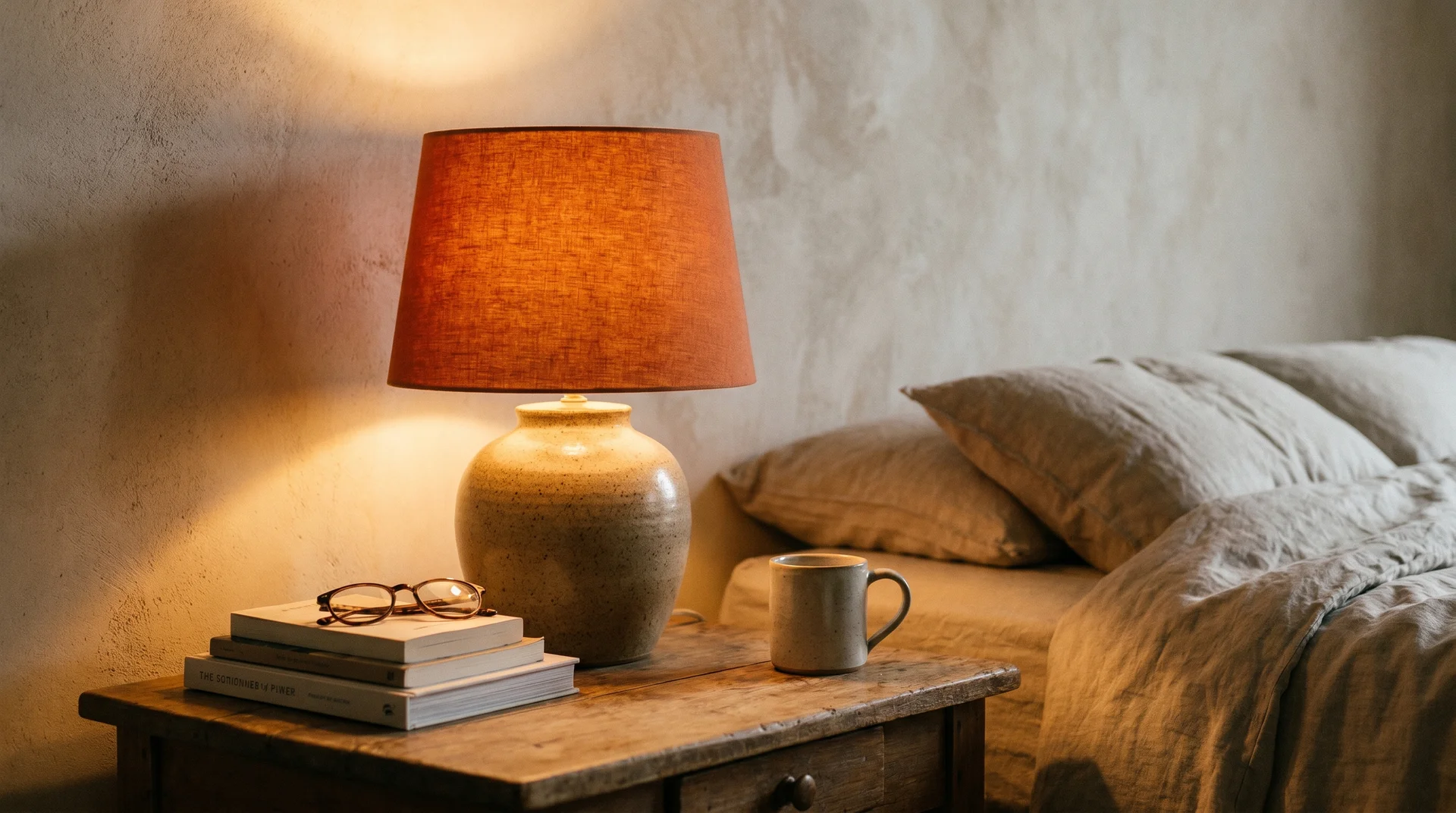
A burnt orange lamp shade is the smallest possible commitment and delivers a disproportionately warm glow. It’s where I tell nervous clients to start.
37. The Mirror Trick for a Small Burnt Orange Bedroom
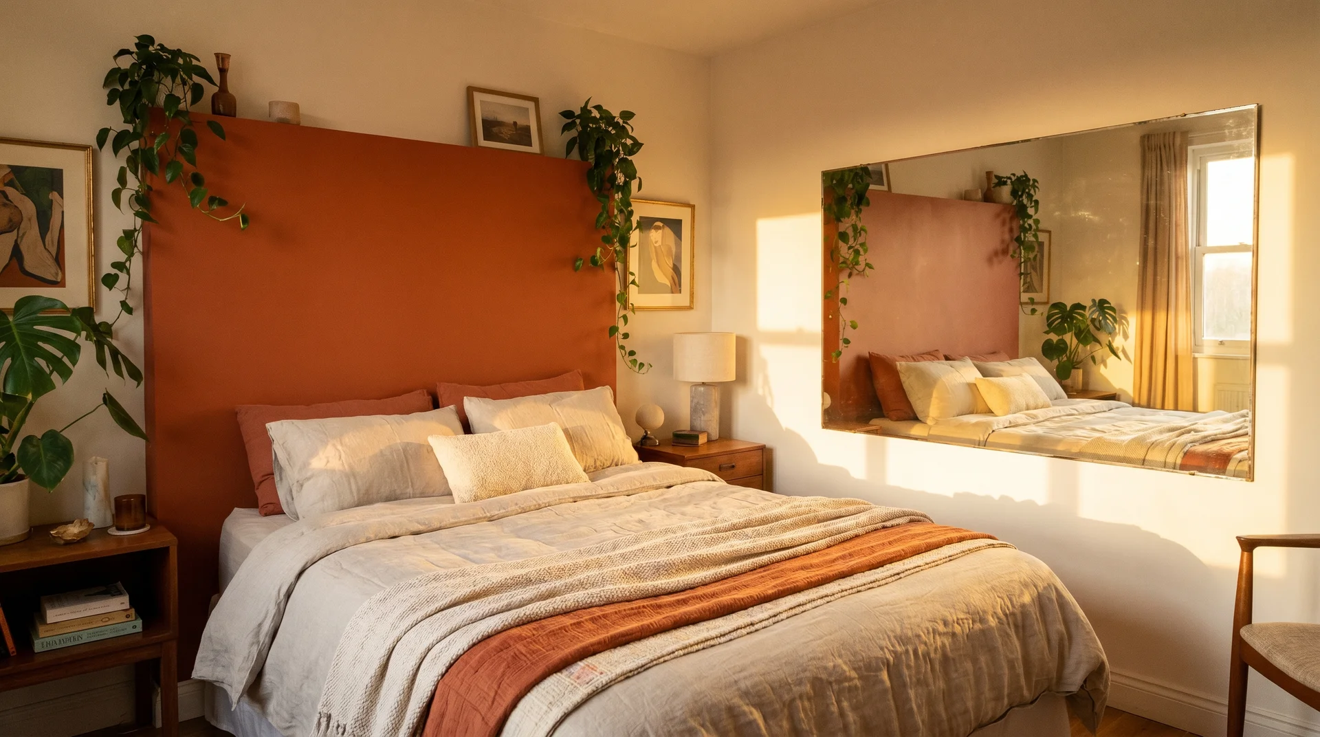
A large mirror placed on the wall opposite the colour doubles the warmth through reflection and creates depth that makes the room feel larger.
38. The Rug-Only Approach in a Small Room
A burnt orange area rug warms the space from the floor up without any commitment above waist height. Keep everything else neutral. This is the most reversible version of this look at a significant scale.
Burnt Orange Bedroom Ideas for Renters
39. Peel-and-Stick Burnt Orange Wallpaper
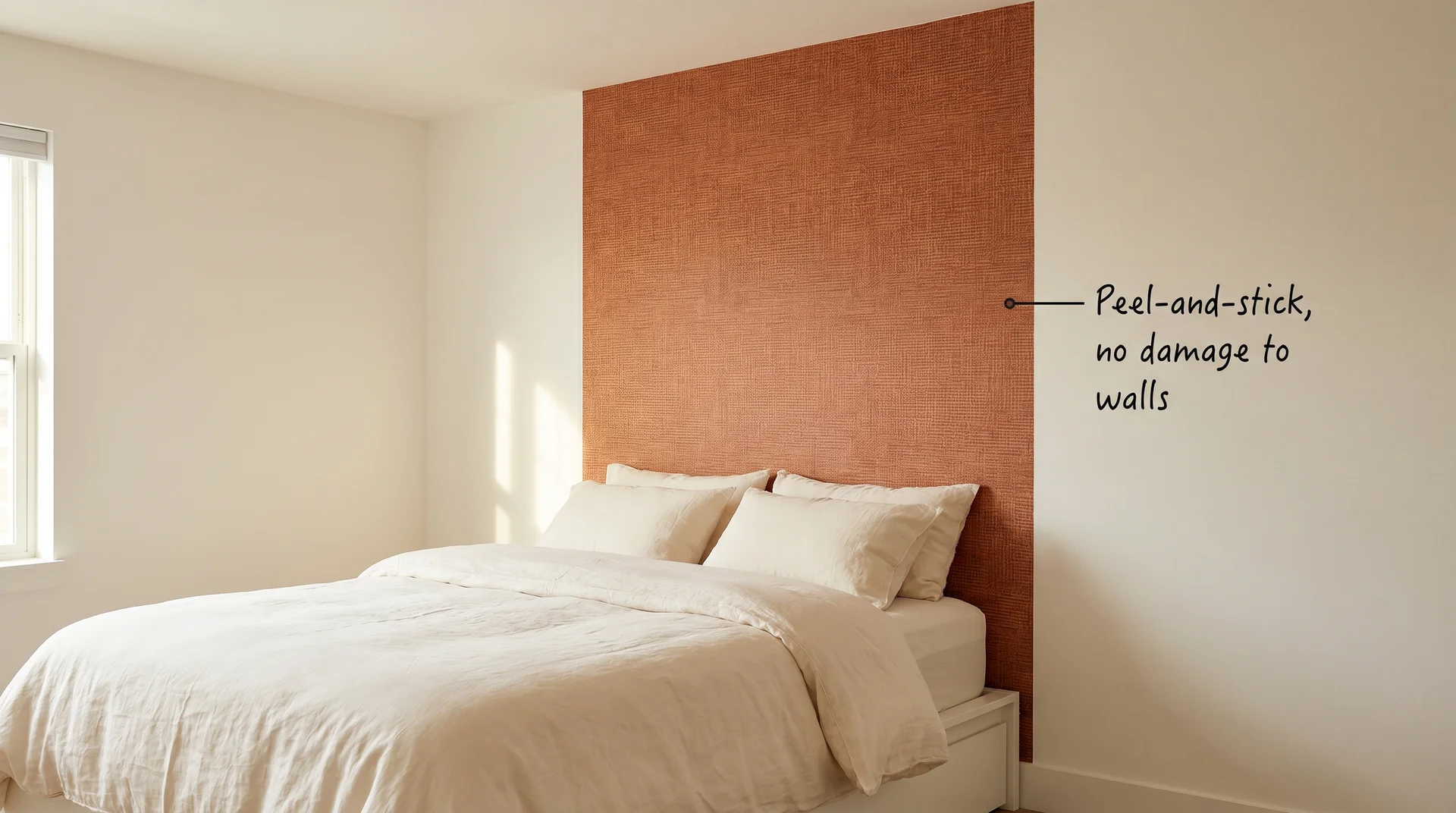
Modern peel-and-stick terracotta or burnt orange wallpaper on the headboard wall. Current quality is genuinely good, and removal is clean.
40. The Burnt Orange Duvet Cover Swap
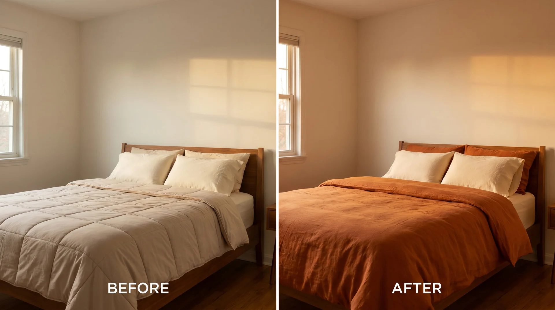
A burnt orange linen or cotton duvet cover is the single most impactful change available to a renter. Pair with cream pillowcases, not matching orange ones.
41. The Oversized Burnt Orange Art Print
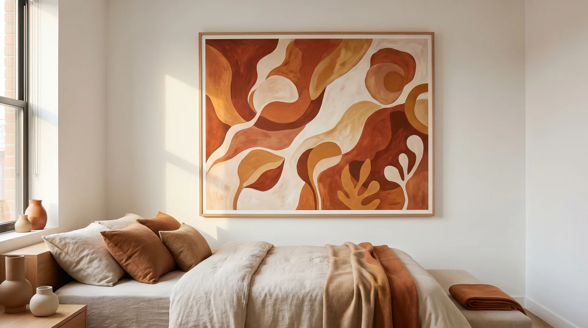
A large framed print in burnt orange, rust, and cream tones above the bed. Go larger than feels comfortable; art that’s too small in a bedroom looks more accidental than art that’s too large.
42. Burnt Orange Curtains on Tension Rods
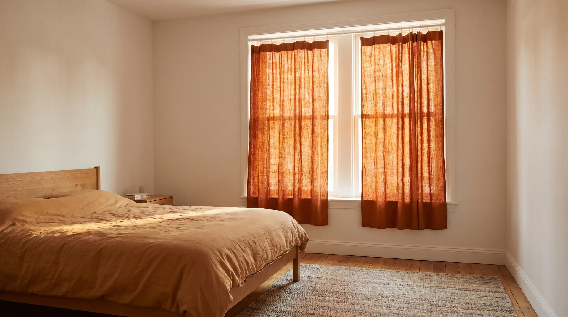
Burnt orange linen curtains on tension rods. No drilling, immediate warmth, and significantly more impact than most people expect from curtains they can remove in the morning.
Boho Burnt Orange Bedroom Ideas
Boho and burnt orange share the same earthy, globally-influenced sensibility. The risk is accumulation without curation. The best boho rooms carry a strong underlying restraint even when they look layered.
43. The Burnt Orange Canopy Bed
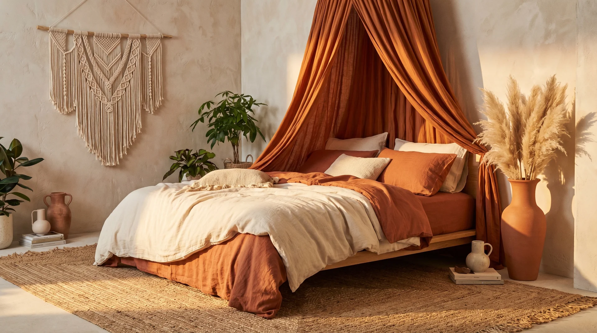
A burnt orange draped canopy over a low wooden bed, earthy linen bedding in cream and rust tones. Macramé wall hanging, pampas grass in a tall terracotta floor vase, woven jute rug. Every element belongs to the same warm, organic family.
44. The Mixed-Pattern Boho Bed
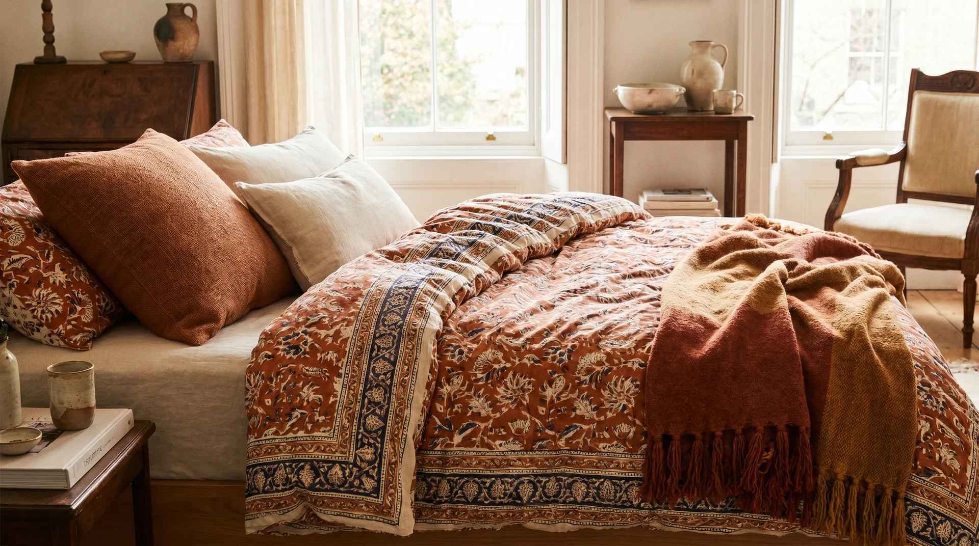
A block-print duvet with burnt orange as the anchor colour, paired with a woven cushion in plain rust and a tasselled throw. This kind of pattern mixing reads intentionally when the colours share a common undertone.
45. The Burnt Orange Floor Cushion Corner
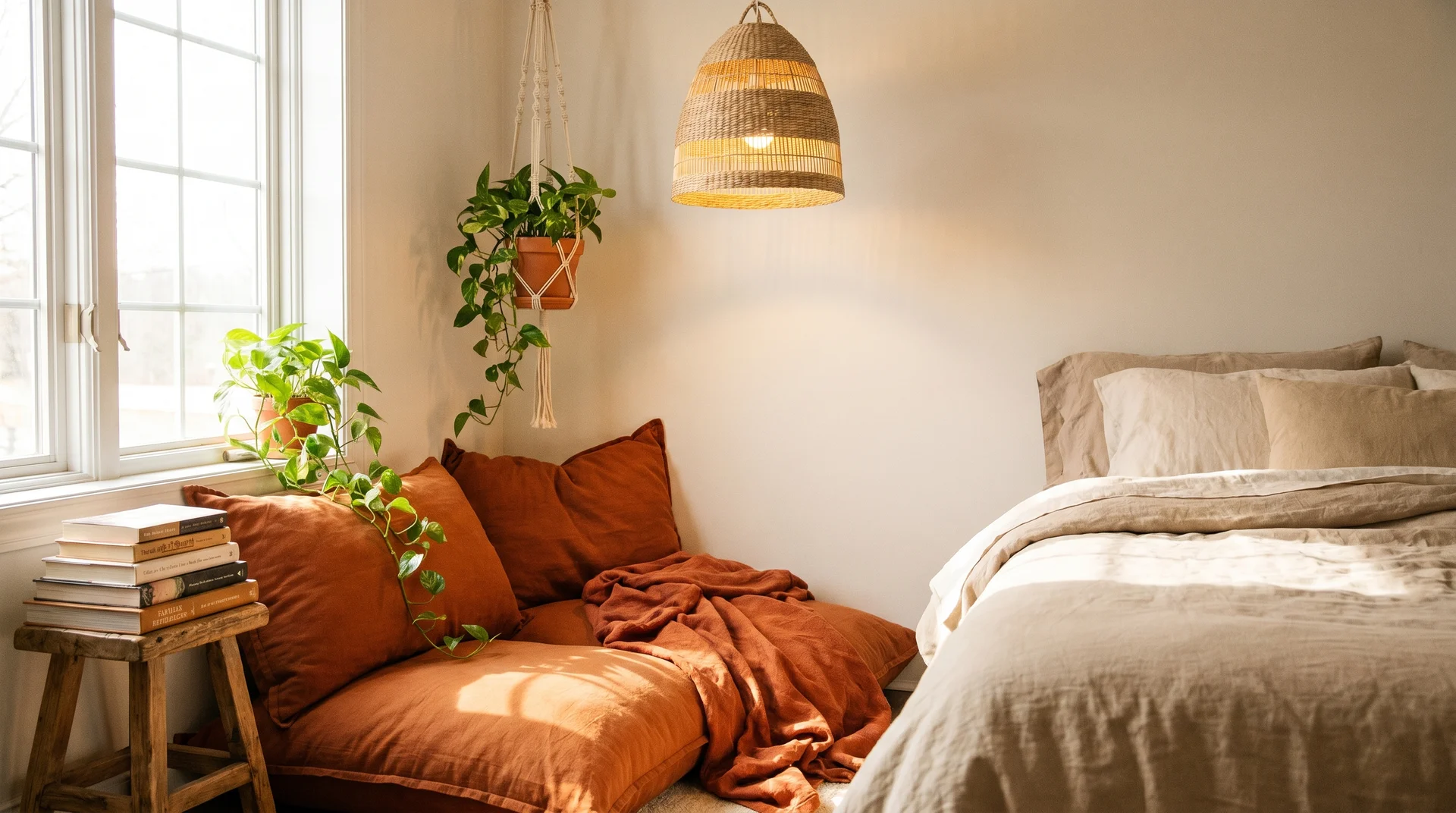
Burnt orange floor cushions in one corner styled as a reading spot, with stacked books, a trailing plant, and a woven pendant lamp. The bed stays neutral. The corner carries the colour.
46. The Sheer Terracotta Curtain Room
Sheer curtains in a terracotta or rust tone filter light throughout the day and cast a warm glow across the room. Pair with a gallery wall in earthy tones above the bed.
Luxe Burnt Orange Bedroom Ideas
This is where warmth becomes sophistication rather than just cosiness. It’s also the area TheSoulNook’s brand lives in, because warmth and luxury are not mutually exclusive.
47. The Burnt Orange Velvet Bed Frame with Brass Hardware
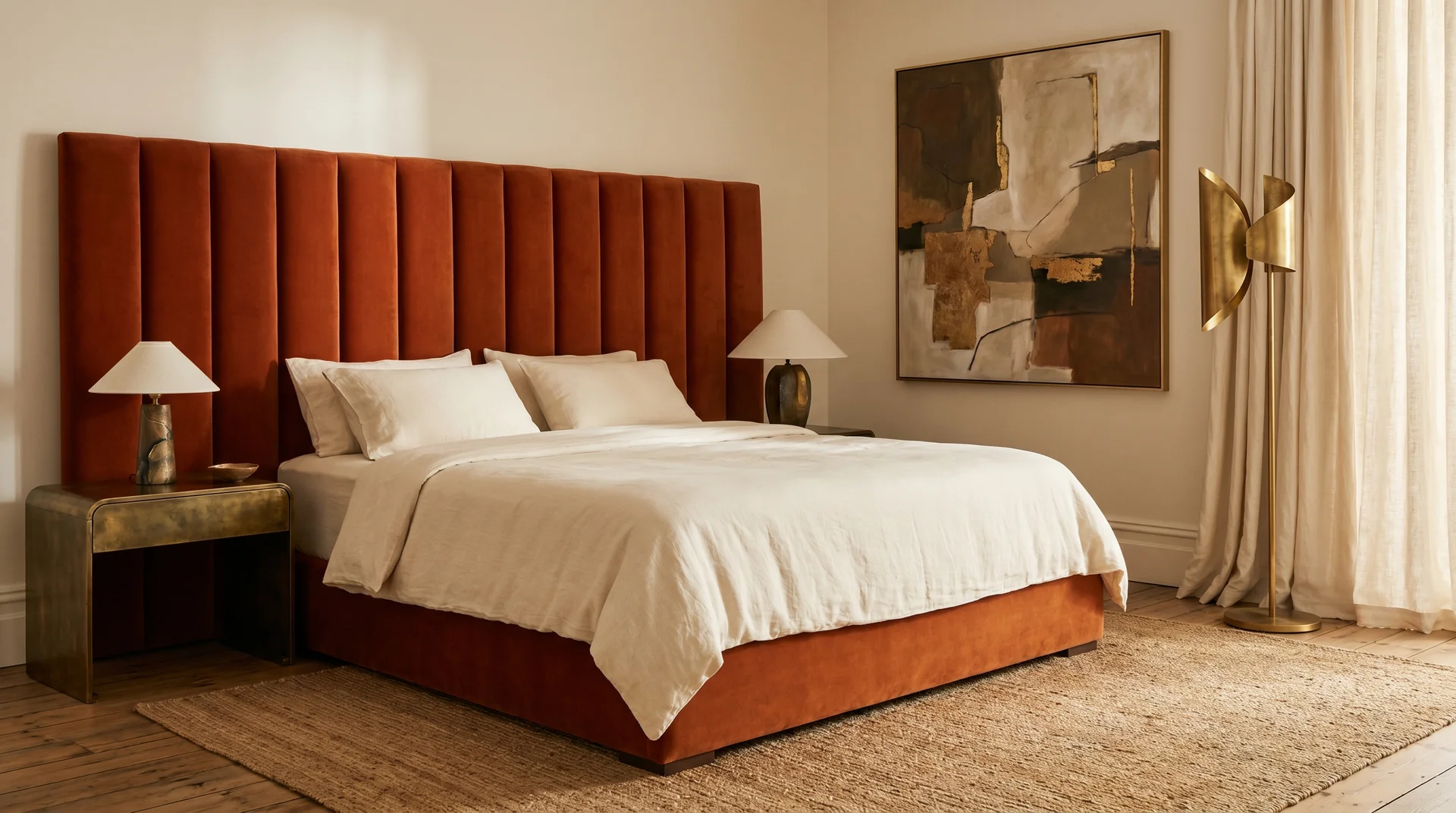
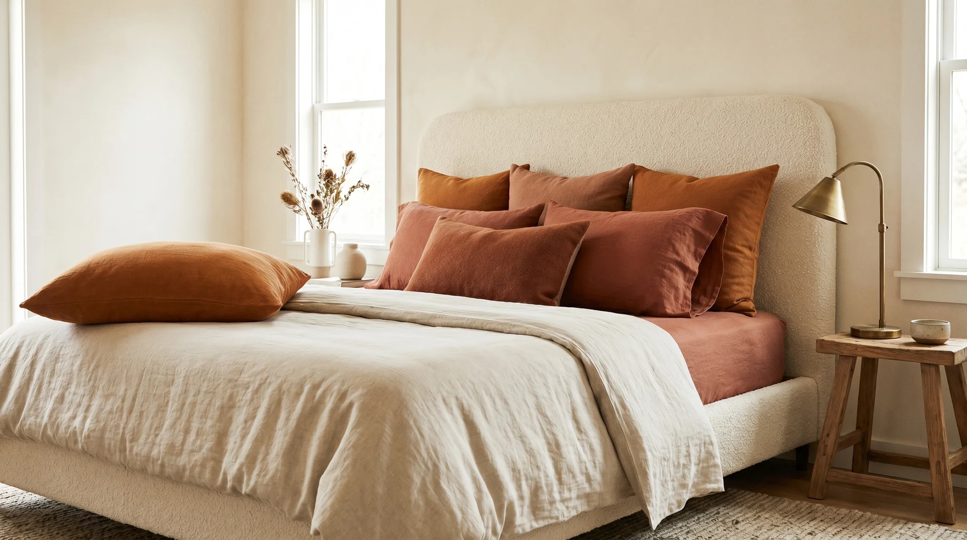
A fully upholstered burnt orange velvet bed frame with a substantial headboard, paired with antique brass bedside tables and a sculptural brass floor lamp. Cream linen bedding. One large piece of art. This room photographs like a five-star suite and lives like a personal retreat.
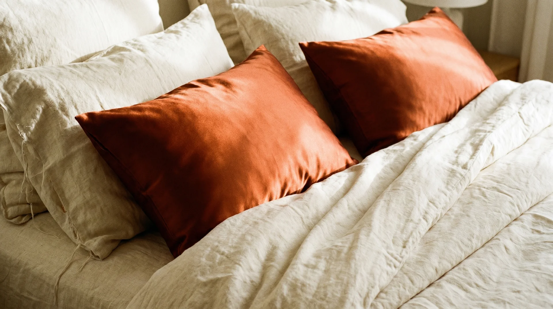
48. The Silk and Linen Cushion Contrast
Two deep burnt orange silk or satin cushions on cream linen bedding. The contrast between organic linen and polished silk creates textural luxury without requiring any additional purchases.
49. The High-Gloss Burnt Orange Feature Wall
A burnt orange feature wall in a high-gloss finish, used deliberately for its reflective, editorial quality. Every other surface in the room stays completely matte. This is not the standard advice, but in a well-proportioned room with controlled lighting, it’s extraordinary.
50. The Boutique Hotel Dark Burnt Orange Room
Burnt orange paired with dark marble surfaces, a pendant light on a long drop cord, and a deep walnut bed frame. No art. One large ceramic vase in an organic shape. This room doesn’t try to charm you.
51. The Old-World Glam Cinnamon and Cream Bedroom
Deep cinnamon-orange velvet curtains are pooling on the floor, against cream walls. An antique mirror above a marble-top dresser. Brass wall sconces on either side of the bed instead of table lamps. Cream bedding with one or two burnt orange velvet cushions.
Mid-Century Modern Burnt Orange Bedroom Ideas
The mid-century modern movement used warm autumn tones specifically because they complemented the walnut and teak woods that defined the era’s furniture. Burnt orange in a mid-century room is period-appropriate, not trend-chasing.
52. The Walnut Platform Bed with a Geometric Burnt Orange Rug
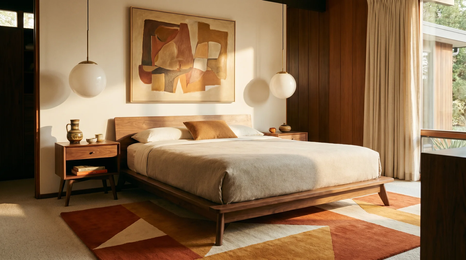
A low-profile walnut platform bed with a burnt orange and ochre geometric rug in a bold pattern. Globe pendant lights. Abstract art in warm tones above the bed. Tapered-leg nightstands.
53. The Angled Burnt Orange Upholstered Headboard
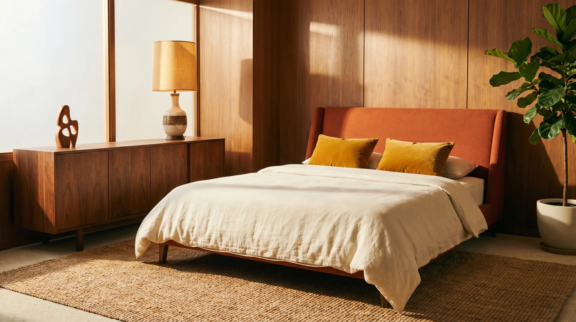
A low, slightly angled, burnt orange upholstered headboard with mustard yellow cushions and a cream duvet. A walnut credenza as the dresser, a vintage-style ceramic lamp, and one piece of sculpture. Clean, warm, and period-coherent without feeling like a recreation.
54. The Walnut Credenza as the Colour Focal Point
For rooms where the bed is already neutral, dress a walnut credenza with a burnt orange lamp, a small geometric ceramic, and a piece of abstract art leaning against the wall above it. The credenza becomes the colour moment rather than the bed.
How to Choose Burnt Orange Bedroom Paint Colors (With Specific Recommendations)
Muted and Earthy vs. Bright and Saturated: What to Look For
Paint brands use LRV (Light Reflectance Value) as a measure of how much light a colour reflects. For a bedroom, you want a burnt orange with an LRV roughly between 15 and 35 and moderate saturation.
Colours in this range feel warm without feeling aggressive. Anything higher in saturation will read closer to a true bright orange in daylight, and significantly more intense under warm evening light.
The other variable is undertone. Burnt orange shades with brown or grey undertones behave more calmly than those with red undertones, which tend to read more energetic in a room.
Specific Burnt Orange Paint Shade Recommendations
For a warm terracotta-adjacent tone:
- Sherwin-Williams Cavern Clay (SW 7701), warm, earthy, and behaves well in both natural and artificial light
- Benjamin Moore Tangy Orange (2014-30), slightly more orange-forward, works well with cream and walnut
For a deeper, richer burnt orange:
- Sherwin-Williams Roycroft Copper Red (SW 2839), deep and complex; use as a single-wall treatment rather than all four walls
- Benjamin Moore Pumpkin Pie (2169-20), warmer and more saturated; pair with cream bedding and matte black hardware
For a muted, dusty rust:
- Benjamin Moore Rust (2175-30) reads dusty and sophisticated; one of the most livable shades in this family for a bedroom
- Portola Paints warm rust formulas in limewash finish, for a naturally varied, aged surface
Finish recommendation for bedrooms: Flat or matte in all cases. If washability matters, eggshell is acceptable. Satin and gloss amplify saturation significantly in this colour family.
How Your Room’s Light Direction Changes the Colour
This matters more than most paint guides acknowledge.
South-facing and west-facing rooms receive the warmest natural light. Burnt orange glows in these rooms and can handle a slightly more muted shade because the light does some of the work.
North-facing rooms receive cooler, diffuse light. Warm colours can look muddy or brownish in them, especially in the evening. Choose a more saturated shade than your first instinct suggests, and invest in warm-toned artificial lighting to compensate. A cool LED ceiling fixture in a north-facing burnt orange bedroom will make the colour look wrong, regardless of how careful the rest of the room is.
East-facing rooms receive soft, warm morning light that suits this colour well. Mid-saturation shades work here; the light quality shifts in the afternoon and a very muted shade can become harder to read by evening.
What Goes with Burnt Orange: Color Pairings, Textures, and Metal Finishes
The Best Burnt Orange Color Combinations and Why They Work
Navy and deep blue work because they’re complementary on the colour wheel. Complementary colours sharpen each other visually, which is why a burnt orange bedding set looks more vivid against a navy wall than against a white one.
Sage green works because both colours share muted, earthy undertones. Neither is fighting to be the loudest thing in the room.
Cream and warm white function as diffusers. They soften the contrast around burnt orange and prevent it from reading as isolated or heavy. Cream bedding is almost always the right call in a room with a significant orange presence.
Charcoal and near-black provide depth. Dark colours absorb rather than compete, and burnt orange appears richer against a dark surface than against a light one.
What to avoid:
- Cool grey with blue undertones: it makes orange look garish
- Pure bright white: the contrast is too sharp, and the orange reads aggressive
- Pink or mauve tones: they create an unintentional clash with the red undertones in some burnt orange shades
- Bright yellow-green: too much visual energy in the same warm-bright register
Textures That Make Burnt Orange Look Expensive
Texture is the main variable in whether burnt orange reads as sophisticated or rough.
- Velvet deepens the colour and adds richness. It’s the single most effective textile companion for this palette.
- Linen softens and diffuses. It prevents the orange from feeling heavy and gives the room air.
- Chunky knit adds casual warmth and tactile interest. One throw, not a complete set.
- Woven rattan grounds the colour in its natural earthy context.
- Tan or cognac leather is a natural companion because it shares the warm brown-orange family.
- Avoid shiny synthetic fabrics in warm tones. Polyester velvet or synthetic satin in orange or rust tones immediately reads cheaper than the actual price.
Metal Finishes That Work with Burnt Orange
Brass and antique gold are the strongest companions. The warm, slightly aged quality of brass sits within the same earthy family and deepens the room’s richness.
Matte black provides a modern counterpoint. It stops the room from reading as purely rustic and gives it a contemporary edge.
Bronze and oil-rubbed bronze suit moody, luxurious rooms. Deeper than brass, warmer than black.
Chrome and polished silver are what to avoid. Cool-toned metals fight the warmth of the room in a way your eye registers immediately as “something’s off,” even if you can’t name what.
Furniture Placement and Bedroom Layout for Burnt Orange Rooms

This is something most burnt orange bedroom guides skip, and it matters more than the colour itself in smaller rooms.
Bed placement: If you use burnt orange on the headboard wall, position the bed so the wall is directly behind it and visible from the doorway. This makes the colour the first thing you see when you enter, which is exactly where a focal-point colour belongs. A bed pushed against a side wall rather than centred will diminish the impact of a feature wall significantly.
Furniture scale: In a room with a strong colour on one wall, furniture that’s too small looks orphaned beside it. A low, wide headboard on a full or queen bed reads better against an orange wall than a narrow, tall one. The width of the headboard should relate to the width of the wall behind it.
Mirror placement: A large mirror on the wall opposite the feature colour doubles the warmth through reflection and adds visual depth in smaller spaces. This is the easiest way to make a colourful bedroom feel larger without changing the footprint.
Dark furniture in an orange room: Dark brown furniture combined with a strongly orange room can create a muddy, heavy effect. If you have existing dark furniture, balance it with lighter textiles rather than compounding the darkness.
Styling the Burnt Orange Bedroom: Bedding, Lighting, and Finishing Touches
How to Build a Burnt Orange Bedding Layer
The most reversible and informative first step in any burnt orange bedroom project is to change the bedding. A duvet cover in this palette, placed on whatever bed you currently have, will tell you whether the colour reads the way you hoped in your actual light, how much orange you can live with, and which supporting colours work in your specific room.
Build the bedding in layers rather than buying a matching set:
- A cream or warm white fitted sheet and pillowcases, never matching orange
- One hero piece in burnt orange, either a duvet cover or a linen quilt
- Two cushions in complementary tones, cream boucle, rust velvet, or sage linen
- One throw in a contrasting texture, chunky knit if the duvet is smooth, smooth velvet if the duvet is textured
Stop there. Most over-styled beds have one too many cushions, not too few.
Lighting for a Burnt Orange Bedroom
Lighting and colour decisions are inseparable in a room with this palette.
Bulb temperature: 2700K is the sweet spot. Warm enough to deepen the earthy quality of the colour, not so warm that the room tips yellow. Anything above 3500K in a room with significant orange presence will create a colour temperature conflict your eye registers as wrong.
Layer your light sources. A single overhead fixture is never enough in a bedroom. You need an overhead source (dimmable), bedside lamps, and a floor lamp or wall sconce if the room is large enough to have a corner the bedside lamps don’t reach.
Avoid cool LED strip lighting in a burnt orange room. The colour temperature conflict is immediate and makes the orange look wrong regardless of the shade you’ve chosen.
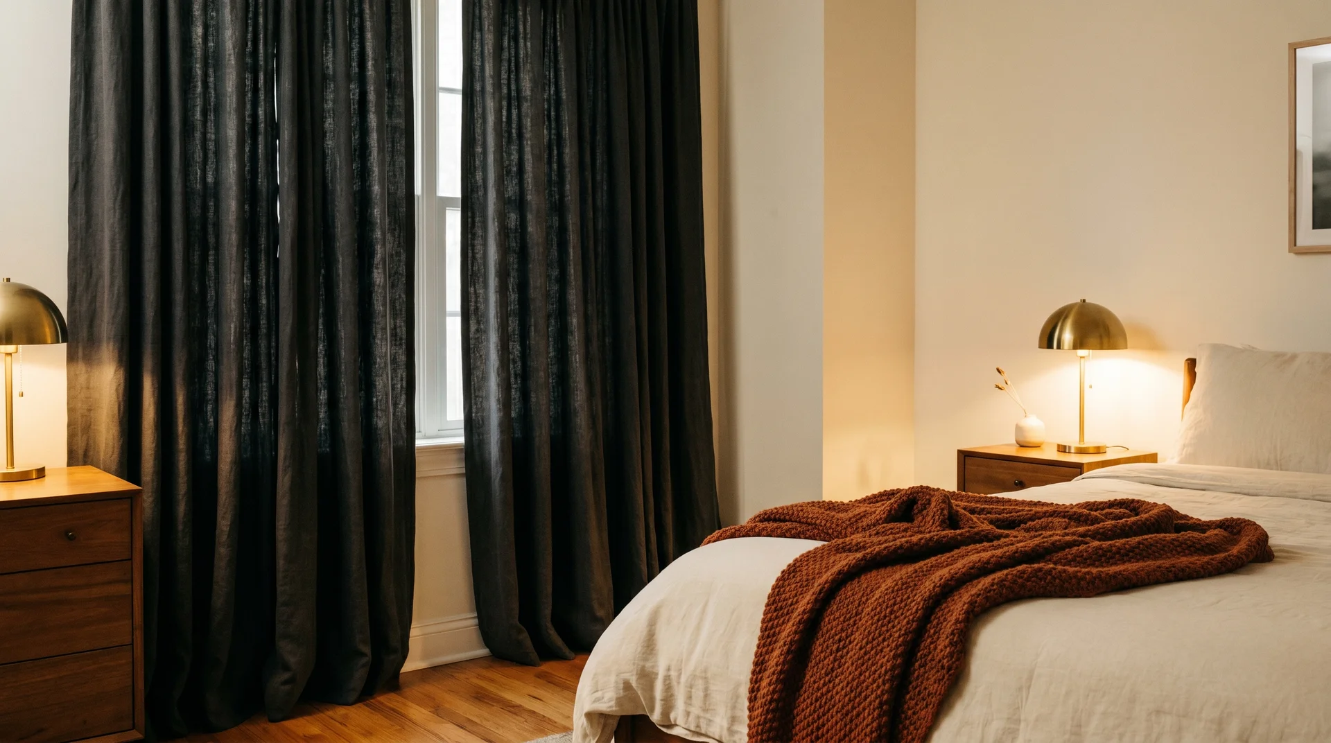
Natural light management: Use sheer curtains in cream, oat, or warm white to filter incoming daylight. Sheers in these tones warm the incoming light. Grey or blue-toned sheers cool the light and undermine everything the paint or textiles are doing.
Keeping Burnt Orange Year-Round: Seasonal Styling Tips
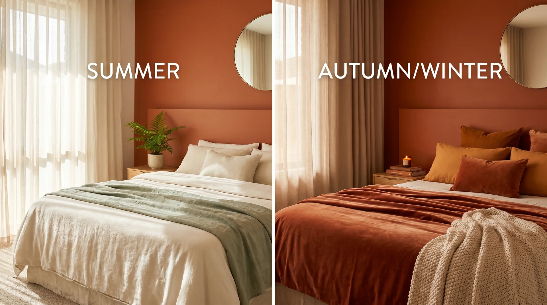
One question clients ask regularly is whether a burnt orange bedroom will feel appropriate year-round or only in autumn. The earthy, muted version of this colour reads differently across seasons without you doing anything. In summer, it reads warm and saturated against bright daylight. In winter, the same room feels cocooning.
To shift the mood deliberately across seasons without repainting:
Summer: Swap the chunky knit throw for a lightweight linen one in cream or sage. Remove heavy velvet cushions and replace with cotton or linen in a lighter burnt orange or terracotta. Keep curtains light and sheer.
Autumn and winter: Layer in heavier textures. A velvet throw, additional cushions in rust and amber, a chunky knit blanket folded at the foot of the bed. The same orange wall or bedding reads significantly warmer and more enveloping with heavier textiles around it.
This seasonal flexibility is one of the strongest arguments for this colour family in a bedroom. Very few palette choices give you the ability to shift the mood without spending anything or moving furniture.
Plants, Art, and Finishing Touches for a Burnt Orange Bedroom
Plants that suit this palette: Trailing pothos, olive trees or branches, dried pampas grass in a terracotta vase, fiddle-leaf figs in well-lit rooms. Avoid very blue-green plants like certain eucalyptus varieties, which can cool the warmth.
Wall art: Abstract prints in a warm tonal palette, amber, rust, cream, sienna. Botanical illustrations in earthy tones. Textural woven wall hangings, which add both colour and texture simultaneously. Avoid artwork with dominant cool tones in a strongly orange room.
Objects and surfaces: Terracotta pots, warm sand-toned ceramics, cognac leather-bound books stacked on a bedside table, wooden trays in walnut or teak. These objects contribute to the palette without calling attention to themselves, and that unobtrusiveness is what keeps the room feeling warm rather than decorated.
What to Shop for a Burnt Orange Bedroom by Budget
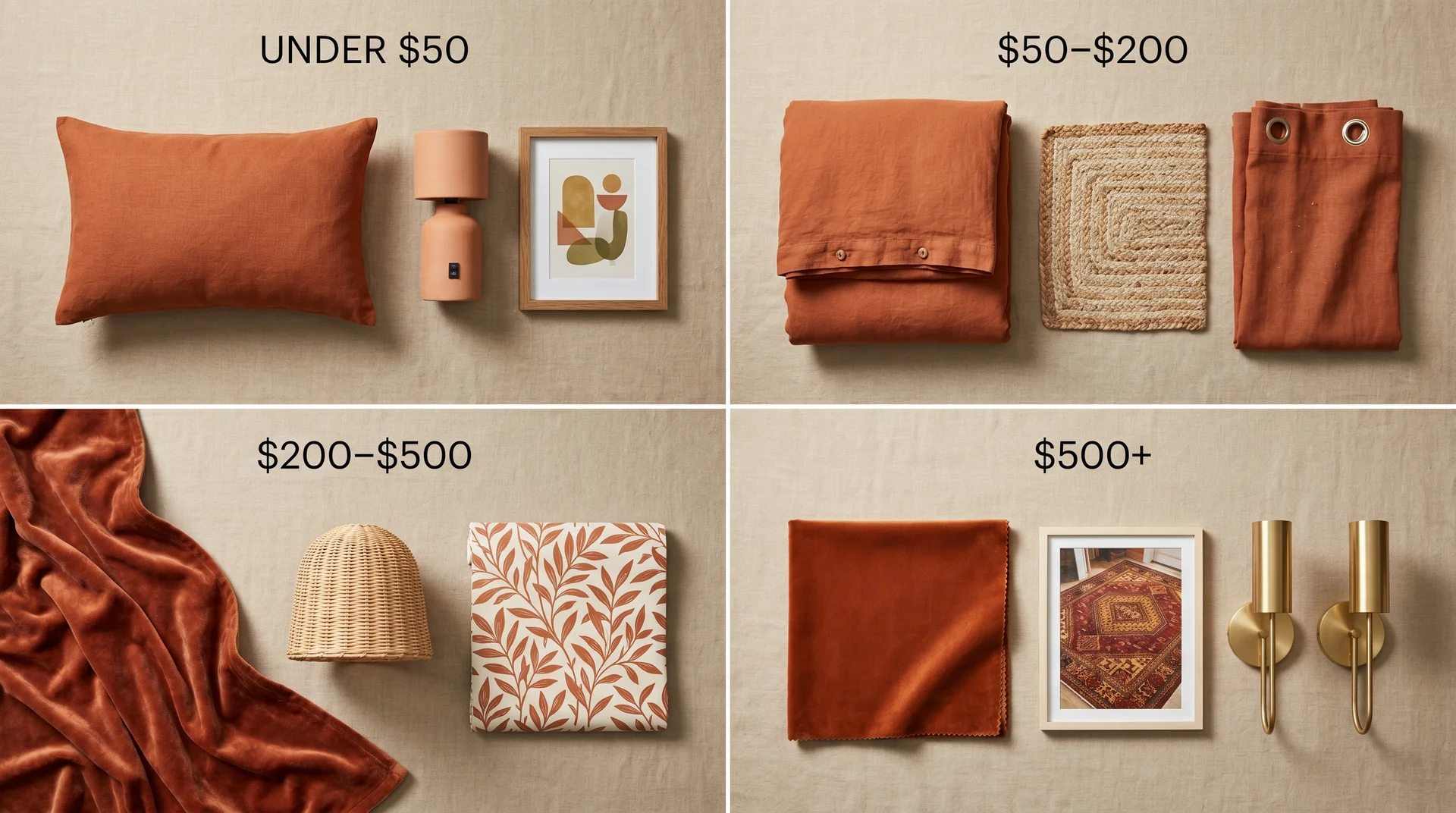
You don’t need to overhaul the room to feel the difference. Here’s where the colour has the most impact at different price points:
Under $50: A burnt orange linen lumbar cushion, a terracotta ceramic lamp base, and a single oversized art print in earthy tones in a thin brass frame.
$50–$200: A burnt orange duvet cover in linen or cotton, a woven jute or sisal area rug, burnt orange linen curtains on a simple rod.
$200–$500: A velvet throw in a deep rust or burnt orange, a rattan pendant light or bedside lamp, a peel-and-stick botanical wallpaper panel for the headboard wall.
$500 and up: An upholstered headboard in burnt orange velvet (the single most transformative piece in this palette), a statement area rug in a navy and orange geometric pattern, a set of antique brass wall sconces.
Frequently Asked Questions
Is burnt orange a good color for a bedroom?
Yes, when you use a muted, earthy version of it in a flat or matte finish. The saturated, high-chroma version does not belong in a bedroom where sleep is the priority. The shades that perform best are closer to terracotta than true orange.
What colors go best with burnt orange in a bedroom?
In order of reliability: cream and warm white, navy and deep blue, sage green, charcoal. Beyond these, mustard and ochre work when treated as tonal companions rather than competing bold colours.
Is burnt orange the same as terracotta?
Related but different. Terracotta leans dustier and more muted. Burnt orange is warmer and more saturated. The two overlap significantly in practice, particularly in paint shades like Cavern Clay.
Can burnt orange work in a small bedroom?
Yes. Use it on the headboard wall only, or through textiles. Keep the remaining walls in a warm off-white, choose lighter-toned furniture, and add a large mirror if the room allows.
Will burnt orange go out of style?
The versions that lean closest to terracotta and earth tones tend to hold up longer than those that read as obviously orange. No palette is immune to the trend cycle, but muted earthy tones age more gracefully than saturated statement colours.
What shade of burnt orange is best for bedroom walls?
Sherwin-Williams Cavern Clay for a terracotta-adjacent, widely liveable tone. Benjamin Moore Burnt Sienna for something dustier and more complex. Sherwin-Williams Roycroft Copper Red for a deeper, more committed treatment.
Does burnt orange work in a north-facing bedroom?
It works with deliberate management. Choose a more saturated shade than your instinct suggests, use warm-toned artificial lighting at 2700K throughout, and avoid cool-toned materials in the room.
A Final Note
The client I mentioned at the start of this article still has that bedroom. She called me two years after we finished it, not to change the room, but to ask whether the same palette would work in her sitting room.
That’s what a well-used warm colour does. It makes you want to carry that feeling into every other room in the house. There’s something about surrounding yourself with a colour that belongs to harvest light and terracotta pots and worn cognac leather that feels genuinely restorative in a way that a grey bedroom rarely manages.
You don’t have to commit to four walls. Start with a throw, or a rug, or a lamp shade with a warm glow. Pay attention to how it makes you feel in your actual room at seven in the evening with your lights on.
If it makes the space feel like the kind of place you want to come back to, you’ll know what to do next.
