
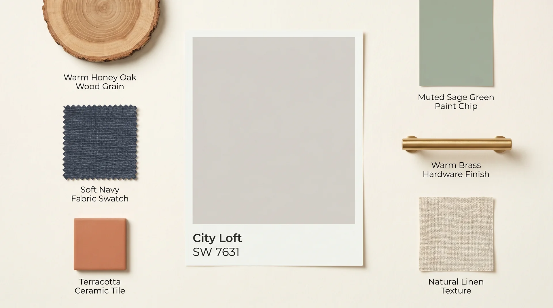
City Loft SW 7631 is a warm greige from Sherwin-Williams with a hex value of #D4C9BC and an LRV of 69, sitting between soft beige and cool gray depending on the light it’s under and what it’s painted next to.
It’s not a true white, and it’s not a straightforward beige. Whether it works in your room depends on two things: your light exposure and your trim color.
I’ve recommended this color in more rooms than I can easily count. I’ve also fielded calls from people who chose it based on a small chip and ended up with a result that looked nothing like what they expected. What I cover here is what the chip won’t tell you.
| This review covers Sherwin-Williams City Loft SW 7631 specifically. Glidden also produces a color called City Loft Gray, which is a different paint with different specifications. If you found a Glidden result in your research, they aren’t interchangeable. |
What Color Is City Loft, Exactly?
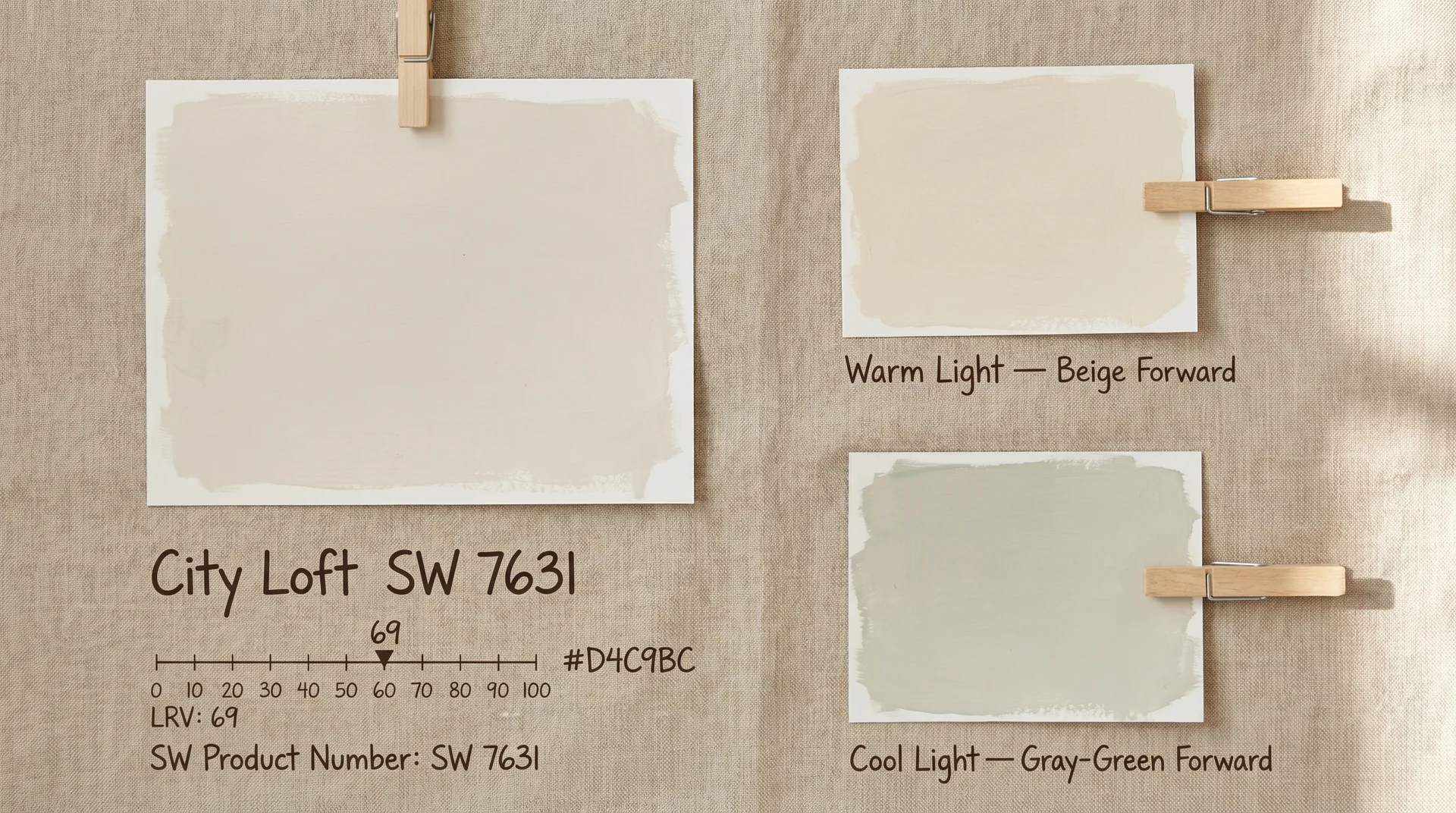
City Loft SW 7631 is a warm, greige-leaning off-white with an LRV of 69, classified by Sherwin-Williams within the white color family.
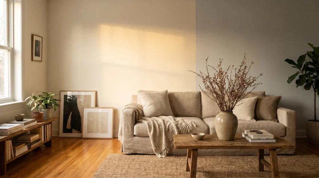
That classification is broad. City Loft reads considerably warmer and richer than most colors people associate with white. It carries enough depth to shift noticeably as the light in your room changes across the day.
City Loft’s LRV and What It Means for Your Space
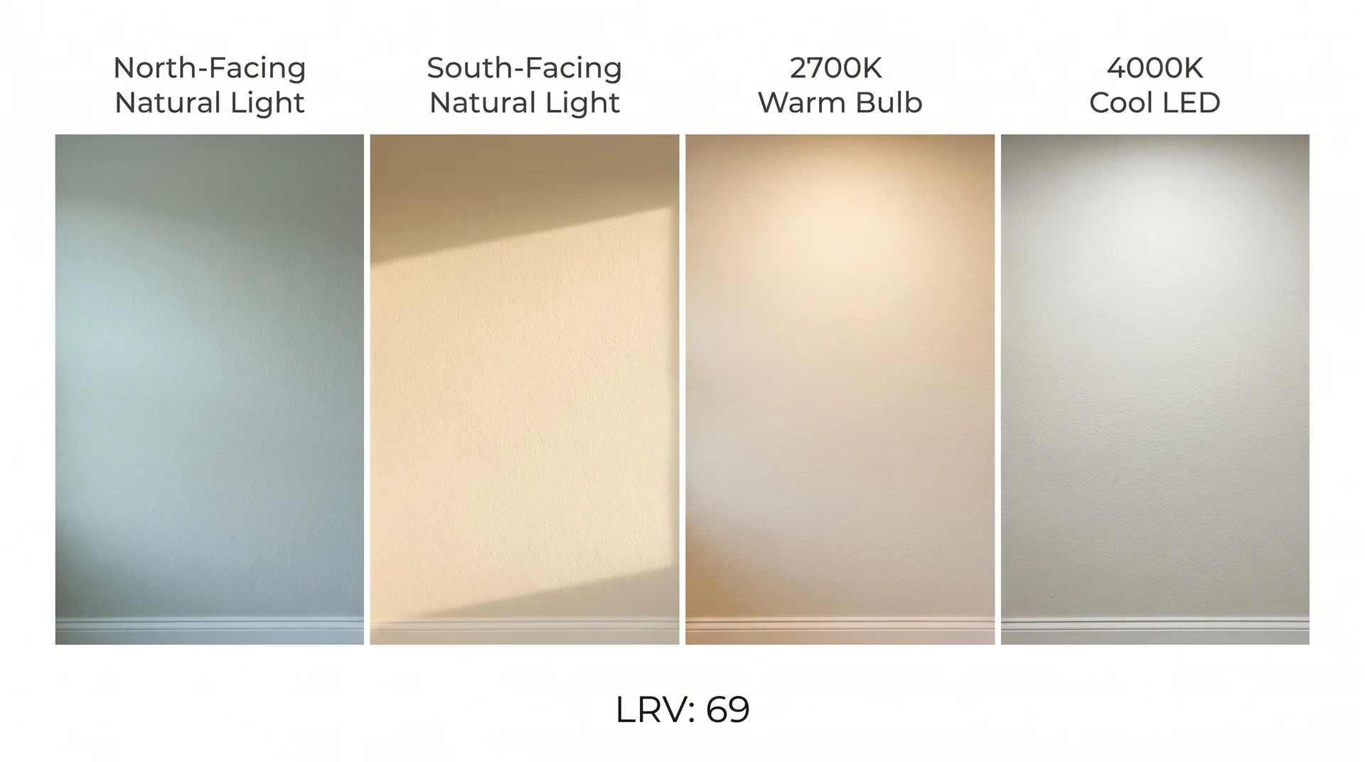
An LRV of 69 means City Loft reflects a meaningful amount of light, but it sits notably darker than most paint colors people think of as white.
LRV runs from 0 (pure black) to 100 (pure white). Colors widely understood as white typically land at LRV 80 and above. At 69, City Loft is light enough to keep a room feeling open, but dark enough that a small or low-light room will feel cozier with it than with a brighter white. In some rooms, that quality is exactly what you want. In others, it’s worth knowing about before you commit.
City Loft’s Undertones: Beige, Gray, or Both?
City Loft has a dual undertone system: warm beige in warm or direct sunlight, and cool gray-green in low or cool-spectrum light.
This is the question that comes up constantly in design forums. The honest answer is that City Loft does both. The light in your room determines which one reads first.
Under warm south-facing light, the beige comes forward, and City Loft looks like a clean, creamy off-white. Under north-facing light or cool artificial bulbs, the gray-green base activates, and the color reads noticeably cooler than the chip suggested. This isn’t a flaw. It’s how complex neutrals behave.
But it’s also why sampling on your actual wall, under your actual light, matters more with City Loft than it does with a simpler warm beige or cool gray.
How City Loft Behaves in Different Light
Light is the single variable that determines whether City Loft delivers what the swatch promises.
It can look like three different paints in three different rooms of the same house. That’s not a flaw in the color. It’s the nature of every complex neutral, and City Loft’s dual undertone system makes it more sensitive to light conditions than simpler colors are.
North-Facing Rooms
In north-facing rooms, City Loft shifts toward its cool gray-green undertone and stays there for most of the day.
North-facing rooms receive indirect, bluish light throughout the day with no direct sun. That cool spectrum suppresses City Loft’s warm beige tones and activates the gray base. The result looks considerably cooler than the version you fell for on Pinterest, which was almost certainly photographed in a south-facing room under warm light.
Lighting recommendation for north-facing rooms: 2700K bulbs or warmer. If you’re installing recessed lights or sconces in a north-facing space, that warm color temperature will push City Loft back toward the version you liked on the chip. Anything cooler pushes it further into the gray register.
Honestly, a north-facing room is where I’d tell someone to seriously consider whether a slightly warmer base color would require less management. City Loft here demands more deliberate lighting decisions than it does in a south-facing space.
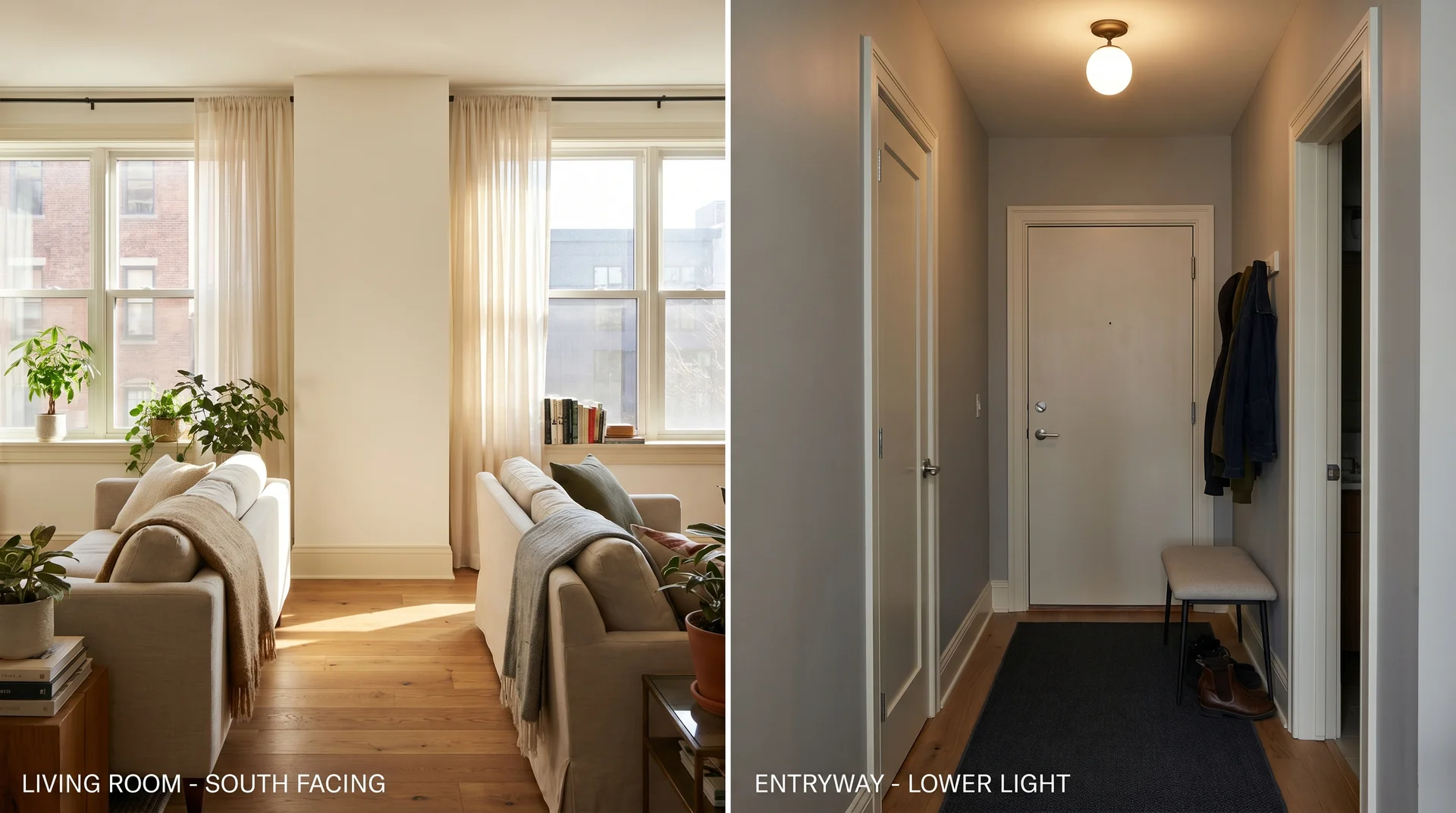
South-Facing Rooms
South-facing rooms are where City Loft performs exactly as advertised.
Warm direct sunlight for most of the day activates the beige undertone, and the color reads as a refined, warm off-white with enough depth to feel layered rather than flat. In strong afternoon sun, City Loft can lean slightly golden.
Most people find that quality pleasant. If you prefer a cooler neutral, that warmth buildup in late afternoon may tip the balance toward a different color choice.
Artificial Light: Warm Bulbs vs. Cool LEDs
The color temperature of your artificial lighting can shift City Loft as significantly as the room’s orientation does.
Warm bulbs in the 2700K to 3000K range push the color toward soft, creamy beige. Cool bulbs in the 4000K to 5000K range activate the gray-green undertone and can make City Loft look flat and cold, particularly in smaller rooms.
I’ll be direct here: predicting exactly how much a color shifts under a specific bulb in a specific room isn’t something anyone can do accurately from a description. The interaction between wall color, ceiling tone, flooring reflectance, and light source creates combinations that even experienced colorists evaluate in person.
This is where sampling does the work that no review can do for you. Which is also a good reason to keep reading to the sampling section before you order a quart.
City Loft in Different Rooms
City Loft has a clear performance range, and knowing where it lands in your room type saves a repaint.
Its LRV and dual undertone system create real differences across room types. Here’s where it earns its reputation and where it needs support.
Living Rooms and Open-Plan Spaces
Living rooms and open-plan spaces are where City Loft consistently delivers its best results.
Large rooms benefit from the color’s complexity. City Loft reads slightly differently across walls depending on which direction each surface faces, creating a sense of dimension that a simpler warm white wouldn’t achieve.
In open-plan spaces, it’s forgiving enough to work alongside a range of cabinet finishes, flooring tones, and furniture materials.
One trade-off worth naming: if your open-plan space has predominantly cool-toned finishes (gray cabinetry, concrete counters, stainless appliances), City Loft can look warm and slightly incongruent against those surfaces.
It works best when there’s at least one warm anchor in the room, whether that’s wood flooring, natural fiber upholstery, or warm-toned hardware.
Bedrooms
City Loft works well in most bedrooms.
In south or east-facing bedrooms, the warmth reads as restful rather than sterile. In north-facing bedrooms, the guidance from the light section above applies directly: warm-spectrum bulbs at 2700K maintain the color’s intended character.
Keep the lighting warm, lean toward natural textiles and wood tones, and City Loft does what you need it to do.
Kitchens and Dining Areas
Kitchens require one specific caution: under-cabinet LED task lighting.
This is the same gray-green undertone sensitivity covered in the light section, showing up in a different context. Task lighting typically runs cooler than ambient overhead lighting.
In kitchens where City Loft is on the walls, cool LED light aimed at the counter surface can pull the gray-green base forward on the lower portion of the wall in a way that reads uneven. The effect is subtle, but worth testing before you paint.
I’ve seen this catch people off guard more than almost any other City Loft scenario. The upper half of the wall looks warm and cream-toned; the lower half shifts noticeably grayer under the task lights.
If your kitchen has warm-toned wood cabinetry, City Loft works beautifully. If you’re running a cooler palette with white or gray shaker cabinets and stainless steel appliances, a cleaner off-white may serve you better.
Entryways and Hallways
Entryways and hallways are the highest-risk spaces for City Loft, and this is the room type I’d ask you to think hardest about before committing.
These areas typically receive less natural light than the main living spaces. With an LRV of 69, City Loft can make a narrow hallway feel smaller and darker than a brighter white would. If your entryway has good natural light and warm-toned flooring, it can still work.
For interior hallways with no windows, a color with an LRV of 75 or higher will serve you considerably better, and that’s a question worth asking before you start looking at coordinating color schemes.
What Colors Go With City Loft?
The trim color adjacent to City Loft has more influence over how the paint reads than the paint’s own undertones do.
Most people spend time picking accent colors and furniture finishes before they’ve sorted out the trim. With City Loft specifically, that’s the wrong order. Get the trim right first, and everything else follows more easily.
Trim Colors: What Works and What Doesn’t
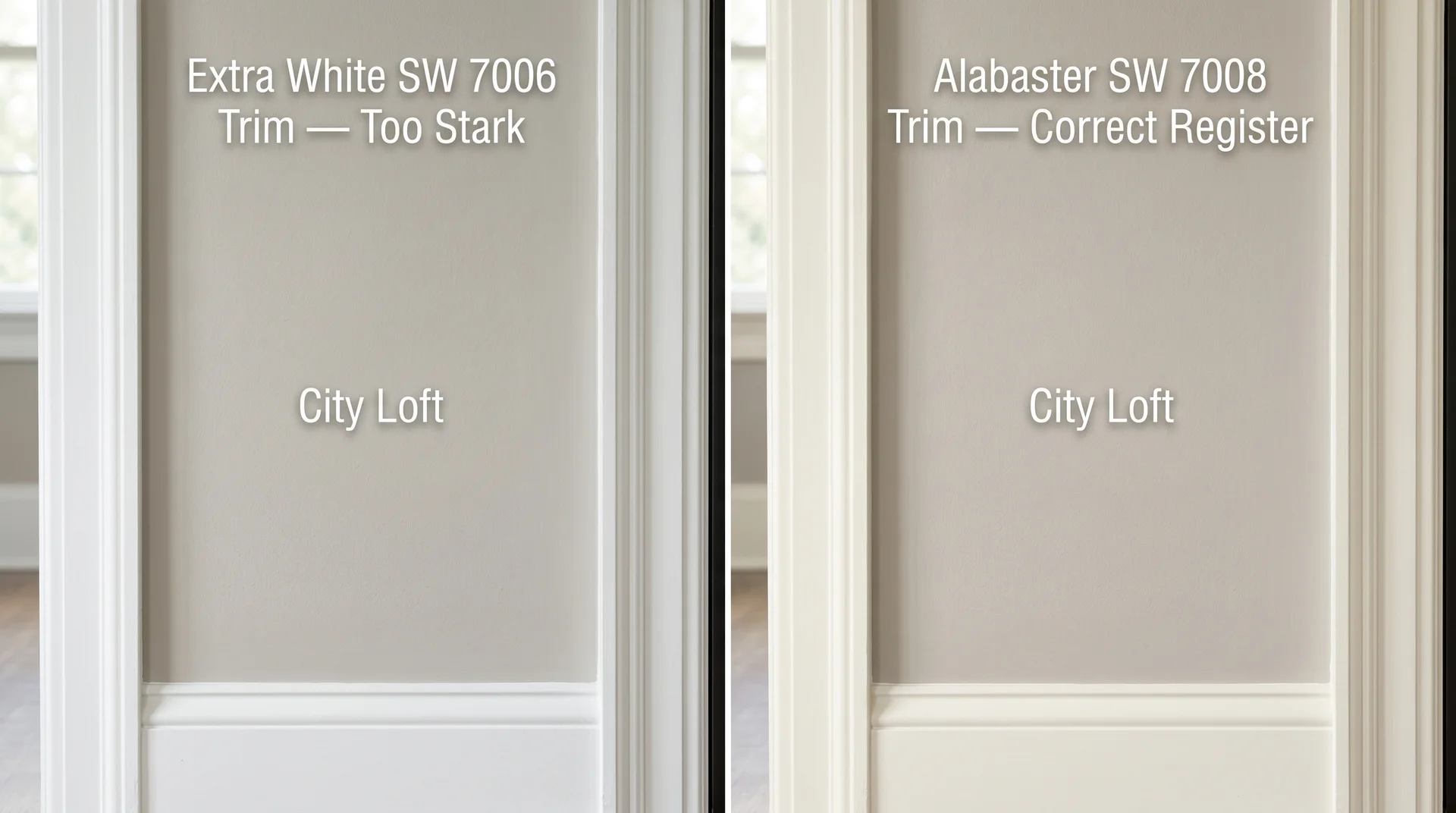
Bright white trim next to City Loft is the most common mistake I see with this color, and it’s one that leads to repaints.
When City Loft walls sit next to a clean, bright white like Pure White SW 7005 or Extra White SW 7006, the contrast makes the wall color look warmer and faintly dingy. The trim wins the comparison, and City Loft ends up looking like an accident rather than a choice. The solution is a trim color in the same warmth register as City Loft itself.
Trim colors that work well with City Loft:
- Alabaster SW 7008: The strongest pairing in most rooms. Warm enough to complement City Loft, different enough to read as intentional trim definition. This is the one I reach for first. If you’re choosing a trim color alongside City Loft, start here.
- Navajo White SW 6126: Works particularly well in rooms with warm wood floors and natural textiles. Slightly more pronounced cream tone.
- Antique White SW 6119: A warmer option that suits south-facing rooms without looking overdone. More richness than Alabaster.
If you already have bright white trim and aren’t planning to repaint it, test a large City Loft sample directly against your actual trim before committing. Some rooms handle the contrast fine. Others don’t.
Accent and Furniture Colors
City Loft coordinates with warm, earthy, and muted tones. Colors that work naturally alongside it:
- Warm navy and soft teal: Deep enough to anchor the room without competing with City Loft’s warmth. One of the more reliable combinations in living spaces. A solid deep navy on a single accent wall, something like Iron Ore SW 7069, or a warm charcoal, reads particularly well against City Loft’s soft beige base.
- Terracotta and rust: Natural partners for the beige undertone. These work especially well in rooms with warm wood floors, where the palette reads cohesive rather than busy.
- Sage green: The muted green tone echoes City Loft’s gray-green secondary undertone and creates coherence across the palette rather than contrast.
- Warm camel and tan leather: Reinforces the warm register without adding unnecessary contrast.
Stark black and cool charcoal can both work as furniture finishes, but they read better against City Loft when a warm wood tone somewhere in the room bridges them.
Flooring Pairings
Warm honey oak and medium walnut floors are City Loft’s most natural flooring partners.
The beige undertone in the paint echoes the warm tones in those wood species, and the two reinforce each other without competing. Cooler gray-toned LVP or light ash hardwood can activate City Loft’s gray undertone and shift the whole room cooler than you intended. The pairing can still work, but it changes what City Loft becomes in that space.
City Loft vs. Agreeable Gray: The Honest Comparison
City Loft and Agreeable Gray are both warm greiges from Sherwin-Williams, but they don’t behave the same way, and they don’t suit the same rooms.
The confusion is understandable. Both sit in the same general neutral territory, both are staples in American residential design, and from a small chip, they look nearly identical.
The differences become clear on walls in real light, and this is a decision worth making carefully, since they’re among the most-compared colors in the category. For a deeper look at how Agreeable Gray performs on its own terms, the full Agreeable Gray guide covers it in the same depth as this review.
| Attribute | City Loft SW 7631 | Agreeable Gray SW 7029 |
|---|---|---|
| LRV | 69 | 60 |
| Primary Undertone | Beige-gray with gray-green secondary | Warm gray with beige base |
| Light Behavior | Shifts notably from warm beige to cool gray | Stays consistently warm gray across most light |
| Best Rooms | South/east-facing rooms, open plans | Most orientations, including north-facing |
| Trim Pairing | Off-white or creamy trim; bright white is risky | Tolerant of both bright and off-white trim |
| Overall Register | Lighter, airier, more complex | Richer, more grounded, more predictable |
City Loft is lighter by nine LRV points, which is a meaningful real-world difference. In the same room, City Loft feels noticeably airier. Agreeable Gray feels more grounded and tends to hold its character across more variable light conditions.
City Loft is the more interesting color. Agreeable Gray is the more forgiving one. Which quality matters more depends entirely on your rooms.
If you want something that behaves consistently throughout a house with mixed light exposures, Agreeable Gray is the more reliable choice. If you want something lighter and more layered, and you’re prepared to manage the trim and the lighting, City Loft rewards that attention.
City Loft vs. Drift of Mist
Drift of Mist SW 9166 is cooler and distinctly grayer than City Loft, with considerably less beige in its base.
If you’re comparing these two, you’re drawn to soft, complex neutrals but haven’t decided on the warmth level. Choose Drift of Mist if your room already runs warm, if you have pronounced warm wood tones throughout, or if you want the result to read clearly gray rather than greige.
Choose City Loft if you want the color to lean warm and airy rather than cool and gray. These two colors rarely serve the same room equally well; the comparison usually answers itself once you’ve sampled both.
Which Sheen Should You Choose for City Loft?
Sheen affects how City Loft reads on the wall almost as much as the light source does.
The right sheen by room type:
- Eggshell: Living rooms and bedrooms. Enough reflectivity to keep the color alive without making wall imperfections visible. The default choice for most interior walls.
- Satin: Kitchens, bathrooms, laundry rooms. More cleanable, slightly more reflective. In lower-light spaces, the added sheen can pull the gray undertone forward, so factor that in alongside the task lighting consideration covered earlier.
- Flat or matte: Ceilings only. On walls, flat finishes absorb light in a way that makes City Loft’s LRV feel heavier and darker than it actually is.
Exterior sheen selection is a separate conversation. UV exposure, surface prep, and climate variables all factor into exterior application, and that belongs in a different article.
Before You Commit: How to Sample City Loft Properly
Most people sample paint incorrectly, and City Loft is the kind of color that punishes imprecise sampling more than most.
A small chip held up in a store aisle tells you almost nothing about how this color will read at scale under your actual light. The sampling process below takes maybe 24 hours and will tell you more than any review can.
Getting a Sample That Actually Shows You the Color
You need a minimum 12-by-12-inch sample on your actual wall to evaluate City Loft accurately.
Samplize peel-and-stick samples for City Loft are available in that size, eliminating the need to buy a quart just to test. A quart and a foam brush work equally well. What matters is the size of the sample, not the method. A small test patch in the corner of the room is genuinely not an evaluation; it’s a guess with a paint chip.
How to Evaluate the Sample on Your Wall
Place the sample on at least two different walls: one that faces toward the window and one that faces away from it.
City Loft looks measurably different on a light-receiving wall versus a wall in shade, and you live with both every day. Evaluating only the best-lit wall gives you an incomplete picture of what you’re about to put in your home.
- Apply or adhere the sample to two different walls in the room.
- Look at it at three different times of day: morning, midday, and evening under your artificial lights.
- Hold or tape a chip of your trim color directly against the sample. This is the step most people skip, and as covered above in the trim section, it’s the one that matters most.
- Evaluate it with the room’s furniture and flooring visible, not in an empty room. Adjacent surfaces affect the read more than most people expect.
- Give yourself at least 24 hours before deciding. First impressions of paint samples are genuinely unreliable.
Is City Loft Still Worth Choosing?
City Loft is a genuinely excellent color in the rooms it suits and a genuinely difficult one in the rooms it doesn’t.
It performs best in well-lit south or east-facing spaces with warm-toned floors, off-white trim, and warm-spectrum artificial lighting. In those conditions, it delivers exactly what the inspiration photos suggest.
Put it in a dark hallway, next to bright white trim, under cool LEDs, and it looks like a mistake. That’s not a failure of the color. It’s a mismatch between the color and the conditions.
If City Loft’s light-sensitivity concerns you but you want something in a similar warmth register, Accessible Beige SW 7036 behaves more predictably across mixed light exposures, with a slightly warmer and more consistent character throughout the day.
Check your room’s light exposure, trim color, and flooring tone against what this review covers before you buy. Sample correctly. City Loft will either confirm itself as the right choice or point you somewhere more suitable, and either outcome is the right result.
