
The first time I recommended Urbane Bronze to a client, she hesitated. It looked nearly black on the chip, and she was convinced it would make her living room feel like a cave. Three weeks after painting, she sent me a photo with three words: “I was wrong.” That is Urbane Bronze in a nutshell. It earns trust slowly, and then completely.
Sherwin-Williams named SW 7048 its Color of the Year for 2021, and the choice made sense. Urbane Bronze sits at the intersection of warmth and depth in a way that very few dark colors manage. It reads like a sophisticated neutral rather than a dramatic statement, which is exactly why designers keep reaching for it years after the trend cycle has moved on.
This guide covers everything you need to know about Urbane Bronze: what it actually looks like in a room, how light changes it, where it works best, and what colors to use alongside it.
What Color Is Urbane Bronze?
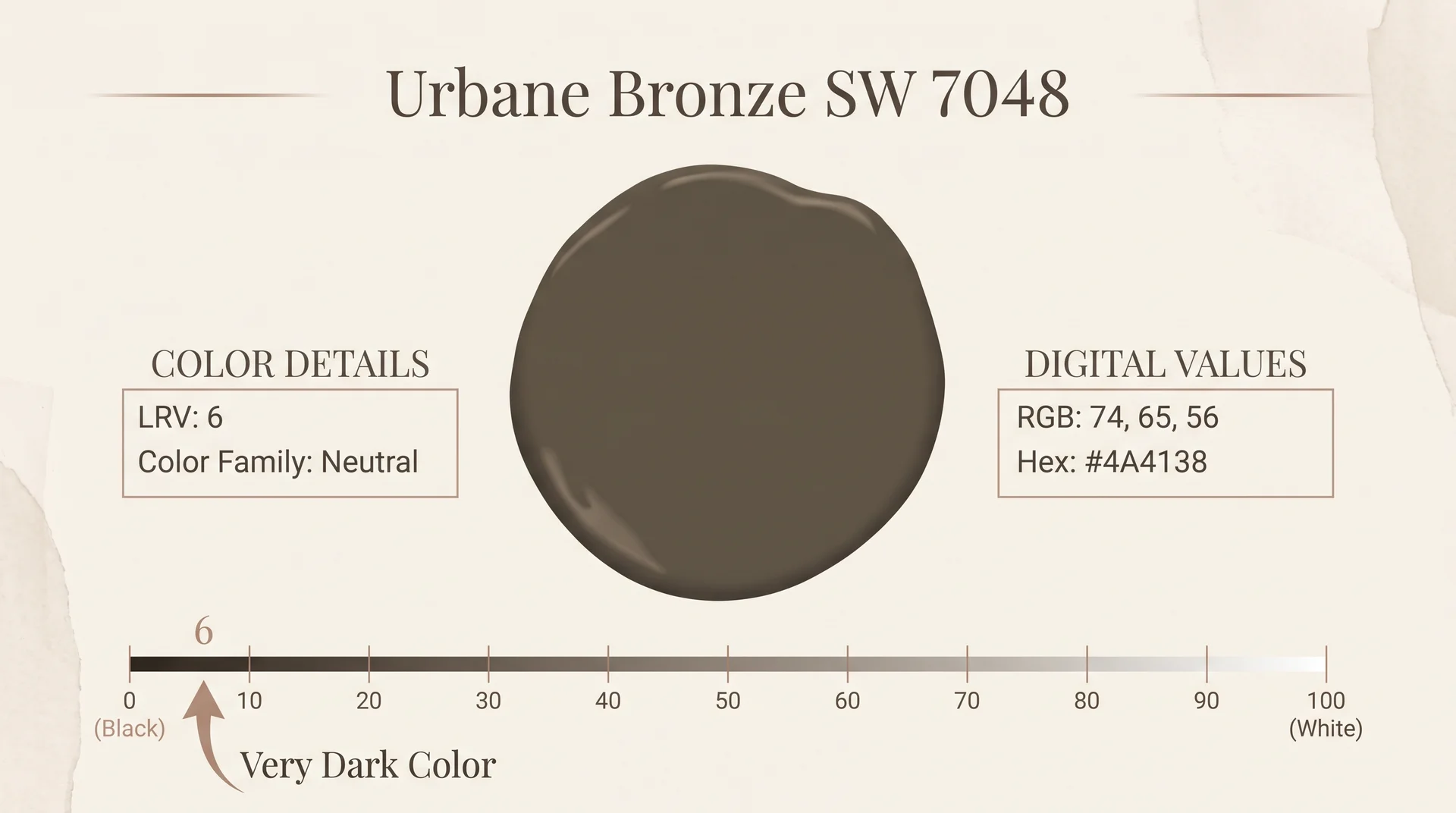
In plain terms, Urbane Bronze is a dark, warm brown-gray paint color with an LRV of 6 and visible brown undertones that shift toward gray in lower light. Sherwin-Williams classifies it as a neutral, but it behaves like a rich earth tone in most interiors.
Urbane Bronze (SW 7048) sits closer to charcoal on the value scale, but the warmth in its base keeps it from reading as a cool gray or a true black. Most people who see it in a room describe it as a very dark taupe or a brownish charcoal.
Its Light Reflectance Value (LRV) is 6, which places it firmly in the deep end of the color spectrum. For context, pure white has an LRV of 100, and pure black has an LRV of 0. At 6, Urbane Bronze absorbs most of the light that hits it, which is exactly what gives it that grounded, enveloping quality.
Here are the core color specs for Urbane Bronze:
- Sherwin-Williams number: SW 7048
- LRV: 6
- RGB: 74, 65, 56
- Hex: #4A4138
- Collection: Pottery Barn
- Color family: Neutral
Despite landing in Sherwin-Williams’ neutral family, Urbane Bronze behaves more like a rich earth tone in practice. It has a weight and depth that purely gray-based neutrals do not, and that quality is what makes it feel so intentional in a space.
Urbane Bronze Undertones
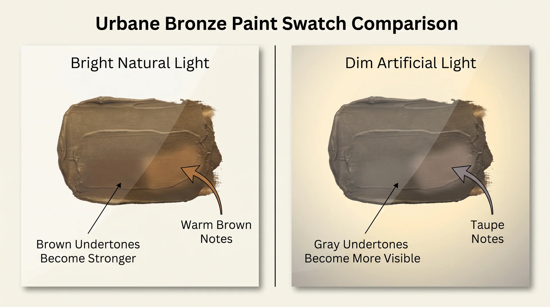
Urbane Bronze carries warm brown undertones with a subtle taupe quality underneath. In most lighting conditions, the brown reads clearly. The gray component keeps it from veering into territory that would read as chocolate or walnut, and the overall effect is a color that hovers between the two without committing to either.
In strong natural light, the brown undertones intensify, and the color reads noticeably warmer. In low light or artificial light, the gray component becomes more dominant, and the color deepens toward something closer to charcoal. Neither reading is unflattering. Both are exactly what you would want from a dark neutral.
The undertones matter most when you are pairing Urbane Bronze with white trim or an adjacent wall color. Cool whites with blue or green undertones will create a visual tension that most rooms do not need. Warm whites work with it naturally.
How Light Affects Urbane Bronze
Urbane Bronze is one of those colors that shifts meaningfully across the day, and understanding those shifts will help you decide where and how to use it.
North-facing rooms receive cool, indirect light throughout the day. In these spaces, Urbane Bronze will lean toward its gray component and feel cooler and heavier. This is not necessarily a problem. A north-facing bedroom or study can carry this color beautifully, especially with warm lighting fixtures and natural wood furniture to balance it.
South-facing rooms receive warm, bright light for most of the day. In these spaces, Urbane Bronze glows. The brown undertones emerge fully, and the color reads as a rich, sophisticated earth tone rather than a dark neutral. South-facing rooms give Urbane Bronze its best possible showing.
East-facing rooms receive warm morning light and cool afternoon light. Urbane Bronze will shift noticeably between these two conditions, which can be striking rather than inconsistent if you expect it.
West-facing rooms are the reverse: cool in the morning and warm in the afternoon and evening. Urbane Bronze tends to look its best in west-facing spaces during the hours most people actually spend time in them.
I always recommend getting a large sample board, at least 12 inches by 12 inches, and moving it around the room at different times of day before committing. A standard paint chip is too small to show you what 6 LRV actually looks like on a wall.
Urbane Bronze Complementary Colors
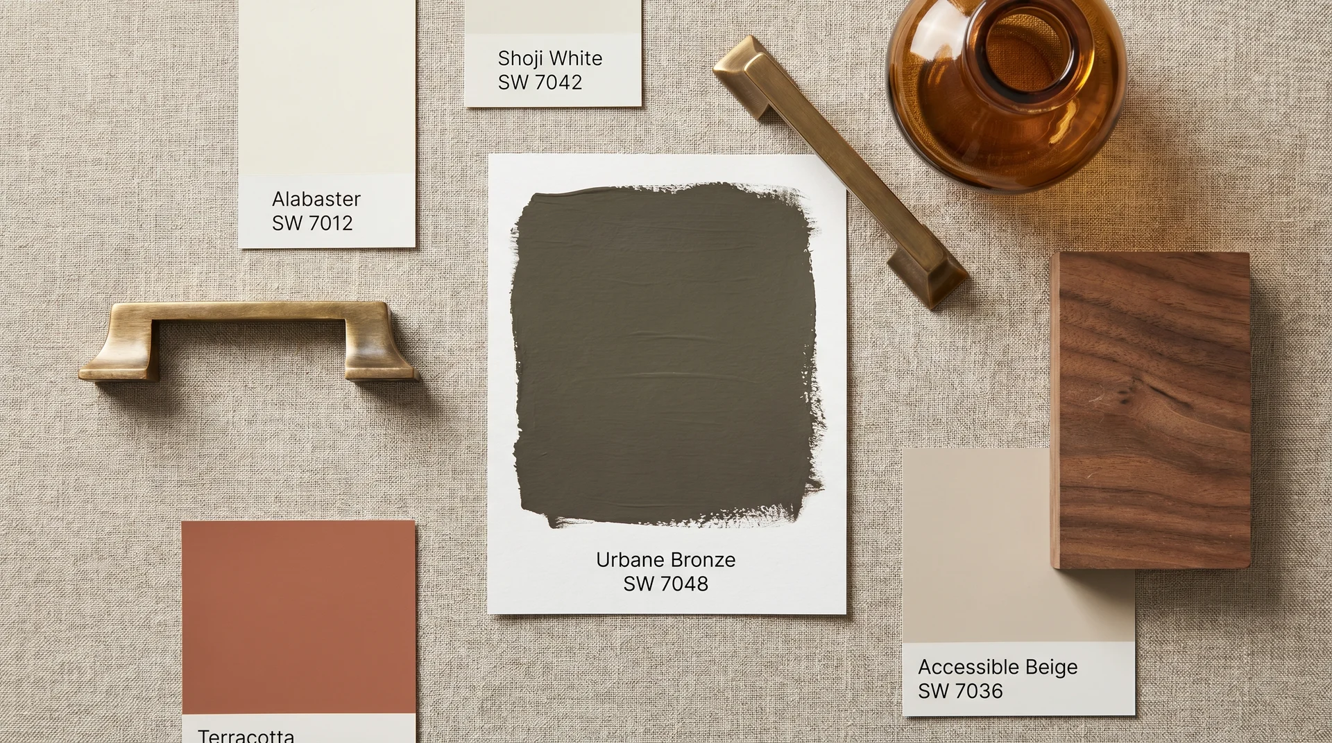
Urbane Bronze pairs best with warm whites like Alabaster (SW 7012) or Shoji White (SW 7042), warm metals like brushed brass, medium to dark wood tones, and earthy accent colors like terracotta and rust.
Urbane Bronze is a generous color to work with because its warm neutrality makes it compatible with a wide range of palettes. Here are the pairings I reach for most often.
Warm Whites for Trim and Ceilings
The most important pairing you will make with Urbane Bronze is the trim color, and warm whites are the clear answer. Alabaster (SW 7012) is the classic choice: creamy, soft, and warm enough to honor the brown undertones in Urbane Bronze without adding yellow.
Shoji White (SW 7042) is another reliable option with a slightly grayer quality that works particularly well in rooms where the Urbane Bronze will cover a single wall rather than all four.
Avoid bright whites with blue or pink undertones. Extra White (SW 7006), which is a popular trim color, can create a jarring contrast against Urbane Bronze that makes the room feel less cohesive.
Warm Metals
Brass and aged bronze hardware are the natural material partners for Urbane Bronze. The warm tones echo each other without matching too literally, and the result is a layered richness that looks intentional.
Unlacquered brass in particular has a depth that complements the color well. Matte black hardware also works, especially on exteriors, though it will push Urbane Bronze toward a more contemporary reading.
Natural Wood Tones
Medium to dark wood tones, think walnut, white oak with a warm stain, and aged pine, sit alongside Urbane Bronze without competing with it. Light, blonde wood tones can also work well as a contrast, especially in rooms where you want to balance the weight of a dark color with something lighter and more airy.
Terracotta and Rust Accents
Terracotta throws, rust-colored textiles, and amber glass all reinforce the warm, earthy quality of Urbane Bronze. These accents make the color feel intentional and layered rather than simply dark. A single terracotta pillow on a sofa against an Urbane Bronze wall can shift the entire mood of a room.
Creamy Off-Whites for Adjacent Walls
If you are using Urbane Bronze on a single wall and need a color for the adjacent walls, consider Accessible Beige (SW 7036) or Antique White (SW 6119). Both are warm enough to transition naturally without creating a stark contrast.
Urbane Bronze Exterior
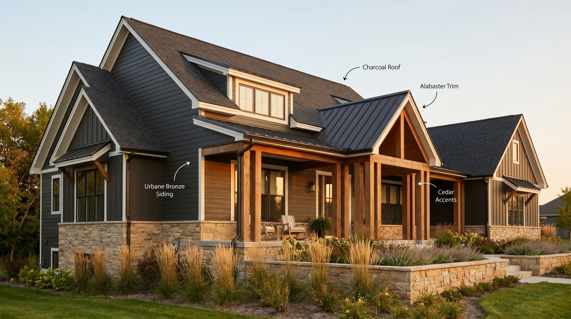
Urbane Bronze on an exterior is one of the most requested recommendations I make, and it consistently delivers. The color reads as a sophisticated deep brown-gray on a facade, sitting somewhere between the cool modernity of Iron Ore (SW 7069) and the warmth of a chocolate brown.
It photographs beautifully, it ages well, and it works across a surprising range of architectural styles. For exterior use, Urbane Bronze works best with these combinations:
- Siding: Urbane Bronze as the field color, Alabaster or Shoji White for trim and fascia
- Roof: Charcoal or dark gray architectural shingles echo the gray component of Urbane Bronze
- Accents: Natural cedar, aged wood, and warm-toned stone all complement the color’s earthy warmth
- Hardscaping: Warm-toned brick, sand-colored concrete, and flagstone all pair naturally
One thing to note about exterior applications: Urbane Bronze will absorb more heat than a lighter color because of its low LRV. In very hot climates, this is worth factoring into your paint selection, particularly for surfaces that receive sustained direct sun.
On painted brick or fiber cement siding, Urbane Bronze applies beautifully with two coats of a quality exterior paint in a flat or low-sheen finish. I tend to recommend a satin finish for siding because it holds up better to weathering while still reading as intentionally matte from a distance.
Urbane Bronze Accent Wall
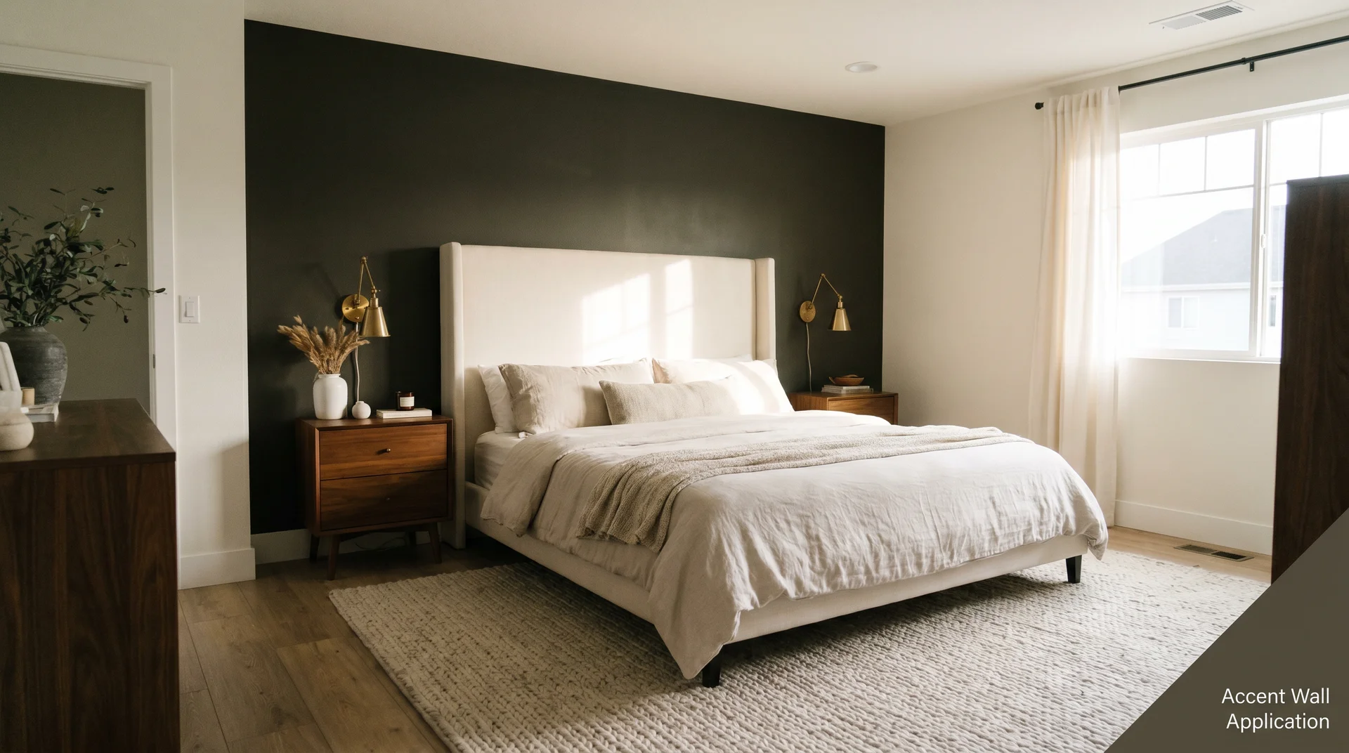
Urbane Bronze (SW 7048) works as a single-wall accent color in living rooms, bedrooms, and dining rooms where a full-room commitment to a dark color feels like too much.
An Urbane Bronze accent wall is one of the safest ways to introduce a dark color into a room that you are not ready to fully commit to. The color has enough depth to anchor a space on a single wall, and the warm undertones prevent it from feeling oppressive against lighter surrounding walls.
The walls I see it work best on are the wall behind a bed headboard, the wall behind a sofa in a living room, and the fireplace walls. In each case, the architectural feature gives the wall a natural reason to be a different color, and Urbane Bronze delivers on that logic without overwhelming the room.
For an accent wall, I recommend pairing Urbane Bronze with surrounding walls in Alabaster, Antique White, or a warm greige like Accessible Beige. The contrast should feel intentional rather than jarring, and warm whites achieve that balance far better than cool whites.
Urbane Bronze Front Door
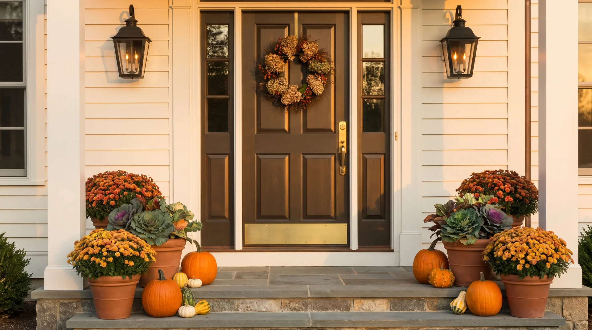
A front door painted in Urbane Bronze signals warmth and confidence before anyone steps inside. The color is dark enough to make a visual statement from the street without reading as aggressive, and the brown undertones give it an organic quality that sits beautifully alongside natural stone, brick, wood porches, and mature landscaping.
Urbane Bronze on a front door works particularly well when the exterior field color is a warm white or cream, a warm gray like Agreeable Gray (SW 7029), or a medium-toned beige. The door becomes a grounding focal point that draws the eye without demanding too much attention.
For finish, I recommend a semi-gloss or gloss on exterior doors. The slight sheen catches light in a way that makes Urbane Bronze look richer and more intentional, and a harder finish holds up better to the wear a front door receives.
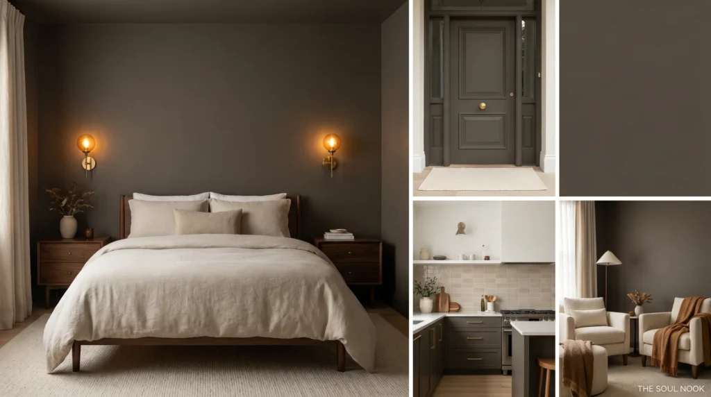
Urbane Bronze in the Bedroom
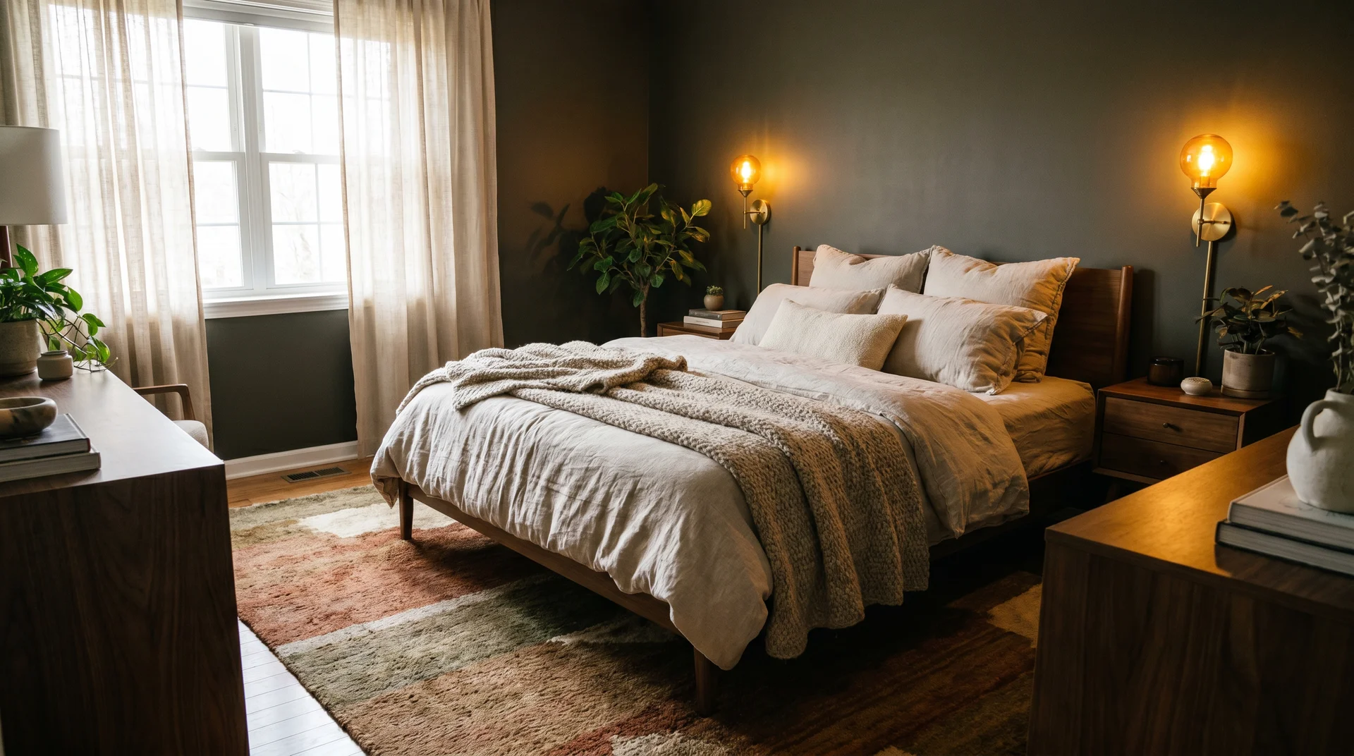
Urbane Bronze in a bedroom creates the low-light, high-warmth environment that makes a room genuinely restful rather than simply decorated.
The client I mentioned at the beginning of this article used Urbane Bronze in a bedroom, and the result was exactly what a dark bedroom color should be: enveloping, restful, and deeply comfortable. The low LRV absorbs light in a way that signals the body to settle, and the warm undertones prevent the room from feeling cold or clinical even in the absence of much natural light.
For a bedroom, the key is to balance the darkness of the color with warm lighting and warm textiles. Warm-toned bulbs in the 2700K to 3000K range bring out the brown in Urbane Bronze and keep the room feeling inviting rather than heavy. Linen bedding in a natural or oatmeal tone, wooden furniture in walnut or white oak, and a wool rug in a warm, earthy tone will all work with the color rather than fighting it.
If four walls of Urbane Bronze feel like too much commitment for a bedroom, a single wall behind the headboard gives you most of the effect with considerably less risk.
Urbane Bronze Kitchen Cabinets
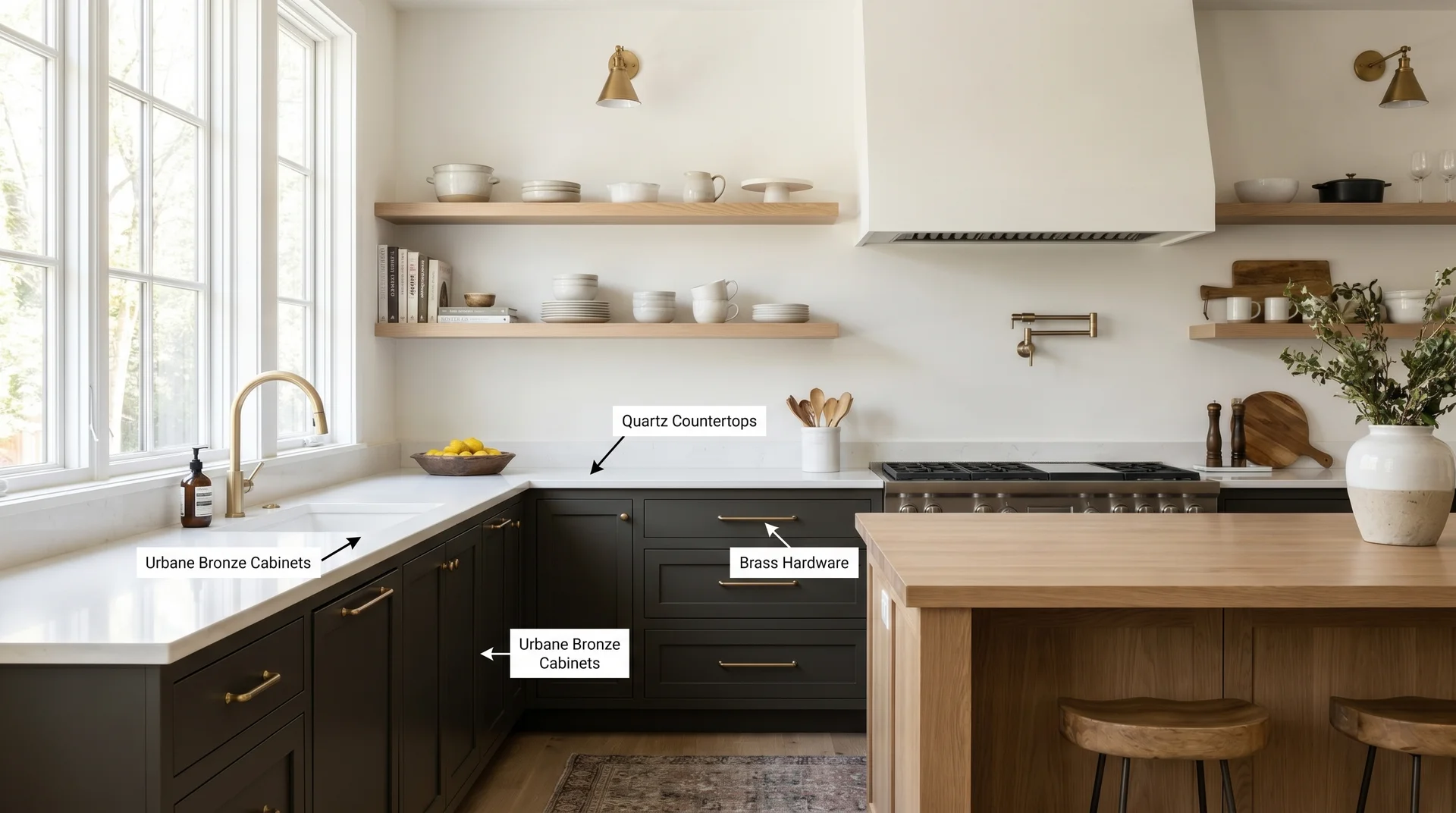
Urbane Bronze on kitchen cabinets is a choice that has grown in popularity as homeowners have moved away from the stark white cabinet moment of the 2010s. It sits in a similar space to Tricorn Black (SW 6258) and Iron Ore (SW 7069) on cabinetry but reads noticeably warmer than either, which makes it more forgiving in kitchens with mixed or warm-toned lighting.
On lower cabinets, Urbane Bronze grounds a kitchen and creates a natural base for a lighter upper cabinet or a contrasting island. On upper cabinets, it requires more confidence but rewards it with a rich, dramatic kitchen that feels genuinely designed rather than assembled from defaults.
Hardware matters significantly on Urbane Bronze cabinets. Brushed brass pulls and knobs are the most frequently requested pairing, and they work for good reason.
The warmth of the metal and the warmth of the color reinforce each other in a way that feels cohesive. Matte black hardware is the modern alternative, and it reads as crisper and more contemporary. Both are good choices depending on the overall direction of your kitchen.
For cabinetry, use a high-quality cabinet paint in a semi-gloss or satin finish. Standard wall paint does not hold up to the handling cabinets receive, and the finish will wear at contact points within a year or two.
Is Urbane Bronze Right for Your Home?
Urbane Bronze is the right choice if you want a dark color that feels warm rather than cold, earthy rather than industrial, and grounded rather than dramatic. It works across a wider range of contexts than most colors at this depth, and it has a staying power that trend colors rarely achieve.
It is probably not the right choice if your room receives very little natural light and you are not willing to invest in warm, layered artificial lighting to compensate.
At LRV 6, Urbane Bronze needs at least some light to show its warmth. In a very dark room with only overhead fluorescent lighting, it will read flat and heavy rather than rich and inviting.
The practical recommendation, as always, is to buy the sample before you commit to the gallon. Sherwin-Williams sells peel-and-stick samples that you can move around the room and observe at different times of day.
Paint a 12-by-12-inch section directly on your wall if you can, or mount the sample board and live with it for at least two to three days. Urbane Bronze rewards the patience of a proper sample test.
Frequently Asked Questions
What color is Urbane Bronze?
Urbane Bronze (SW 7048) is a dark, warm brown-gray paint color by Sherwin-Williams with an LRV of 6. It has warm brown undertones that shift toward gray in low light and behaves like a rich earth tone in most interior and exterior applications.
What colors complement Urbane Bronze?
Urbane Bronze pairs best with warm whites like Alabaster (SW 7012) and Shoji White (SW 7042) for trim, brushed brass or aged bronze hardware, warm wood tones in walnut or white oak, and earthy accent colors like terracotta and rust.
Is Urbane Bronze good for exteriors?
Yes. Urbane Bronze works well on exterior siding and front doors. It reads as a sophisticated, deep brown-gray on a facade and pairs naturally with warm white trim, charcoal roof shingles, and natural stone or cedar accents.
