
If you’ve been holding a Snowbound chip against your wall and wondering whether it’s going to look pink, you’re asking the right question. It’s the one I hear more than almost anything else about this color, and the answer isn’t just “it depends.”
There are specific conditions that bring out Snowbound’s pink side and specific conditions that keep it reading as the clean, barely-there soft white it looks like in the store.
I’ve specified SW 7004 for client projects across a decade of residential design work, watched it perform beautifully in some rooms and feel slightly off in others, and learned to predict which situation you’re in before the first drop of paint goes on the wall. This review covers what you need to know to make that call for your home.
What Is Snowbound SW 7004?
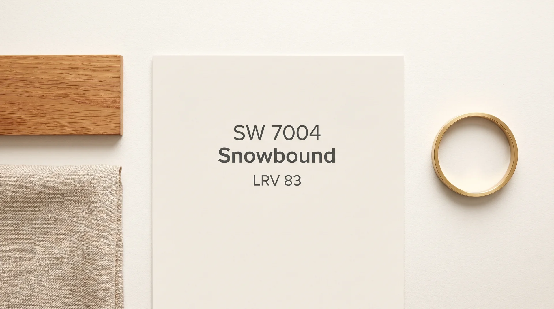
Snowbound SW 7004 is a soft, warm white paint color by Sherwin-Williams with a Light Reflectance Value of 83, placing it in the upper range of off-whites without crossing into stark, bright-white territory.
It belongs to Sherwin-Williams’ Whites and Pastels color family. The color sits below pure white on the brightness scale but above warm creams like Antique White, which gives it a wide range of applications across walls, trim, ceilings, and cabinetry.
Snowbound at a Glance
| Property | Value |
|---|---|
| Color Number | SW 7004 |
| LRV (Light Reflectance Value) | 83 |
| Color Family | Whites and Pastels |
| Undertone | Pink/violet |
| HEX Code | #EDE8DF [VERIFY] |
| Finish Options | Flat, Matte, Eggshell, Satin, Semi-Gloss, Gloss |
| Best Application | Interior walls, ceilings, trim |
Where Snowbound Sits in the White Paint Spectrum
Snowbound is a soft white, not a pure white or a cream. Pure whites like Sherwin-Williams Extra White have LRVs above 86 and read as crisp and bright; creams like Antique White have prominent yellow undertones that warm a room noticeably. Snowbound lives between those two categories: bright enough to feel fresh, warm enough to avoid the sterile quality of a true white.
That middle position is what makes it appealing and also what makes it worth understanding before you commit. There’s less margin for error with a soft white than with a committed warm or cool color, because the undertone becomes more visible when the surrounding environment amplifies it.
Understanding Snowbound’s Undertones
Snowbound’s undertones are pink and violet, pulled from the red and blue pigments in its base formula.
Whether those undertones read as a problem in your home depends almost entirely on your lighting conditions and the materials around the walls, not on the paint itself. The pink is real, and it’s built into the formula, but it isn’t fixed — it activates or recedes depending on what surrounds it.
What Undertones Does Snowbound Have?
Snowbound has pink and violet undertones that come from its red and blue pigment base.
At an LRV of 83, the color is light enough that these undertones remain subtle under most conditions. Snowbound’s specific balance of red and blue pigment is what separates it from yellower warm whites like Alabaster and cooler whites like Extra White.
The pigment basis matters because it explains a pattern that catches people off guard: the undertone doesn’t read the same way in every room.
Different light sources and surrounding surfaces either reflect those pink and violet wavelengths back or absorb them, which is why the same gallon of paint can look like a clean soft white in one room and a slightly lavender-pink in another.
When Does Snowbound Look Pink?
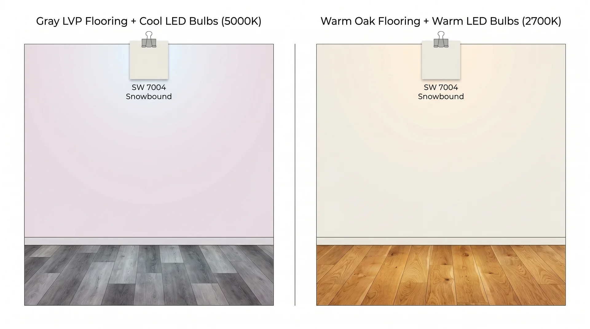
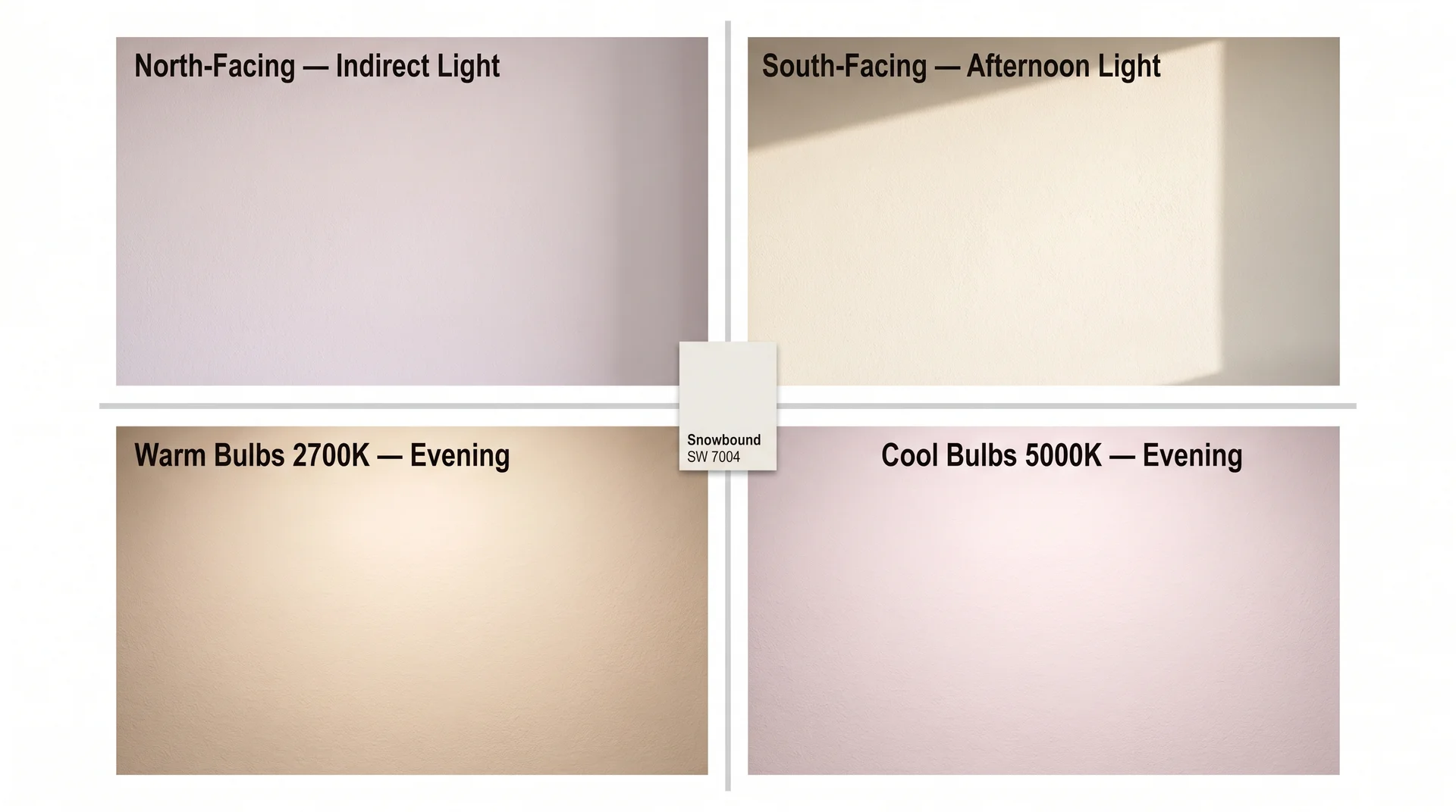
Snowbound reads most pink under cool, north-facing light combined with cool-toned surrounding materials.
The conditions that bring out the pink most noticeably:
- Cool white or daylight LED bulbs at 5000K and above. These bulbs emit light weighted toward the blue end of the spectrum, which bounces off the pink and violet pigments in Snowbound and makes them visible.
- Gray flooring, particularly the gray luxury vinyl plank, became standard in residential construction between 2015 and 2022. The blue-gray tones in that flooring reflect upward onto the walls and activate the pink undertone. This is the most common pairing that goes wrong, and it’s almost never discussed in paint reviews.
- Cool-toned upholstery in grays, blue-grays, or cool greens. Same principle as the flooring: cool surrounding tones create contrast that makes the pink more visible.
- North-facing rooms, where natural light is indirect all day and shifts toward the blue end of the spectrum.
The gray flooring issue is the one I want you to sit with. If your home has the gray LVP that was installed almost everywhere in the past decade, Snowbound is a riskier choice than its popularity suggests. You can make it work with the right lighting and the right accents, but you need to sample it carefully rather than trusting the chip.
When Does Snowbound Read as a Clean Soft White?
Snowbound reads as a clean, barely-there soft white when the surrounding materials are warm-toned, and the light source is warm.
- Warm wood flooring like oak, honey hardwood, and walnut absorbs rather than reflects the pink wavelengths. In those conditions, the pink undertone stays quiet, and Snowbound reads as a warm, slightly soft white.
- Warm white LED bulbs at 2700K to 3000K suppress cool-spectrum reflection and let the softness of the color come forward without activating the pink.
- South- and west-facing rooms with warm afternoon light.
- Cream or warm-toned upholstery, natural linens, and similar furnishings that don’t create cool contrast.
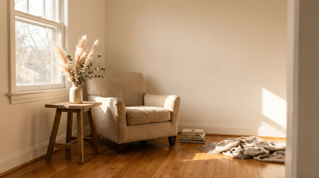
In those conditions, Snowbound is one of the most livable whites available. It doesn’t read as stark, it doesn’t go yellow, and it works with almost any accent color that leans warm or neutral. I find it more forgiving than its pink reputation suggests, but only in the right room.
How Light Affects Snowbound in Real Rooms
Light direction changes what Snowbound looks like more than almost any other variable, including the finish you choose.
This is where paint decisions get made and unmade. A color that photographs beautifully in a south-facing studio can look completely different in a north-facing bedroom, and Snowbound is more sensitive to this than many of the whites it competes with, because of those pink and violet undertones.
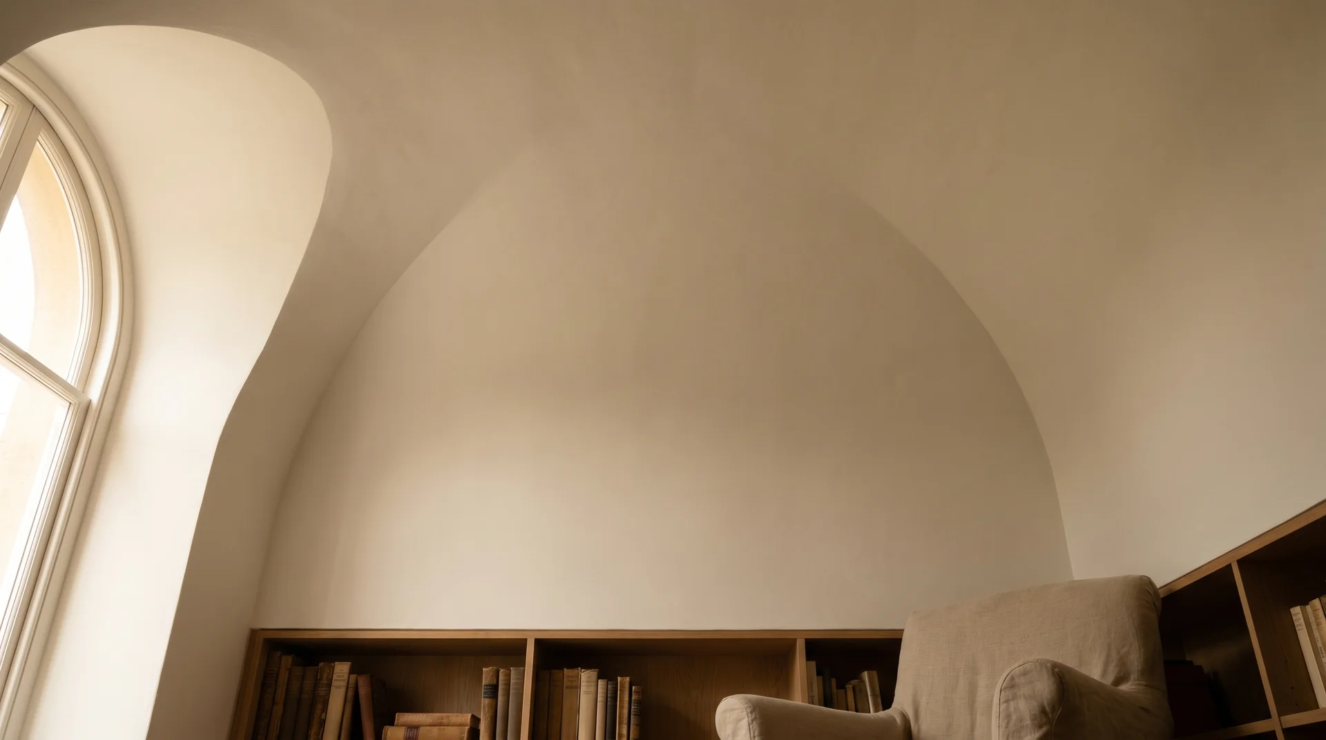
North-Facing Rooms
North-facing rooms are where most Snowbound regret originates, and I say that from experience.
North-facing light is indirect all day. It doesn’t receive direct sun at any point, which means the ambient light is consistently cooler in color temperature and more blue-shifted than light in other exposures. Research in architectural daylighting consistently documents north-facing light as cooler in color temperature than direct sun exposure, and for paint colors with pink or violet undertones, that shift is consequential.
For Snowbound, that cool shift does two things. First, it reduces the warmth that suppresses the pink undertone. Second, it amplifies the violet and pink wavelengths in the formula.
The result, particularly in rooms with cool flooring or furnishings, can be a wall color that reads more lavender than white.
If you have a north-facing room you want to paint Snowbound, sampling is not optional.
Put the sample on at least two walls, observe it at midday and in the evening under your actual light fixtures, and look at it with your existing flooring and furniture in the room. The chip is meaningless here. What you need is the color in context, in your specific light, in your specific space.
South- and West-Facing Rooms
South- and west-facing rooms are Snowbound’s best environment. Warm afternoon and direct sunlight suppress the pink undertone consistently, and in these exposures, the color tends to read exactly as it looks in photographs: a soft, airy white with just enough warmth to feel comfortable.
If your main living areas face south or west and you’re choosing between Snowbound and a slightly creamier white, Snowbound is probably the stronger choice. The warm light will prevent it from reading cold without pushing it toward yellow.
East-Facing Rooms
East-facing rooms get warm morning light and cooler, flatter afternoon light. In practice, Snowbound usually performs well in east-facing spaces because the morning hours, when these rooms are most actively used, provide the warm light that keeps the undertone in check. Bedrooms are the one exception worth noting: if you use the space significantly in the afternoon, test the color in that flat afternoon light before committing.
Artificial Lighting: Warm Bulbs vs. Cool Bulbs
Bulb temperature changes how Snowbound looks more than most people expect, and it’s one of the most controllable variables in your decision.
Bulbs at 2700K to 3000K (warm white) suppress the pink undertone and make Snowbound read as a soft, inviting white. Bulbs at 4000K and above (cool white and daylight) shift the color toward pink and, in north-facing rooms especially, can push it noticeably toward lavender.
I’ll be honest about something here: I’ve seen the same Snowbound walls look dramatically different in two rooms with supposedly identical lighting setups, and I don’t have a completely clean explanation for why.
Ceiling height, wall area, and the placement of light fixtures all affect how light bounces, and those interactions are harder to predict than bulb temperature alone. The practical takeaway is still the same: switch to warm-spectrum LED bulbs if you haven’t already. It’s the lowest-cost adjustment that makes the most consistent difference.
Snowbound vs. Similar White Paint Colors
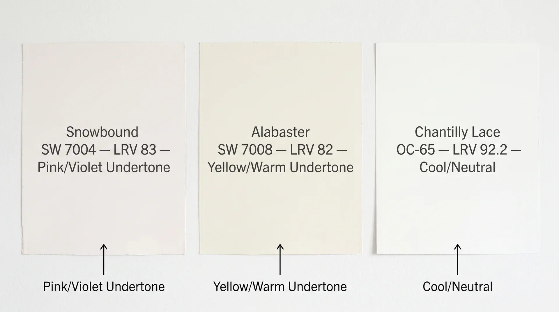
Snowbound is most often compared to Sherwin-Williams Alabaster and Benjamin Moore Chantilly Lace, and both comparisons have a direct answer.
Snowbound vs. Sherwin-Williams Alabaster
Alabaster is warmer and more yellow; Snowbound is softer and more pink. The right choice depends on your flooring.
If you have warm wood floors or any flooring with yellow or honey tones, Alabaster will blend with them naturally, and Snowbound will read more like a deliberate color choice than a neutral.
If you have cool gray or white-toned flooring, Alabaster may look too yellow, and Snowbound may look too pink, and in that situation, a truer white is often worth considering instead.
| Property | Snowbound SW 7004 | Alabaster SW 7008 |
|---|---|---|
| LRV | 83 | 82 |
| Primary undertone | Pink/violet | Yellow/warm |
| With warm wood floors | Works well | Excellent |
| With cool/gray floors | Sample first – pink risk | May read yellow |
| North-facing rooms | Can read pink/lavender | Can read yellow/flat |
| South/west-facing rooms | Excellent | Excellent |
| As a whole-house neutral | Yes, in warm-toned homes | Yes, in warm-toned homes |
My honest call: if you’re undecided and your home has mixed lighting and mixed flooring across an open plan, Alabaster is the more forgiving choice for most people. Its warm yellow undertone is less directional than Snowbound’s pink and reads more consistently across different light conditions.
Snowbound is the better choice, specifically when you want a softer, less creamy white, often in a room with warm light, where Alabaster starts to feel a little golden.
For a full look at how Alabaster behaves across different rooms and light exposures, see our complete Alabaster review.
Snowbound vs. Benjamin Moore Chantilly Lace
Chantilly Lace (OC-65) is a crisper, cooler white with an LRV of 92.2, which makes it substantially brighter than Snowbound. Where Snowbound reads as a soft white with warmth, Chantilly Lace reads as a clean, modern white with almost no undertone.
These two colors aren’t really competing for the same room. Chantilly Lace is for people who want white to look white — bright, clean, and unambiguous. Snowbound is for people who want white to feel softer without going into cream territory.
If your inspiration images show bright, airy spaces with white oak floors and abundant natural light, Chantilly Lace is probably closer to what you’re picturing.
Snowbound vs. Other Soft Whites
Within the soft white category, the closest comparisons are Benjamin Moore White Dove (slightly warmer, more yellow undertone), Sherwin-Williams Decorator White (cleaner and brighter, reads more neutral), and Sherwin-Williams Greek Villa (warmer and creamier).
Snowbound is the pinkest of this group. If pink-leaning is a concern, White Dove and Decorator White are lower-risk alternatives in the same brightness range.
The Best Rooms for Snowbound Paint Color
Snowbound works in most rooms of a home, but it performs differently depending on how much light the space gets and what materials it shares the room with.
Living Rooms and Open-Plan Spaces
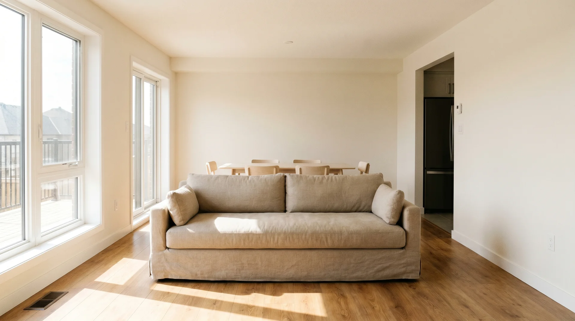
Living rooms are the most common application for Snowbound, and the one that requires the most thought.
The challenge with open plans specifically is that they often span multiple light exposures, a south-facing kitchen flowing into a north-facing dining area, for example, and Snowbound can read differently across those zones within the same application.
The flooring issue covered in the undertone section is most consequential here. Open-plan living areas almost always have continuous flooring, and if that flooring is cool-toned gray, the pink undertone will be visible from multiple angles.
The furniture follows the same logic: a sectional in blue-gray or cool charcoal will activate the pink more than a sofa in warm linen or camel.
In living rooms with warm wood floors, warm-toned furnishings, and good south or west light, Snowbound is among the best whites you can choose. It’s soft enough to feel comfortable but bright enough to keep the space from feeling small.
It also works as a whole-house color in homes with consistent warm-toned materials across rooms. The slight softness of LRV 83 is forgiving across different room sizes and ceiling heights.
Bedrooms
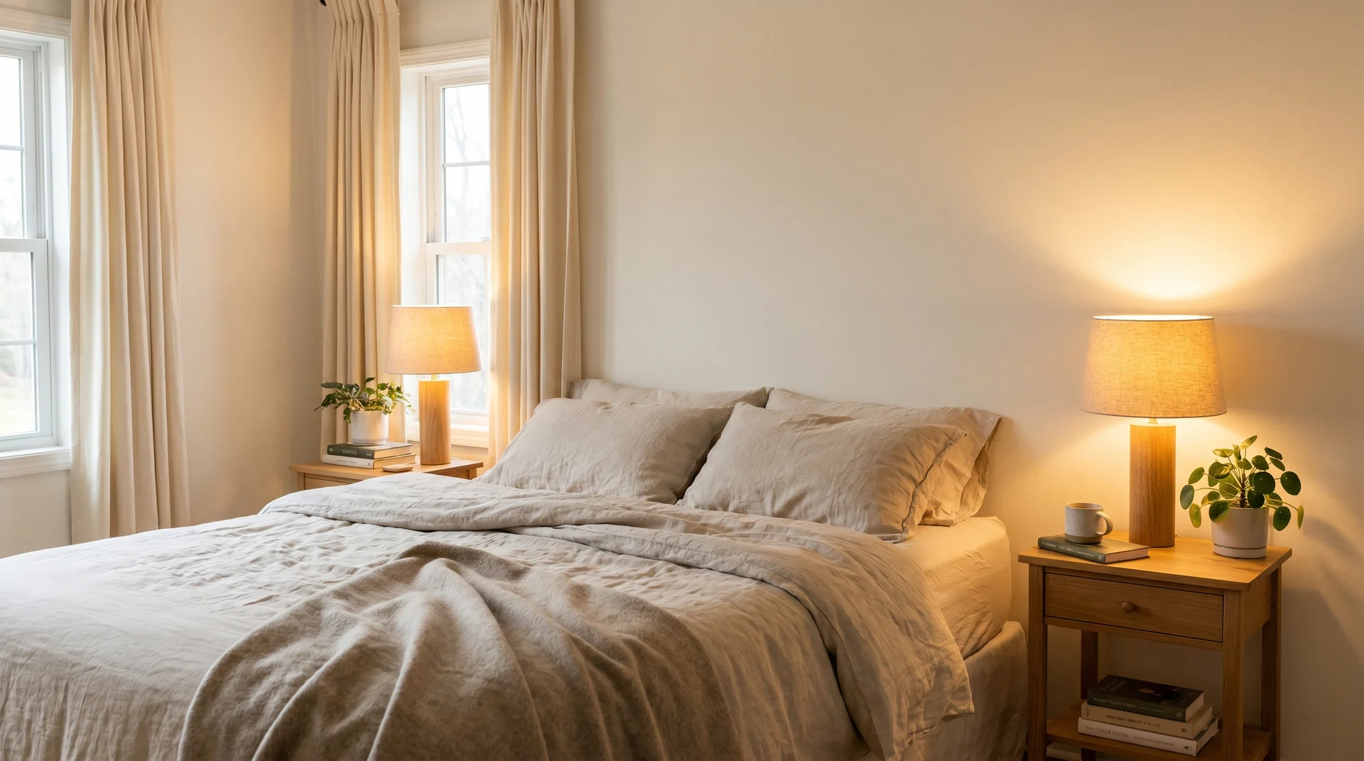
Snowbound works well in bedrooms, particularly because bedroom lighting tends to be warm and layered rather than overhead and cool. The smaller wall area in most bedrooms also means the undertone has less opportunity to accumulate visually.
The north-facing caveat still applies, but bedrooms with warm-temperature lamps almost always read well even in difficult light exposures.
Kitchens and Bathrooms
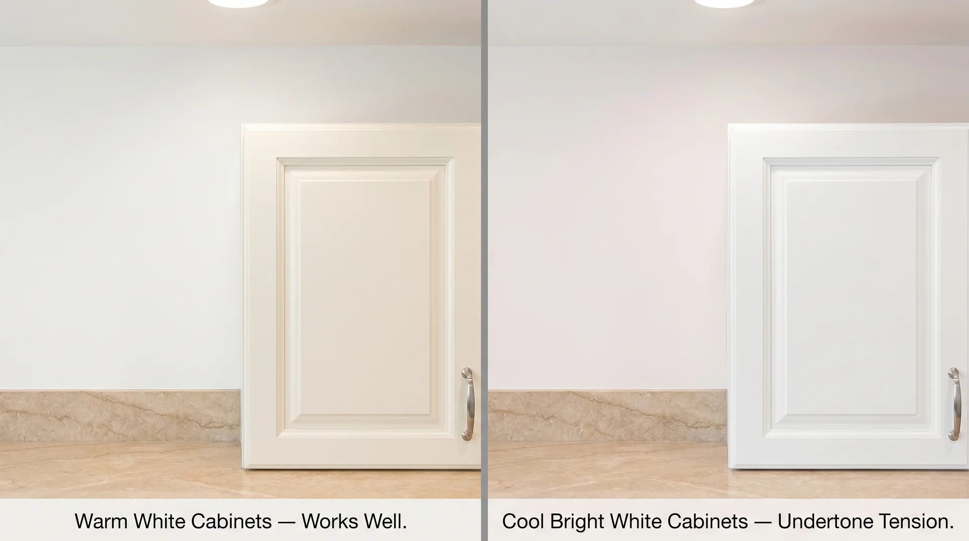
Kitchens require one specific consideration: cabinet color. Snowbound on kitchen walls with white cabinets can create a slight warm-cool tension if the cabinet white is a cooler shade, because the pink undertone in the walls becomes visible against a brighter white reference point.
White cabinets in Extra White or Pure White on Snowbound walls can make the walls look slightly off in a way that’s hard to name. If your cabinets are already a warm white or a wood tone, the pairing works well.
In bathrooms, the main variables are the vanity finish and the light fixture temperature. Snowbound with warm Edison-style bulbs and a warm wood or brass vanity reads beautifully. Snowbound with cool daylight bulbs above a white vanity is the bathroom version of the gray-flooring problem.
Ceilings
Snowbound is a good ceiling color in rooms where it’s also on the walls, creating a continuous envelope that makes the space feel calm and cohesive. Use flat finish only sheen on a ceiling, amplifies undertones, and picks up light unevenly.
Coordinating Colors and Trim for Snowbound
Snowbound’s trim and accent color decisions directly affect whether the undertone reads as warm and intentional or slightly off. This is the area where I’ve seen more client regret than in almost any other paint decision, usually because the trim or flooring was chosen without accounting for the pink.
The Best Trim Colors for Snowbound
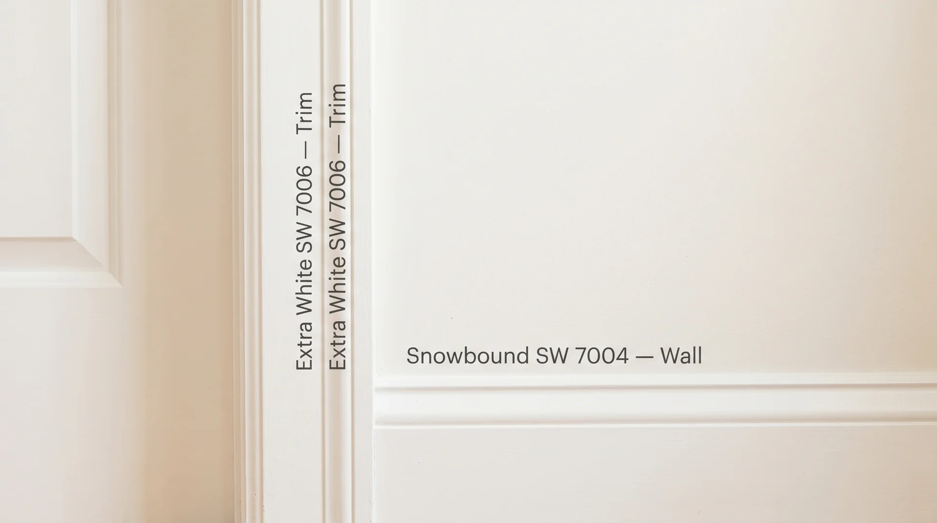
For most homes, Sherwin-Williams Extra White (SW 7006) is the best trim color with Snowbound walls.
Extra White is brighter and crisper than Snowbound, which creates a clean delineation between wall and trim without the high-contrast look of a stark white against a deeper wall color.
Pure White (SW 7005) also works; it’s slightly warmer than Extra White and produces a softer transition that suits rooms with abundant warm light.
Matching trim and walls in the same color, Snowbound on both, is a choice I’ve seen look genuinely beautiful in rooms with high ceilings and lots of architectural detail.
It’s also a choice I’ve seen disappear entirely in rooms with average-height ceilings and standard trim profiles, where the lack of contrast makes the space feel slightly shapeless.
That one matters more than people expect. The chip won’t tell you which situation you’re in. You need to look at the room.
Trim colors to approach with caution alongside Snowbound walls:
- Very cool, blue-leaning whites like Sherwin-Williams High Reflective White. The contrast against Snowbound’s pink undertone reads as a color conflict rather than a deliberate choice.
- Bright whites above LRV 90, which can make Snowbound walls look slightly dingy by comparison.
Accent Colors That Work With Snowbound
Snowbound’s pink undertone responds well to accents that either lean into warmth or hold firmly at neutral.
- Warm blues, dusty navy, slate, muted coastal blues. These create a combination where the pink undertone reads as intentional rather than accidental. This is probably the most reliable accent pairing for Snowbound in living rooms and bedrooms.
- Soft greens with yellow or olive bases, like sage or muted eucalyptus. Snowbound’s softness complements earthy greens without competing with them. If you’re considering a muted green-gray as a companion color in an adjacent room, Evergreen Fog (SW 9130) pairs well with Snowbound’s warm softness.
- Warm taupes and caramels for larger surfaces like rugs and upholstery. These suppress the pink and let Snowbound read as a clean, warm white.
- Natural materials – rattan, linen, jute, warm wood. Honestly, these do more for Snowbound than any paint color decision.
Accents to approach carefully: cool gray and blue-gray as the dominant material tone in the room. A single cool gray pillow is fine.
A room where gray is the primary upholstery and flooring material, combined with Snowbound walls, creates the tension described in the undertone section, not dramatic, but unsettling in a way that’s hard to fix without repainting.
Flooring and Furniture That Bring Out the Best in Snowbound
This is the practical heart of the whole review, and it’s the piece most color guides skip entirely.
Paint colors don’t exist in rooms alone. They share space with flooring, furniture, textiles, and trim, and each of those materials reflects or absorbs light in ways that change how the paint color reads. For Snowbound specifically, the flooring choice is the most consequential variable outside of lighting direction.
Flooring that works with Snowbound:
- Warm oak hardwood in any tone from light honey to medium brown. These absorb the pink wavelengths and let Snowbound read as clean and soft.
- Natural walnut, which adds a deeper, warm contrast that makes Snowbound look almost luminous above it.
- Light natural-wood LVP with warm undertones (beige, tan, light brown). This is the flooring that most reliably produces the look you see in Snowbound photos online.
- Warm-toned tile in cream, beige, terracotta, or sand.
The same pink undertone we discussed at the beginning of this review is the one that gray floors activate most aggressively. To be specific about which gray floors carry the highest risk, the cool, blue-tinted gray LVP that was installed widely in the past decade is the most problematic pairing with Snowbound.
If your floors fall into that category, get a large sample on the wall and spend a full day with it before ordering paint.
How to Test Snowbound Before You Commit

Sampling Snowbound correctly takes about 48 hours and costs almost nothing relative to a bad paint decision.
Most articles skip this section. In my experience, it’s often the step that makes the difference between a color you love and a room you repaint in six months.
- Get a peel-and-stick sample or a quart. Sherwin-Williams sells peel-and-stick color samples that are large enough to be useful. A small chip from the store is not sufficient for a color with Snowbound’s undertone behavior.
- Apply the sample to at least two different walls in the room. One wall should be opposite a window; one should be adjacent. Light hits each wall differently, and the undertone often reads differently on each.
- Observe it at three distinct times: morning, midday, and evening. Don’t decide in the first hour. You need to see how the color shifts as the light changes throughout the day.
- Look at it with your actual furniture and flooring in the room. Move a piece of furniture next to the sample if you can. Your gray sofa or gray floor tile is the most important variable in the space, not the light alone.
- Check it under your actual light fixtures in the evening. Flip on every light in the room and observe the sample. If you’re using cool-white bulbs, you’ll see the pink more clearly here than at any other point.
- Wait 24 to 48 hours before deciding. First impressions of paint color are unreliable. The color your eye adjusts to after living with it for a day is the real color.
One note on scope: if you’re considering Snowbound for the exterior of your home, this interior testing process doesn’t apply. Exterior performance involves different substrate variables, finish requirements, and how UV exposure affects undertones over time. That’s a separate decision and a separate article.
What Finish Should You Use for Snowbound?
Finish choice changes how Snowbound’s undertone reads, because sheen affects how light reflects off the surface.
| Surface | Recommended Finish | Why |
|---|---|---|
| Most interior walls | Eggshell | Low sheen, cleanable, doesn’t amplify undertones |
| High-traffic areas (hallways, kids’ rooms) | Satin | More durable and wipeable while staying relatively matte |
| Ceilings | Flat/Matte | Absorbs light evenly, prevents undertone from becoming visible |
| Trim and doors | Semi-Gloss | Standard trim finish; durable and creates clean definition against walls |
| Kitchen and bathroom walls | Satin | Moisture-resistant without going full gloss |
Higher sheen finishes amplify undertones. If pink is a concern in a specific room, matte or eggshell reduces how much the undertone activates compared to a satin or semi-gloss on the same wall. It won’t eliminate the undertone, but it reduces the conditions under which it’s most visible.
If low VOC content matters to your project, Snowbound is available in Sherwin-Williams’ Harmony interior paint line, which is a zero-VOC formula in the same color. The finish and color behavior are the same; the formula is the variable.
Is Snowbound the Right White for Your Home?
Snowbound is the right choice if your home has warm natural light, warm wood or neutral-toned flooring, and you want a white that reads soft and comfortable rather than crisp and modern.
It’s the wrong choice or at minimum a high-risk choice if you have cool-toned gray flooring, north-facing primary rooms, or cool-white light fixtures you don’t plan to replace.
Not because the color is bad, but because the conditions that make it look pink are exactly the conditions that became standard in a lot of homes over the past decade.
As a whole-house color, Snowbound works best when the home has consistent warm-toned materials throughout. Homes with mixed flooring (warm wood in some rooms, gray tile in others) will read inconsistently from room to room, which is worth knowing before you apply it everywhere.
The most useful thing I can tell you is also the most honest one: if you’re genuinely uncertain after reading this, the answer isn’t to pick Snowbound or rule it out. The answer is to sample it in your actual space, with your actual light and your actual furniture, before the decision is made.
For a color this sensitive to its environment, no amount of reading replaces 48 hours of observation. Some variables on a specific wall in a specific room are simply things I can’t predict from the outside.
The biggest Snowbound mistake isn’t choosing it for the wrong room. It’s choosing it without a sample and hoping the chip was enough.