
Swiss Coffee and Alabaster are not interchangeable. Alabaster leans yellow-beige. Swiss Coffee leans yellow-green.
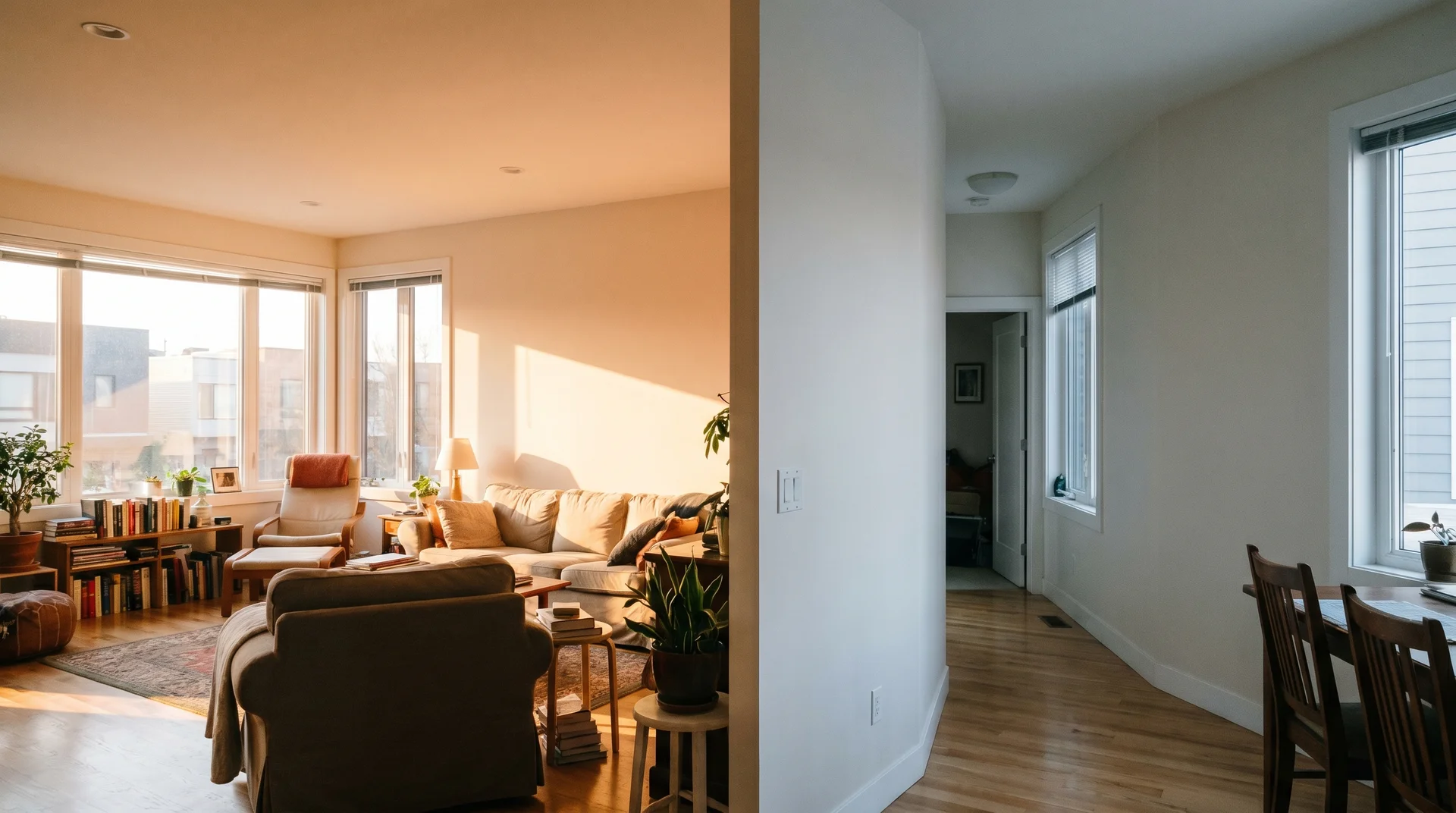
In warm, south-facing light, that difference is subtle. In a cool or north-facing room, it becomes obvious.
This piece covers interior rooms only. For exterior paint, the comparison works differently and belongs in a separate guide.
If you’re also comparing these two against Greek Villa, White Dove, or other popular off-whites, our off-white paint color guide covers that ground.
Swiss Coffee vs. Alabaster: What Actually Separates These Two Colors
These two off-whites are close enough to confuse, and different enough to matter.
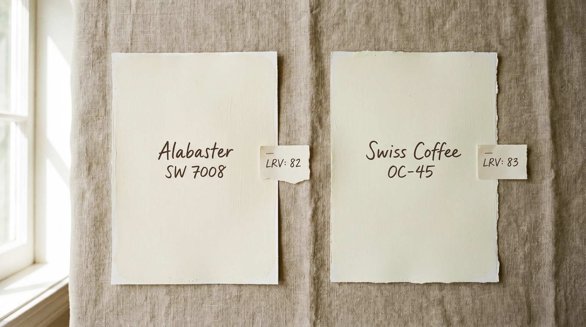
Here is the core data side by side. The rest of this article explains what these numbers mean in a real room.
| Feature | Sherwin-Williams Alabaster (SW 7008) | Benjamin Moore Swiss Coffee (OC-45) |
|---|---|---|
| LRV | 82 | 83.93 |
| Primary Undertone | Yellow-beige | Yellow-green |
| Best Light Direction | North- and east-facing rooms; mixed-light spaces | South- and west-facing rooms with warm natural light |
| Whole-House Reliability | More forgiving across variable light | Best in homes with consistent warm natural light |
| Aesthetic Fit | Transitional, contemporary, modern farmhouse | Cottage, Tuscan, traditional farmhouse |
LRV stands for light reflective value. It measures how much light a color bounces back into a room, on a scale from 0 to 100. Both of these whites sit near the top of that scale.
The LRV scores are nearly identical. What the numbers don’t show is the undertone. That’s the part that catches people out.
Swiss Coffee & Alabaster: LRV and Undertones
LRV is a useful metric, but it only tells half the story. It tells you how much light a color reflects. It says nothing about what color direction that brightness pulls toward.
What LRV Tells You
LRV measures brightness. It does not measure undertone.
- Alabaster has an LRV of 82.
- Swiss Coffee has an LRV of 83.93.
Both are highly reflective whites that make most rooms feel open and warm without going stark.
You will not feel that 1.93-point difference standing in a room. What you will feel is the undertone. That’s where these two colors split.
Think of LRV as volume and undertone as pitch. Two sounds can play at the same volume and still sound completely different. The same principle applies here.
Alabaster’s Undertone: Yellow-Beige
Alabaster’s undertone is yellow-beige, and it reads as balanced across most light conditions.
The yellow-beige sits broadly in the warm spectrum. It doesn’t pull hard in any specific direction.
- In north-facing light, Alabaster holds its warmth without going flat or peachy.
- In south-facing sun, it gains a gentle cream quality. It doesn’t shift much between the two.
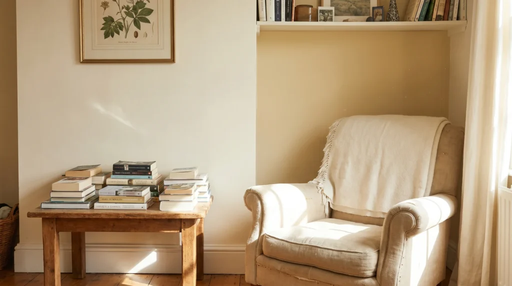
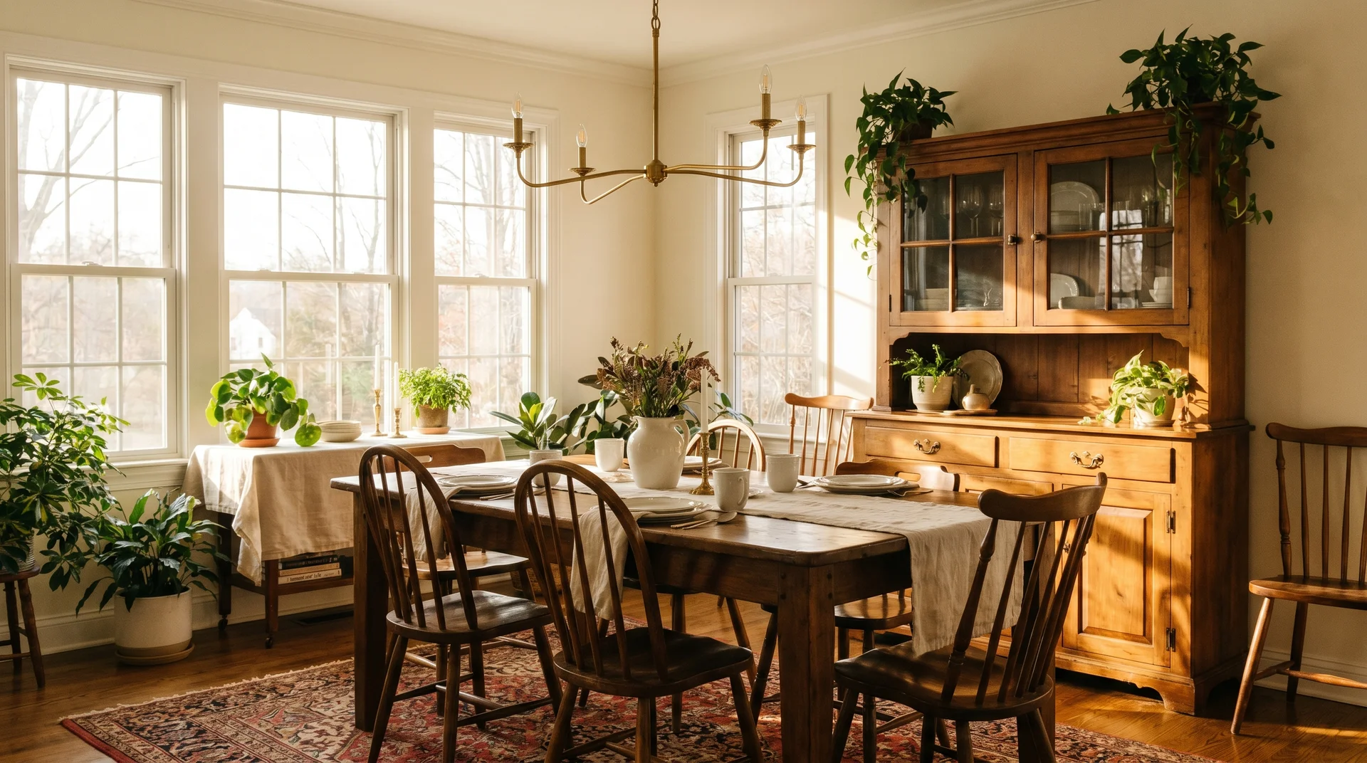
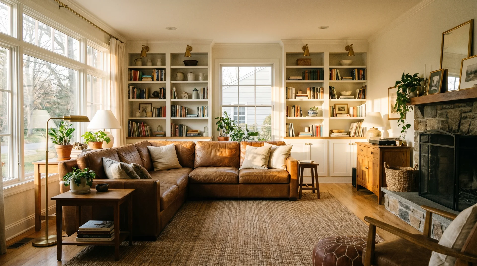
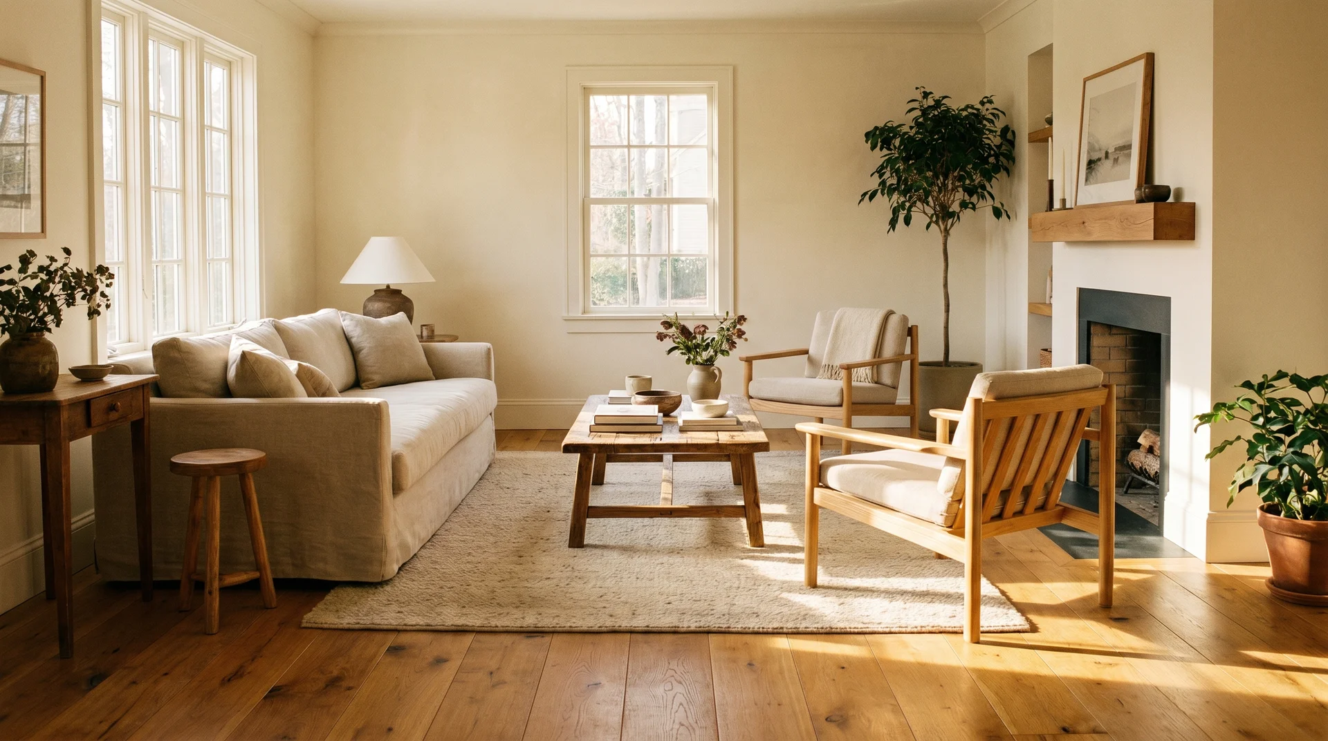
That consistency is why Alabaster is so often recommended for whole-house use. I’d call it forgiving rather than exciting. It earns its place in almost any room without asking much in return.
For a closer look at how Alabaster performs across different rooms, finishes, and pairings, see our complete Alabaster paint color guide.
Swiss Coffee’s Undertone: Yellow-Green
Swiss Coffee’s undertone is yellow-green, and it’s the main reason this color surprises people after it goes on the walls.
On a 2-inch chip surrounded by white store paper, you see a soft, creamy, warm white. Nothing alarming.
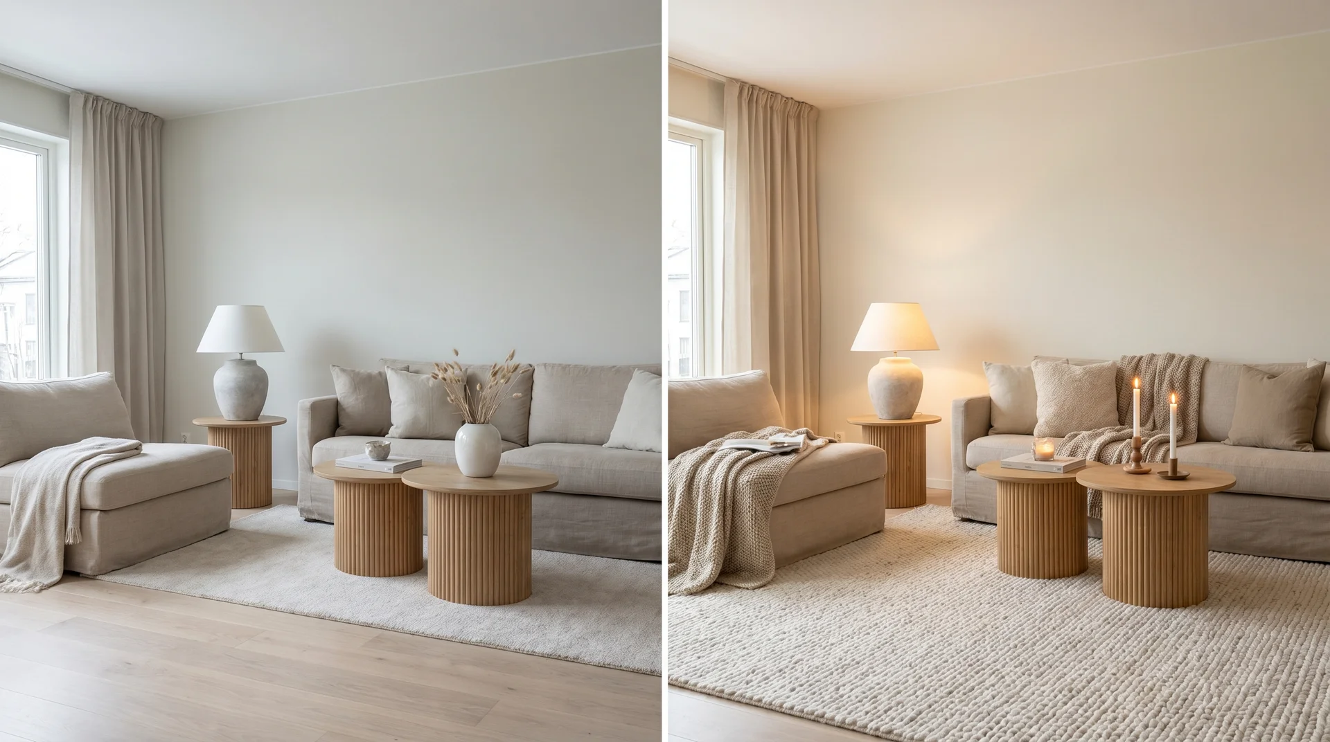
At room scale, that undertone activates. The surrounding walls, floor, and furnishings reflect light back into the color. In warm-light rooms, this creates a glowing, lived-in quality that’s genuinely beautiful.
In cool or north-facing light, the same undertone can read flat, slightly yellow, or faintly green.
I’ve had clients describe it as “something is off, but I can’t pinpoint it.” Every time, it’s been the yellow-green undertone reacting to cool light. The color isn’t wrong. That room just wasn’t the right match for it.
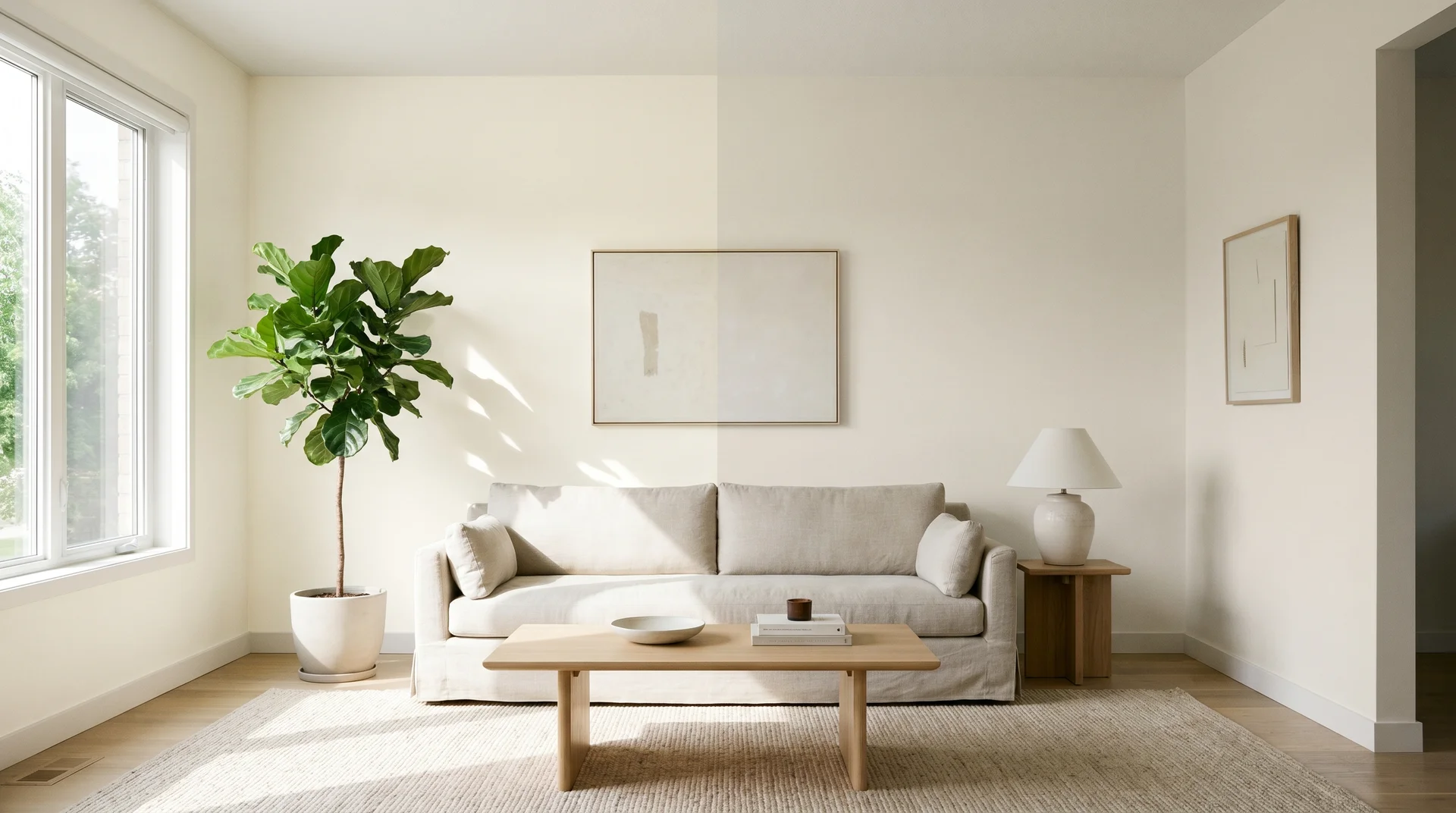
Light Direction Is the Real Variable
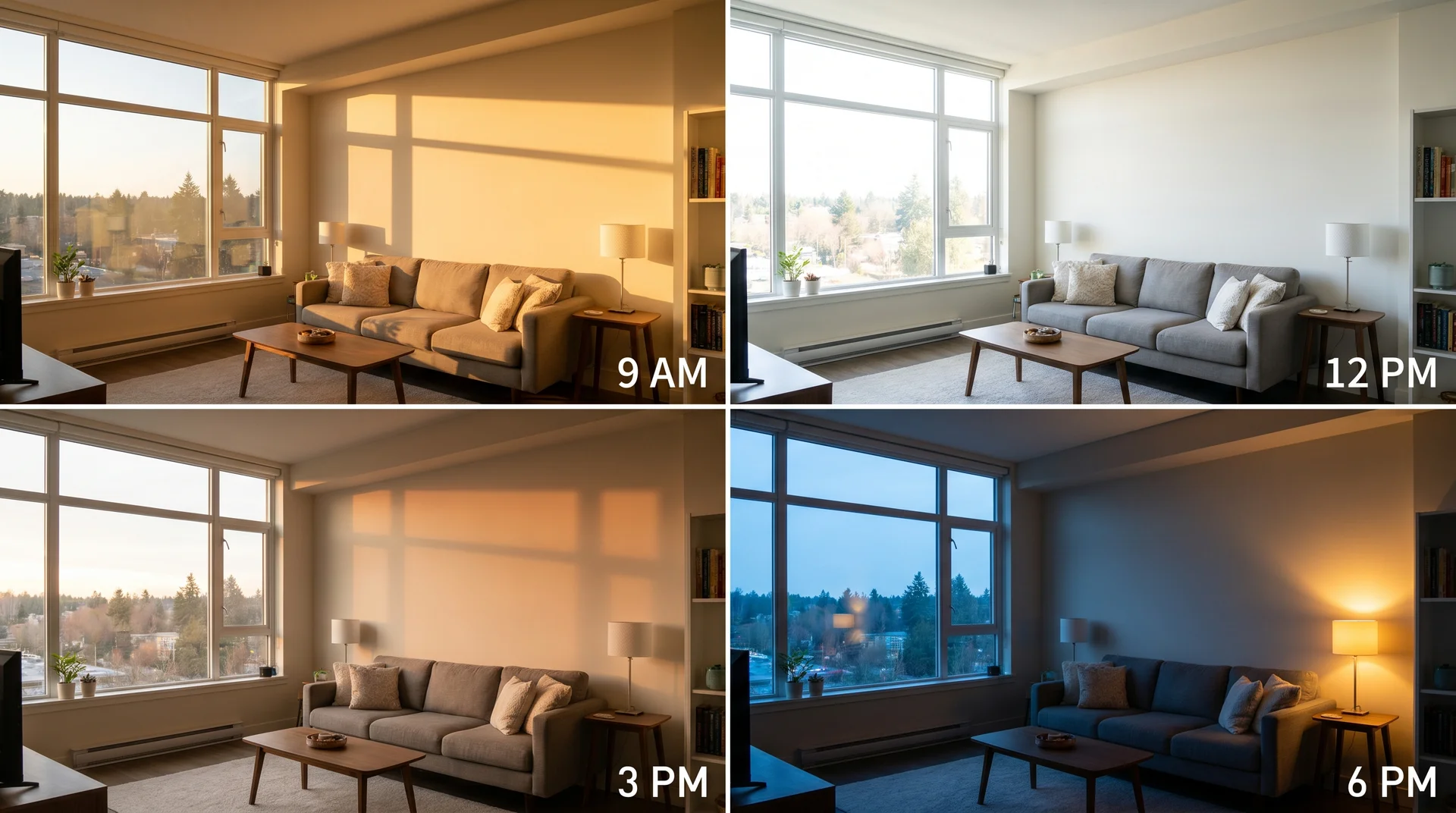
Light direction matters more than any other single factor in this decision. The same paint color can feel completely different from room to room. The only variable is where your windows face.
North-Facing Rooms
In north-facing rooms, Alabaster is the safer choice.
North-facing rooms receive indirect, cool-spectrum daylight all day. There is no direct sun warming the walls at any point.
That cool light brings out the yellow-green in Swiss Coffee. It can shift from soft cream to something flat and slightly dull. The effect is subtle at small scale and builds in a large room.
Alabaster’s yellow-beige undertone holds up better here. Beige carries natural warmth that doesn’t depend on sunlight to activate.
The north-facing room isn’t a problem. It’s the reason Alabaster is the obvious choice.
South-Facing Rooms
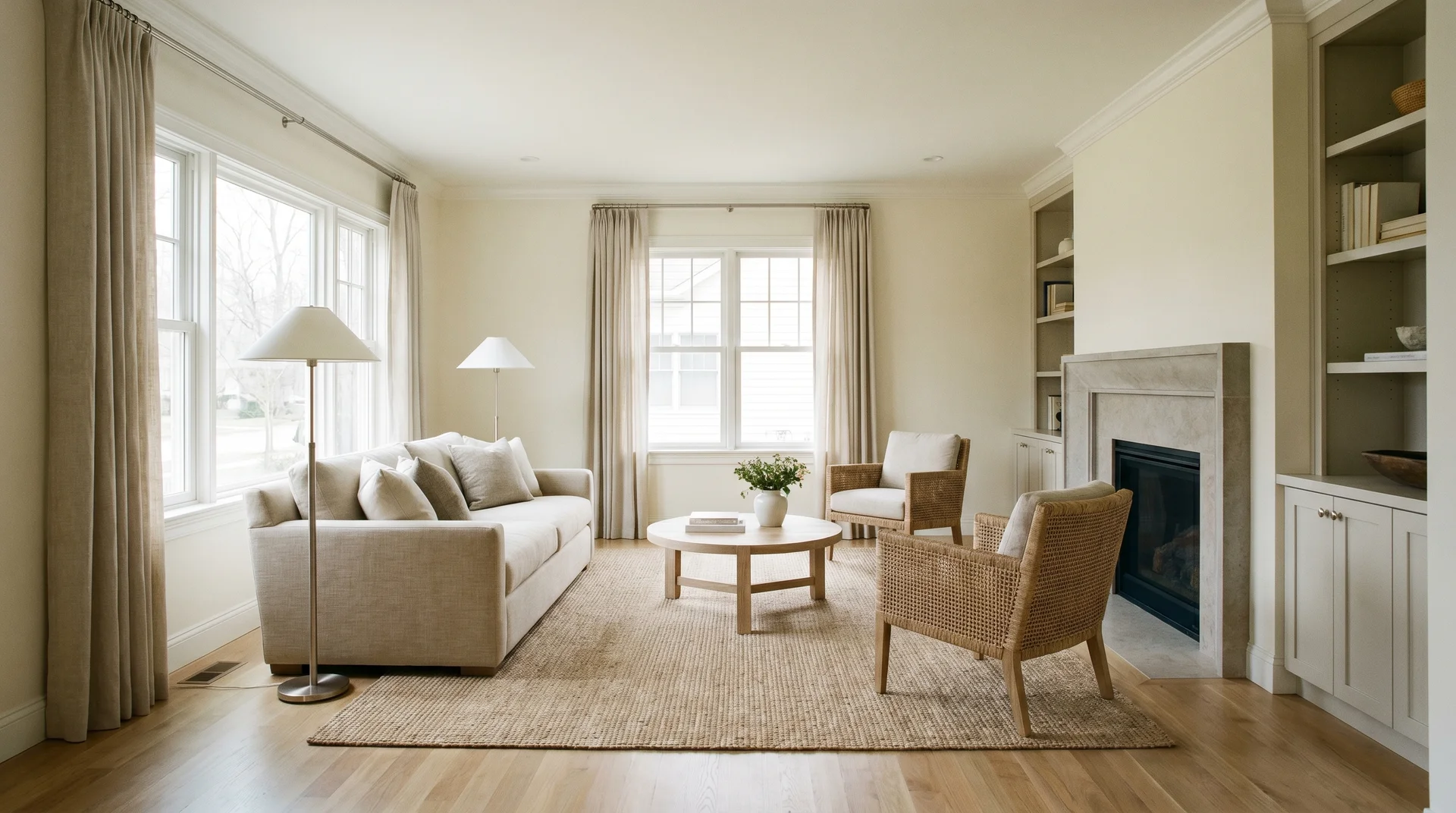
South-facing rooms are where Swiss Coffee performs best.
Warm, direct sunlight fills these spaces for most of the day. That warmth activates Swiss Coffee’s yellow-green in the best possible way. It reads as golden rather than green.
Alabaster also looks good in south-facing rooms. It warms up pleasantly and feels calm and creamy. But if you want to see Swiss Coffee at its peak, a south-facing room is the place to test it.
In this light condition, your flooring and existing furnishings carry more weight than the paint color itself. Both whites work well enough that everything else becomes the deciding factor.
East- and West-Facing Rooms
East- and west-facing rooms require more careful testing because the light shifts significantly across the day.
East-facing rooms receive warm morning sun and cool afternoon light. West-facing rooms flip that sequence. In both cases, the color reads differently depending on when you’re in the room.
Swiss Coffee can work in these spaces. Test it at both ends of the day before you commit.
A warm-morning east-facing kitchen might feel exactly right at breakfast and slightly unsettled by dinner. You’re watching how the color moves, not just how it looks at one moment.
Where in the Room Each Color Works Best
Placement changes how a color reads, even within the same room.
A ceiling reflects light differently from a wall. Where you apply the paint affects how the undertone shows up.
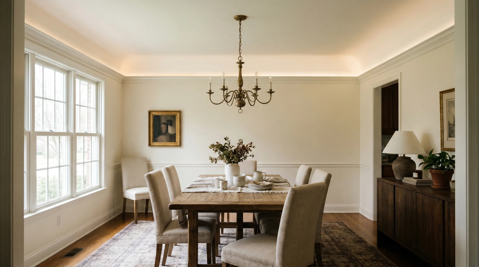
Walls
Both colors work well on walls. Your light direction determines which is right for you.
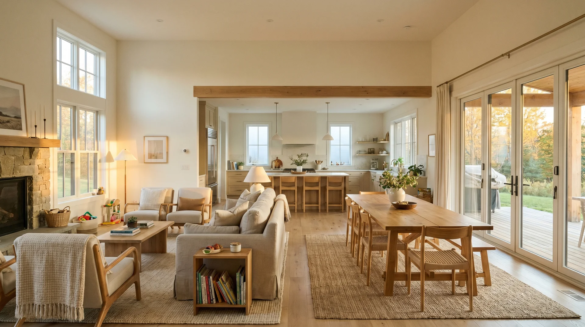
For large open-plan spaces with variable light, Alabaster is more reliable. Its undertone doesn’t shift as much between rooms.
Swiss Coffee on walls works best in a dedicated space with consistent warm light. Rooms that tend to suit it:
- South-facing dining rooms with strong afternoon sun
- Bedrooms lit primarily by warm-spectrum artificial fixtures
- Kitchens with significant natural afternoon light
In open-plan layouts where one color flows across multiple light exposures, Alabaster is the more forgiving choice.
Swiss Coffee is also a popular choice for board-and-batten wall treatments in warm-light entryways and mudrooms. The warm undertone reads well against the vertical texture of the battens when the light is working in its favor.
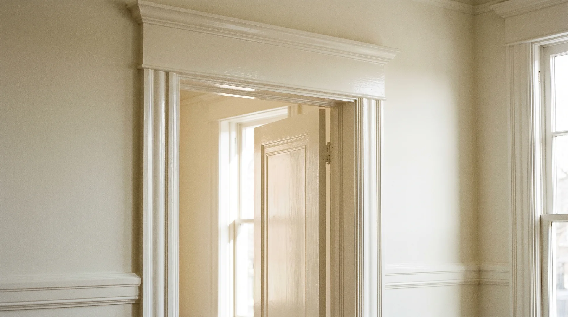
Trim and Doors
Using the same color on trim and walls works with either white, but the sheen matters more than most people expect.
Alabaster handles the same-color trim cleanly. The yellow-beige reads consistently whether it’s on a flat wall or a semi-gloss door frame.
Swiss Coffee on trim can pull slightly more yellow at higher sheens. Gloss and semi-gloss finishes intensify undertones. If you’ve noticed the trim looks different from the walls in the same color, this is usually why.
Changing your wall color affects how your trim reads. That’s worth knowing before you open the second can. And if you’re using semi-gloss or gloss on trim, ventilate the space well; those finishes have stronger fumes than flat or eggshell.
Ceilings
For ceilings, a lighter version of either color often performs better than the full paint.
Ceilings receive reflected light from below, not direct light from windows. The undertone reads softer as a result.
Many designers use a whites-only ceiling paint even alongside a warm wall color. The ceiling reads as the right complement without the color becoming heavy overhead.
If you’re using either of these colors on the walls and wondering whether to carry it up to the ceiling, sample it there separately first. It may read lighter or warmer than it does at eye level.
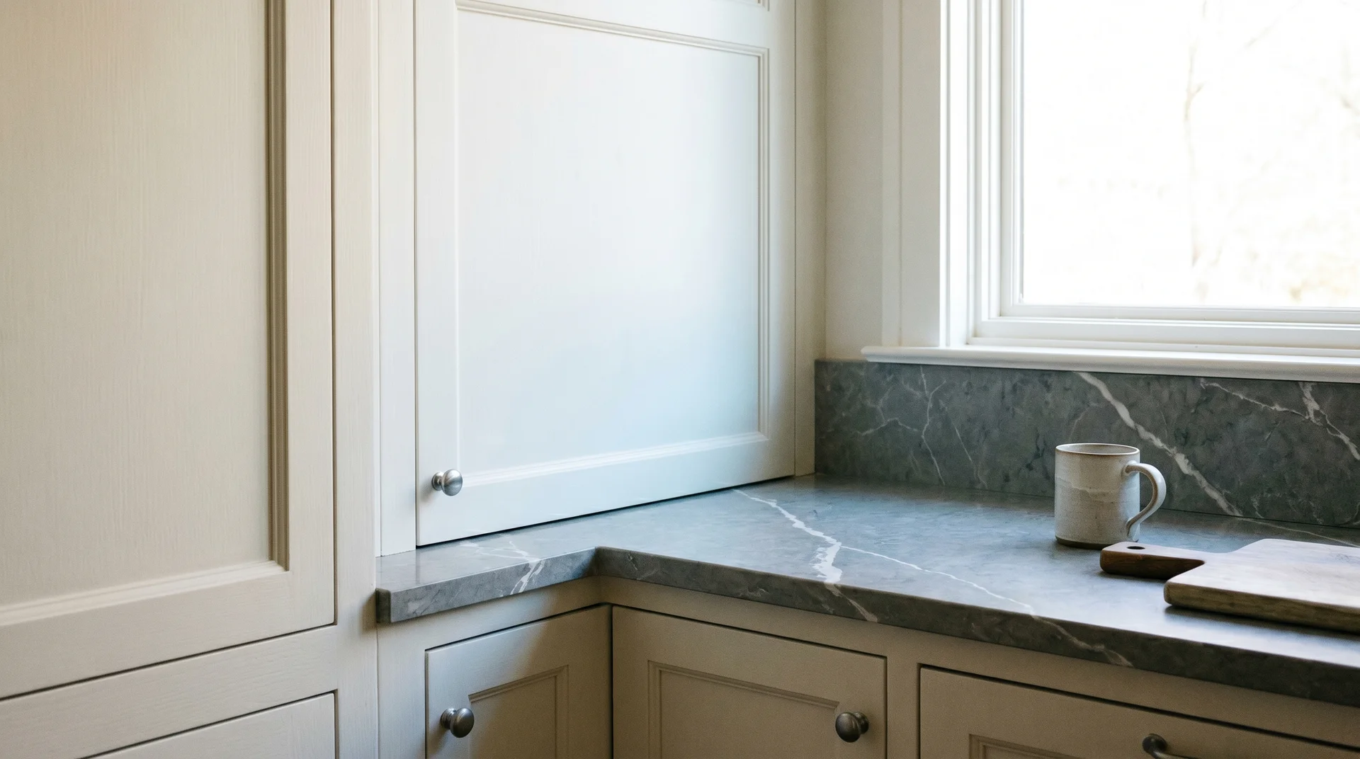
Cabinets and Built-Ins
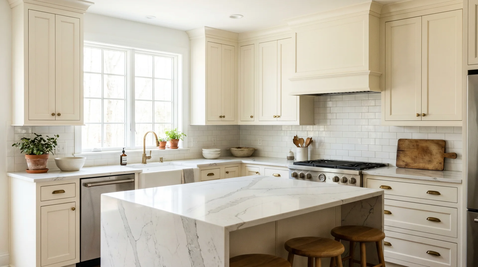
Cabinet surfaces show undertones more strongly than drywall, and the difference becomes obvious at full kitchen scale.
Cabinets are denser and smoother than drywall. They absorb light differently. An undertone that’s quiet on a flat wall can read more distinctly on cabinet door faces.
Alabaster has a strong track record in cabinetry. The yellow-beige reads as clean and creamy in most kitchen environments, especially against quartz or stone countertops with cool veining.
Swiss Coffee on cabinets works well when the kitchen has warm natural light and warm-toned countertops. In a kitchen with cool gray quartz and north-facing windows, I’d choose Alabaster without hesitation.
I’ve seen Swiss Coffee look beautiful in the right kitchen and genuinely muddy in the wrong one.
What to Pair Each Color With
Undertones don’t exist in isolation.
What’s already in your room shapes how the paint reads. Knowing what you’re working with before you choose a color is as important as the choice itself.
Flooring
Flooring is the largest adjacent surface in most rooms, and it has the strongest pull on how an undertone behaves.
Warm wood tones amplify undertones in both directions. With Alabaster, warm floors bring out a pleasant creaminess. With Swiss Coffee, the same floors can push the yellow-green further than you intended.
| Flooring Type | With Alabaster (SW 7008) | With Swiss Coffee (OC-45) |
|---|---|---|
| Warm wood (oak, walnut, cherry) | Brings out a pleasing creaminess | Can push the yellow-green further than intended |
| Cool or gray floors (concrete, gray tile) | Balanced; holds its warmth without conflict | Can feel unsettled; undertones may compete |
| Whitewashed or light-toned wood | Clean and neutral | Generally works; pulls slightly warm |
| White or near-white tile | Neutral backdrop; color reads crisply | Neutral backdrop; color reads crisply |
The principle is that warm surfaces and Swiss Coffee’s yellow-green reinforce each other. Whether that reads as beautiful or overwhelming depends on the room’s light and the scale of the flooring area.
Countertops and Stone
Countertop material is one of the most common triggers for undertone conflict in kitchens and bathrooms.
Cool gray quartz with white veining favors Alabaster. The cool stone and yellow-beige undertone create a balanced neutral combination. Swiss Coffee against the same stone can start to read yellow in an unflattering way.
Warm beige or cream stone works well with both colors. The undertones move in the same direction and don’t compete.
Stark, bright white countertops are the trickiest pairing for either color. They make any warm undertone more visible by contrast. Test your paint swatch directly against your countertop surface before deciding.
Wood Tones and Furniture
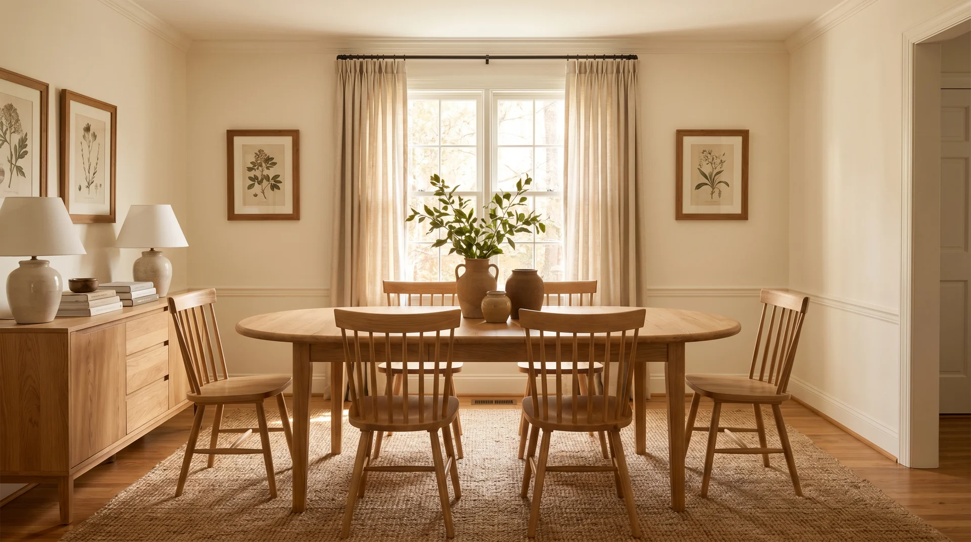
Most warm wood furniture tones work more broadly with Alabaster than with Swiss Coffee.
Natural oak and warm walnut sit comfortably against Alabaster’s yellow-beige. The tones are compatible without competing.
The same woods work well with Swiss Coffee in warm-light rooms. In cooler rooms, the combination starts to feel too yellow overall.
Darker woods, ebonized finishes, or dark espresso stains pair equally well with both whites. The contrast is strong enough that the undertone becomes less relevant.
Metals and Hardware
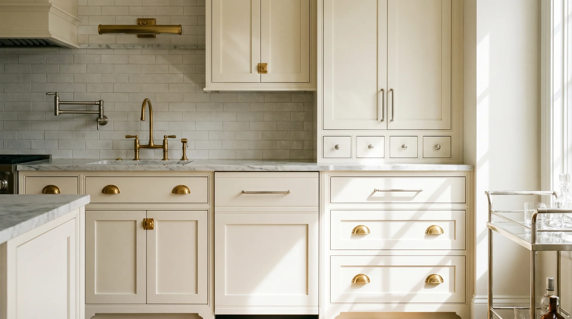
Warm metals favor Swiss Coffee. Cool metals favor Alabaster.
Brass and warm gold fixtures pull Swiss Coffee’s warmth in a genuinely rich direction. The yellow-green undertone and the warm metal reinforce each other. The result looks deliberate.
Brushed nickel and chrome sit naturally against Alabaster. The cooler metal tones and the yellow-beige undertone don’t compete.
Mixed metals, which most real-world homes have, sit more comfortably with Alabaster. It’s accommodating enough not to fight with anything specific.
Whole-House Use: Which One Is More Forgiving Across Rooms
For whole-house paint, the key variable is light consistency.
If your home has consistently warm, south-facing light throughout, Swiss Coffee is a genuine whole-house candidate. That’s a relatively rare scenario.
Alabaster is the more reliable choice for whole-house use. Its yellow-beige undertone doesn’t shift much between a sunny living room and a north-facing hallway.
The yellow-green undertone that makes Swiss Coffee beautiful in one room can read flat or muddy in the next.
I’ve consulted on whole-house projects where clients chose Swiss Coffee after falling in love with it in the showroom. The kitchen looked exactly as they hoped. The bedroom at the north-facing end of the hallway did not.
That room got repainted. Swiss Coffee’s yellow-green undertone doesn’t disappear between rooms. It just behaves differently based on the light each room receives.
Know which rooms in your home get the least natural light before you commit to Swiss Coffee throughout.
I can’t tell you exactly how Swiss Coffee will read across every room in your specific home. Every home has different variables, and they all shift the result. That’s the honest limit of any general guide.
Swiss Coffee is the more conditional color. That’s not a flaw. It’s just what it is.
How to Sample These Colors Correctly
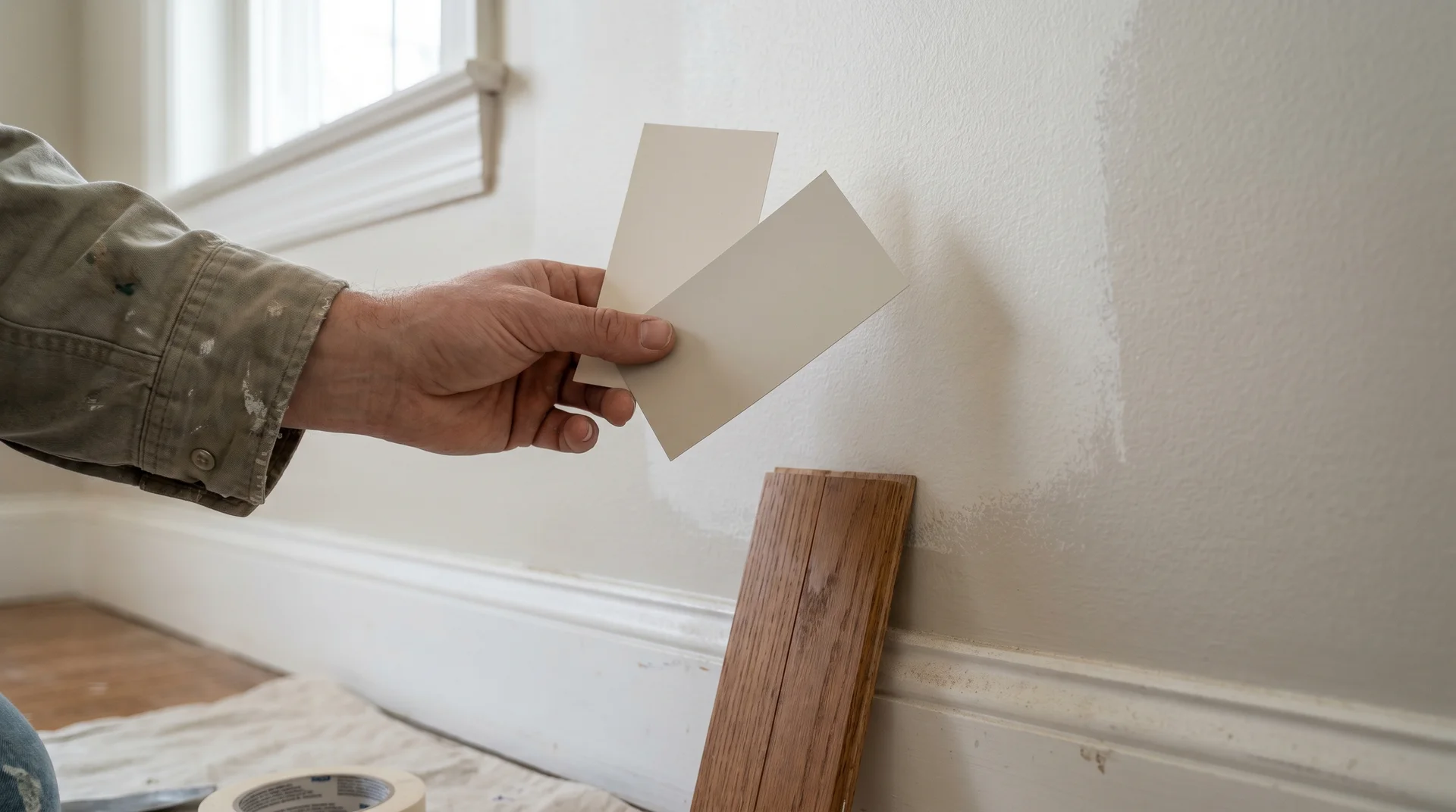
Sampling is the step most people get wrong, and it’s not because they skip it.
You’re looking for the undertone behavior I described earlier. A 3-inch chip doesn’t show you that. Here’s what does.
- Paint at least a 12×12-inch swatch directly on your wall. A chip surrounded by white store paper suppresses the undertone. The swatch on your actual wall exposes it.
- Paint swatches on two different walls in the same room: one that receives direct light and one that doesn’t. The same color reads differently on each wall, and you need to see both.
- Hold your flooring sample or a piece of actual flooring next to the swatch. The combination tells you more than either surface does alone.
- Evaluate three times: morning light, midday light, and evening, with your artificial fixtures on. This last step matters most for Swiss Coffee, which shifts more between natural and artificial light than Alabaster does.
- Look for specific signals. If the color reads slightly gray or faintly green at any point, the yellow-green undertone is reacting to cool light. With Alabaster, watch for whether it goes peachy or flat. Neither should happen in a well-matched room.
The chip shows you the color under conditions where the undertone is suppressed. The swatch on your wall, in your light, next to your floors, is the only reliable test.
I know “test your sample” sounds like advice you’ve read a hundred times. The difference here is knowing what you’re watching for and what a passing result looks like.
Frequently Asked Questions
These are the most common questions about these two colors.
The chip comparison doesn’t settle them. The full picture does.
Is Alabaster Lighter Than Swiss Coffee?
Swiss Coffee has a higher LRV, but Alabaster often reads as the lighter-feeling color in practice.
Swiss Coffee’s LRV is 83.93. Alabaster is 82. That makes Swiss Coffee the technically more reflective paint.
In cool or north-facing light, Swiss Coffee’s yellow-green undertone makes it feel heavier and more present than the number suggests. Alabaster’s more neutral undertone lets it read lighter in those same conditions.
Is Swiss Coffee Like Alabaster?
They are in the same off-white family but behave differently at the room scale.
On a small chip, they look nearly identical. Both are warm, creamy off-whites sitting close on the LRV scale.
At room scale, the undertone difference becomes clear. It’s most visible in cool or mixed-light spaces, where Swiss Coffee’s yellow-green pull separates it from Alabaster’s more balanced yellow-beige.
How Does Swiss Coffee Compare to Alabaster?
Swiss Coffee is the richer choice in warm light. Alabaster is the more consistent choice across varied conditions.
In south-facing rooms with warm natural light, Swiss Coffee has a glow that Alabaster doesn’t quite match. Alabaster performs more reliably across varied light directions and is the safer whole-house choice for homes with mixed light exposure.
Can I Use Swiss Coffee and Alabaster Together in the Same Space?
Using them on adjacent surfaces in the same room is not recommended.
The undertone difference reads as a mismatch at close range, not as an intentional contrast. That’s true even though both colors look similar on a chip.
They work well as choices across separate projects. Within the same room, pick one and apply it consistently. Paint a 12×12 swatch on your actual walls. Evaluate it across a full day in your actual light, next to your actual floors.
If you walk away from that process still undecided, trust the room with the worst light. That’s your limiting condition. Whichever color holds up there is the right choice for your home.
