
If you’ve already got chips taped to the wall and none of them look right, you’re not doing anything wrong. You’re missing the framework that makes this decision actually work.
Off-white is the most-used interior paint category in residential design, and also the one that trips people up most consistently, because “off white” describes a family of colors, not a single one.
What is an Off-White Paint Color?
An off-white paint color is any white base modified by a secondary hue like yellow, gray, green, peach, or beige, that prevents it from reading as stark, blue, or clinical on a wall.
How much of that secondary hue the formula carries determines whether the result reads as barely-there warmth or something noticeably creamy. The vocabulary in this space gets muddled fast.
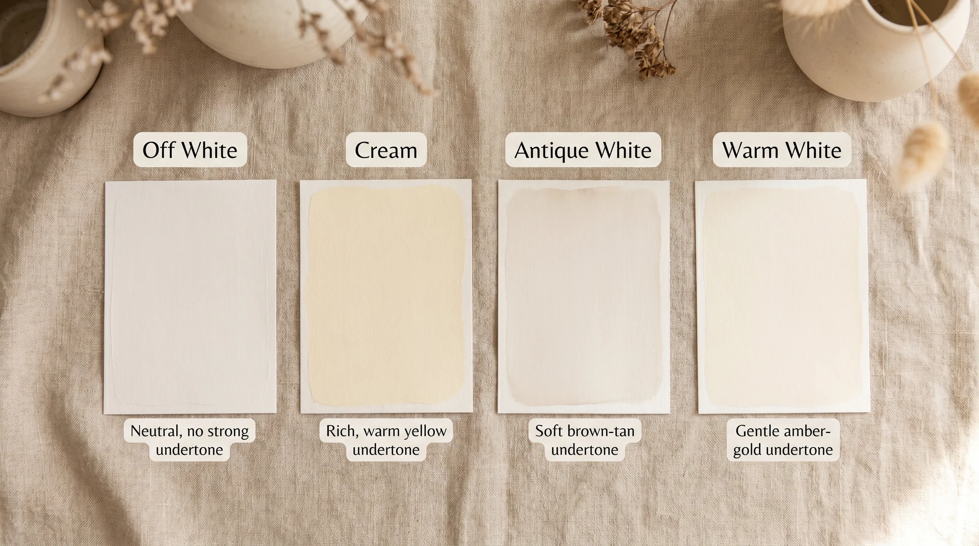
Cream, antique white, warm white, and off-white are used interchangeably in most conversations, but they describe different things.
| Term | Dominant Undertone | What It Tends to Look Like |
|---|---|---|
| Off White | Varies – yellow, gray, green, or beige | Softened white; reads as neutral |
| Cream | Yellow to peach | Noticeably warm; reads as inviting |
| Antique White | Yellow-brown, sometimes tan | Deeper and more aged; traditional feel |
| Warm White | Yellow or amber | Clean but with warmth; most designer whites fall here |
Off-white dominates interior paint because it does something pure white can’t. Pure white comes from an untinted base, which often comes across as cold, blue, or flat under artificial light.
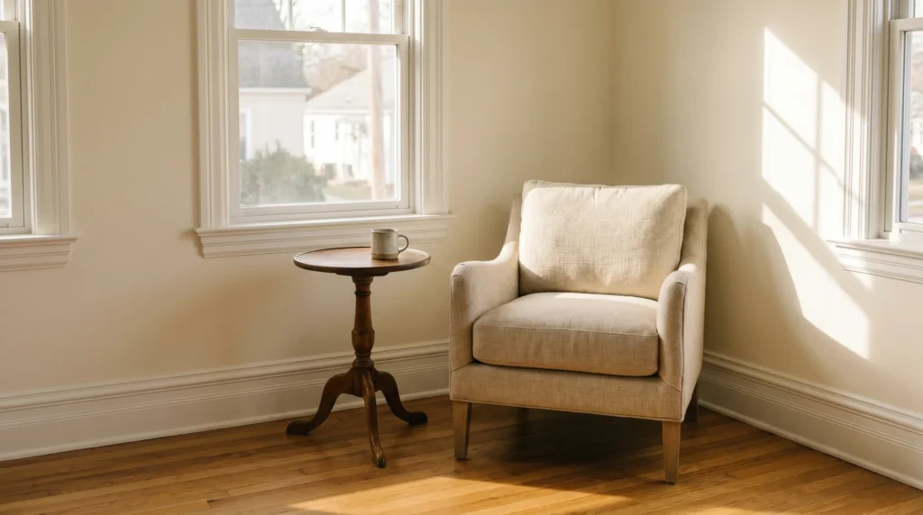
Off-white adds enough warmth or softness to feel livable without sacrificing brightness. That’s why it shows up in nearly every professionally designed interior, even spaces that appear, at first glance, to be painted white.
Why Off-White Looks Different in Every Home?
Off-white color selection confuses people for a specific reason. Most people treat it as an absolute decision when it’s actually a relational one. The paint chip tells you almost nothing on its own.
What matters is how that chip’s undertone interacts with the light in your room and the fixed finishes already in it.
Warm Undertones vs. Cool Undertones in Off-White
Warm undertones of off-whites carry yellow, peach, or cream as their secondary hue. They read as cozy and settled in rooms with warm light and natural wood tones. In a north-facing room or against cool gray stone, the same color can look dingy or muddy in ways that are genuinely hard to identify until you’re standing in the finished room, wondering what went wrong.
Cool undertones of off-whites carry gray, green, or occasionally lavender as their secondary hue. They read as crisp and fresh. Under cool LED lighting or in rooms with white or gray finishes, they hold up well and feel considered. Put them under warm incandescent bulbs, and some will shift toward a flat, slightly institutional tone.
There’s also what I’d call the green ghost problem. Several popular off-whites, including some that get recommended constantly, have a green undertone that’s nearly invisible on the chip but becomes apparent on four walls under certain lighting. It catches people off guard every time.
Benjamin Moore Swiss Coffee (OC-45) is the color this comes up most often with.
If you’re deciding between Swiss Coffee and Alabaster, our comparison of Swiss Coffee and Alabaster shows exactly how this plays out on a wall, and what to watch for when you test your samples.
How to Identify Undertones Before You Buy
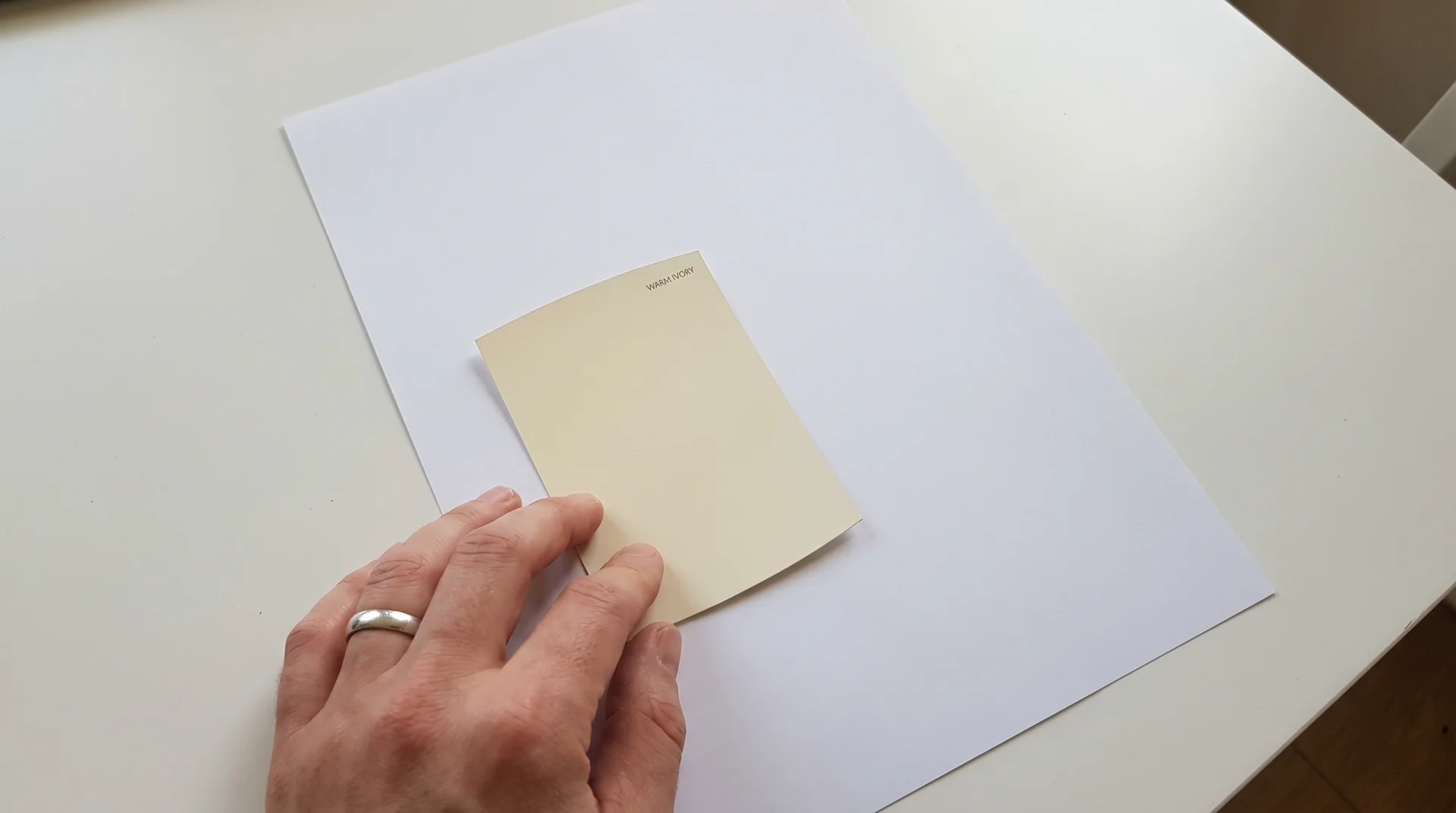
The fastest way to read an off-white’s undertone: hold the chip directly against a piece of standard white printer paper.
Your eye has a reference point for true white, so the secondary hue in the paint becomes visible immediately. What reads as neutral in the store often reveals a clear yellow or green tilt the moment you give it a white reference point.
The Munsell Color System, which forms the basis of the ASTM D1535 color notation standard, describes color in three dimensions: hue, value, and chroma.
For off-whites, hue is the variable to watch. A white rotating toward 5Y on the Munsell scale is heading toward yellow.
A white rotating toward 5GY is heading toward yellow-green. You don’t need to memorize color notation to use this.
What it means practically is that every off-white is already tilting somewhere, and your job is to figure out where before it goes on your wall.
How Your Existing Finishes Shape the Decision
Your flooring is the biggest variable most people underestimate.
Warm-toned oak floors pull off whites toward a yellow read. Cool gray or whitewashed wood floors pull them cooler.
The same gallon of paint placed against each floor type will read as two different colors, and that’s not a flaw in the paint.
- Stone and quartz countertops carry their own undertones, and they fight with wall color in ways that aren’t visible until everything is installed. A quartz with warm beige veining and a cool-gray off-white on the walls will look like an error. One has to lead; the other follows.
- Cabinetry is the third major variable, particularly in kitchens. The undertone relationship between cabinet finish and wall color is the most common source of kitchen repaint regret. The cabinet color you chose six months ago is now the constraint your wall color has to work around.
- Existing trim sets a hard constraint if it’s already painted. The trim’s undertone becomes your starting point, not the wall color you want.
How Light Changes Off White: Orientation, Source, and Time of Day
The paint store’s lighting is designed to make colors look their best, which is exactly why colors chosen in the store regularly disappoint at home.
Your home’s light is different; it changes throughout the day, and it changes what the paint actually looks like on your walls. Room orientation is the first variable to account for before you commit to anything.
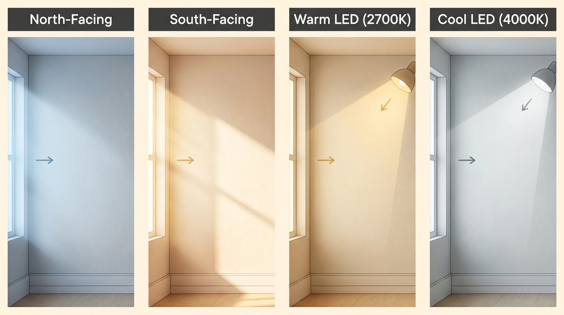
North-facing rooms receive indirect, cool, blue-toned light all day. A warm off-white with a yellow or cream undertone counterbalances this and prevents the room from reading cold. A cool off-white in a north-facing room will shift gray by midday.
South-facing rooms get abundant warm light, especially in the afternoon. Almost any off-white works here, but cool off-whites actually perform particularly well because the warm light softens and flatters them. South-facing rooms give you the most flexibility of any orientation.
East and west-facing rooms shift significantly through the day. East-facing rooms are warm in the morning and cool by afternoon; west-facing rooms reverse that pattern. For rooms with strong directional light changes, neutral off-whites perform most consistently because they don’t go dramatically warm or cool as the light moves.
Artificial light deserves specific attention.
The Illuminating Engineering Society recommends a Color Rendering Index of 90 or above for accurate color evaluation. Standard LED bulbs below CRI 90 and most household bulbs don’t reach that level to distort color enough to affect off-whites.
Warm LED bulbs amplify yellow undertones. Cool LED bulbs flatten warm off-whites and can push them toward gray or even a slight green. Evaluate any paint sample under the actual bulbs you use in that room, not daylight alone.
The Best Off-White Paint Colors for Interiors
These are not a complete catalog. They’re the colors that perform consistently across real room conditions, organized by undertone category so you can match them to what your space actually needs.
Most lists get the order backwards — names before framework. Use the undertone and lighting guidance above to identify which category your room needs first, then use these picks as your starting point for sampling.
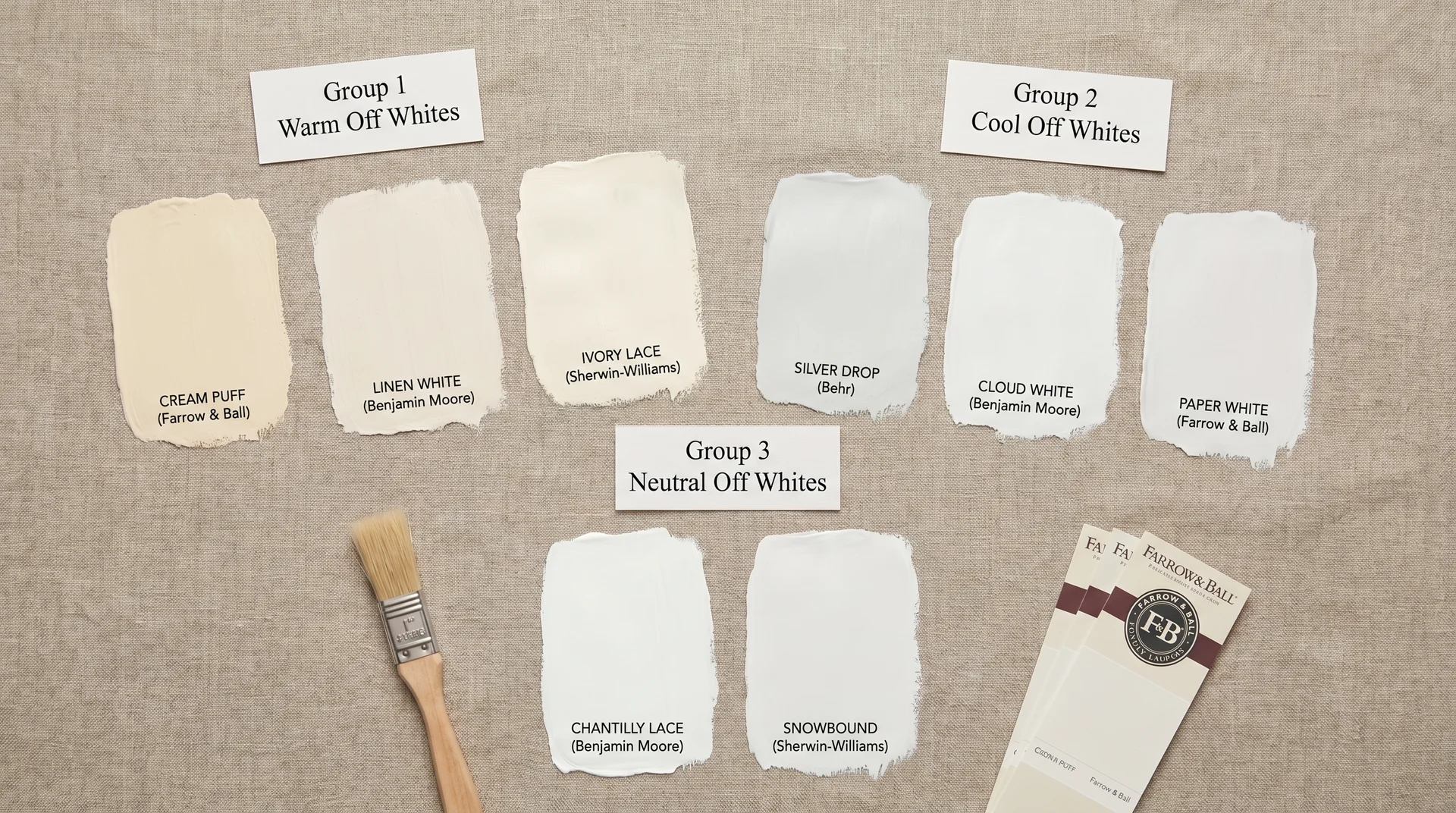
Warm Off Whites
Warm off-whites carry yellow or cream as their dominant secondary hue. They work in rooms with natural wood tones, warm-toned stone, and traditional architectural details. In modern interiors with cool gray finishes, they can feel heavy or dated.
- Benjamin Moore White Dove OC-17 (LRV 85.35): The most versatile warm off-white available. It has a soft yellow-cream undertone subtle enough not to read as yellow outright, but warm enough to counterbalance cool north-facing light. It works across most room conditions and most home styles, which is why it appears more than any other single color in professionally designed interiors. If you have to choose one color to sample first, start here.
- Benjamin Moore Navajo White OC-95 (LRV 74): Deeper and more overtly cream than White Dove. It suits older homes with warm wood trim and traditional millwork. In a contemporary space with cool finishes, it reads dated. In the right context, it’s warm and considered.
- Sherwin-Williams Antique White SW-6119 (LRV 73): Yellow-beige with more warmth than Alabaster. Pairs naturally with honey-toned wood cabinets and earth-toned stone. Not a first choice in rooms dominated by gray, white, or cool-toned finishes.
Cool Off Whites
Cool off whites carry gray, green, or occasionally lavender as the secondary hue. They read as clean and fresh, and they’re in the right direction for modern interiors with white or cool-toned finishes. They need warm enough lighting to avoid feeling flat or cold.
- Benjamin Moore Chantilly Lace OC-65 (LRV 92.2): Technically a near-white rather than a classic off-white, but it belongs here because people reach for it when they want crisp without stark. It has a slight cool undertone that can shift green under warm incandescent lighting. It’s not universally flattering. Sample it specifically under your actual bulbs before committing — the green ghost problem is real with this one.
- Sherwin-Williams Alabaster SW-7008 (LRV 82): Slightly warmer than Chantilly Lace, with a soft gray-cream undertone that makes it more adaptable. It’s the most commonly recommended off-white in the industry right now. For most modern to transitional interiors, that reputation is earned. It rewards warm lighting and fights cool LEDs, worth knowing before you fall in love with it in the store.
- Sherwin-Williams Greek Villa SW-7551 (LRV 84): The one I keep coming back to when clients can’t decide between warm and cool. It reads warm in natural light and cooler under artificial light, which makes it unusually forgiving across different orientations.
Neutral Off-Whites: The Hardest to Find and the Most Forgiving
True neutrals like off-whites without a dominant undertone in any single direction are genuinely difficult to identify and harder to predict.
This is where I’ll be honest: there’s no reliable formula for how a neutral will read in your specific room. The variables of light, adjacent finishes, and ceiling height interact in ways that only sampling can resolve.
- Benjamin Moore White Heron OC-57 (LRV 83.94): One of the most balanced off-whites in the Benjamin Moore line. It carries a very faint warm undertone that prevents it from going gray, without leaning yellow enough to read as cream. Relatively consistent across orientations, which is a real advantage.
- Sherwin-Williams Creamy SW-7012 (LRV 81): Despite the name, it’s softer and less overtly creamy than you’d expect. Warm-neutral quality that works in transitional interiors. It does tip slightly warm, so test it specifically in north-facing rooms before committing.
| Color | Brand | LRV | Undertone | Best Conditions | What It Fights |
|---|---|---|---|---|---|
| White Dove OC-17 | Benjamin Moore | 85.35 | Soft yellow-cream | North-facing rooms, warm wood, most conditions | Very cool modern interiors |
| Navajo White OC-95 | Benjamin Moore | 74 | Deep cream | Traditional homes, warm wood trim | Modern spaces, cool finishes |
| Antique White SW-6119 | Sherwin Williams | 73 | Yellow-beige | Wood cabinets, earth-toned stone | Gray or white-dominant rooms |
| Chantilly Lace OC-65 | Benjamin Moore | 92.2 | Cool, slight green | Modern interiors, bright light, cool finishes | Warm incandescent lighting |
| Alabaster SW-7008 | Sherwin Williams | 82 | Gray-cream | Modern to transitional, most conditions | Very warm, wood-heavy spaces; cool LEDs |
| Greek Villa SW-7551 | Sherwin Williams | 84 | Warm-neutral | Mixed orientations, transitional style | Rooms with very cool stone or tile |
| White Heron OC-57 | Benjamin Moore | 83.94 | Balanced neutral | Most conditions | Hard to predict — sample first |
| Creamy SW-7012 | Sherwin Williams | 81 | Soft warm-neutral | Transitional interiors | North-facing rooms without warm lighting |
Off-White in Specific Rooms
The same off-white can be the right choice in one room and genuinely wrong in another room of the same house.
Room conditions vary enough that the fixed-element analysis from the undertone section has to happen room by room. The variables are the same, but they combine differently depending on the room’s size, function, and how it’s lit.
Off-White in Living Rooms
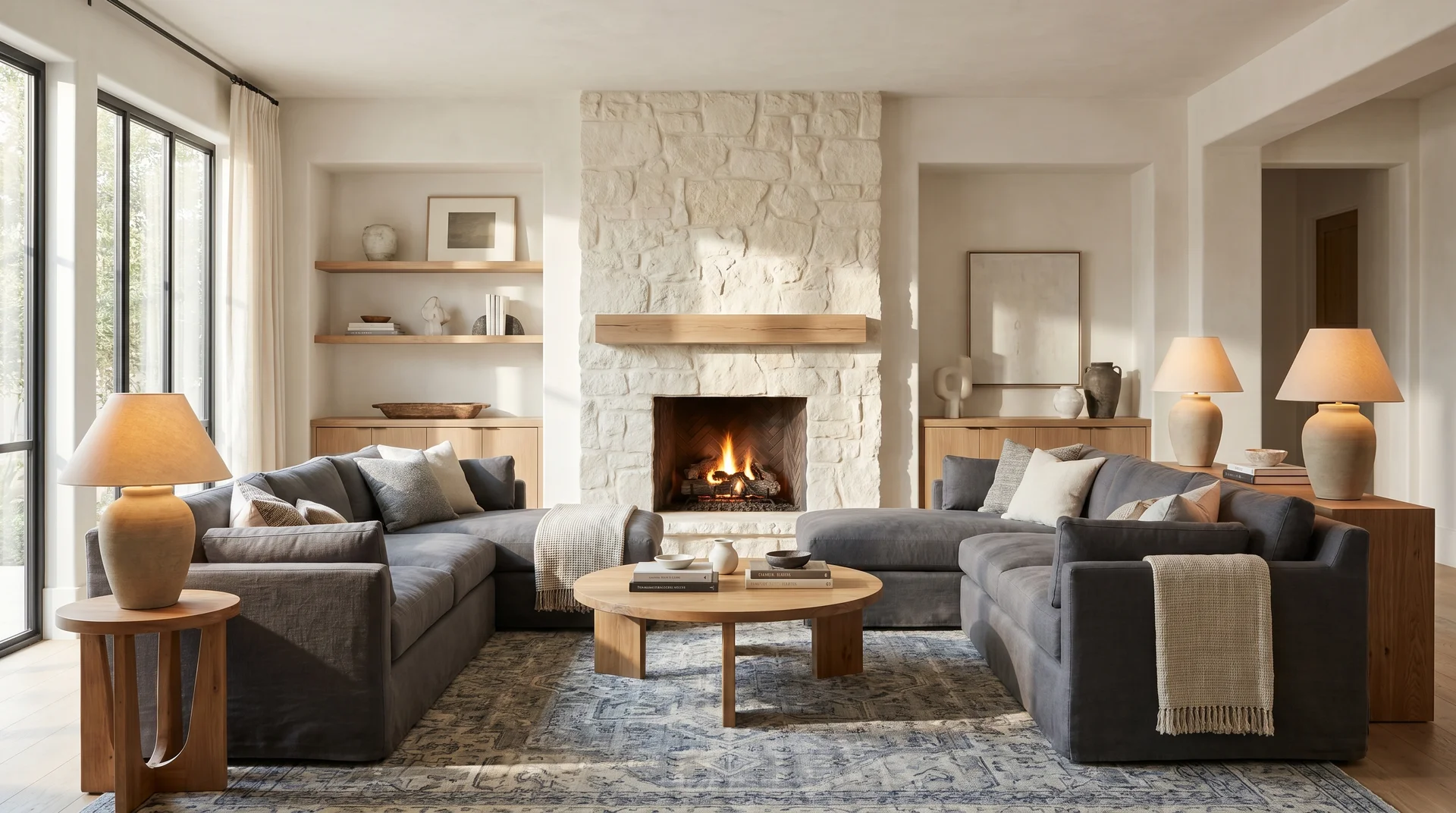
Start with the room’s anchor element before you look at a single chip. If you have a fireplace surround in cream stone, a warm off-white will read as intentional. If you have a gray sectional and a cool-toned area rug, a warm off-white will fight the room at every angle.
Living rooms typically have mixed lighting, natural light, overhead fixtures, and lamps, which is where neutral off-whites perform best. They shift subtly with the light rather than going dramatically warm or cool at different times of day.
The most common mistake in living rooms is choosing a wall color before the furniture is settled. If you’re still selecting furniture, pick the off-white last.
Off-White in Kitchens
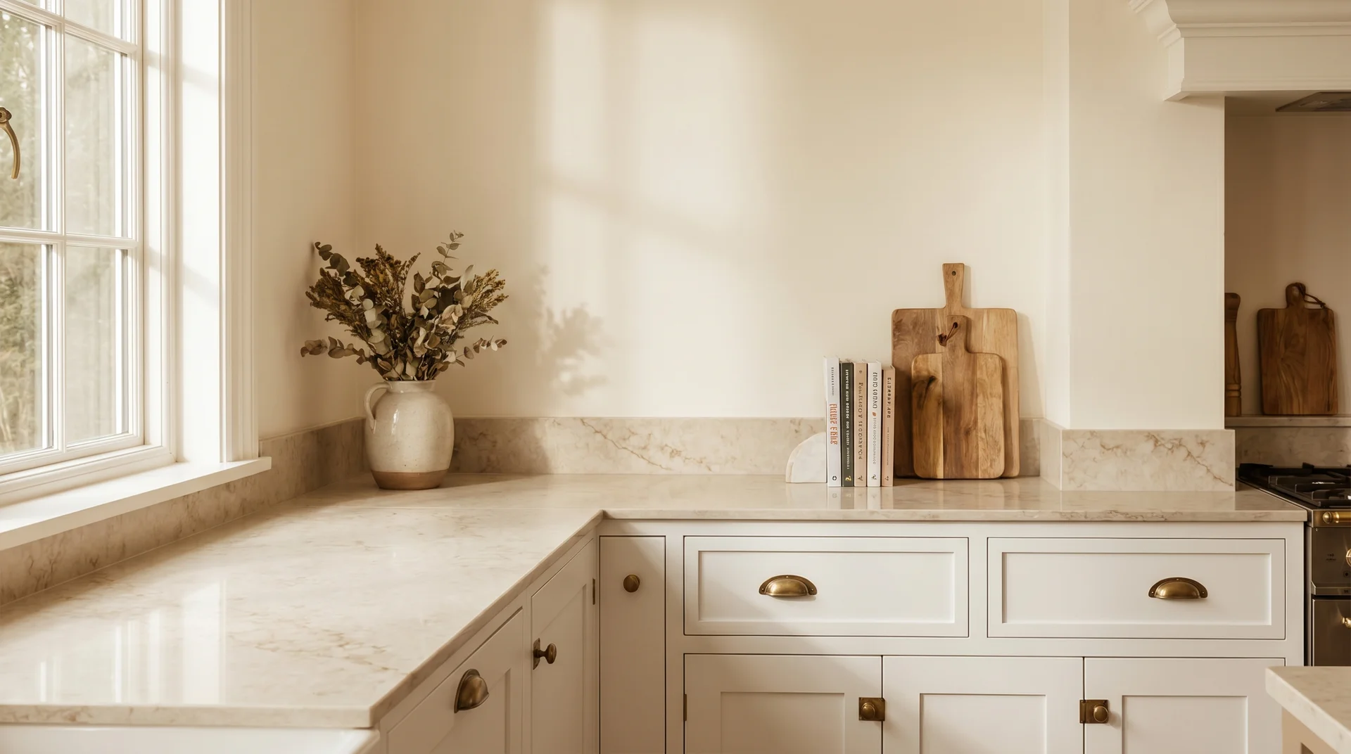
For most kitchens, White Dove OC-17 and Alabaster SW-7008 are the two off-whites worth sampling first. Both have enough undertone flexibility to adapt to the mixed lighting conditions most kitchens operate under.
Kitchens are the most complicated room for this decision because every surface has an undertone that influences the wall. Cabinet color, countertop veining, backsplash material, and hardware finish all introduce variables that interact in ways you can’t see on a chip.
White or off-white cabinets paired with an off-white wall only work when the undertones align. If the cabinets are cool-white and the walls are warm cream, the cabinets read dingy by comparison.
The countertop is the wildcard. Check its undertone under your kitchen’s actual lighting before choosing a wall color to accompany it.
If you’re working with stone or quartz and you’re not sure how to read its undertone, the same undertone principles that apply to granite and quartz selection apply here, too: warm veining pulls warm, cool veining pulls cool, and the wall color has to follow.
Off-White in Bedrooms
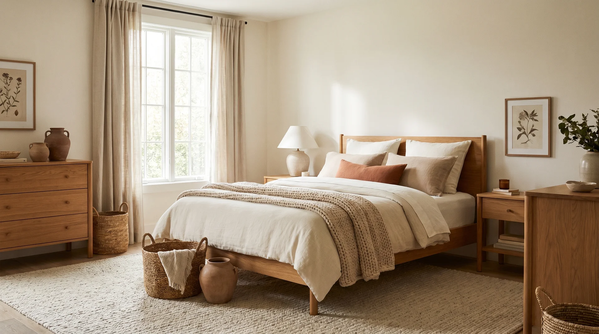
Bedrooms are the most forgiving room for this decision because there are fewer fixed elements.
Most bedrooms have flooring and trim. The remaining choices, like bedding, furniture, and textiles, are easier to adapt than stone countertops or built-in cabinetry.
Warm off-whites work particularly well in bedrooms because they create a soft, settled atmosphere that suits a sleep environment. Navajo White and Creamy are worth testing here, especially in rooms with warm wood furniture or earth-toned textiles.
South-facing bedrooms can handle almost any off-white. North-facing bedrooms benefit most from the warmest options in the lineup. This is where White Dove consistently outperforms cooler choices.
Off-White and Trim: Getting the Pairing Right
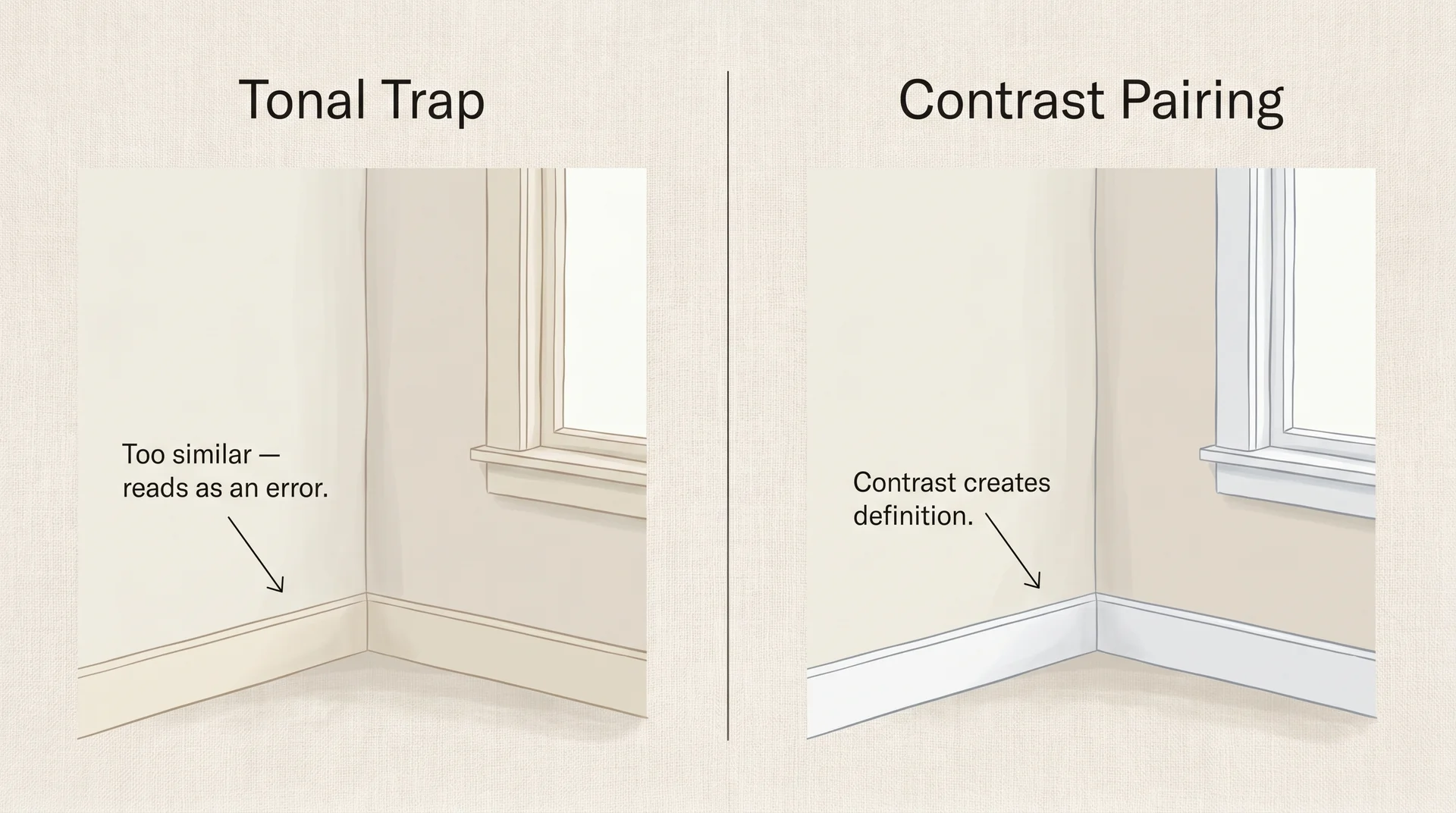
The most common mistake in off-white selection isn’t the wall color. It’s ignoring how the wall interacts with the trim.
When the wall and trim are too similar in value and undertone, the whole room looks flat. Not cohesive. Flat.
Everything reads as slightly the wrong shade of the same color, and it’s one of those results that’s hard to name but immediately noticeable.
The trim question trips more people up than the wall color itself, in my experience.
The general principle is contrast: if the wall is warm cream, a brighter and cooler white on the trim creates clean separation that makes both colors read better. If the wall is a cool off-white, tonal trim can work, but only when there’s enough value difference to distinguish the two surfaces clearly.
One situation where intentionally matching wall and trim works: rooms with strong architectural detail that provides its own visual contrast.
Older homes with deep crown molding, paneled doors, and substantial baseboards can carry a tonal off-white wall and trim combination because the shadow lines from the millwork do the work of separation that color contrast would otherwise provide.
Without that depth of detail, tonal matching almost always reads as indeterminate.
How to Sample Off-White Paint Correctly?
The undertone framework we’ve covered throughout this guide applies directly to sampling, too. The chip cannot tell you how a color reads on your specific wall under your specific light; only a large, well-placed sample can do that.
- Buy large sample pots, not chips. A 2″x3″ chip doesn’t show you how a color reads at scale. Sample pots are inexpensive. Paint at least a 12″x12″ section directly on the wall, larger if the wall is a prominent surface you’ll be looking at daily.
- Sample on multiple walls in the same room. The north wall and the south wall will show you two different versions of the same color. Both are accurate. You need to know which version you’ll be living with most.
- Don’t sample over bare primer. Primer’s surface and sheen affect how paint reads. Sample over the existing wall surface where possible, or apply two full coats of the sample color before evaluating.
- Evaluate under morning light, afternoon light, and your actual evening artificial lighting. Three separate assessments give you a complete picture. The evening evaluation under your bulbs is the one most people skip and most often regret skipping.
- Leave the samples up for 48 hours before deciding. Colors shift as you adapt to them and as the light in your home changes through the day. The 48-hour rule sounds excessive until you’ve watched someone paint an entire room and hate it by the next morning.
- Narrow to two, then compare each against your fixed finishes individually, not against each other. Hold each sample next to your flooring, countertop, and trim in turn. The winner is the one who fights less, not the one who looks better in the abstract.
One last note on finish: for most interior walls, eggshell or matte eggshell is the right sheen for off-whites.
Flat finish hides imperfections but marks easily. Satin is more durable but can make an off-white look slightly different in sheen-heavy light.
The color you sample in eggshell is the color you’ll live with. Don’t evaluate a matte sample and then order satin.
Most sampling advice gets the order backwards: chip first, wall evaluation second, fixed-finish comparison last. That sequence consistently produces regret.
Understand the room’s fixed elements and their undertones first. Narrow your candidates to match. Then sample to confirm.
Off White vs. White: When to Go Brighter
Off-white isn’t always the right answer, and knowing when to use true white is as useful as knowing how to choose an off-white.
| Situation | Better Direction |
|---|---|
| High-contrast modern interior with black or dark accents | True white — off-white softens where you want sharpness |
| A room with very low natural light | True white — counterintuitively, it reads as brighter and cleaner |
| Architecture you want to read crisply (moldings, built-ins) | True white — architectural detail reads more precisely against a clean base |
| Lived-in space with warm wood or natural materials | Off-white — warmth integrates; true white fights the organic tones |
| A room where bright white would feel clinical or cold | Off-white — the undertone takes the edge off without losing brightness |
| Space adjacent to rooms painted in warm tones | Off-white — the transition reads as considered, not accidental |
The combination worth avoiding: off-white walls with off-white trim in nearly matching but not identical tones. True white walls with bright-white trim are coherent. Off-white walls with bright-white trim are coherent.
Off-white walls with off-white trim that’s only slightly different is the one pairing that reliably produces a muddy, indeterminate result.
End Note
One thing I’m not covering here is exterior off-white paint. Exterior color selection involves different variables entirely: UV reflectance, how the trim relationship reads at architectural scale, material weathering over time, and how the color sits against the landscape.
It warrants its own treatment, and combining interior and exterior guidance in a single piece would shortchange both. If that’s where your project is headed, it’s a separate conversation.

2 Responses
The distinction you made between ‘off-white’ as a broad category and specific undertones like yellow or gray really clarifies why chips often fail to translate on actual walls. Your table effectively highlights how a secondary hue shifts a color from clinical to inviting, which is crucial knowledge for avoiding that ‘wrong’ feeling when taping samples. This framework is exactly what homeowners need to navigate the ‘muddled vocabulary’ of these versatile shades.
The distinction you made between ‘off-white’ as a broad family and specific undertones like yellow or beige really clarifies why my paint samples never looked right on the wall. It’s true that swapping the secondary hue is the key to moving beyond that clinical or stark look, rather than just chasing a generic ‘warm’ label. This framework definitely solves the confusion people face when those creamy shades end up looking too dated.