
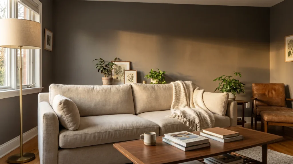
Sherwin-Williams Mink SW 6004 is a warm grayish-brown taupe with an LRV of 20.53, approved for both interior and exterior use. It sits between brown and gray without committing to either.
On a well-lit south-facing wall, it reads as a sophisticated warm neutral. Under cool-white LED lighting or in a north-facing room, it behaves considerably differently, and that gap is where most paint decisions involving this color go sideways.
What Color is Sherwin-Williams Mink SW 6004?
Mink SW 6004 is a dark, warm taupe: brown-based, gray-modified, and low in saturation. Sherwin-Williams places it in the Neutral color family.
Its hex code is #847B77. The RGB values are Red 132 / Green 123 / Blue 119, which means red is only slightly dominant enough to produce warmth, but not enough to read as definitively brown.
Here are the core specs from the Sherwin-Williams product data:
- Hex: #847B77
- RGB: R 132 / G 123 / B 119
- LRV: 20.53
- Hue angle: 18.5°
- Saturation: 0.10 (very low – this is a muted, restrained color)
- Approved use: Interior and exterior
The saturation of 0.10 is worth paying attention to. Mink is not a punchy color. It’s quiet and layered, and that restraint is exactly what makes it hard to read from a chip and easy to misjudge before you put it on a wall.
The Undertones in Mink SW 6004 — And Why They Matter
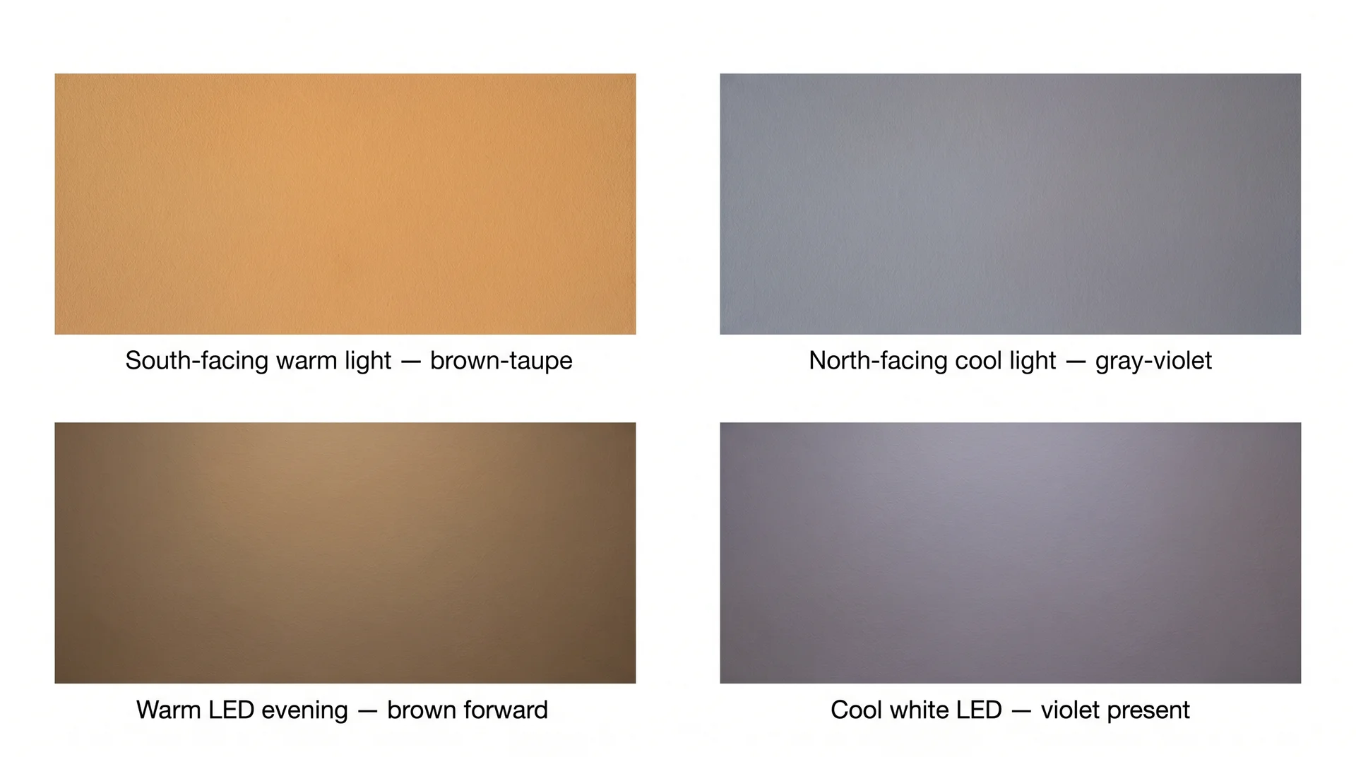
Mink has three active undertones: a warm brown base, a gray modifier that desaturates the warmth, and a violet frequency that most buyers don’t see until after they’ve painted. The violet undertone is not a defect. But it is real, and it changes how the color reads under specific conditions.
Honestly, the violet component is the thing most chip-pickers never expect. I’ve had clients come back after painting what they fully believed was a cozy brown-taupe, confused because their north-facing bedroom looks gray-purple by 9 pm under their LED downlights.
The warmth they fell in love with at the paint counter was real; it just needed warm light to show up. Under cool light, the gray modifier and the violet frequency take over.
Here is how Mink reads across different light conditions:
| Light Condition | How Mink Reads |
|---|---|
| South-facing room, warm daylight | Warm, cozy brown-taupe. This is the version you saw on Pinterest. |
| West-facing, afternoon sun | Deep, dusky taupe. Rich and grounded — probably the best Mink looks. |
| East-facing, morning light | Warm early, then shifts to a quieter, more neutral reading by midday. |
| North-facing, cool indirect light | Grayer and cooler. The violet undertone becomes noticeable here. |
| Cool-white LED, evening | The warmth largely disappears. This is where the violet surfaces most. |
| Warm-white incandescent or warm LED | Brown base comes forward. Closest to how it looks on the chip. |
Mink amplifies your room’s existing light quality rather than correcting it.
A warm, sunny room gets the inviting taupe you expected. A cool-light room gets a version of this color that is more complicated and harder to work with.
LRV 20.53
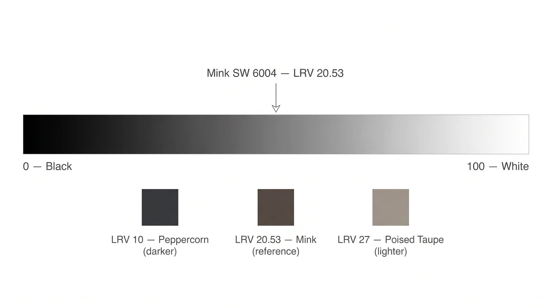
An LRV of 20.53 means Mink absorbs approximately 80% of the light that hits it. The Light Reflectance Value scale runs from 0 (pure black) to 100 (pure white).
At 20.53, Mink sits in the darker third of that range, a genuine medium-dark color, not a near-black, but well past the light neutrals most rooms use day-to-day.
Most advice on painting darkness frames this as a question of taste. The right question is whether your room has enough light to let the color behave as intended.
A large, south-facing living room with warm-white recessed lighting and 9-foot ceilings will carry Mink without any sense of weight. A 10-by-10 bedroom with one small north-facing window and no overhead fixture will not.
Here are the specific conditions where LRV 20 works against you rather than for you:
- Small bathrooms without natural light – at this LRV, the walls will visually close in on the space
- North-facing bedrooms with cool-white lighting and no warm supplemental sources, the violet undertone and the depth compound each other badly here
- Windowless hallways or utility corridors, where the intimacy Mink creates tips into something claustrophobic
- Rooms where the furniture, flooring, and fixtures are all cool-toned cool-gray sofas, chrome hardware, cool-white tile, because Mink’s warm base will fight them at every turn
What Colors Go With Mink SW 6004?
Mink pairs best with colors that share its warm temperature. Its brown base is the defining quality, so cool-toned pairings create friction rather than the contrast you want. The goal is warmth compatibility, not a strict match.
Coordinating Colors
Sherwin-Williams identifies three primary coordinating colors for SW 6004:
- Biscuit SW 6112: A warm, light neutral that echoes Mink’s brown base without competing with its depth. Best for adjacent walls in an open plan where you want the palette to read continuous rather than contrasted.
- Tatami Tan SW 6116: An earthier, deeper mid-tone that keeps the palette grounded and organic. Works when you want the space to feel rooted in natural materials rather than polished and modern. The warmth here is more forward than in Biscuit.
- Snowfall SW 7104: A crisp, near-white for contrast. Best on ceilings or as a clean visual break. It reads brighter against Mink than most whites, which is an asset in rooms that need to feel airier above the dark walls.
Trim Color With Mink
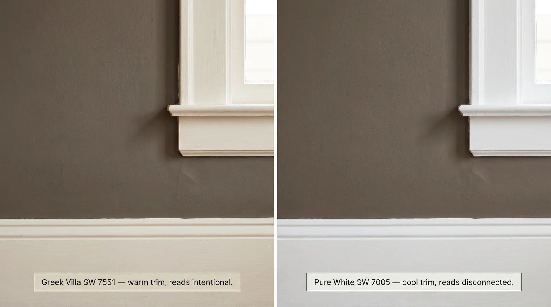
The trim choice matters more with Mink than with most neutrals. A color this complex, with undertones that shift under different light, reacts visibly to whatever sits next to it on the wall. Get the trim wrong, and the room looks unresolved.
- Greek Villa SW 7551 is the right answer in most situations. It’s a warm, creamy off-white that shares Mink’s warmth and temperature. The contrast between them reads deliberate. Against a cooler white, it reads like a default.
- Worldly Gray SW 7043 works for a quieter, monochromatic approach. The mid-tone gray creates a subtle boundary rather than a bright frame, the better choice when you want the room to feel like one cohesive statement.
- Pure White SW 7005 is a reasonable ceiling color, but not ideal as trim directly against Mink walls. It runs slightly cool, and against a warm-based neutral, it tends to land as an afterthought rather than a decision.
Accent Colors That Work
- Deep navy: SW Naval SW 6244 is the clean choice. Strong contrast, no temperature conflict. Good for throw pillows, drapes, or a single accent piece rather than a full accent wall.
- Warm bronze and brushed gold metallics: these pull the brown base forward in exactly the right way. Light fixtures, hardware, and frames are the natural application.
- Evergreen Fog SW 9130: a soft green-gray that brings an organic, earthy note without going cold. Good for textiles, accent chairs, or an adjacent room where you want a connected but distinct palette.
- Warm wood tones in any finish, from pale oak to dark walnut, both work. Natural materials read better against Mink than almost anything else on this list, which is why rooms with wood floors and wooden furniture photograph so well in this color.
What does not work: cool blues, stark whites as primary accent colors, and chrome-dominant palettes. They push against the warmth in Mink rather than building on it. The room ends up feeling like two competing decisions made in the same space.
Where to Use Mink SW 6004
Mink works best in rooms with adequate warm light and furnishings that lean warm or natural. It performs well in specific conditions and poorly in others, and knowing which conditions you have is the whole decision.
Living Rooms
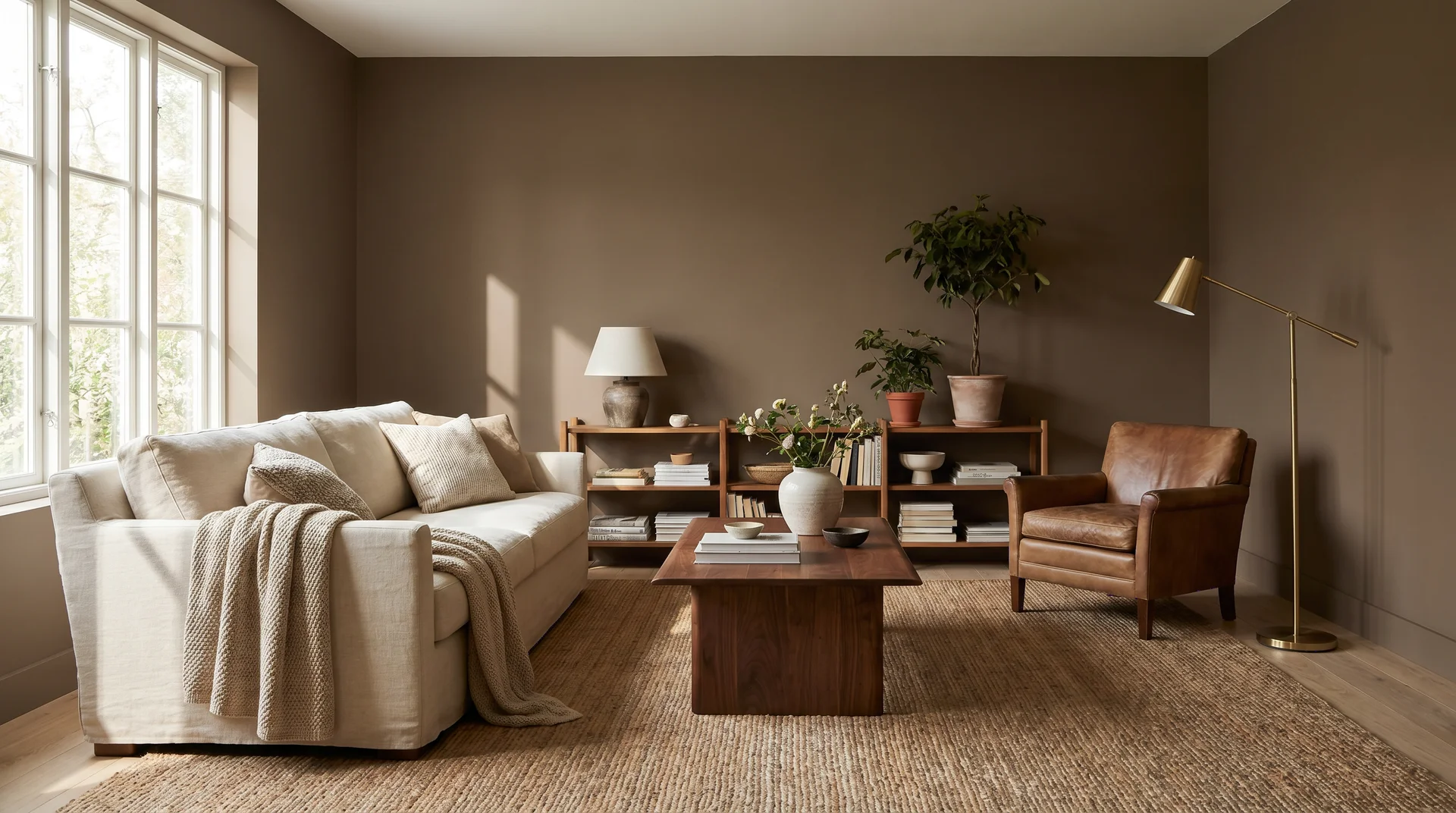
This is one of Mink’s strongest use cases. A large, light-forward living room with warm wood floors, textured upholstery, and warm-white lighting is where this color delivers what it promises.
The depth creates intimacy without making the room feel heavy.
One real constraint worth naming: if your primary sofa is cool gray or has visible blue undertones, Mink will fight it.
The visual temperature difference reads as a mismatch rather than contrast. If you’re choosing furniture alongside this paint decision, lean warm or lean natural.
Bedrooms
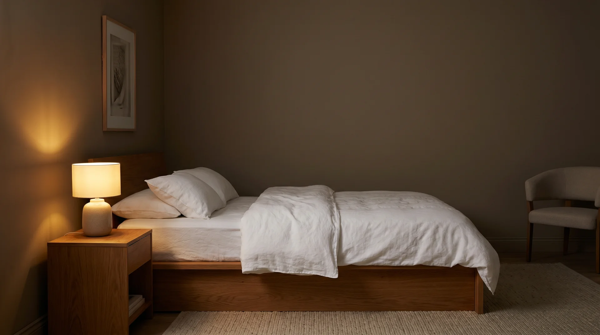
This is actually where Mink performs best, in my view. Mink’s LRV of 20.53 absorbs most of the light in the room, which creates the cocoon effect that makes a bedroom feel like a genuine retreat rather than a place where you happen to sleep.
Wrap it with warm lighting and natural-fiber textiles, and it does exactly what you’re hoping for.
Remember what the light-condition table showed: a north-facing bedroom is the specific scenario where Mink’s violet undertone is most likely to surface.
If that’s your room, add at least one warm supplemental light source before you commit to a bedside lamp on a warm-white bulb, which does more than you’d expect or consider stepping up to Poised Taupe SW 6039 for a lighter, more consistently warm version of the same idea.
Dining Rooms
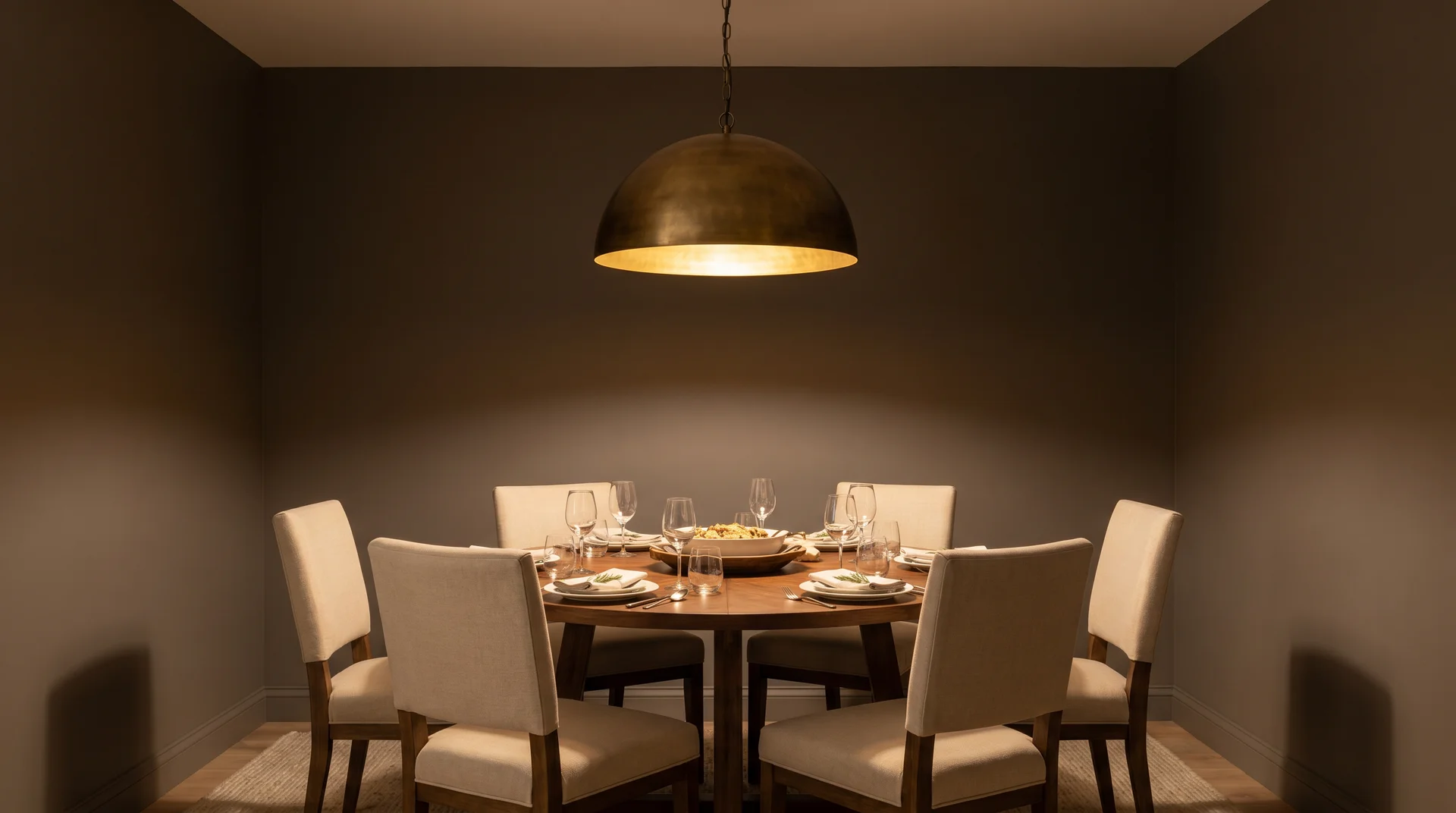
Full-room treatment works well here. The intimacy that comes with LRV 20 is an asset at a dining table; it wraps the room around the experience rather than letting the walls recede.
Pair with warm wood furniture and bronze or gold light fixtures. The room earns its depth.
Cabinets and Furniture
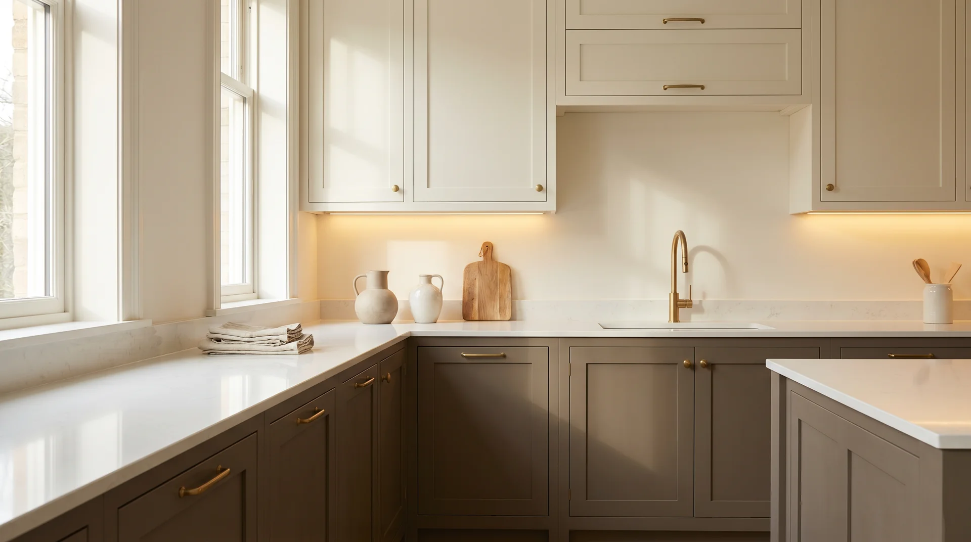
Mink works on painted kitchen cabinets and furniture pieces, such as lower cabinets, kitchen islands, or standalone dressers, where it reads as a warm, high-end alternative to the navy and forest green cabinet trend.
Pair with lighter countertops and warm-metal hardware. Keep surrounding walls lighter than Mink so the cabinets have something to contrast against, or the whole kitchen will absorb too much light.
Exterior Use
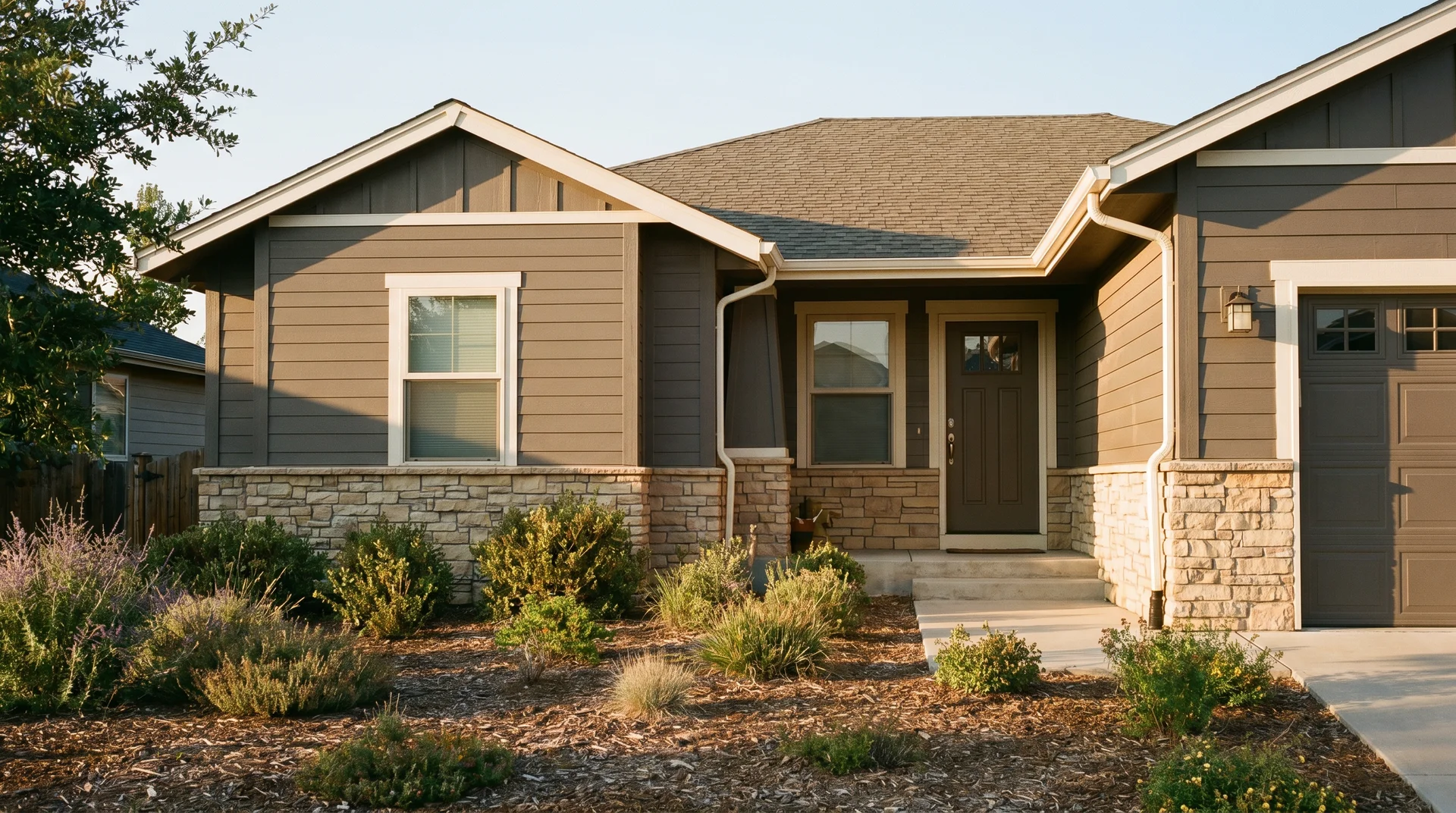
Sherwin-Williams approves SW 6004 for exterior use, and it works on siding, shutters, and front doors. On a home exterior, it reads as a modern, earthy neutral, particularly good against warm beige stone or brick facades, where Mink’s brown base can echo the masonry.
I’ll be straightforward about the limits of my advice here: exterior performance is the one area where I have genuine uncertainty about prescriptive guidance. Sun angle, siding material, surface texture, and sheen level interact in ways that are hard to predict by location and orientation.
A front door in direct Florida afternoon sun will look completely different from north-facing cedar lap siding in the Pacific Northwest. Sample on the actual surface in actual exposure conditions before ordering beyond a quart.
When Mink Is the Wrong Call
- Small windowless bathrooms.
- North-facing hallways with no warm supplemental light.
- Rooms where every fixture, flooring choice, and furnishing reads cool or gray. T
These are not edge cases; they’re specific, real conditions where LRV 20 stops working for the space and starts working against it.
Mink vs. Similar Sherwin-Williams Colors
Mink is not the only dark warm neutral on the SW fan deck, and the differences between it and its neighbors are more specific than they appear on the color strip.
| Color | SW Number | LRV | Primary Undertone | Key Difference From Mink |
|---|---|---|---|---|
| Mink | SW 6004 | 20.53 | Warm brown + gray + violet | Reference color |
| Poised Taupe | SW 6039 | 27 | Warm brown + gray | Lighter and more consistently warm; less violet; reads more classically as taupe in most light conditions |
| Chinchilla | SW 6011 | 22 | Cool gray + brown | Cooler and less brown-forward; reads grayer in most light |
| Spalding Gray | SW 7031 | 22 | Warm brown, higher saturation | Warmer and more visibly brown than Mink; less of the gray complexity |
| Peppercorn | SW 7674 | 10 | Blue-gray | Much darker and cooler; a different direction entirely – no warm brown base |
| Folkstone | SW 6005 | 14 | Gray + violet | One step darker on the same strip; shares the violet undertone but amplified |
Color consultant Kylie M Interiors has noted that Mink and Folkstone share similar undertone behavior; both carry the violet frequency, but Folkstone’s lower LRV makes that quality more pronounced, not just darker.
If Mink tests too dark for your room, Poised Taupe SW 6039 is the natural lighter step. Its warmth is more consistent, and it lacks the gray-violet complexity that makes Mink conditional on light conditions.
How to Sample Mink Before You Commit
The chip lied to you. It always does with colors at this depth. The chip is backlit by store fluorescents, printed on a glossy card, and about the size of a business card, none of which resembles a matte wall in your house.
- Get the physical chip from the paint rack, not a digital swatch. Screen representations of #847B77 vary widely across devices and displays.
- Buy a sample pot and paint two 12-by-12-inch patches: one on the wall that gets the most natural light, one on the wall that gets the least.
- Let both patches dry for at least four hours completely before judging them. Wet paint is always darker than dried paint.
- View both patches at three points in the day: morning, midday, and evening, under your actual artificial lighting. The evening test matters most for catching the violet undertone under LED light.
- Hold your trim color chip against the dried wall sample and not against the chip. They read differently together than they do in isolation.
- Leave both patches up for 48 hours before making any decision. Your eye needs time to stop reading them as test patches and start reading them as walls.
Most people skip step six. It’s also the one that prevents most of the regret calls.
The undertone surprises covered earlier in this piece, the violet activation under evening LED light, are exactly what steps four and six will catch before you commit to a full room.
Mink SW 6004 Specs at a Glance
| Attribute | Value |
|---|---|
| SW Number | SW 6004 |
| Color Name | Mink |
| Hex Code | #847B77 |
| RGB | R 132 / G 123 / B 119 |
| LRV | 20.53 |
| Hue Angle | 18.5° |
| Saturation | 0.10 |
| Color Family | Neutral |
| Interior / Exterior | Both |
| Closest Neighbors | Folkstone SW 6005 (darker), Poised Taupe SW 6039 (lighter) |