
The stair railing decision tends to sit in the open-tab, come-back-to-it-later loop longer than most home projects. It’s rarely a shortage of options causing the delay. It’s the absence of a framework for sorting through them, and every article that leads with “black is timeless, white is always safe” hands you a non-answer and sends you back to the paint chip wall no clearer than before.
Here’s the actual design principle I use with clients, and the one that cuts through the noise faster than anything else: your staircase is the only surface in your home that belongs to every room at once, which means its color has to make sense from a dozen different angles, not just from the one spot where you held up the paint chip. That’s why the decision feels harder than it should. It also points directly to the solution: read the room first, then read the color.
This guide walks through that process in full: how to read your space, how to choose by interior style, how to handle the three components of the railing separately, which specific colors and finishes hold up, and where most homeowners go wrong.
Before You Pick a Stair Railing Color? Read the Room!
The staircase sits inside a space with walls, floors, and trim that have already set a tone. Your railing color doesn’t need to match all of them, but it does need to be in conversation with them.
Before you open a single paint chip, look at your staircase from every angle you’d naturally see it: from the front door, from the landing above, from any adjacent room with a sightline to the stairs. The color you choose will live in all of those views simultaneously.
The Three Visual Anchors That Drive Your Stair Railing Color Decision
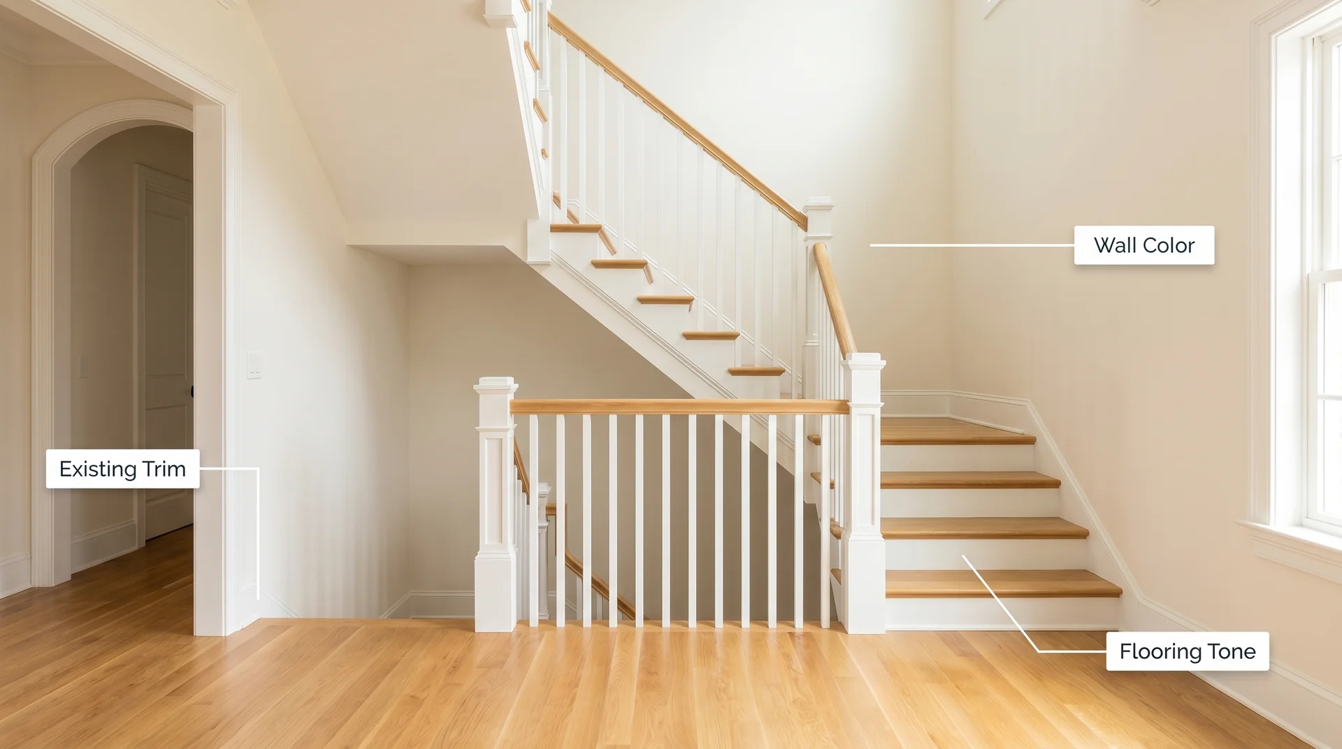
Write down three things before you look at swatches:
- Your wall color adjacent to the staircase. This is the primary backdrop your railing will always be seen against, and it’s the most influential anchor of the three.
- Your flooring tone, specifically its temperature: warm (honey, amber, red-toned wood), cool (pale stone, whitewashed wood), or neutral (balanced mid-tone wood).
- Your existing trim color. Baseboards, door casings, and window frames already function as a family within your room. Your railing can join that family in color for cohesion, or deliberately depart from it for contrast.
Both paths produce beautiful results when they’re chosen intentionally. The problem arises when you drift into something in between: just enough color to look like a decision, not enough contrast to look deliberate.
Should Your Stair Railing Match Your Trim or Your Floors?
When you’re uncertain, match the trim. Trim already connects the architectural elements of your interior, linking walls to flooring, doorways to ceilings. A railing that joins that trim family in color integrates into the room rather than competing with it. Whites, off-whites, and warm creams work exactly this way: the staircase recedes and reads as part of the architecture.
The exception worth knowing: if your flooring is doing real design work, a beautiful wide-plank white oak, a rich dark walnut, a statement natural stone, echoing that tone in the handrail can pull the staircase together in a way that feels very considered. This works especially well in traditional and transitional homes where the wood floor is a genuine feature of the space.
Avoid matching the railing to flooring with strong orange or red undertones. Those tones were common in flooring from the late nineties and early 2000s, and they tend to read as dated on a railing in a way they don’t on a floor. A cooler, more neutral dark on the railing creates a gentle contrast that modernizes the staircase without touching anything else in the room.
Should You Paint or Stain Your Stair Railing?
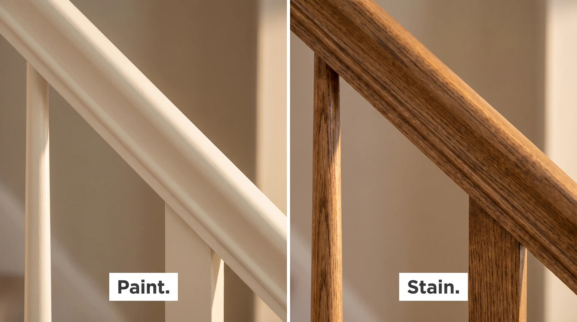
Before settling on a specific color, there’s a prior decision worth making: paint or stain? The answer affects both how the color reads and how the finish holds up over time.
Paint gives you the widest range of color options and works on almost any railing material, including wood with minor imperfections that stain would highlight. Painted railings suit modern, transitional, and farmhouse interiors particularly well. The trade-off is that painted surfaces on high-contact areas like handrails can show wear sooner and will need periodic touch-ups.
Stain enhances the natural grain of the wood and creates a warmth that paint can’t fully replicate. Stained railings age gracefully and tend to suit traditional and rustic interiors where exposed wood is part of the design language. The practical limitation is that stain comes in far fewer color options and requires more careful surface prep to apply evenly.
A split treatment, stained handrail with painted balusters, gives you the warmth of wood where hands make direct contact and the color flexibility of paint on the visual field of the railing. It’s one of the most enduring combinations in residential interior design, for reasons covered in detail in the section below.
Once the railing color is settled, the trim at the floor level of the staircase, where the baseboard or the bottom riser meets the floor, is the detail that closes out the full stair picture. A shoe molding or quarter round decision at the base affects how the whole staircase reads from a distance, and it’s worth making that call before you consider the project complete.
If your railing is metal rather than wood, paint is always the finish. Wrought iron and steel railings are typically painted in black, bronze, or dark charcoal for a classic look, though any paint formulated for metal surfaces will hold on these materials. A rust-inhibiting primer is essential before any topcoat goes on a metal railing.
What Color to Paint a Stair Railing Based on Your Interior Style
Once you understand the visual context of your staircase, the next question is what your interior style is calling for. Different styles have different relationships between the railing and the surrounding room, and understanding yours is the fastest path to a confident color decision.
Traditional and Classic Interiors
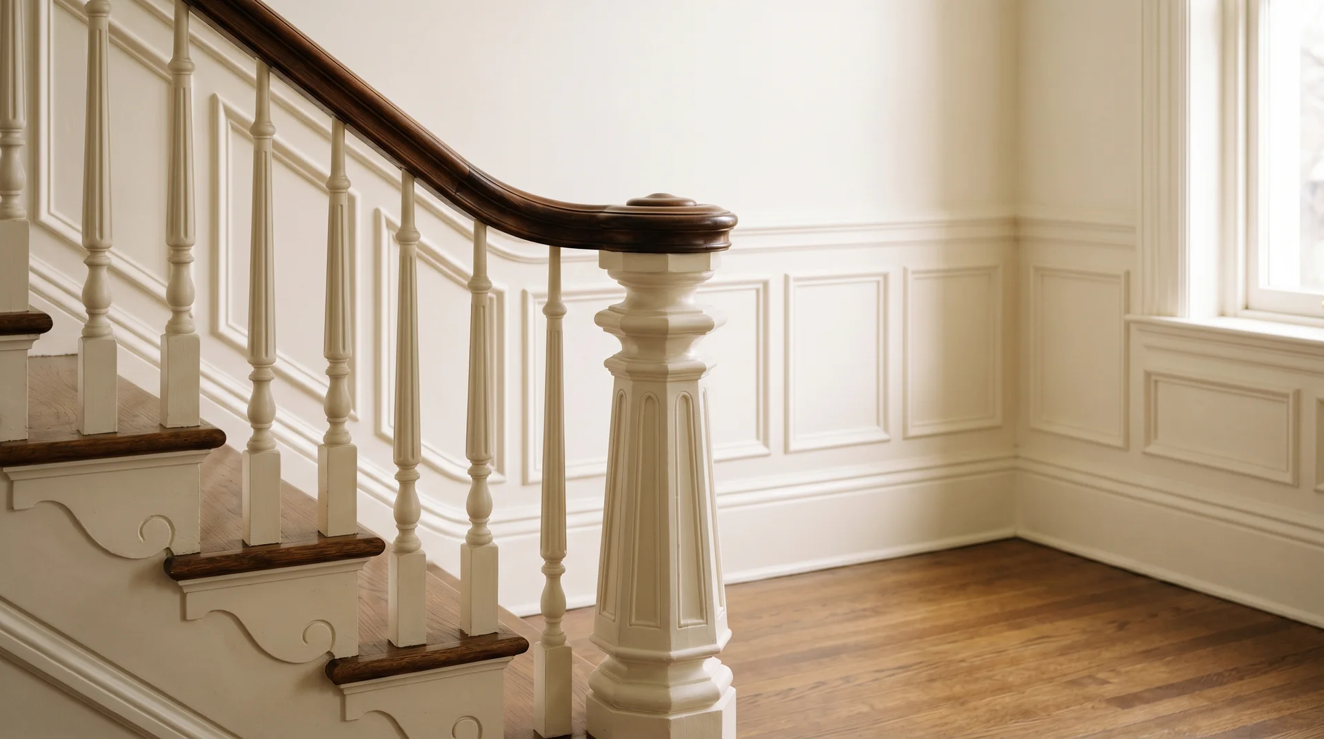
In a traditional interior, the staircase tends to be a formal architectural moment: turned balusters, a substantial handrail with a proper profile, and detailed newel posts. The railing should feel like part of the architecture, and the most reliable way to achieve that is to stay in the trim family.
Crisp white or warm cream on the balusters and newel post, matched to the baseboards and crown molding, creates a unified and polished result. The handrail in a traditional interior often looks best left in natural stained wood, which adds warmth and a sense of craft that fully painted wood can lose in a formal space. If you prefer a fully painted railing, a deep, warm black on the balusters with a chocolate brown handrail delivers sophistication without the severity of a flat, cool black.
Modern and Contemporary Interiors
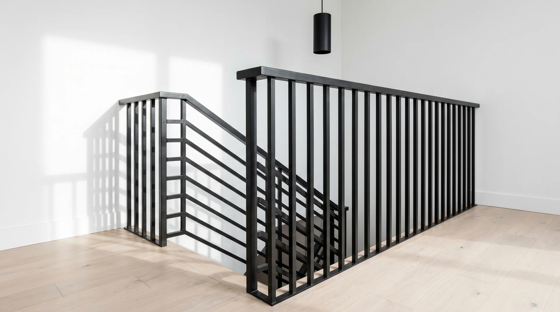
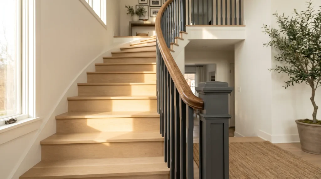
In a contemporary interior, the railing often functions as a graphic element, a dark vertical structure set against a light background, and contrast is the primary tool. Against white walls and pale flooring, a true warm black railing carries real authority, grounding the staircase and providing structural definition that a mid-tone or light railing simply can’t deliver in the same space.
The risk to avoid in a modern interior is playing it too safe. A warm gray or mid-brown railing in a clean, light contemporary space tends to fall flat because it carries just enough color to look like a decision, but not enough contrast to look intentional. Commit to the contrast, and the railing becomes part of the design rather than a missed opportunity within it.
Transitional Homes
Transitional interiors, with traditional architectural bones and a more modern palette and furniture sensibility, are where most American homes actually land. They’re also where railing color decisions feel the most uncertain, because neither a fully traditional white railing nor a fully contemporary all-black treatment lands perfectly.
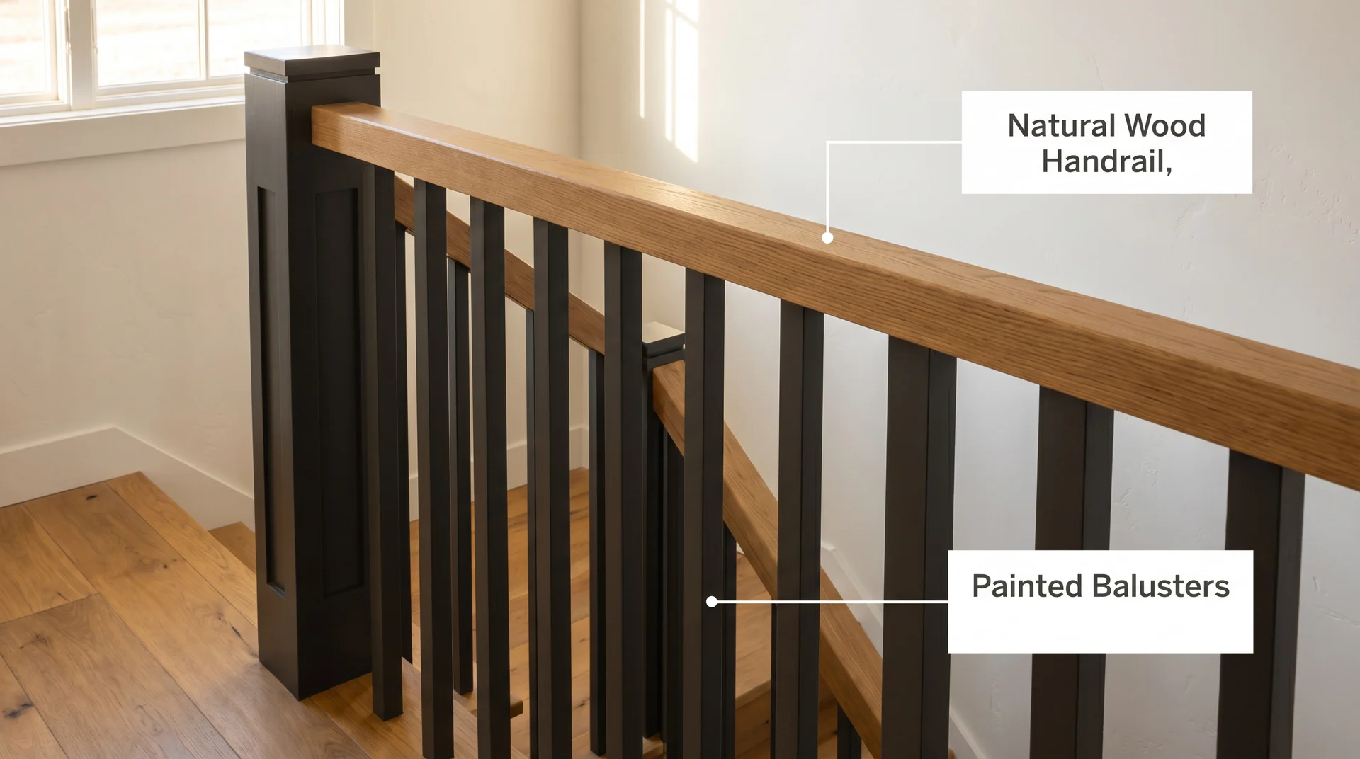
The approach that works consistently for transitional homes is a split: a natural wood handrail in a warm stain, with painted balusters in a soft near-black or deep warm charcoal. The wood connects to the traditional architecture of the house. The painted balusters bring modernity.
Sherwin-Williams Iron Ore (SW 7069) is the color I specify most often in this context. It reads as grounded and sophisticated, and it works across a wide range of wall tones without competing with them.
Farmhouse and Cottage Styles
In a farmhouse or cottage interior, the railing should read as part of the trim. Keeping it in the same white or warm cream as the baseboards and window casings makes the staircase settle comfortably into the room rather than announcing itself.
If you want a gentle departure from all-white, a soft sage green or a warm linen on the balusters can work well, particularly when the walls carry a complementary earthy tone. Keep the handrail consistent with the other painted trim, and the result holds together without effort.
Eclectic and Maximalist Interiors
In an eclectic interior, the railing genuinely has permission to be a statement. Deep jewel tones carry real impact here: a hunter green, an ink navy, a dusty plum. The condition for any of these to work is that the surrounding space stays relatively restrained.
Bold railing colors need breathing room, and a busy wall or patterned flooring will compete with the railing rather than let it command the space.
A useful test: look at your staircase from its primary vantage point, usually the front door or the entry to the main living area.
If that view already holds two or more strong colors, a deep neutral on the railing is almost always the stronger choice. If the surrounding view is restrained, you have real latitude to use the railing color as the focal point.
Do Your Handrail, Balusters, and Newel Post Need the Same Stair Railing Color?
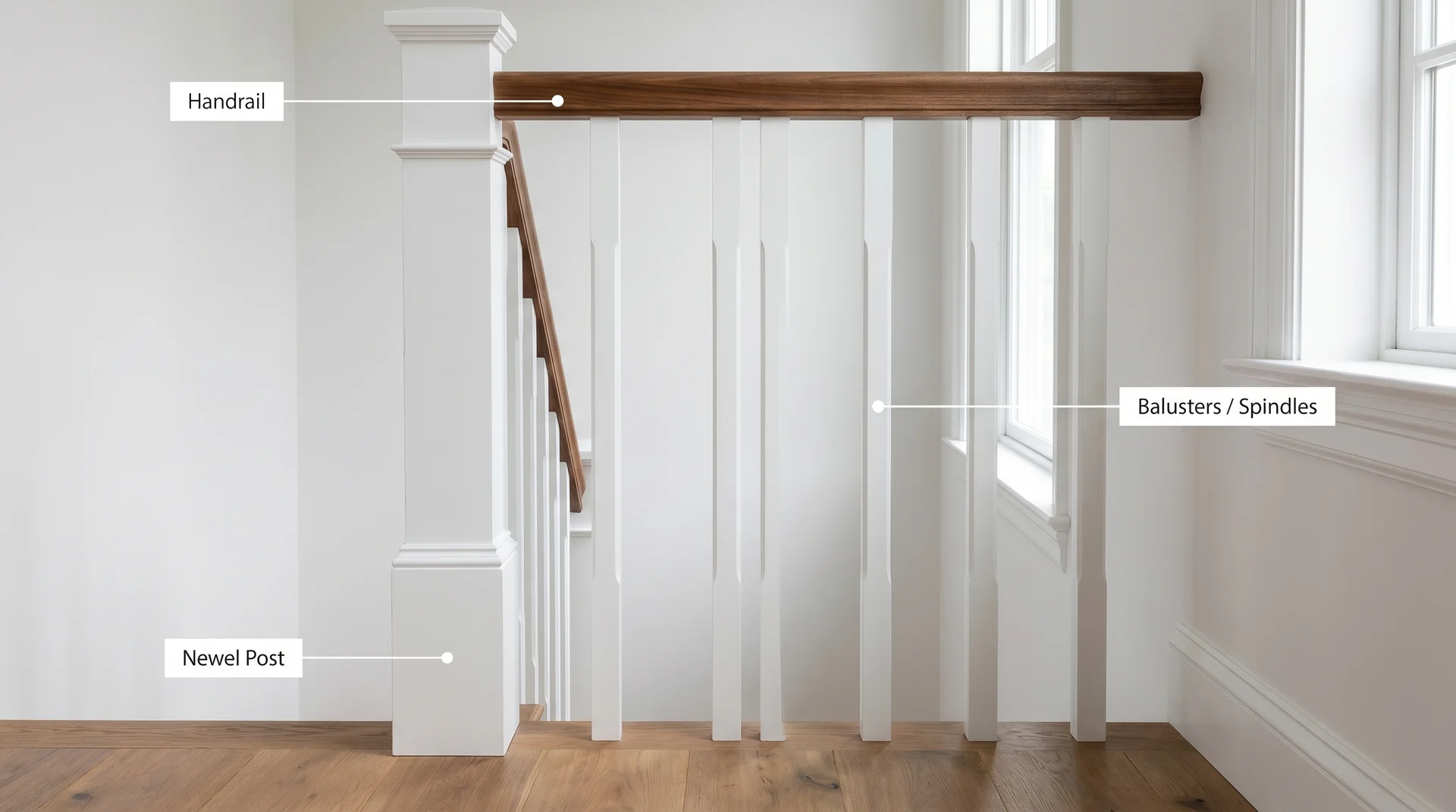
Most color advice treats the stair railing as a single object. In practice, it’s three distinct components, each with its own surface, scale, and visual role, and the most considered-looking staircases almost always treat them as separate decisions.
- The handrail is the continuous rail you grip as you use the stairs. It has the most hand contact of any element and reads as a single horizontal line from a distance.
- The balusters (also called spindles) are the vertical elements between the handrail and the base. They collectively form the visual field of the railing as it moves across the staircase.
- The newel posts are the larger anchor posts at the top and bottom of the staircase. They carry more visual weight than any individual baluster and are where the eye naturally pauses.
When One Color Across the Whole Railing Works
A unified treatment works well in two situations. The first is a formal, traditional space where the staircase should be a calm architectural element, and the room already has enough visual interest elsewhere.
All-white reads with quiet confidence in this context. The second is a contemporary space where the graphic clarity of an all-black railing is precisely what the room needs.
Introducing a contrasting wood handrail in a very clean modern interior softens the effect in a way that doesn’t always serve the design.
How to Split the Stair Railing Colors Without It Looking Unfinished
The most enduring split is a natural wood handrail paired with painted balusters and a painted newel post. The wood provides warmth and organic texture. The painted elements read as clean and finished. The contrast between them is soft enough to feel intentional without creating visual noise across the staircase.
When you use this split, the newel post should follow the painted balusters in color rather than the wood handrail. This keeps the visual base of the staircase unified, which reads as grounded and deliberate.
The wood handrail becomes the singular departure, and because it runs horizontally across the top, it sits above the geometry of the balusters rather than competing with them.
A practical note: if your handrail has a simple, clean profile, leaving it in natural wood reads easily as a design choice. If the profile is more elaborate and ornate, painting it to match the balusters is often the tidier decision, because paint quiets the detail and lets the shape speak rather than the texture.
What to Do With the Newel Post Color
Because the newel post sits at corners where the eye naturally stops and is considerably larger than any single baluster, it carries more visual weight than its position might suggest. In most cases, painting it the same color as the balusters is the right call.
It keeps the visual base of the staircase unified and lets the handrail do its own thing without a third color to manage.
Occasionally, a slightly deeper or richer variant of the baluster color on the newel post adds a quiet layer of refinement, the kind of detail that rewards close attention rather than announcing itself from across the room.
What consistently doesn’t work is a dramatically different color on the newel post. It draws attention in a way that reads as unresolved rather than intentional.
The Best Stair Railing Paint Colors by Category
Here are the specific colors I return to most consistently in residential work, by category, with context on where each one performs best.
Best White Stair Railing Colors
White reads as trim, connects to the ceiling, and works across nearly every interior style. The nuance is which white you choose, because whites on wood carry their undertones more visibly than they do on drywall, and the light conditions in a stairwell can be unpredictable.
| Paint Color | Brand | Undertone | Works Best In |
|---|---|---|---|
| White Dove OC-17 | Benjamin Moore | Warm, creamy | Traditional, farmhouse, and transitional homes with warm floors |
| Simply White OC-117 | Benjamin Moore | Warm with a very slight yellow | Bright, airy interiors where the walls are already a clean white |
| Chantilly Lace OC-65 | Benjamin Moore | Crisp, true white | Formal traditional interiors needing a sharp trim white |
| Extra White SW 7006 | Sherwin-Williams | Clean, slightly cool | Contemporary and modern interiors with cooler overall palettes |
Avoid stark, blue-toned whites on railings in warm-lit rooms. Cool whites on wood surfaces in warm light tend to look gray and slightly chalky, which reads as unfinished rather than crisp, especially as the light shifts through the day.
Best Black and Near-Black Stair Railing Colors
The best blacks for railings have depth and a touch of warmth. Flat, cool blacks can read thin once they’re dry, and they show fingerprints and scuffs with an unforgiving clarity that wears on you faster than you might expect.
| Paint Color | Brand | Character | Works Best In |
|---|---|---|---|
| Iron Ore SW 7069 | Sherwin-Williams | Deep warm charcoal, slight green undertone | Transitional and modern interiors, especially with warm wood floors |
| Tricorn Black SW 6258 | Sherwin-Williams | True, very neutral black | Contemporary and formal spaces where a clean, graphic black is the point |
| Off-Black No. 57 | Farrow & Ball | Soft near-black with warm depth | Traditional, transitional, and eclectic interiors |
| Graphite No. 26 | Farrow & Ball | Deep charcoal with a blue-gray quality | Modern and moody interiors with cooler wall colors |
Iron Ore is the color I specify most consistently for railing work. It gives you the drama of a dark railing without the severity of a true black, and in spaces with warm wood floors, it reads as grounded and sophisticated rather than stark. It also holds well across changing light conditions throughout the day, which matters in stairwells where the light source shifts.
When a Bold Stair Railing Color Makes Sense
A colored railing is a commitment, and the homes where it works best share one quality: restraint everywhere else. Quiet walls, consistent flooring, furniture that doesn’t carry a competing strong color. When those conditions exist, the railing can become the focal point of the entry without fighting for it.
| Paint Color | Brand | Character | Works Best In |
|---|---|---|---|
| Studio Green No. 93 | Farrow & Ball | Deep, inky hunter green | Traditional, eclectic, and maximalist interiors |
| Naval SW 6244 | Sherwin-Williams | Deep navy with slight warmth | Transitional and coastal-influenced interiors |
| Hale Navy HC-154 | Benjamin Moore | Classic, versatile navy depth | Traditional and transitional spaces with neutral surroundings |
| Radicchio No. 96 | Farrow & Ball | Deep dusty plum-red | Eclectic and maximalist interiors with the right ambient light |
Before committing to any of these, test the color on the actual railing surface in the sheen you plan to use. Colors read differently on turned wood than they do on a paint chip or flat wall, and a color that looks rich and saturated in the store can feel slightly flat once it’s applied across the geometry of balusters.
What Type of Paint and Finish to Use on a Stair Railing
In residential work, I’ve seen more railing projects fall short because of paint type and finish than because of color. The finish changes how the color reflects light, how it reads from different distances, and critically, how well the surface holds up to daily contact. A great color in the wrong product looks worn within a year.
What Type of Paint to Use on Stair Railings
The best paint for stair railings is a water-based alkyd, also called waterborne alkyd. It applies like a latex paint, meaning it cleans up with soap and water and carries lower VOCs than traditional oil-based paint, but it levels and hardens like an oil-based paint once it’s cured. The result is a smooth, durable surface that resists the chipping and scuffing that standard latex suffers on high-contact trim.
Benjamin Moore ADVANCE and Sherwin-Williams Emerald Urethane Trim Enamel are the two products I recommend most for railing work. Both are widely available, apply well with a brush or small roller on balusters, and cure to a hard, washable finish.
A well-applied waterborne alkyd in semi-gloss on a properly primed railing can last five to ten years before needing a full repaint, though handrails in high-traffic homes may need spot touch-ups sooner. The durability difference between a waterborne alkyd and standard interior latex on trim surfaces is significant enough to be worth the slightly longer dry time.
For metal railings, use a paint formulated specifically for metal surfaces and prime with a rust-inhibiting primer before any topcoat goes on. The color selection process is the same as for wood, but skipping the right primer on metal is the single fastest path to a failing finish.
Satin, Semi-Gloss, or High-Gloss: The Right Sheen for Stair Railing Paint
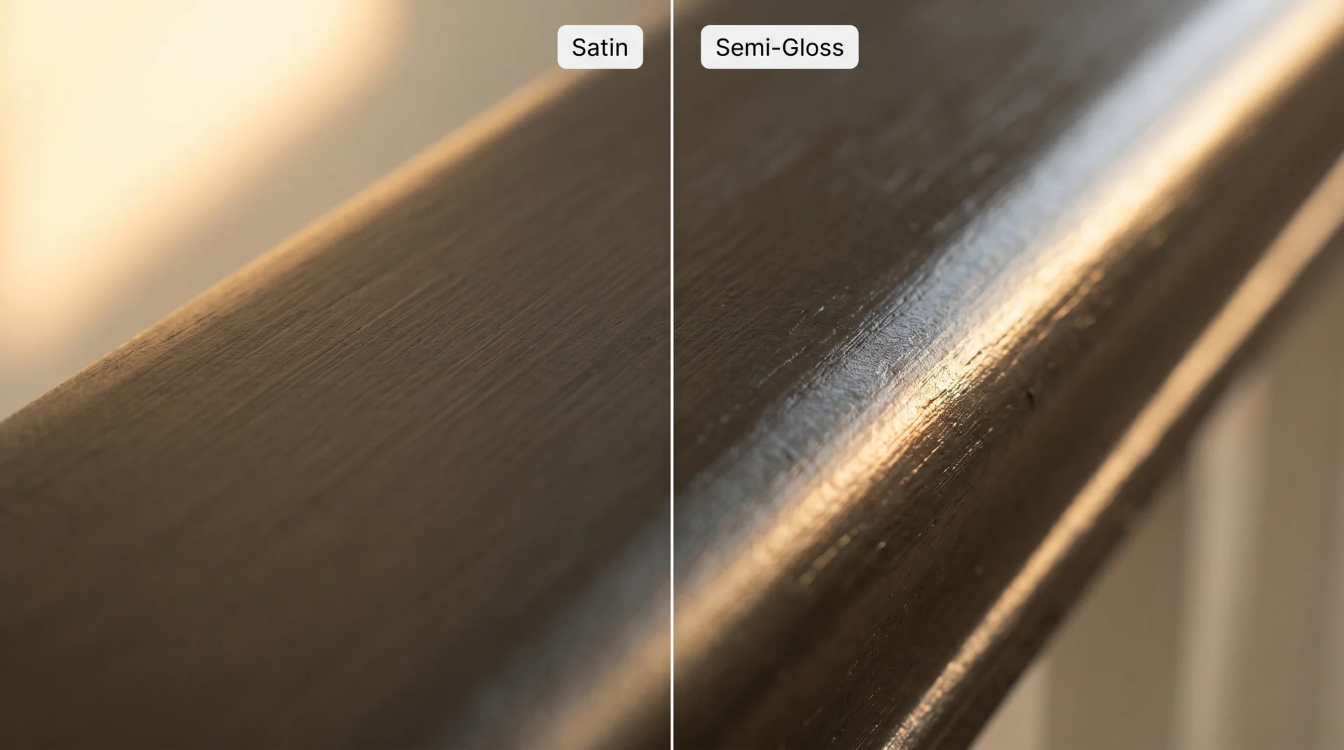
Semi-gloss is the most practical and durable sheen for stair railings, particularly the handrail. It reflects enough light to look clean and polished, wipes clean easily, and holds up to the oils and grime that hands transfer over years of daily use.
Satin works well on balusters, where direct hand contact is less frequent. It has a softer, quieter sheen that reads as refined without drawing attention to itself, and it tends to photograph beautifully in both natural and artificial light.
High-gloss has a specific and legitimate use case: in a formal, traditional interior with a beautifully profiled handrail, high-gloss can look genuinely striking, the kind of lacquered finish that makes architectural detail read with real clarity. In a casual or contemporary interior, it tends to read as overly shiny. Use it only when the railing has a detail worth highlighting.
Why Matte Paint on a Stair Railing Is Almost Always a Mistake
Matte paint looks sophisticated on walls, and it’s natural to assume that quality carries over to railings. It doesn’t. Matte paint is porous, and handrails are constant-contact surfaces. Hand oils absorb into a matte finish within weeks and create patches that can’t be cleaned off without abrading the paint.
On medium or dark colors, those contact patches become visible quickly, and the railing starts to look worn well before its time. If a low-sheen look matters to you, eggshell is as far down as you should go on the railing surface, and even then, the handrail itself is better served by semi-gloss.
Stair Railing Color Mistakes That Are Easy to Make
These errors come up repeatedly in projects that look slightly off once the paint is dry, and they share a consistent pattern: each made complete sense at the planning stage and revealed itself only on the wall.
Testing the swatch on the wall instead of the railing. Paint reads differently on wood than it does on drywall, because the texture, porosity, and grain interact with the pigment in ways drywall doesn’t. Always test your color on the actual railing surface, or at a minimum, on a piece of scrap wood primed the same way as the railing.
Matching the railing to the orange-toned flooring. Warm, red-toned wood floors were very common in the late nineties and early 2000s, and many homes still have them. Matching the railing to those undertones tends to reinforce a dated quality that the room may have outgrown. A cooler, more neutral dark on the railing creates enough contrast to modernize the staircase without changing a single floor plank.
Going all-black on every element simultaneously. A black handrail, black balusters, black newel posts, and black-painted treads accumulate more visual weight than most rooms can comfortably hold. What reads as elegant on one component can feel genuinely heavy when it’s multiplied across the full staircase structure. If black is the direction, consider leaving the treads in natural wood or a warm stain to give the eye somewhere to rest.
Ignoring the stairwell lighting. A color that reads warm and rich in afternoon natural light can look noticeably cooler and flatter under the recessed fixture or pendant above the staircase at night. Test your color in the actual light conditions at the time of day you use the staircase the most.
Skipping stain-blocking primer on a previously stained railing. If your railing was ever stained rather than painted, tannins in the wood can bleed through paint over time, causing yellowing or discoloration even through a well-applied topcoat. A stain-blocking primer is not optional in this situation. It’s the step that determines whether your paint job holds for two years or two weeks.
A note for older homes: If your home was built before 1978, test for lead paint before sanding any railing surface. Lead test kits are available at most hardware stores, take under a minute to use, and cost just a few dollars. If lead paint is present, consult a certified lead abatement professional before proceeding with any sanding or stripping work.
Quick Stair Railing Color Decision Guide
If you want a fast reference to take with you to the paint store, here it is.
| Your Situation | Best Direction | Color Starting Point |
|---|---|---|
| Light walls, light wood floors, white trim | White or soft cream matched to trim | Benjamin Moore White Dove OC-17 |
| Light walls, dark floors, modern interior | Warm black or deep charcoal | Sherwin-Williams Iron Ore SW 7069 or Tricorn Black SW 6258 |
| Transitional home with warm wood tones throughout | Natural wood handrail, painted near-black balusters | Iron Ore SW 7069 on balusters |
| Farmhouse or cottage with painted trim | All-white or cream matched to trim throughout | Benjamin Moore Simply White OC-117 |
| Eclectic interior with neutral walls and floors | Deep jewel tone as a focal point | Farrow & Ball Studio Green No. 93 or BM Hale Navy HC-154 |
| Formal traditional interior | Warm white trim-matched or unified warm black | Chantilly Lace OC-65 or Farrow & Ball Off-Black No. 57 |
| Metal railing (wrought iron or steel) | Black, bronze, or deep charcoal with metal-specific paint | Tricorn Black SW 6258 or Graphite No. 26 by Farrow & Ball |
The principle across all of these: decide first whether you want the railing to integrate into the room or stand apart from it. That single decision makes the color choice much easier, because you’re choosing a direction rather than browsing colors at random.
Frequently Asked Questions About Stair Railing Color
What Is the Most Popular Color for Stair Railings?
White and black are the two most widely used stair railing colors in US interiors. White integrates the railing into the trim and gives the staircase a settled, cohesive quality. Black creates contrast and graphic definition, reading as modern and intentional against light walls and floors. Black has grown significantly in popularity over the past decade, particularly in transitional and contemporary homes, though white remains the more common overall choice.
Should a Stair Railing Match the Trim or the Floor?
In most interiors, matching the trim is the more reliable choice. Trim connects all the architectural elements of a room, and a railing that joins that trim family in color tends to feel integrated rather than competing. Matching the railing to the floor works well, specifically when the floor is a beautiful, feature-quality wood tone you want to carry into the staircase, typically through the handrail.
Can You Paint a Wood Stair Railing Black?
Yes, and it’s one of the most effective ways to update a dated staircase. The key steps are thorough sanding, a stain-blocking primer if the wood was ever stained, and two coats of a quality waterborne alkyd in semi-gloss or satin. Skipping the primer is the most common reason painted-over-stained railings develop yellowing or patchiness within the first year.
Is White or Black Better for a Stair Railing?
It depends on what your staircase needs to do. White integrates and recedes. Black contrasts and commands. In a busy entryway with a lot of visual input already present, white tends to produce the more cohesive and restful result. In a clean, light interior where the staircase is the primary architectural feature, black provides the structural definition the space needs. Both are timeless in the right context.
What Paint Sheen Is Best for Stair Railings?
Semi-gloss is the most practical and durable sheen for stair railings, particularly the handrail. It resists moisture, cleans easily, and holds up to daily hand contact far better than matte or eggshell. Satin works well on balusters where contact is less direct. High-gloss suits formal interiors with architectural railing detail worth highlighting.
How Long Does Stair Railing Paint Last?
A well-applied waterborne alkyd in semi-gloss on a properly primed railing can last five to ten years before needing a full repaint. The handrail typically shows wear before the balusters do, and spot touch-ups every few years are normal in a well-used home. The longevity difference between a quality waterborne alkyd and standard interior latex on high-contact trim is significant enough to make the product choice worth thinking about.
