
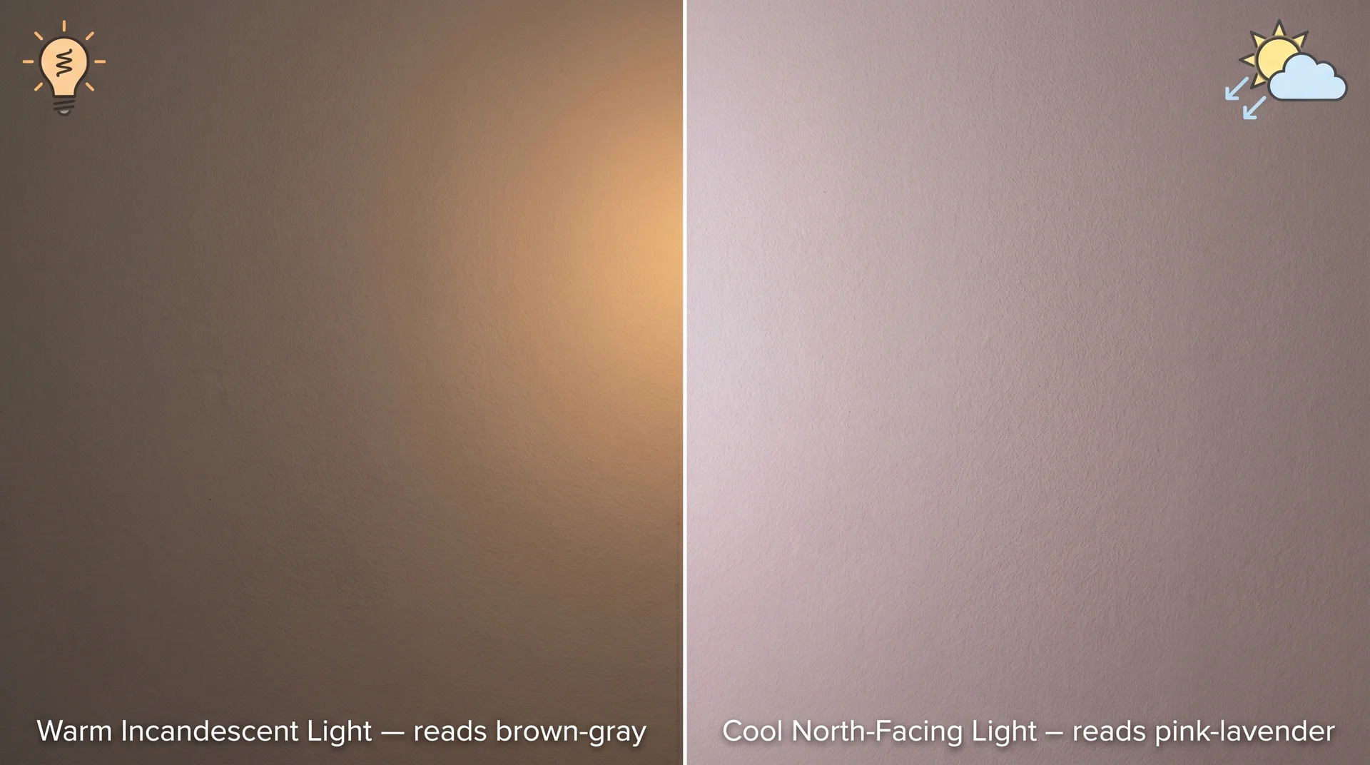
Taupe sounds simple until you paint it on your wall. Then it reads warm and golden in the morning, shifts toward gray by midday, and by late afternoon in a north-facing room, it’s doing something close to lavender. That’s not a defective color.
That’s taupe behaving exactly as taupe does, and understanding that before you commit saves you from one of the most common and most fixable paint mistakes out there.
This piece covers what taupe actually is, how to test it correctly, which shades work in which rooms, and what makes a taupe choice go wrong. Exterior paint applications aren’t covered here; the way a color behaves on a facade under direct UV exposure across different seasons is its own conversation. This is about interior taupe, chosen well.
What Taupe Actually Is (and Why It Keeps Looking Different)
Taupe is a neutral color that sits at the intersection of brown and gray, with a warm undertone base that can lean anywhere from golden-beige to rosy-gray depending on the specific formulation.
The Definition, and Why It’s Genuinely Complicated
The word taupe comes from the French for mole, referring to the color of the animal’s fur. In practice, that doesn’t narrow things down much.
Taupe spans a wide range, and different paint brands interpret it differently, which is why two paints both labeled “taupe” can look nothing alike when you hold them side by side.
What unifies taupe shades is that they carry brown pigment modified by gray, with undertones that vary by formula. Those undertones are what determine how a taupe paint behaves in your room, not the base color itself.
Get the undertones right and taupe is one of the most livable neutrals in a home interior. Get them wrong and you’re repainting within six months.
Why Taupe Reads Differently in Every Room
Taupe shifts in appearance because its undertones respond differently to different light sources, a phenomenon called metamerism.
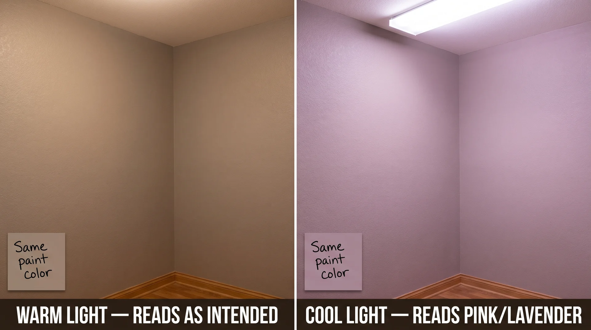
Taupe formulations that carry red or violet undertones look warm and brown under incandescent or warm LED light. Under cool northern daylight or blue-tinted LEDs, those same undertones activate, and the wall reads distinctly pink or lavender. The pigments haven’t changed. The light reading has.
I watched this happen to clients repeatedly during my time as a design consultant. Someone would choose a taupe in the showroom, love it completely under the warm display lighting, and call me a week later because the wall looked nothing like they expected.
The issue was almost always a violet or pink undertone that was invisible under warm retail light.
Sherwin-Williams Mink SW 6004 is one of the clearest examples of this pattern. It looks warm and brown grounded at the paint counter, but can read distinctly gray-violet by evening in a north-facing room under cool LED lighting. The fix is in how you test the sample, and I’ll get to that shortly.
The swatch card from the paint store tells you almost nothing about what the color will do on your wall. It’s a small chip evaluated under fluorescent retail lighting, which bears little resemblance to how your room is actually lit.
The Light Reflectance Value and Why It Matters More Than the Swatch
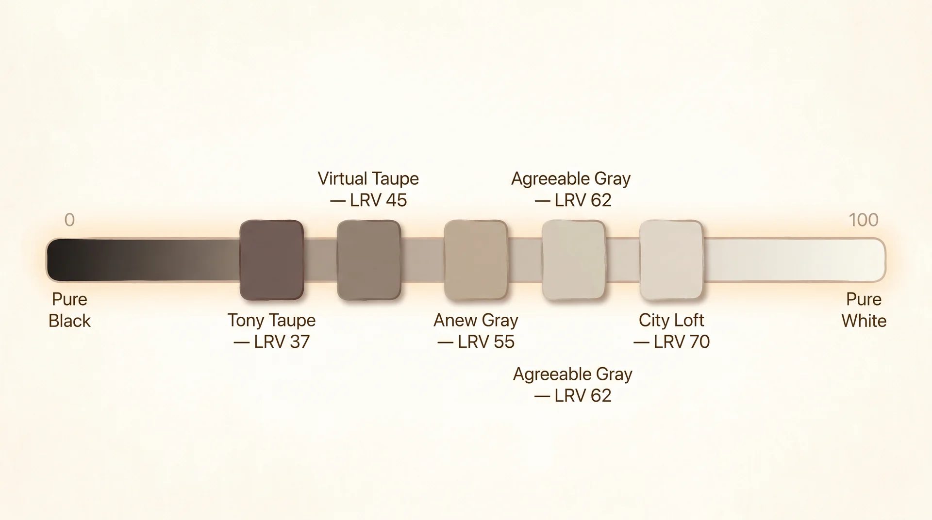
Every paint color carries a light reflectance value, or LRV, which measures how much light the color reflects on a scale from 0 (pure black) to 100 (pure white). Most taupe shades fall in the mid-range, roughly between 35 and 65, depending on depth.
A taupe with an LRV below 45 reads as a medium to deep tone and works well in larger, well-lit spaces. One above 55 reads lighter and suits rooms where natural light is limited. Paint brands publish LRV values on their product pages and on the back of sample pots. Those numbers are more reliable than any visual impression you form in the store.
Taupe vs. Greige: What’s the Actual Difference
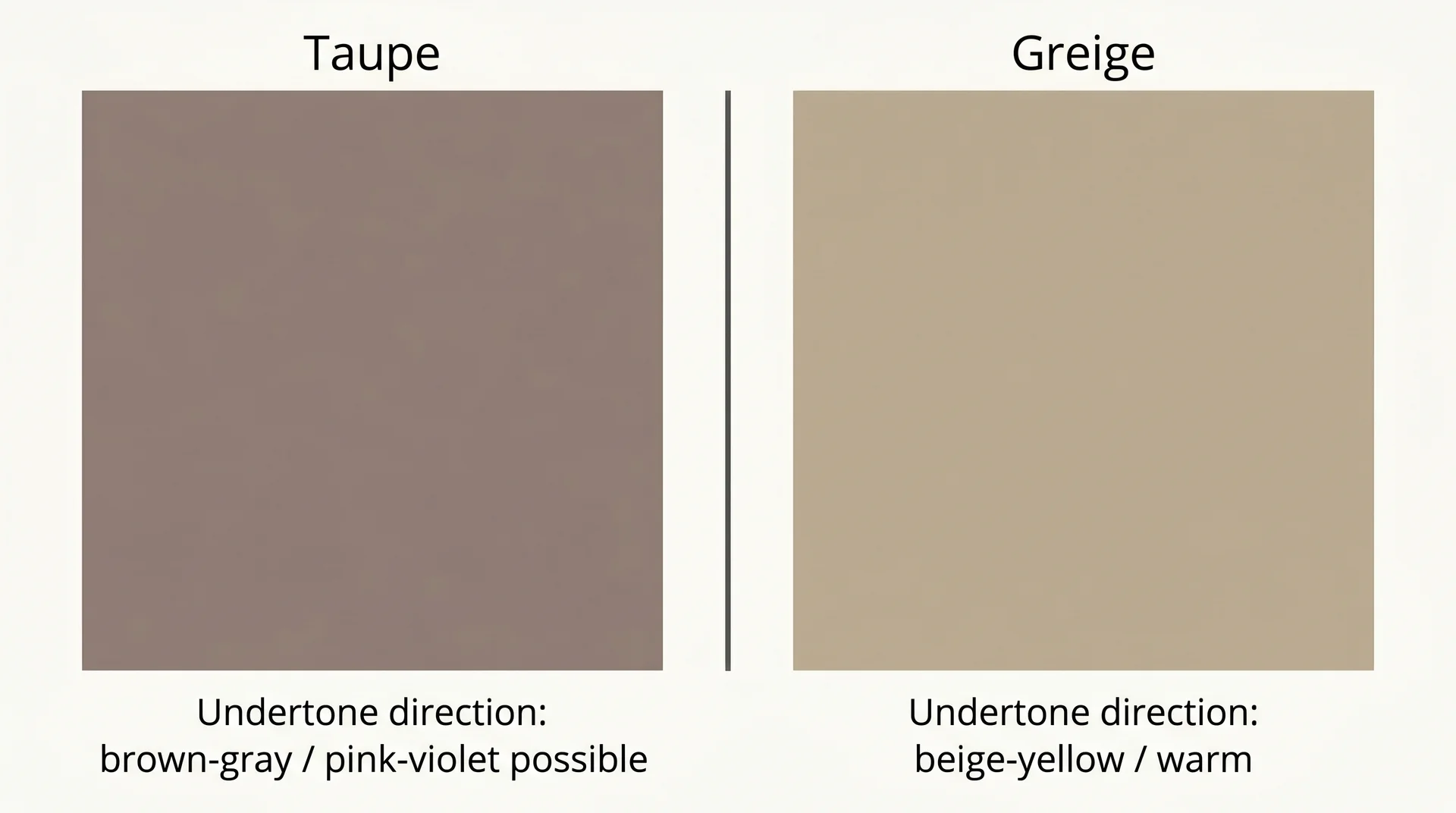
Taupe leans brown-gray with possible pink or violet undertones. Greige leans beige-gray with yellow or warm beige undertones. They are not the same color, and they don’t behave the same way in real rooms.
Where Taupe Ends and Greige Begins
Greige, a blend of gray and beige, sits closer to beige on the spectrum. Its undertones are warm in a yellow or camel direction. Taupe’s warmth comes from brown pigment rather than beige, and it can carry red or violet undertones — the kind that look warm under incandescent light but shift toward pink or lavender under cool northern daylight.
In practice, greige tends to be more forgiving in rooms with warm wood tones because its yellow-beige base complements golden wood finishes naturally. Taupe is more complex. It can read richer and more sophisticated in the right room, but it needs careful undertone checking against your specific floors and furniture before you commit to it.
When to Choose Taupe Over Greige (and Vice Versa)
Choose taupe when you want more depth and a slightly moodier quality to your neutral.
Choose greige when your room has honey-toned or golden wood floors, and you want something that integrates cleanly without risk of undertone conflict. A color like Agreeable Gray (SW 7029) sits right at the boundary, worth understanding before you decide which direction is right for your space.
If you’re genuinely unsure between taupe and greige, test both on the same wall under the same light before deciding. That’s the only comparison that means anything, and it will take the choice from “maybe” to obvious.
How to Test a Taupe Sample Before You Commit
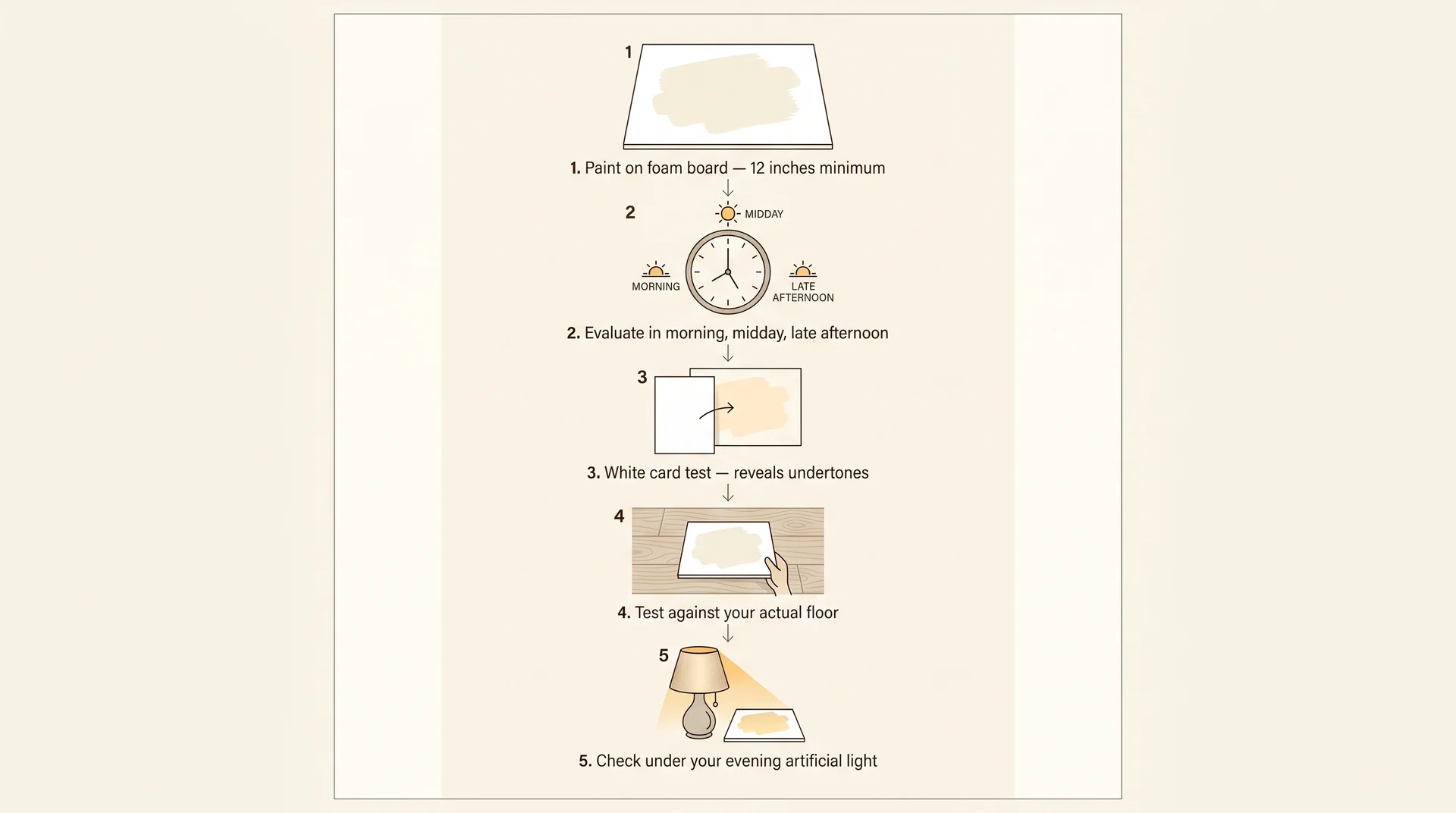
Most taupe samples are tested incorrectly, which is why taupe gets blamed for problems that are really about process. The steps below address that.
What Time of Day to Look (and Why Morning Lies)
Taupe looks its warmest in morning light and its coolest or gray in the flat light of midday. North-facing rooms reach their coolest light quality in the mid-afternoon, and that’s exactly when any pink or violet undertone in your taupe sample will show itself most clearly.
Evaluate your sample at a minimum of three points across the day: morning, midday, and late afternoon. If it holds up well in all three, it’s a solid choice for your room. If it turns lavender or distinctly pink at any point, the undertones aren’t compatible with your light conditions, and no amount of hoping will change that once it’s on the wall.
How to Read Undertones Against Your Existing Floors and Trim
- Paint your sample on a piece of white foam board, at least 12 inches square. Not directly on the wall — you want to be able to move it around the room and hold it against different surfaces.
- Hold the sample flat against your floor in the room’s natural light. Look at the edge where the sample meets the floor. You’re looking for harmony between the two, not two competing tones trying to coexist.
- Hold it against your existing trim. If the trim is a bright cool white and the taupe has pink undertones, the contrast will read off. Soft white or off-white trim usually integrates better with warm taupes.
- Set it against your largest furniture piece and step back. Undertone conflicts between upholstery or wood finish and paint become immediately visible at a distance in a way they don’t when you’re standing close.
- Look at it again in the evening under your artificial lighting. Whatever you use at night, like warm LEDs, recessed overheads, or lamps, is the version of this color you’ll actually live with most of the time.
The White Card Test Most People Skip
Hold a piece of bright white paper next to your taupe sample. It makes the undertones immediately visible in a way that’s difficult to see against a neutral wall. Pink undertones become clearly pink next to white. Gray undertones go cool and obvious. Warm brown undertones look settled and grounded.
Honestly, this is the most useful test in the whole process, and I’ve almost never seen it mentioned in a paint guide. It takes ten seconds, and it’s more informative than an hour of staring at a chip on the wall.
What to Pair With Taupe: Floors, Furniture, and Trim
Taupe is not a neutral that automatically works with everything. What it pairs with depends directly on the undertones in your specific shade.
Taupe With Warm Wood Floors
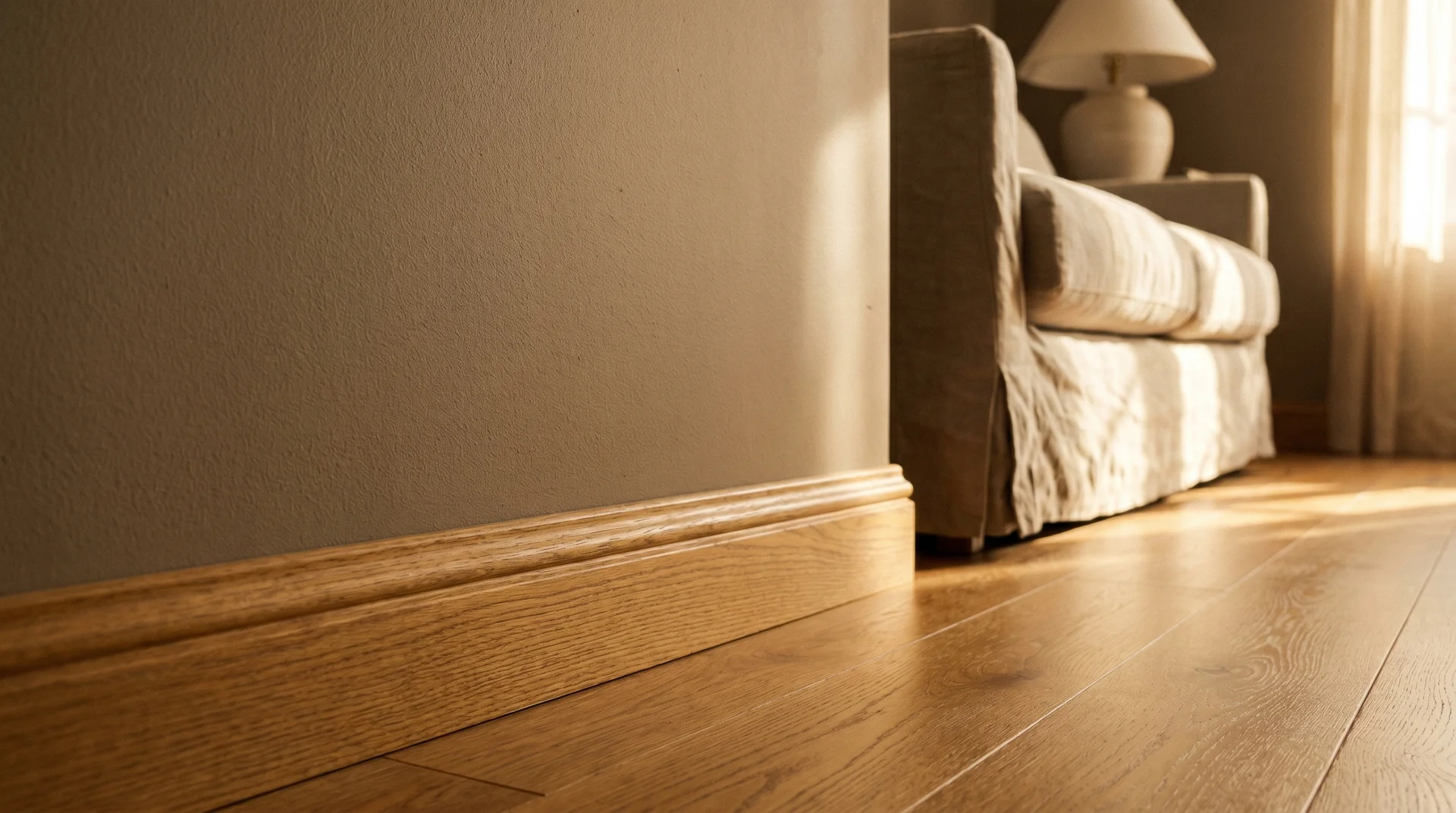
Warm wood floors like honey oak, golden pine, and medium walnut need a taupe with warm brown undertones rather than a gray-leaning or violet-leaning formula. A taupe that pulls cool or pink against warm wood reads muddy, and the two tones drag each other in the wrong direction.
Look for taupes described as warm brown or earthy at the darker end of their range. Confirm the undertone with the white card test before buying a full gallon. With the right shade, warm wood floors and taupe walls are one of the most grounded pairings you can make in a neutral interior.
Taupe With Cool Gray Floors
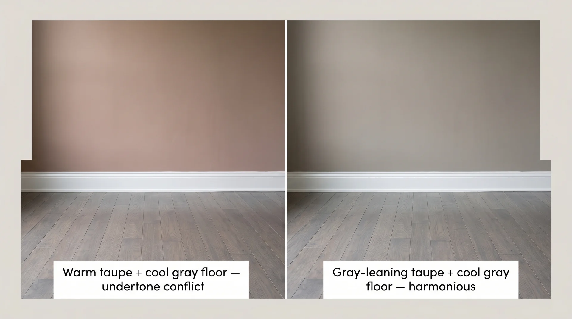
Gray-toned hardwood or cool stone tile reads best with a taupe that has gray undertones rather than warm brown ones. A warm taupe against a cool gray floor can look like two competing neutrals fighting for dominance rather than working together.
| Floor Type | Best Taupe Direction | Undertone to Avoid |
|---|---|---|
| Honey or golden oak | Warm brown taupe | Pink or violet |
| Medium walnut | Warm or neutral taupe | Cool gray |
| Cool gray hardwood | Gray-leaning taupe | Yellow-beige |
| White oak | Warm or neutral taupe | Strong violet |
| Tile or polished concrete | Gray or brown taupe, room-dependent | Pink undertones |
Trim Color: Bright White vs. Soft White vs. Greige
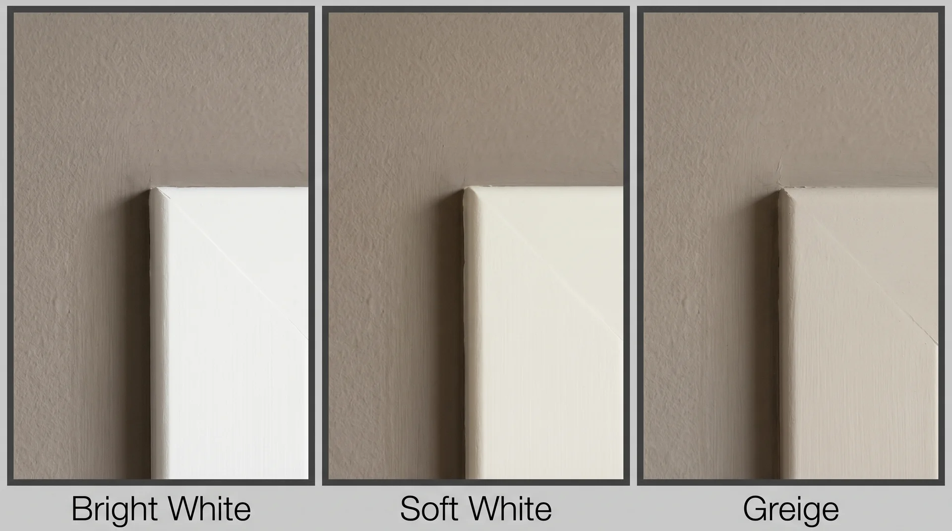
Bright white trim creates high contrast against taupe walls and reads crisp and defined. It works best when the taupe is a medium or deeper shade and the room has enough natural light to handle the contrast without feeling stark.
Sherwin-Williams Extra White and Benjamin Moore Chantilly Lace are the two most-used bright whites in this pairing.
Soft white or off-white trim integrates more gently and suits lighter taupes where you want a quieter, more layered look. Sherwin-Williams Alabaster and Benjamin Moore White Dove are the standards here.
Greige trim alongside taupe walls is less common but works in rooms where you want a fully warm, tone-on-tone palette without a clean break between wall and woodwork.
The Best Taupe Paint Colors by Brand
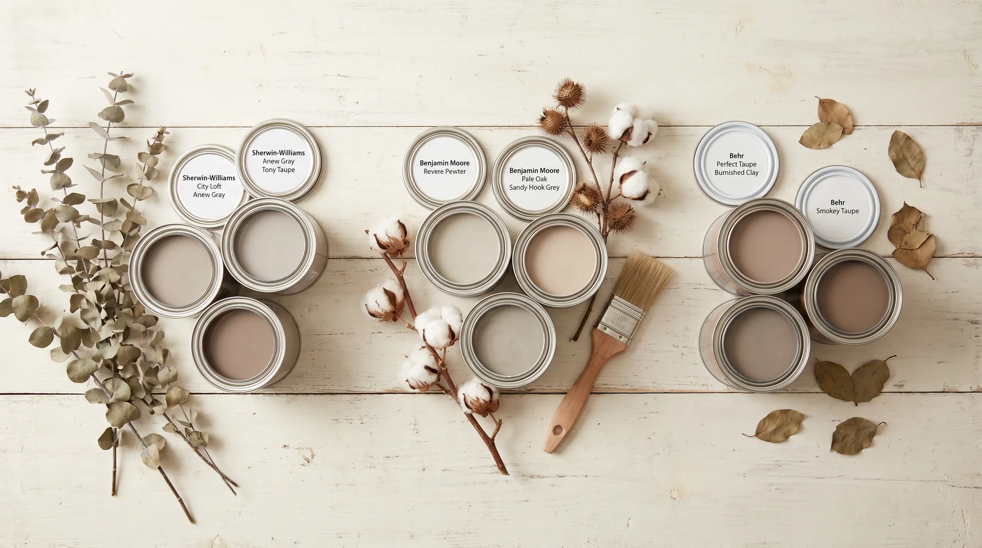
Taupe performs differently across brand lines because each manufacturer interprets the brown-gray-undertone balance differently. Here’s what’s worth looking at in each family.
Sherwin-Williams Taupe Colors Worth Considering
- City Loft (SW 0712): A light taupe with a soft greige quality. High LRV in SW City Loft, which means it stays bright even in rooms with moderate natural light. Works well in open-plan spaces where you need a neutral that reads clean without disappearing entirely. The greige direction makes it more forgiving against a wider range of wood tones than most taupes on this list.
- Anew Gray (SW 7030): A medium taupe with genuine gray undertones. Lower risk of pink or violet shift than warmer formulations, which makes it a strong candidate for north-facing rooms or spaces with cool LED lighting. It reads sophisticated without going cold.
- Tony Taupe (SW 7038): A deeper, more saturated option with warm brown undertones and a lower LRV. It adds real weight to a room. Best in larger spaces with good natural light, or in rooms where you want the walls to have presence rather than simply disappear.
Benjamin Moore Taupe Colors Worth Considering
- Revere Pewter (HC-172): The most famous taupe on the market, which is both its strength and its limitation. It has been used so widely over the past fifteen years that it’s lost some of its distinctiveness, and in certain lighting — particularly rooms with green-undertoned flooring or cabinetry — it reads more olive-gray than true taupe. It still performs well in warm-floored spaces with southern or western exposure, but I’d encourage looking at the others on this list before defaulting to it.
- Pale Oak (OC-20): Lighter and more clearly beige-adjacent, but with enough warmth to land in taupe territory. A safer choice for rooms where you want a near-neutral with warmth but aren’t confident about undertone management yet.
- Sandy Hook Grey (HC-108): A gray-leaning taupe with cool undertones. Works well in contemporary interiors with cool materials and cooler light exposure. Less warm than most taupes on this list, which is exactly what some rooms actually need.
Behr Taupe Colors Worth Considering
- Perfect Taupe (PPU18-13): Behr’s flagship in this family, warm and brown-leaning. The word “perfect” in the name is a little optimistic. It performs well in warm, well-lit rooms and less well in north-facing or cool-lit spaces where its undertones can shift toward mauve. Check those undertones carefully before committing to a full room.
- Burnished Clay (S230-4): Deeper and richer, with an earthy warmth. In a furniture retail context, I saw this kind of deeper taupe get passed over constantly by clients who thought they wanted something lighter, then the same clients called back after choosing something pale and said the room felt hollow. If you want taupe to actually register on the wall rather than read as a slightly off beige, Burnished Clay is worth sampling seriously.
A Note on Dupes and Alternatives
If you’re looking at a color like Kensington Taupe and want a less expensive alternative, the honest answer is that color matching by name is unreliable across brands. Undertones vary enough between manufacturers that a “dupe” can behave entirely differently in your room. Get samples of both, test them side by side on your actual wall, and let that determine the choice.
Room-by-Room Guidance for Taupe Paint
Taupe performs differently depending on the room’s size, ceiling height, and light exposure. The guidance below accounts for that.
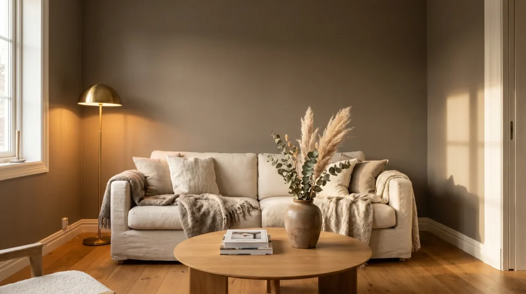
Taupe in Living Rooms
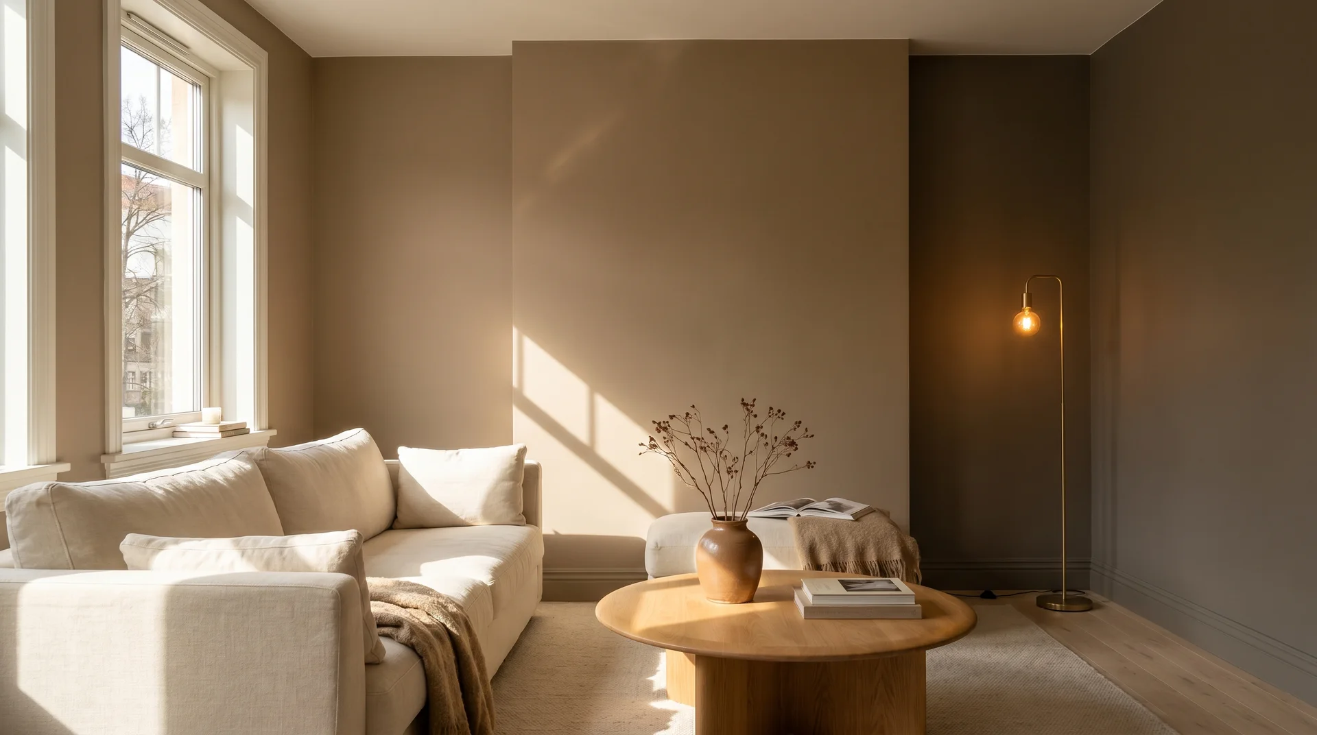
Living rooms are taupe’s strongest setting. They typically have good natural light, multiple light sources in the evening, and enough square footage that a mid-range taupe can develop fully on the walls. A shade with an LRV in the 45 to 55 range suits most living rooms well.
In open-plan spaces, confirm that your taupe reads consistently across the full floor area. Natural light changes dramatically in large open plans, and a taupe that works in one corner can look noticeably different twenty feet away. Test in both zones before committing.
Taupe in Bedrooms
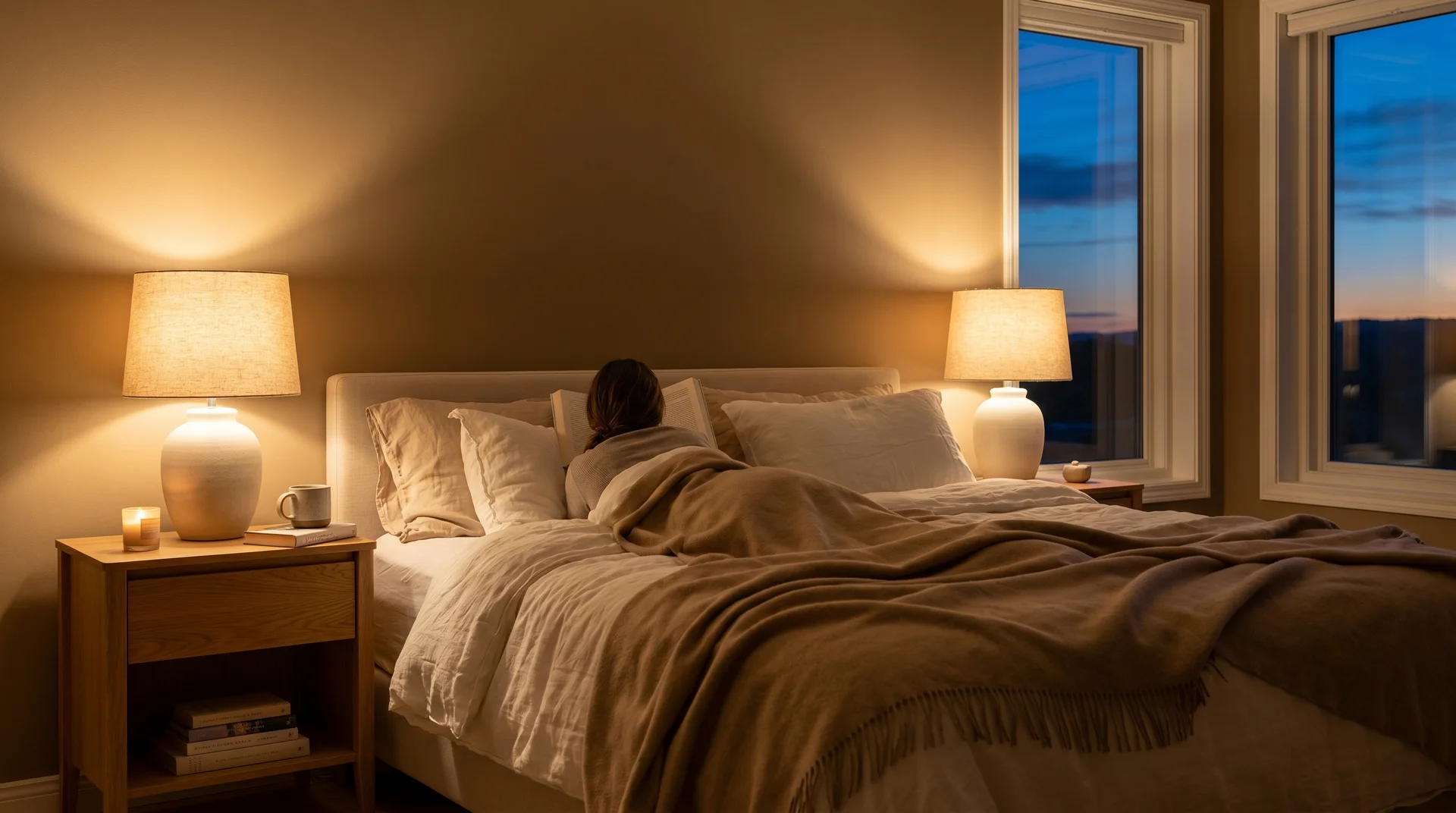
Bedrooms suit taupe well because the warmth in the color supports a restful feeling without going as heavy as navy or forest green.
For primary bedrooms, a medium-depth taupe creates the most comfortable result. Guest rooms can go lighter, particularly if the room is small or the window exposure is limited.
Taupe in Kitchens and Bathrooms
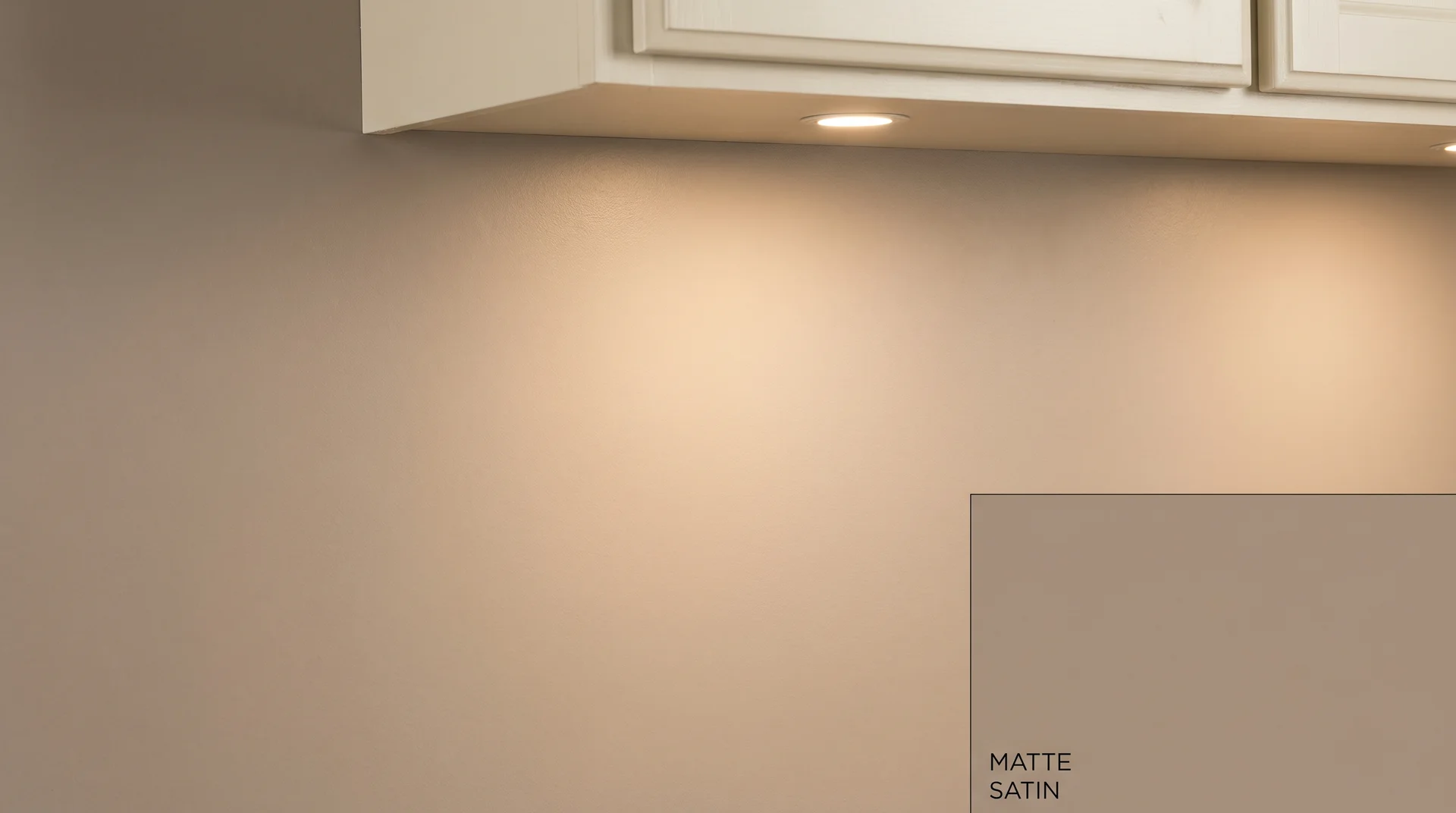
Use an eggshell or satin finish in kitchens and bathrooms rather than matte, both for durability and because the slight reflectivity keeps the color looking warm rather than flat under artificial task lighting.
Sheen level affects how taupe reads almost as much as the color itself, worth knowing before you order a full gallon in matte and wonder why the room feels dim.
The Mistakes That Make Taupe Look Wrong
Most failed taupe choices aren’t about the color. They’re about the process that led to choosing it.
Choosing Under the Wrong Light Source
As with the metameric shift described at the start of this piece, the light source you evaluate your sample under has an outsized effect on what you see.
If you’re judging the color under warm halogen store lights, you are not seeing what it will do under your overhead LEDs or in your north-facing afternoon light. Bring the sample home. Look at it there, under your actual conditions, at different times of day.
The pink-or-purple wall problem that comes up constantly in paint forums traces back to this every time. The undertones were always in the paint. They just weren’t visible under the conditions where the decision was made.
Ignoring the Floor-to-Wall Undertone Relationship
Taupe walls and warm wood floors don’t automatically work together. If the floor has golden or orange tones and the taupe has violet or pink undertones, the colors compete. The floor reads more orange against the pink wall, and the wall reads more pink against the orange floor; each amplifies the worst quality in the other.
The fix is straightforward: hold your sample flat against the actual floor and look at the edge where they meet. If there’s a conflict, you’ll see it immediately. Don’t rely on the general promise that taupe is versatile enough to handle anything, because it isn’t.
Going Too Light in Low-Ceiling Rooms
A very light taupe in a room with low ceilings tends to disappear. The walls read as off-white rather than taupe, and the warmth that makes taupe worth choosing isn’t there. In lower-ceiling rooms, go a step deeper than your instinct suggests.
The color will always read lighter on the wall than it does on the swatch, and a medium-depth taupe will actually look like taupe rather than an unsuccessful attempt at white.
End Note
I’ll be honest here: I’m less certain this applies universally than I am about the rest of the advice in this piece. There are cases where a very pale taupe on low walls works because the ceiling is painted a contrasting tone, or because the room has particularly warm natural light that activates the color.
As a general starting point, going deeper in low-ceiling rooms gives you better odds. But if your specific conditions suggest otherwise when you test, trust what you see.
