
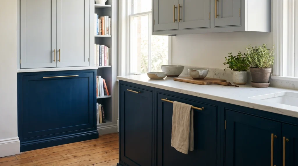
The right two-tone blue and gray kitchen starts with one decision most inspiration galleries skip: picking two colors whose undertones are compatible with each other.
You can love your navy and love your gray separately and still end up with a kitchen that feels off without being able to say why.
This guide gives you a practical framework for choosing, placing, and committing to a blue and gray cabinet palette that works in your kitchen, not just in a professionally staged photo.
Why Blue and Gray Work So Well Together?
Blue and gray are naturally compatible because they share the same cool-tone family.
Both colors lean cool. Neither carries the warmth of green, yellow, or red. That shared temperature is what makes blue and gray feel calm and cohesive when you get them right.
The trouble starts when one color’s undertone pulls toward warmth, and the other doesn’t.
The Undertone Problem
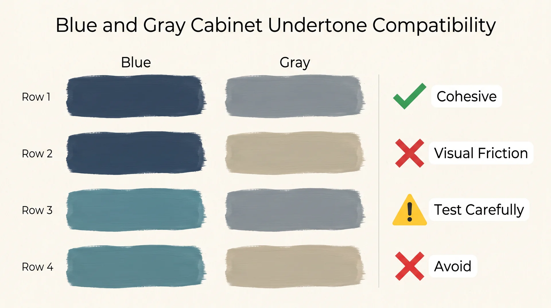
The most common failure in two-tone blue and gray kitchens isn’t the wrong color. It’s mismatched undertones between the two cabinet runs.
Every paint color has an undertone: a secondary hue that becomes visible once the color is on a large surface. Some grays read warm, leaning toward beige or taupe.
Others read cool, leaning toward blue or green. The same range exists in blues. A navy might carry green undertones that push toward teal in bright light.
Another might lean more violet. Pair the wrong two together, and you get that unsettling “something’s off” feeling most homeowners sense but can’t name.
Here’s the undertone compatibility map for this palette:
| Blue Undertone | Gray Undertone | Result |
|---|---|---|
| Cool (blue-violet or blue-gray base) | Cool (blue-gray or true neutral) | Cohesive, sophisticated |
| Cool (blue-violet or blue-gray base) | Warm (greige or taupe base) | Visual friction – the two colors fight |
| Blue-green undertone | Cool neutral gray | Workable, but test carefully – can read teal-heavy |
| Blue-green undertone | Warm greige | Avoid – green in the blue clashes with yellow in the gray |
The practical rule: if your gray carries beige or yellow warmth, your blue needs warm undertones too. If your blue is a pure cool navy, your gray should lean cool as well. Mixing temperature across the two cabinet runs is the most common and most fixable mistake in this palette.
How Your Kitchen’s Light Direction Changes Everything
Paint colors shift with light, and your kitchen’s orientation determines how much.
- A north-facing kitchen receives indirect, cooler light all day, which intensifies blue tones and can make a warm gray look surprisingly cold.
- South and west-facing kitchens get warm afternoon light that softens navy toward something richer and can push a “neutral” gray toward greige territory.
The reason your inspiration photo looks different from your paint samples is almost always light.
Professional photography uses staged lighting in spaces that rarely share your orientation or window placement. Color consulting professionals see this constantly; it’s not a personal failing on your part.
Two-Tone Blue and Gray Kitchen Cabinet Ideas
These twenty ideas show you what that science looks like in a real kitchen, across different styles, layouts, contrast levels, and design goals.
1. The Classic: Naval Lower Cabinets, Repose Gray Uppers
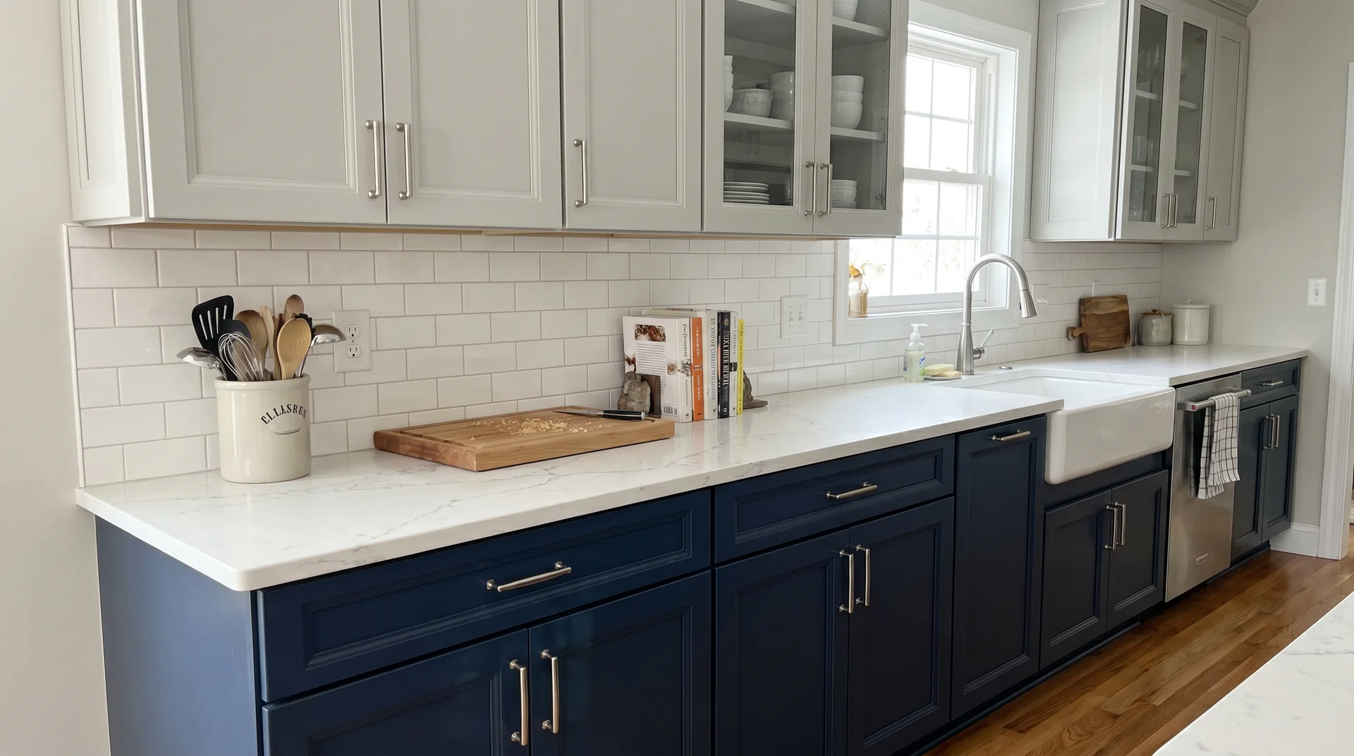
Naval SW 6244 on the base cabinets, Repose Gray SW 7015 on the uppers, white quartz countertop with brushed nickel hardware.
This is the combination that set the blueprint for the blue and gray two-tone kitchen, and it holds up because every element is doing the right job. The navy anchors the floor plane. The gray opens the upper half. The white countertop bridges both without competing with either.
It works in transitional, coastal, and modern kitchens alike. If you’re not sure which direction to go, start here.
2. The Warm Version: Naval + Mindful Gray with Oak Floors
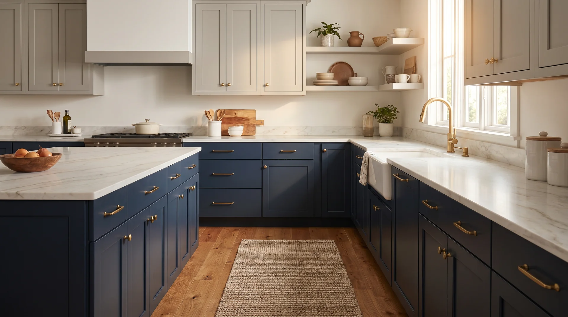
The same Naval base, but Mindful Gray SW 7016 on the uppers instead of Repose Gray.
The slight warmth in Mindful Gray does something that Repose can’t in a wood-heavy kitchen; it bridges the cool navy and the warm oak floors without creating an undertone gap between the cabinet runs and the floor.
Pair with unlacquered or satin brass hardware. This is the combination I’d default to in any kitchen where warm wood tones are a significant element of the palette.
3. Contemporary Restraint: Smoky Blue + Dovetail
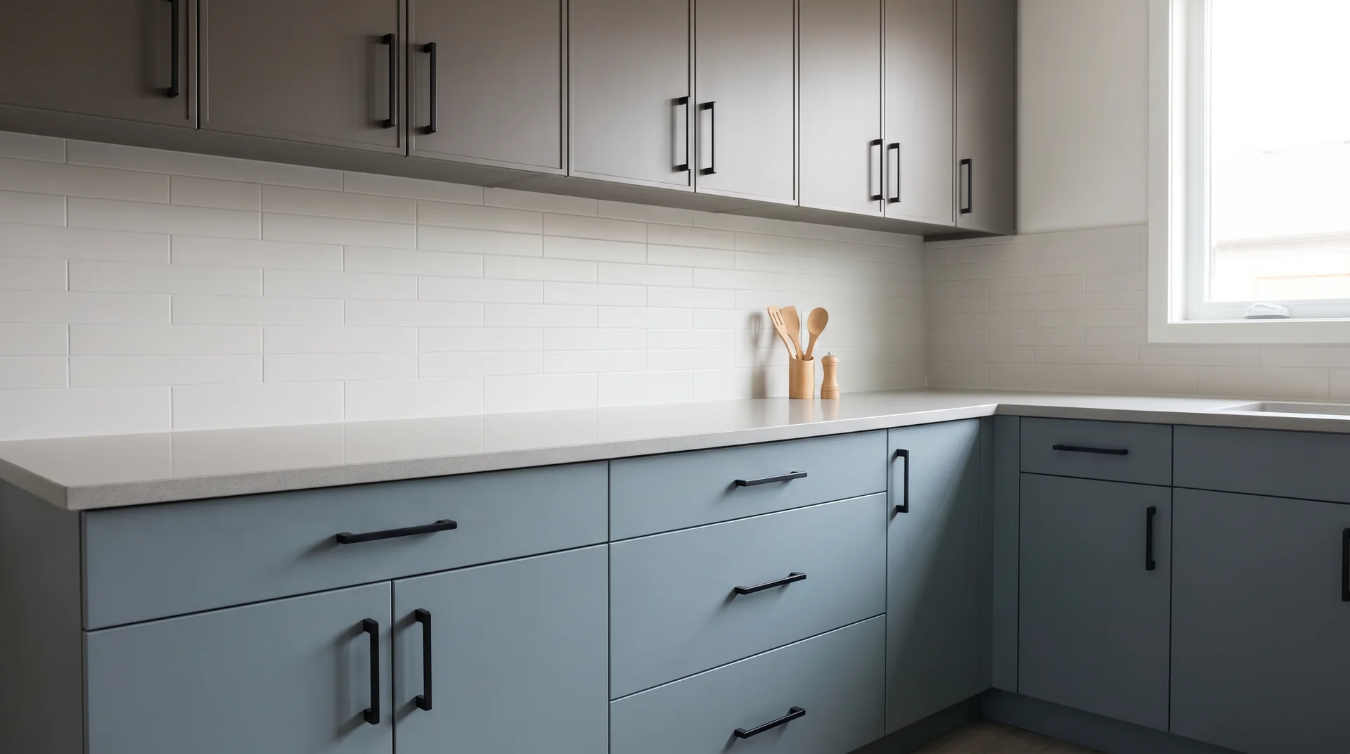
Smoky Blue SW 7604 on the lower cabinets, Dovetail SW 7018 on the uppers.
Both colors sit in the same middle range of the value scale, which means the contrast between the two cabinet runs is subtle rather than bold.
The result reads as layered and sophisticated rather than high-contrast and graphic.
Matte black hardware and a light gray quartz countertop complete this palette. For kitchens that want color without announcing it from across the room, this is the right approach.
4. The Island Introduction: White Perimeter, Navy Island
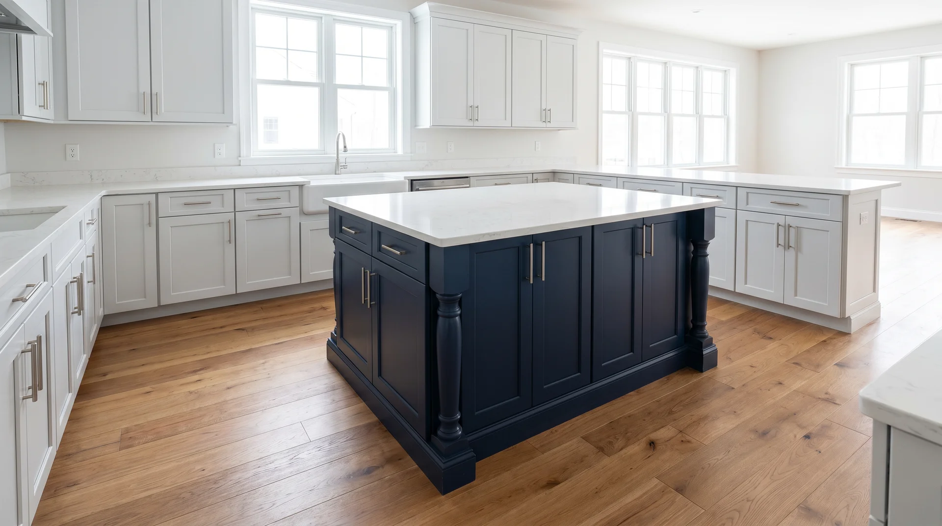
All-white or light gray perimeter cabinets with a Naval SW 6244 island. The two-tone palette lives entirely on the island, which functions more like a furniture piece than a cabinet run.
It’s the lowest-commitment path to the blue and gray kitchen, and it’s reversible if you change your mind later.
This approach also works as a first phase. Paint the island navy, live with it for a season, and decide whether you want to extend the blue to the full lower cabinet run.
5. High-Contrast Contemporary: Stardew Upper, Iron Ore Lower
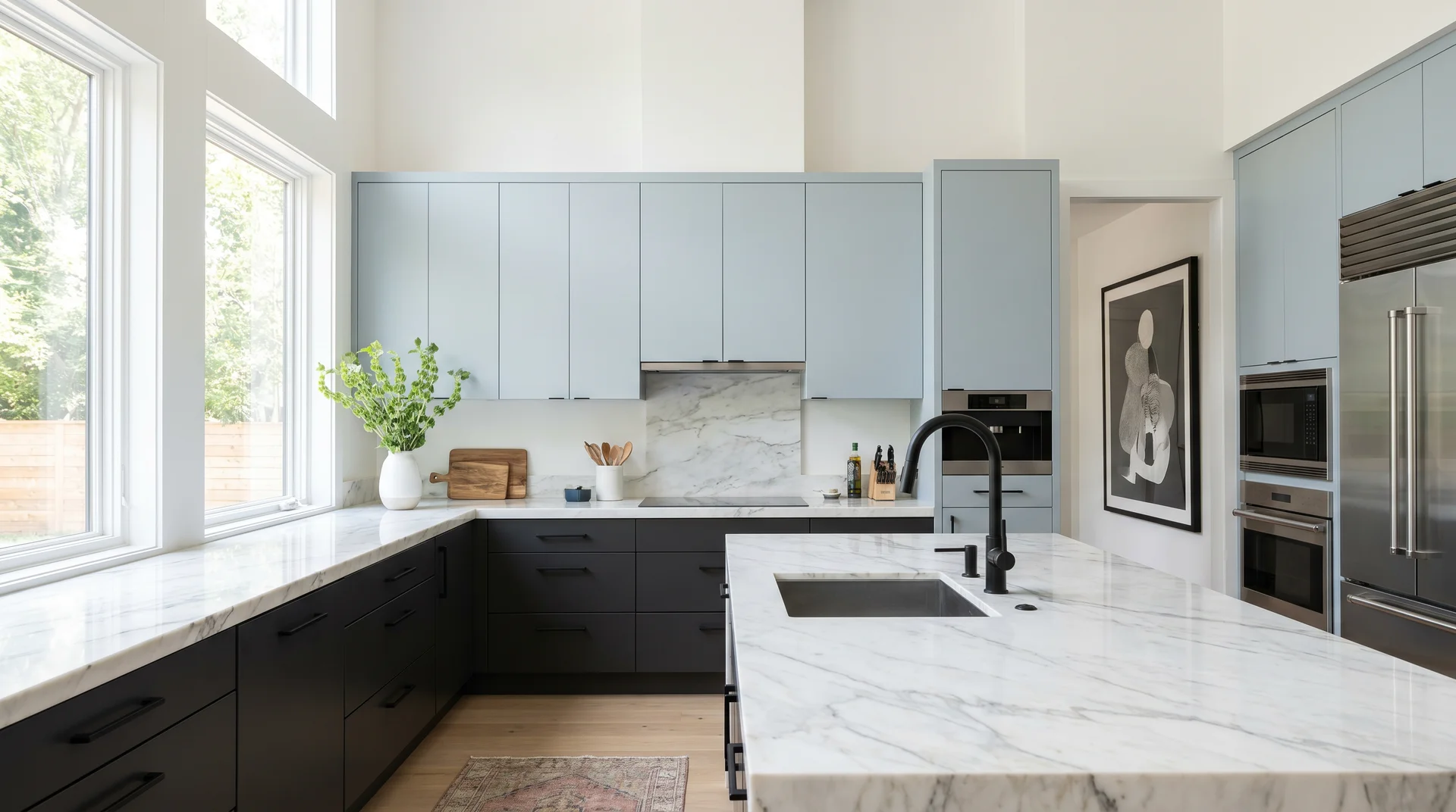
Stardew SW 9138 on the upper cabinets, Iron Ore SW 7069 on the lowers. This is the reversed formula, the lighter color on the uppers, the darker on the base, taken to its most dramatic expression.
Iron Ore is dark enough to read as near-black on a cabinet face, while Stardew’s light blue-gray keeps the upper half of the kitchen from feeling heavy.
It only works in kitchens with substantial natural light. A white quartz or marble countertop is non-negotiable here, the countertop provides the visual breathing room the dark lower cabinets need.
6. Tonal Elegance: Silvermist Upper, Dorian Gray Lower
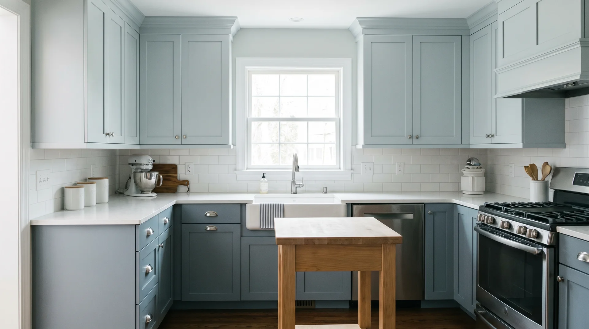
Silvermist SW 7621 on the upper cabinets, Dorian Gray SW 7017 on the lowers. Both colors lean blue-gray and sit close in value, which means the two-tone effect is present but quiet.
From across the room, the kitchen reads as a cohesive blue-gray palette. Only up close does the two-tone distinction become clear.
This approach suits smaller kitchens where high contrast would feel busy. It’s also the right choice for homeowners who love the two-tone concept but find bold contrast too assertive for a space they use every day.
7. Coastal Farmhouse: Salty Dog Base with Open Shelving Uppers
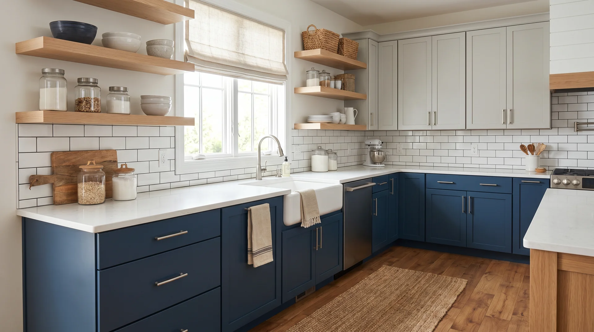
Salty Dog SW 9177 on the base cabinets. Some upper cabinets in Repose Gray SW 7015, with select upper cabinet runs replaced by open shelving in white oak.
The mix of closed storage and open shelving breaks up the upper half of the kitchen and gives the navy base room to breathe.
White subway tile backsplash, warm wood shelves, and simple bar pulls in brushed nickel complete the look.
The Salty Dog reads richer and slightly more coastal than Naval; it’s a subtler starting point if straight navy feels too bold.
8. Moody Industrial: Rainstorm + Dovetail + Concrete
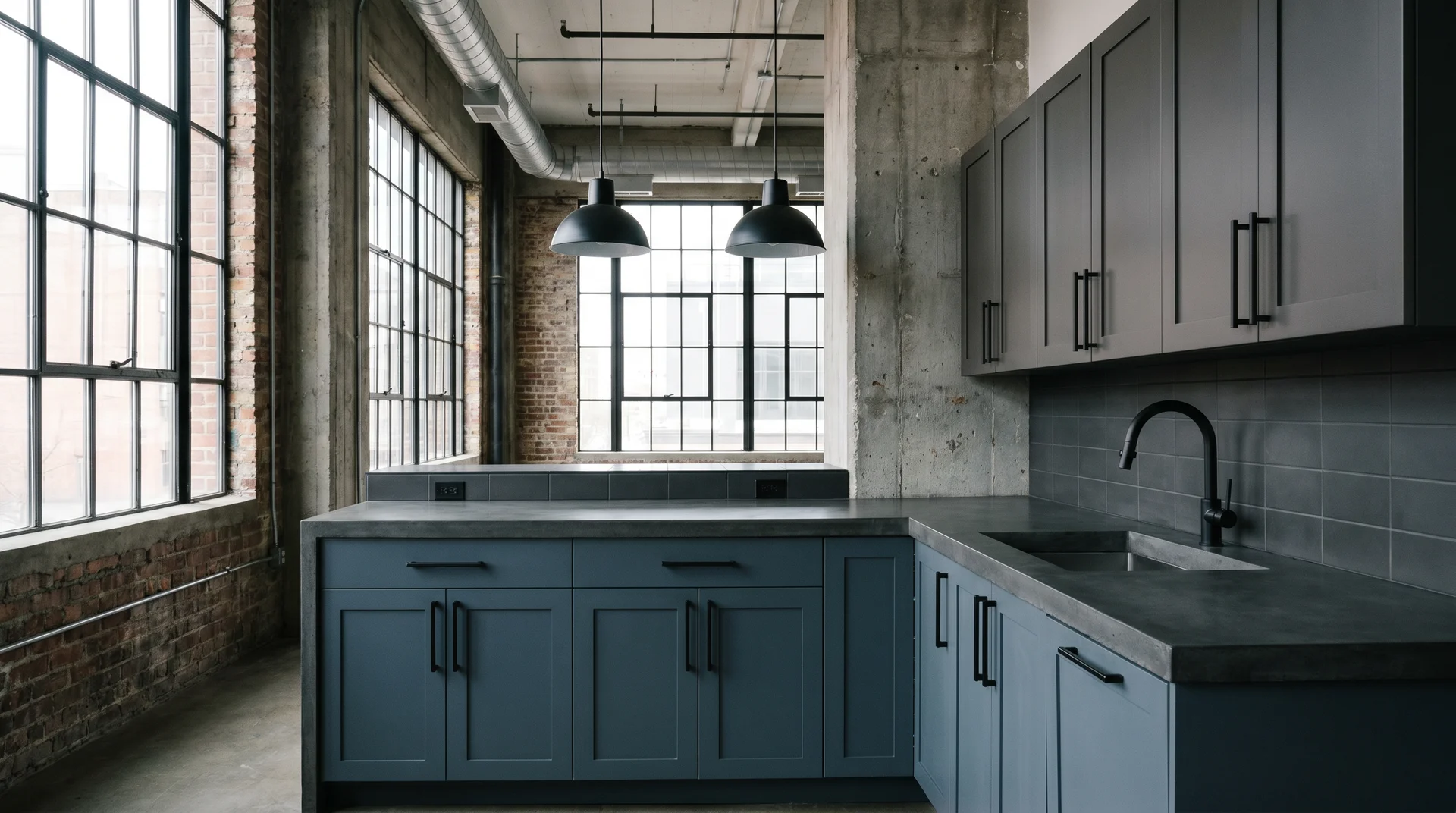
Rainstorm SW 6230 on the lower cabinets, Dovetail SW 7018 on the uppers.
Rainstorm is a slate blue that leans toward gray-blue rather than classic navy, which gives this combination a more industrial, contemporary character than the Naval-based pairings.
Both colors carry similar cool undertones, so the transition between cabinet runs reads as deliberate rather than arbitrary.
Concrete countertops or honed dark granite, matte black hardware, and fixtures throughout. This is a strong choice for loft-style kitchens or any space with exposed brick, concrete floors, or industrial lighting.
9. Brass-Forward: Naval + Mindful Gray + Statement Hardware
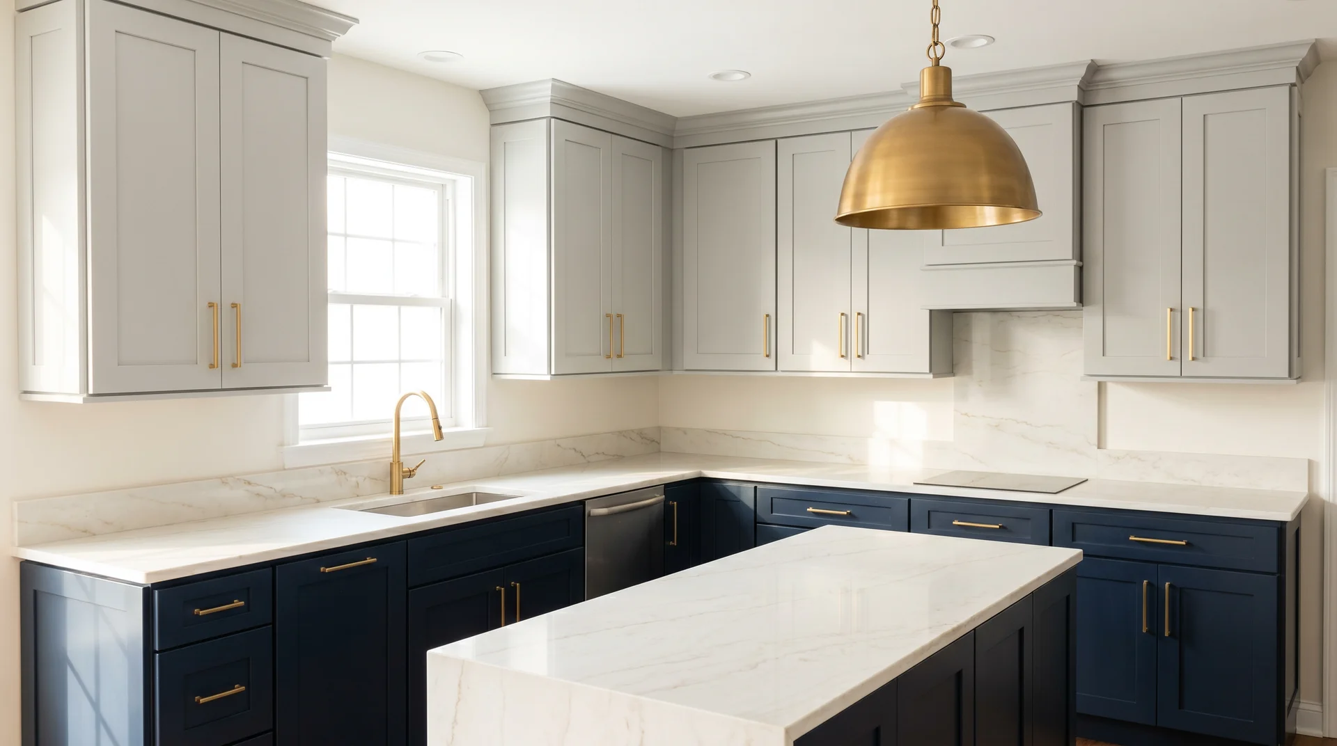
Naval lowers, Mindful Gray uppers, white marble countertop, but with satin brass hardware as the intentional third element.
The brass is not an accent here; it’s the thread that connects the two cabinet colors and ties the kitchen together. Every hardware element matches: cabinet pulls, faucet, light fixtures, and pot rack, if present.
This is the same foundational pairing as idea two, but the design intent shifts when brass takes a lead role.
The warm metal fills the temperature gap that the cool navy leaves open, and the result reads warmer than the color palette alone would suggest.
10. The Peninsula Play: Navy Peninsula, Gray Perimeter
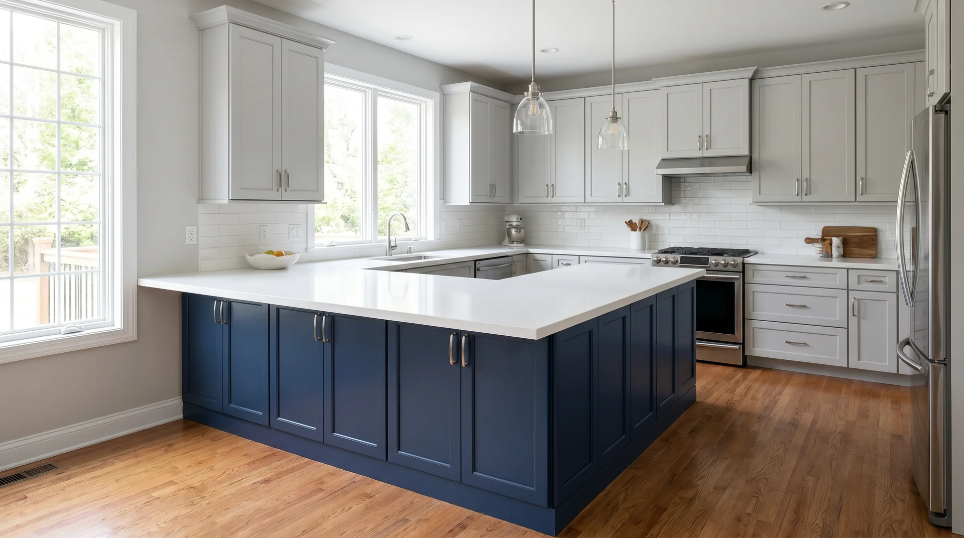
For kitchens without a traditional island, the peninsula is the two-tone opportunity.
Navy base cabinets on the peninsula, Naval or Salty Dog with Repose Gray or Mindful Gray on the perimeter runs.
The color divide follows the peninsula footprint rather than the upper-lower line, which gives the kitchen a different structural logic than the standard two-tone formula.
The peninsula becomes the focal point, and the gray perimeter stays calm around it. It works particularly well in galley or L-shaped kitchens where a full island isn’t possible.
11. Glass-Front Detail: Navy Lower, Gray Glass-Front Upper
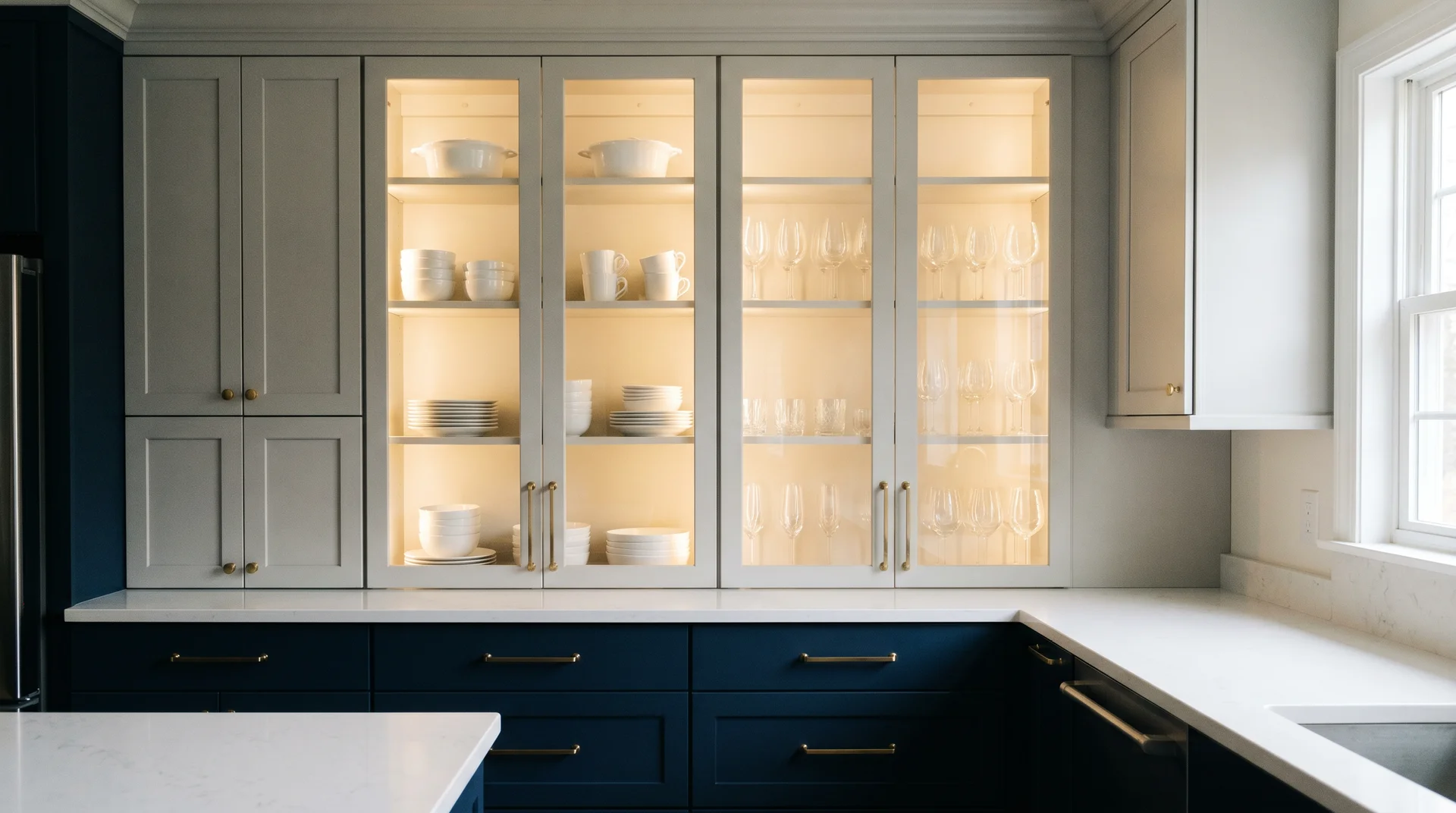
Naval or Salty Dog on the base cabinets. Gray upper cabinets, Repose Gray or Mindful Gray, with glass-front doors on the display units.
The interior of the glass-front cabinets is painted a lighter blue or warm white, which adds depth when the doors are closed and frames the dishware when they’re open.
This approach adds a third layer of visual interest to the standard two-tone formula.
The glass fronts break up what would otherwise be a solid run of gray upper cabinets and create a natural display moment in the kitchen.
12. The Shiplap Hybrid: Navy Lower, Open Upper Half
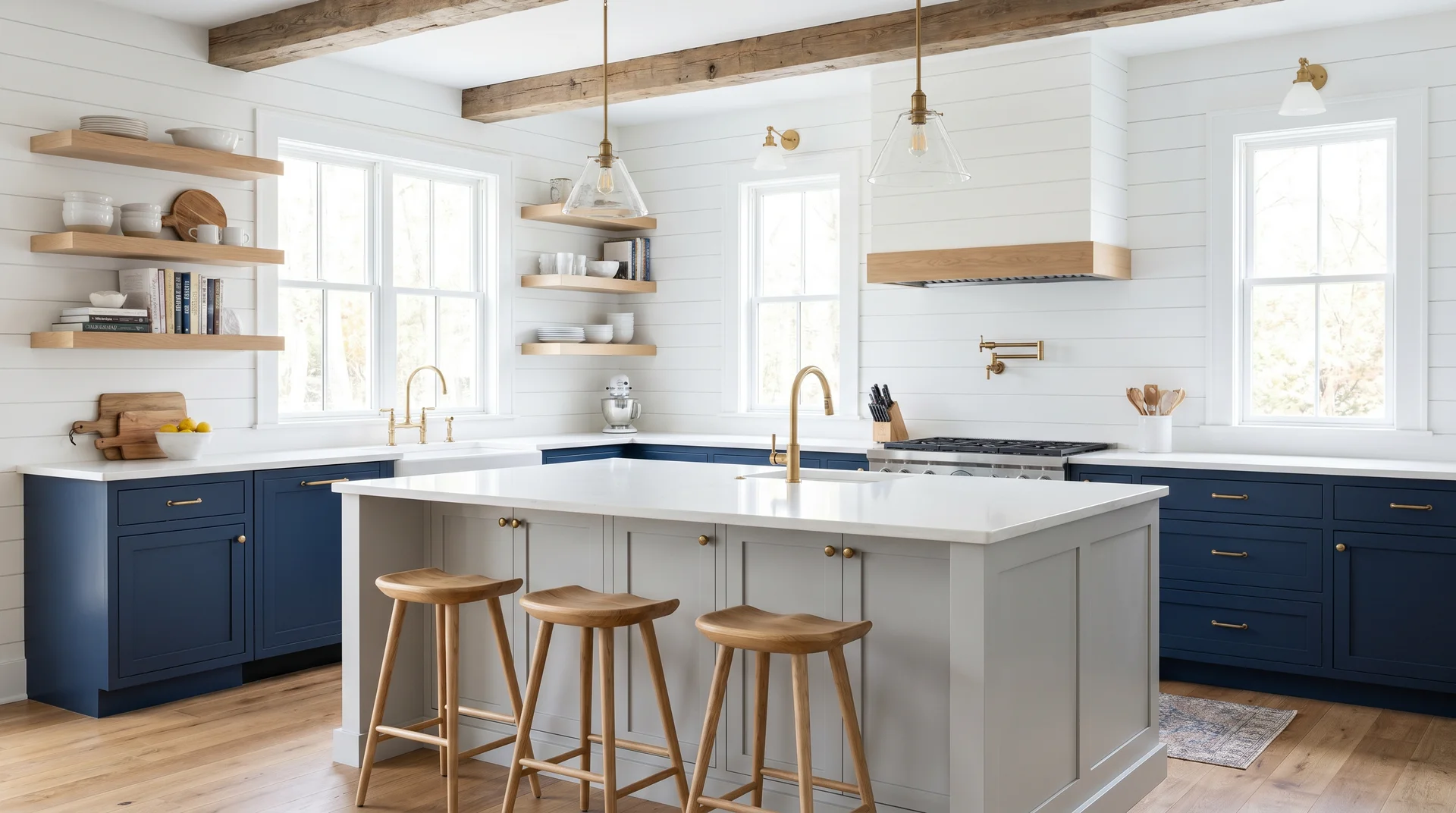
Navy base cabinets, Naval or Rainstorm, with the upper cabinet run replaced entirely by painted shiplap and open shelving.
The gray in this version appears only on the island or as a painted accent on the shiplap itself. The effect opens the upper half of the kitchen dramatically while keeping the blue anchor at the base.
This is a strong option for kitchens that feel visually heavy with full upper cabinet coverage.
The shiplap reads as an architectural detail rather than an absence, and the open shelving adds warmth through the displayed objects.
13. The Soft Reversal: Stardew Upper, Light Gray Lower
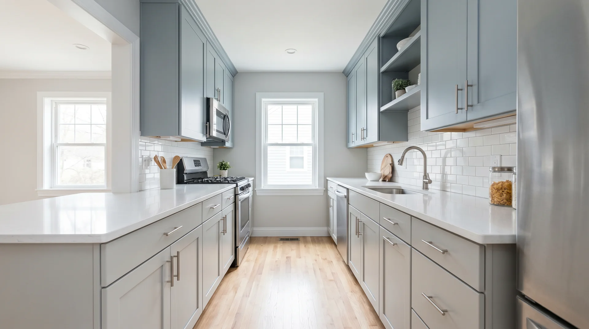
Repose Gray or Mindful Gray on the lower cabinets. Stardew SW 9138 or Smoky Blue SW 7604 on the uppers.
The formula is reversed, lighter lower, colored upper, which makes the floor plane feel wider in kitchens with limited square footage. The lighter lower cabinet run stops the kitchen from feeling anchored into the floor.
This version works best in small kitchens or galley configurations where the standard dark-lower formula would add visual weight that the space can’t absorb.
It’s counterintuitive but effective when the geometry is right.
14. The Pantry Anchor: Gray Kitchen, Navy Pantry Cabinet
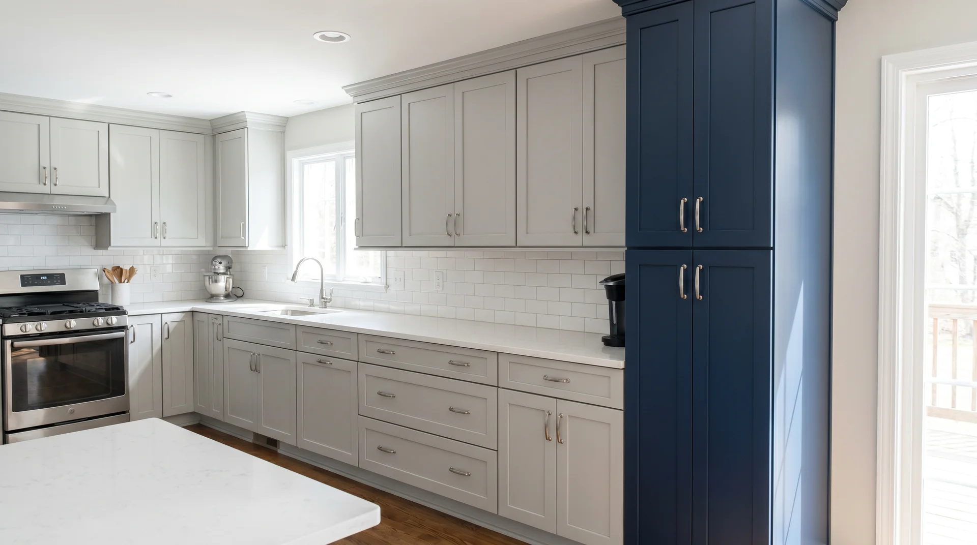
The full kitchen in Repose Gray or Mindful Gray. One full-height pantry cabinet, butler’s pantry, or broom cabinet in Naval SW 6244.
The navy lives in a single vertical element rather than running across an entire cabinet line.
The contrast is high, the commitment is low, and the pantry becomes the kitchen’s focal point without demanding that every cabinet participate in the color story.
This is the right approach for homeowners who love the navy-gray palette but are working in a kitchen with proportions that can’t support a full lower-cabinet run in a dark color.
15. Dark on Dark: Iron Ore Lower, Smoky Blue Upper
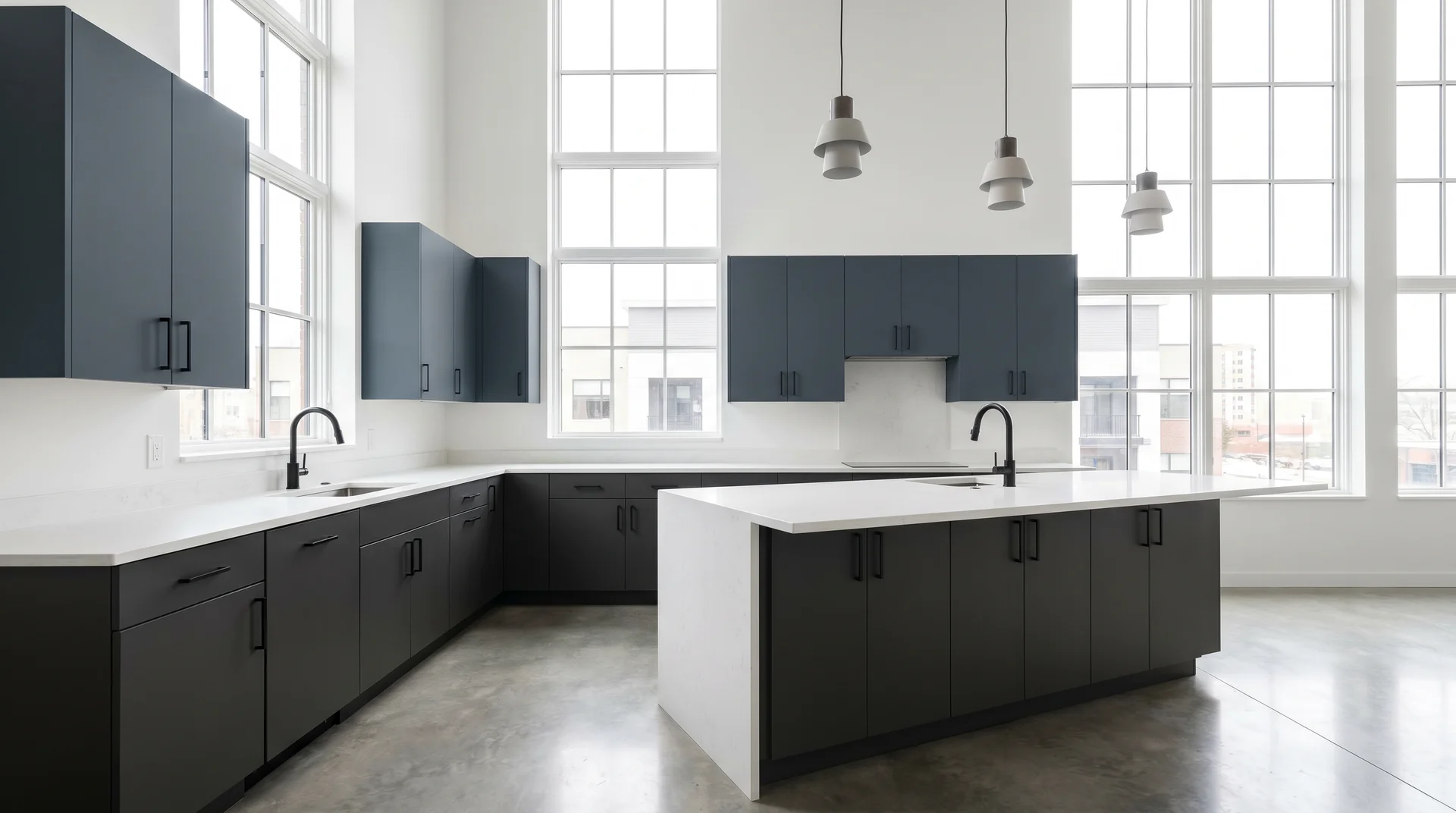
Iron Ore SW 7069 on the lower cabinets, Smoky Blue SW 7604 on the uppers.
Both colors are deep, which means this combination requires a kitchen with significant natural light to work.
The white quartz countertop and white walls are not decorative choices here. They’re structural requirements that prevent the palette from collapsing into itself.
When the light is there, this pairing reads as bold and deliberate in a way that lighter palettes can’t achieve.
For kitchens with south or west-facing windows and high ceilings, it’s worth considering.
16. The Countertop Story: Calacatta Quartz as the Feature
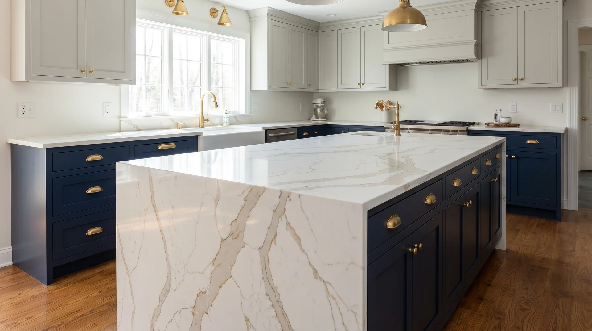
Naval lower, Repose Gray upper, but with a waterfall-edge Calacatta quartz as the kitchen’s primary visual statement.
The two-tone cabinets become the frame rather than the subject. The dramatic white marble patterning on the island waterfall edge or the full countertop run takes the lead, and the navy and gray surround it without competing.
Hardware in unlacquered brass. The warm metal complements the gold veining in the Calacatta and softens the cool cabinet palette at the same time.
17. Two Door Styles, Two Colors
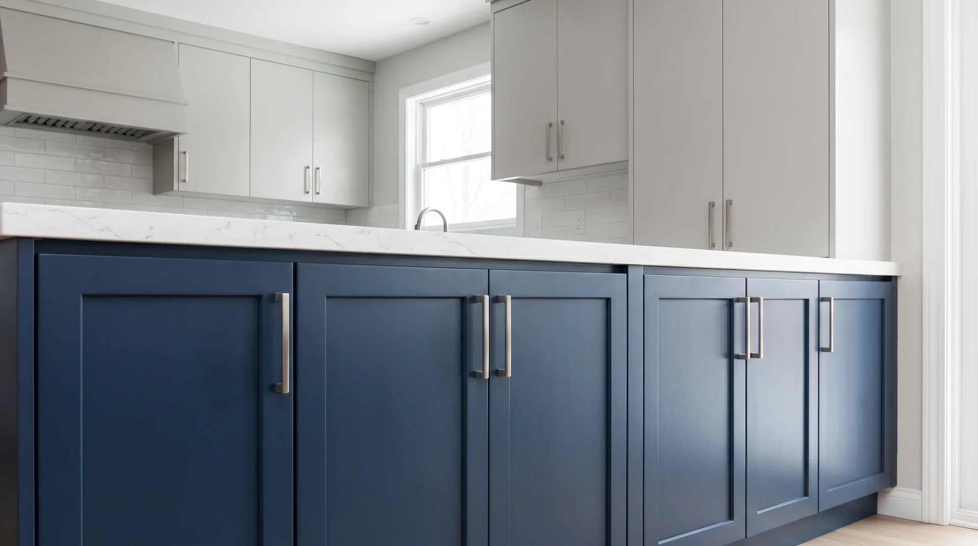
Navy SW 6244 on Shaker-profile lower cabinet doors. Repose Gray SW 7015 on flat-panel upper cabinet doors. The two-tone effect comes from both color and door profile simultaneously.
The Shaker lowers carry more visual weight and detail. The flat-panel uppers are cleaner and quieter. Together, they create a kitchen that reads as custom and considered at a level that color alone doesn’t always achieve.
This is worth considering in kitchens with new cabinetry where you have control over door specification, or in a refacing project where upper and lower doors are ordered separately.
18. Blue on Three Walls, Gray Island
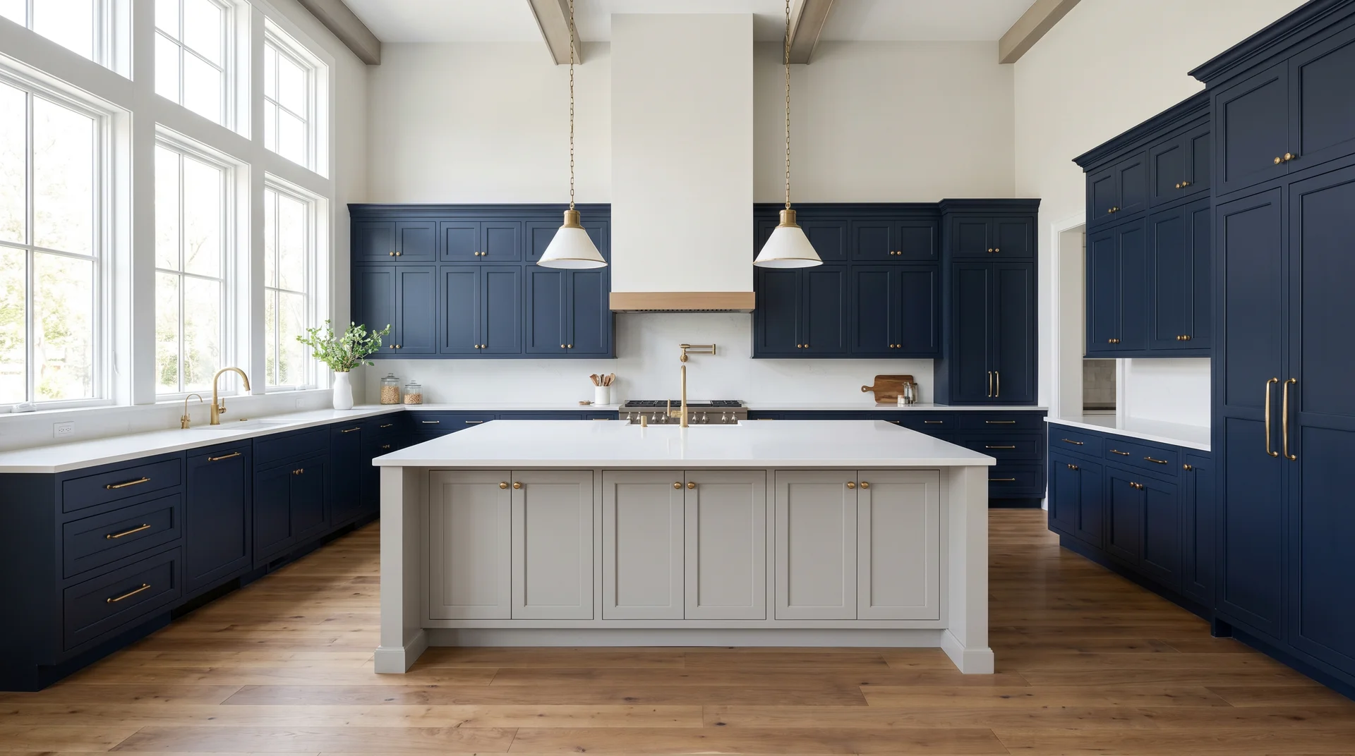
Naval SW 6244 on the perimeter cabinets, all three walls, lowers, and uppers. Repose Gray or Dovetail on the island alone.
The formula is fully inverted: blue is the dominant color, gray is the accent. The island becomes the quiet contrast piece rather than the bold focal point.
This only works in large, generously lit kitchens where a full perimeter of navy doesn’t close the space down.
In those kitchens, the effect is dramatic and immersive in a way the standard formula can’t produce.
19. Midnight and Mist: Naval Lower, Silvermist Upper
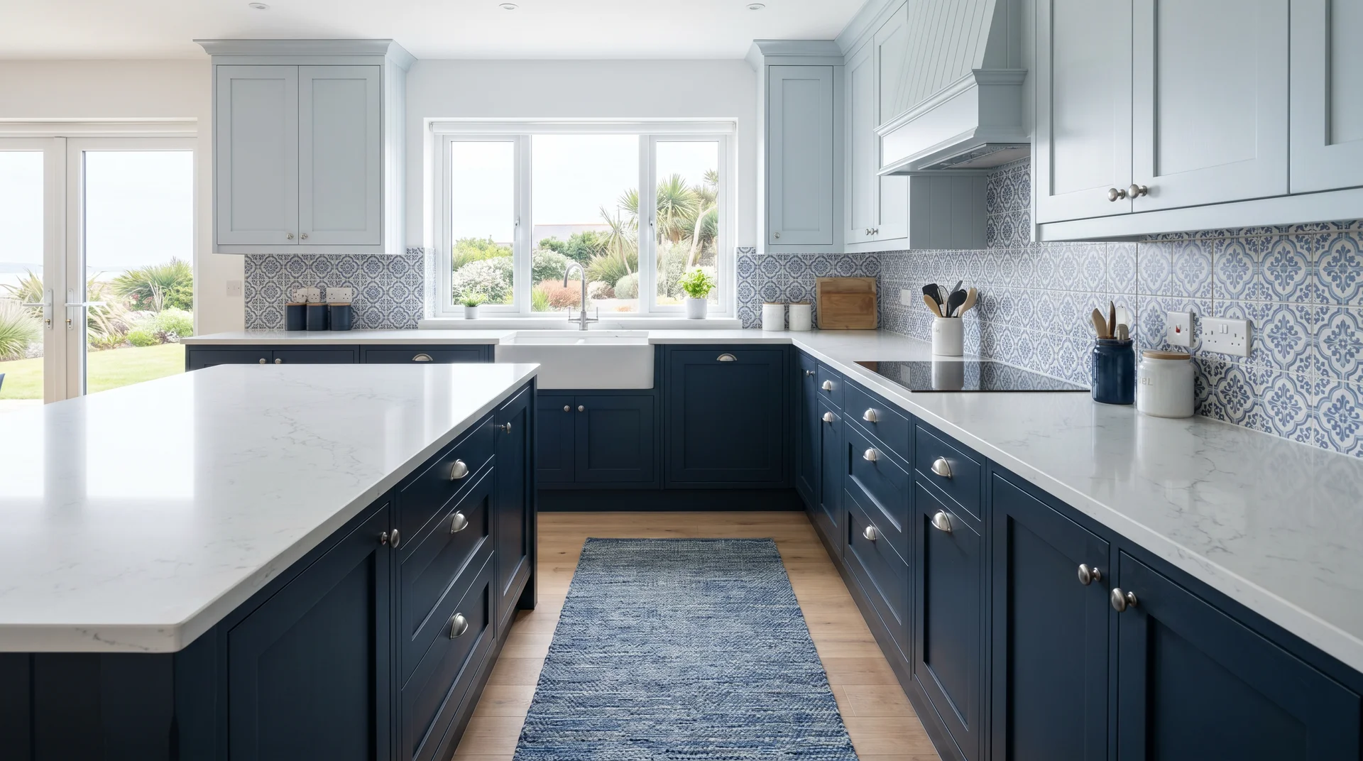
Naval SW 6244 on the lower cabinets, Silvermist SW 7621 on the uppers.
Silvermist is a light blue-gray close in tone to Repose Gray but with a more visible blue component.
The two-tone palette stays entirely in the blue family, with Navy delivering the dark anchor and Silvermist providing a pale, airy contrast above.
The result reads as cohesive and distinctly blue-influenced rather than a blue-and-gray combination.
For homeowners who want the two-tone contrast without any warm neutrality in the upper half of the kitchen, this is a cleaner version of the classic formula.
20. The Budget-Smart Phase Approach

Paint only the lower cabinets in Navy first. Live with it for one season.
Evaluate whether the kitchen needs the gray uppers at all, and which specific gray feels right once the navy is in place and you can see how your lighting reads it.
Lower cabinets are the higher-impact visual change in a two-tone kitchen.
They cover more visible surface from normal standing height, take more wear, and define the base of the room. Doing the lower run first costs less and gives you concrete information for the second decision.
It’s also reversible in a way that a full two-tone commitment isn’t.
Which Color Goes Where: Upper Cabinets, Lower Cabinets, & the Island
In most kitchens, the darker blue belongs on the lower cabinets and the lighter gray on the uppers, but understanding why that works matters more than following the rule blindly.
The Standard Formula
- Dark lower cabinets anchor the floor plane.
- Light upper cabinets reflect light upward, creating the illusion of height and keeping the space from feeling heavy.
This is why the lighter-on-top formula appears in virtually every kitchen designer’s portfolio; it isn’t a trend; it’s spatial logic that holds across kitchen sizes and styles.
With a navy or charcoal-blue lower run and a soft gray on the uppers, you get one more practical benefit: darker lower cabinets hide scuffs, grease marks, and daily contact wear far better than any light color would.
Lower cabinets take significantly more abuse than uppers. Putting your most durable-feeling color in the most punishing zone is as much a practical decision as an aesthetic one.
When to Flip It
There are specific situations where putting the blue on top makes more sense:
- High ceilings: Bold blue upper cabinets draw the eye upward and use the ceiling height as a design asset. Keep base cabinets in a lighter gray to prevent the space from feeling closed in at floor level. The color sits in the upper visual band, and the room feels taller for it.
- Small kitchens with limited natural light: A lighter gray on the lowers makes the floor plane feel wider. Paired with a medium blue on the uppers, this configuration can open up a tight galley better than the standard formula.
- When you want a less expected result: Reversed placement is uncommon enough that it reads as deliberately custom when the kitchen’s proportions support it.
The Island as a Third Option
If you’re not ready to commit blue across an entire run of lower cabinets, the island is a lower-stakes starting point.
Painting just the island in navy or slate blue while keeping the perimeter in a single gray gives you the two-tone palette without the full visual weight.
I’ve seen this work especially well in larger kitchens where the island functions more like a furniture piece than a built-in.
The contrast reads intentional at scale, and it gives you the chance to live with the blue before committing it to the full lower run.
Best Sherwin-Williams Color Pairings for Two-Tone Blue and Gray Cabinets
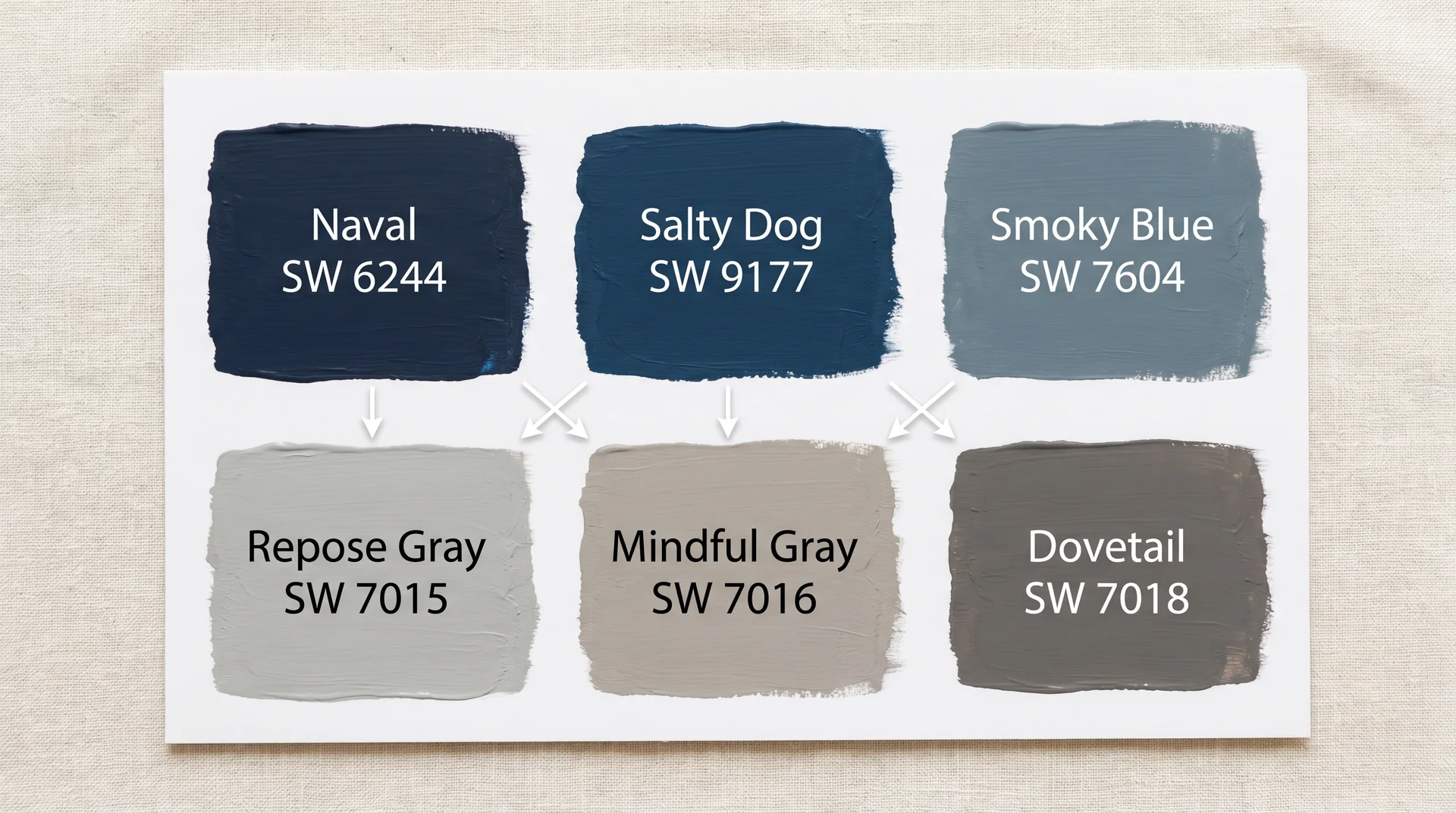
Sherwin-Williams has one of the most consistent color libraries for cabinet work, and it’s the brand I’ve sampled most extensively with residential clients.
The pairings below are organized by contrast level from bold to subtle, so you can match the approach to how much visual tension you want between your two cabinet runs.
One process note before you dive in: order the Peel & Stick samples for both colors in any combination you’re considering, not the small paper chips.
Chips are too small to give an accurate read. Apply both samples to a cabinet door and observe them side by side in your kitchen light before committing to anything.
Navy Blue Plus Soft Gray (Classic Pairing)
This is the combination most people picture when they imagine two-tone blue and gray kitchen cabinets. High contrast, broadly compatible with the widest range of countertops and hardware, and the most proven in terms of long-term appeal.
| Blue | SW Code | Gray Partner | SW Code | Why It Works | Best For |
|---|---|---|---|---|---|
| Naval | SW 6244 | Repose Gray | SW 7015 | Both lean cool-neutral; Naval’s gray base echoes Repose’s undertone directly | Modern, transitional, coastal kitchens |
| Naval | SW 6244 | Mindful Gray | SW 7016 | Mindful Gray’s slight warmth softens the contrast; it suits kitchens with warm wood floors | Transitional kitchens, wood-heavy spaces |
| Salty Dog | SW 9177 | Repose Gray | SW 7015 | Salty Dog reads richer and slightly more saturated than Naval; both stay in the cool family | Farmhouse and coastal styles |
Naval (SW 6244) is the most forgiving navy in the SW library for cabinet applications. Its undertones sit right at the blue-gray intersection, which means it reads as classic navy rather than pulling toward purple or teal. That stability across different lighting conditions is what makes it consistently reliable.
Naval with Mindful Gray (SW 7016) is the warmer version of this combination. Mindful Gray’s greige undertones add softness to what might otherwise read as a very cool, stark kitchen.
If your floors are warm wood or your kitchen gets substantial natural light, this pairing tends to feel more livable day-to-day than the cooler Naval-plus-Repose combination.
I’d default to Mindful Gray in any kitchen where wood tones are playing a major role in the palette.
Mid-Blue Plus Charcoal Gray (Contemporary Pairing)
For kitchens that lean more contemporary, the high-contrast navy-plus-light-gray formula can feel too traditional. These pairings work in a more modern register — less contrast between the two cabinet runs, more sophistication in the tonal relationship.
| Blue | SW Code | Gray Partner | SW Code | Why It Works | Best For |
|---|---|---|---|---|---|
| Smoky Blue | SW 7604 | Dovetail | SW 7018 | Similar value levels create a low-contrast pairing; both lean cool with just enough warmth to stay grounded | Contemporary and minimalist kitchens |
| Stardew | SW 9138 | Iron Ore | SW 7069 | Stardew’s gentle warmth plays against Iron Ore’s cool gray-black for unexpected depth | Kitchens with abundant natural light |
| Rainstorm | SW 6230 | Dovetail | SW 7018 | Rainstorm’s slate-gray undertone aligns cleanly with Dovetail’s neutral-cool base | Industrial and contemporary styles |
The Smoky Blue plus Dovetail pairing is one I keep returning to for clients who want color without a bold statement.
The contrast between the two runs is subtle enough to read as sophisticated rather than bold, and the similar value levels give the kitchen a layered, considered quality that high-contrast combinations don’t always achieve.
Soft Blue-Gray Plus Deeper Gray (Tonal Pairing)
A tonal pairing uses two colors from the same family, close in value but different enough to register as a deliberate choice rather than mismatched paint.
Silvermist (SW 7621) on the uppers with Dorian Gray (SW 7017) on the lowers is the most refined version of this approach in the SW library. Both lean blue-gray, but Dorian Gray has enough depth to anchor the lower cabinets without competing with the uppers for attention.
The result is elegant and calm, well-suited to smaller kitchens where high contrast would feel busy.
The risk with tonal pairings is value difference. If the two colors are too close, the effect reads as mismatched rather than intentional.
Test them side by side in your kitchen light to confirm there’s enough contrast to read as a deliberate design choice from across the room.
Colors to Avoid Pairing
Not every blue and gray in the SW library works together. These combinations consistently cause problems:
- Rainwashed (SW 6211) or any blue-green with strong green undertones, paired with warm greige grays: The green in the blue and the yellow in the gray pull in opposite directions. I’ve seen this combination on mood boards more times than I can count; it rarely translates well to an actual kitchen. The green undertone in Rainwashed is significantly stronger than the swatch suggests.
- Agreeable Gray (SW 7029) with a cool, saturated navy: Agreeable Gray is a warm greige. It’s a beautiful cabinet color in the right context, but pairing it directly with Naval or Salty Dog creates the exact undertone conflict the compatibility table above describes. If you want warmth alongside a navy, Mindful Gray (SW 7016) is the better partner.
- Two colors too close in value: If both cabinet runs land in the same mid-tone range, the two-tone effect disappears. You need either a clear light-to-dark shift or a distinct enough blue-to-gray distinction to read intentionally from across the room.
How to Test Before You Commit
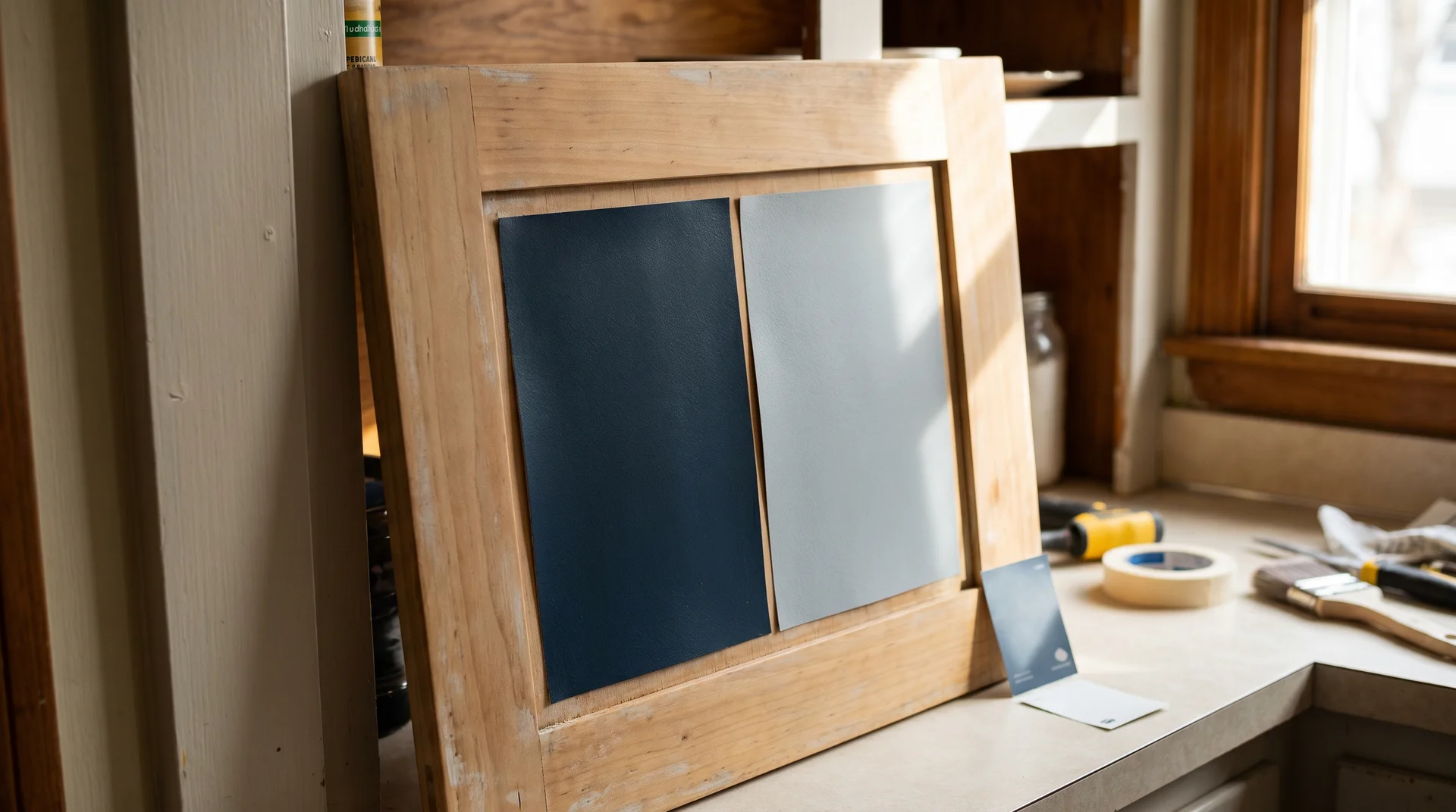
The single most important step in choosing two-tone blue and gray kitchen cabinets has nothing to do with color theory — it’s testing both colors together in your actual kitchen before buying a full gallon of either one.
I’m not covering cabinet painting prep or application here. That’s a separate tutorial, and trying to handle both topics in one article would shortchange both. This section is purely about validating your color choices before money changes hands.
- Order Peel & Stick samples for both colors. Sherwin-Williams sells these directly. They’re large enough to give an accurate surface read, and you can reposition them without painting anything permanently.
- Apply both samples to an actual cabinet door, not the wall. Cabinet surfaces have different reflectivity than drywall. The color reads differently on each surface, and a wall test gives you inaccurate information about how the color will behave on your cabinets.
- Place both samples side by side and evaluate them together. One sample on the upper cabinet and one on the lower, viewed from across the room — that’s the relevant test. You’re evaluating the relationship between them, not each color on its own.
- Observe at three different times of day: 9 am, noon, and 4 pm. Light quality changes significantly over the course of a day, especially in kitchens with east or west-facing windows. What reads cohesive at midday can feel entirely different under late afternoon light.
- Hold your countertop material sample against both cabinet samples at the same time. Your countertop needs to bridge both cabinet colors simultaneously. Evaluating it against only one is an incomplete test.
- Live with the samples for 48 hours before deciding. Color decisions made in ten minutes tend to be regretted. Your eye needs time to adjust and reassess what it’s actually seeing.
Paint stores use fluorescent or cool-white lighting that actively skews colors in the blue-gray range — this is a widely observed problem in color consulting work, not a quirk of your perception. Never make a final decision under store lighting.
What to Pair With Two-Tone Blue and Gray Cabinets
Two-tone cabinetry creates a coordination challenge that a single-color kitchen doesn’t face: your countertop, backsplash, and hardware all need to work with two different cabinet colors at once, not just one. That changes how you evaluate each element.
Countertops
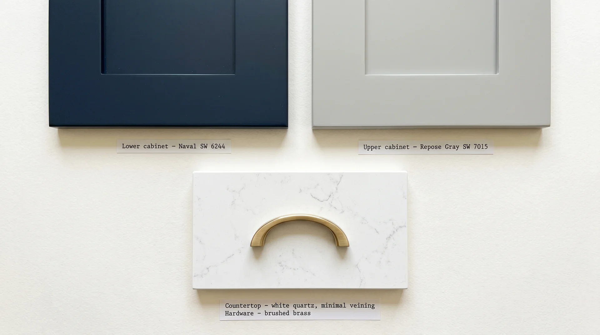
Neutral white or light gray quartz with minimal veining is the most reliable countertop choice for two-tone blue and gray cabinets.
Two colored cabinet runs already create visual interest.
A busy or warm-toned countertop adds a third competing element, and the kitchen tips from layered to chaotic before you’ve added a single accessory.
This is the countertop mistake I see most often in two-tone kitchens: choosing a heavily veined slab because it’s beautiful in isolation, without considering that it has to bridge two cabinet colors simultaneously.
| Countertop | Works With | Avoid Pairing With |
|---|---|---|
| White quartz, minimal veining | All blue and gray combinations, especially strong with high-contrast navy and light gray | Nothing – the most universally safe choice |
| Light gray quartz with white veining | Navy and soft gray pairings; contemporary combinations like Smoky Blue and Dovetail | Warm greige grays – the countertop pulls the palette in two directions |
| White marble or marble-look quartz | Naval plus Repose Gray; coastal and transitional kitchens | Marble with heavy gold or brown veining – conflicts with the cool cabinet palette |
| Butcher block or natural wood | Naval plus Mindful Gray specifically – the warmer gray pairing adds the warmth the wood needs | Cool pairings like Smoky Blue plus Dovetail – the warmth creates a temperature conflict |
| Dark gray or black quartz | Stardew plus Iron Ore; contemporary kitchens with abundant natural light | Small kitchens or north-facing kitchens – add heaviness without enough light to balance it |
Hardware Finishes
Hardware finish changes the temperature of the whole palette.
With a cool blue and gray combination, you’re choosing between staying in the cool register or deliberately introducing warmth to balance it. Both are valid – they just produce different results.
- Brushed nickel is the most cohesive choice for cool blue-gray palettes. It stays in the same temperature family, doesn’t compete, and works across every SW pairing in the tables above. Reliable, if not the most memorable option.
- Matte black creates a strong graphic contrast that works particularly well with Naval plus Repose Gray. It grounds the palette without adding warmth. For best results, use it when there’s some black elsewhere in the kitchen appliances, window frames, and pendant light fixtures, so the hardware doesn’t appear isolated on the cabinets alone.
- Satin or unlacquered brass adds the warmth that cool palettes often need and rarely get from any other element. Use it as an accent rather than throughout two or three brass fixtures, which looks deliberate; applying it to every cabinet pull reads as overdone. Best suited to Naval plus Mindful Gray, where the warmer gray can absorb the brass without visual tension.
- Brushed gold is a softer brass and pairs especially well with Naval plus Mindful Gray in kitchens with warm wood floors. In a purely cool palette like Smoky Blue plus Dovetail, brushed gold can feel like it arrived from a different design scheme entirely.
- Polished chrome reads modern and clean. It pairs naturally with white quartz or marble-look countertops and works well in contemporary pairings. Less suitable for farmhouse or transitional palettes.
Mixing two metal finishes is fine; it’s common in well-designed kitchens right now. The approach is to choose one dominant finish and use a second as a limited accent. Three finishes in the same kitchen rarely hold together.
Backsplash
This is where I push back on the “let your backsplash make a statement” advice that circulates widely in kitchen design content.
A bold or complex tile becomes a third competing element when the cabinets already have two colors going on.
Simple white or pale gray subway tile is the most reliable bridge between two cabinet tones.
If you want texture without adding color competition, a matte ceramic tile in a simple format, stacked brick, square, or a handmade-look style adds material interest without creating another focal point.
Save the patterned tile for a kitchen with single-color cabinetry that actually needs the visual lift.
Will Two-Tone Blue and Gray Cabinets Date Your Kitchen?
Blue and gray is one of the more durable two-tone combinations in kitchen design, but the specific shades you choose matter far more than the color family itself.
Both blue and gray have long histories in residential interiors.
Naval-toned cabinets appeared in high-end kitchen design well before they became a mainstream trend, and they’ve held up because the color has classical precedent rather than relying on a fashion moment. Charcoal and slate grays carry the same foundation.
The shades that carry real trend risk are the highly saturated, fashion-adjacent blues: cobalt, electric teal, bright turquoise. These don’t have the history that navy and slate carry, and they tend to date with the trend cycle that made them popular.
There’s also a resale consideration worth naming: a well-executed two-tone kitchen in a classic navy-plus-gray combination consistently attracts buyers looking for a custom, designed-feeling space. The same kitchen in a clashing or overly trend-forward palette can work against you.
- Lower trend risk: Naval SW 6244, Salty Dog SW 9177, Rainstorm SW 6230, Smoky Blue SW 7604, Stardew SW 9138, Dovetail SW 7018, Iron Ore SW 7069
- Higher trend risk: Highly saturated teals, cobalt blues, and blue-greens with a strong green bias
Honestly, I can’t tell you with certainty how any specific palette will land with buyers in your market five or ten years from now.
What I can say is that the classic navy-plus-gray formula has held up far better than most people expected when it peaked in popularity, and the underlying logic, cool anchoring tone on the lower cabinets, lighter neutral on the uppers, is structurally sound regardless of which specific shades are having a moment.
Common Mistakes to Avoid With Two-Tone Blue and Gray Cabinets
Most two-tone cabinet projects that go wrong share one or more of these:
- Choosing each color in isolation. Same logic as the undertone section covered earlier, colors don’t exist in a vacuum. A blue you love, and a gray you love, can still clash if their undertones point in different directions. Compare them together before committing to either one individually.
- Testing samples on the wall instead of a cabinet door. Drywall and painted cabinet surfaces reflect light differently. The color reads differently on each surface, so a wall test will give you inaccurate information about what the same color does on your cabinets.
- Ignoring the floor when making cabinet color decisions. Warm oak floors pull the entire palette warmer. Cool tile floors intensify the cool register of blue and gray. Your flooring is part of the color equation, whether you account for it or not.
- Using the same paint finish on both cabinet runs. Lower cabinets need a harder, more cleanable finish. Applying a matte or eggshell finish to lower cabinets creates a maintenance problem that shows up fast in a working kitchen.
- Picking a countertop that works with the blue but not the gray. Your countertop has to bridge both cabinet colors at the same time. Always evaluate all three elements together, never in separate decisions made on separate days.
The swatch problem is worth stating plainly: paint chips do not tell the full story of a color.
I’ve watched clients fall in love with a color on a chip and have a completely different reaction once it’s on a cabinet door in their actual kitchen. Order the Peel & Stick samples.
Do the 48-hour test. It takes two days and prevents weeks of regret.