
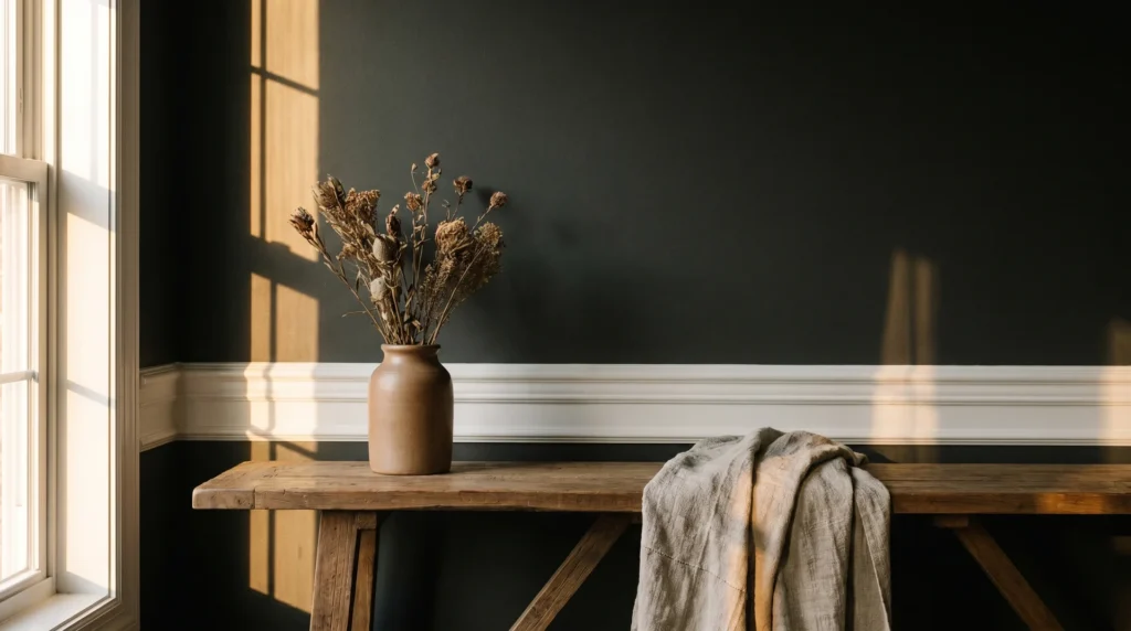
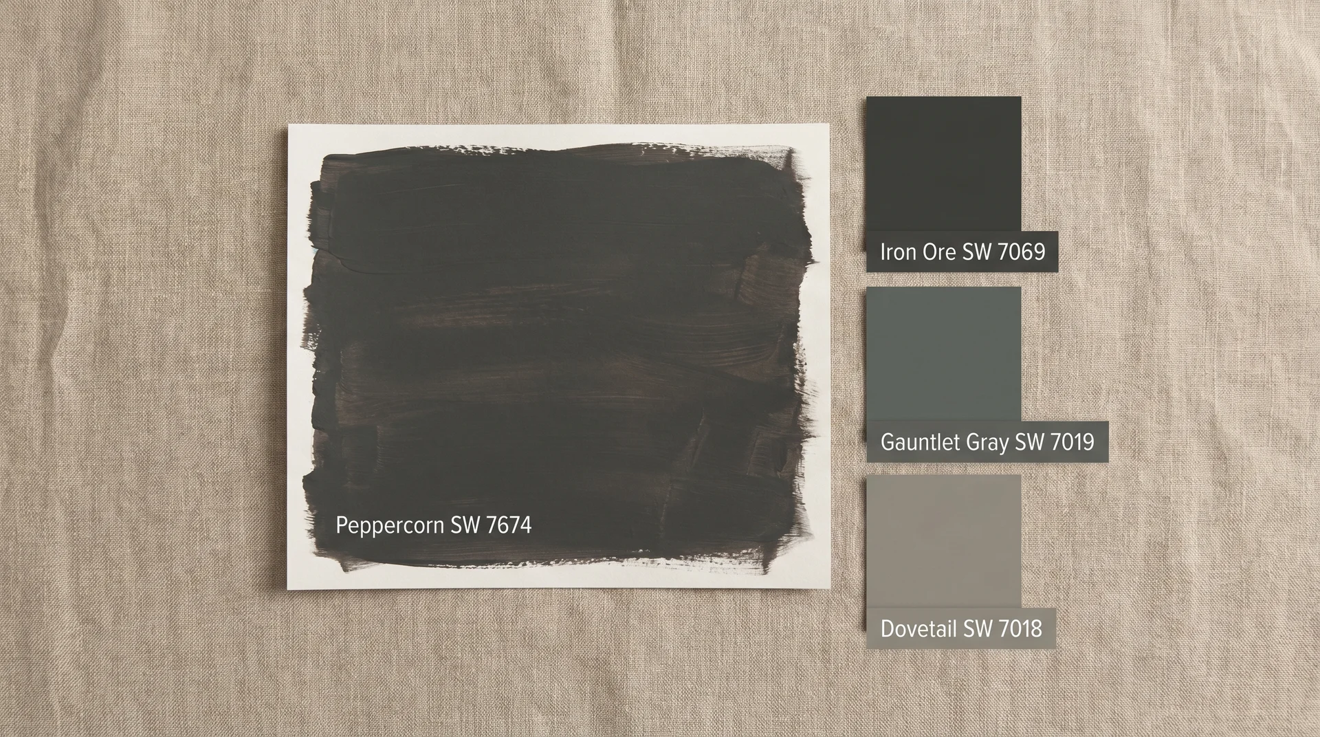
Peppercorn SW 7674 is one of the most reached-for dark neutrals in residential design, and it earns that attention.
It’s moody without being oppressive, dark without crossing into black, and versatile enough to work on walls, cabinets, and exteriors.
But it has a specific behavior that trips a lot of people up, and if you’ve painted a sample patch and found yourself wondering whether it looks gray or purple, you are not imagining things.
The short answer: Peppercorn is a deep charcoal with violet undertones that activate under specific lighting conditions. Whether those undertones are a non-issue or a real problem depends entirely on your room, and that is exactly what this piece covers.
What Color Is Peppercorn, Exactly?
Peppercorn SW 7674 is a deep, dark warm-gray charcoal with an LRV of 10 and violet undertones that become visible in low light or under cool artificial lighting.
An LRV of 10 places Peppercorn very close to the dark end of the scale, where 0 is pure black, and 100 is pure white. It absorbs a significant amount of light, which is what gives it that grounded, rich quality on a wall.
Most people are surprised by how dark it reads in person compared to the chip at scale. It is a genuinely bold commitment.
It sits in charcoal territory, warmer and softer than Iron Ore SW 7069, which reads more as a neutral near-black. Compared to a true mid-gray, Peppercorn is in a completely different category; it is a statement, not a background.
The purple undertone is real, and it is not a minor variation.
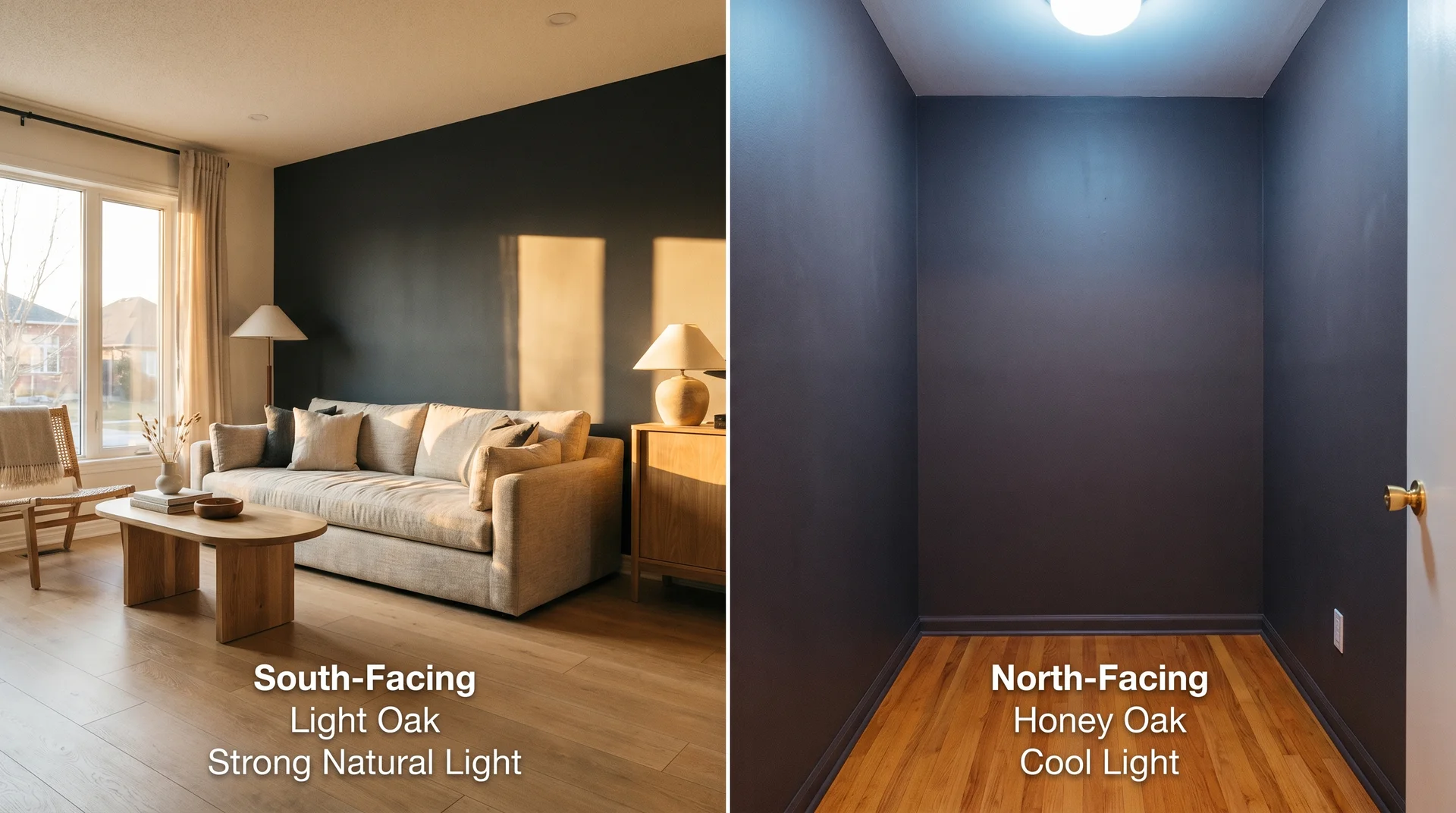
It comes from a violet base in the formula. In north-facing rooms, small spaces with limited windows, or under cool LED lighting, Peppercorn can read distinctly plum-gray rather than true charcoal.
In rooms with strong natural light or warm bulbs, it reads closer to a rich, neutral dark gray.
How Peppercorn Compares to Similar Dark Neutrals
| Color | Code | LRV | Undertone | Best Application |
|---|---|---|---|---|
| Peppercorn | SW 7674 | 10 | Violet/purple | Accent walls, cabinets, exterior, entryways, powder rooms |
| Iron Ore | SW 7069 | 6 | Neutral to warm | Near-black applications, dramatic interiors, exterior siding |
| Gauntlet Gray | SW 7019 | 17 | Green-gray | Full-room interiors needing a softer, dark neutral |
| Dovetail | SW 7018 | 26 | Warm gray | Medium-depth contrast without full drama |
How Peppercorn Performs in Different Lighting Conditions
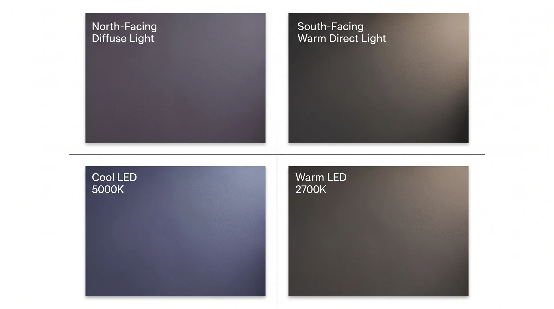
Lighting is where Peppercorn either earns its reputation or frustrates whoever bought it. This is not a color that looks the same at nine in the morning and nine at night, and treating it as if it does is exactly why so many people end up second-guessing themselves after the sample hits the wall.
The direction your windows face will shape how Peppercorn reads more than any coordinating color you choose around it.
- North-facing rooms receive indirect, cool, diffused light all day. In these rooms, Peppercorn trends toward its purple side, which can be genuinely beautiful if that is what you wanted, and a real problem if you were expecting a clean charcoal.
- South-facing rooms get warm, direct light that suppresses the violet undertone and pulls the color toward a richer, more neutral dark gray.
- East-facing rooms have strong morning light and dimmer afternoons. West-facing rooms reverse that pattern. Peppercorn shifts noticeably through the day in both cases, which some people find compelling and some find distracting. It is worth knowing before the gallon goes on the wall.
Artificial lighting changes the equation entirely, and most people forget to test it.
- Warm incandescent-style bulbs in the 2700K range tend to warm Peppercorn up and reduce the violet shift.
- Cool daylight LEDs at 5000K and above amplify the purple undertones significantly. Most modern homes run on LED lighting, which means if you have not looked at your sample after dark with the bulbs you actually use, you have not finished the test.
How to Test Peppercorn Before You Commit
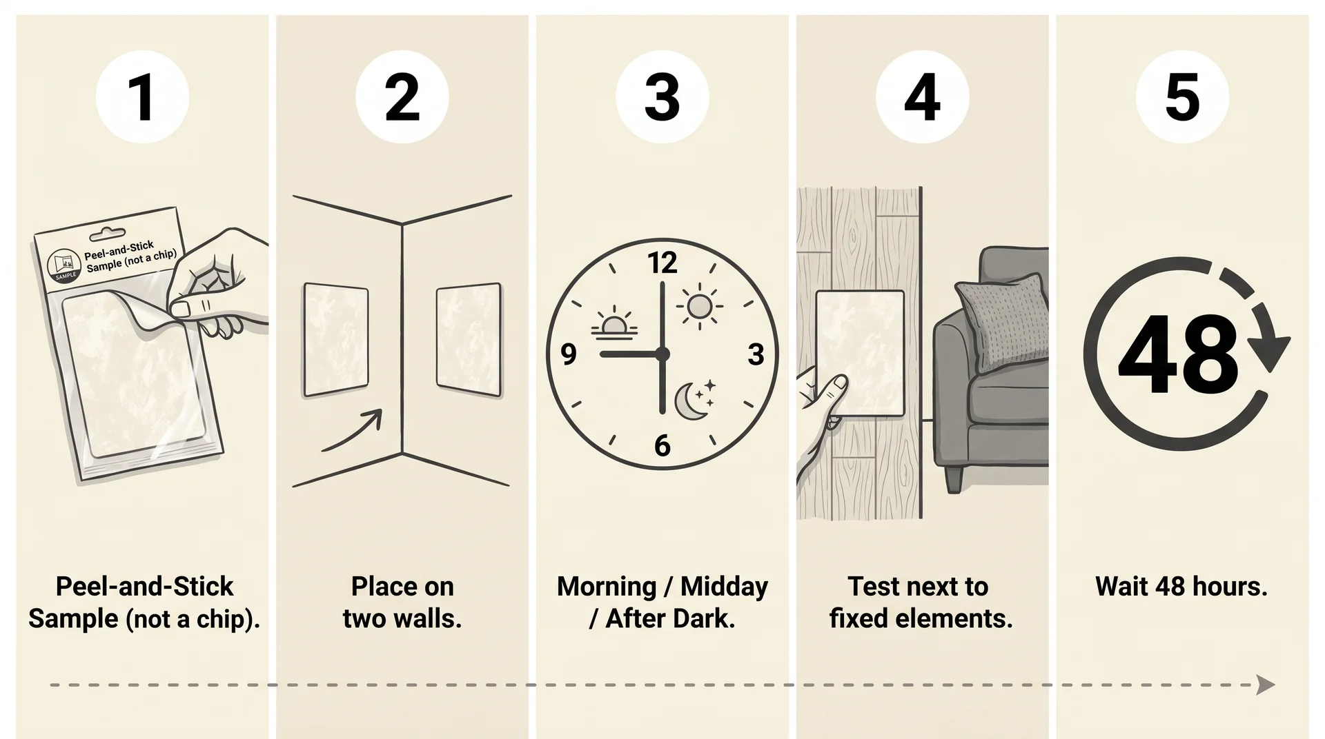
- Buy the Sherwin-Williams peel-and-stick sample or a small paint pot, not just a chip. A printed chip has a different surface texture than a painted wall, and that difference changes how the color reads, sometimes dramatically.
- Place the sample on at least two walls in the room, including the wall that gets the least natural light.
- Observe it at three distinct times: morning, midday, and after dark, with your normal overhead and lamp lighting running.
- Hold it next to your largest fixed element, your sofa, your flooring, your existing cabinetry. That pairing is the real test, not the wall in isolation.
- Give it 48 hours before deciding. Color perception shifts with familiarity, and a second look after a night’s sleep is almost always more accurate than the first reaction.
Is Peppercorn a Good Choice for Your Room?
Peppercorn is an excellent color in the right conditions and a genuinely difficult one in the wrong ones, and the conditions are specific enough to name plainly.
It consistently delivers in spaces where it has room to work: entryways with decent ceiling height, powder rooms where the drama is intentional and contained, and rooms with strong natural light where the violet undertones stay in check.
Kitchen cabinets in well-lit kitchens and exterior applications are strong uses, and both get their own sections below.
Where it can struggle:
- Small rooms without natural light, the color can turn heavy and airless rather than moody and intentional, and there is not much to be done once the paint is on the four walls
- Rooms with warm honey-toned hardwood floors, where the violet undertone and the orange-adjacent warmth of the wood create an uncomfortable contrast that no amount of accent color coordination fully resolves; I have watched clients walk into this one more than once
- Full four-wall applications under exclusively cool LED lighting, where the purple shift is most pronounced and most persistent
The question worth asking before committing: what are the fixed elements in your room?
The paint color is the one thing you control. Your flooring, furniture, trim, window placement, and lighting situation are almost certainly not changing.
Peppercorn needs to work with those things, not just look right in someone else’s before-and-after photo where the light, the floor, and the furniture are all different from yours.
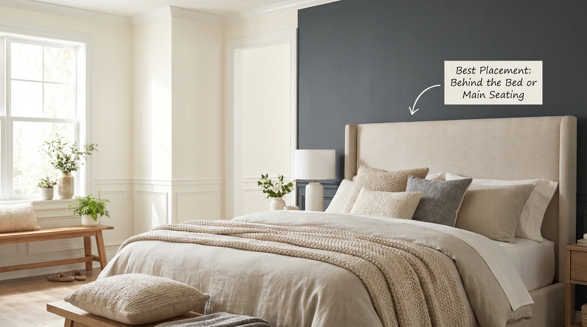
Peppercorn in the Bedroom
As a four-wall bedroom color, Peppercorn works best when the room has at least one window that gets direct light and when the bedding and soft furnishings are in warm whites, natural linens, or warm creams.
Against those elements, the depth reads as cozy rather than heavy. In a small bedroom with one north-facing window, honestly, it is a harder sell than most articles will admit.
In a small bedroom with one north-facing window, honestly, it is a harder sell than most articles will admit.
If you want the depth of a dark neutral for that kind of room without managing Peppercorn’s stronger violet shift, Mink SW 6004 sits about ten LRV points lighter with a warm brown base that handles lower-light conditions more reliably.
<p>As an accent wall behind the bed, Peppercorn is strong
in almost any bedroom.</p>
As an accent wall behind the bed, Peppercorn is strong in almost any bedroom. The drama stays on one surface, and you are not committing the whole room to managing its undertones across every light condition through the day.
Peppercorn on Kitchen Cabinets
Peppercorn has violet undertones that shift in low or cool light on a wall or on a cabinet door; the behavior is the same.
Keep that in mind as you evaluate whether your kitchen’s light situation suits it.
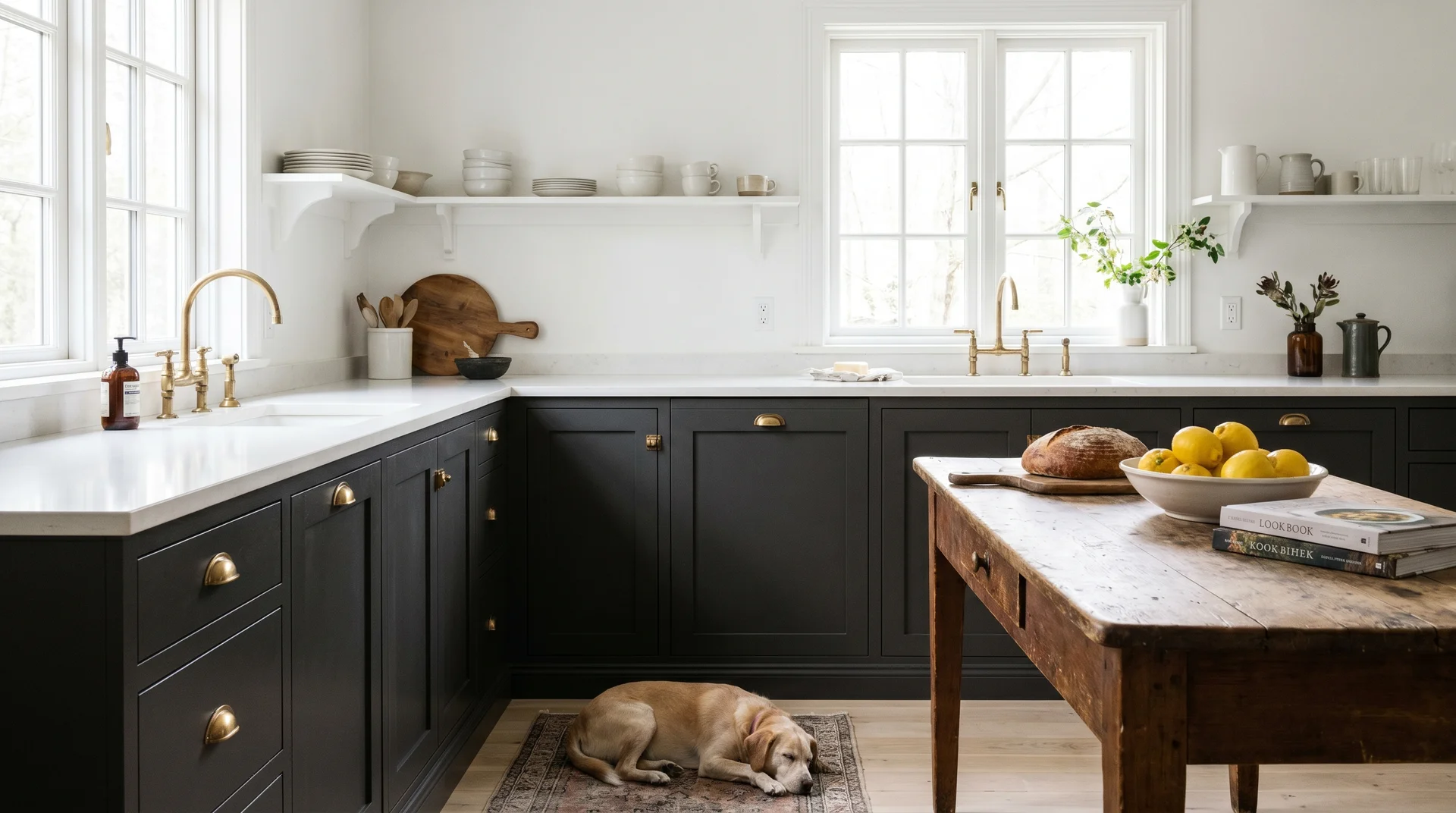
In a well-lit kitchen with pale countertops, white or near-white walls, and hardware in brass or matte black, Peppercorn on lower cabinets is one of the more intentional choices available in a dark neutral.
In a kitchen that does not get strong natural light, or where the countertops are already in a darker range, the result can read flat and heavy rather than dramatic and deliberate. The violet undertones do not disappear because the surface is a door panel rather than a painted wall.
Finish matters more on cabinets than anywhere else in the house. Eggshell is not durable enough for painted cabinet surfaces that see daily contact, grease, and cleaning. Use satin at a minimum, semi-gloss if cleanability is a real priority.
The higher sheen also reflects light and mildly softens the violet undertone in a lower-light kitchen, which is a practical benefit on top of a durability one.
Peppercorn on the Exterior
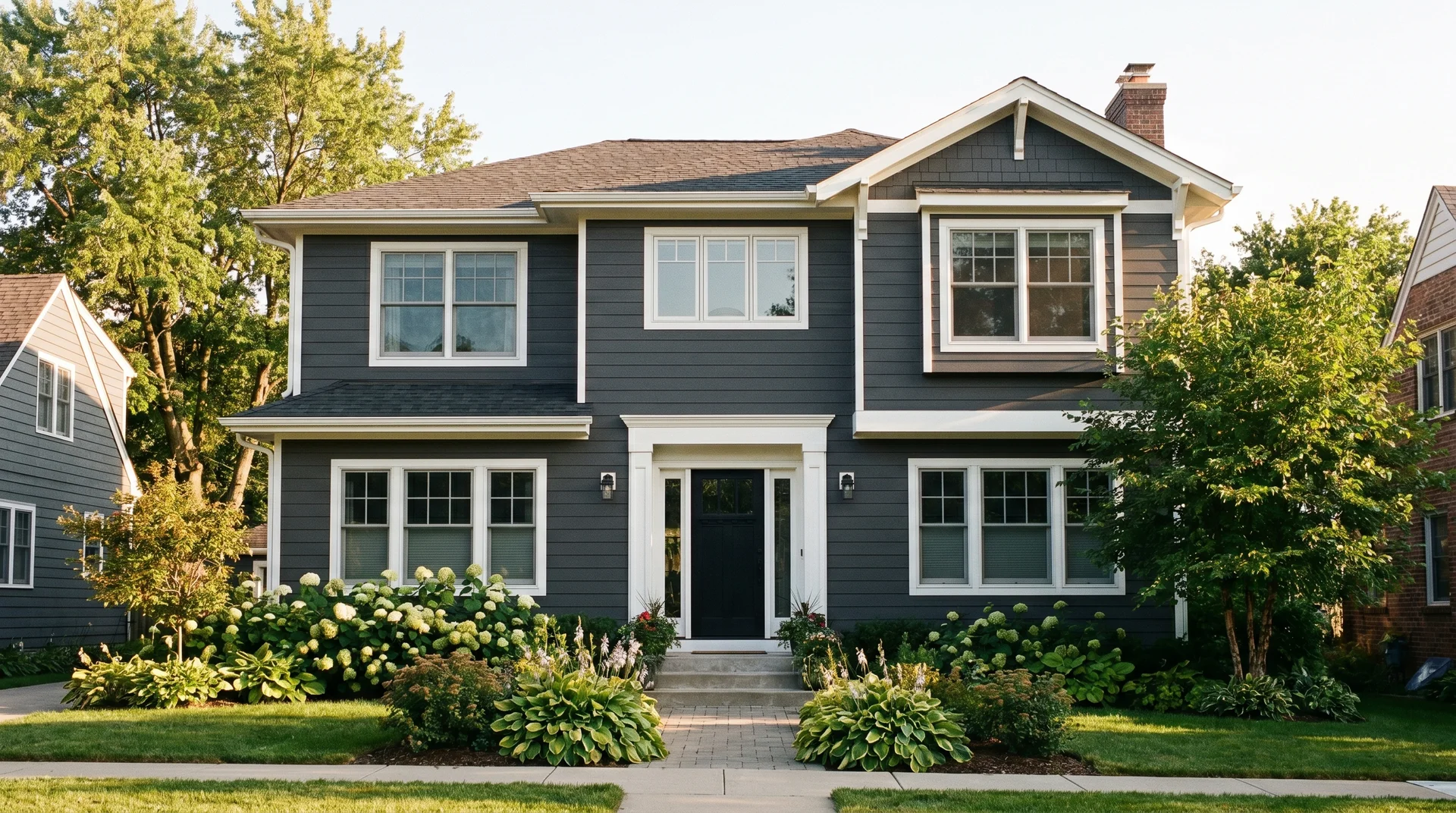
Peppercorn is one of the most reliable dark neutral choices for exterior residential applications, and exterior use is arguably where it performs at its best.
Outdoors, Peppercorn benefits from something it does not always get inside: abundant, direct, full-spectrum natural light. That light suppresses the violet undertones almost entirely and lets the true charcoal depth read clearly.
- Against white trim, it delivers contrast that reads as crisp and considered. Against natural wood, cedar, or stone, it has a grounded quality that works with the materials rather than competing with them.
- As a front door color, Peppercorn punches above its weight. It reads as deliberate against almost any siding color and picks up detail in door hardware and architectural molding that lighter front door colors flatten.
It is one of the few dark neutrals that works against warm brick without the purple undertone becoming a problem outdoors, in direct sun, the violet simply does not show up the same way it does inside.
On the question of what makes a house look expensive: consistent depth and intentional contrast are the most reliable answers. A dark charcoal body color with crisp white trim and considered hardware is one of the more timeless approaches to curb appeal, and Peppercorn handles that combination well in most exterior light conditions.
Peppercorn in the Bathroom
In a powder room, Peppercorn is an excellent choice. The space is small, low-traffic, and the drama is contained and intentional. A large mirror, good sconce lighting in the 2700K range, and crisp white trim are all it needs.
In a full bathroom with a small window and limited ventilation, approach more carefully. The question of what not to paint a bathroom is less about specific color names and more about what low light does to dark values at scale.
Peppercorn in a poorly lit full bath can read oppressive rather than dramatic, and it is a difficult decision to walk back once it is done.
Coordinating Colors That Work with Peppercorn
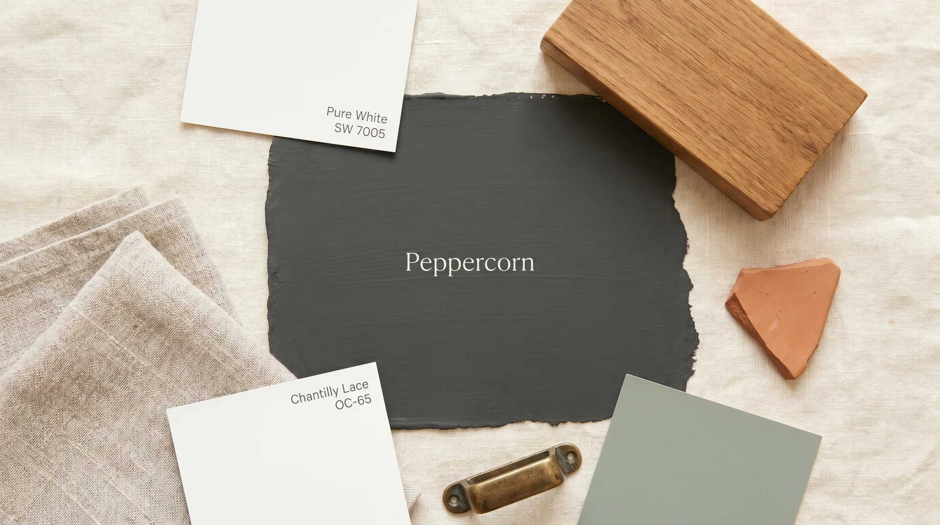
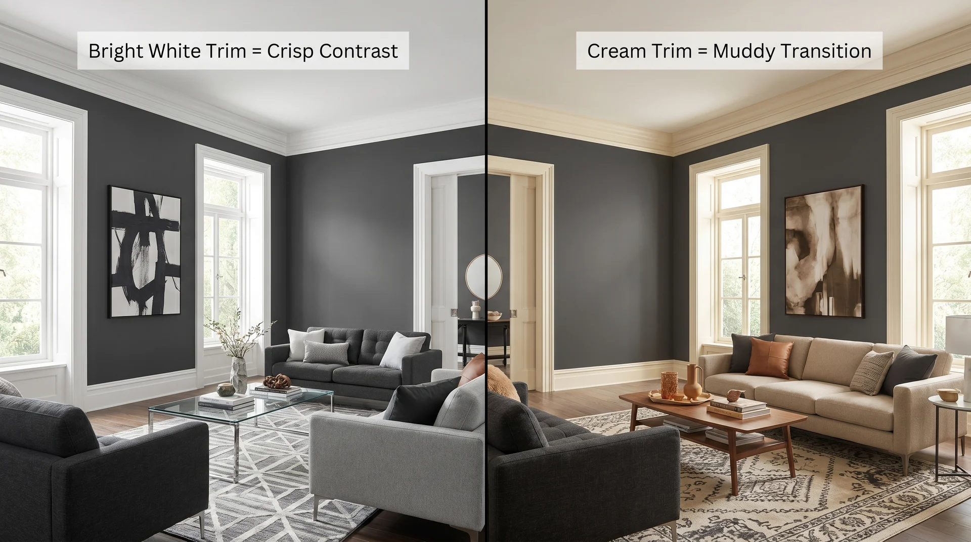
Peppercorn pairs best with crisp whites on trim, warm creams, and natural linens in soft furnishings, and muted warm-toned accents — not with cool blue-grays or high-chroma saturated colors.
The trim color decision gets more debate than it deserves. Chantilly Lace BM OC-65 and Pure White SW 7005 both work well because they are bright, clear whites with minimal undertone. A creamy, yellow-adjacent white, like Antique White or Ivory, next to Peppercorn muddies both colors.
I’ve had this exact conversation with clients more times than I can count. They want warmth in the trim and end up with something that looks indecisive rather than considered. Crisp is correct here.
For the walls in a room where Peppercorn is used as an accent, a warm light gray like Agreeable Gray SW 7029 on the remaining three walls gives the Peppercorn surface room to read without the space feeling enclosed.
For accent colors, the strongest pairings share one quality: warmth with restraint.
- Muted dusty greens: the kind that lean more sage than emerald; full saturated greens compete rather than complement
- Warm terracotta and rust tones at a lower saturation than you might expect; the full-chroma versions fight Peppercorn rather than sitting alongside it
- Aged brass hardware, which brings warmth without competing for attention and reads especially well against the dark value
- Natural wood in the medium-warm range: light oak and walnut both work, for different reasons
Bright, saturated colors placed directly next to Peppercorn tend to read as contrast-for-contrast’s sake. The color is already doing significant visual work on its own. Accents should earn their place next to it, not shout.
Peppercorn with White Trim
Use a bright, neutral-to-cool white for any trim that sits directly adjacent to Peppercorn. Pure White SW 7005 and Chantilly Lace BM OC-65 are the most reliable choices.
Warm ivories and creams on trim in the same room muddy rather than clarify the boundary between the dark wall and the trim, and once you see it, you cannot unsee it.
Peppercorn as an Accent Wall
Most accent wall advice gets the wall selection backwards. People default to the most visible wall, the one directly facing the entry. For Peppercorn, the wall behind the main seating or behind the bed reads better. You live with it as a backdrop, not as the first thing you walk into.
A warm white or warm light gray on the remaining three walls gives the Peppercorn surface room to read without the whole room feeling enclosed. The same crisp-white trim rule applies here as it does everywhere else in the room.
Peppercorn Alternatives From Other Paint Brands
Peppercorn SW 7674 has no exact equivalent in other paint brands, but there are close alternatives for readers working with Benjamin Moore, BEHR, or PPG.
The differences between these alternatives are real, not cosmetic. LRV, undertone composition, and how the formula behaves in different lighting conditions are all specific to each brand and mix. The coordinating colors that work well for SW 7674 may need adjustment if you switch brands.
| Brand | Color Name | Code | Notable Difference vs. Peppercorn |
|---|---|---|---|
| Sherwin-Williams | Peppercorn | SW 7674 | Reference color. LRV 10, violet undertone. |
| Benjamin Moore | Kendall Charcoal | HC-166 | Bluer undertone; reads more cool blue-gray than violet-gray; less purple shift in low light |
| BEHR | Cracked Pepper | PPU18-01 | Slightly deeper value; undertone leans more neutral; less visible purple shift under cool artificial light |
| PPG | Black Pepper | PPG1025-7 | Warmer base; reads more brown-gray in warm light; less violet |
I want to be straightforward about the limits here. The PPG entry carries more uncertainty than the others.
Paint formulas are proprietary, and matching across brands at LRV and undertone simultaneously is genuinely imprecise. Close is not the same as identical, and a chip comparison in a store is even less reliable than it is for your primary choice.
If you are switching brands to approximate Peppercorn, run the same 48-hour sample test described in the lighting section above. Same approach, same walls, same lighting windows. The brand on the can does not change what the color does in low light.
Choosing the Right Finish for Peppercorn
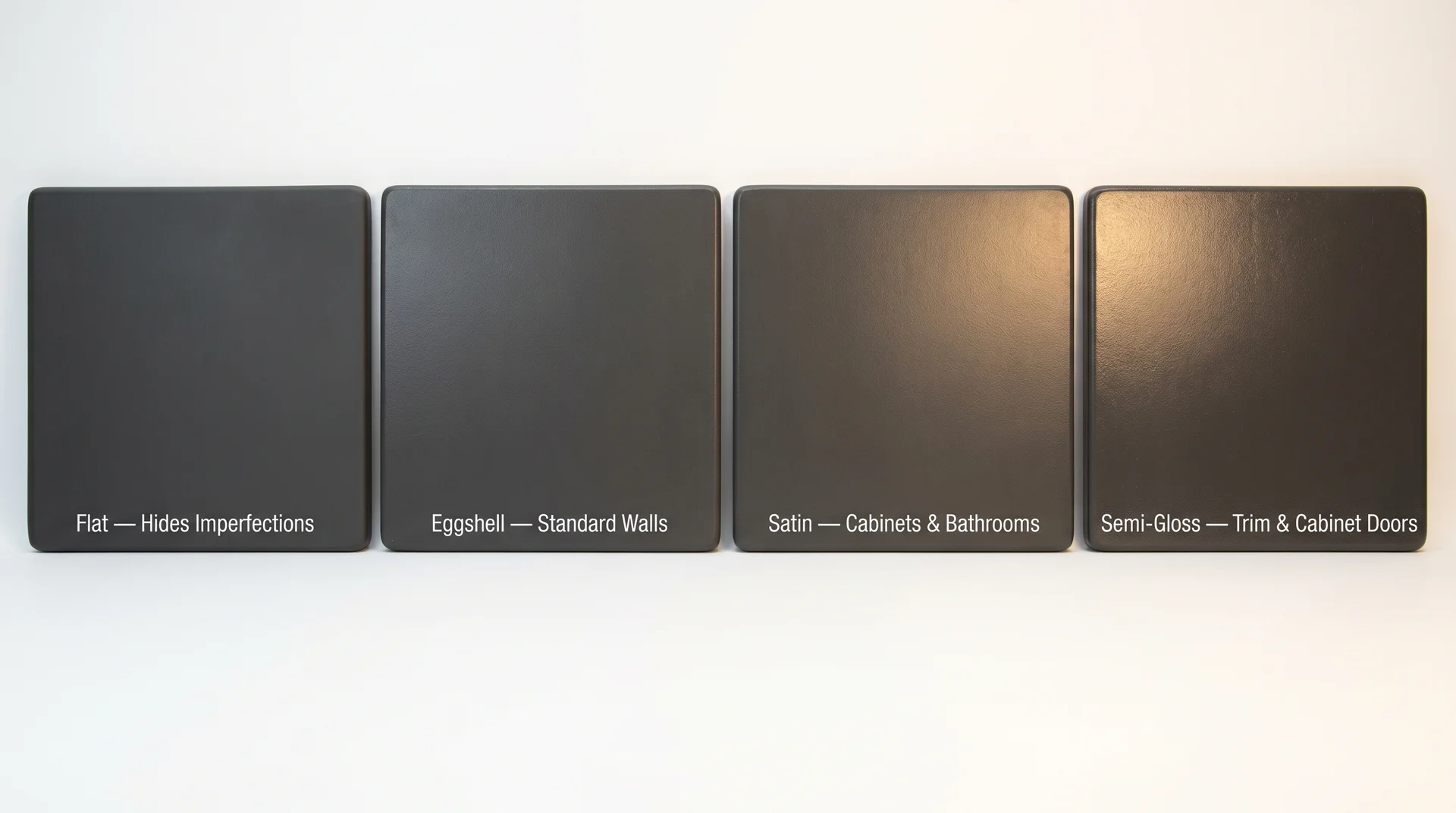
Finish affects both durability and how the color reads. Dark colors show sheen variation more visibly than lighter ones, which makes this decision more consequential with Peppercorn than with a soft white or medium gray.
The right finish varies by surface and use:
- Living room and bedroom walls: Eggshell. Cleanable, holds the color well, and does not amplify imperfections the way satin can on textured walls.
- Kitchen and bathroom walls: Satin, for moisture resistance and wipeability.
- Cabinets: Satin or semi-gloss. Semi-gloss holds up better to handles, daily cleaning, and grease — and its light-reflective quality mildly softens the violet undertone in lower-light kitchens, which is a secondary benefit worth knowing about.
- Trim: Semi-gloss. The sheen contrast between a dark eggshell wall and semi-gloss trim creates a clean visual separation that reads especially well with Peppercorn.
- Exterior: Use a formula specifically rated for exterior application, satin for siding, semi-gloss for trim, and front doors.
A higher sheen finish reflects more light and softens the apparent intensity of the violet undertone. It will not fix a north-facing room, and it is not a substitute for testing the color properly.
